Android Wear 1.4 review: Marshmallow brings more features with less polish
If the purpose of Android Wear is to offload some of the things we reflexively check our phones for every day to the wrist, this last year is evidence enough that Google has succeeded. When used correctly, these wrist computers become stylish extensions of your phone that absolutely get you to check your phone less every day. It's a platform that has seen slow and steady growth thanks to over a dozen quality hardware offerings in various shapes and sizes, but it's clear Google isn't going to stop with what we have seen so far.
The next step is to make Android Wear something that is more than a notification dumpster at the end of your arm, and more of an interactive experience that complements the Android interface. Long term, it's clear the goal is to offer Android Wear as something you can use without a phone at all, but not to a point where you're actually replacing your phone with a watch.
This is our Android Wear 1.4 review.
About this review
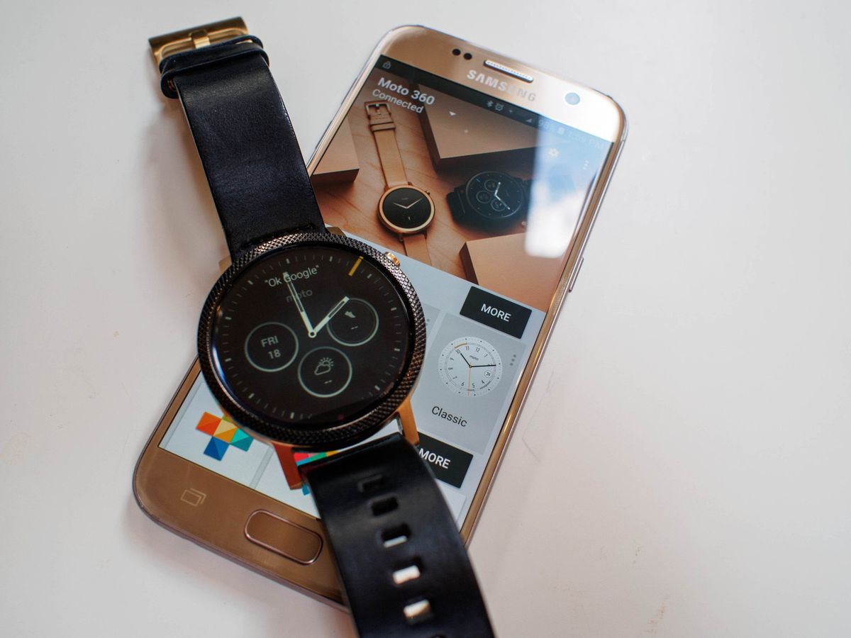
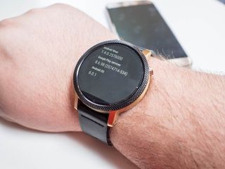
We're writing this review after several weeks of using Android Wear 1.4 (Build MEC23G) on a Moto 360 (2015) paired to the Samsung Galaxy S7. Android Wear 1.4 is available on 7 watches from multiple manufacturers at the time of this writing, with further updates expected over the next couple of months. While this review has been primarily written from the perspective of a round watch, square watches with Android 1.4 have been used as well.
Read More: These are the best Android Wear smartwatches
Phantom buzzing that never ends
Android Wear Interface
Visually, little has changed in the jump from Android Wear 1.3 to Android Wear 1.4. Google has settled on what they feel is best for the wrist, and the upgrade to Android 6.0 under the hood was more about making that interface work a little better. What has changed is the number of options you have when navigating that interface. Previously, Android Wear was designed to be a touch or voice interface. You could swipe around through the entire interface, or you could speak and jump to whatever part of the interface you wanted. Voice works great if you're in a quiet space and want to get somewhere quickly, but doesn't work well when you're out and about. Touch works great if you have a hand free, but because you're wearing the watch on your wrist you are effectively using two hands to navigate the entire interface. Google solved this by extending gestures, which now allow you to navigate the entire interface.
Be an expert in 5 minutes
Get the latest news from Android Central, your trusted companion in the world of Android
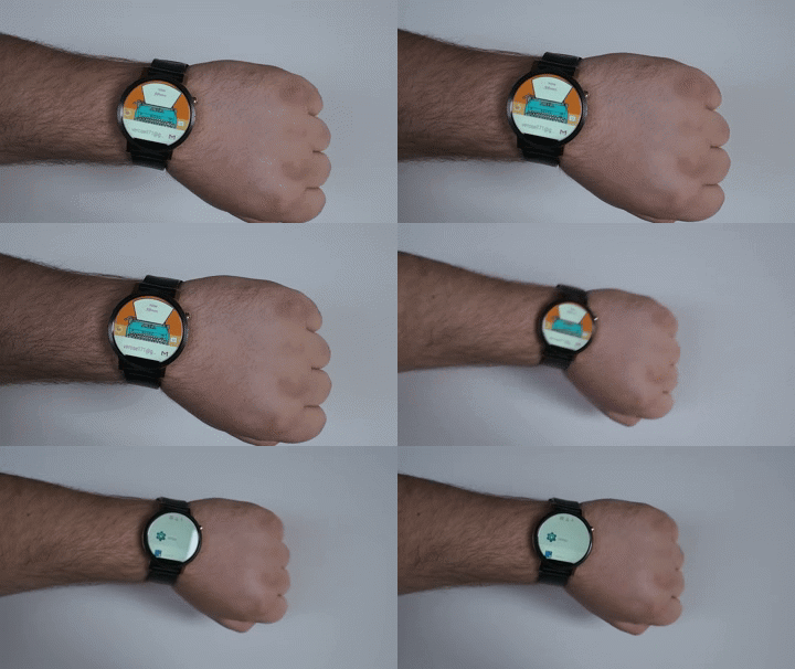
Google initially used gestures to allow users to jump back and forth between notifications on the watch, but now there are gestures for travelling left and right in the interface, as well as a select function when you don't have a finger free to tap. This means you can more easily launch an app with an arm full, or if you're in a hurry to get somewhere. What you won't be with these gestures is discrete. You can quickly shift your arm to access a single notification or to launch an app, but you're unlikely to use this to navigate all the way into the setting menu for anything. It's a fantastic addition to the overall experience once you adapt to the gestures so you aren't wildly swinging your arm around to select something.
For some watches, the interface has grown to include a dialer and the ability to make and receive calls through the watch. While the Moto 360 (2015) lacks the speaker to make this work, our own Jerry Hildenbrand had this to say from his experience with the Huawei Watch:
You're now able to do things like enable voice feedback in the settings menu and have what you're seeing and doing read back to you, or play music from Google Play Music directly through the watch speaker. But what has people the most excited is the ability to make and receive phone calls using the speaker and mic on your watch.When you first use the phone app on the watch, you're asked for permission to route headset audio through your watch as well as allow access to contacts. After that, you can use the phone app (or a voice command like "call mom") to make a phone call. Don't expect the same call quality you would get from a premium Bluetooth headset, but in general it works really well. Of course you can also receive calls, and you can choose to answer directly through the watch or decline and send a message.Remember, though, unless your watch has its own LTE SIM card you'll need to be in range of your paired phone to talk to your people.
Android Wear 1.4 mostly feels like Google is extending out from what they already know works in order to see what else watches can be used for. Adding gestures and speakers feel almost like an experiment to see if people want to use these things moving forward. The only watch we've seen built around this experience so far was pulled from the shelves days after it was launched due to a manufacturing defect (and is just now returning to stores after a 4-month delay). We'll no doubt see more Android Wear watches with LTE onboard later this year, but for right now it's unclear how useful the ability to speak to your wrist is going to be for a lot of users.
Adding steps and tightening screws
Android Wear interactions
The early days of Android Wear felt a great deal like Google's goal was to have everything handled by the app on your phone. Native apps on your wrist are never going to be as capable as the apps on your phone, and so it made sense to see this experience where Android Wear was almost another display for your phone.
With Android Wear 1.3 we saw that shift a little, allowing Google Maps to run as a full app on your wrist in order to better function as a mechanism for turn-by-turn directions. We've seen a couple of other apps make their way to the wrist, in order to take advantage of the Android Wear always-on display mode. If your to-do list is on your wrist even when the screen is dim, the watch consumes less battery power and you can glance when you need it. This balanced approach makes sense as long as you're not trying to play games on your phone, and generally extends the functionality of the watch.
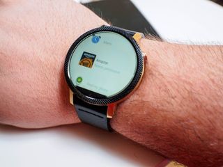
Android Wear 1.4 is based on Android 6.0, and that means the same permission system that exists on Android now exists on your watch. Instead of making it so permissions were managed through the Android Wear app on your phone, permissions are managed on the watch directly. Apps that you have installed on your phone with an Android Wear component will sync to your wrist when connected to the Android Wear app, but in order to use that app on your wrist you need to approve the watch-specific permissions. It's a nice safety measure that keeps apps from doing things like accessing the microphone on your watch when you don't want it to, and that's important. This does mean the initial setup for some of these apps takes a lot longer than they would have if the app wasn't installed directly on the watch.
One big example is the Amazon shipping app, which has an instruction set like this:
- Tap the app on your watch
- Tap the Permission request pop-up
- Tap the Accept option in the Permission request
- Wake your phone so the app can confirm the new Permissions
- Swipe away the notification telling you about the features you just activated
- Use the app
Granted, after this you never have to do any of this every again, but it's a lot to ask a user to do for an app on their watch. This is an extreme case, but it's also an app that a ton of people have on their phones. This process could use a little streamlining, especially as more app developers start to consider moving their app to the wrist. On the other hand, it makes malicious use significantly more complicated.
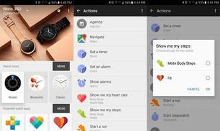
With everything happening on the wrist you may find yourself asking what the Android Wear app is mostly used for now, and the answer is basically shortcuts. While the Android Wear app is still fantastic at managing the initial setup process for every Android Wear watch, and you can quickly choose which watch face you want to use from the app, the only other big thing you do with the app now is manage shortcuts. We have lots of apps that do lots of things on our phones, and the ability to choose which one you launch when asking your phone to perform a specific task is important. If you don't want to use Google Maps for navigation, or the default clock app for managing alarms, this is where you set up different defaults for those behaviors. The Android Wear app gives you the entire list of actions, and you assign as needed.
If Android Wear really is preparing to create an environment where the watch and phone don't need to be connected all the time, these are the steps necessary to make that happen. It's a little less convenient right now for the folks who never plan to separate the two, but as the platform grows into the next year these user experience decisions will start to make a lot more sense.
Not better, but not worse
Android Wear The bottom line
Where the last big update to Android Wear was all about polishing what Google had already built, Android Wear 1.4 is building for what happens next. Some of it feels a little unfinished right now, and that's something Google should have handled a little differently, but the core of this experience is better than ever. When paired with your watch of choice, it's a great way to extend Android and make it more convenient to interact with the things happening on your phone.
The biggest question is whether Android Wear is really ready to be a standalone platform with an LTE-enabled watch, and it'll be a while before we have a real answer to that question.


