Android Wear has been living on our wrists for a little more than a year now, and it's grown and changed quite a bit in that time. The overall goal has always been to give you parts of your smartphone experience at a glance, and decrease the total number of times you have to open your phone and push buttons every day, and now Google thinks it's doing this even better than before. Outside of a huge outpouring of support from app developers and watch face designers, Google has learned from its users and made some changes to the overall experience.
Despite these changes, a lot of the same questions from the launch of Android Wear remain. Is this wrist computer actually more convenient than reaching for my phone? Does that convenience justify the average cost of an Android Wear watch? With the improved software and new wave of hardware options out there, can Android Wear replace actual watches for folks who enjoy nice watches?
Here's our review of Android Wear 1.3, in which we answer those questions.
Article continues below 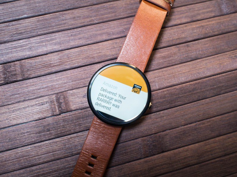
About this review
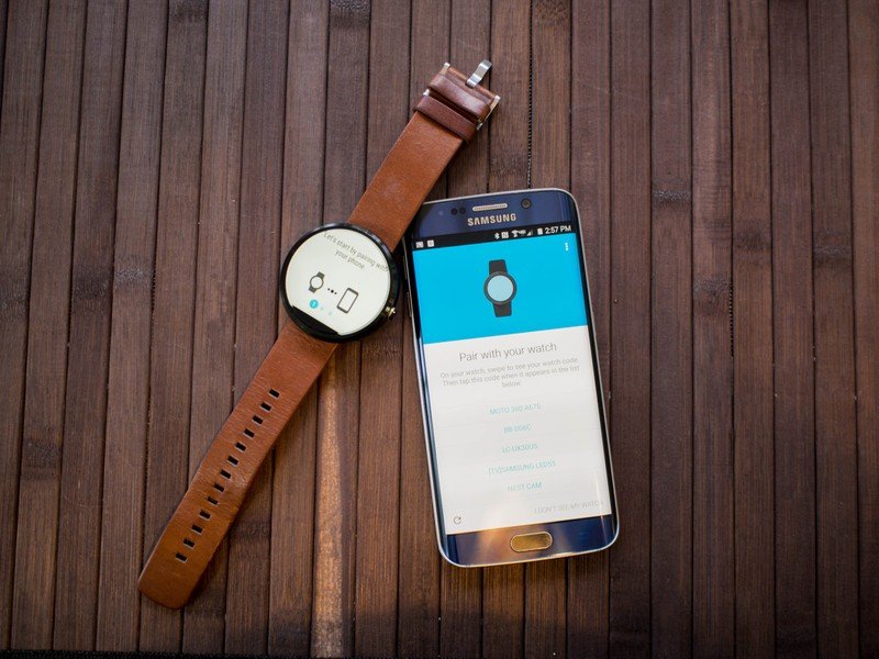
We're writing this review after two weeks of using Android Wear 1.3 (Build LCA44B) on the Moto 360 (2014) paired to the Samsung Galaxy S6 edge. At the time of this writing, Android Wear 1.3 is available on 10 different watches from multiple manufacturers, with plans for more by the end of this year. While this review has been written mostly from the perspective of a round watch, several square watches with Android Wear 1.3 have been used as well.
Read More: These are the best Android Wear smartwatches
Getting started
Android Wear initial setup
As a platform, Android Wear relies heavily on being connected to and receiving instructions from your smartphone. It's not a requirement that an Android Wear watch be connected 100 percent of the time, especially if your plans involve jogging or you just need something to tell you the time. But the bulk of the value in this setup comes from a connection to your phone. This connection is typically over Bluetooth, but if you're in a place where you frequently connect to Wifi you can set things up through your local network as well.
Get the latest news from Android Central, your trusted companion in the world of Android
For the out-of-the-box experience, Bluetooth is where you start.
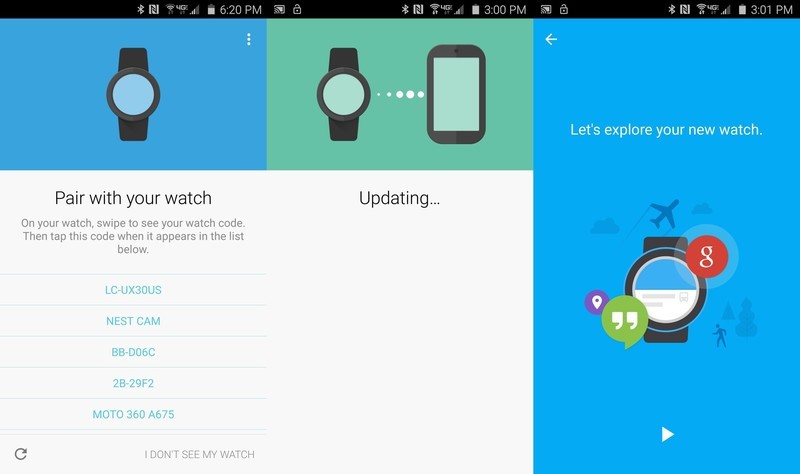
Android Wear does a great job eliminating a lot of the obnoxious steps in pairing a Bluetooth accessory. There's no navigating your Settings panel or setting your Bluetooth device to discoverable, you just install and run the Android Wear app on your phone. The app will ensure Bluetooth is enabled, and it searches for the nearest thing running Android Wear for your to connect to. (Though it will list other Bluetooth devices in range.) You select your watch by matching the unique identifier chosen by the watch and shown on your watch display to the code listed in the app, tap the name on your phone, and accept the pairing request.
Google has done well to educate the user throughout the setup process.
From here, the Android Wear app will ensure your watch is running the most recent version of the software and offer to walk you through a brief tutorial. While this is happening, your watch is syncing all of the relevant information from your phone and preparing for initial use. If you have apps on your phone with Android Wear functionality baked them, those apps will be installed on your watch during this sync process, along with your contacts and any additional watch faces you may have installed. (This is an all-or-nothing thing. You don't get to choose which apps sync.) Depending on how many apps, contacts, and watchfaces you have ready to be synced when the watch is paired, this process can take anywhere from 1 to 15 minutes.
Once the sync is complete, the watch has its own tutorial to show you how to navigate the interface. This includes swiping away notifications, changing your watchface, accessing the Always On display, and navigating the core interface. When this tutorial ends, you are given access to all of the apps and services that have now been added to your watch from your phone.
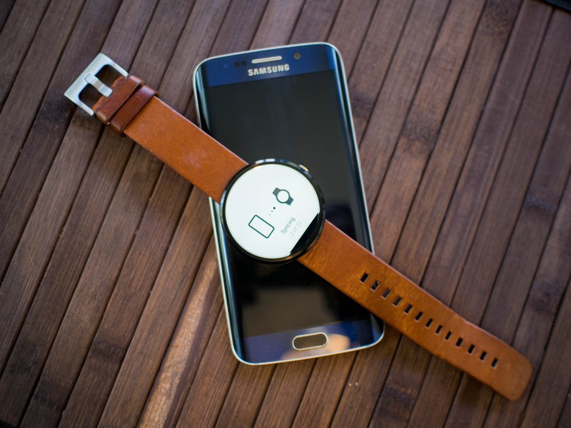
Overall, this process is fairly straightforward. The Android wear app now does a much better job keeping the user informed instead of having everyone stare as a sync screen with next to no additional information. And as long as you actually read the tutorials and participate in the guided areas of the experience, it's hard to imagine anyone getting lost or wondering how to access anything.
Compared to the original setup system for Android Wear, Google has done well to educate the user — and that's a much bigger deal than it may seem to those who have been using Android Wear from the beginning.
Lists and lists and lists
Android Wear interface navigation
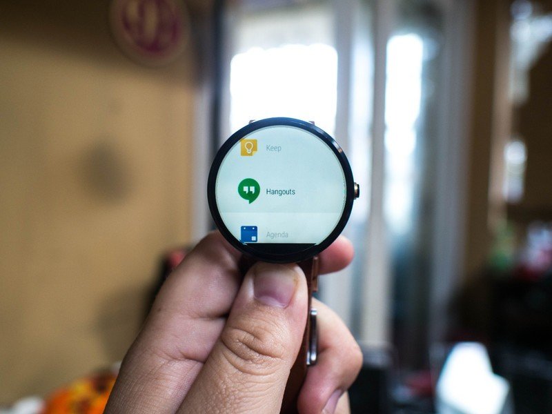
Android Wear is broken out into five basic parts — watch face, app drawer, contact list, voice commands and watch settings. The default starting location for everything is the watch face. From here you receive information from your phone and can interact with that information as it arrives. This includes Google Now cards, incoming calls, battery information, and of course notifications.
Any Android notification that supports Wear interactions will give you the ability to address that notification right on the watch. These interactions can be as simple as marking an email as read or as complex as replying to a message with your voice. Mostly, it's the same kind of interaction you'd get from a rich notification on your Android phone, making it so you don't have to unlock your phone and engage with the app directly. The rest of the notifications you get are meant to be glance notifications, allowing you to either swipe the notification away and dismiss it or unlock your phone and head directly to the information from that notification, rather than try to load the entire app on your watch.
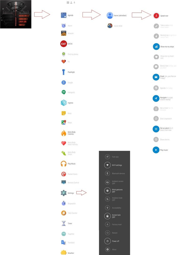
Your app list is always a single swipe to the left, giving you access to an alphabetical list of everything synced to your watch. For those of us with a lot of apps installed, this list can get somewhat extreme. If you've been flipping back and forth between multiple apps, the last three you've used will appear at the top of the list, followed by the proper list. Some of these apps are included by your manufacturer — Motorola has its own fitness and heart rate tracking apps, for example — but everything else tries to be a wrist-friendly extension of the app you have on your phone. For example, the Amazon Shopping app lets you voice search for products and make one-click purchases using your default payment information. Google Keep gives you a glance at your notes with the ability to create new notes with your voice, and Ingress lets you jump in quickly and interact with the closest portal.
It's a clean, simple list that you'll either use all the time or forget it exists.
Settings is treated like an app in your list, instead of having a separate mechanism for access. From here you can change the font, see your remaining battery, reboot if something has gone horribly wrong, or glance at your system information. After you've set everything up for the first time you probably won't find yourself here often, but it's a good idea to take a look at what is available should you ever need it.
Contacts is exactly what it looks like. All of your phone contacts are in an alphabetical list, with the ability to text or call those contacts from within the list. There's not much happening here, but it's available in two swipes if voice commands aren't an option. It's a clean, simple list that you'll either use all the time or forget it exists.
The final swipe in this list is more a reference list than anything else. Voice commands and access to the Google Now service can be accessed from anywhere on the watch by saying "OK Google" but if you don't know what options are available to you, the list can be a good refresher. If you don't want to give the full voice command, you can scroll through and tap on the option you want to activate. But after that you still need to use your voice since there's no keyboard. It's important to be aware we're not complaining about the lack of a keyboard here, just making it clear your only option is voice commands. Please, Google, don't ever put a keyboard on these watches.
Flick a little
Android Wear wrist gestures
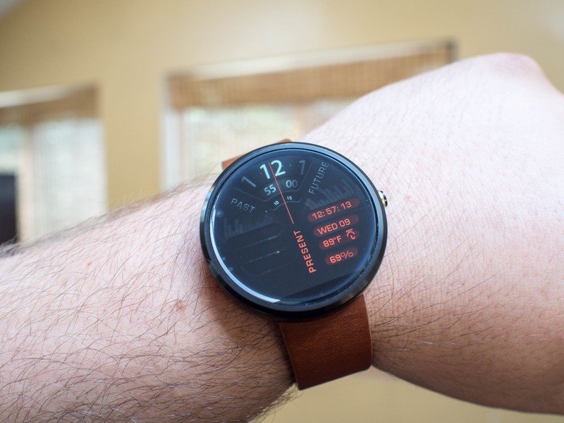
One of the more frustrating things about the original interface for Android Wear was the realization that your watch was technically a two-handed device. Both hands — rather, one hand and the other wrist — are needed to flick away notifications and see what you've missed. This meant a lot of the interactions weren't actually more convenient than pulling out your phone, which is obviously not what Google wanted. The solution, in many cases, was wrist gestures.
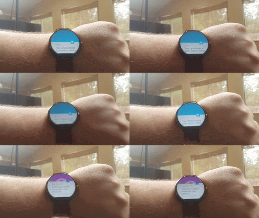
Instead of flipping through your notifications with your other hand, wrist gestures let you perform subtle wrist flicks to cycle through the information you want. Flick your watch away from yourself quickly to jump from one notification to the next, and reverse this gesture to go back in your list of notifications. This gives you a quick way to look at multiple notifications without using your other hand, or to dismiss notifications entirely and reveal only the watch face to others.
Having tested this gesture control system on multiple Android Wear watches now, the feature takes a minute or two to get used to, but it quickly becomes and invaluable way of accessing information without using both hands.
Fully loaded
Android Wear app
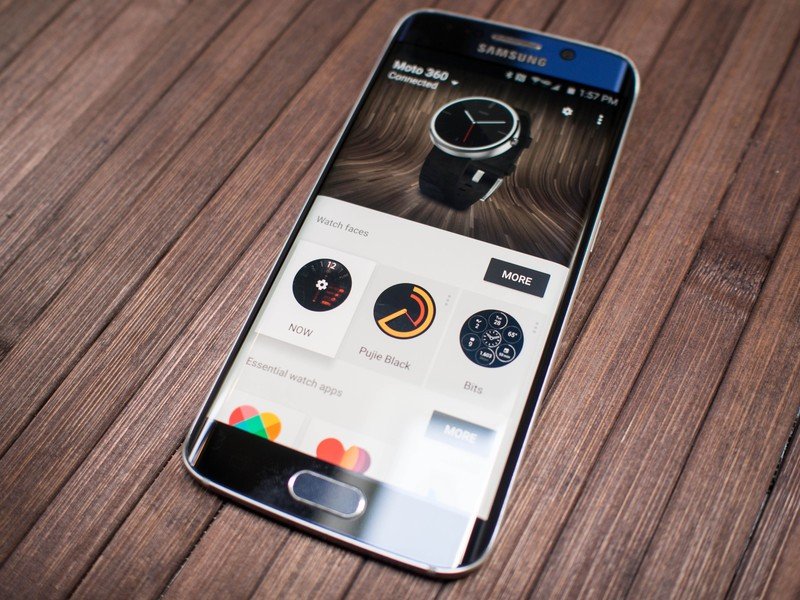
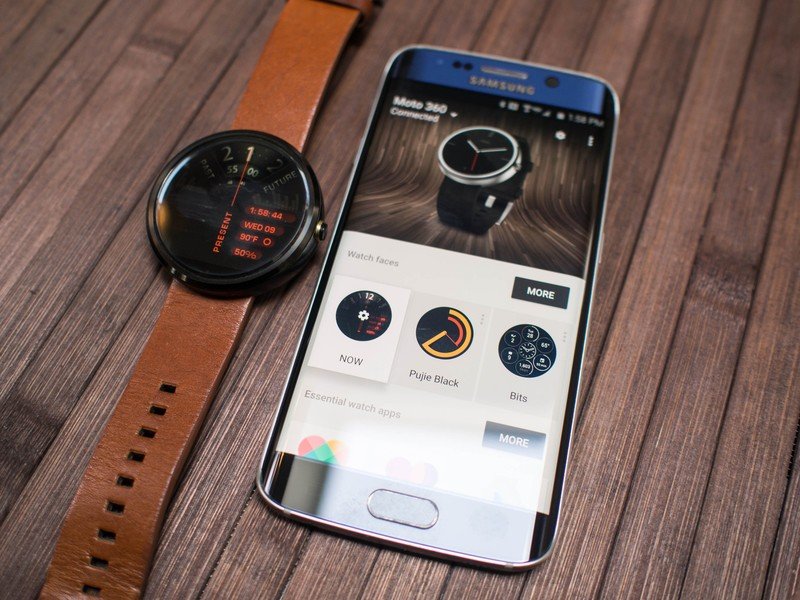
There's quite a bit you can accomplish from the watch itself, but if you want to fine-tune your Android Wear experience you're going to want to do so from the app. In most cases, these granular changes are a whole lot faster on your phone, and the Android Wear app does much better job than it used to making those interactions mostly effortless. From the Android Wear app you can make a lot of watchface changes, but you can also set specific apps for voice commands and control how notifications come to your watch.
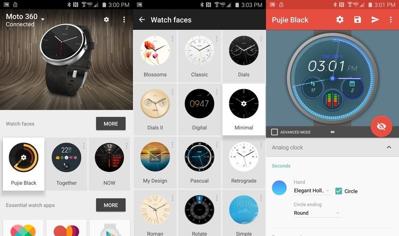
Watchface customization happens when the developer gives you that ability, which you see when there's a gear over the icon in your watchface list. Depending on the watchface, you can control basic colors and fonts before the watchface appears on your watch. If you're using an interactive watchface, you can control where the watch gets information from and what kind of animations your watch should have from the phone.
The variety of options is incredible, and really encourages users to install a bunch of watchfaces and try them individually to see what is available when a little imagination is applied.
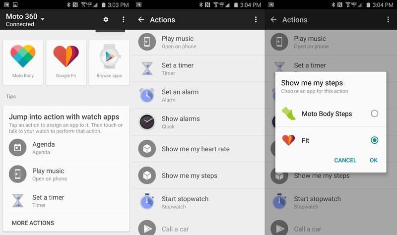
Command controls are a little less interesting, but no less important if you're the type to rely heavily on voice commands in Android Wear. This part of the app lets you choose which apps the voice command activates when you call for it. This means you can choose which app launches when you want to call a car, start a timer, or listen to music.
The only limitation here is that the app support Android Wear, which you'll see by selecting that command and asking for a list of supported apps. If you don't have an app on your phone that works with a voice command, you'll be taken to the Google Play Store for options.
Tucked away in the menus you'll find basic settings control for Android Wear, including debug options if you're developing for Android Wear and screenshot controls if you want to show the world what your watchface looks like without snapping a photo of your wrist. Most important of all, you find notifications controls here.
Endless buzzing
Android Wear notifications
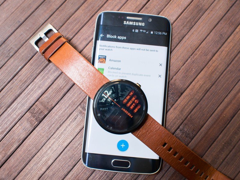
If you use your phone for everything, and you get a bunch of notifications from all of your apps all day long, it's not going to take long for that firehose to become annoying. Android Wear still lacks a quick way to dismiss a notification from the watch with some sort of "never show me things from this app ever again" button — the block option is far right — but you do have a lot of control over the notifications that hit your watch from the Android Wear app.
The Blocked Notifications section in Settings is an on/off switch for every app and service on your phone. This means you can disable every notification that comes from Facebook if that's what you want, but you can't only disable specific kinds of notifications from Facebook. It also means the list generated by the Android Wear app is incredibly long, and full of a lot of unnecessary junk that already can't generate a notification for your watch. Android Wear will auto-disable some obvious things, like if you have a calendar app that syncs to Google Calendar you don't want notifications from two different notification apps with the same information, but everything else needs to be picked through this list.
Once you've selected the app you want to disable, the notifications stop immediately. If you decide later this was a mistake, you'll need to come back here and remove that app from the list.
Stumbling at the start
Android Wear fitness tracking
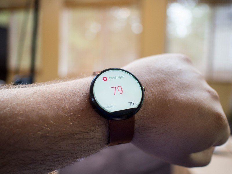
Despite a wealth of changes to Android Wear over the last year and change, there's still only one watch that does fitness tracking particularly well and that's the Sony Smartwatch 3. Several of the first generation smartwatches, including the Moto 360 used int his review, stop at offering a passable heart rate monitor and a mostly inaccurate step counter. Things have gotten a little better with the second generation of watches, but the lack of GPS and the absence of reasonable waterproofing in most cases makes the overall experience somewhat lacking.
What Android Wear lacks in hardware, it tries to make up for in software. Google Fit integration is a key part of Android Wear, which tucks in nicely to a bunch of watchfaces, but third party apps are where the action is. Swapping out Fit for Strava, Runtastic, and Endomondo adds a little focus and makes it easier to fit your existing fitness setup. It would still be nice to see a complete fitness solution in Android Wear at some point, especially when compared to some of the competition.
A little better all the time
Android Wear the bottom line
Android Wear has improved in a lot of critical ways over the last year, taking this platform from a neat concept that would be fun to play with to a smartwatch platform worth recommending to people who aren't as technically inclined as most of the folks who read Android Central. In a world where Fitbit is the golden standard of step counting, often asking for well over $100 for the privilege, there are plenty of folks out there who would appreciate how much more you can get from Android Wear, especially with the variety of hardware options that are now available.
It's all about the complete picture, and if you're a heavily connected mobile user that picture is significant.
When folks ask what one thing makes a smartwatch "worth it", it's an easy question to answer. There is no one thing, no single killer feature, that makes a smartwatch worth it. The overall experience is what justifies its existence. The reality that, at the end of the day, you've used your phone less and interacted with the world more. The understanding that you have on your wrist a tool for giving you a glance at how healthy you've been today, or the ability to get turn by turn directions on your steering wheel instead of glancing down at your cupholder or mounting your phone to your windshield. It's all about the complete picture, and if you're a heavily connected mobile user that picture is significant.
All of that having been said, Android Wear still has some clunkiness to it. Sorting through notifications to filter out the stuff you don't want shouldn't be as complicated as it is, and there should be a simple button during sync that lets you choose to not sync an Android Wear app to your watch just because you have the app on your phone. Fortunately, we know from experience that Google is not only listening but improving Android Wear based on the way we are all using these watches, so the experience will only improve from here.


