Regularly review - how to tackle fuzzy task management

Regularly for Android is a fresh take on the usual task management app. Instead of setting hard deadlines, Regularly is an attempt to organize tasks that simply have to be done within a certain window on a recurring basis. Users can set the interval for reminders throughout the task’s period, and tasks that are approaching or past due are appropriately color-coded and bubble up to the top for increased visibility.
Style

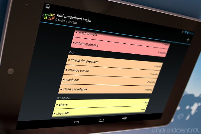
The overall layout feels like it has taken at least a little bit of inspiration from Clear for iOS, though that’s not necessarily a bad thing; the blocky color-coded looks works well for task management. It’s just too bad that it’s missing the spiffy suite of multitouch gestures; even single swipes for marking tasks as done would be nice and natural for most people. Besides that, Regularly stays pretty comfortably within the default Holo theme guidelines. The menu button is up in the top-right, the icon in the top left doubles as a back button when appropriate, There are also resizable widgets available to nag you at every glance at the home screen.
Function

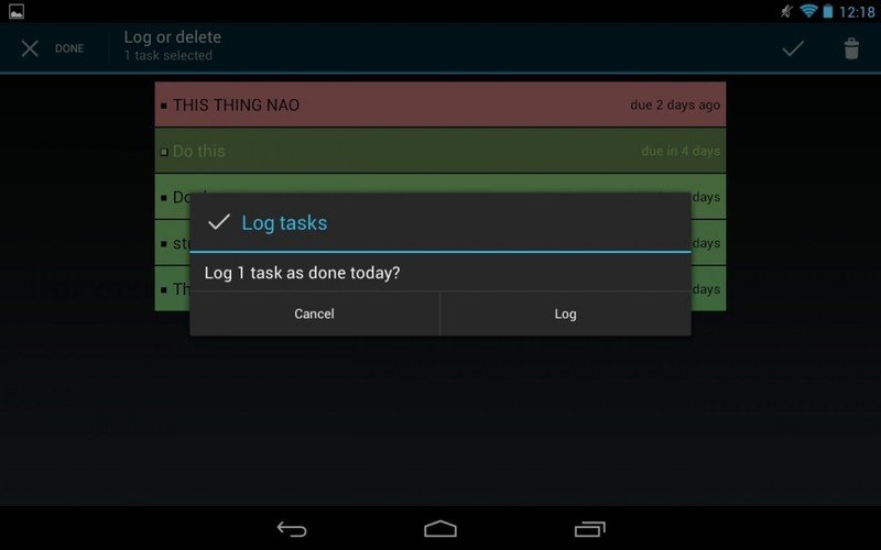
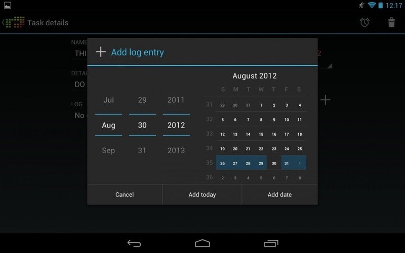
A long press puts users into selection mode, allowing them to pick one more more tasks to log as completed or delete. A plus button at the top launches into the creation of a new task, the period in which it needs to get done, when the first round is due, and extra task details. Tasks have a full log, so you can see your progress on particular tasks on a historical basis, and attach custom notes to each one.
To get started with the app, Regularly offers a bunch of predefined tasks, spanning car, home, grooming, health, and other miscellaneous tasks. It would be nice to be able to add more to the list for the tasks that are off-again/on-again in your routine.
There’s no search bar or collapsible categories, or even tags, which could make the app not quite as practical for those with a lot on their plate. Regularly offers highly granulated reminder intervals, down to the percentage of the duration of the task’s window; for example, at 50%, you’ll get a reminder on Wednesday at noon to complete a weekly task, or daily if you drop it down to 14%. Some tasks you might not want to be bothered about, so luckily every task has a manual notification toggle. Those that get particularly involved with their task lists can have them exported to an SQLite database; that’s not a particularly user-friendly format, but given the wide range of data included, I’d have a hard time imagining what a spreadsheet would look like.
Pros
- Interesting concept
- Clean, simple layout
Cons
- Tasks lack searchability
Bottom line
Regularly is a really interesting take on the task management app, and could easily find itself alongside other, more deadline-oriented productivity apps. Regularly could easily find use among folks that are either extra-busy and need a different management cycle for casual tasks, or more easygoing users that don’t need all of the bulk of a big-time task management app.
Be an expert in 5 minutes
Get the latest news from Android Central, your trusted companion in the world of Android

