Readabilty for Android now available from Amazon - we've got your full review

Readability is the latest app to address the double-edged sword that is the modern smartphone browser. When the iPhone arrived on the scene in mid-2007 it ushered in the era of (mostly) complete access to the world-wide-web from handheld mobile devices. Up to that point even the most sophisticated mobile browsers such as Pocket Internet Explorer 4 would present a heavily pared down view of web-sites.
However, the comparatively few people that actually did anything more than check email with their phones did so through old-school WAP browsers. Readability is now available for free from the Amazon Appstore. We've got your full review after the break.
Download Readability from the Amazon Appstore
Youtube link for mobile viewing
When Steve Jobs announced the iPhone, he trumpeted the fact that it was the first phone to give users access to the “real Internet.” While that was certainly a breakthrough, trying to read content from the real Internet on a small handheld screen actually turned out to be somewhat painful for anything more than a 200 word blog post or a tweet. Scrolling around a page to read longer articles can get downright annoying and make you want to give up.
Services like Instapaper, ReadItLater and Readability all aim to strip away the extraneous content including side-rails, ads and page headers to give readers access to the bare article. Readability has actually been available for some time as a service that other developers can use to pull the stripped down articles into other apps, but the developer has just released its own full-fledged apps for iOS and Android and we been trying out the latter for a few days now.
To take full advantage of Readability, you'll need to create a free account and then install an add-on or bookmarklet in your desktop browser. The Chrome and Firefox extensions appear in the tool bar and provide three options, Read Now, Read Later and Send to Kindle which e-mails the clean article to your Amazon e-reader.
Be an expert in 5 minutes
Get the latest news from Android Central, your trusted companion in the world of Android
Read Now instantly converts the article and displays it in your current browser window. Read Later, does a background conversion and saves it to your reading list which can be accessed from your browser, or through the new app on your mobile device.
The User Interface
After logging into your account in the app you’re presented with a copy of your reading list. The Readability developers have taken Google’s recent directive about eliminating the menu and search keys to heart. Where tapping the menu button from the opening screen of most Android apps will still get you to a settings or preference page, in Readability that button does nothing. (Which makes us wonder why it's there at all.)
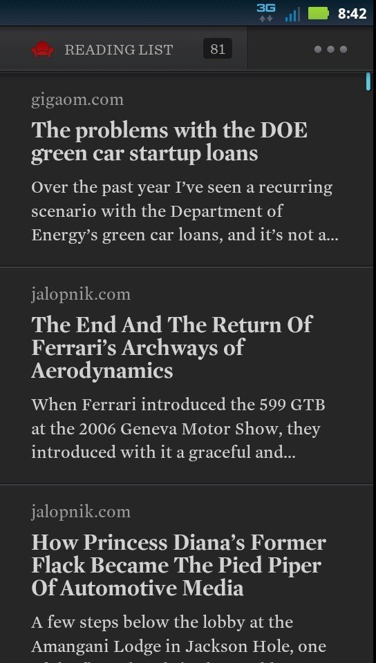
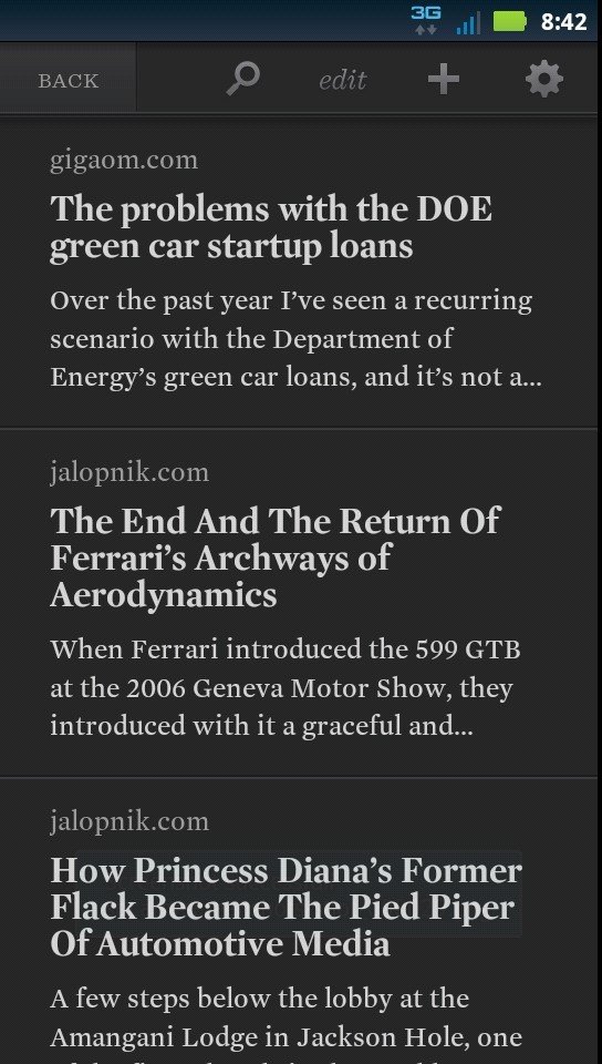
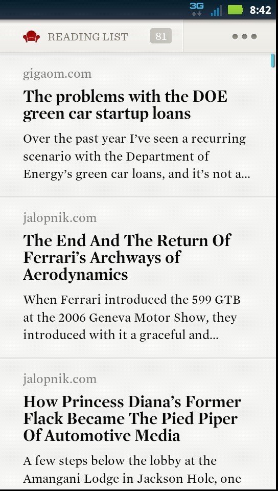
Instead, this app features the ICS-style application bar at the top of the screen with the increasingly familiar ellipsis for the menu and a Reading List button with the number of articles currently available. The Reading List button drops down a list that lets you switch to your favorites or archives of old articles.
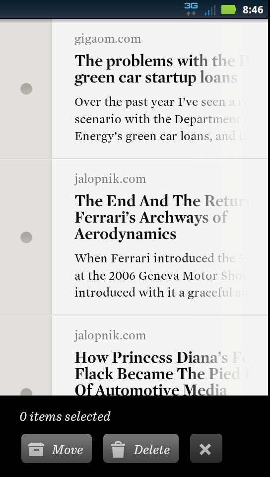
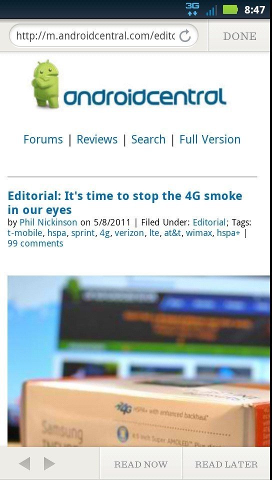
Tapping the ellipsis causes the bar to slide left, revealing search, edit, plus and the settings gear icon. The edit button causes the list to slide right, revealing selection buttons to the left of the articles with delete and move buttons at the bottom. The move button moves any selected articles back and forth between your current reading list and the archive depending on which view you are currently in. The plus button reveals a search field and browser view that enables users to find articles that can be converted and added to the reading list on the fly.
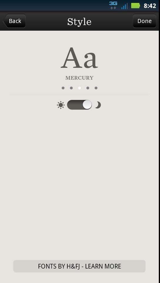
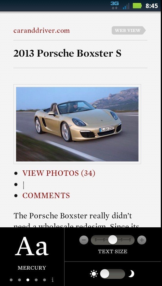
Under the settings, you can toggle display of archived articles, re-download everything or even log-out of your Readability account. You can also enter Twitter and Facebook log-in credentials for sharing what you read from the app. The style settings let you choose between five different fonts and light or dark modes. The dark mode is great if you like to read in bed at night because it reverses the display from black text on a white background to a white on dark grey that is much easier on the eyes.
Tapping on any article in a list opens up the reading view where the article is presented in a clean, uninterrupted mode. A tap on the title area of an article pops up an action bar from the bottom of the screen that enables you to favorite, archive, delete or share the current article as well as change the style settings. The in-article style settings provide the same font and dark/light mode controls as the main settings as well as a font-size slider that for some reason is missing from the main panel.
While it’s nice to have access to these options from within an article, this app shows one of the downsides of Matias Duarte’s questionable design decision to abandon the menu button for ICS. In order to maximize the viewable reading area in an article, Readability doesn’t display the action bar at the top of the screen when you are in an article. If you are halfway through an article and decide you want to share, you have to scroll to the top of the article to tap the title area and then go back to where you were.

If a dedicated menu button was still available, you could tap it at any point in an article to bring up the controls. While the virtual action and system bars enable hardware designers to maximize the area of the phone dedicated to the display and get rid of the controls when not needed for reading or video playback, the current system still needs work. Perhaps a sweeping gesture from the bezel area could be used to reveal the controls.
The Readability experience
Readability and similar services aim to make the experience of reading longer articles on small devices more enjoyable and less frustrating, so how well does this app succeed? Overall, very well.
Saving an article with one of the browser add-ons sends it to the Readability servers where the page is parsed to find relevant text and photos for re-formatting. One of the handiest aspects of the service is the way it handles those annoying multi-page articles found on many sites including the New York Times. Since the web doesn’t have the physical size constraints of a sheet of news print, the only reason to split an article this way is to increase the page view count. However it also slows down the reading process significantly when reading over a 3G/4G connection since the browser has to reload each page. Readability automatically detects extra pages and pulls the text from linked pages to compile the full article into a single page.

The article presentation in the app is attractive with minimal margins and line spacing that makes reading a breeze. The default font size looks great on my Droid 3’s qHD screen and the white/black presentation means that the PenTile dithering that comes with many other colors is not an issue. Photos are preserved in the reformatted article as are all hyperlinks in the text. Embedded videos are not supported in the Readability view, but a web view link above the title lets readers see the article in its original form.

If you leave an article to play some Angry Birds, answer e-mail or even read another article, the app remembers your place and automatically takes you to the same place when you return.
When you get to the bottom of an article, an upward swipe pulls up the view and loads the next article in the reading list for easy navigation. In anything but the most recent article, pulling down from the top of the page will also load the next newest story and a pull down in the reading list view will trigger a refresh and download of new articles. New articles are also synced in the background although there doesn’t seem to be anywhere to control how frequently the app checks for updates.
The wrap-up
Overall Readability for Android is a great app aside from a couple of minor issues that arise from following Google’s current design guidelines. The UI is attractive mostly easy to use without a lot of extraneous functionality. The great thing about mobile apps is that developers can build them with a single purpose in mind rather than MS Office-style functionality for every possible need approach.
If you’re looking for an app that makes reading long-form articles more pleasant, the free Readability is an excellent alternative to ReadItLater Pro or Everpaper. Readability also offers a subscription plan with a suggested $5 per month fee, although you can choose to pay more or less. Readability sets aside 70 percent of the subscription fee to be distributed on a proportional basis to the writers and publishers you read to help offset lost advertising revenue resulting from reduced page views. Now if someone would just produce a Dolphin HD add-on to save articles to Readability I’ll be all set.


Jerry is an amateur woodworker and struggling shade tree mechanic. There's nothing he can't take apart, but many things he can't reassemble. You'll find him writing and speaking his loud opinion on Android Central and occasionally on Threads.
