Qualcomm Toq smartwatch review
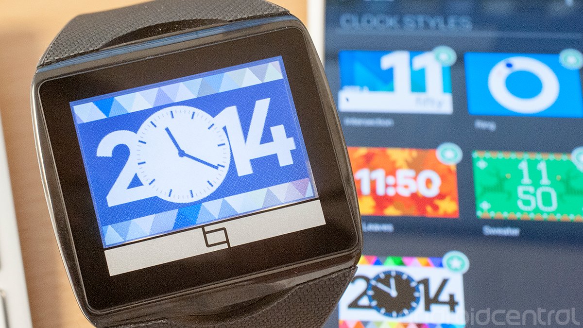
Qualcomm's Mirasol display brings a new dimension to smartwatches, but you still have to set your expectations properly.
The Qualcomm Toq tells a familiar tale, one we've heard from smartwatches before. "It's pretty cool, but ..." It's that caveat that has stuck in our mind after a few weeks with the Toq, and it's a big one. Or maybe several big ones.
But perhaps it's better if we better define what Toq is. It's a smartwatch, sure. It connects to your Android phone over Bluetooth and shows notifications, the weather, stocks — and the time, of course, with a number of interesting and attractive watchfaces.
But what Toq is, really, is a Mirasol display with a smartwatch attached to it. As a technology, Mirasol has been around for a few years, but nobody's really picked it up in any great numbers. Even Toq wasn't originally planned as a major consumer product. But here it is, and you can buy one for $350. This is the most expensive smartwatch we've tested.
Is it worth it? Let's find out.
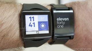
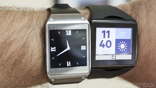
The Qualcomm Toq is the newest of the major smartwatches currently available. And like the Pebble and Samsung Galaxy Gear, the Toq seems to fill its own niche, for better or worse.
"What is this giant plastic box that comes with the Toq?
The out-of-the-box experience is fairly interesting. We wouldn't normally expect much from the packaging in a first-generation device, but Qualcomm's paid some attention to how the Toq is presented. That's nice to see. But seeing the boxy charger for the first time was a bit of a shock. Is it a box to keep the watch in when you're not wearing it? Is it something else?
Nope — just a large device to charge your watch. And to that end, it serves its purpose. Press a button to pop up the actual charger, place the watch sideways in the appropriate groove, and charge away. The extra spaces (with Day-Glo orange? really?) technically are for storing the wireless earbuds that you can't actually buy yet but will be recharged by this same box. This is a piece for your dresser — not for your gear bag. But, unfortunately, there's no other way to charge your Toq yet. And, by the way, placing the Toq on the charger is the only way to turn the watch. Remember that should you feel like mucking about in the settings and turn it off.
Be an expert in 5 minutes
Get the latest news from Android Central, your trusted companion in the world of Android
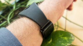
Fitting the Toq's band isn't difficult, but it's lacking adjustibility once the deed is done.
You're going to have to do a little minor surgery before you actually put on your Toq. That is, the watchband is not adjustable, and in fact you have to cut it to length, insert the spring bar and then affix it to the clasp. It sounded daunting (I'm not a watch guy and had never done this before), but in actuality it was plenty easy and took about a minute to do. (And Qualcomm has a helpful video that serves as a guide.) The downside is that while you can always make the band tighter — Qualcomm throws in a couple extra spring bars, too — you can't actually loosen the band. The whole thing fits together with a clasp that smartly wraps around the battery box.
So how's the watch feel once you've actually got it on? Not bad. It's got a rather large face — the display itself is 1.55 inches diagonally — and the band flares out where it meets the body of the watch, but it's not uncomfortable. That the band is relatively flexible seems to help a bit. My only real complaint is that there are times when I might want to tighten it up a bit, as the larger watchface can feel awkward when it starts sliding around. But, again, that's not happening without some more minor surgery.
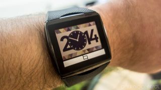
The Qualcomm Toq Mirasol display
As we said above, it's not inappropriate to think of the Toq as a Mirasol display with a smartwatch attached to it. Qualcomm's selling points are that this is an "always-on" device, like the Pebble. You only need to glance down to see the information on the screen, no wrist-flicks or power-button-presses necessary. And that's the way it should be.
The colors in a Mirasol display aren't anywhere as vibrant as Qualcomm would have you believe.
Where Mirasol gets it value-add is with the addition to color. Pebble's stuck with black and white (or, rather, pixels that are either on or off), while the Mirasol display attempts to liven things up a bit. And it does so — to a point. Let's be perfectly clear here: The renderings you'll see on Qualcomm's website and in the Toq app itself show a bright, vibrant display, full of color. In real life, the Toq's colors are much more soft and subdued, to the point where I'd say Qualcomm's images are flat-out misleading. Maybe that's what they look like on the screen when they're being designed, but that's certainly not what they look like on the watch.
That's not to say that the Mirasol display, and the colors it presents, are inherently bad. They're not. It's nice to see a little life in a smartwatch face. But the color is in the Toq's Mirasol display is just nowhere near as vibrant as you might be led to believe. Mirasol simply does not have the color reproduction you're likely used to on smartphones, or in what Qualcomm's showing on its website. Or in the Toq app itself.
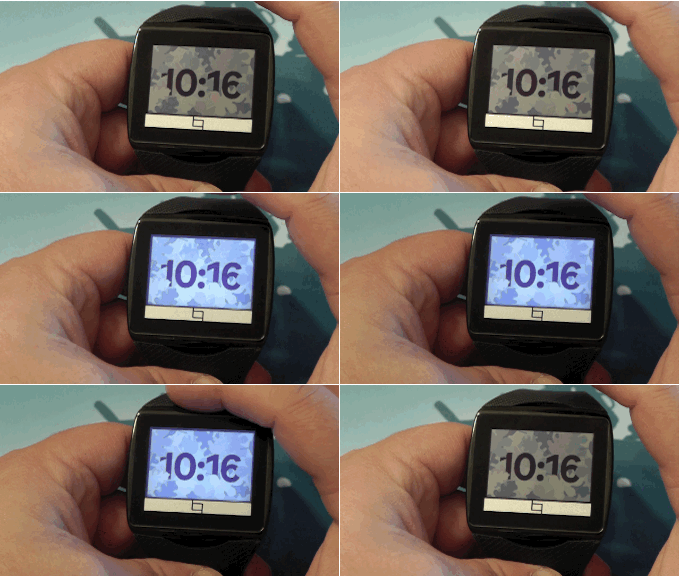
Then there's the matter of lighting. Mirasol displays aren't backlit like traditional displays, which makes it useless in the dark. To fix that, it uses old-school front lighting. Double-tap the top of the half-moon cutout just above the watchface to turn on the front lights, and you'll clearly see three of them doing their thing along the bottom of the watchface. It's not sophisticated at all, but it gets the job done, at the expense (again) of color reproduction.
Using the Qualcomm Toq
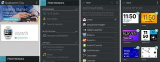
For as unimpressed as we might be with the Mirasol display (and it's really not that bad, just different), Qualcomm nearly made up for it with its Android application. The HOLOYOLO crowd will find fault in it, for sure, but it's still a pretty smartly designed Android app. It walks you through setting up your Toq easily enough, and pairing over Bluetooth.
Qualcomm's Toq app is nice, but the watch's user interface feels a bit haphazard.
Unfortunately, once paired, Qualcomm sort of gives up on helping out. Maybe that's with the assumption that anyone who buys a Toq is the sort of person who knows his or her way around a settings menu, or will poke through things, or knows that notifications don't just happen on their own here. Or maybe it was out of sheer laziness. Either way, a simple "Head into the preferences to set up your Toq's notifications" would have gone a long way.
So, yeah. Head into the preferences section of the Toq app on your smartphone to set up notifications. The good news is that after connecting over Bluetooth, "Preferences' is really the only other thing to do in the app. That's where you'll find the available watchfaces — all of which are enabled by default. You can also set "favorite applets" (more on that in a second), set up which apps you want to feed notifications to the Toq, and configure quick replies, music app, weather info, stocks and calendar information. The "Advanced settings" section is worth a look as well, for more discrete functions.
Let's go back to the watch.
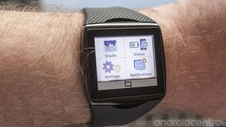
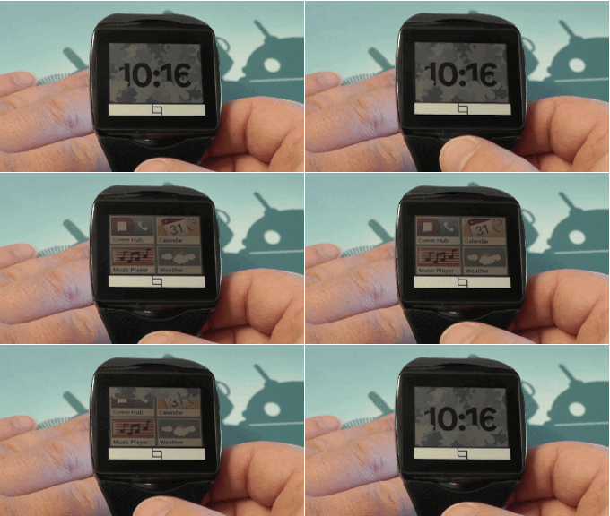
The Toq's display works pretty decently as a touchscreen, at least, though Qualcomm's managed to make a bit of a mess out of the user experience. To start with, you'll actually be tapping the watchband a bit. We've already mentioned how to turn on the front-lighting. Tap the bottom half-moon (on the edge or just below it) to get into the Toq's "applets."
The "applet launcher" is where you'll access the "Com hub," calendar, music player, weather, stocks status, settings and notifications sections. Once you're in one of those applets, you can either swipe left to return to the applet launcher or main menu (which is what I'm calling it in my mind), or press the lower half-moon again. It seems a little odd to have two options for what essentially is a "back" function, but it works.
Most of the applets are pretty self-explanatory. Com hub is where you can see your call log and text messages. From there, you can initiate a return call, or text back using a preloaded "quick reply." You can also set up your own quick reply for a custom response.
You also can set up applets as "shortcuts," to the left of the applet launcher. Not that it's any quicker or easier to swipe over four pages instead of either tapping in the applet launcher (or swiping down once and then tapping), but whatever. It's an option. Use it if you want.
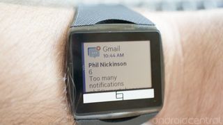
Once you get all that settled, the Toq is pretty decent to use. My only real quibble is the way Toq handles multiple notifications. Toq doesn't actually log into your Gmail account, so it's basically reading the notifications as they hit your phone. A single email is easy enough to parse. You see who it's from, and the subject line. Get multiple emails at once, though, and the subject lines all run together, making them next to worthless.
Qualcomm Toq battery life
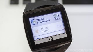
Mirasol delivers when it comes to battery life.
Here's how Qualcomm (and us, too) sums up Mirasol: Always-on display with colors and a long battery life. Two out of three ain't bad on the Toq. The display indeed is always on. And while color reproduction is disappointing, battery life is not. We've easily been getting four or five days of use out of the Toq. That's the same as we've been getting with the Pebble smartwatch, and way longer than with the Samsung Galaxy Gear. Qualcomm has delivered with that promise.
And if you consider that you're going to be taking the Toq off at night (at least I would) and have the charger nearby, battery life really isn't much of a concern. In fact, I'd go so far as to say that while the charging box is big and clunkly and certainly is a head-scratcher, it's also easier to use than the Pebble's Magsafe-esque charger. There's no guessing here. Just place the watch on the charger and walk away. No worries about notifications vibrating it off a desk or table and unhooking it.
Qualcomm, as you'd expect it to, nailed power consumption and recharging.
The bottom line
We weren't supposed to be able to buy the Qualcomm Toq. When it was first announced, it was meant to be a sort of developer device. But here it is. And you know what? Qualcomm's got a decent smartwatch on its hands here.
Toq is a nice, competent smartwatch, though it's tough to justify Qualcomm's $350 asking price. But if you just have to have it, you won't be disappointed.
That's not to say there aren't a few frustrating bits. The user experience is still not as simple as should be, if Qualcomm ever wants to take a run at this being a mainstream device. (Plenty of time for that to happen, though.) And the disparity between advertised colors and actual reproduction borders on false advertising. Maybe I'm being overly sensitive for this sort of first-generation device, but it's plenty apparent.
But Qualcomm redeems itself with excellent battery life, a comfortable fit, and a nicely designed Android app.
We haven't really talked price, though. As we mentioned at the outset, Toq (at the time of this writing) runs $350. That's another $50 over the also expensive Galaxy Gear, and more than twice that of the Pebble, which has the same functionality and is more extensible at this point, with a more mature developer base.
You have to really want the Qualcomm Toq. And that's not to say we'd rush into harm's way to keep someone from buying it. If you want one and you have the cash to burn, you could do worse than the Toq. Just know its limitations.


