5 problems that could keep the Galaxy Fold from true success
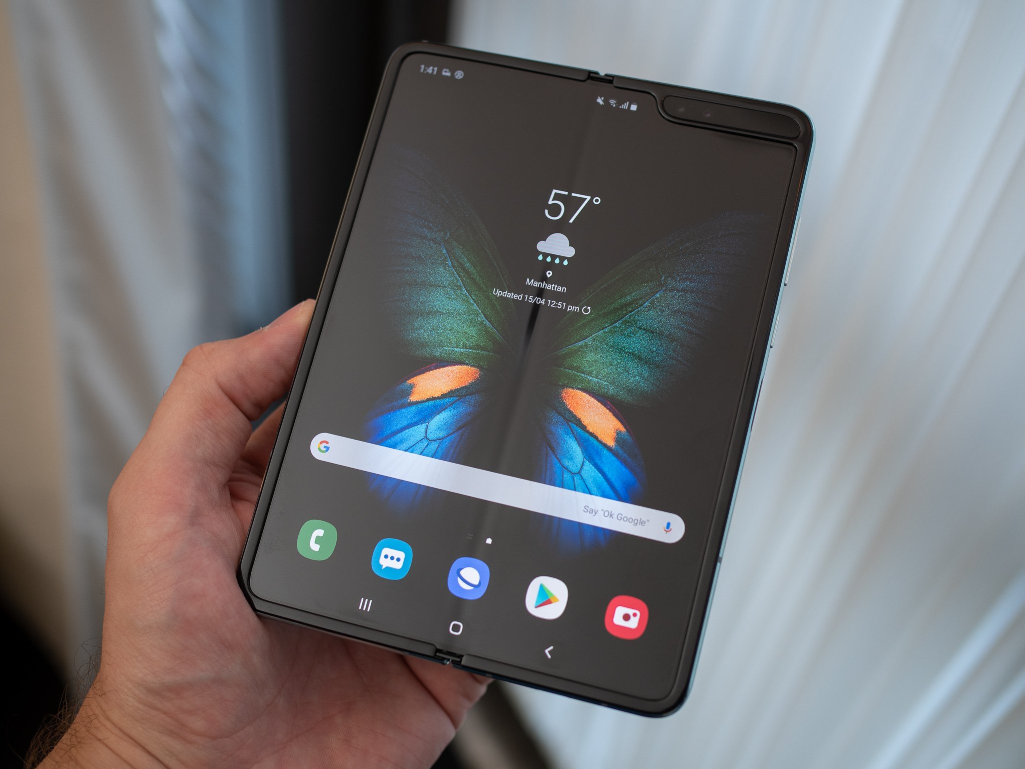
The Samsung Galaxy Fold marks the start of a new evolution of smartphones that have foldable displays aimed at providing a balance between capabilities and size with an amount of flexibility that just wasn't possible before. It's a truly unique and fascinating device. But as a first-generation product, it faces an uphill battle of convincing people to look past notable compromises in order to get a taste of the future today.
There are five problems the Galaxy Fold is facing that have the potential to get in the way of it being a success on any level.
The screen 'crease'
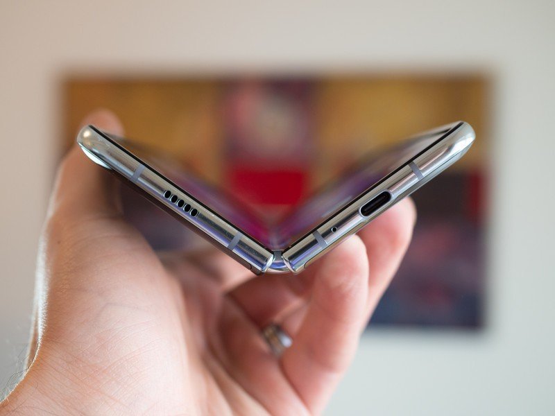
You can't have a discussion about foldable phones without talking about the "crease" created by the phone's main feature. At this point the foldable display panels themselves have reached excellent quality levels, but they just can't get around the fact that the flexible plastic covering the panel is, well, plastic. Whether we're talking about the Galaxy Fold, the Huawei Mate X, or any other upcoming competitor, the screen crease problem hasn't been solved and isn't likely to be for some time.
We're used to pristine screens with Gorilla Glass — this is far from that experience.
In regular use you really don't notice the crease, so I don't want to make it sound like it's some massive eyesore. But it shows up now and then and really detracts from whatever you're looking at in the moment you notice it. If your brightness is set a little low, or you're in harsh direct lighting, it's more likely to be visually distracting. And if you hold the Fold in landscape mode, you're far more likely to be bothered by it as you scroll and swipe with your thumbs across the crease line.
The crease isn't actually a detriment to usability, but it isn't particularly flattering and can be something that takes away from the experience of using an otherwise futuristic and expensive phone. We're honestly spoiled by curved Gorilla Glass displays at this point, but it's what we're used to — and a plastic screen covering with a crease is far from those quality levels.
Thickness and weight
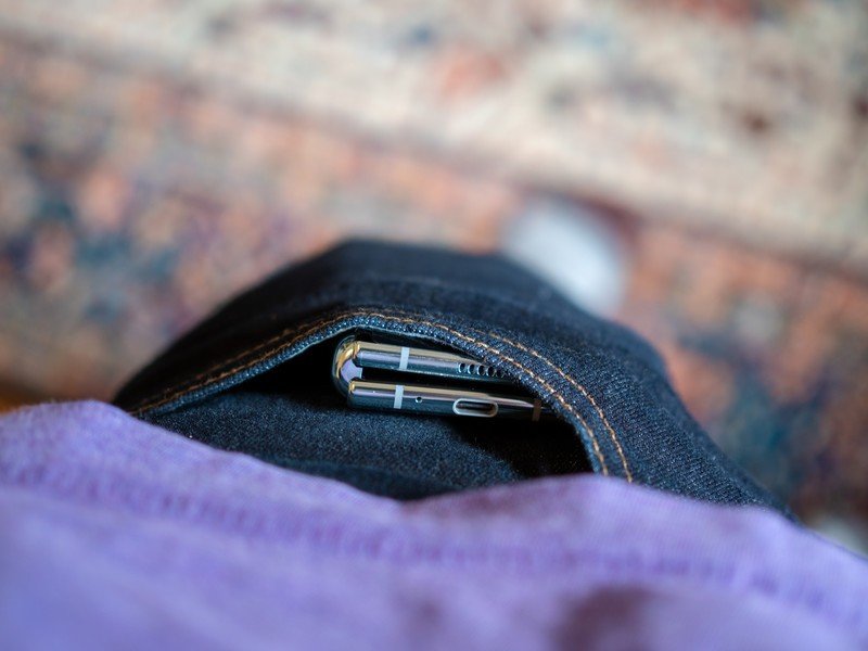
Perhaps the biggest issue with the Galaxy Fold is its sheer size. It's slightly taller than even the Galaxy S10+, while also being twice as thick and 50% heavier. Even though the weight is very well distributed and the phone is narrow when closed, there's no getting around just how awkward it is to hold considering its thickness and weight.
Technological improvements over time will easily fix this problem, but the first-gen Fold is at a dimensional disadvantage.
It's actually a bigger problem when closed because you're using it one-handed, where the weight and thickness just makes it tougher to use for a long period than any "normal" phone. But the thickness and height are big considerations when you think about putting the Fold in your pocket — most people I spoke to that had used a Fold remarked that it did fit in a jeans pocket, but it produced quite a bulge and in some cases was reaching the very top of the pocket.
Be an expert in 5 minutes
Get the latest news from Android Central, your trusted companion in the world of Android
In many ways, the appeal of having a phone that's "small" and folds out to be twice the size loses some of its appeal with the folded phone is still twice as thick as a regular phone. Technological advancements over time will easily fix this problem, but the first-gen Fold is certainly at a dimensional disadvantage.
App (in)compatibility
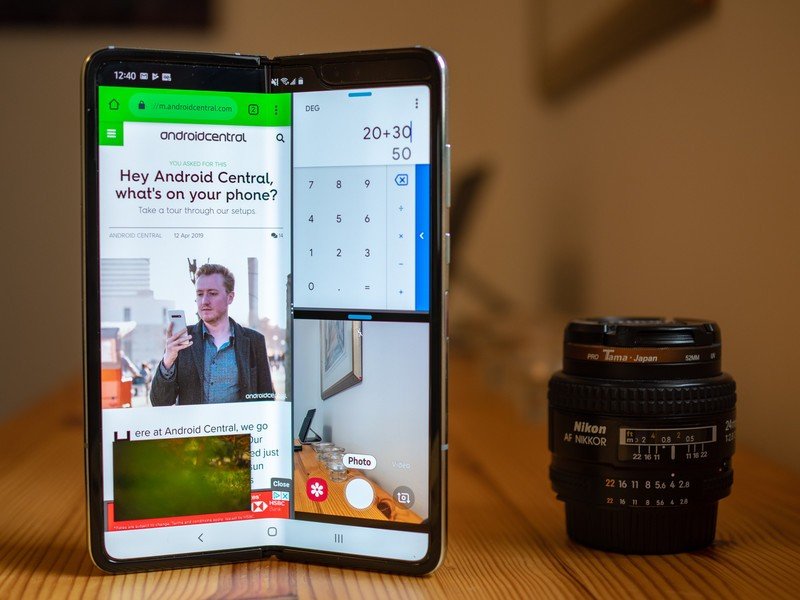
Foldables are a new frontier in Android devices, bringing both larger displays back into the conversation and throwing in the extra wrinkle of screens that can change their size and aspect ratio at a moment's notice. And that's a problem, because Android apps have historically struggled with looking good and working properly on large screens. And with Android tablets being effectively a non-factor in the market, the situation hasn't really changed in the last handful of years.
Most apps make no more use of the Fold's huge display than the Galaxy S10's.
This manifests itself in two distinct problems. The first is the lack of app continuity between the small and large screens, which is something that Google and Samsung (and surely others) have been working on leading up to the Fold's launch. This is the feature that lets an app load on the smaller cover screen at 21:9, and then immediately switch to the larger 4:3 screen and resize without missing a beat. Some apps do it, and the experience is exactly as you'd expect, but many do not. Apps need to be closed and restarted when you open the Fold in order to fill the screen, which Samsung gives you a button to do or you can opt to have happen automatically. It's annoying, at a minimum, and in some cases causes you to lose your place or text you've already input into an app when on the smaller cover screen. This is a problem that will be theoretically fixed through Google's coaxing of developers to write their apps to reflow properly, but we've seen this sort of scenario play out poorly before.
Thankfully multi-window works, but sometimes you just want to focus on one big app that fills the screen properly.
In a similar vain, Android apps in many cases just don't look good on large screens. A 7.3-inch 4:3 display isn't exactly a traditional "tablet" size as we're used to, but it's pretty darn close, and in many cases you start to notice that you're just using a scaled-up phone app with no more usable screen space or information than if you viewed it on a regular phone. Apps like browsers, Google Maps, YouTube, calendar apps and many others in the productivity space naturally make more use of the space as they expand out, but most of people's mainstays like Twitter, Instagram, Slack, Pocket Casts, chat apps, financial apps, password managers and the like make absolutely no more use of the Fold's huge display than a Galaxy S10's.
Even apps that ostensibly have a "tablet" interface, like many of Google's own, don't seem to trigger the more information-dense tablet-style UI unless you drop your display scale down below the default. That's a real shame, because the Fold really is big enough to utilize the tablet-style interface of apps like Gmail, and it just doesn't show up unless you make other usability compromises in scaling down everything on your screen. Thankfully the Fold has a great multi-window functionality that lets you do a two-thirds/one-third split view of two apps to use the "phone" interface of both, but there are many times you want to focus on one app and have it also be more useful than on a phone.
Cover screen too small, but main screen too big
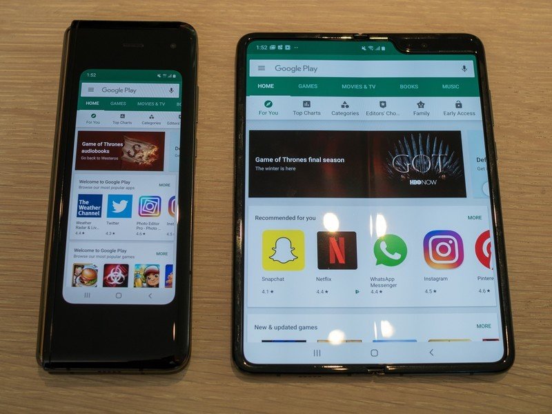
This is somewhat tough to explain, but hear me out. The main appeal of the Galaxy Fold is of course its big foldable display that can be stowed for one-handed use and deployed for extra viewing area at a moment's notice. But with its in-folding form factor, it necessitates having a "cover" screen on the outside of the phone. While it's actually the correct combination from my point of view, the proportions aren't quite right: the cover screen is too small, and the inside screen is a bit too big.
The cover screen is a crutch for when you can't devote two hands to using the Fold extended.
That front display is just 4.6 inches at a 21:9 aspect ratio, which just feels tiny by modern standards. It's extremely narrow (just three app icons wide), and because it's nestled inside of pillow-like bezels it's rather tough to use like you would any other phone that even had the same sized screen. Typing with the on-screen keyboard is difficult because of the tight key spacing, and I've even come across a few apps that don't even render and reflow text properly. It's fully functional and completely usable, but it's absolutely not enjoyable for more than a handful of minutes. The cover screen really is designed only for those times when you have just one hand free and need to have a firm grip on the phone because you can't open up to the big screen inside.
The issue with the Fold's interior screen is mostly summarized in the previous section: it doesn't always make great use of the display real estate because even the biggest and most popular apps out there today don't properly resize and reflow information into every inch of it. But larger than that is the issue that the Fold is too big when extended to comfortably use with one hand for any extended period. It's fine if you're casually reading and scrolling slowly with one thumb, but if you have any sort of interaction to do with the display beyond that you need to get a second hand involved. If you don't, it's time to close the phone and go back to that cover screen, which as discussed feels just a bit too cramped to comfortably use for long.
Price
I struggled with including this one as a true "problem" facing the Galaxy Fold. Yes, it's expensive. $1980 is at least double what most people will pay for their phone in 2019. And yet, it's not exactly a problem when you consider that it's the easiest thing on this list to "fix." As Samsung matures all of this new technology, it will make phones with fewer manufacturing issues and will eventually recoup enough of its R&D costs to drop the price.
Unlike all of the technical problems, pricing is ostensibly the easiest to fix.
Unlike all of the other problems Samsung has to fix with technical solutions, it's relatively easy to simply drive down the price of foldable phones. I wouldn't sit around waiting for a price drop on the Galaxy Fold itself, but going forward with future generations we can absolutely expect prices to come down considerably.
So first, we need Samsung to surpass the technical hurdles. Then we'll get to discussions about what price makes sense for a mass-market foldable phone.
Andrew was an Executive Editor, U.S. at Android Central between 2012 and 2020.

