Pop-up cameras are just the evolution of the slider phone

Phone companies make a lot of design decisions that, in retrospect, are very bad. We've seen some poor smartphone designs over the last decade, and most of them can be boiled down to an attempt to be exciting, innovative and interesting, only to backfire spectacularly because they led to massive compromises or didn't work as intended.
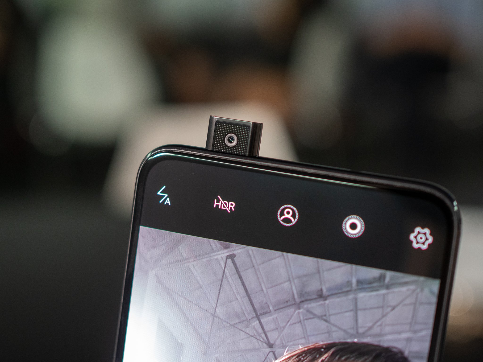
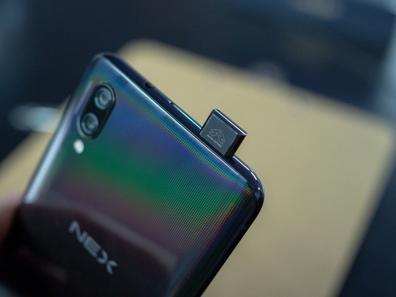
So I don't blame anyone for being skeptical when the last week brought about the latest trend in hardware innovation: pop-up cameras. First with the Vivo NEX, with its periscope-like front-facing camera, and later with the Oppo Find X, making use of a large sliding mechanism to reveal both front- and rear-facing cameras.
Some have dismissed these movable structures for hiding cameras as a fad and poor attempt at being innovative with no real benefit. I see it somewhat more pragmatically — this is a necessary development, given today's available technology, to offer consumers all of the things they want. Not unlike the early 2000's, when flip phones and sliders dominated the landscape of feature phones and smartphones alike.

Look deep into history, back to the early 2000's, when feature phones we evolving at a rapid pace. Early on, just about every feature phone had a "candy bar" form factor with a small screen and a majority of the face of the phone dominated by a keypad. The phones were pretty simple.
Movable components were integral to new feature phone developments, and they'll rise again.
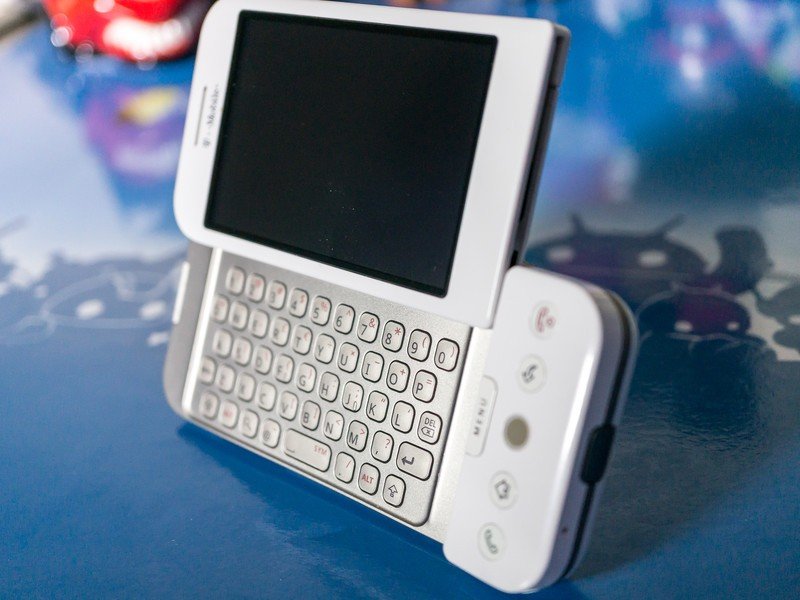
As our demands for phone features changed, so did the priorities of the hardware. We wanted large color screens and better cameras, so phones got a little bigger. But small phones were still a priority, so flip phones arrived that incorporated both a larger screen and a keypad. Soon we wanted an even larger display, and were willing to accept a keypad that took a backseat, so we got vertical slider phones. In the latest stages of feature phones as we transitioned to smartphones, we got landscape slider or hinged phones with full QWERTY keyboards.
Throughout this expansion of feature phone and early smartphone hardware development, we saw all sorts of retractable antennas, various screen swivel mechanisms and new keyboard designs. Phones back in those days were still highly mechanical. They were heavily reliant on physical buttons and many moving parts for basic operation of the phone. Most of it came out of necessity — components just weren't small enough and technology wasn't good enough to have a fully solid-state device that did everything we wanted.

Today, we face a very similar dilemma — this time with smartphones, coming from the other direction. Modern phones are now entirely solid state and permanently fused together, eschewing as many ports and movable parts as possible in the name of cramming as much technology into a single slab as possible. Sliders and flip-style phones are all but dead. Back panels and batteries are no longer removable. Buttons have been reduced to a bare minimum. SD card slots are very rare. With eSIM on the horizon, there won't be a single opening on a phone bigger than a USB-C port. On the new HTC U12+, the only thing that actually physically moves in the phone is the OIS module of the camera. But this trend is at odds with consumers' other demand: to not give up core hardware features like conveniently placed cameras.
Be an expert in 5 minutes
Get the latest news from Android Central, your trusted companion in the world of Android
People want smartphones that have a larger display, but in a proportionally smaller device. They don't want bezels, apparently, and have a disdain for display notches. Yet they don't want the compromises of an oddly-positioned camera, small speakers or missing sensors. What's the result? We return to movable components on phones. A feature that used to be a core tenet of "advanced" feature phones circa 2004, now modernized and automated to bring us the hardware features we both don't want to see but also can't live without.

Engineering a little module or even a whole segment of the top of the phone to rise up and show your cameras is not something to be taken lightly. It's a seriously impressive feat, both on the tiny scale of the Vivo NEX and the larger side with the Oppo Find X. And to be clear, these two phones have other small compromises, like the NEX's relatively large size and slower fingerprint sensor, and the Find X's lack of a fingerprint sensor altogether.
But when people say they want huge screens, small bodies and no bezels, companies answer the only way they know they can: with these new movable parts. While they may not be a permanent fixture of smartphone designs going on in perpetuity, they're more than a fad — this is what we're going to have to get used to from at least some smartphone companies that want to offer it all.
Andrew was an Executive Editor, U.S. at Android Central between 2012 and 2020.

