Pocket updated to version 5, promises to be smarter and more dynamic
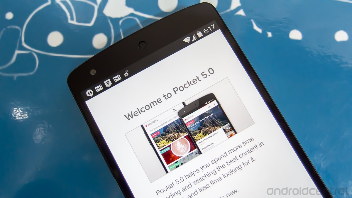
Highlights, better app navigation, and an improved user experience make their way to Pocket's Android client
Pocket is the most popular save-it-for-later service out there. Over 1.5 million items get added daily, and the grand total of over 10 million users makes it the largest provider of it's type. People like to use it. I use it myself. Whenever I come across something on my phone that I just know would be better read on a tablet or computer, into Pocket it goes. It's handy like that. And with today's update to version 5.0, they say it's going to get better.
Anytime big changes come to an app with a slew of existing users, we tend to worry. People don't like change in their normal routine, if their normal routine serves them well. The good news is that Pocket's added some great additions, without doing anything that will force users to change their ways. Read through and see what I mean.
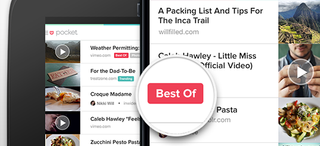
The three big changes in this update look to prove them right.
- Highlights to surface the best content you’ve already saved to Pocket
- Streamlined navigation
- Enhanced user experience with simplified search, new bulk edits, and bigger visual tiles for video
The highlights feature takes the content you've saved, and dynamically sorts out the best based on different parameters, like best of, best videos. long reads etc. and sounds perfect for the power user with plenty of articles saved for later. If you're like me and read through your list every evening and don't have a pile of content there, it stays out of your way and lets you keep using Pocket the way you like to use it. That's important, and I was worried that this feature would break one of my favorite apps. It doesn't. Adding a feature without changing usage habits of your existing user base is a damn fine way to make me like your app even more.
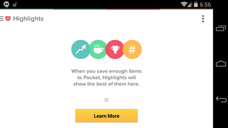
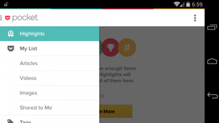
You find the new highlights category in the new sliding drawer menu. Swiping from the left is becoming second nature for Android users, with great apps like Google's Play apps and the Android Central app using it. Pocket has it, and they've done an excellent job.
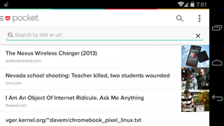
Everything you need quick access to is there, and the motion is fluid and speedy. In addition to the newly styled drawer, you've also got universal search sitting in the upper right corner anytime you need it. Tap the magnifying glass icon, and search for any text, title, headline, or video right from one place. Changes like these are great, and users should appreciate them. I know I do.
There is one issue though, and that's with the new video player plugin. It;s working fine on my Moto X, but on the Nexus 5 and Nexus 7 it gives me an error in the spot where a video should be ready to play. Hopefully, this is just an oversight and things get fixed in short order. I need those videos back on my tablet.
Be an expert in 5 minutes
Get the latest news from Android Central, your trusted companion in the world of Android
All in all, this looks like a very nice update to an app that a lot of people already love. And none of those people are going to be forced to change the way they use it. I'm still in the process of checking it out, but so far I like what I'm seeing. If you're on Android 4.4, you might want to hold off if you need to watch videos from your mobile device, but for everyone else you can grab it from the Google Play link above.

Jerry is an amateur woodworker and struggling shade tree mechanic. There's nothing he can't take apart, but many things he can't reassemble. You'll find him writing and speaking his loud opinion on Android Central and occasionally on Threads.
