Plex is releasing its redesigned UNO UI across all TV platforms this week

What you need to know
- Plex will begin rolling out its new "UNO" user-interface across all TV platforms this week.
- The streamlined UI is now available on the Plex Web app as well and is slated to be available on iOS and Android soon.
- It was first rolled out for Roku users and as a beta for Apple TV in April.
Plex had announced its new big-screen interface in April this year. Initially, the new UI was rolled out to Roku users and as a beta for Apple TV. Internally codenamed "UNO", the new UI has now been released for the Plex Web app and will be rolling out across all TV platforms this week. It will be available on iOS as well very soon but it will take slightly longer to arrive on Android.
Here's how Plex explained its new "UNO" interface in a blog post:
In case you missed it, UNO is our latest effort to streamline the process of searching, discovering and enjoying your content in your Plex library—no matter the type, no matter the source, no matter the format. It's an easy, elegant, and powerful system that's consistent no matter where and how you Plex. It gives you the ultimate control over how you navigate your collection.
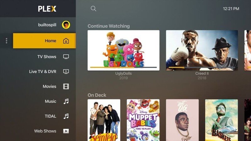
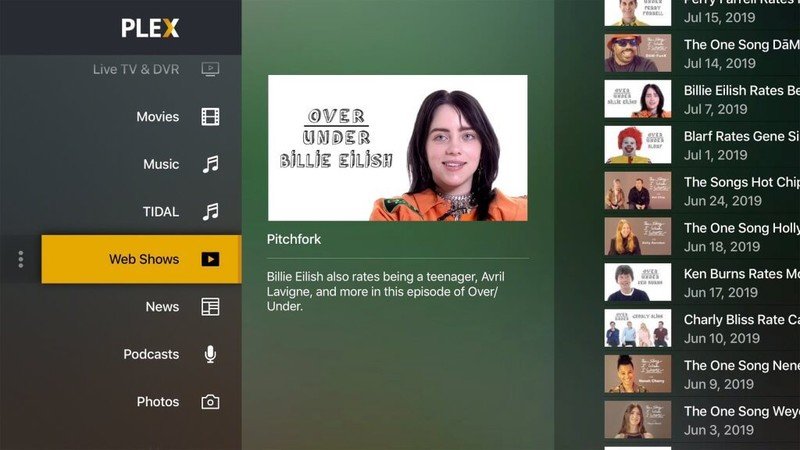
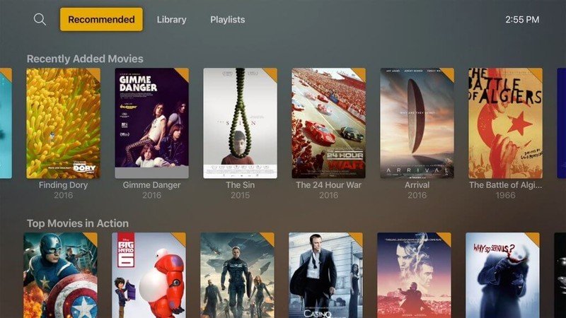
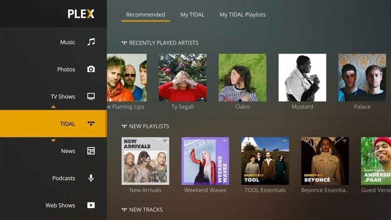
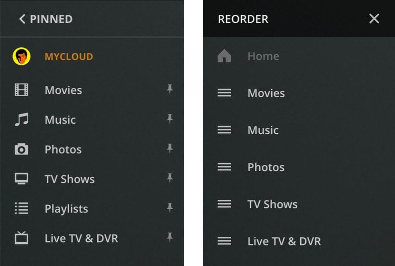
One of the key highlights of the new interface is that it happens to be highly customizable. In case you aren't happy with the experience Plex builds for you, UNO lets you rearrange sources, add or remove rows from the screen, and even hide sources. A new sidebar is included as well, which makes it easier to choose which source you wish to view, especially if you have access to several sources. You can even move a source up or down in the list depending on your preference.
Plex: Everything you need to know!
Get the latest news from Android Central, your trusted companion in the world of Android

