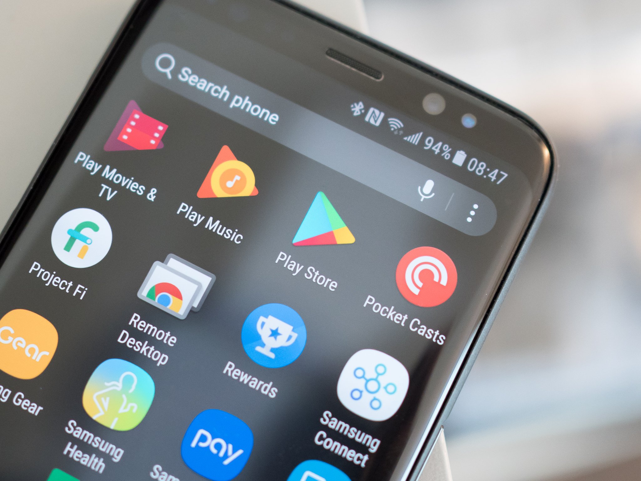
The Play Store finally joins the rest of its family with a Play button app icon

It's understandable. After all, most folks don't look for the title under an app icon, they just look for the shape or color and tap it. So when app icons change, there's usually a good reason for it. Google is changing one of the most important app icons on your phones, the Google Play Store, and the reason was spelled out a long time ago. It just begs the question: what the heck took them so long?
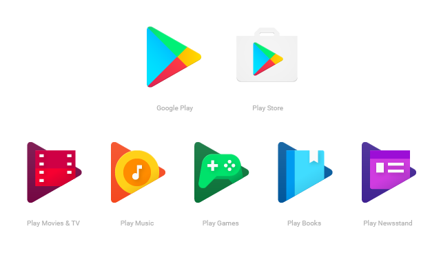
Over a year ago, Google announced that it was updating its app icons to give a consistent shape and look across the Google Play family, from the slick-looking Google Play Movies icon to that dumb-ass Google Play Music icon. (Give me back my headphones!) The Play Store would maintain its iconic shopping bag for a time, but the others have long since adopted the big, bold play button shape, and it was time that Google Play followed suit.

If you had trouble finding the Play Store this morning, like one of our editors, that's why. If you don't like it, may I suggest using an icon pack? Has it reached your devices yet? Let us know in the comments.
Be an expert in 5 minutes
Get the latest news from Android Central, your trusted companion in the world of Android
Ara Wagoner was a staff writer at Android Central. She themes phones and pokes YouTube Music with a stick. When she's not writing about cases, Chromebooks, or customization, she's wandering around Walt Disney World. If you see her without headphones, RUN. You can follow her on Twitter at @arawagco.

