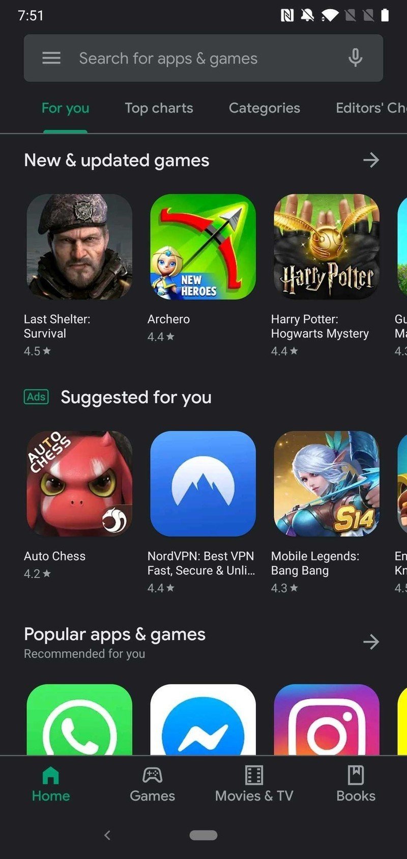
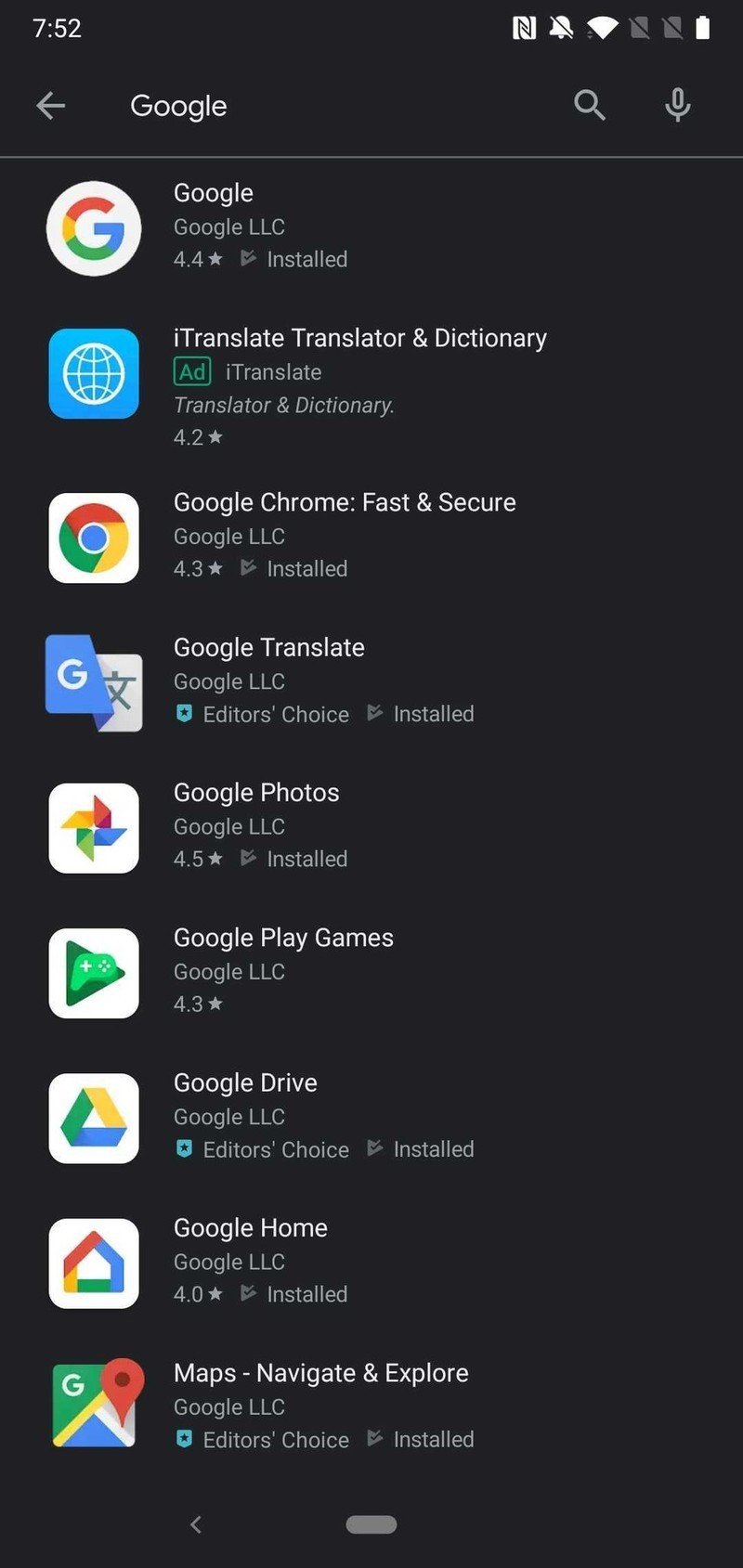
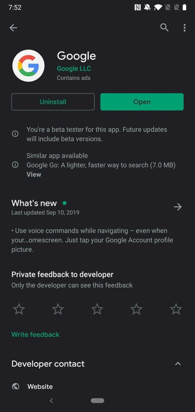
Play Store dark theme is now widely rolling out

What you need to know
- Google Play Store dark theme is now rolling out.
- It has been spotted on version 16.7.21 of the app, but it is a server-side switch.
- Follows the official rollout of the dark theme for Gmail that happened yesterday.
Google may not have had all of its apps updated with the dark theme by the time Android 10 launched, but its starting to catch up. In the past 24 hours, we have seen two of its biggest and most popular apps get the night time makeover.
Following the dark theme rolling out to Gmail yesterday, we're now seeing the Play Store joining the fray. As with Gmail, the new dark theme is a server-side switch and it may not be showing up for everyone. I know neither of them are showing up for me yet, but as the theme continues to roll out, you can expect to see the change sometime soon. So far, users have reported it showing up with version 16.7.21 of the Play Store.


Once the new dark theme makes an appearance on your device, you can expect a look similar to other Google apps. The theme will feature a dark gray background with white text, while the colored icons have shifted to a more subdued hue — making the contrast easier on the eyes. The dark theme is, of course, all about making the UI more relaxing for your pupils.
The new dark theme follows the recent material theme facelift we saw Google roll out to the Play Store back at the end of May. That update brought bigger changes to the user interface by moving the navigation bar, removing the card layout, and introducing a new download progress circle.
Google Play: Everything you need to know!
Be an expert in 5 minutes
Get the latest news from Android Central, your trusted companion in the world of Android

