With the Pixelbook on its way, is Chrome OS ready to be a tablet OS?
When Google shows off its new products on October 4, one of them will be the Pixelbook, the latest in the Chromebook Pixel line.
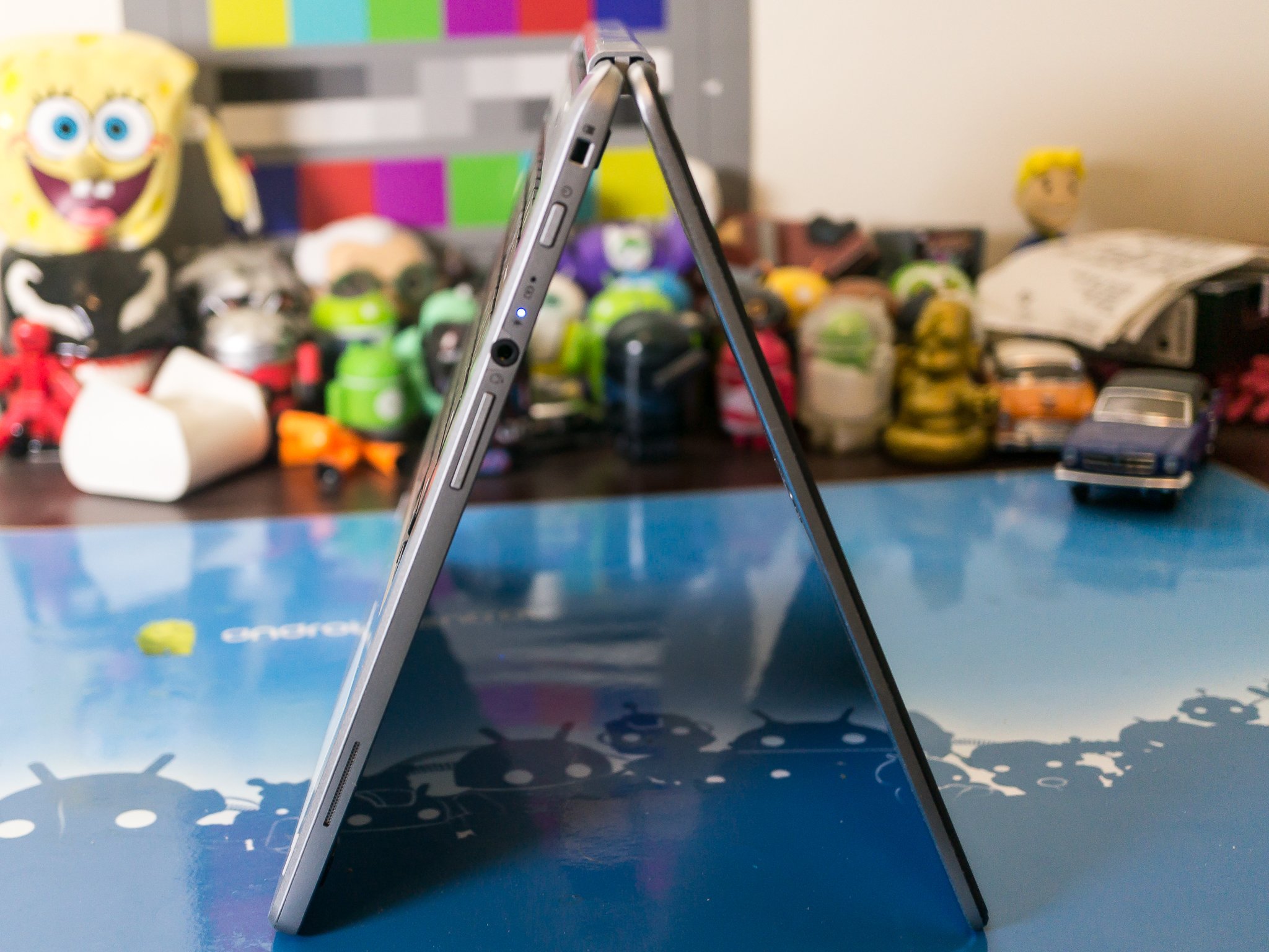
The Pixelbook has a lot in common with the previous Chromebooks that came directly from Google, with a high price tag and a spec sheet to match, but the Pixelbook will showcase the two newest enhancements to Chrome OS with stylus support and a hinge that allows for fold-over convertible use as a tablet. Neither of these things is new (convertible laptop designs have been a Windows staple for ages) but both are new for Google.
Including these features in Chrome and putting them on a high-priced Chromebook aimed squarely at developers and enthusiasts means Google really wants them to become a natural part of the Chromebook experience, and ultimately part of the web experience. So we have to ask, is Chrome finally ready to be a replacement for your tablet?
The answer is a mixed bag. It seems like answers are always that way. And Google needs to lead by example, then get everyone else on board.
The Chromebook Plus
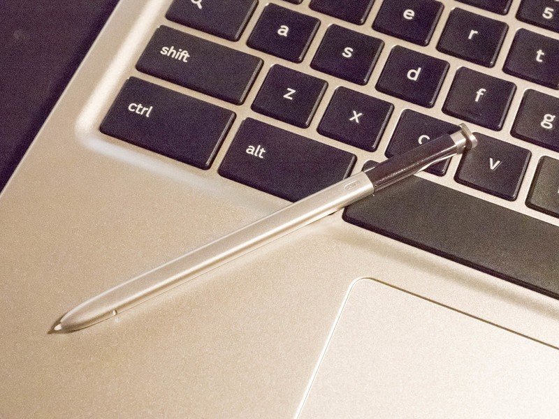
We already have Chromebooks with the Pixelbook's features. Starting with the Acer Chromebook R13, most every new Chromebook is built with tablet-mode support and touch has tight integration with the operating system. Samsung worked directly with Google to build pen support into Chrome and it debuted with the Chromebook Pro and Plus models. And while not a new thing, the Chromebook Plus also has a hinged design with a bright, high-resolution display that is every bit as good as Google's offering. Because Chrome OS is mostly the same across every model, we can look at the Plus to see where Chrome excels at being touch-friendly as well as where it fails.
The Chromebook Plus is also the Chromebook most of us should be buying, but that's another article.
More: The best Chromebook you can buy
Be an expert in 5 minutes
Get the latest news from Android Central, your trusted companion in the world of Android
Outside of an early bug that would kill the touch screen and require a reboot (fixed), the hardware needed for touch in Chrome OS is well supported. Most Chromebooks sold today have a touch screen and there are a handful of gestures supported throughout the OS. While there is always room for improvement, Chrome has great support for the hardware that companies need to use if they want to include a great touch display. We even have Chromebooks, like the new Acer Chromebook Spin 11 with Wacom support.
On the software side, everything works, too. Chromebooks like the Chromebook Plus that are built with tablet mode included have an on-screen keyboard with swiping to type, handwriting input and voice to text built in. But we need to be able to do more than just type. Even if the OS itself works well in a touch-only setup, the application support is still critical. And that's where we see a few problems.
Samsung Chromebook Plus vs. Pro: The Differences and Which Should you Buy?
App support
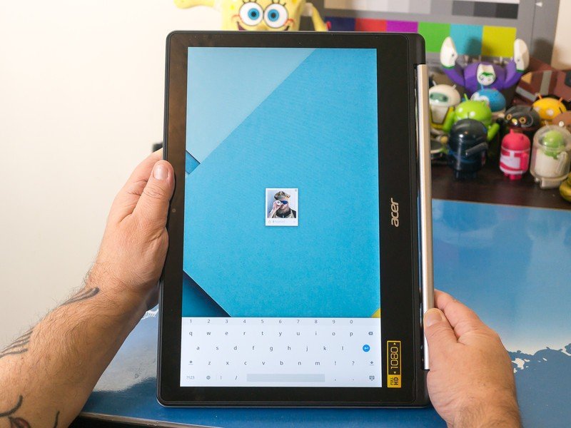
We need to start with the browser. Naturally, it's the same Chrome browser you can use on any other laptop. There are some changes that make it perform a lot better than Chrome for Windows or Mac, but the interface is exactly the same. And that's not great. You can touch the screen to do anything, so it's not a matter of not having touch support. Two things make it a less-than-perfect experience: it wasn't designed with touch in mind, and the touch targets aren't perfect.
The operating system has great support for touch, but the applications need some work.
It's easy to use Chrome with a trackpad and keyboard because the people who wrote the software had that in mind while they were designing things. Using the trackpad to do things like dragging and dropping or multi-select for files is simple. And it's something most everyone is used to doing because almost every piece of software you use on any laptop was designed the same way. Not being super touch-friendly isn't just a Chromebook thing. User input, especially on a large display, is very different when you're holding a Chromebook like a tablet and using your finger instead of the trackpad and keyboard. And porting over the Chrome browser built for Android or iOS isn't a fix because they aren't built for the big screen.
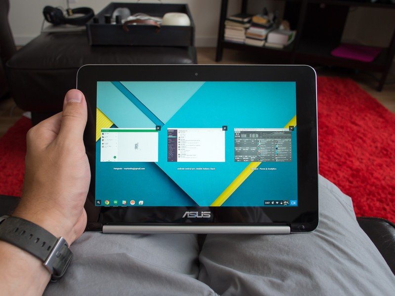
To fix this is going to require some serious gesture support. Things like long press + swipe to open settings or multi-finger gestures for page navigation would make for a better experience without losing the familiar layout. We've seen Google put in plenty of work on the keyboard since the Chromebook Plus was released, and we hope they will continue to find ways to make Chrome more touch friendly.
The Material Design update for the settings menu also brought excellent touch optimization. More of that please, Google.
Part of that would be making adjustments for the touch targets. Some need expanded, some need added and some need a bit more space between them. With a 10-inch or larger display, there is plenty of room to make these adjustments. We've already seen some changes in the settings, where more space was added between entries and a large touch target on the drop-down arrow to expand a heading were added as part of a Material Design update. Being touch friendly wasn't what we noticed at first because the layout was done well and things don't look out of place. Google will have to find a way to give a similar design for the rest of the app interface without making big changes that disrupt what we're used to. That's tough but necessary.
Chrome and all the native Chrome apps work with touch, and most people don't have any serious issues. I'm not claiming otherwise. But Google is in the same spot Microsoft was in several years ago when touch screens on Windows laptops became popular, and needs to work to optimize not only the OS interface but the native apps as well.
Android apps
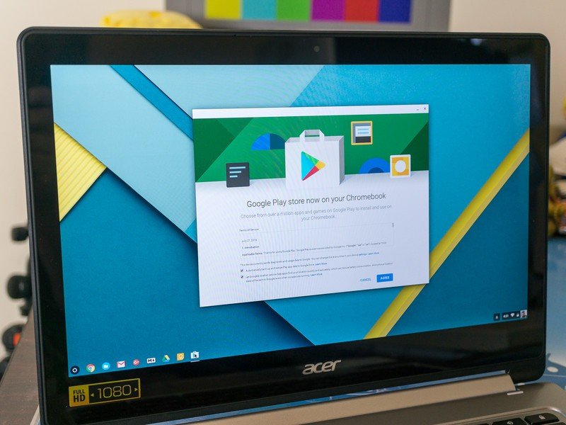
Android apps are built for touch input, but they pose the biggest problem. Not because there are any fundamental differences between touch input on a Chromebook or your phone, but because of the size differences and dependence of other developers to fix it all.
Almost all Android apps work on a Chromebook. You'll find an app to do most anything you want to do, but you might have to try a few different ones to find the app that does it the way you like on a bigger screen. Google has some work to do here and Android Oreo's new multi-window and picture-in-picture support need to find their way to Chrome ASAP. But there are a lot of apps that aren't great on your Chromebook, and good multi-window support can't change that.
These are the Chromebooks that have Google Play support
Android is fully capable of resizing a window to infinity, but writing an app with a certain look and feel in both a small screen mode (phone) and a large screen mode (tablet, TV or Chromebook) means double the work. When you resize a typical Android app from its small view to a larger one, you're left with a lot of wasted white space as things simply stretch out. It's great that almost every app in Google Play can stretch out, as it doesn't affect how they work or what they do, but it looks bad and can be harder to navigate.
Apps need to do more than just work, or we'll just not use them.
There are apps that handle the transition just fine. Google's own Gmail app is a great example, and the large screen interface we see on a tablet or Chromebook has multiple panes and is filled with information, yet doesn't feel cluttered or confusing. The YouTube app for Android TV is another great example, only taken to the extreme. Google's "couch" interface makes YouTube easy to use on even the biggest television. But those are Google apps and it is paying people to design and build these large screen interfaces. Third-party developers have little financial incentive to go back and re-design their apps, and if Google only allowed you to install apps designed for the big screen like Apple does for iPads in the App Store there would be very slim pickings at Google Play.
This isn't a new thing. We've been talking about it since the days of the original Samsung Galaxy Tab and the Motorola Xoom. It just matters even more on a Chromebook because they are heavier and holding one as a tablet is a bit more cumbersome. Tiny apps on a ultra-high resolution 2K display make for a bad touch experience. For the apps that will re-size on a Chromebook, you're left with an interface where everything is on the edges of the window while the center is bare.
It's a usability thing: Chromebooks make for a bulky and heavy tablet.
I'm not trying to be negative here. I've retired my Pixel C and use Lenovo's Flex 11 or my Acer R13 for all my tablet needs. I face the same issues as my wife, who still loves her Galaxy Tab S2, but they're less of an issue on a very thin and very light tablet than they are on a folded over laptop with a keyboard on the back. A true two-piece convertible like Microsoft's Surface might make for a better experience here, but Google still needs to do some work if they want a Chromebook to replace the tablet.
Here's to hoping that's exactly what it's doing.

Jerry is an amateur woodworker and struggling shade tree mechanic. There's nothing he can't take apart, but many things he can't reassemble. You'll find him writing and speaking his loud opinion on Android Central and occasionally on Threads.
