Pixel Plus: How to make your phone look like a Pixel (and better)
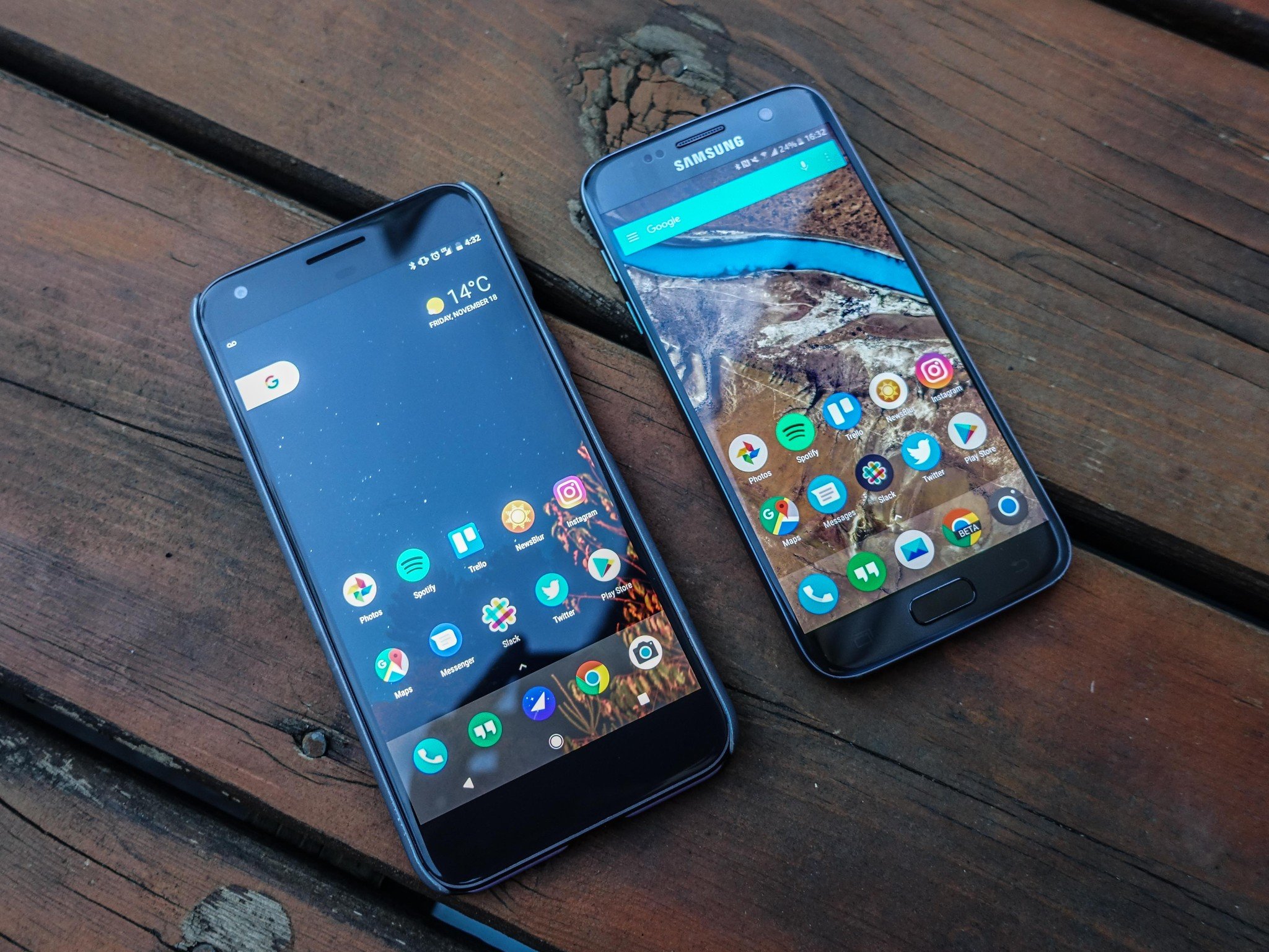
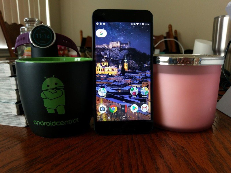
The clean lines of the redesigned Google widget atop the screen, the whimsical portholes for folder icons, the faint white bar behind the dock … Google did a lot of interesting things with its new launcher layout, and while I'm all for the Pixel look, let's face it: not all of us have 800 bucks for a Pixel. And even those with a Pixel can get fed up with the launcher's limitations when it comes to desktop grid size and icon packs. Don't worry! You don't have to give up your sweet Pixely theme just because you're giving up the Pixel Launcher.
Luckily for us, two of the most popular replacement launchers on the market have already done most of the work for us; all we have to do is turn the proper settings on. We'll show you how to bring out the Pixel in Nova Launcher and Action Launcher, and how to put it all together.
Google Wallpapers
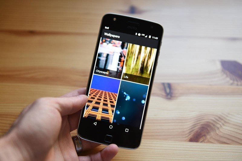
I've said before in themes like these that stock wallpapers are boring as hell, make me sad and shouldn't be used. Thankfully, I don't have to say that this time because the Wallpapers app that ships on the Pixel and is available on Google Play has dozens and dozens of beautiful and diverse wallpapers ranging from Google Earth and Landscapes to Life and Textures. They even have daily wallpaper settings so that your wallpaper can't get stale and sad, because you can wake up every morning to a new one! Yay!
See our review of Google Wallpapers
Icons
The Pixel uses round icons. Woo. Hoo. There are a lot (by which I mean a metric crapton) of round icon packs out there, but we've come to the two we prefer over all others, and indeed over the mismatched stock icons on the Pixel.
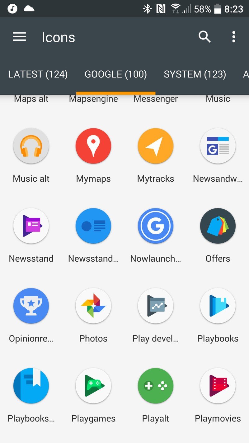
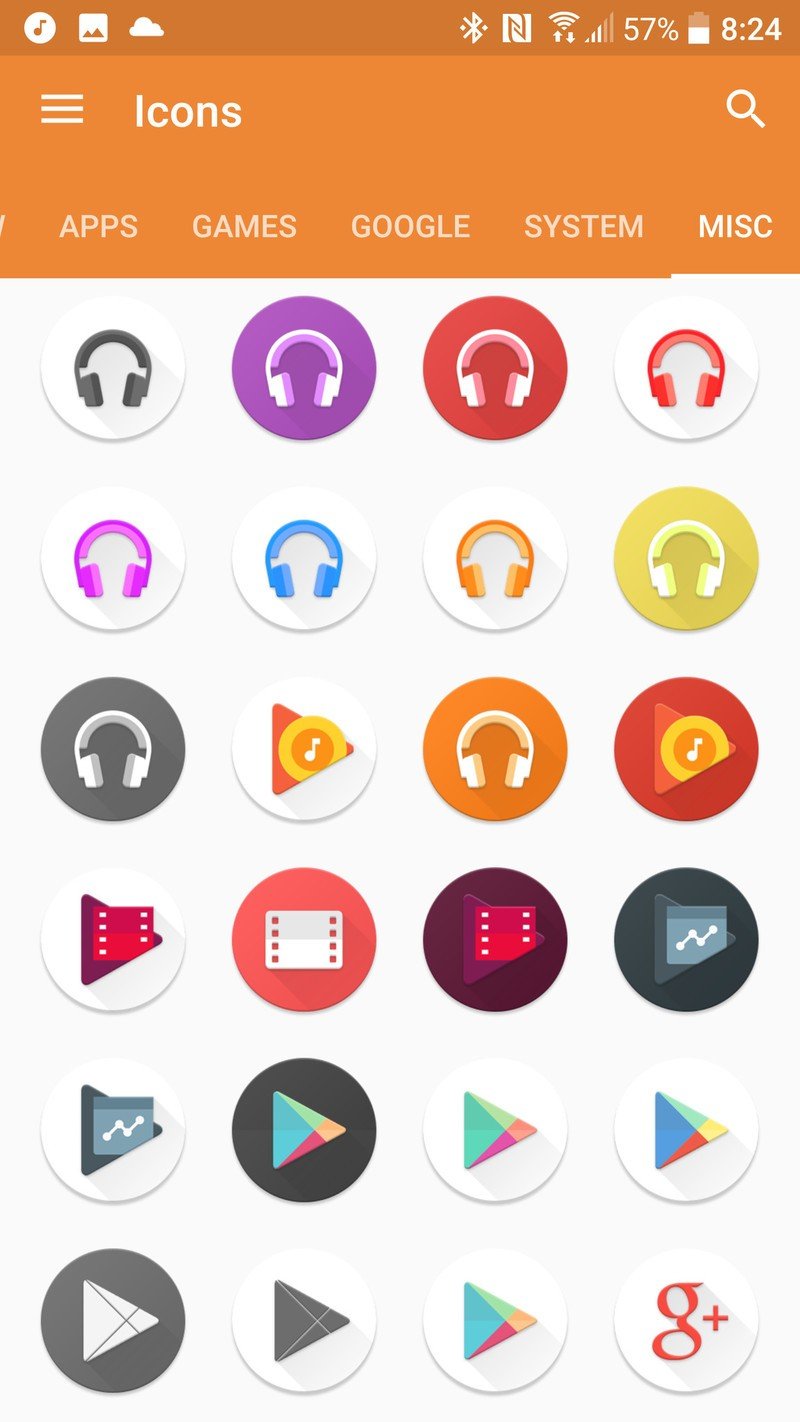
Pixel UI Icon Pack, left, and Dives - Icon Pack, right
- Pixel Icon Pack (Free) is a free icon pack with the Pixel icons we've come to love (or not), along with a decent amount of themed third-party icons and a masking tool for icons that don't have an icon in the pack yet. There aren't a lot of alternate icons, but it looks decent in the app drawer and on the home screen, is easy to apply and easy to navigate if you're looking for a specific icon or alternate.
- Dives - Icon Pack ($0.99) is by Vertumus, a developers with some very robust and beautiful packs, and while you can find the standard Pixel icons here for stock apps along with round icons for thousands of apps, what we also have here are alternate icons for apps like Google Play Music that look SO MUCH BETTER than the one Google is using. In fact use the alt_3 icon for all the Google Play apps. Oh, and the icon pack is on sale for a dollar right now, half off its usual $2 price tag.
Pixel via Action Launcher (aka the easy way)
Action Launcher recognizes that changing settings across an entire launcher takes a while, which is why they were gracious enough to provide a shortcut. Here's how to find it again if you didn't use it the first time it popped up:
Be an expert in 5 minutes
Get the latest news from Android Central, your trusted companion in the world of Android
- Open Action 3 Settings.
- Swipe up to scroll down to the bottom of the settings menu.
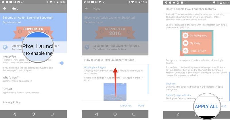
- Tap Help.
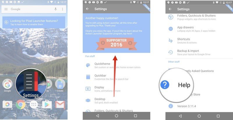
- Tap Looking for Pixel Launcher features.
- Action Launcher will then list and explain all of the Pixel features and styles it has. It'll tell you where you can activate each individual one.
- Tap Apply All.
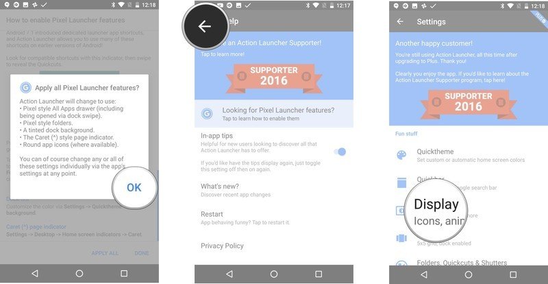
- Action Launcher will tell you what all it is about to change and ask you if that's what you wanted. Tap OK.
- Tap the back button to get back into the main menu of Action 3 Settings.
- Scroll up and tap Display.
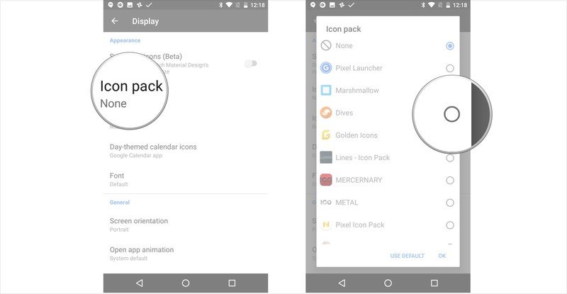
- Tap Icon pack.
- Select Dives or Pixel Icon Pack. Action Launcher has some of the default Pixel icon built in, but you'll want a real icon pack to put some consistency on your launcher.
This will get you everything for the Pixel theme except the Google search bar, which isn't available in Quickbar but instead as a standalone widget at the top of the widget drawer. While this does mean that you can put that little pill wherever you want on the screen and that you don't look the entire top bar of your screen like you do on other launchers, you can't customize the color like Action Launcher's signature Quickbars, nor can you get the date or weather. Shame.
Pixel via Nova Launcher (aka the hard way)
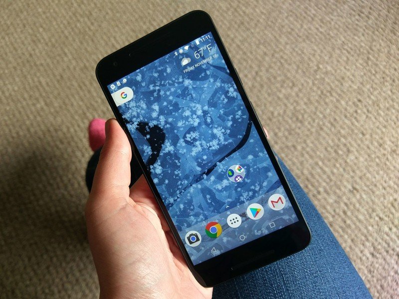
Nova Launcher is the Old Faithful of third-party launchers: it is beautiful, it is dependable, and it's the best quarter I ever spent in Google Play back in the day. While you can get most of the way to Pixel with the free version of Nova Launcher, you need Nova Launcher Prime for the gesture actions we're going to be using for the app drawer. The Pill search bar is still in beta for Nova Launcher, which you can opt into here.
If you didn't already use Nova Launcher, you can import your current layout to Nova upon installing it by going into Nova Settings. In the Backup & import settings, tap Import and select your launcher. You'll have to click through a few warnings about deleting your current Nova layout, but if you just installed the launcher, you're just losing the default layout
- Open Nova Settings.
- Tap Desktop.
- Tap Desktop grid.
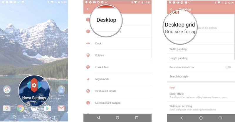
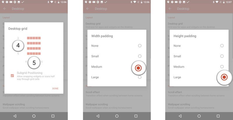
- Set the desktop grid to 4 rows by 5 columns. Tap Done to return to Desktop settings.
- Tap Width Padding and select Medium.
- Tap Height padding and select Large.
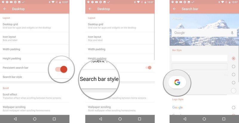
- Tap Persistent search bar to turn it on.
- Tap Search bar style.
- Tap the pill-shaped Pixel Bar style.
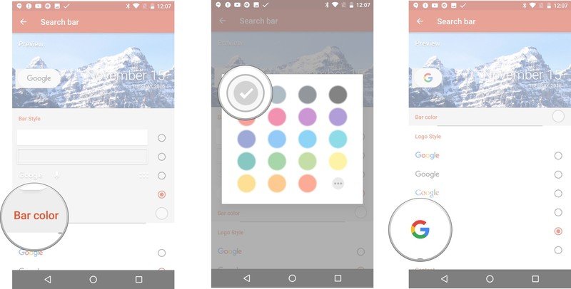
- Tap Bar color
- Set it to white.
- Scroll down to Logo style and select the colorful G.
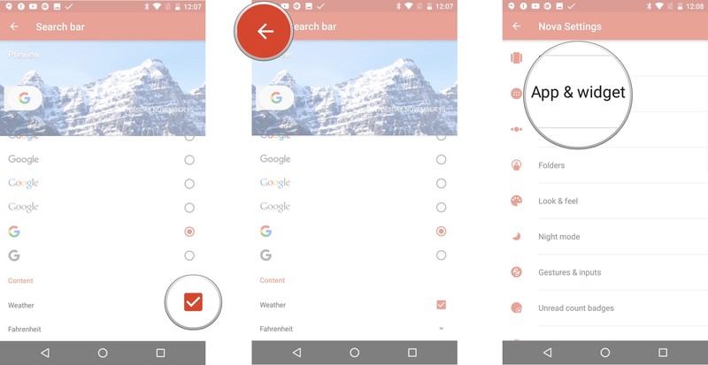
- Scroll down and tap Weather to turn on weather content in the search bar. NOTE: Nova has since moved this to Nova Settings > Labs.
- Tap the back button twice to return to the main menu in Nova Settings.
- Tap App & widget drawers.
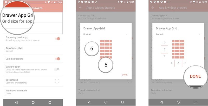
- Tap Drawer App Grid.
- Set to 6 rows by 5 columns.
- Tap Done to return to App & widget drawer settings.
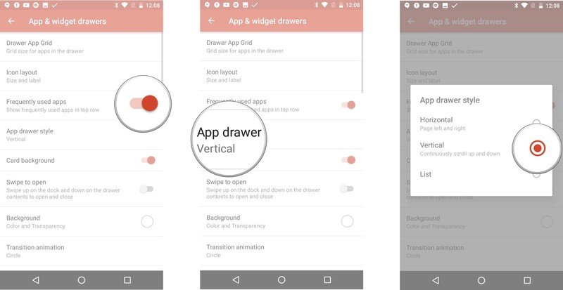
- Tap Frequently used apps to turn it on.
- Tap App drawer style.
- Tap to select Vertical.
- Make sure Card background is turned off.
- Tap Swipe to open to turn it on.
- Tap Background.
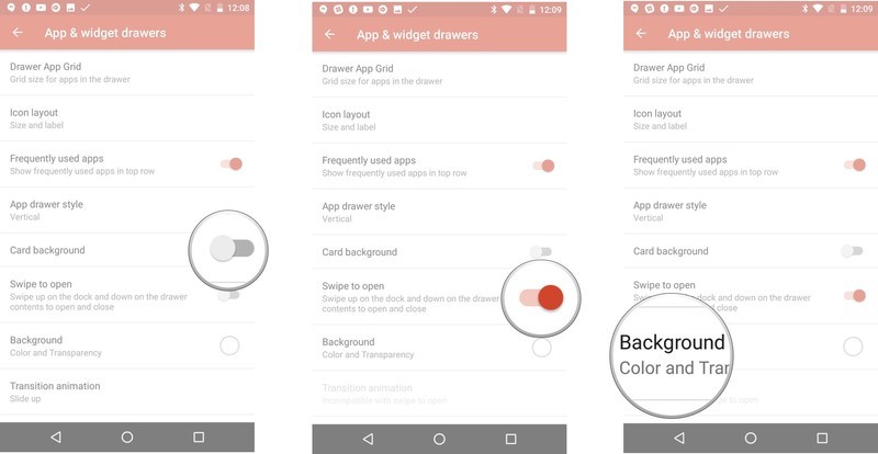
- Select White and set Transparency to 0%.
- Tap Enable fast scrollbar to turn it on.
- Tap Scroll accent color
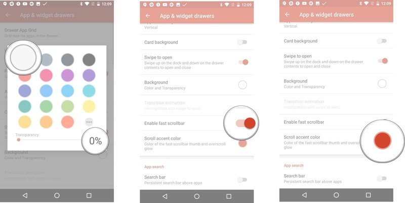
- Select Teal (fourth row, first column).
- Tap Search bar to turn it on.
- Tap the back button to return to the main menu in Nova Settings.
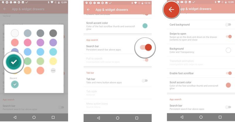
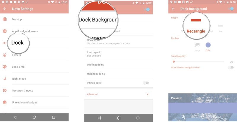
- Tap Dock.
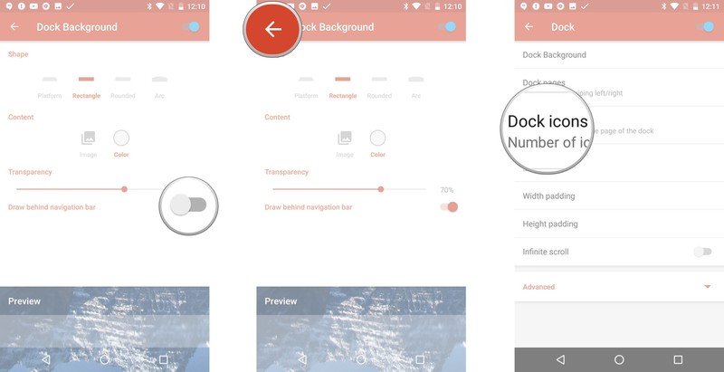
- Tap Dock Background
- Select Rectangle.
- Tap Color.
- Select White.
- Drag Transparency to 70%
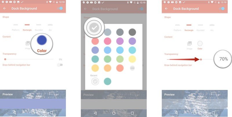
- Tap Draw behind navigation bar to turn it on if you have on-screen navigation buttons.
- Tap the back button to return to Dock settings.
- Tap Dock icons.
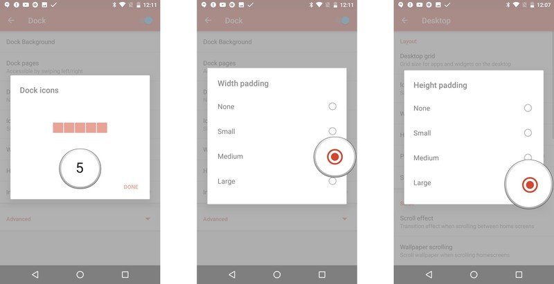
- Set to 5. Tap Done to return to Dock settings.
- Tap Width padding and select Medium.
- Tap Height padding and select Large.
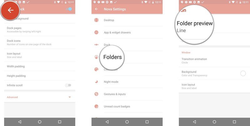
- Tap the back button to return to the main menu in Nova Settings.
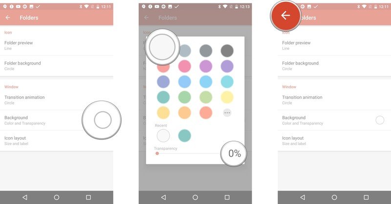
- Tap Folders.
- Tap Folder Preview.
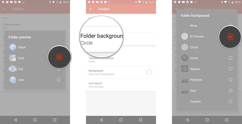
- Select Grid.
- Tap Folder Background.
- Select N Preview.
- Tap Background.
- Select White and set Transparency to 0%.
- Tap the back button to return to the main menu in Nova Settings.
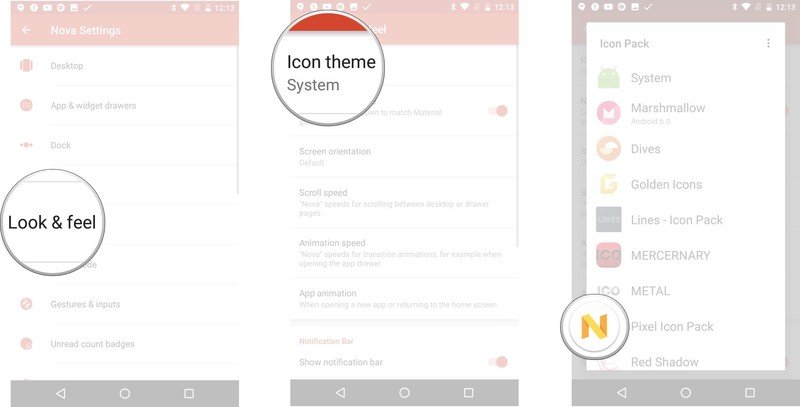
- Tap Look & feel.
- Tap Icon theme.
- Select Dives or *Pixel Icon Pack**.
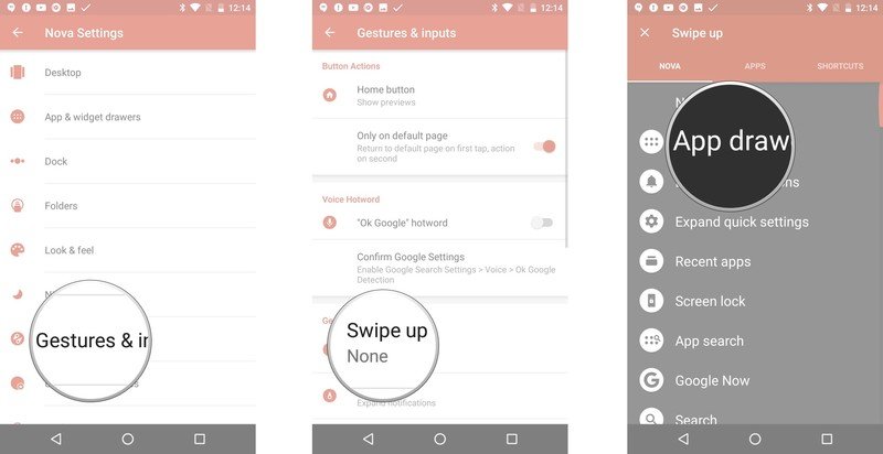
- If you want an extra way to swipe open your app drawer, tap Gestures & inputs.
- Tap Swipe up.
- Tap app drawer.
Going beyond the Pixel
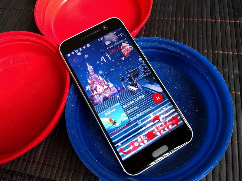
The stock Pixel theme we've described up above brings a nice, clean, bright look to our launchers, but there's no saying we have to follow the Pixel theme to the letter. Here are a few ways to make your Pixel theme a little more flexible, fun, and fitting:
- Folder Fun: By changing the color of your folder Background in Nova or Folder icon background away from white, you can make your folders pop with a colored ring on that porthole preview. It can be a challenge to pick a hue that looks good on your theme as both a preview and folder background color, but when pulled off properly it can be quite stunning.
- Pretty Pill: While you can't customize the color of your Pixel search widget in Action Launcher, Nova will let you customize the color of the search bar to better match your wallpaper or theme colors. I don't know about you, but white widgets hurt my soul.
- Shapely Icons: If circular icons aren't your cup of tea, you can fall back on some of our favorite icon packs: the Material icon pack Glim or the monochromatic Whicons and Zwart packs go with almost any theme, Pixel included.
So, how Pixely do you like your launcher? Have any circular icon packs that we may have overlooked? Chime in below in the comments, and if you have any themes you'd like me to tackle, sing out!
Ara Wagoner was a staff writer at Android Central. She themes phones and pokes YouTube Music with a stick. When she's not writing about cases, Chromebooks, or customization, she's wandering around Walt Disney World. If you see her without headphones, RUN. You can follow her on Twitter at @arawagco.
