The quick take
It's easy when reviewing a device to get distracted by what the product could have been, or what it maybe was supposed to have been, rather than what it actually is. And that distraction is even more apparent when it comes to the Google Pixel C, a beautiful but heavy 10-inch Android tablet that almost certainly isn't yet living up to its full potential.
The good
- A large, beautiful display
- Excellent build quality
- Impressive (optional) keyboards
- Nexus-like promises of software updates
The bad
- It's heavy
- And the keyboards make it heavier (and thicker)
- A good bit of wonk in Android on this platform
- Too many apps don't play nice with landscape orientation
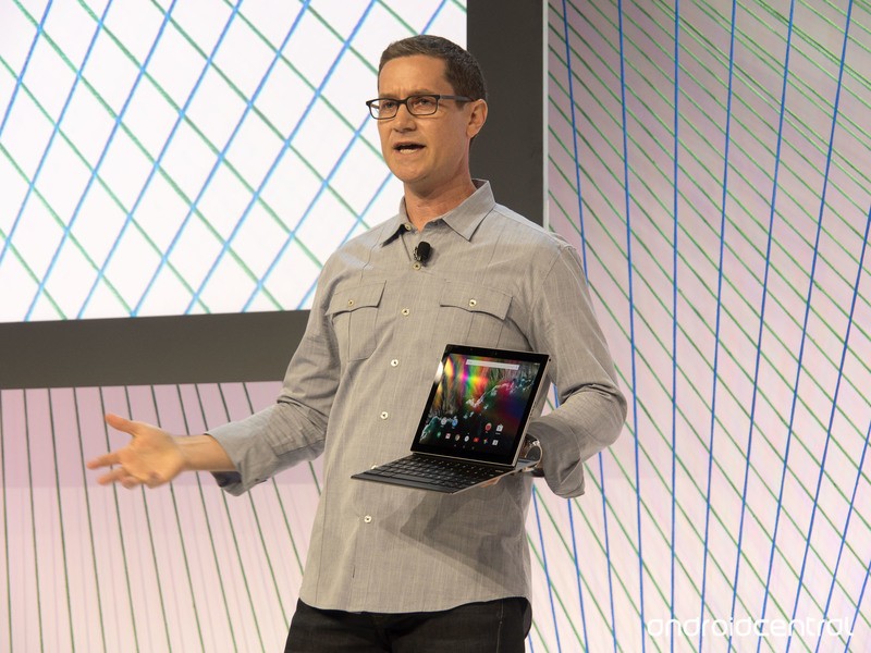
Google's Andrew Bowers, introducing the Pixel C at the 2015 Nexus event in San Francisco.
Pixel C Full Review
Eight minutes of stage time was all the Pixel C got at Google's Nexus event in late September in San Francisco. And the brief hands-on time we got afterward confirmed a few things and left any number of other questions unanswered.
First, coming from a year of the Nexus 9, this new tablet was both bigger and chunkier. Definitely heavier. And anodized aluminum is très chic. But from a user perspective, what was new? We'd been running the Marshmallow developer previews just fine on the Nexus 9. And we've used optional keyboards on tablets before. Did Google really want to make its own tablet just to do it? What would NVIDIA's powerful Tegra X1 processor and GPU (so ... many ... cores) bring to the table?
And a strange 1:√2 aspect ratio that's the same as a sheet of paper (that's 1 to the square root of 2, and you're forgiven for not knowing that before the Pixel C, too), giving you the same aspect ratio if you cut it in half, which would make sense for the multi-window feature hidden inside the first M preview build earlier in the summer and removed in the second preview.
The Pixel C is now available, starting at $499 for the 32-gigabyte level of storage. There are a couple $149 keyboards (which also serve as the only official protective cases) available for it as well.
And this is our full Pixel C review.
- 10.2-inch LTPS LCD display
- 2560 x 1800 resolution
- 8MP rear camera
- 2MP front-facing camera
- 34.2 Wh (9243 mAh @ 3.7V)
- 15W USB Type-C adapter
- NVIDIA Tegra X1
- Maxwell GPU
- 3GB RAM
- Wifi 802.11ac
- 2x2 MIMO, dual-band
- 32/64GB internal storage
About this review
We've been using a retail Pixel C for the past 10 days. It's a 64-gigabyte version as purchased from the Google Store. It's running Android 6.0.1, on build MXB48J, and installed a 58-megabyte update immediately after we turned it on. (There's another build — MXB48K — available as a factory image, but as yet we're unsure what's different.)
We've used the Pixel C with the Pixel C Keyboard (the anodized aluminum one) as well as with the leather Keyboard Folio.
Pixel C Video Review
Pixel C Hardware
Excellent build quality and a gorgeous display house powerful internals in the Pixel C.
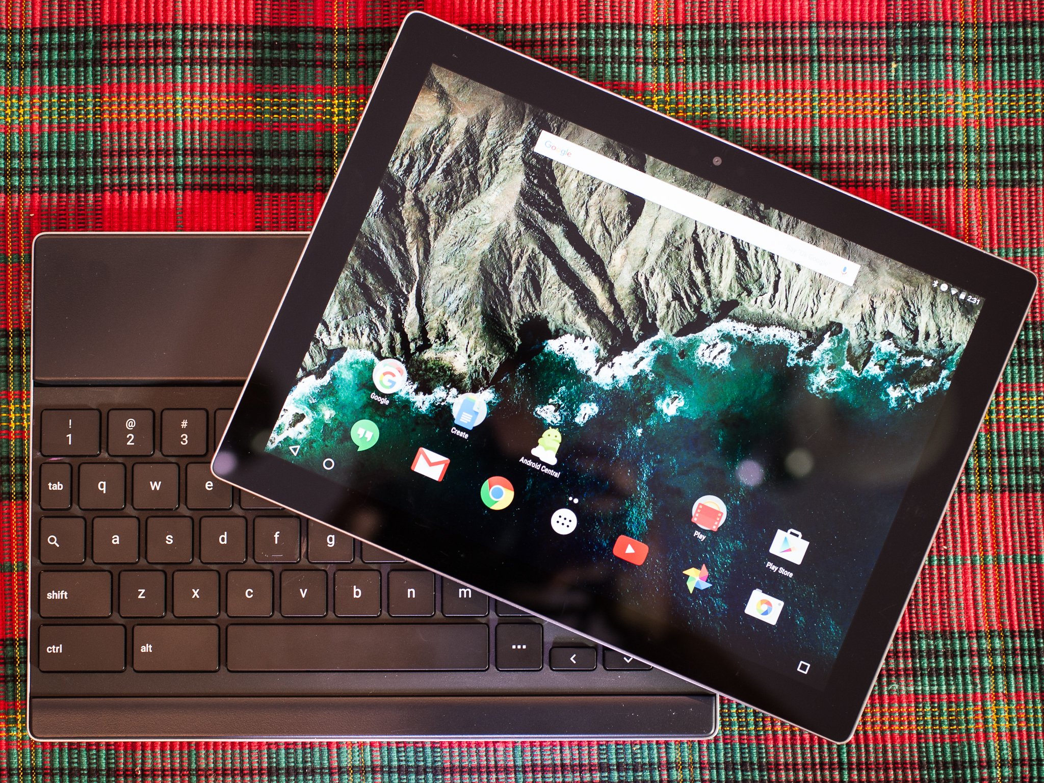
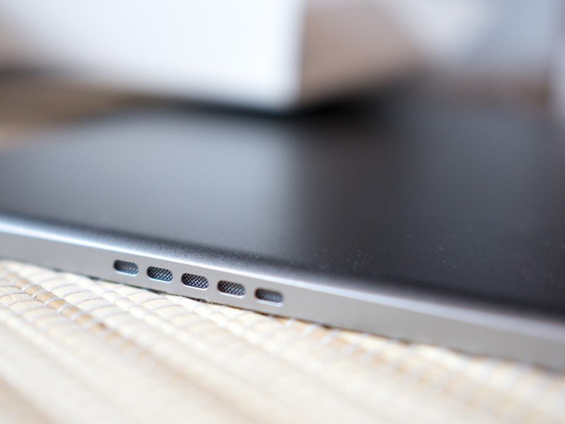
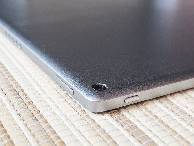
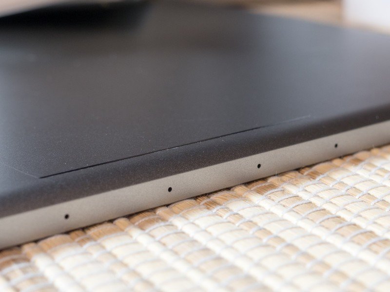
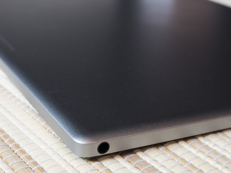
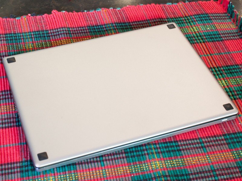
The Pixel C is gorgeous. It's an obvious companion to the Chromebook Pixel (as if the name didn't make that obvious enough) with a single piece of anodized aluminum serving as the shell. The Pixel C isn't all that curvy — nearly flat until you just about get to the edges — and it's maybe not quite as nice to hold as other tablets that round off a little sooner. And the aluminum doesn't do anything to help with grip, so you'll be hanging onto the edges a good bit.
But, damn, it looks nice.
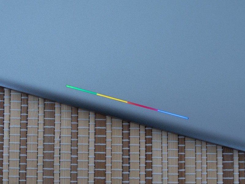
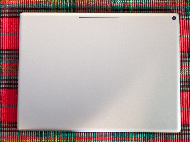
This is also one of those "sideways" tablets. It's certainly not the first, but it's the first from Google since the 2012 Nexus 10 to push the "landscape" orientation by default. You know that from the placement of the front-facing camera, of course, as well as the rear LED — and the Google logo when you first boot the thing.
The display
The large display — again, 10.2 inches diagonally — might be a little bit taller (or wider, if you're holding the thing sideways) than you're used to thanks to that 1:√2 aspect ratio. Google was quick to tell us at the launch event that a sheet of A4 paper (otherwise just known as "a sheet of paper") has the same aspect ratio. And that if you cut the display in half, you end up with ... two halves in that same 1:√2 aspect ratio. And that would be important if the Pixel C yet had any sort of functionality that makes use of the display in some sort of multiwindow mode. And it almost certainly will at some point. But today It's just an odd spec.
The display itself, however, is very impressive. The sheer number of pixels — some 4.6 million of them at 2560x1800 — has something to do with that. So does the 500 nits of brightness. The display temperature is a little less blue that what's on the Nexus 9, but it's also not quite as washed out. That is, colors are more prominent.
Speakers & buttons
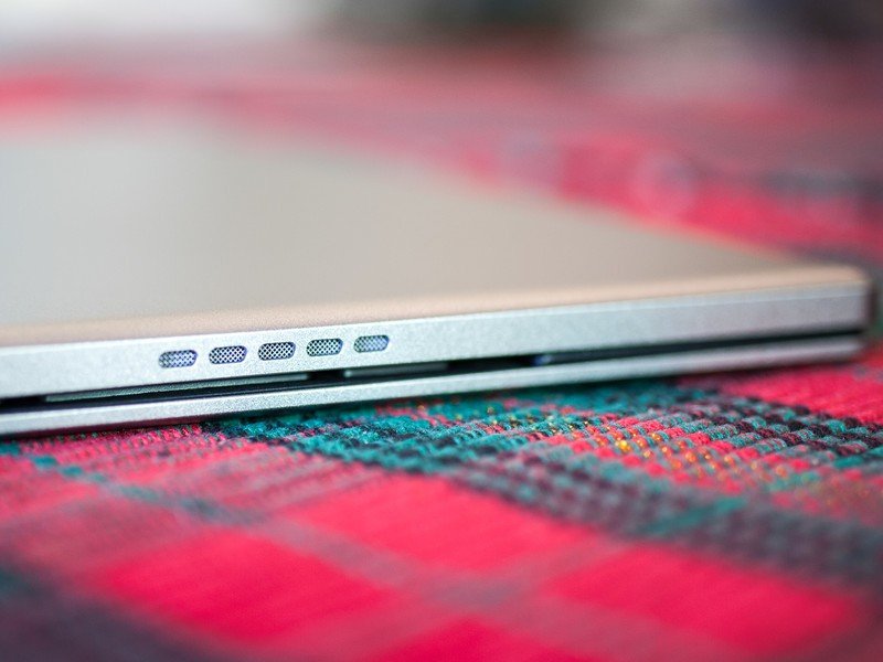
The speakers on either end (or top or bottom, if you're holding the tablet sideways) do a nice job of directing sound toward the front, and not just laterally. But they're a bit tinny, lacking the depth we've enjoyed in other tablets. (They're specifically not as bassy as the Nexus 9.) And on occasion I've found myself covering one or both of them when my hands when gaming. It depends on what I'm playing and how I'm holding the tablet, but it happens.
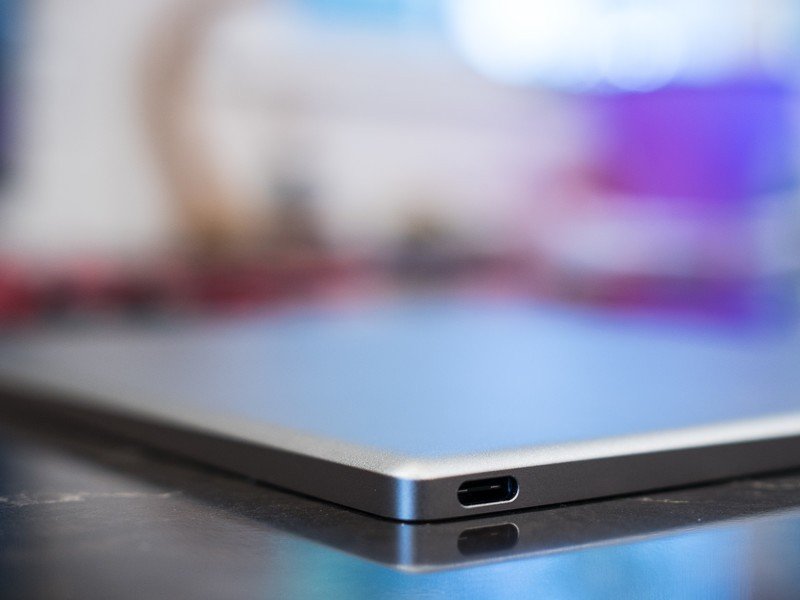
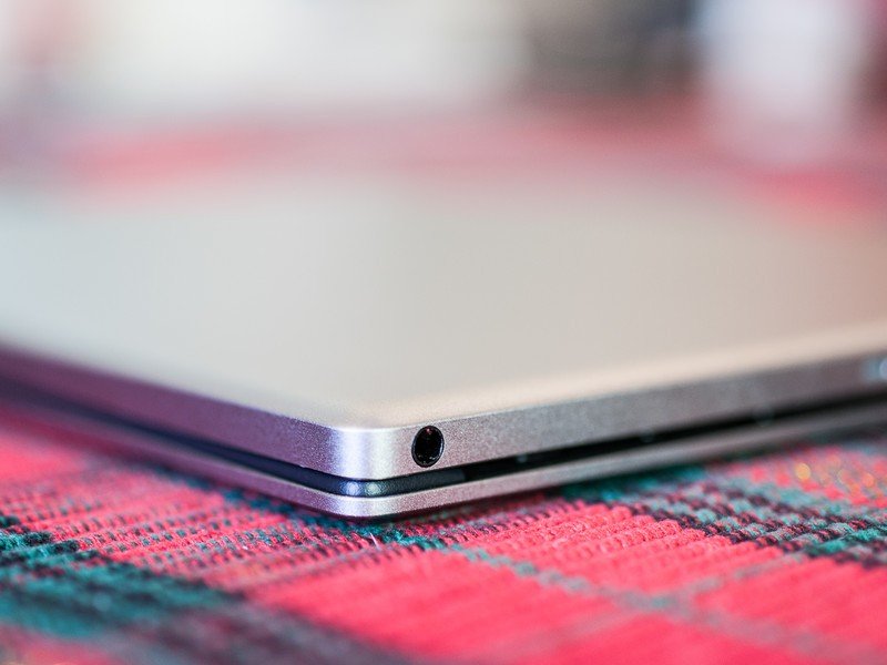
The USB-C port and 3.5mm headphone jack are on opposite corners, with the former smartly closest to the desk or table or whatever you have the Pixel C resting when it's connected to one of its keyboards. That means you can plug in to charge without having the cable dangling through the air. Smart. (Or course if you need to plug in an audio cable, it'll be dangling quite a bit from the top right.)
The horizontal orientation also does a decent job keeping you away from the warm spots while gaming. It depends on how high you're holding the tablet, but generally speaking your hands will be low enough to avoid the worst of it on the left-hand side.
The overall hardware experience of the tablet itself is a mostly a good one. I've not had too much of a problem using the Pixel C in landscape. It's when I switch over to portrait — that is, vertical, and something you'll still have to do a lot — that the Pixel C starts to feel too big. (Too wide, in that orientation.) It's not unusable, just not all that comfortable for me.
A larger issue for me (and this is one that I'm trying to get used to but am still struggling with) is the weight. The Pixel C itself weighs 517 grams — that's 1.13 pounds. That's about 21 percent heavier than the Nexus 9, but it's definitely getting up there, particularly when you take the keyboards into account.
Pixel C Internals
The Pixel C is packing the NVIDIA Tegra X1 "Super Chip." The ARM CPU itself is octa-core, with four low-power A57 cores, and four high-power A53 cores. The standout feature, though, is the 256-core Maxwell graphics processor. (For those into GPUs, yes, that's desktop-class stuff we're talking about.)
What's that mean for real-world use? Depends on what you're doing. Or trying to do. Jumping through the usual Android menus and home screens isn't 10x faster or anything. (If anything, actually, we're seeing occasional little hiccups, as if things aren't quite dialed in. More on that in our software section.) As far as running apps goes, the Pixel C has handled everything we've thrown at it as quickly as we'd expect.
Apps (and games is where you're more likely to run into this) that have been optimized for the Tegra platform may well have improved graphics. This was subtle but apparent when playing Vainglory on the Nexus 9 and then switching to the Pixel C. The changes aren't huge, but they are noticeable. (Whether you'll notice while playing is another matter, but better is always better.)
Consider these Vainglory screenshots. That's the Pixel C on the left, Nexus 9 on the right. There are subtle differences in the "Item Shop" tent, as well as the flames, and details on the ground.
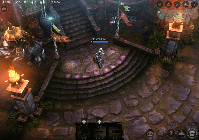
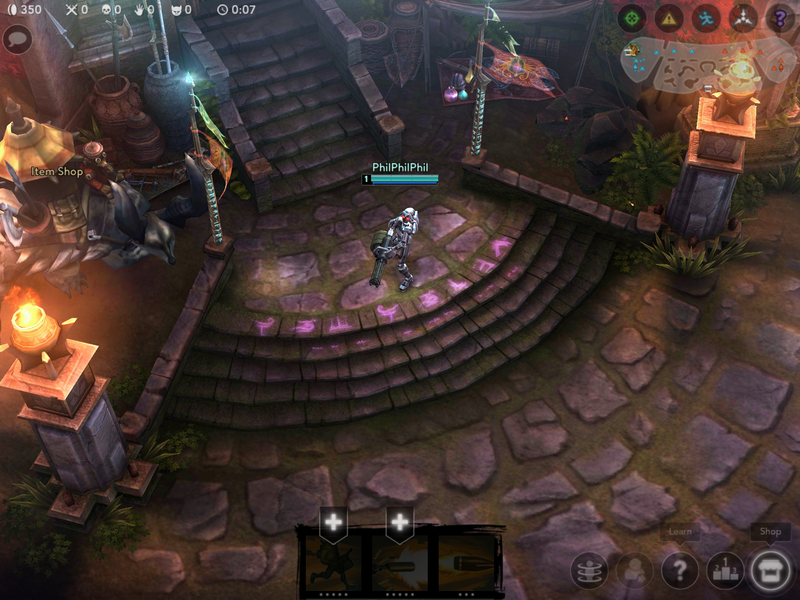
Interesting, though, is that NVIDIA tells us the improved detail is simply a matter of increased resolution, and isn't inherent of Tegra X1 having more cores than Tegra K1 in the Nexus 9.
Battery life & charging
As for battery life, the Pixel C sports a 34.2 Watt-hour battery. (That's about 9,200 mAh if you don't mind some rough conversion.) Either way it's a big battery. By comparison, the larger iPad Pro has a 38.5 watt-hour battery. A 90-minute showing of "Inside Out" at 50 percent brightness killed 17 percentage points. During our testing time we generally were recharging every day and a half or so. Sometimes more, sometimes less, depending on how hard we were pushing things.
But that's where the good news comes in. The Pixel C comes with a 15-watt USB-C charger and goes from 15 percent to full in about 2.5 hours, which isn't bad at all considering how much juice you're pumping in there.
Another fun thing is that the Pixel C can serve as a sort of emergency charger for other devices. We plugged a Nexus 5X directly into the Pixel C and after 30 minutes the Pixel C dropped 4 percentage points, and the 5X gained 6 percentage points. That's not anything we'd want to have to rely on, but it's a neat trick.
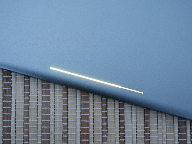
And finally, the LED on the back of the Pixel C — in addition to being fancy and flashing the Google colors — also serves as a way to see the battery charge without actually turning on the display. Just tap the light bar a couple times (or more, as it frequently doesn't work on the first try) and it'll show the charge level in yellow.
The Pixel C Keyboards
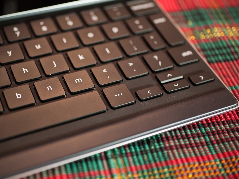
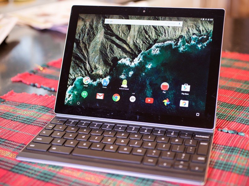
There are two official keyboards available for the Pixel C at the time of this writing. The simpler of the two is the eponymous "Pixel C Keyboard." It's done in the same anodized aluminum as the tablet and has four rubber feet on its back, for keeping everything in place while typing.
The Pixel C Keyboard
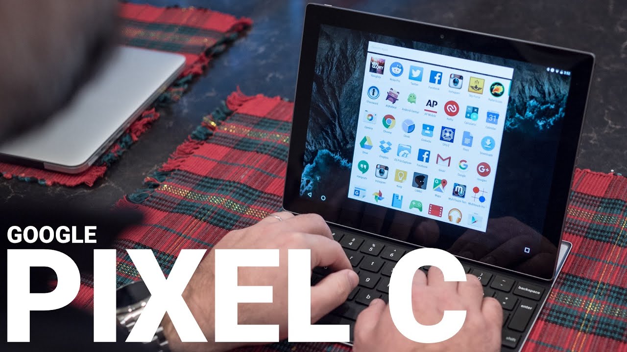
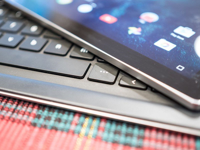
And as far as tablet keyboards go, this one is really slick. As in neat. It takes advantage of six magnets built into the Pixel C to affix itself three ways. There's the standard "Hey, look, this is almost a laptop" configuration wherein the bottom couple of inches of the tablet stick to the top couple inches of the keyboard, which then hinges from 100 degrees to 135 degrees of viewing. You also can face the display against the keys when not in use to keep everything nice and protected — again, with the strong magnets holding things in place. Or you can affix the back of the tablet to the keyboard side of things to make a tablet that's 78 percent thicker and 77 percent heavier.
This is a really cool keyboard — that might scratch the hell out of your display if you're not really careful.
That's not to say this keyboard isn't good. Because it is. It's got the same build quality as the tablet itself. It's a great way to prop up the tablet on a desk or table. The 35-degrees of travel make for great viewing angles. (Though it is a bit bouncy when you poke at it.) And we can't say enough about how well the magnetic locking mechanisms work in all three positions.
But for as well as those magnets work, and as cool as they are, we do have some real concerns about the idea of sliding something across the Pixel C's display over and over again. Because that's how you get the two halves apart. You slide one to the side, then pry it off. All it takes is one grain of sand to start gouging away at the screen.
And that's exactly what's happened to ours.
The scratches are small. But they're apparent. And if we keep sliding the keyboard on and off like we have to do without making sure it's 100 percent grit-free, we're going to be in real trouble. Or at least our Pixel C will be.
Really, what we want to see is some sort of cover like what's available for the Nexus 9. It's thin, light, magnetic and — most important — doesn't come with a very good chance of scratching the display. If having a keyboard means risking scratches, we'll look elsewhere, thank you very much.
The Pixel C Folio Keyboard
The leather-clad Folio Keyboard changes things up a bit with a hard rear shell and magnets of its own (with a slot for the Pixel C's LED to shine through). It's got just two angles for viewing — 127 degrees and 146 degrees. And it's not a bad option at all, though it does add a couple extra millimeters to the overall thickness and more than doubles the tablet's original girth to 14.15mm. Weight is just shy of the metal keyboard, at a total 908 grams, including the Pixel C itself.
And at this point it's the probably the option we'd recommend. Again, it's thicker than the metal keyboard cover and adds a good bit of weight, but there's virtually no chance that it'll damage your screen. It's also a little easier to remove the Pixel C from the Folio Keyboard, which you're going to have to do fairly regularly given that there are so many apps that don't play nicely in landscape.
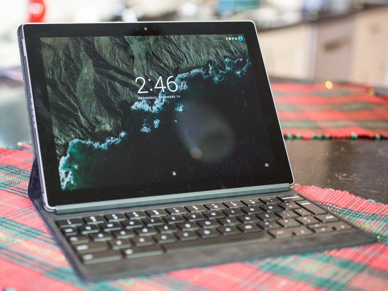
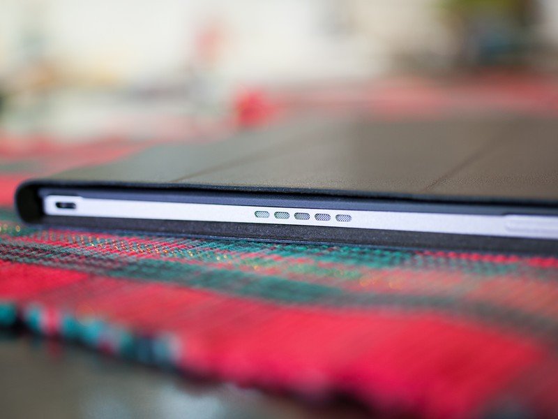
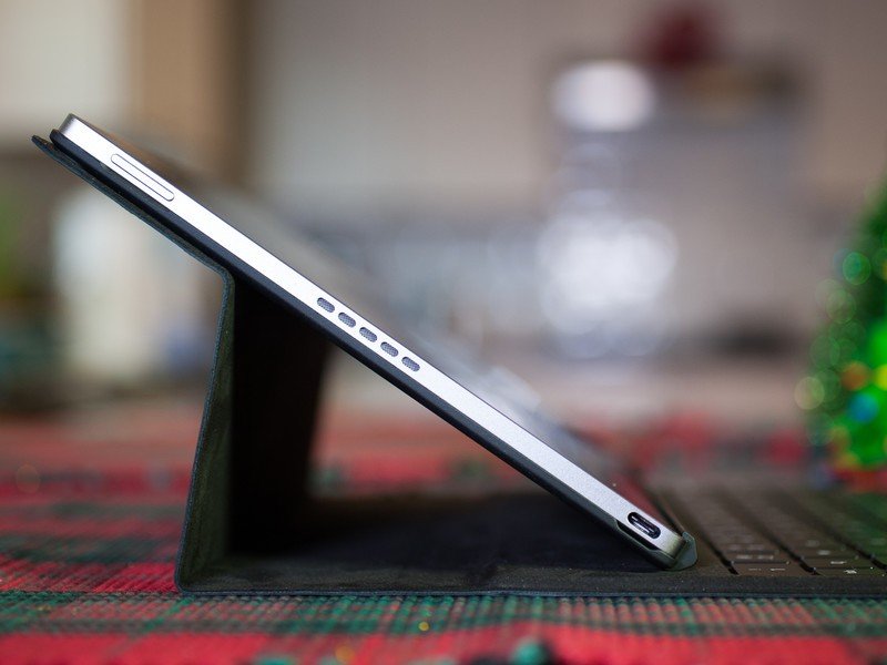
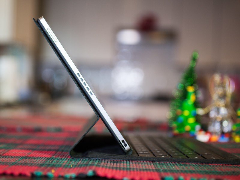
And that brings us to our only real physical issue with the keyboards in particular, and the Pixel C overall. The keyboards do what they do really well. The keys have great travel to them, the nearly 19 mm pitch (the distance from the center of one key to the next) is adequate, and the magnets keep everything smartly in place. And the inductive charging is a neat trick — the tablet charges the keyboards when closed and not in use. That's brilliant. And because of it I've yet had to worry once about whether the keyboard was charged. (Though Google says it'll last for upwards of a month in any event.
But the Pixel C and keyboard (pick your poison, either the metal or folio option) is just too heavy (and/or thick) for me to justify carrying around, mostly because the software isn't up to snuff yet. And that includes some pretty serious disconnect issues, and a general inability for the keyboard to keep up with what we're typing, both of which probably fall on the Bluetooth stack. If and when Android is updated with multiwindow and other features to take advantage of a semi-permanent keyboard, our tune may change. But for now there's just not enough incentive to justify lugging either one around, which is a shame.
.@philnickinson has keyboard issues, ex. 1: pic.twitter.com/K71ii0YpzJ.@philnickinson has keyboard issues, ex. 1: pic.twitter.com/K71ii0YpzJ— Andrew Martonik (@andrewmartonik) December 21, 2015December 21, 2015
Ex. 2: pic.twitter.com/mjkOMwDayXEx. 2: pic.twitter.com/mjkOMwDayX— Andrew Martonik (@andrewmartonik) December 21, 2015December 21, 2015
Pixel C Software
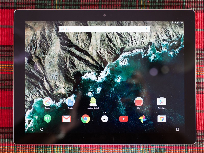
The Pixel C as we're reviewing it is running Android 6.0.1 Marshmallow, nearly identical to the Android 6.0.1 we're enjoying on Nexus phones and tablets.
The biggest difference is that the home, back and recent apps buttons have been split, with the first two on the left-hand side of the screen, and the last on the right. It takes a little getting used to, and isn't a huge change in any case. I think I might prefer the home button in the middle so that it's easier to get to from either hand. But, again, not a huge deal.
Other than a few other little odds and ends — trusted devices can't be used for Smart Lock, for some reason, and there are hooks for the keyboards to be automatically detected — this is stock Android as it is on any other tablet.
The Pixel C software — for now, anyway — does virtually nothing to improve the Android tablet experience.
And, well, that's pretty much it for Android on the Pixel C.
That is, except for all the app wonk.
There are a couple areas of concern here. One of them is Android itself. It generally runs OK on the Pixel C, but only just so. We've had sporadic hangups and general unresponsiveness, almost like something (or too much?) was going on in the background. That's not the sort of thing you'd expect from a tablet with the perceived power of the Tegra X1 platform. (Scuttlebutt is that because more work is offloaded to the GPU cores than the application processors, things might not yet be completely optimized for this platform.)
The bigger problem, though, is apps. Remember that the "preferred" orientation for the Pixel C is landscape. Sideways. But many apps either aren't really designed for use in landscape — or simply don't work at all in that orientation. And we're not just talking about fringe apps here.
If you're a fan of Instagram on a tablet, you'll be going back to vertical. And that means no using it while connected to the keyboard. That's the case for any number of apps. And it's also a best-case scenario when it comes to things not working. Other apps are much worse.
Popular chat service Slack forces a vertical orientation when you're logging in — which can span a number of screens before you're finally logged in and then are able to use it in landscape. Though it's not really optimized for that, either.
More: Read our Android 6.0 Marshmallow review

Then there's Facebook, which actually has a decent horizontal layout these days. Until you start viewing images and it forces you into portrait — which in the case of the Pixel C either means rotating the tablet in your hands, again a nonstarter if you've got one of the keyboards attached.
Some of the software woes are inherent to all Android tablets. Others are more specific to the Pixel C.
I use Relay for Reddit to get my daily dose of cat gifs. But I can only use it in landscape, because anything with motion — videos, gifs, whatever — are broken in portrait. (And only on the Pixel C.)
So the problem is twofold. We've got a tablet that prefers to be in the landscape orientation (and must be when used with the keyboard), and apps that either don't work in landscape because they were designed that way, or don't work in landscape because the developer doesn't care to design them that way. (Or, worse, works great in landscape for many things but forces you into portrait for others.)
Should every app be able to work horizontally? In a perfect world — and particularly on a tablet as big as the Pixel C — yes. Maybe an app presented vertically (all letterboxed to hell) in landscape isn't ideal, but it's better than not being able to use the Pixel C in its intended orientation at all. If the developers aren't going to do something about this on their own, Google's going to need to step in and some up with some wort of workaround. Because in any event this isn't a great experience for those of us this side of the Pixel C screen and keyboard.

Pixel C Other odds and ends
So for the most part we're looking at a pretty standard Android tablet here. A powerful one, no doubt, and one that's very nicely designed. But also not one with anything out of the ordinary.
That is until you get to a few things that are missing.
For one, there's no GPS on this tablet. That's not to say it can't find location by other means, but just know that if you have to have proper GPS on a tablet (the Samsung Galaxy Tab S2 and Nexus 9 both have it), this isn't he one for you. Same goes for NFC. There's no near-field communication on the Pixel C.
Pixel C Cameras
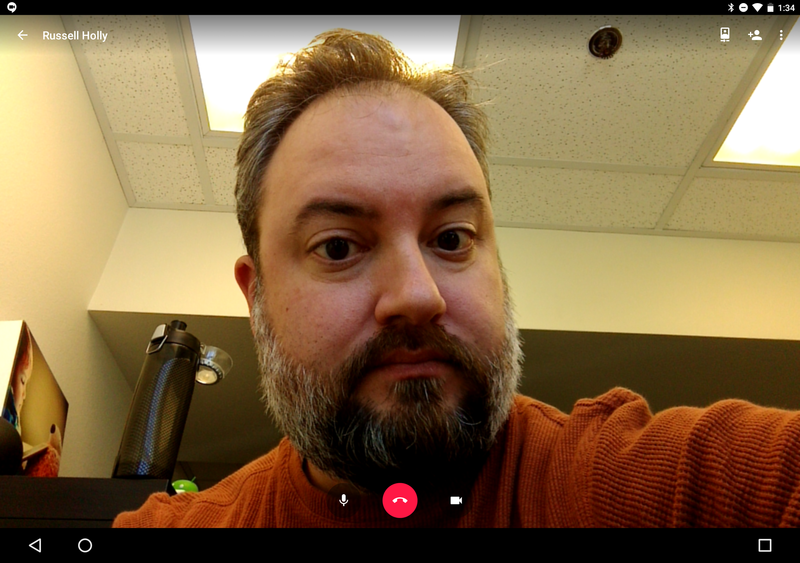
We've seen smartphone manufacturers place extra emphasis on the front-facing cameras for smartphones, for the "Ultimate Selfie Phone" or whatever. And we've never quite figured out why tablet manufacturers haven't done the same thing. (Internal space may be a valid reason.) But for all the "productivity" talk that gets tossed around with a product like the Pixel C, the idea of video chat seems to get the short end of the stick — at least in terms of megapixels.
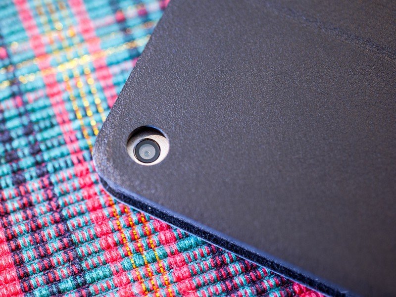
The Pixel C has an 8-megapixel camera on the back side — we'll call this the secondary camera because no one in their right mind should use this as their main shooter (see the picture above if you need more explanation)— and a 2-megapixel camera on the front. Neither is particularly impressive.


Pixel C The bottom line
As a tablet and only a tablet, the Pixel C isn't bad at all. In fact, it's good. Very good. It's a little big and maybe not as friendly to hold as other offerings, but then again we've said that about other tablet lines as they've increased in size. And there's no denying the gorgeous display, Nexus-like software experience (warts and all) and the speedier charging.
But for as good as the optional keyboards are physically, the actual experience of using a keyboard with Android hasn't really improved any. Some of that has to do with the Android operating system itself. But mostly it has to do with too many applications not being properly coded to run the landscape orientation — to say nothing of them being properly designed for it.
That will, in all likelihood, change at some point. Google's Pixel team has alluded to that in a Reddit AMA. But the question is when the Pixel C will gain software that better makes use of its multiwindow-friendly aspect ratio. (And whether the Pixel C's $499 starting price will go down before then.)
But for now, the Pixel C is more about potential than it is progress.

Should you buy the Pixel C?Not yet, if you can help it
There's a lot to like about the Pixel C. An awful lot. But aside from the keyboard experience it doesn't yet bring anything to the table (or to the tablet, for that matter) that you can't get in the cheaper and more mobile Nexus 9. The top-end Nexus 9 is currently going to for what you'll pay for a base-model Pixel C, and both have nearly identical software experiences. And the Nexus 9 has a proper cover available for it, and not just the far more bulky (and expensive) keyboard covers. (The Nexus 9 also has an LTE-capable version available, still for less than what you'll pay for the Pixel C.)
We have a feeling the Pixel C will grow into itself at some point. And it's not like it's a bad tablet. If you've got to have a keyboard with your Android experience, or if you just have to have the latest Android tablet and have some extra money to burn, this is the one to get. But if you're on the fence or just don't need a new tablet just yet, we'd wait.
Pixel C Where to buy it
As of the writing of this review, the Google Store remains the only place you can purchase the Pixel C in the U.S.
