The Pixel 4's best features are the ones nobody's talking about
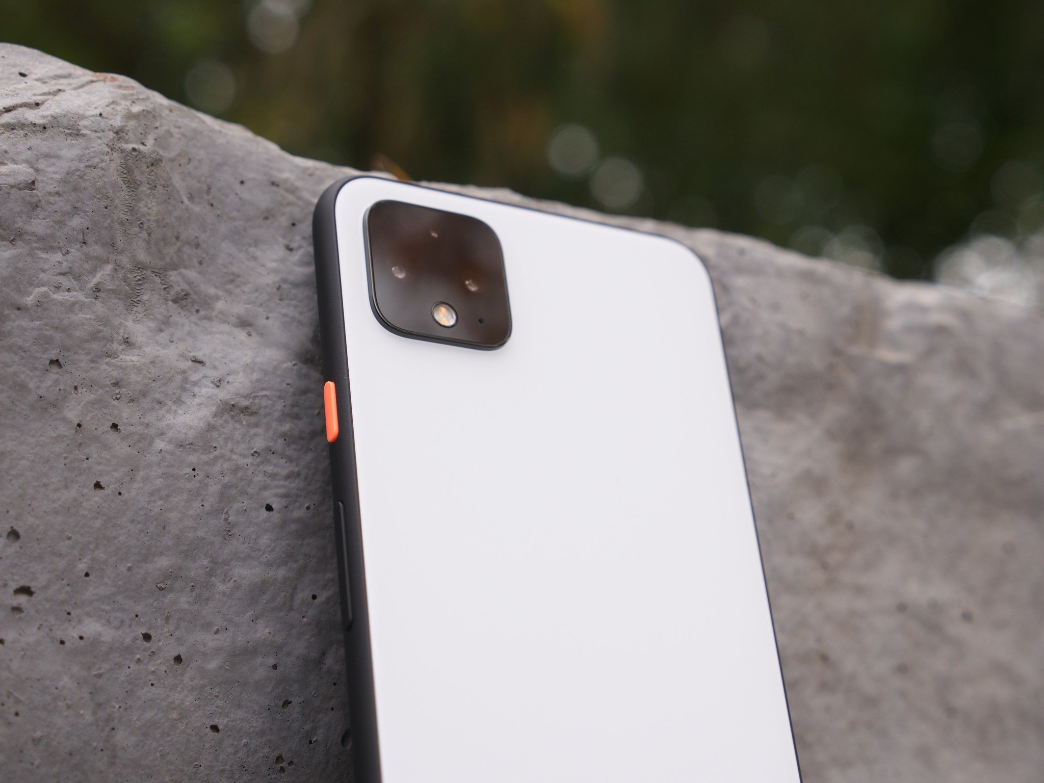
Whenever a new phone comes out, there are some features that get marketed and talked-about more than others. For the Pixel 4, that includes its top-notch photos, the 90Hz display, and clean software that's backed with guaranteed updates.
Those flagship features define the Pixel 4, but as with any device, there are a ton of smaller, lesser-known things that also contribute to how good or bad it is.
After using the Pixel 4 XL as my daily driver for a little under two months, I've found five smaller features that have proven to be some of my favorite parts of the phone. Some of the things here are available on other Pixels, but either way, this is what's kept me coming back to the Pixel 4 time and time again.
Exposure controls in the camera app
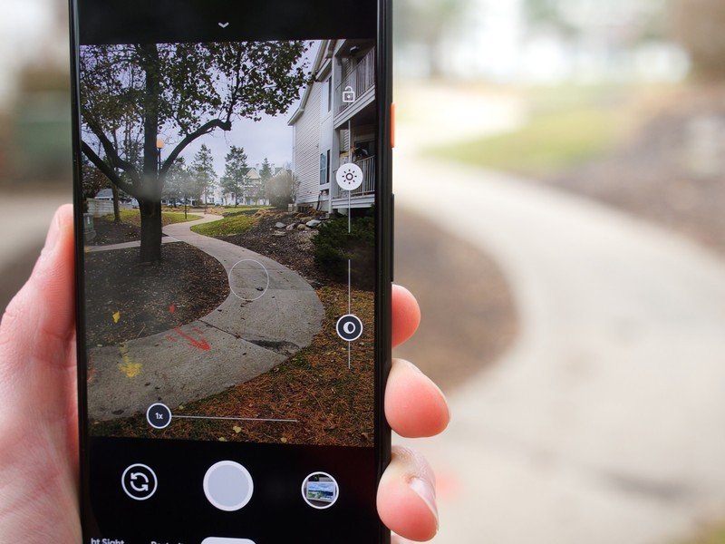
The Pixel 4 taking gorgeous pictures is far from an unknown fact, but there's a specific aspect of the camera that's absolutely enthralled me — Dual Exposure Control.
When taking a picture with the Pixel 4, you can manually adjust the highlights and shadows of your shot before pressing the shutter button. It's something we haven't previously seen on any other phone, and it's quickly become something I can't live without.
I appreciate being able to whip out my phone, snap a picture, and know it'll look great. Manual modes allow for greater fine-tuning, but they also require a lot of work and some prior photography knowhow. For me, Dual Exposure Control is kind of the perfect middle-ground.
I'll still snap pictures with my Pixel 4 just to quickly get a shot, but more often than not, I find myself wanting to play with the highlights and shadows to see how I can better-compose what it is I'm taking a picture of. One of my favorite examples is of my dog Damon, shown below.
Be an expert in 5 minutes
Get the latest news from Android Central, your trusted companion in the world of Android


The first image was taken by doing nothing more than pressing the shutter button. All-in-all, it looks pretty good (albeit a tad dark for my liking). The second shot was captured after a couple of seconds playing with Dual Exposure Control, and if you ask me, the end result is substantially better.
Damon stands out a lot more than in the first shot, and some of the darker parts of his body (mainly his eyes and snout) have greater detail.
Dual Exposure Control is really easy to use even if you're not a photography nut, and chances are you'll be able to pull off some insane pictures with it.
The stereo speakers are insanely loud
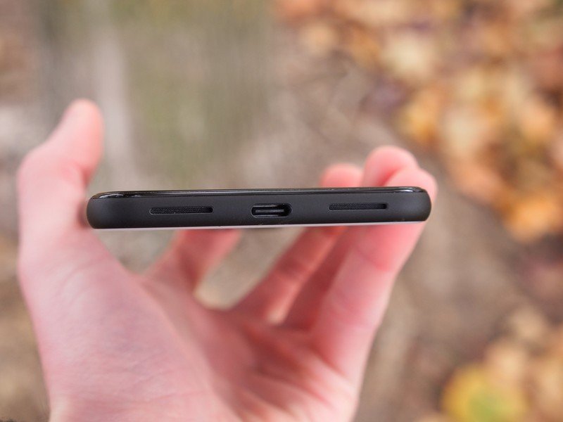
All of my music listening is done through dedicated speakers or headphones, but I regularly use my phone's built-in speakers for YouTube, Hulu, and podcasts. When doing so, the Pixel 4 has been a champ.
Stereo audio is offered via the bottom-firing speaker and front-facing earpiece, and I've been really happy with the output. Audio quality is pretty good, giving you a fairly flat and clean profile, but I think the real highlight is how loud the speakers get.
Blasting the Pixel 4 at max volume is almost too loud for my ears, and that's a great problem to have. For those times when I'm listening to an episode of House Hunters over the roar of a dishwasher or dryer, being able to rely on the Pixel 4's speakers to break through all of the ambient noise around me has been a delight.
The Style tools are a huge win for Android customization
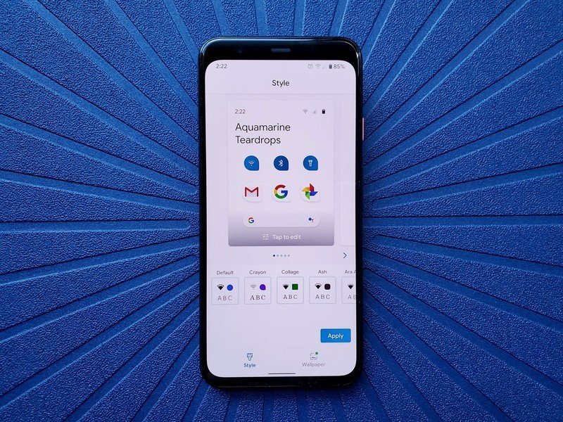
One of Android's greatest strengths has always been its openness for user customization. You can design your phone to be uniquely yours, and that's something you just don't get with competing platforms (cough the iPhone cough).
However, when the original Google Pixel was first launched and as its successors came out, there was some concern that Google was moving away from this ideal and trying to make Android more locked down. The Pixel Launcher can only be (officially) downloaded on Pixel phones, Android 10 just recently added support for its gestures with third-party launchers, etc.
Those concerns were quickly put to rest following the Pixel 4's launch, as the phone debuted a new "Style" toolset for deeply customizing the user interface.
This level of out-of-the-box customization is amazing.
The Style suite of customization is pretty robust, giving you an out-of-the-box way to change the Pixel 4's font, icon style for the status bar/quick settings, accent color, and icon shape for your apps. Yes, it's still limited to the Pixel Launcher, but seeing Google embrace user customization like this is really reassuring.
Not only that, but this Style section is a lot of fun to use. Going through all of the different options is dead-simple, and you can create custom themes that you can switch back and forth between at any time.
As someone that used to install custom ROMs just to get more customization options on my devices, I love this so much.
Now Playing is severely underrated
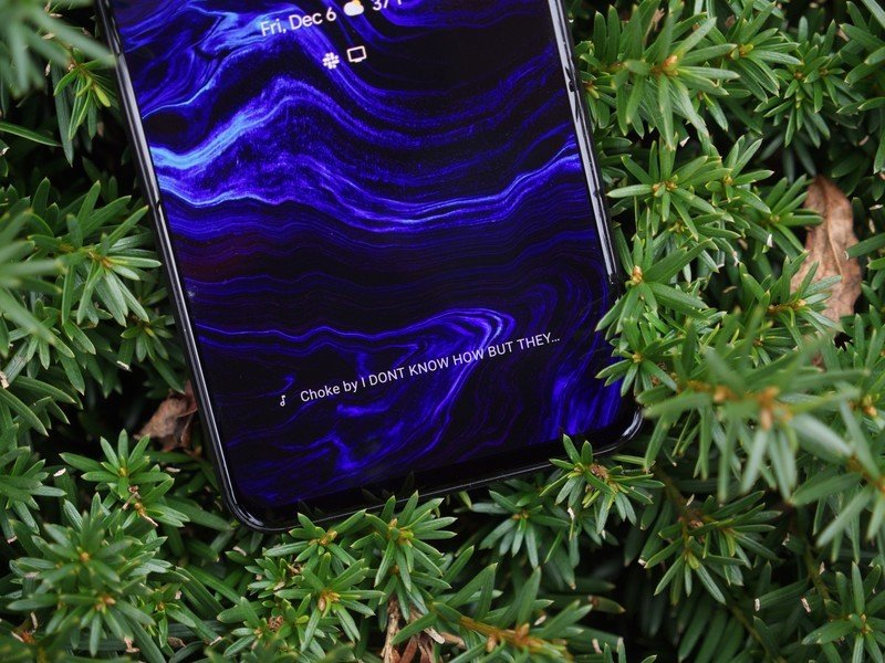
Now Playing was first introduced on the Pixel 2 back in 2017, so while it isn't all that new these days, it continues to be one of my favorite reasons to use a Pixel phone.
For anyone that may not know, Now Playing is basically like Shazam that's constantly running in the background and works 100% offline. When the Pixel 4 hears a song playing anywhere around it, it'll show the name and artist of the song on your lock screen and always-on display.
Now Playing is something I use and rely on every single day.
The fact that this works all on-device with no internet connection required is still kind of mind-blowing, and I continue to be impressed with how the Pixel 4 is able to detect songs in a busy/loud restaurant or coffee shop.
Now Playing has also improved a bit since its introduction a couple of years back, with there now being a Now Playing History where you can see all of the songs Now Playing has detected. All of the songs are organized in the order they were heard, and if you tap on one, you get quick links for listening to it on your preferred music app.
This is one of those features that you're not always thinking about, but when you do take advantage of it, the convenience it offers is unlike anything else out there.
Active Edge is my favorite way to use the Assistant
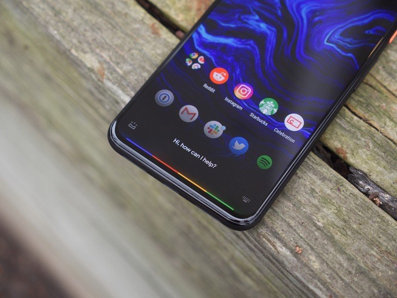
My final favorite feature of the Pixel 4 is one that a lot of people seem to be very torn on — Active Edge.
This is the feature that allows you to squeeze the bottom half of the Pixel 4 to bring up the Google Assistant, and many of my friends and colleagues have complained about Active Edge being annoying and the first thing they turn off.
On the contrary, it's one of my favorite ways to use the Assistant.
I talk to the Google Assistant all the time via the collection of smart speakers and displays throughout my apartment, but on most phones, I find myself not bothering with the Assistant at all. However, with the digital helper just one little squeeze away on the Pixel 4, I use it a lot more often.
Active Edge makes the Assistant feel like a much more integrated feature of the Pixel 4, and when you combine that with the improved Assistant performance thanks to the Pixel 4's on-device language processing unit, this ends up being my favorite phone for interacting with it.
Joe Maring was a Senior Editor for Android Central between 2017 and 2021. You can reach him on Twitter at @JoeMaring1.

