In pictures: Sony Xperia Z3 + Z3 Compact versus Z2 + Z1 Compact
Get the latest news from Android Central, your trusted companion in the world of Android
You are now subscribed
Your newsletter sign-up was successful
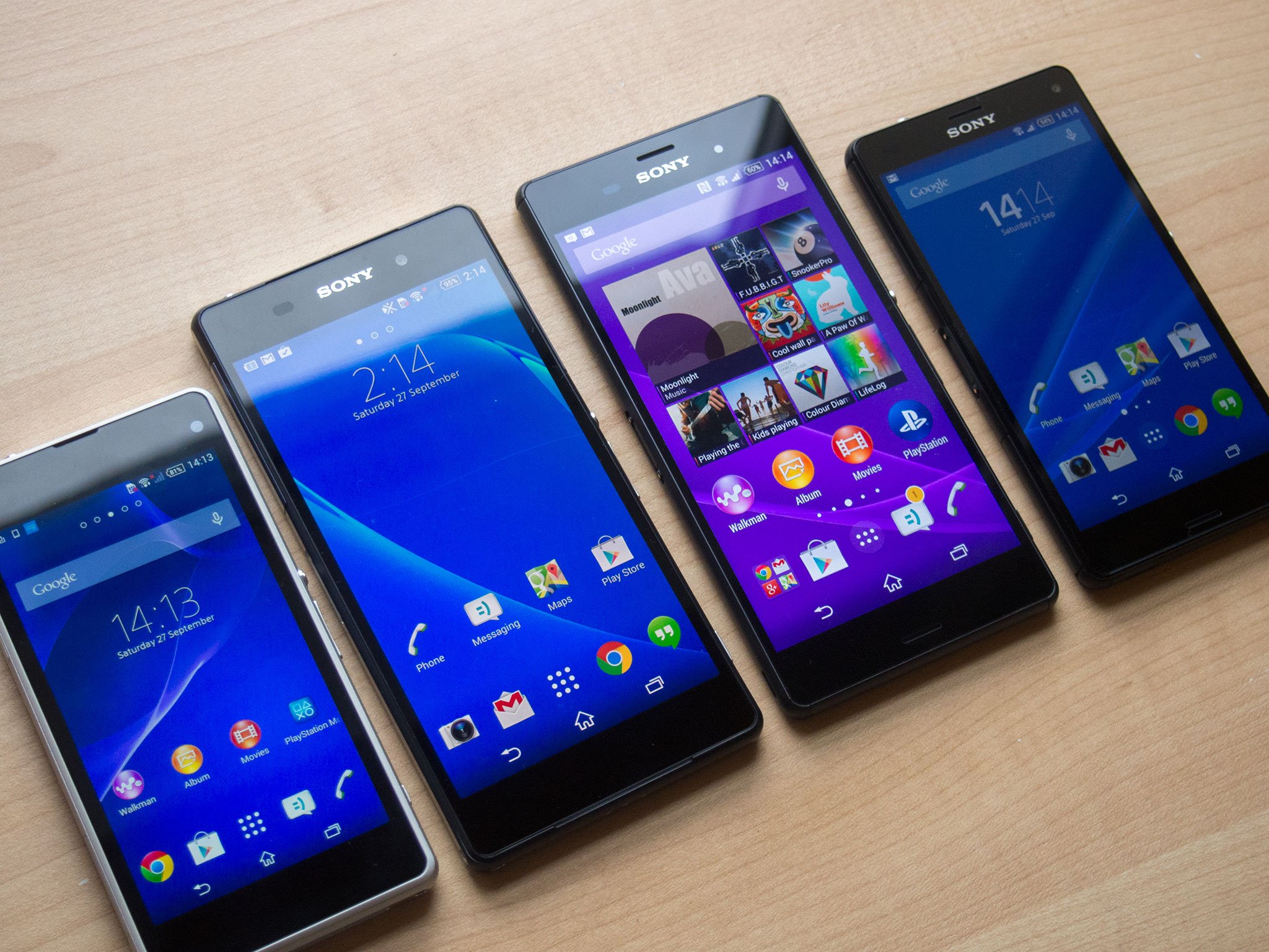
The Sony Xperia Z3 and Xperia Z3 Compact are upon us, with both devices now available in parts of Europe, and at least one of them likely to hit American shores next month. Sony's rapid-fire release cycle for high-end Android phones results in each generation of phones being the sum of many iterative updates upon the last. That's true of the Z3 series — both phones take their predecessors, the Xperia Z2 and Xperia Z1 Compact, and improve upon them in ways both subtle and substantial.
We'll have more to say on both new Sony phones in the next week, but for now we've rounded up both phones and their forebears for a quick photo shoot. Check it out down below.
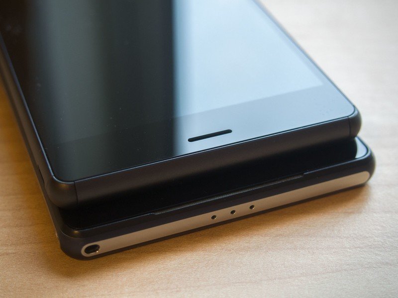
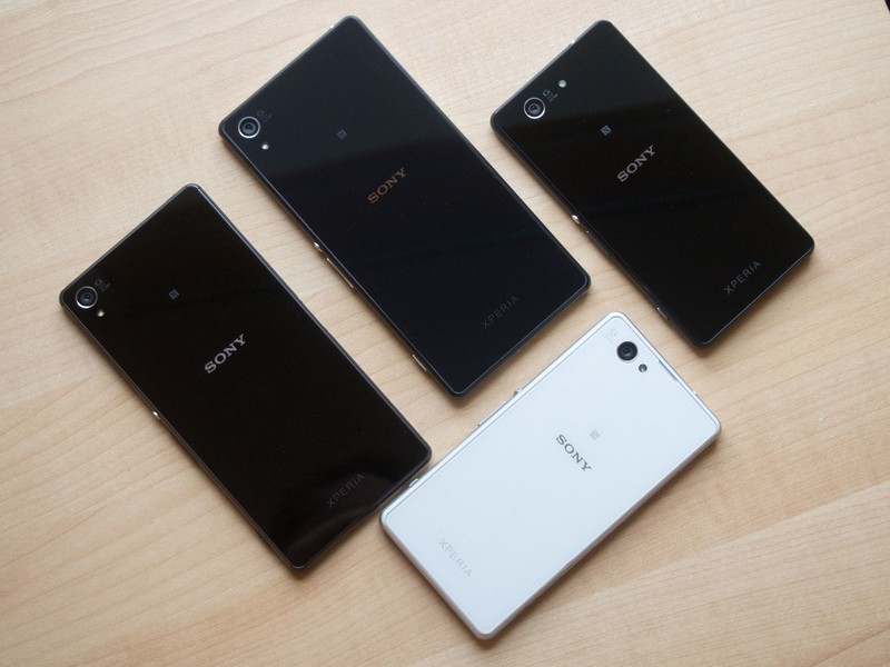
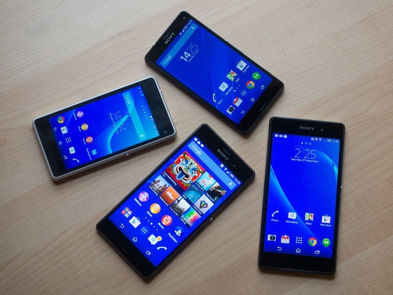
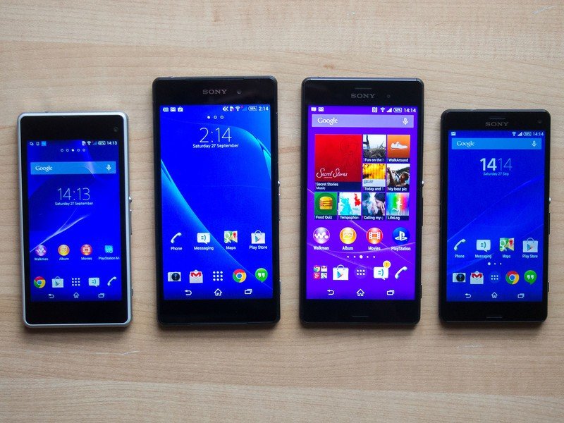
From right to left: Xperia Z1 Compact, Z2, Z3, Z3 Compact.
Article continues below 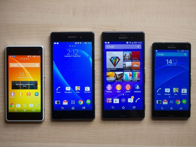
Xperia Z3 (top), Xperia Z2 (bottom). Sony evolves its "Omnibalance" design language with rounder metal edges on the full-sized Z3.
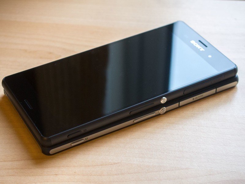
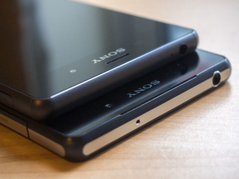
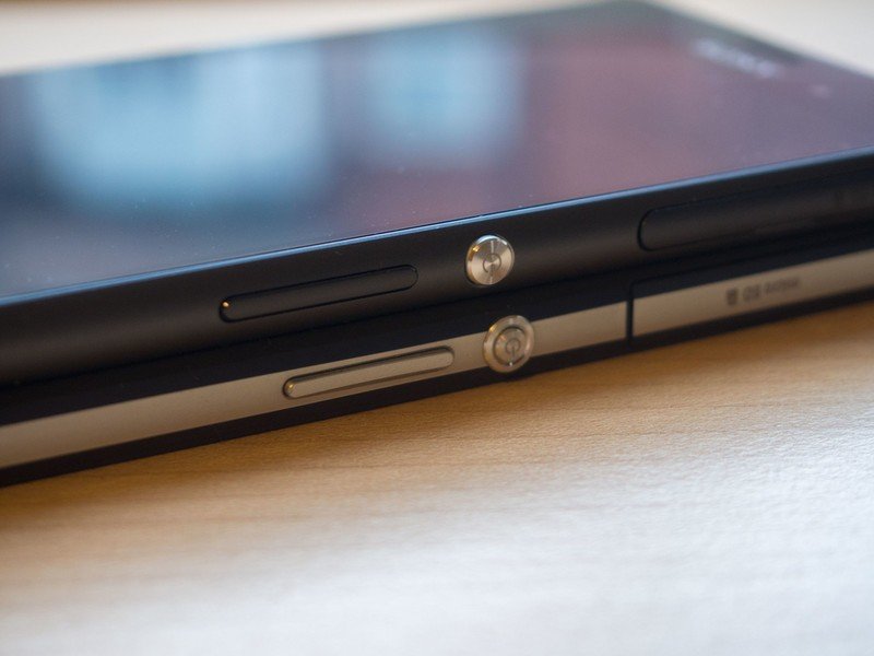
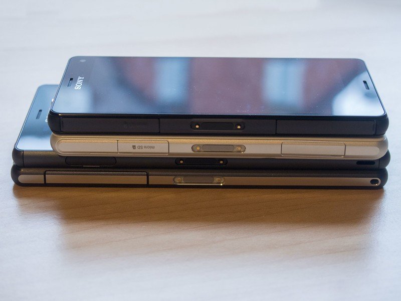
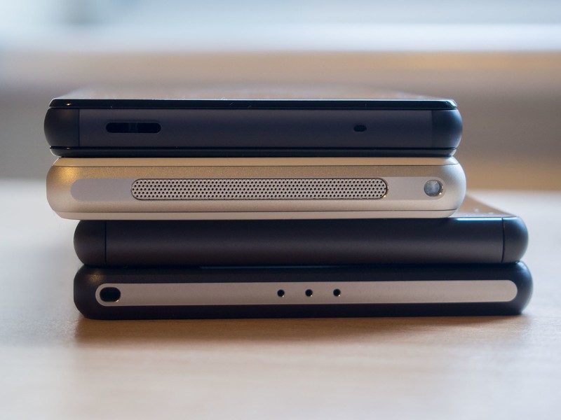
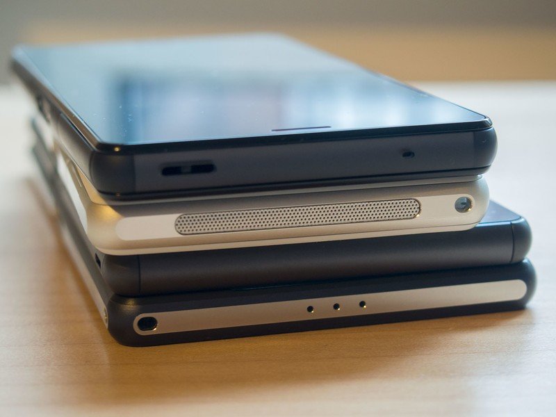
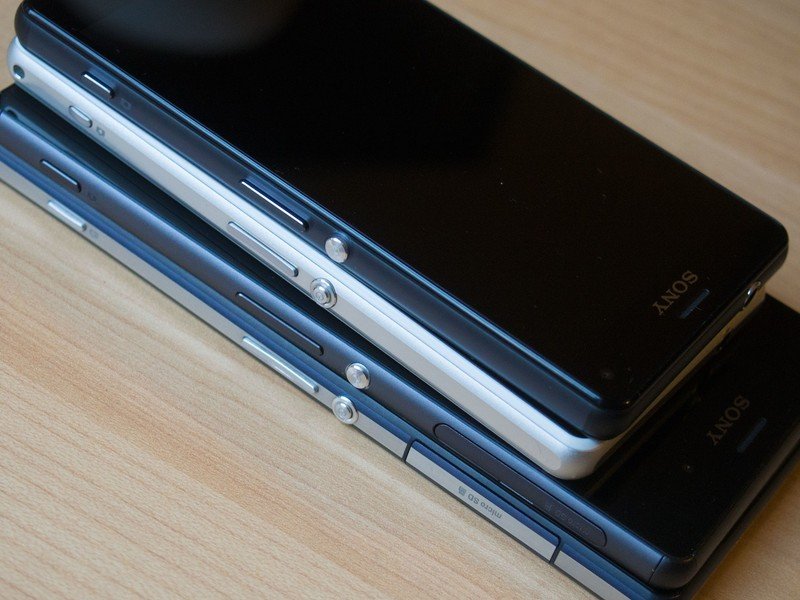
Top to bottom: Z3 Compact, Z1 Compact, Z3, Z2. The Z3 Compact uses a plastic frame in place of the Z1 Compact's metal, but the move from a cheap-feeling plastic back to glass means the newer Compact feels like the more premium device.
Clockwise from left: Z3, Z2, Z3 Compact, Z1 Compact. The Z3 is slightly narrower than the Z2, in addition to being thinner and lighter. The Z3 Compact is also thinner than its predecessor, while maintaining the same footprint with a larger 4.6-inch display (up from 4.3 inches).
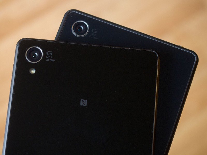
Sony uses a 20.7-megapixel Exmor RS sensor across all four devices, though the Z3 series uses a slightly wider-angle lens.
Get the latest news from Android Central, your trusted companion in the world of Android
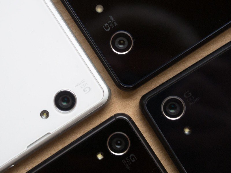
Clockwise from top left: Z1 Compact, Z3 Compact, Z2, Z3.
From top: Z3 Compact, Z1 Compact, Z3, Z2. The buttons, ports and flaps are all in much the same location. The Z3 switches to thinner ports, though, while consolidating microSD and nanoSIM slots behind one door. (The flap on the left now houses the microUSB port alone.)
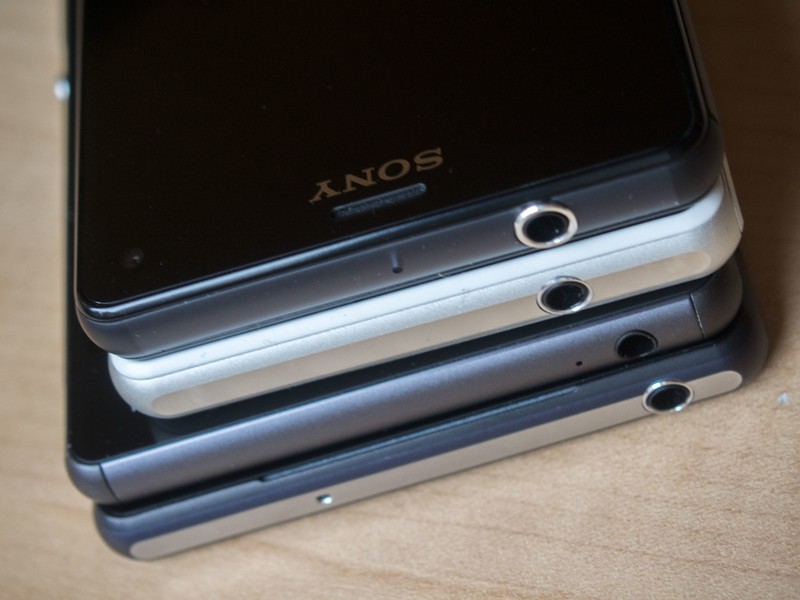
Xperia Z1 Compact (white) and Z3 Compact (black). The jump from a 4.3 to 4.6-inch display in the same device footprint results in narrower bezels.
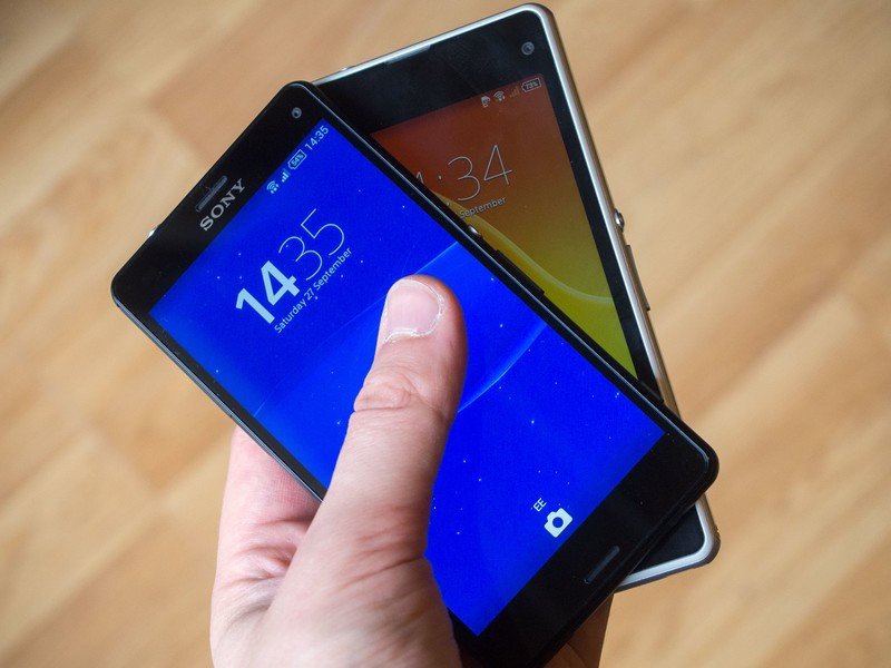
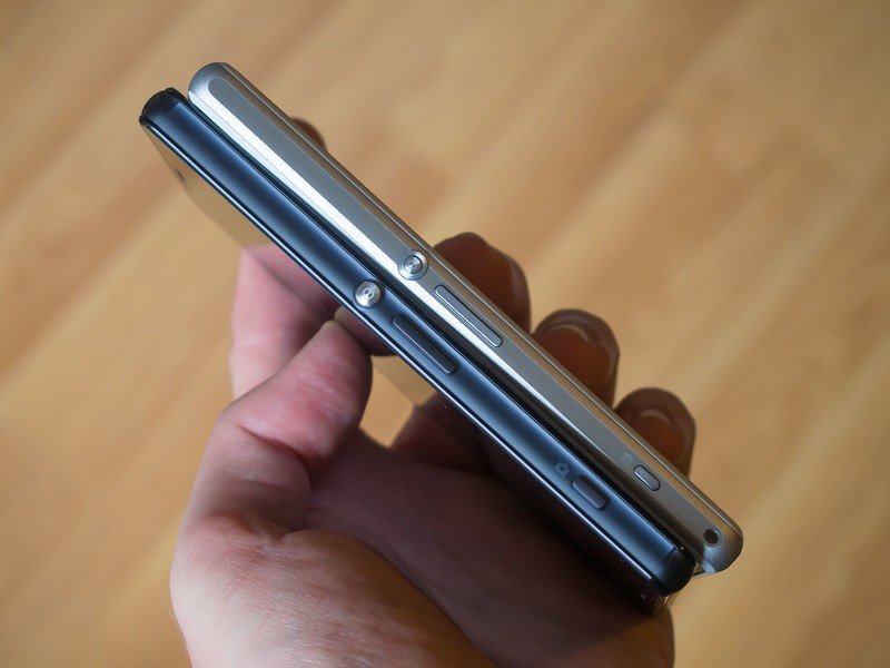
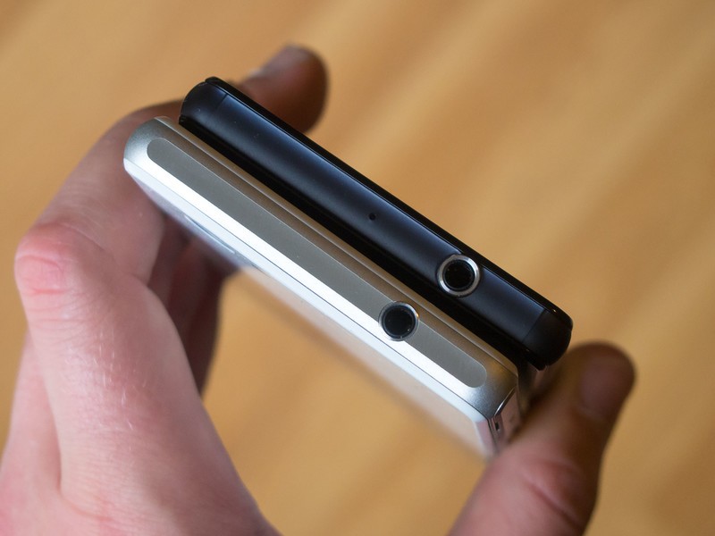
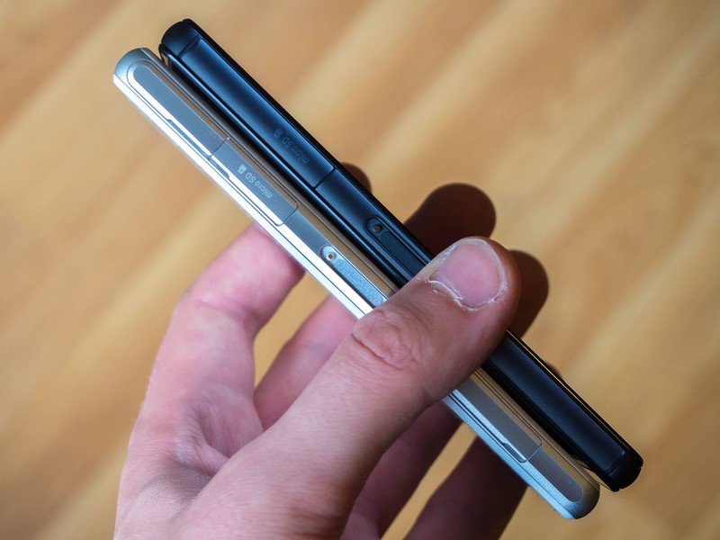
Xperia Z3 + Z2. Despite the visual similarities, the Z3 feels substantially more comfortable in-hand, due to its rounded corners and more svelte chassis.
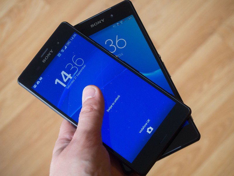
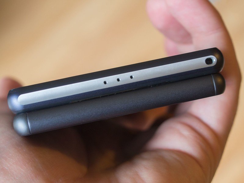
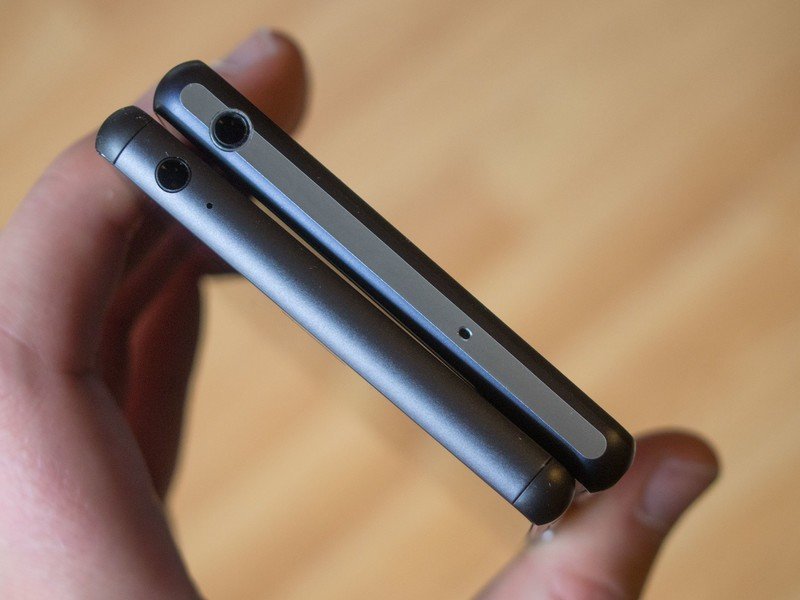
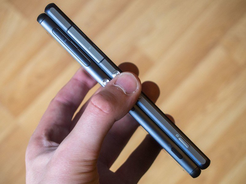
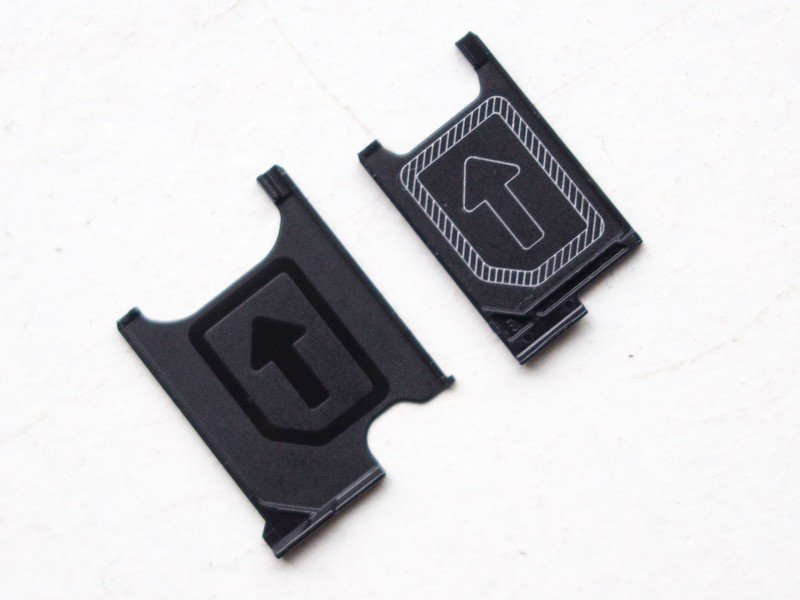
And finally, a redesigned (but just as fiddly) SIM tray for the Z3 and Z3 Compact, which use nanoSIMs. The older microSIM tray can be seen on the left.



Stay tuned for our full review of the Xperia Z3 and Z3 Compact in the coming week. Thanks to Clove Technology for providing the Z3 for review.

Alex was with Android Central for over a decade, producing written and video content for the site, and served as global Executive Editor from 2016 to 2022.
