Vivo X Fold hands-on: Foldables can actually have good cameras
And they don't take up any extra space, either.
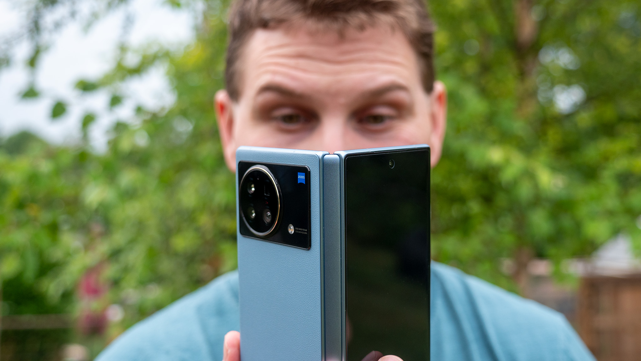
Any time a new technology is in the throes of infancy, it’s always fascinating to see the trajectory of innovation as products confer on an ideal design. Case in point, the Vivo X Fold ushers in yet another amazing large foldable phone that decimates Samsung’s Galaxy Z Fold 3 in almost every way. Yet, there’s almost no universe where this sells nearly as well as Samsung’s beast of a foldable.
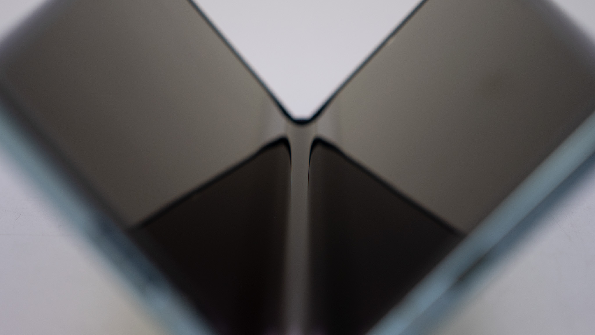
That’s a real shame, too, because the Vivo X Fold is easily the best foldable phone I could imagine using at this juncture of technology. The inner crease isn’t quite as “nonexistent” as the OPPO Find N, but it’s a far nicer-looking design than Samsung’s Galaxy Z Fold 3’s hinge. Plus, it folds completely flat, which is always a nice trick.
Couple that with some truly spectacular cameras around the back — which even includes a periscope camera for great zoom detail — and you’ll understand why Vivo’s first major foldable phone is a real winner. I’ve spent the past two weeks with it and, while this isn’t a full review because it’s largely a region-specific product, it left a lasting impression on me that I absolutely must talk about.
Bringing leather back
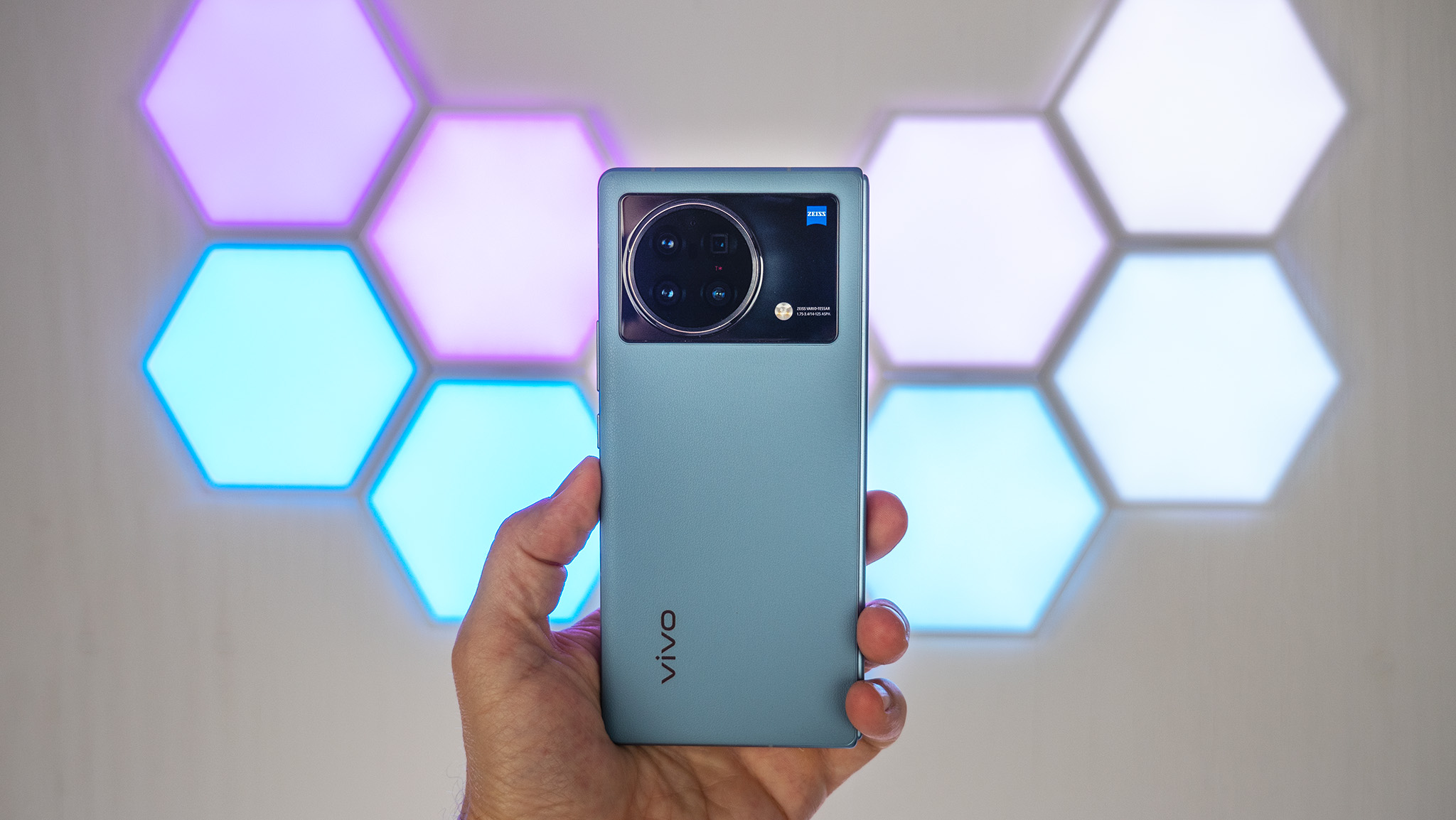
I’ve used a number of foldable phones up to this point in time, but none so far have attempted to bring back the “leather” trend from the smartphones of yesteryear. In fact, that was one of the very first things I noticed about the Vivo X Fold when I took it out of the box since, like all other foldable phones, it ships unfolded.
There’s just something special about that grippy, textured leather that I can’t get enough of. Heck, that’s why I slapped a cow on my Z Fold 3 with DBrand leather skins.
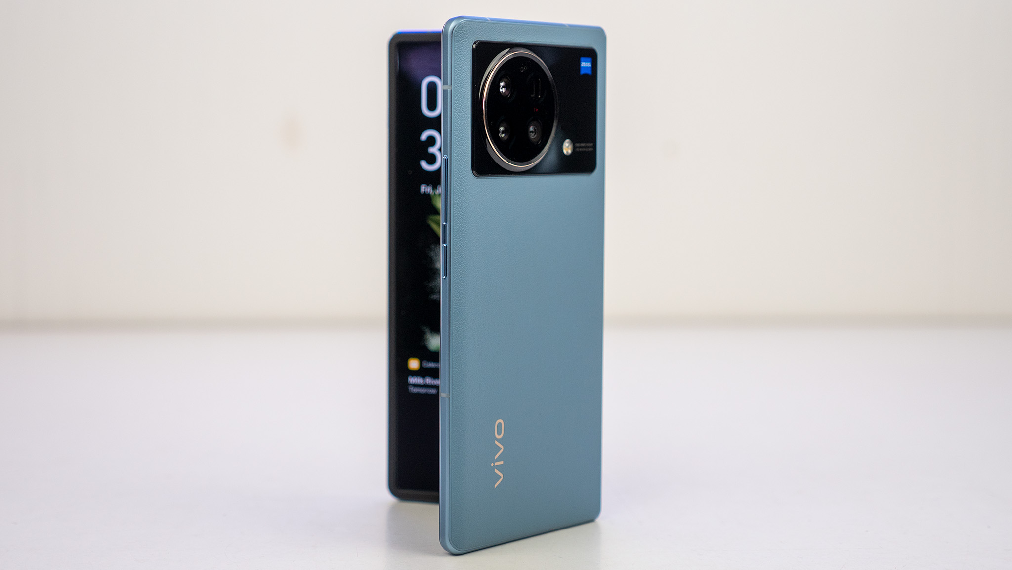
While the camera module on the Vivo X Fold is substantially larger than the three separated modules Samsung choose for the Z Fold 3, the hump doesn’t protrude any further than Samsung’s design. It’s also raised closer to the center, meaning the phone doesn’t wobble much when using the outer display while the phone is resting on a table.
| Category | OPPO Find N |
|---|---|
| Operating System | Android 12, OriginOS |
| Outer Display | 6.53 inches, 21:9 aspect ratio, 2520x1080 (419 ppi) resolution, 120Hz LTPO AMOLED |
| Inner Display | 8.03 inches, 5:4 aspect ratio, 2160x1916 (360 ppi) resolution, 120Hz LTPO AMOLED |
| Processor | Qualcomm Snapdragon 8 Gen 1 |
| Memory | 12GB RAM |
| Storage | 256GB or 512GB UFS 3.1 |
| Rear Camera 1 | 50MP, ƒ/1.8, 1.0µm |
| Rear Camera 2 | 12MP, ƒ/2.0, 2x optical |
| Rear Camera 3 | 8MP, ƒ/3.4, 5x optical |
| Rear Camera 4 | 48MP, ƒ/2.2, 114-degree ultra-wide |
| Front Camera (inner and outer display) | 16 MP, ƒ/2.5 |
| Security | 2x in-glass fingerprint sensor (inner and outer displays) |
| Battery | 4,600mAh, 66W wired charging, 50W wireless charging, 10W reverse wireless charging |
| Water Resistance | ❌ |
| Dimensions (folded) | 162 x 74.5 x 14.6 mm |
| Dimensions (unfolded) | 162 x 144.9 x 6.3 mm |
| Weight | 311g |
There’s no water or dust resistance, hence Vivo’s decision to use faux leather on the back.
It’s obnoxious to use when fully open sitting on a table — just like the Z Fold 3 — because it can’t sit completely flat.
Be an expert in 5 minutes
Get the latest news from Android Central, your trusted companion in the world of Android
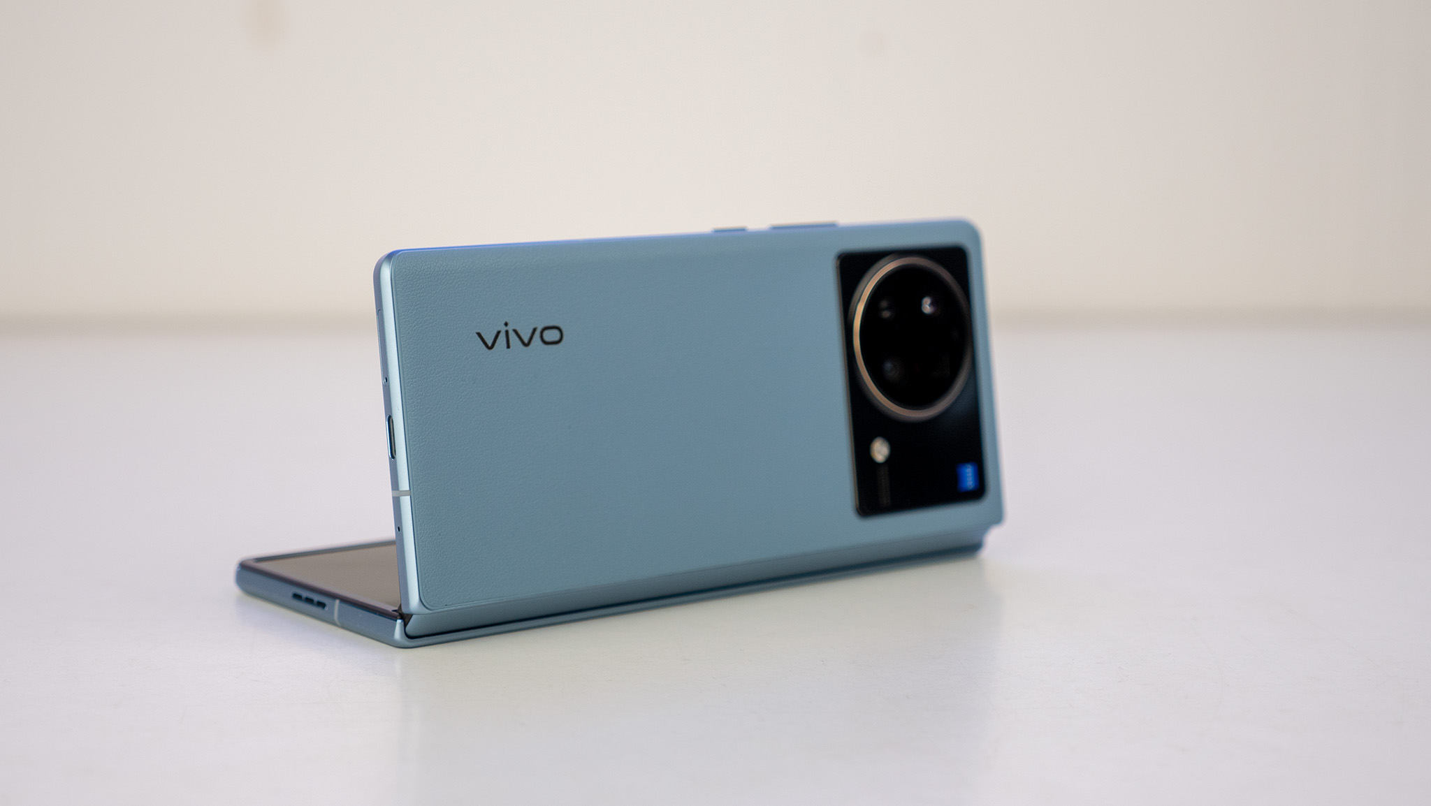
Vivo’s hinge design is similar to Motorola or OPPO’s in that it folds into a teardrop shape when the phone is closed. This serves twofold purposes; the first of which is that the phone folds completely flat when closed. Second, the display crease is substantially reduced when compared to the Z Fold 3. Time will tell if this is the case after a few months’ use but, for now, it definitely looks better.
The downside to a teardrop hinge is that there’s no water or dust resistance, hence Vivo’s decision to use faux leather on the back. At this point, it seems like you either have to decide between water resistance, or a crease on foldable phones.
While we’re still discussing points of contention, Vivo went the OPPO route and chose a more “normal” aspect ratio for the outer display on the Vivo X Fold. I like the Z Fold 3 for a lot of reasons — and one of them is the one-handedness a narrow outer display offers — but typing on that narrow outer display is a pain and a half.

Compact, this phone is not.
Vivo has that covered with this gorgeous outer display, which is big, beautiful, and comfortable to use. Comfort, in this case, will differ from person to person. I’m someone who loves big displays and wholly welcome the flood of tablet-sized foldables like the Vivo X Fold. Compact, this phone is not.
The inner display is also larger and more square than the Galaxy Z Fold 3’s inner display, which makes tablet-optimized apps feel even better. Apps that don’t quite fit on a 5:4 aspect ratio display can be adjusted to a 4:3 or 16:9 aspect ratio, whichever fits the app best. Instagram, for instance, only properly works on a 16:9 aspect or taller ratio (unless you enjoy viewing cut-off photos).
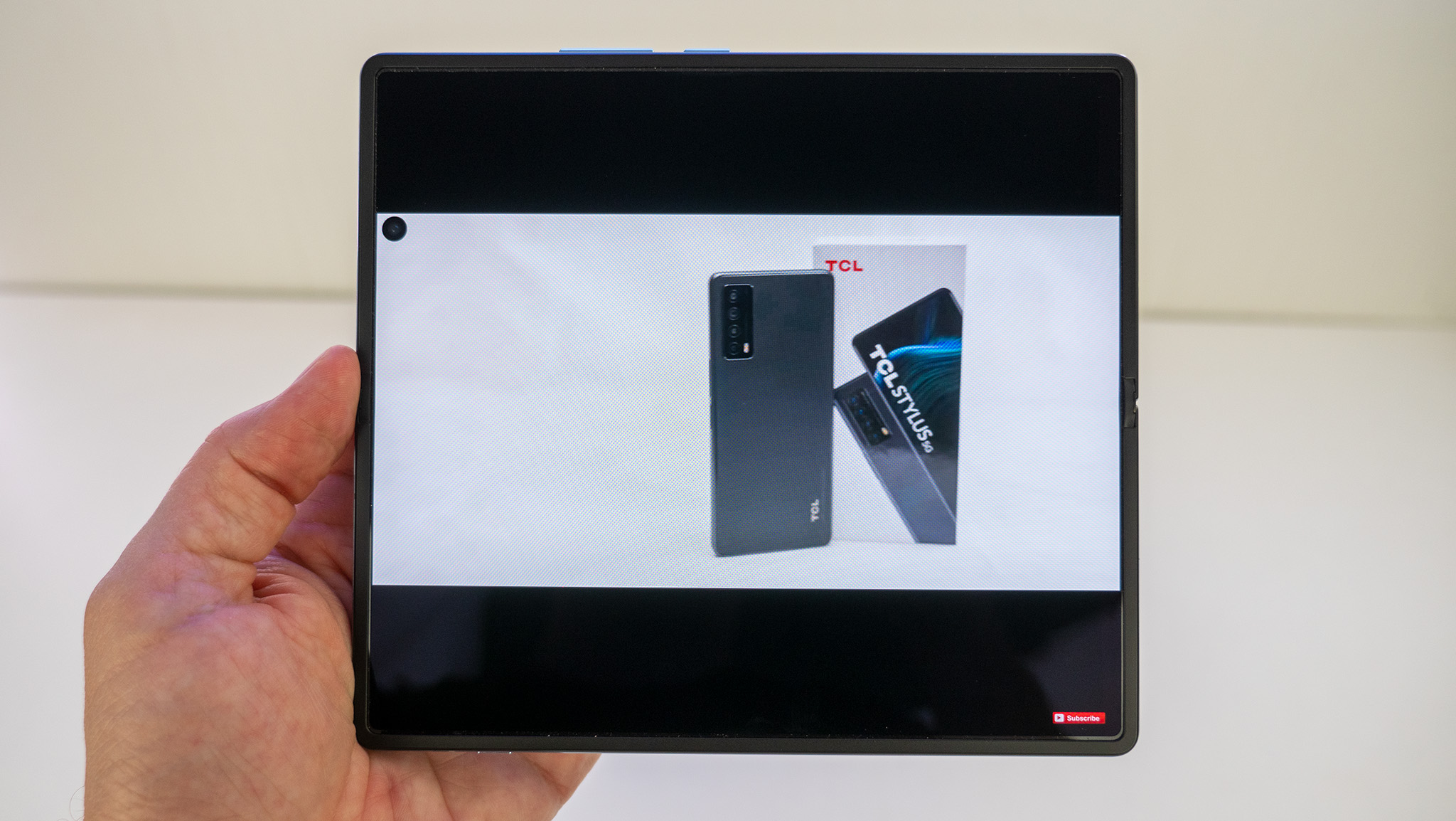
There’s no under-display camera anywhere on the Vivo X Fold, and while this would normally mean a pesky little dot is cut out of every full-screen app, Vivo purposefully darkens the status bar by default to help hide the dot. The downside here is that, when viewing apps in landscape mode, you either have to deal with a non-centered app or, for full-screen videos, an annoying dot on one side.
Despite that minor negative, there’s one big positive that might go unnoticed if you don’t hold the Vivo X Fold next to practically any other display: the anti-glare coating on the display. It’s hard to understand just how big a deal this is until you see it in person, but this image of the Vivo X Fold next to a Galaxy Z Fold paints the picture pretty well.
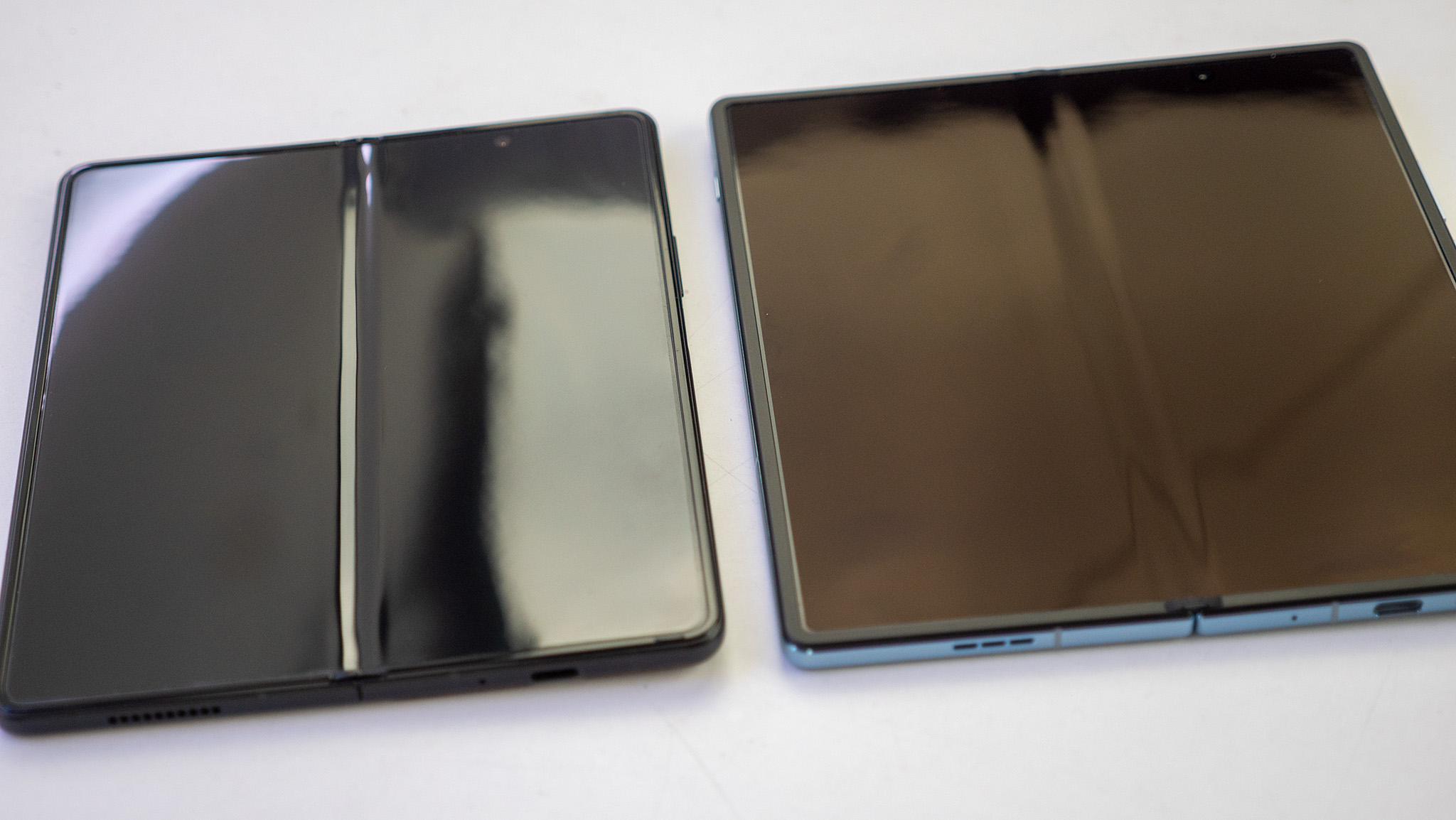
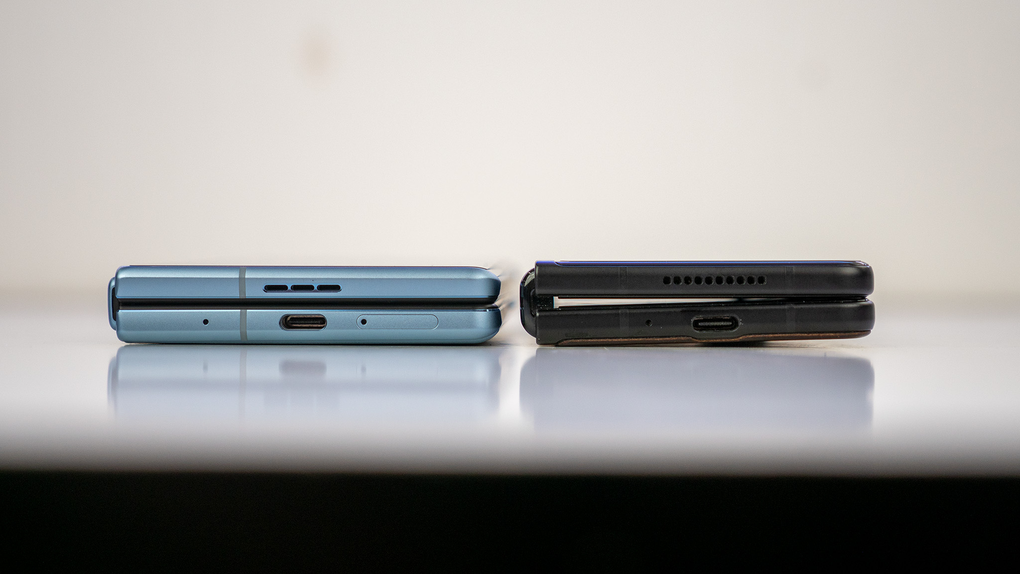
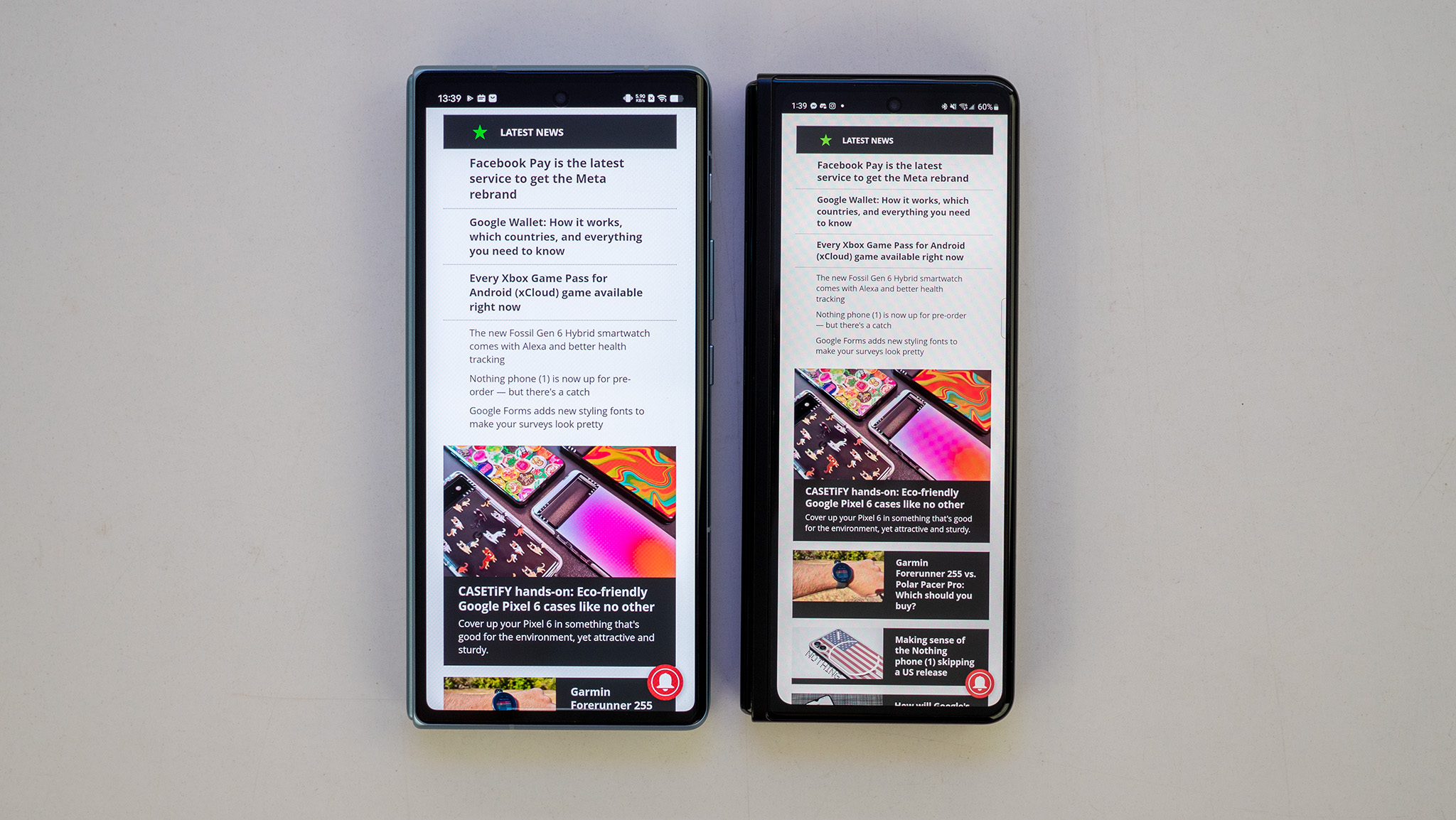
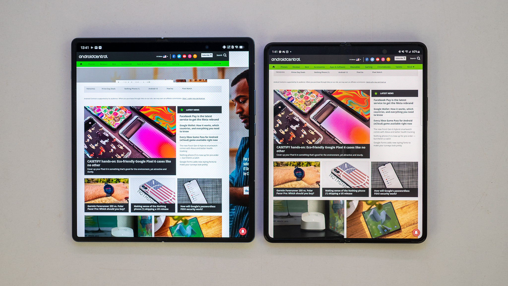
The same bright white light can be seen reflected in each display but, in the Vivo X Fold’s case, that same light’s brightness is substantially reduced. It’s a huge deal in any light, particularly, when viewing the screen outside.
Vivo also outfitted both the inner and outer displays with an under-display fingerprint sensor which, despite my initial misgivings, works incredibly well. I wasn’t sure how well this sort of setup would work when compared to the side-mounted fingerprint sensor on the Z Fold 3 — since that’s accessible via the same location no matter if you have it open or closed — but Vivo was careful to ensure the location of the scanner also doesn’t change so that you develop muscle memory.
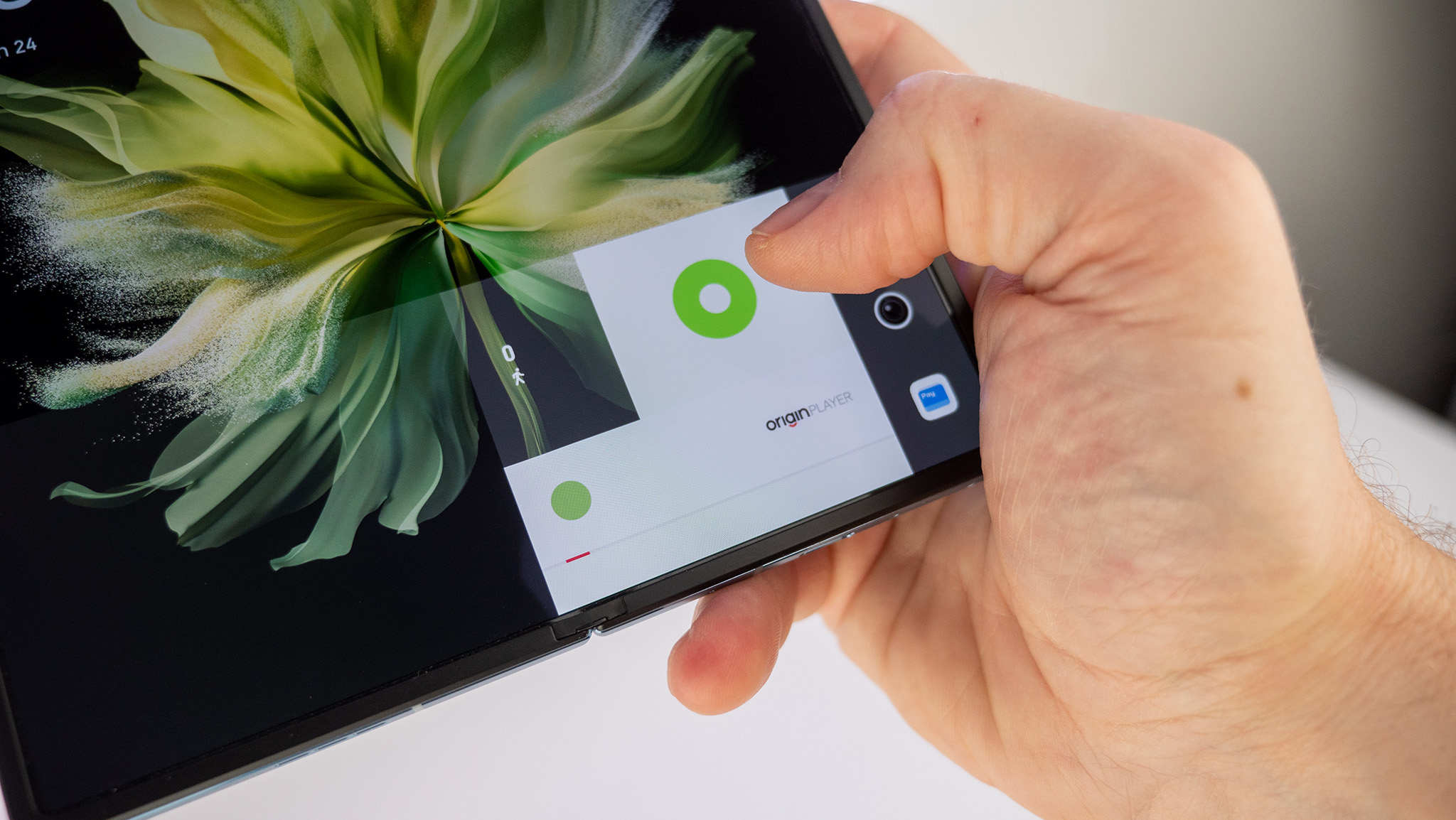
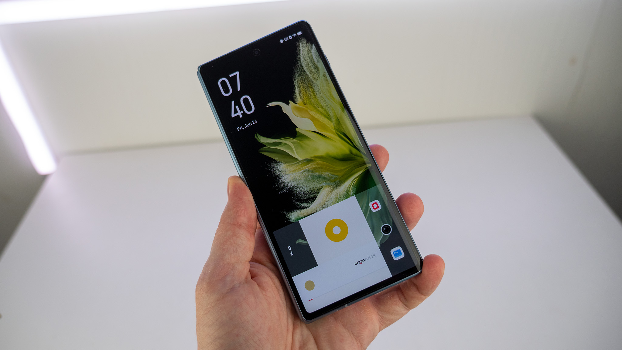
That in-display fingerprint sensor is also extremely fast and accurate. It’s just a quick tap on it and you’re in.
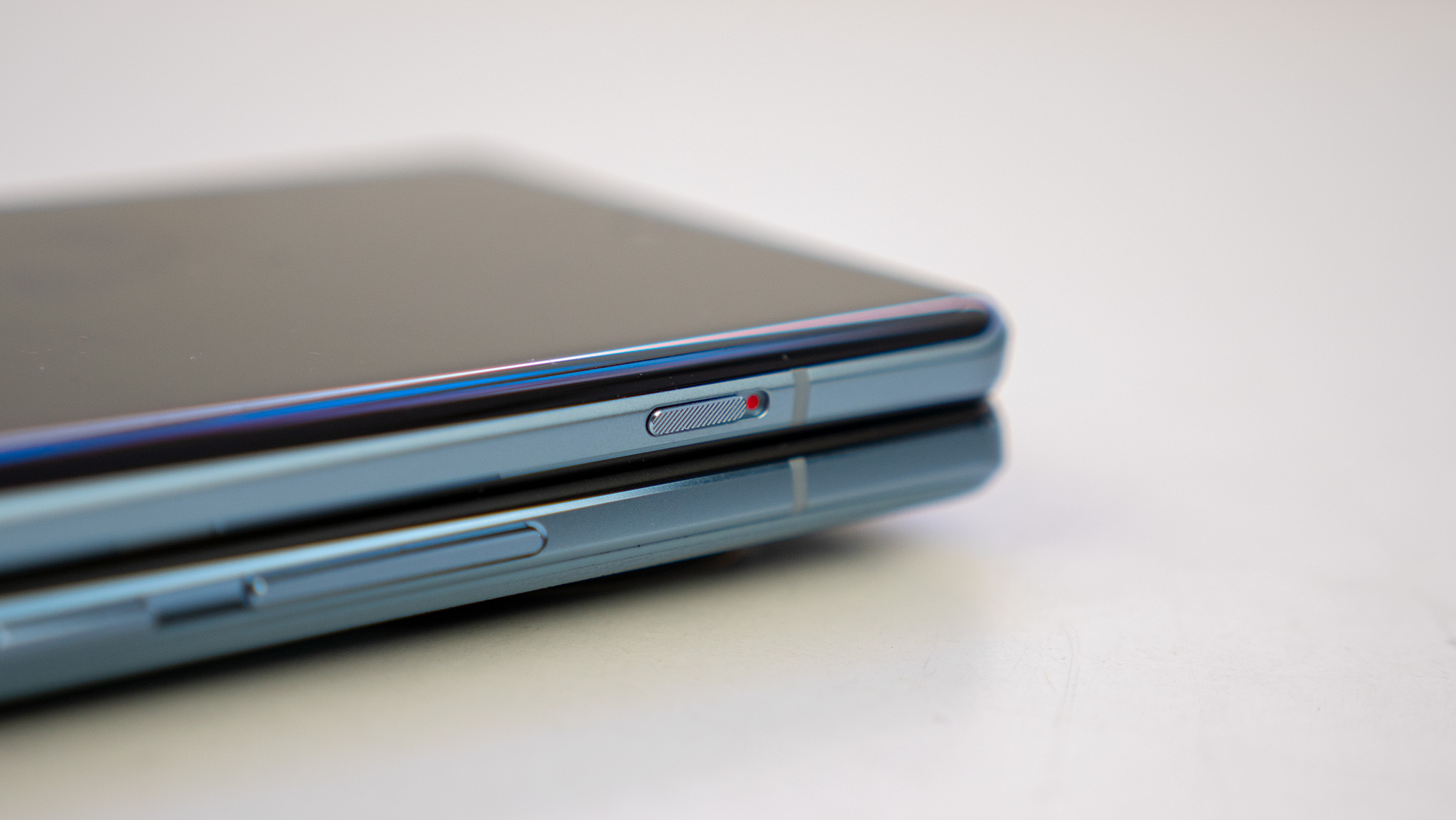
Lastly, the alert slider to toggle between ring and vibrate modes is always a welcome addition. The only issue is that it’s located on the outer display portion of the phone, so it’s located on the right side when closed and the left side when open. Not the end of the world but it’s aways nice to have consistency with the location of these sorts of things.
Software that makes sense
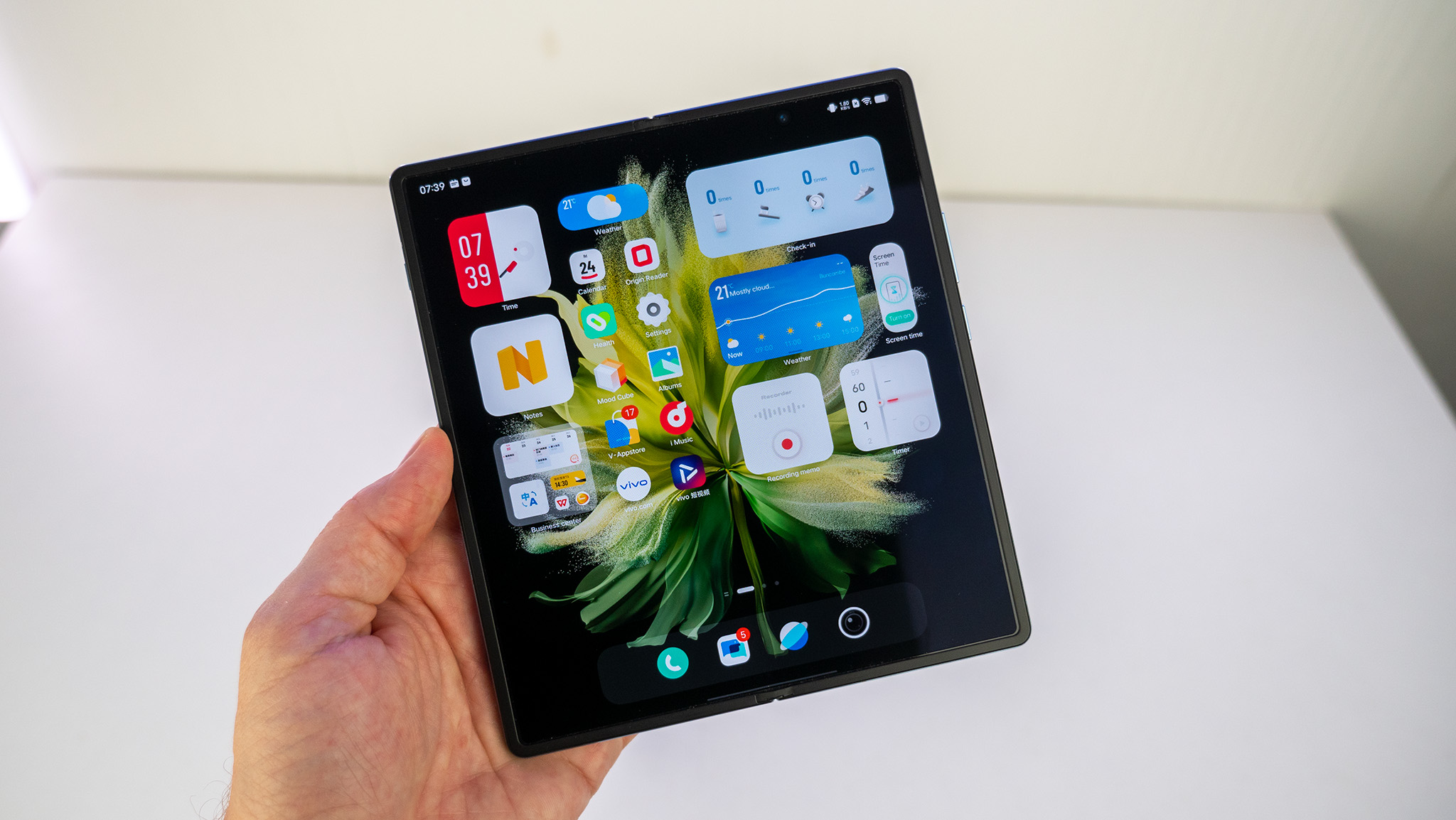
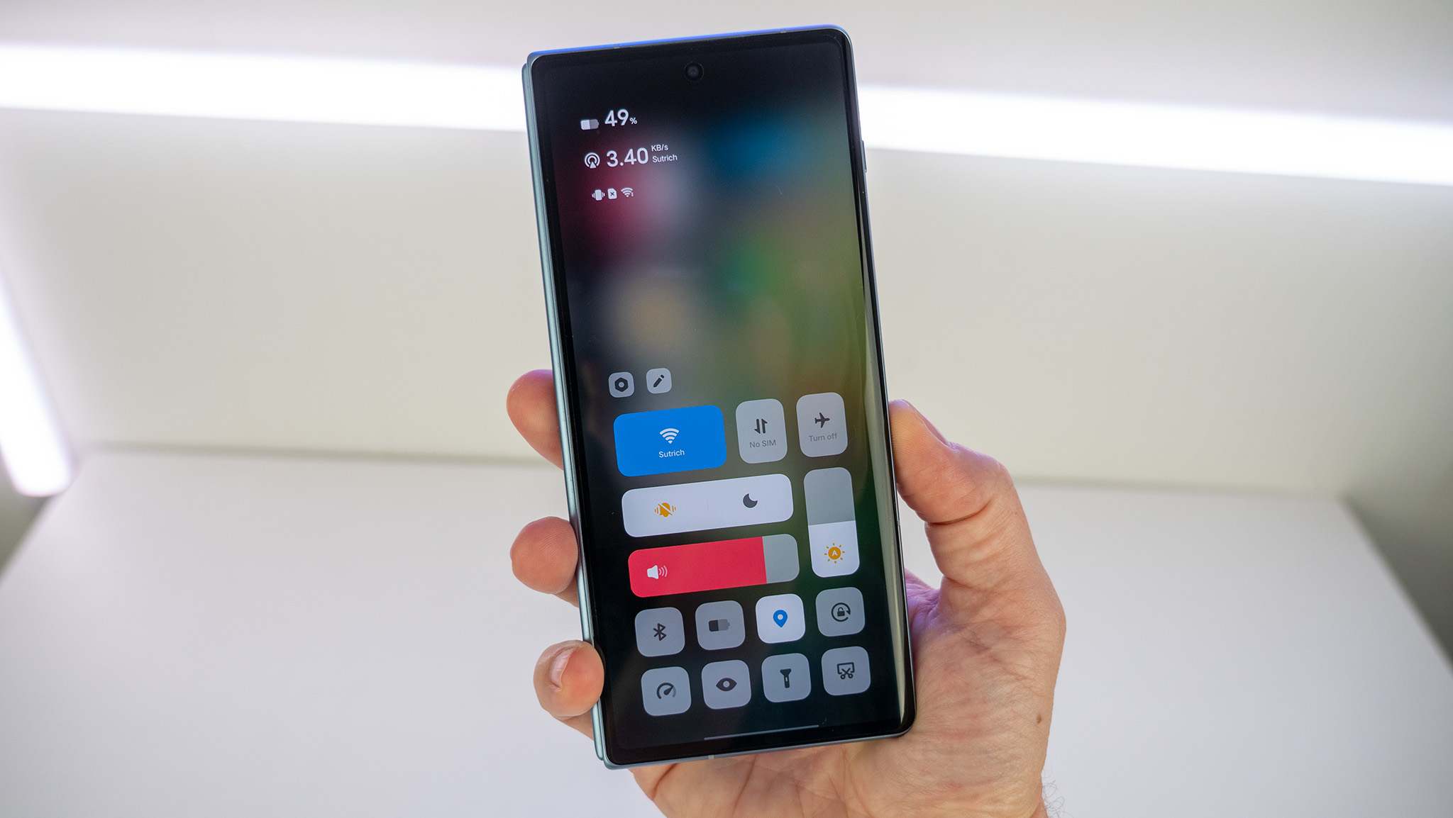
Anyone who has ever used a modern iPhone — that means one without a home button — will feel right at home with the UI design from Vivo. The notifications panel has been split so that pulling down from the status bar on the left side will show notifications, while pulling down from the right will bring up the quick toggles panel.
It’s iOS design through and through, but it’s not without its advantages. Giving a full-sized panel to quick toggles means you get one-swipe access to a larger number of buttons and sliders than Android’s usual design. While it’s not paginated, it does scroll vertically if you like to add a bunch of quick toggles to the list of viewable options.

Since this phone is generally designed for the Chinese market, Vivo’s OriginOS is only somewhat localized in different languages. Installing the Google Play Store on the phone is quite simple out of the box — all you need to do is install any Google app found in Vivo’s app store and the Google app will ask you if you also want Play Services installed — but there are some parts of the OS that are hard-coded in Chinese, and are difficult to use if you can’t read the language.
Outside of that, OriginOS is an extremely friendly, easy-to-use flavor of Android that feels very purpose-built for the folding experience. Vivo’s home screen design is chock full of useful widgets from the get-go, and it’s obvious the company spent time thinking about how to make the home screen more useful in many ways.
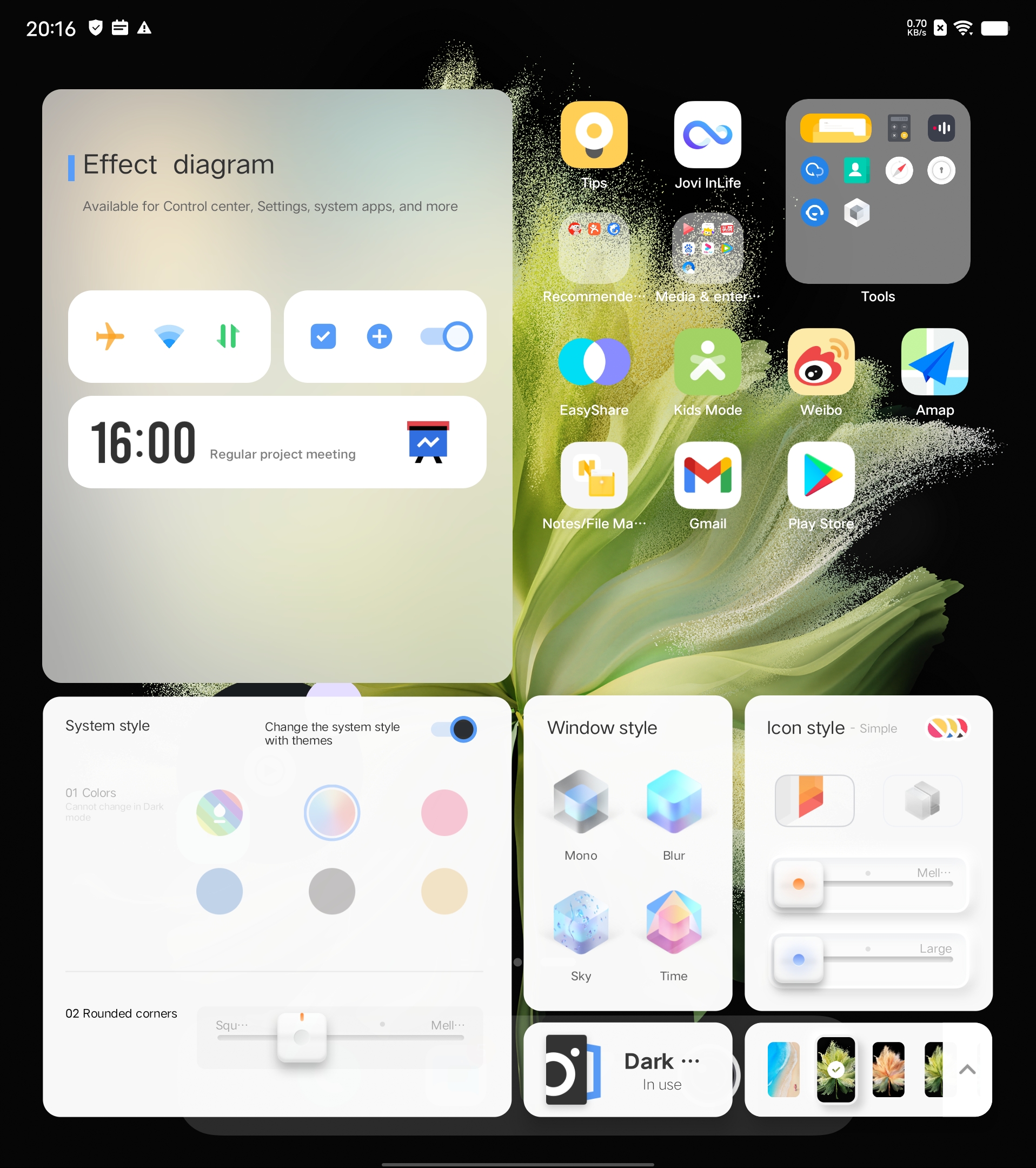
It’s also highly customizable, including a bevy of options for theming in what Vivo calls the Mood Cube — a single pane of glass where you can change the icon style and shape, system colors, wallpaper, and overall themes. It’s a nice way to make use of all this screen space so users can see everything without scrolling.
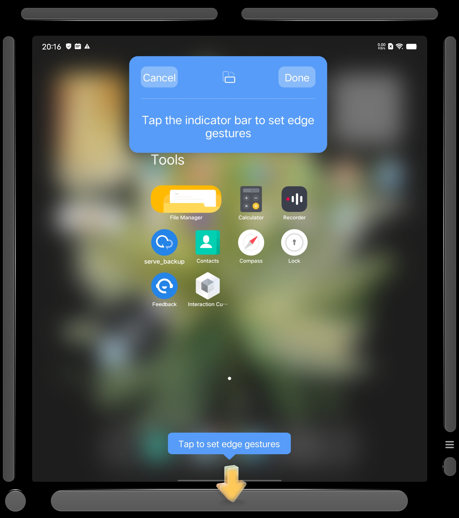
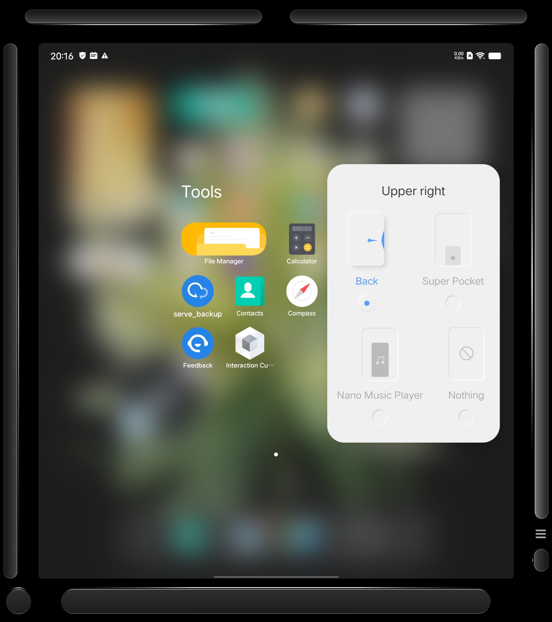
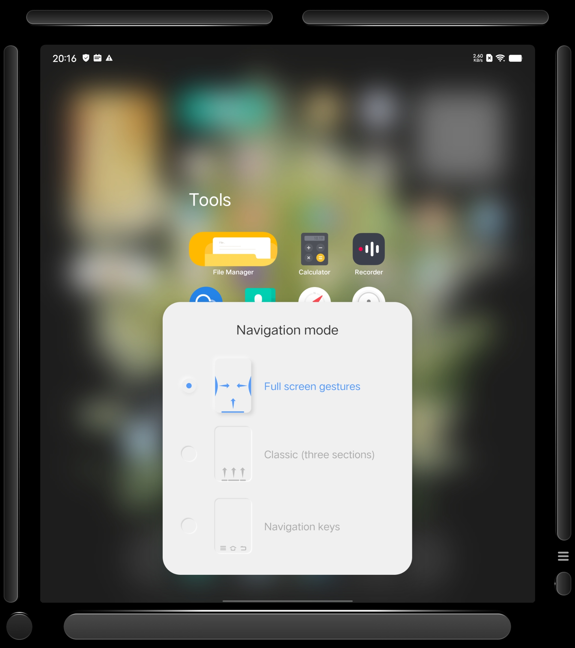
You can even customize the gesture areas around the periphery of the display to an extent by long-pressing on the home screen and tapping the highlighted areas around the edge of the display.
Really, the number of options on the Vivo X Fold are almost overwhelming at first. Every sub-menu in settings seems to have dozens of other sub-menus filled to the brim with features and niceties. I often wonder if all of these features are necessary but, at the least, they certainly offer up something for everyone.
Finally, a foldable with a great camera
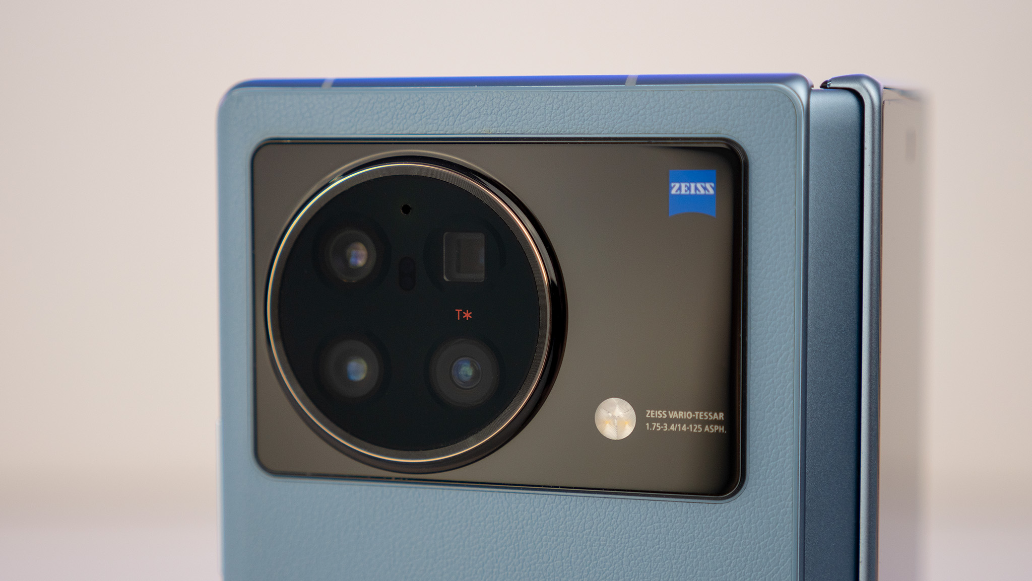
In this section, I'll mostly let the pictures do the talking. In a nutshell, Vivo prioritized camera quality on the X Fold in a way Samsung simply didn't. The Vivo X Fold sports four dedicated cameras on the back that deliver a superb experience in any light. Thanks to dedicated 2x and 5x lenses, the Vivo X Fold also features far greater zoom detail than the Samsung Galaxy Z Fold 3 could ever hope with its 1x and 2x cameras.
The series of photos below of a building in New York City shows just how far the Vivo X Fold can zoom in without losing any detail. Things really only become muddy when zooming in beyond 30x.




Compared with the Galaxy Z Fold 3, there's really no contest when zooming in beyond simple 2x enhancements.
I also found the Vivo X Fold's color and white balance was generally a bit better, as can be evidenced by the lovely greens and blues present in this shot below.
Vivo's processing on its wide-angle camera was a little more aggressive and often resulted in a slightly softer picture than what the Samsung Galaxy Z Fold 3 delivers, although I still prefer the colors in the Vivo shot.
Things take a turn in Samsung's favor with the front camera — that's the one on the smaller screen when either phone is closed — where Samsung's camera both offers a cleaner-looking photo, and one with better white/color balance. Samsung also offers a wide group-style shot, which offers a perspective closer to Vivo's default here. These are both the default capture options.
And the favor flips right back to Vivo once either device has been opened. Samsung's under-display camera is a great-looking way to hide the camera on the big display, but it negatively affects camera quality in a huge way.
As has been the case for a few generations now, companies like Vivo love to come up with niche camera modes that are only useful in one or two scenarios, but those scenarios create compelling imagery that make swiping over to them worthwhile. This mode is called Supermoon, and it takes a gorgeous low light shot and super-imposes a zoomed version of the moon in the sky.
Here's a comparison of a regular auto mode shot compared with a Supermoon one. I took these photos right after each other at dusk.


Proof that we need competition
Unfortunately, for foldable enthusiasts, getting your hands on a Vivo X Fold isn't the easiest or cheapest thing in the world if you don't live in China. Like the OPPO Find N, Vivo isn't planning on a big International release for the X Fold, and that's really a huge shame.
While the Vivo X Fold doesn't one-up Samsung's Galaxy Z Fold 3 in every way — two notable exceptions are lack of water resistance and no support for a stylus of any kind — it does improve the experience over Samsung's hardware in substantial ways. Better cameras, a reduced display crease, the ability to fold completely flat, and that lovely faux leather back are just a few highlights, not to mention the change in screen size and aspect ratio versus the Fold.
At some point, we'll have more foldables readily available for people to buy, but for now, it's great to see more excellent devices make their way to market — even if that availability is quite limited in scope.

