One UI 7 Beta first impressions: An early Christmas present from Samsung
One UI 7 is a shiny new update making Samsung phones feel fresh and new again.

Android Central Labs is a weekly column devoted to deep dives, experiments, and a focused look into the tech you use. It covers phones, tablets, and everything in between.
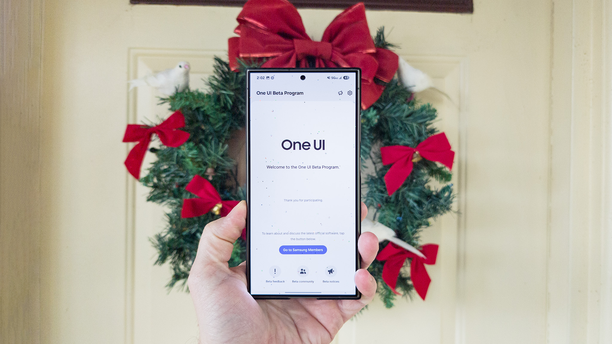
The Samsung One UI 7 beta program is fully underway, having just released its second beta that's filled with bug fixes for all eligible Samsung Galaxy phones. I've been using it on my Samsung Galaxy S24 Ultra and am already convinced this is the best version of One UI Samsung has made in a very long time.
The latest beta is all about fixing bugs, but there are so many new features in One UI 7 that it's hard not to sift through them all to find my new favorites. Samsung is doing a lot to cater to long-time fans and folks who dislike One UI by doing what it does best: offering options for every imaginable preference.
So, what's it like to use One UI 7? Exceptional in most ways, thankfully.
A new UI
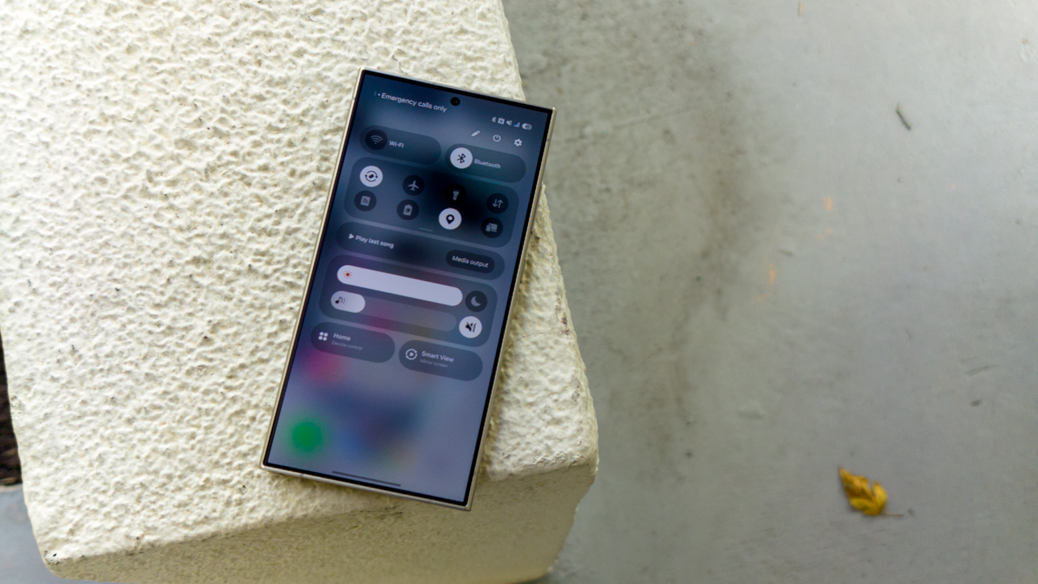
Right off the bat, seasoned Samsung users — and there are a lot of you out there — will immediately notice that Samsung has split the notification shade by default. This means that pulling down on the right side of the status bar brings up a full screen of quick toggle buttons and sliders while swiping down on the left side of the status bar brings up notifications. It's exactly like an iPhone.
I can see a lot of people getting really frustrated with this new default behavior, and I'm not sure it's my favorite decision ever. On the bright side, you can quickly move between the two panels with a horizontal swipe, so it doesn't take much effort if muscle memory kicks in and you need to get to the other panel.
Thankfully, you can change it back to the original single-panel behavior, but you'll need to hit the pencil button in the quick toggles pane and swap back over. It's a little bit hidden, and I think Samsung needs to surface it a bit more. I tried the new split pane for a while, but I really don't like it, so I made the switch back to the Android-style behavior.
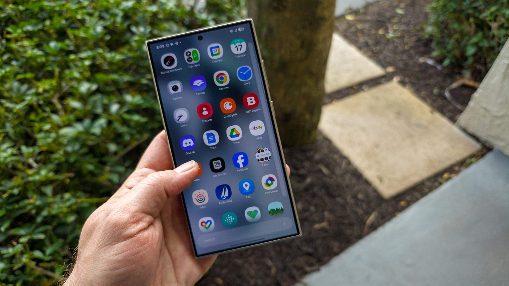
Finally! A vertical app drawer by default!
The next thing you'll likely notice is the vertical app drawer. Ironically, while Samsung is copying Apple with the default split notification pane, it's going with a more Android-like experience with the default app drawer layout. If you don't like this, you can switch back by choosing the "custom" sort order. It's a weird wording choice and I think Samsung needs to just change it to "vertical" or "horizontal" to avoid confusion.
Be an expert in 5 minutes
Get the latest news from Android Central, your trusted companion in the world of Android
The new vertical drawer is wonderful, though, and even has a scroll bar on the right for quickly moving between apps, all sorted alphabetically by default. The vertical app drawer is a massive improvement that makes One UI instantly feel like it was developed in the 2020s rather than the 2000s.
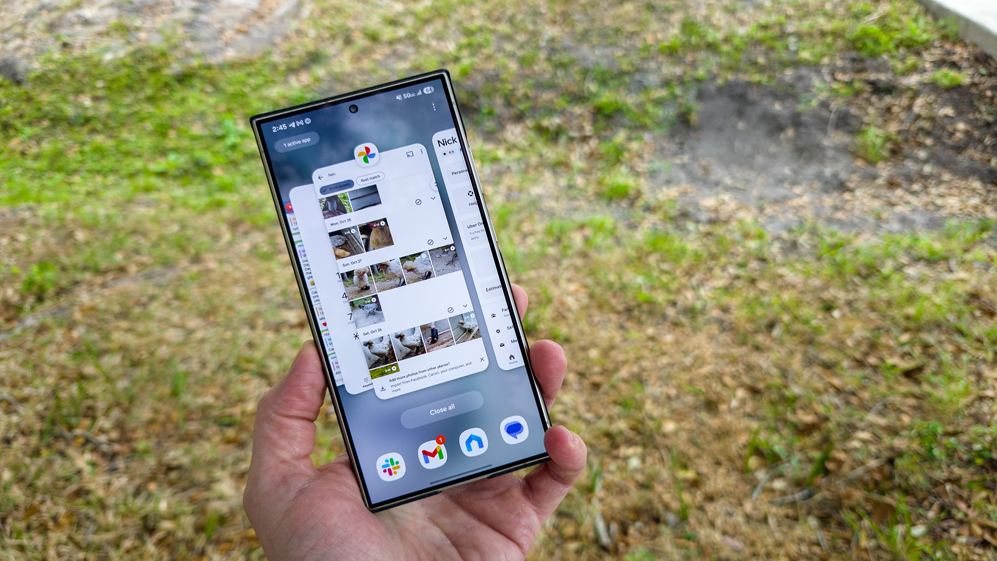
The new multitasking UI is SO MUCH BETTER than Google's awful default design in Android.
The third huge thing you'll notice is the new multitasking UI, which finally lets you see more than one app tile at a time. Instead of spacing tiles out horizontally and making the middle one take up most space, Samsung now arranges tiles in a 3D carousel so you can peek behind and easily see apps ahead as you scroll through the list.
The active app immediately moves to the right of the screen so you can quickly juggle between multiple apps. Of course, this design is nearly identical to the iOS style of multitasking that has existed on iPhones for over a decade, and it's about time, too.
Google launched the old horrendous layout with Android 9, and I never understood why the company kept it for as long as it did. It's not a multitasking UI if you can only see one app at a time. This at least does a lot to fix that, even if it's a blatant iOS ripoff.

Good Lock isn't ready yet, so what you see is what you get until then.
If you want any of the other multitasking styles, you'll have to wait until Good Lock's Home Up module gets updated for One UI 7 compatibility, likely after the final OS launch, which is expected in January.
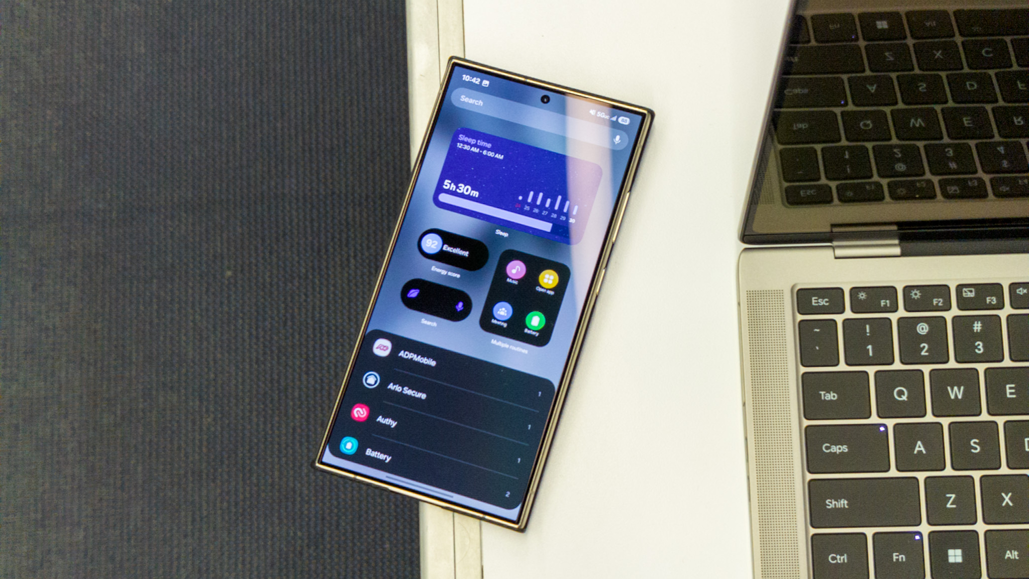
Other refreshes around the OS include new icons, updated fonts, a new battery indicator that looks super swanky, and plenty of new widgets you'll definitely want to play around with. I particularly love the countdown widget, which lets you pick a specific date on the calendar and drop it on your home screen to build anticipation.
Not quite nailing the feeling
While the new UI changes are mostly positive with a few controversial decisions, the "feeling" you get is something of a non-measurable category. If I compare One UI to something like OxygenOS 15, for instance, Samsung's user experience still doesn't feel like the best of the best.
Haptics, for instance, still feel weak and are often missing in important places and it makes the experience feel so vacant compared to my OnePlus 12. Moving the brightness slider or clearing notifications on a OnePlus phone delivers satisfying haptics that make them feel like physical buttons or sliders, while Samsung's UI doesn't vibrate or feel responsive at all.
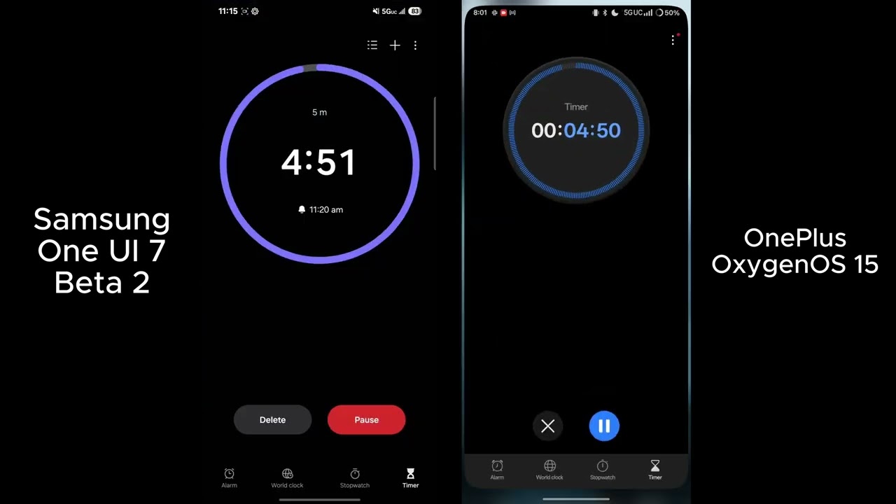
Animations in One UI 7 aren't anywhere near the caliber of OxygenOS 15 on the OnePlus 12. For instance, when you set a timer and swipe home on OnePlus's OxygenOS 15, the app will "minimize" to the status bar in a super slick way. When you click the timer, it then warps and enlarges into the app when you click it. This is better shown in motion, which you can see below.
Samsung's new animations still aren't the same caliber that can be found in OxygenOS 15, and haptics in One UI 7 still feel vacant and hollow.
However, in One UI 7, the app just slides down and away without any pomp. Clicking the live notification timer in the status bar just opens the app in the standard way. No pizazz. Nothing fun is happening at all.
What I will say is that Samsung's new Live Notifications are a great riff off of the iPhone's Dynamic Island that I've been craving. But instead of just copying Apple, Samsung improved on the concept by making the notification "pill" appear at the bottom of the display where it's most clickable.
You'll see this new pill on the always-on display or the lock screen, making it easy to quickly pause that timer or take actionable information for a supported app. Otherwise, the little pill lives in the status bar on top, so you can see it at all times without it taking up any more room than the status bar ever does. Bravo, Samsung.
Ten thousand features
As you might expect from Samsung, the new features list for One UI 7 is a mile long. While some beloved features were removed, the new OS version is packed full of things you might only use a handful of times but, ultimately, will find useful when you get the chance to use them.
There's something here for everyone, even if you only find yourself using it once in a blue moon.
One example is moving all calendar entries to a new calendar instead of having to do it one by one. If you're sharing a file over Quick Share and it fails, you'll now be offered the option to transfer it using an internet connection instead of having to redo the transfer.
Notifications will also stack when an app gives you a bunch at a time. This is handy for when you have multiple Gmail accounts, for instance, as you'll get one instance of Gmail in the notification shade but can easily swipe down on it to see everything.
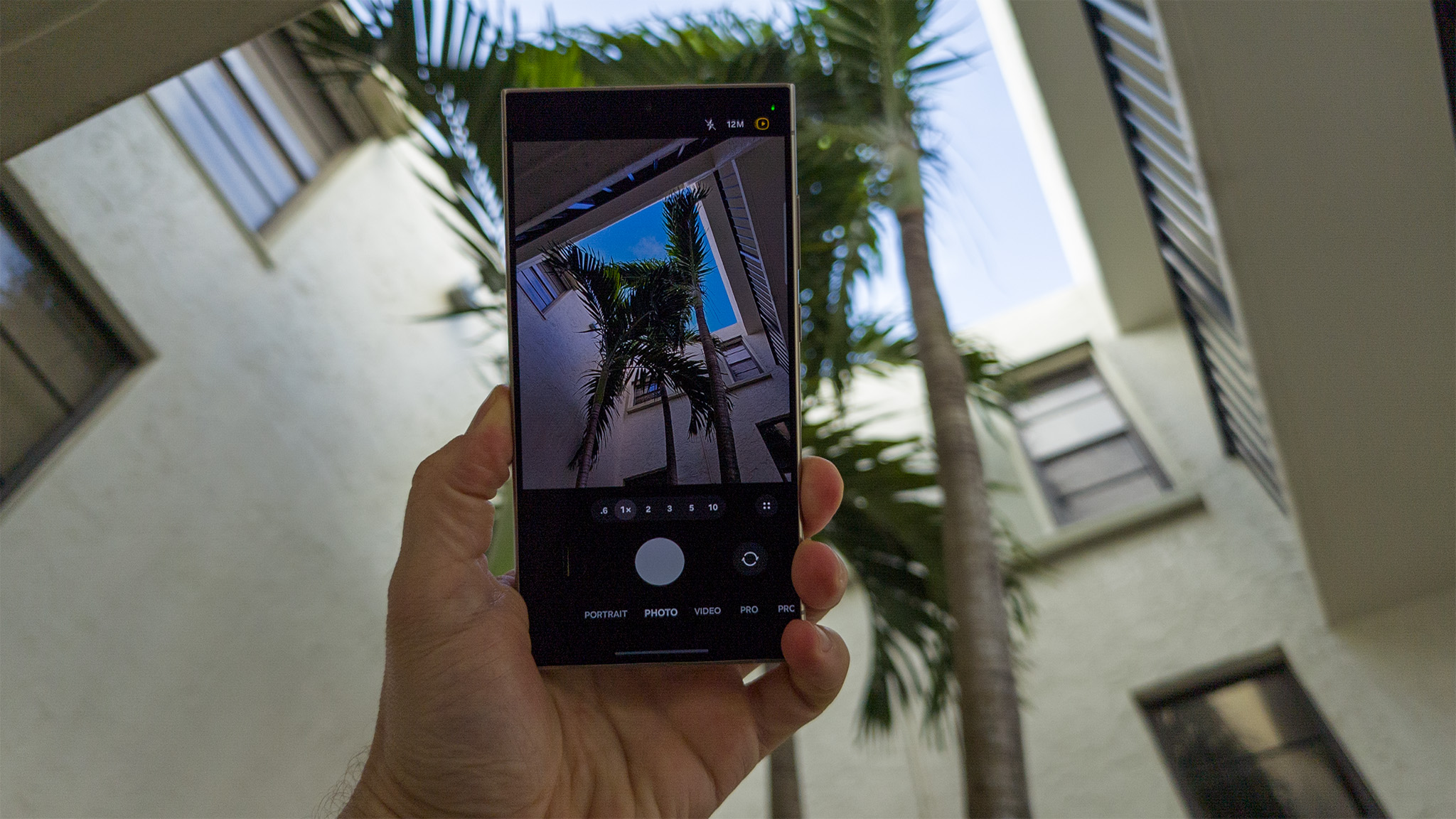
Even the camera got some love, although I'm not super crazy about everything. The camera has a 2x zoom button right on the viewfinder, adding to the list of .6, 1, 2, 3, 5, and 10x zoom options to instantly get where you want without having to scroll. Samsung even added fun new effects for live photos so you can quickly turn them into a Boomerang or slow-motion preview of your photo.
Still a work in progress
One UI 7 isn't perfect, but I think it's a huge step in the right direction for Samsung. One UI has felt a bit dated for a while now and needed some updating to feel modern again. I'm glad to see Samsung not only taking feedback but also being willing to make much-needed changes for UI elements that have been around for way too long, like that terrible horizontal app drawer.
This is only the second beta release for One UI 7, and the next release of the beta is expected to fix more bugs that'll likely crop up; plus, it could make a few tweaks based on user feedback in the beta program. Most likely, we'll see the next beta update pop up before the year ends.

You must confirm your public display name before commenting
Please logout and then login again, you will then be prompted to enter your display name.
