Why you can trust Android Central
To say that Samsung turned its software efforts around in the last four years would be an understatement. The introduction of One UI back in 2018 was pivotal in doing so; it laid the groundwork for Samsung to overhaul its software from the ground up, offering an interface that was modern and clutter-free.
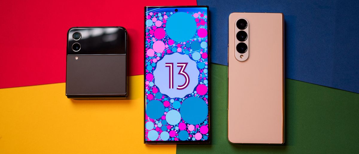
With the Android 13-based One UI 5, Samsung is refining the overall design aesthetic while introducing a few new features that make the interface that much more usable — similar to what Google did with Android 13. You'll find tweaks to Material You, a new customization feature that makes it easier to change the look and feel of the lock screen, new gestures for multitasking, call backgrounds, and a whole lot more.
Samsung has to be cognizant of making broad changes to the UI; as the largest Android manufacturer, it has an addressable userbase that's significantly larger than every other phone brand. As such, Samsung has to do a delicate balancing act where it rolls out new features while maintaining legacy features that are core to One UI. And with One UI 5, Samsung managed to do just that.
One UI 5 goes all-in on Material You
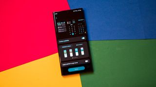
For the most part, One UI 5 is largely identical to One UI 4.1, with Samsung not making too many alternations to the interface. That said, the UI feels much more fluid this time around, with smoother transitions throughout the UI. This is an area where One UI lagged behind the likes of ColorOS and MIUI, so it is good to see Samsung do the legwork to optimize the interface.
The biggest visual change has to do with Material You integration throughout the interface, including the calling menu, volume picker, and all the first-party apps. Samsung didn't go overboard here, instead opting to add a pop of color to better accentuate the design. Like in Android 13, you get to choose between 16 color palettes for accent colors (Android 12 had just four) and these change based on your home screen background.
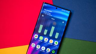
On that note, Samsung added more backgrounds for home and lock screen customization. You can also use the color palette with app icons, and it is just as wonky as the Pixels. The best part about Samsung's implementation is that you can disable the color palette entirely, so if you're not a fan of the bright colors throughout the UI, you can use this mode to switch back to a more understated design.
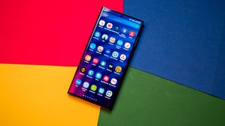
One other change I like is the background blur effect; it's more consistent across the notification pane, overview menu, and app drawer, and it uses the dominant color in the currently-selected color palette. Rounding out the visual changes, Samsung added a new call background feature that adds dynamic backgrounds (including AR emojis, if that's your thing) to the calling menu, and the best part is that these can be customized to individual contacts.
Notification management is straightforward
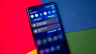
Samsung introduced a few tweaks to the notification pane in One UI 5, and the biggest change is large app icons with much better readability. One UI 4.1 had monochrome icons that were the same size as the notification text, and Samsung is making amends with One UI 5.
The notification shade itself hasn't changed as such, and Samsung (thankfully) continues with a split layout with quick toggles at the top and notifications at the bottom.
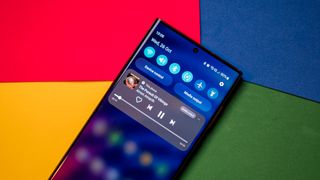
Google introduced a task manager to the bottom of the notification shade that shows all apps currently active, but that isn't available in One UI 5 as the shade goes all the way to the bottom of the screen with a dual pull-down gesture. Samsung instead tucked it away in the overview menu, and it shows just background apps.
Samsung didn't change the media player that's tucked into the notification pane; it is identical to the One UI 4.1 option, and that's just fine.
A big change around notifications in Android 13 is opt-in notifications, and One UI integrates the feature. You'll see a dialog box the first time you open an app to give it the authorization to send notifications. This only works if you're using a fresh build of One UI 5 or for any new apps installed on your phone; if you're switching over from One UI 4.1, the notification settings are carried over as is.
Finally, you get granular control over whether an app can show pop-up notifications or icon badges.
Customize the lock screen to your liking

Samsung has always offered a lot of customizability for the lock screen, and with One UI 5, it is adding a suite of new features. First up is the ability to change the clock style, shortcuts, notifications, and background directly from the lock screen instead of having to go into the settings.
There's much more customizability as well, with Samsung adding a host of new fonts and backgrounds, and the ability to make clips of your own videos to use as the background. It is similar to lock screen customization in iOS 16, and while Samsung had most of these features in Good Lock, it is making them much more accessible to a broader audience with One UI 5.
On that note, the feature isn't as intuitive to use as iOS 16; you will have to press and hold on the lock screen and then enter your passcode to launch the customization page.
One UI 5 has useful camera features
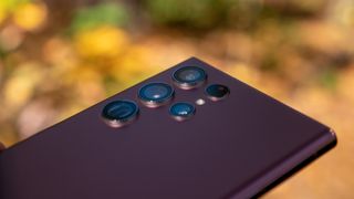
Every new One UI release includes camera tweaks, and it's no different with One UI 5. The camera interface itself hasn't changed, but there are a few subtle alternations: the zoom bar is smaller than before and easier to use one-handed, all the filters are now in a single location, and you get useful hints when using Pro mode for taking photos and videos.
For phones that have a telephoto lens, you can now use the module with Food mode. There's also the option to watermark photos with time, date, and any custom information, like the name of the phone.
The big addition this time is text extraction; whenever there's text in an image — either in the viewfinder or the gallery — you'll get a message to automatically extract that text. The best part is that One UI serves recommendations for that text, so if you take a photo of a signage that has a phone number on it, you can just tap to call the number. This feature works not just in the Gallery but also on Samsung Internet and Keyboard.
Multitasking is easier than ever
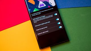
Google made it harder to access split-screen multitasking in Android 13, but Samsung is thankfully not following suit. In fact, multitasking is easier than before thanks to a new gesture — swiping upward with two fingers from the bottom of the screen automatically pulls up split-screen multitasking. This is very convenient if you're using a large phone like the Galaxy S22 Ultra, and I'm glad Samsung finally introduced a gesture for multitasking.
In a similar vein, you can switch between full-screen and pop-up modes via a swiping inward gesture with one finger from either corner at the top of the screen. Both of these gestures need to be enabled in the settings, and you'll need to go to Advanced features -> Labs to do so. You can also choose an app from the overview menu to launch in split-screen mode.
Bixby Routines is now Modes and Routines
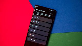
Samsung is divesting itself of Bixby, and the latest change has to do with Bixby Routines. It is now known as Modes and Routines, and as the name suggests, it sees the introduction of modes that automate actions, like engaging Do not disturb when switching to work mode, and so on.
There are five modes by default, and you can customize each mode to kick in at a particular time or location. You can then trigger an action that includes opening an app, changing the phone's power profile, and so much more. For instance, you can set up Driving mode to launch Google Maps as soon as it's active.
There isn't much new on the routines front, and you'll find useful routines on the Discover page that sits to the left of the home screen. You can also trigger more actions via routines, and the active routine will be highlighted on the Routines screen.
What else is new?
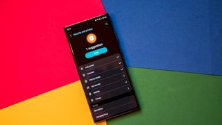
One UI 5 is packed with loads of small features, and here's a short rundown of some of the new additions in the interface:
- It's easy to stack widgets of the same size; just drag a widget onto an existing widget on the home screen.
- You can now add individual contacts to override DND settings.
- You can change language preferences for individual apps, a nifty addition if you're bilingual.
- There's a unified dashboard for security and privacy settings, giving you all the information on a single page.
- You'll find a Notification Settings button at the bottom of the notification pane that lets you manage notification settings.
- The Digital Wellbeing dashboard has been refreshed and is in line with Android 13.
- The Connected devices page gives you an overview of all the features that are designed to work with other devices, including Android Auto, Samsung DeX, Smart View, Quick Share, SmartThings, and Link to Windows.
- The Media output button within the notification pane now shows Chromecast targets, making it easy to stream music to a Cast-enabled device.
- One UI 5 lets you set several timers at once.
One UI 5 is coming to a Galaxy near you
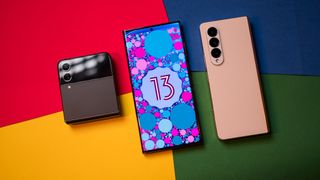
Samsung took a little bit longer than usual for the One UI 5 beta program, but the stable build is now available and rolling out to the Galaxy S22 series around the world.
The brand has shared its official release schedule for One UI 5, with the best Samsung phones and latest mid-range Galaxy A devices getting the Android 13 update in November:
- Galaxy Z Fold 4
- Galaxy Z Flip 4
- Galaxy Z Fold 3
- Galaxy Z Flip 3
- Galaxy S21/S21+/S21 Ultra
- Galaxy Note 20/Note 20 Ultra
- Galaxy S20/S20+/S20 Ultra
- Galaxy Tab S8/S8+/S8 Ultra
- Galaxy Tab S7/S7+
- Galaxy Quantum 3
- Galaxy A53 5G
- Galaxy A33 5G
That's followed by older Galaxy Z and Galaxy S models, and most of the Galaxy A portfolio in December:
- Galaxy Z Fold 2
- Galaxy Z Flip 5G
- Galaxy S20 FE
- Galaxy Tab S7 FE/S7 FE 5G
- Galaxy Tab S6 Lite
- Galaxy A Quantum/Quantum 2
- Galaxy A52s 5G
- Galaxy A51 5G
- Galaxy A42 5G
- Galaxy A32
- Galaxy Jump/Jump 2
And as we head into January, these devices will switch to the Android 13-based build:
- Galaxy Tab A8
- Galaxy Tab A7 Lite
- Galaxy Tab Active 3
- Galaxy Buddy 2
- Galaxy Wide 6
- Galaxy Wide 5
- Galaxy Buddy
- Galaxy A23
- Galaxy A13
- Galaxy M12
- Galaxy XCover 5
One UI 5 strikes the right balance

Following the launch of the first version of One UI back in 2018, I wrote that the onus is on Samsung to lead the way for software updates on Android. Four years on, it is the brand to beat in this area; Galaxy phones get more software updates than any other Android devices — including Google's own hardware. Furthermore, Samsung has shown that it can deliver platform updates faster than just about every other manufacturer.
Much like the Android 13 release it is based on, One UI 5 is all about refining existing features instead of groundbreaking new additions. That said, Samsung did a good job integrating Material You and introducing new features like lock screen customization, multitasking gestures, new camera features, and tweaks to the notification pane.
One UI 5 is a polished interface that builds on what One UI 4.1 had to offer, and it sets the tone for Samsung going into 2023. On that note, Samsung's push to get Android 13 to most of its 2022 devices means a lot of the phones that have been discounted for Black Friday are already on the latest version of Android, giving them an added advantage.
Black Friday phone deals: Best Buy | Walmart | Amazon | Verizon | AT&T | Samsung
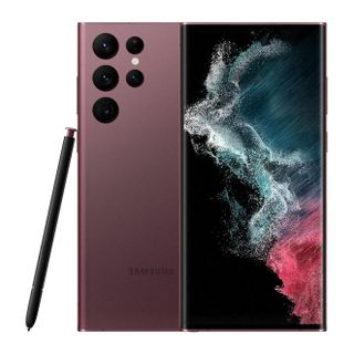
The Galaxy S22 Ultra is the best showcase for One UI 5. Samsung's flagship is still one of the best overall devices you can buy today, and the switch to Android 13 has made it just that little bit more fluid. The best part is that thanks to Black Friday, it is heavily discounted by $250 and is down to $849.

Harish Jonnalagadda is Android Central's Senior Editor of Asia. In his current role, he oversees the site's coverage of Chinese phone brands, networking products, and AV gear. He has been testing phones for over a decade, and has extensive experience in mobile hardware and the global semiconductor industry. Contact him on Twitter at @chunkynerd.
