Samsung Galaxy Z Fold 4 hands-on: The fun-size foldable
Better cameras and a tweaked size could finally bring out the Fold's true potential.
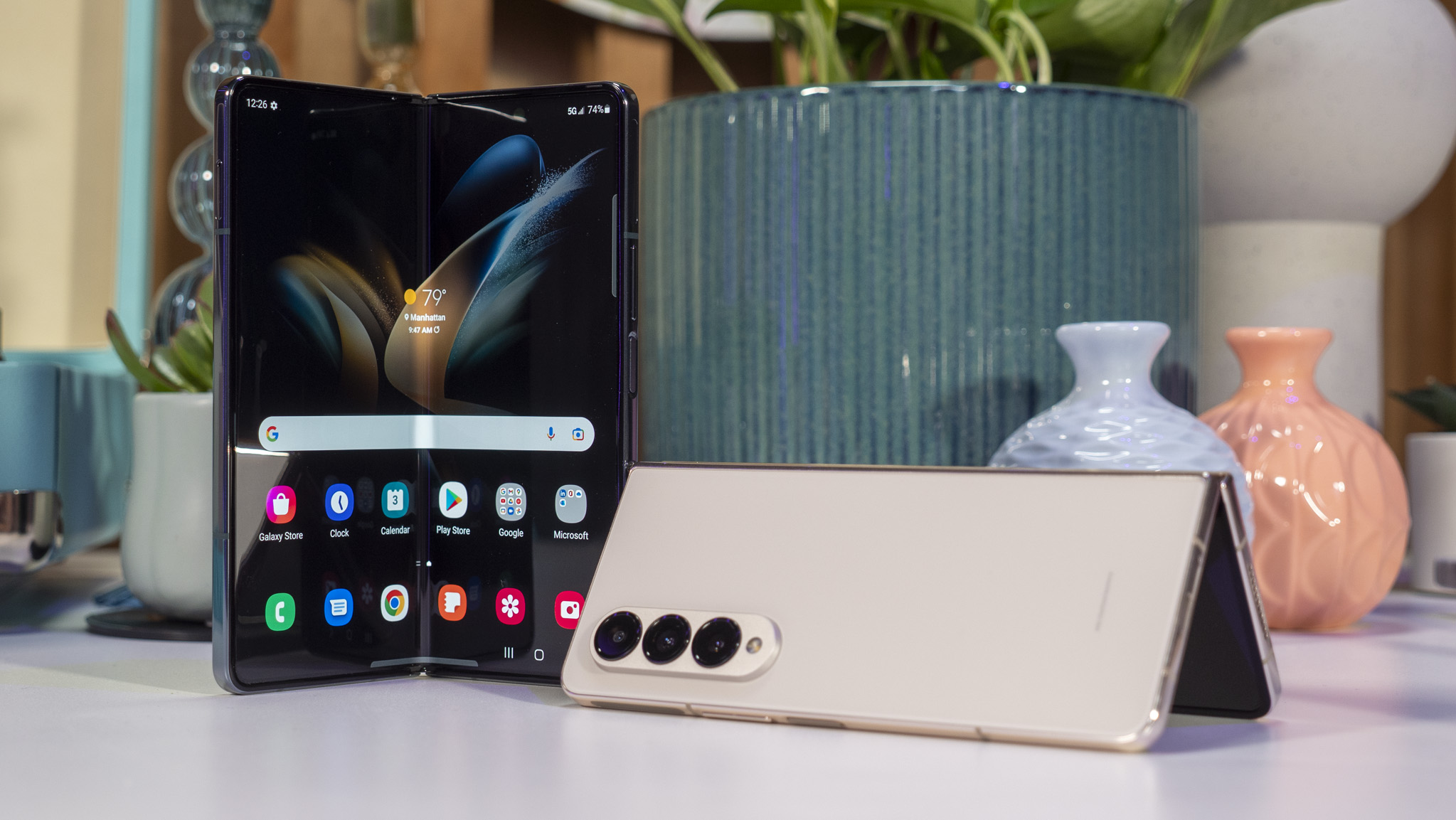
The Galaxy Z Flip may be the foldable phone line that's been in the hearts and minds of millions of fans, but Samsung knows that a certain set of power users love the Z Fold series for the ultimate productivity. That's why this year's Galaxy Z Fold 4 is all about tweaking the design to work better in every situation, whether that's one-handed texting with the small outer screen, or multi-app multitasking on the big one.
The Galaxy Z Fold 4 tightens up last year's design by lowering the height of the phone by a few millimeters to make it a bit more compact, reducing the weight in the process. Like the Galaxy Z Flip 4, the Galaxy Z Fold 4 debuts with new cameras and 45% stronger foldable glass to ensure your foldable experience is better than with any other foldable on the market.
Samsung is also adding a new Note package to the lineup, which includes a newly redesigned "Note-style" case with an S Pen holster, along with a duo of new S Pen colors to match the two new colors the Z Fold 4 is launching with. I got to go hands-on with the Galaxy Z Fold 4 in New York City at a special press event, and came away with pictures and impressions of what's likely the best foldable phone yet.
Update 8/11: added photos of the new under-display camera on the Fold 4 and compared it to the Fold 3's under-display camera. Updated fast wireless charging spec with additional info.
Galaxy Z Fold 4: A pinch here and a touch there
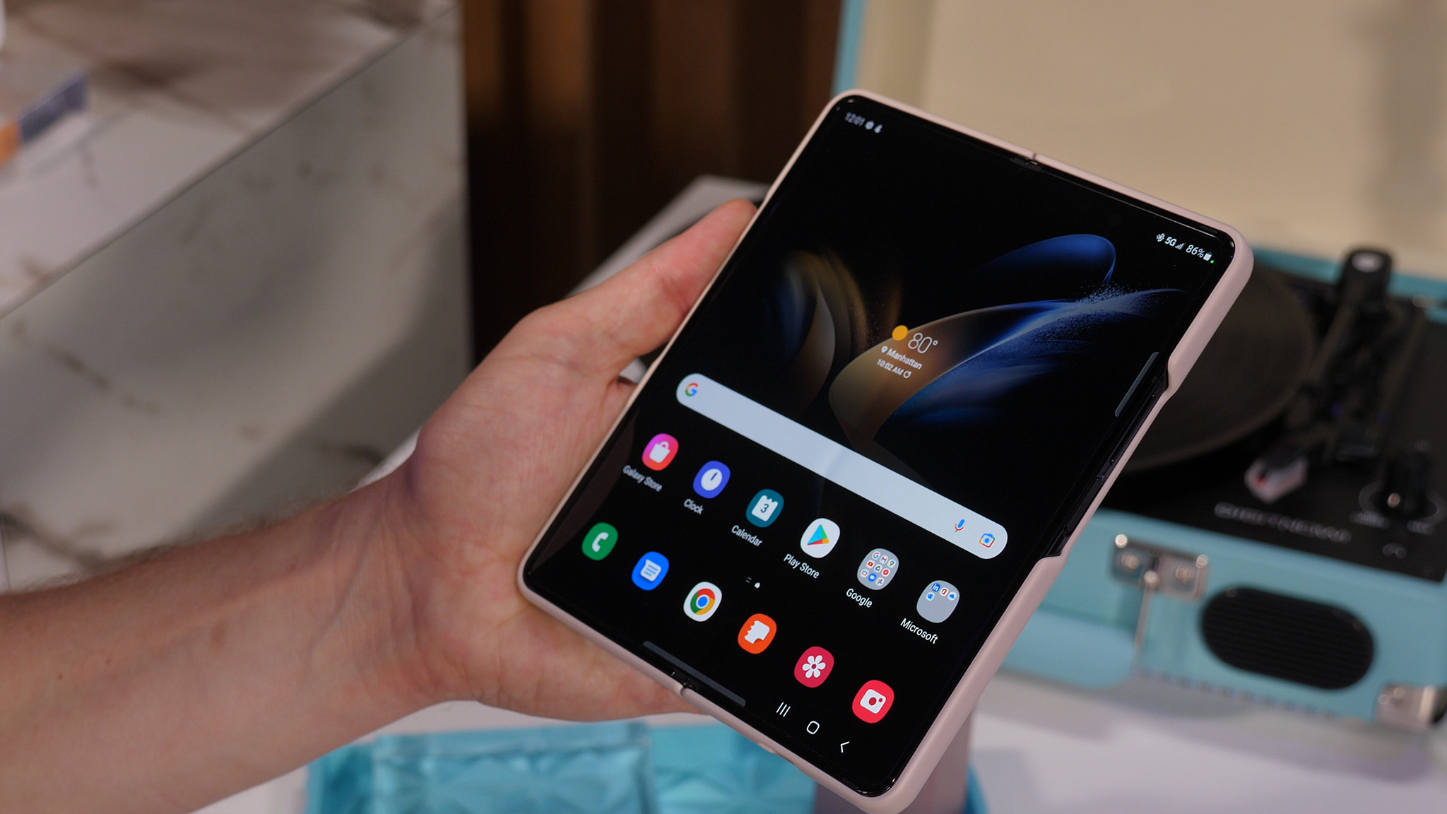
The Galaxy Z Fold 4 is a few millimeters shorter and wider than the Z Fold 3, which should be a slightly less awkward size when closed.
Not to be outdone by the shiny Z Flip 4, the Galaxy Z Fold 4 is seeing the biggest visible hardware changes since the transition from the original Galaxy Z Fold to the Z Fold 2.
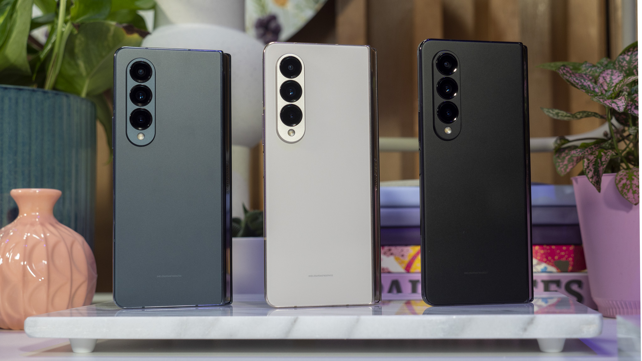
It's not as glitzy-looking as the Flip 4, but the two new colors — Graygreen and Beige — look super classy and are far more pronounced colors than the ones from last year. Phantom Black is still available, for folks that love that classic business-like look.
Likely owing to the general awkwardness of the outer display on the Z Flip 2 and 3, Samsung has shortened and widened the device by 3mm and reduced the bezels on both displays.
Be an expert in 5 minutes
Get the latest news from Android Central, your trusted companion in the world of Android
The difference is a bit more obvious on the smaller front display, and should ensure it's more comfortable to use when folded closed. I'll need to use it a bit longer to assess just how much of a difference this will make when typing in particular, but I'm feeling positive that the change will help, even if only just a bit.
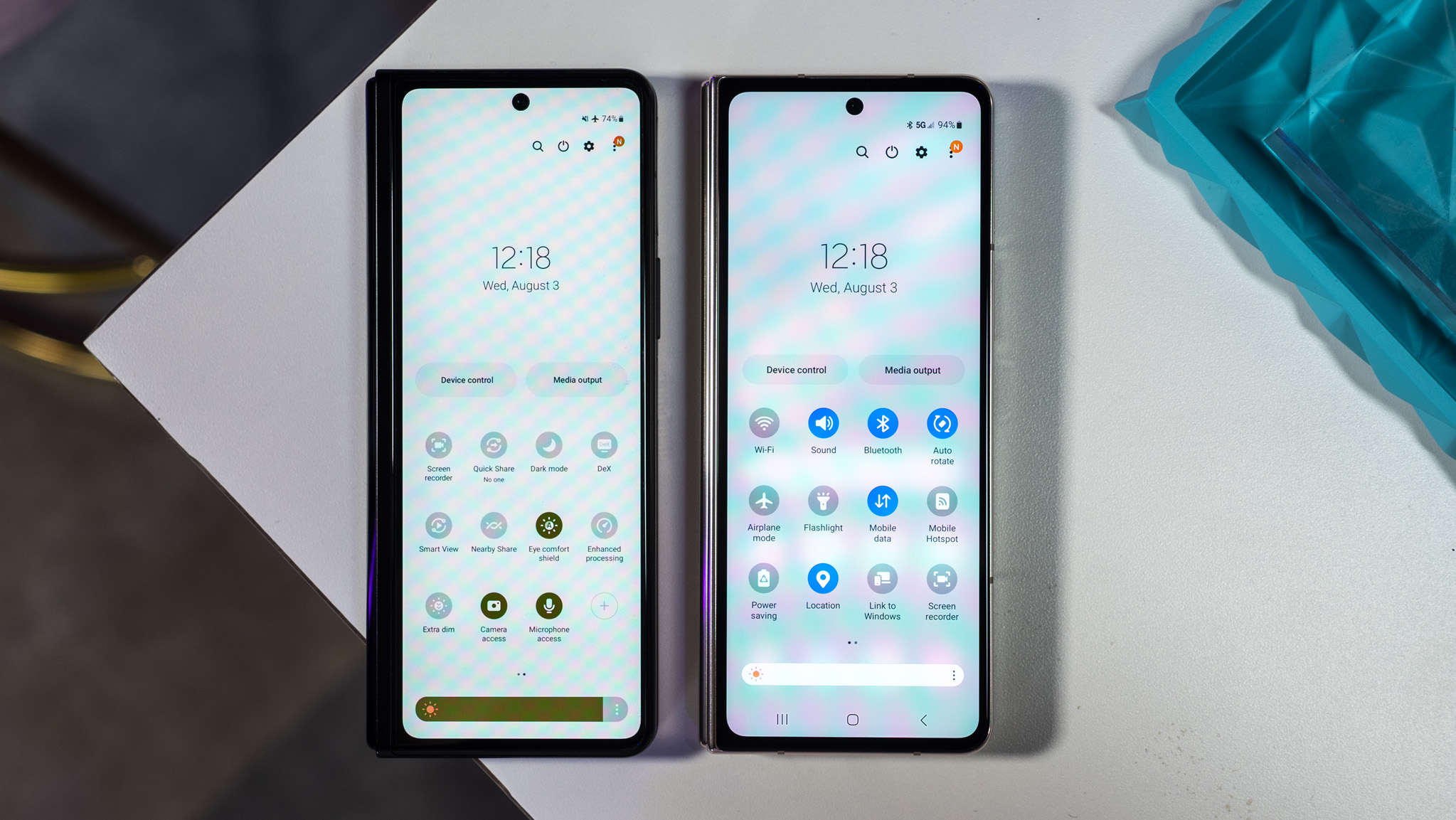
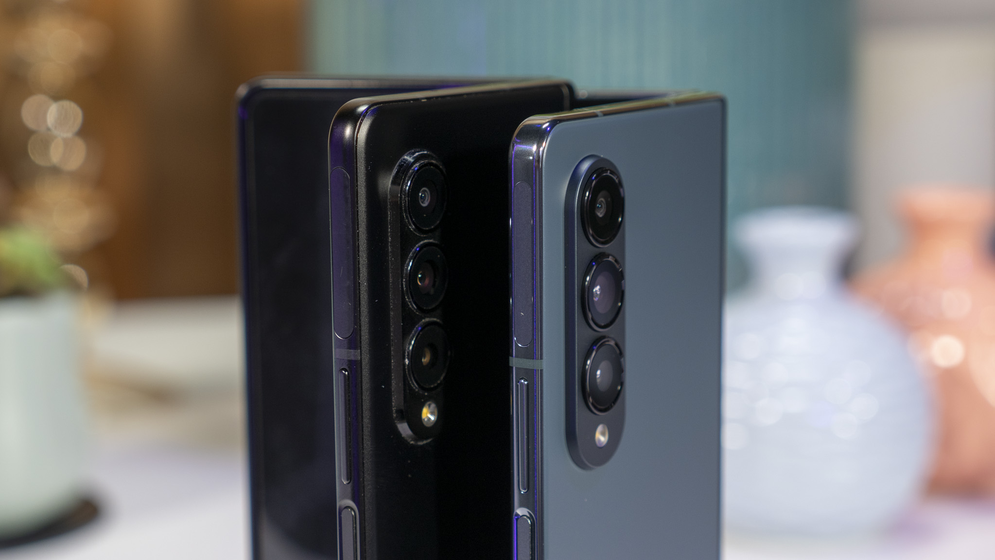
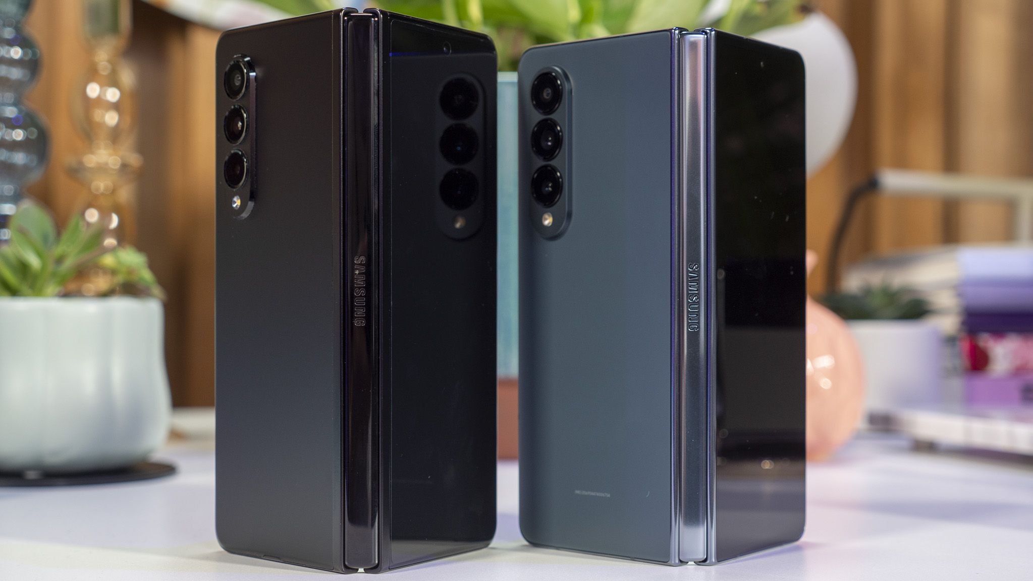
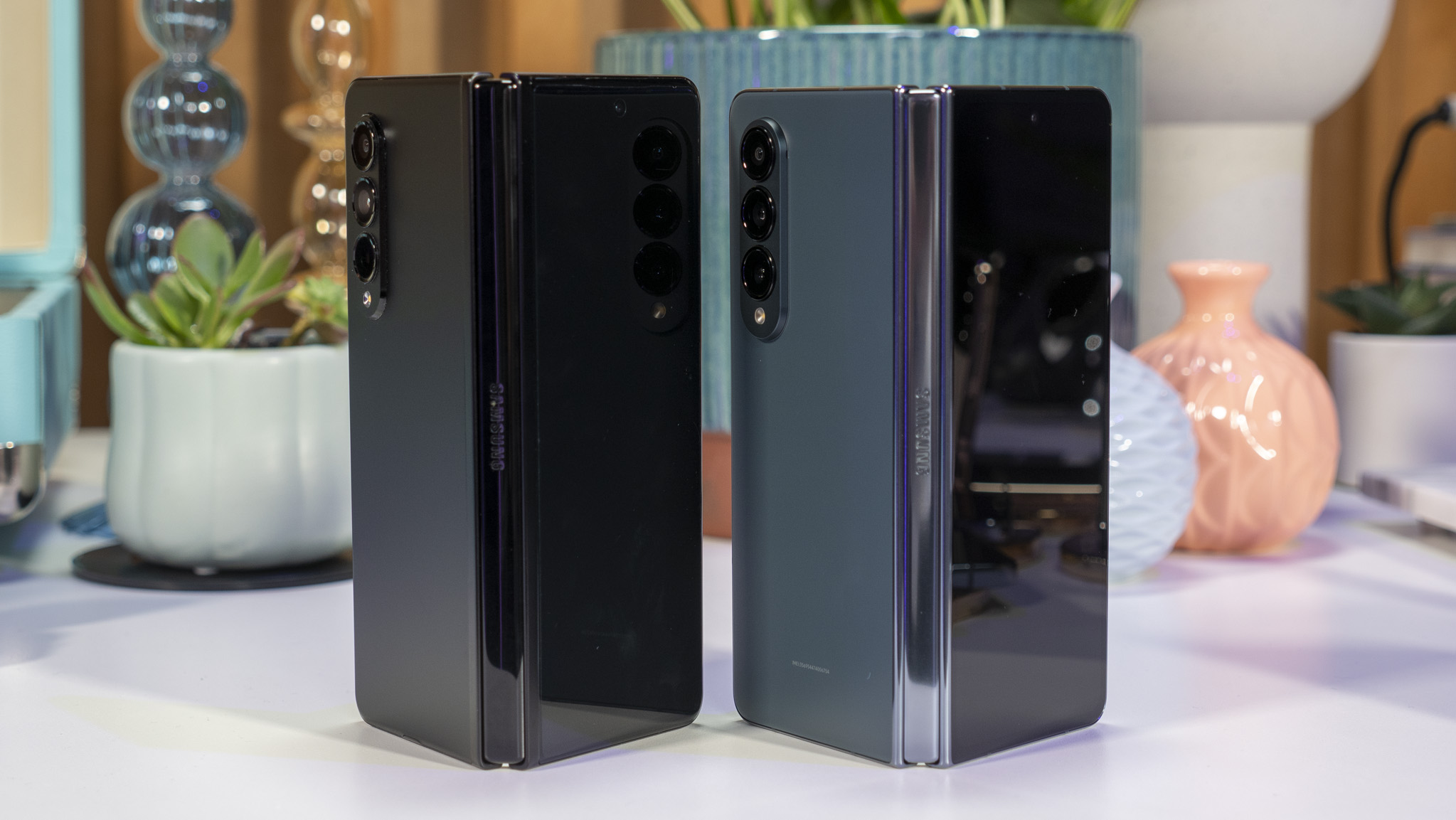
You'll also notice the bezels appear to be slimmed up on that front display, but it's not necessarily because the bezels themselves have seen some drastic reduction — although, they are definitely a tad smaller. Rather, it's the hinge that's seen some toning up versus the Z Fold 2 and 3.
This new hinge doesn't appear to do much (if anything) to reduce the crease on the inner display, but it certainly helps slim the phone up quite a bit when closed.
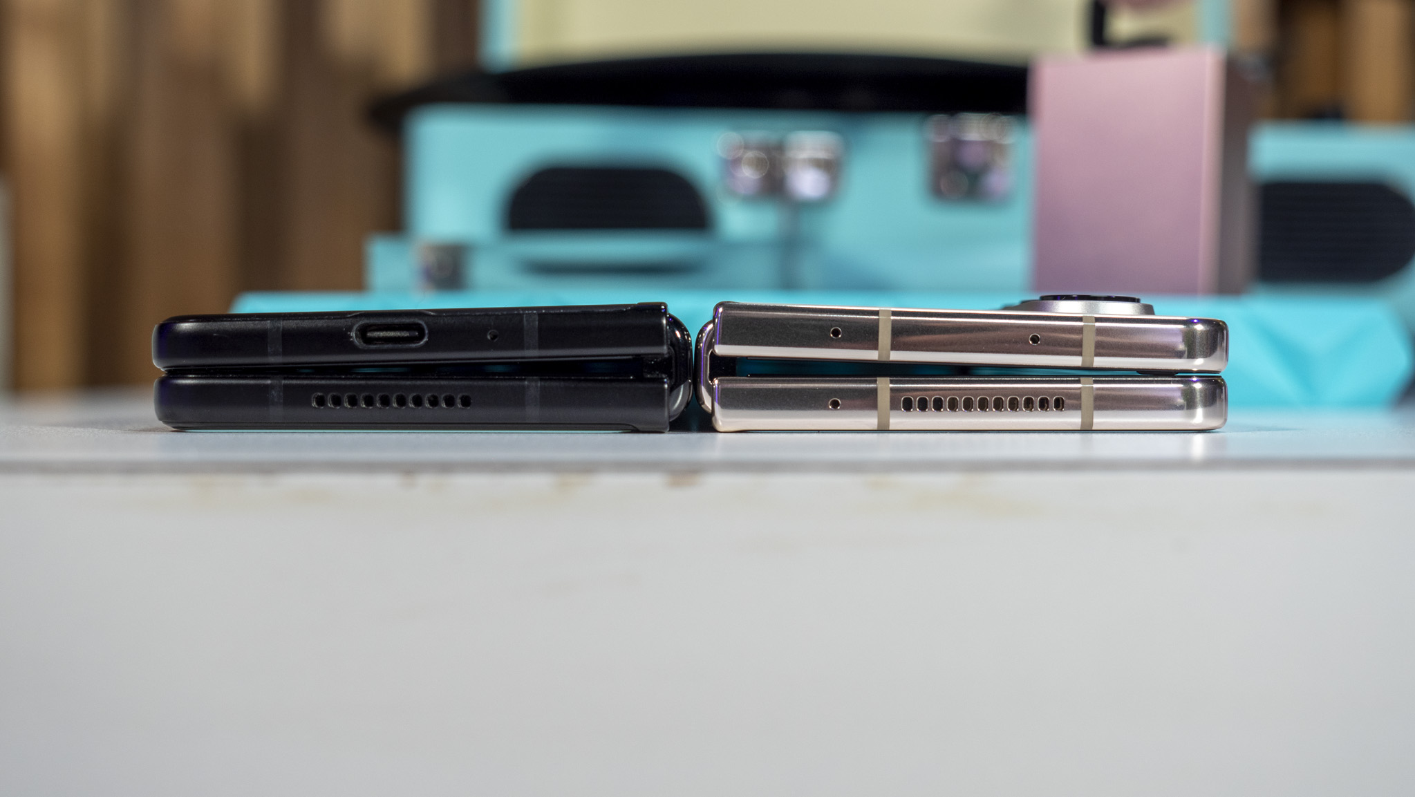
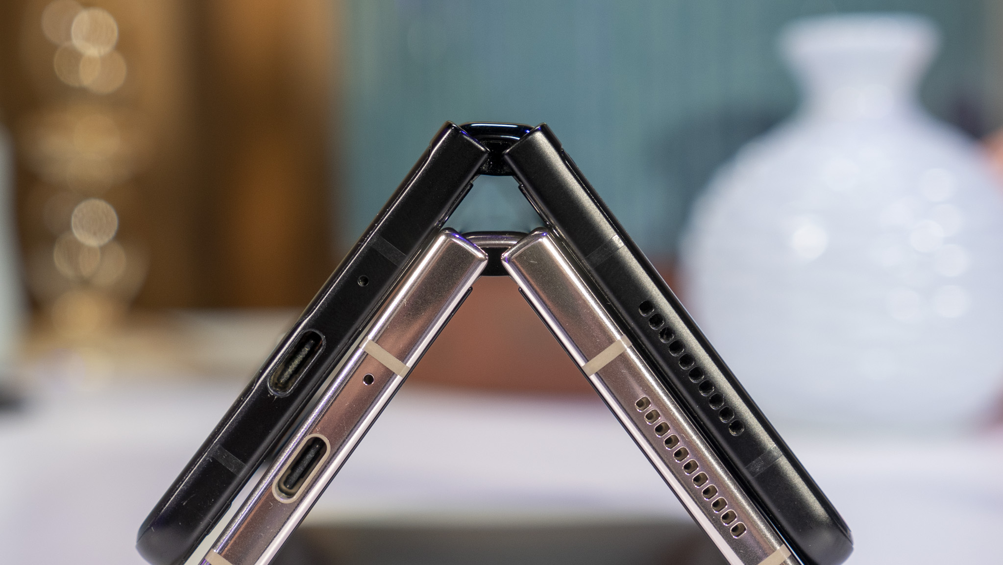
Unfortunately, that new hinge also doesn't change the shape of the phone when closed. It's still a slight wedge if you look at it from the bottom or top when closed, and (as far as I could tell with my eyes) there's no difference in the thickness of the device.
| Category | Samsung Galaxy Z Fold 4 |
|---|---|
| Display | 7.6-inch Dynamic AMOLED 2x, LTPO (1-120Hz), 2176x1812, 21.6:18 |
| Cover display | 6.2-inch Dynamic AMOLED 2x, LTPO (48-120Hz), 2316x904, 23.1:9 |
| Chipset | Snapdragon 8+ Gen 1 |
| Memory | 12GB |
| Storage | 256GB, 512GB, or 1TB |
| Rear Camera 1 | 50MP, ƒ/1.8, 1.0μm, 85-degree FoV (main camera) |
| Rear Camera 2 | 12MP, ƒ/2.2, 1.12μm, 123-degree FoV (ultra-wide) |
| Rear Camera 3 | 10MP, ƒ/2.4, 1.10μm, 3x optical zoom |
| Cover Camera | 10MP, ƒ/2.2, 1.22μm, 80-degree FOV |
| Inside Camera | 4MP, ƒ/1.8, 2.0μm, 80-degree FOV |
| Battery | 4,400mAh (dual 2,200mAh batteries) |
| Charging | 25W fast charging, 10-15W fast wireless charging 2.0, 4.5W reverse wireless charging |
| Weight | 263 grams |
| Dimensions (folded) | 67.1 wide x 155.1 tall x 15.8mm thin |
| Dimensions (unfolded) | 130.1 wide x 155.1 tall x 6.3mm thin |
| Water and dust resistance | IPX8 |
| Colors | Graygreen, Phantom Black, Beige, Burgundy (Samsung.com exclusive) |
The battery isn't bigger, but the Fold 4 charges faster and has a more power-efficient processor than the Fold 3.
The height reduction and slimming of the thick hinge have also reduced the physical weight of the Z Fold 4 when compared to the Fold 3, which was immediately noticeable the moment I picked it up. The Z Fold series has always been a bit of a brick since the beginning, so it's good to see improvement in this area.
While Samsung isn't upgrading the battery size on the Z Fold 4 — it's the same 4,400mAh battery as the Z Flip 3 — the Snapdragon 8+ Gen 1 inside is more power efficient than last year's processor, and should theoretically deliver better battery life.
Charging speeds have at least been improved, though, with Samsung saying the phone will charge from 0-50% in just 30 minutes. In that same time frame, the Z Fold 3 would only charge about 30-35%.
That Snapdragon 8+ Gen 1 inside the Galaxy Z Fold 4 is notably faster than what's inside even the Galaxy S22 Ultra and, probably more importantly, it's a much more efficient and cooler chipset, too. That's important given the issues with heat and throttling that occur with the regular Snapdragon 8 Gen 1 chipsets in the Galaxy S22 series, and many other Android phones in 2022.
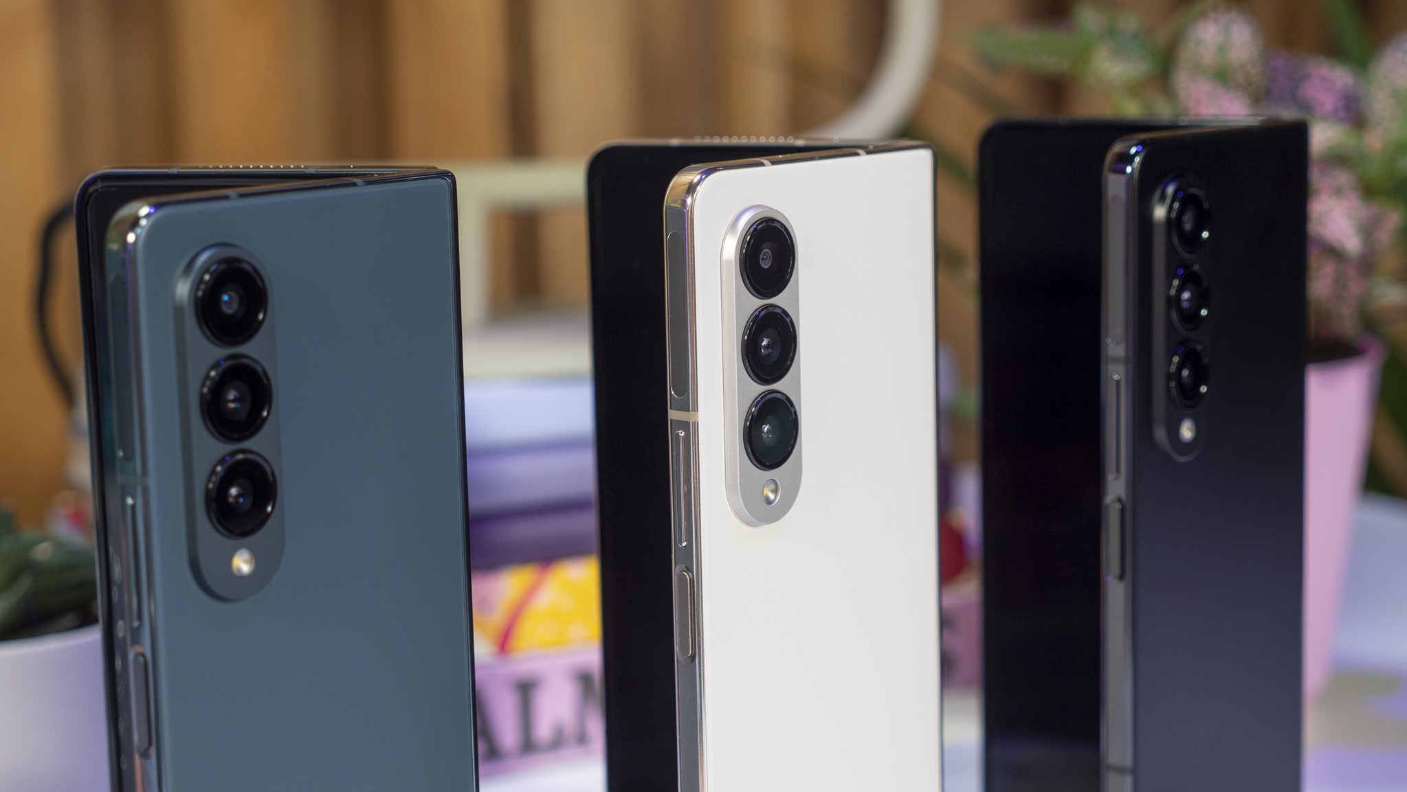
Samsung was able to include the Galaxy S22's excellent cameras in the Z Fold 4, including the 50MP main sensor and improved 30x Space Zoom.
Before we open up the phone, I want to stop around the back for a quick tour of the new camera hardware. Like the Z Flip 4, the Z Fold 4 is seeing a huge camera upgrade.
Samsung was able to cram in the same great cameras from the Galaxy S22, including that same main 50MP sensor, and a new telephoto camera with 3x optical zoom. That enables up to 30x Space Zoom this time around, and all in all, should be a massive upgrade over last year's cameras. Samsung is even including the latest in its Nightography technology, so low-light photos should really shine on this phone.
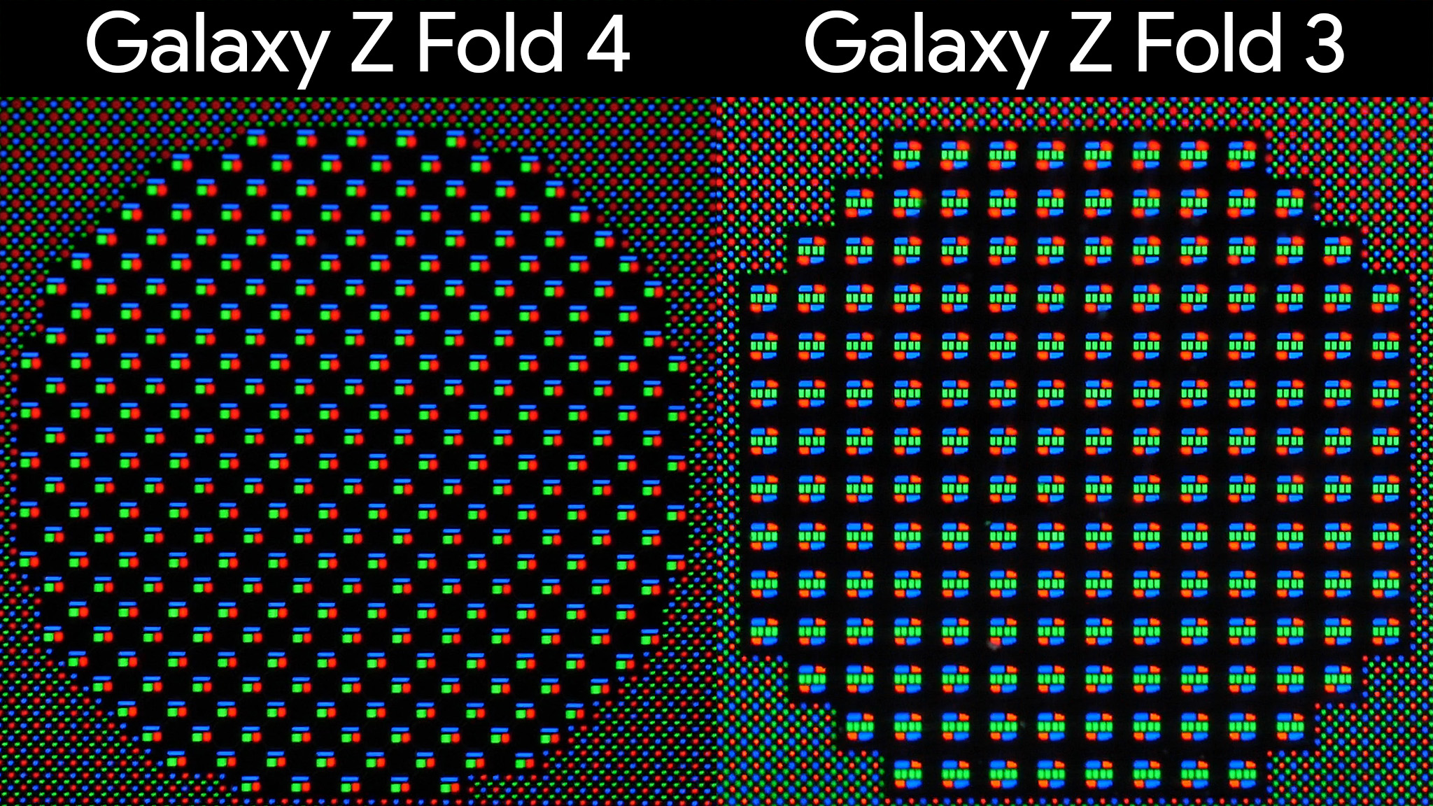
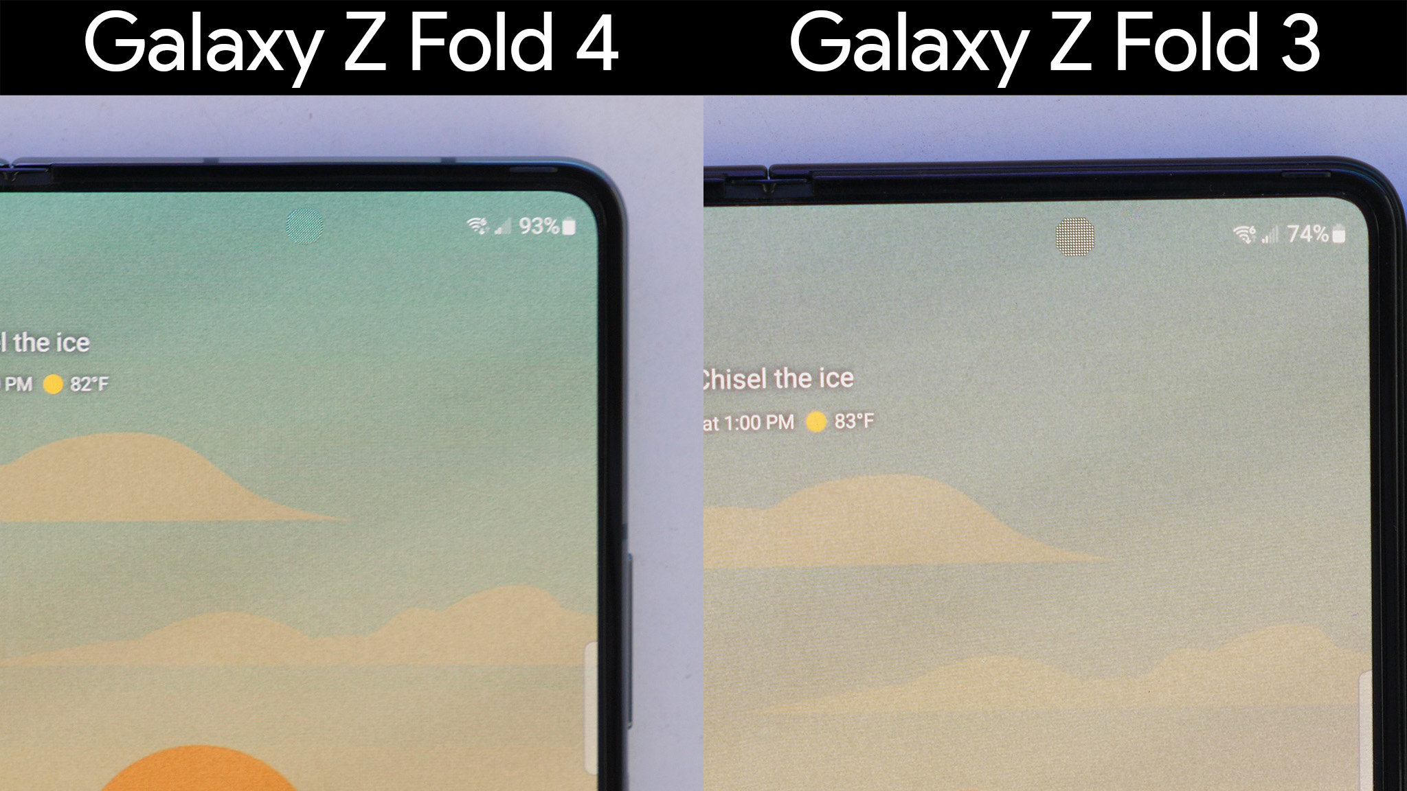
The inner camera has also seen an upgrade and some significant aesthetic changes, as well. It's now harder than before to see that there's a camera under the inner display, which is always a positive thing. Last year's Z Fold 3 debuted the under display camera for Samsung, and did a great job of hiding the camera, but the pixel structure still made it somewhat obvious that a camera was hiding there.
Without taking a bunch of pictures from the phone, I can't comment much on a quality increase, but am hoping the new design helps in all lighting situations this time around. The previous design made the already low-resolution sensor look worse, and produced a lot of bloom and other visual problems.
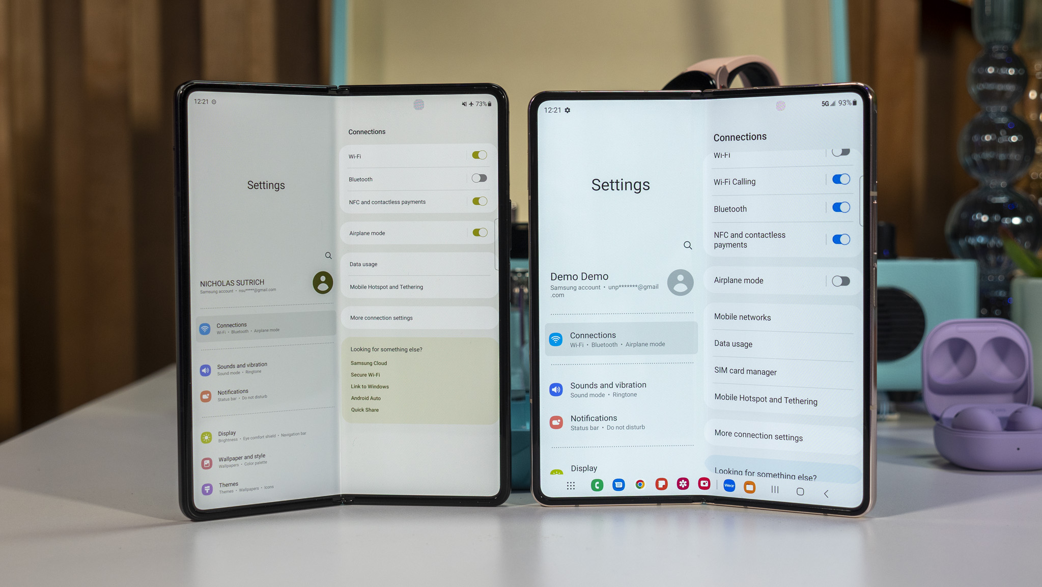
A new persistent taskbar on the large inner display makes multitasking a breeze.
Onto the software itself, Samsung has redesigned the side-oriented edge panel, bringing it down to the bottom of the screen and shrinking it to look and behave more like a tablet or computer taskbar. Sure enough, it was ultra-easy to switch between apps with this new design, which makes the large inner screen feel even more useful than before.
The taskbar will show recent apps to make switching between them quicker than ever before. As with the previous design, though, you can pin apps (or pairs of apps) if you prefer.
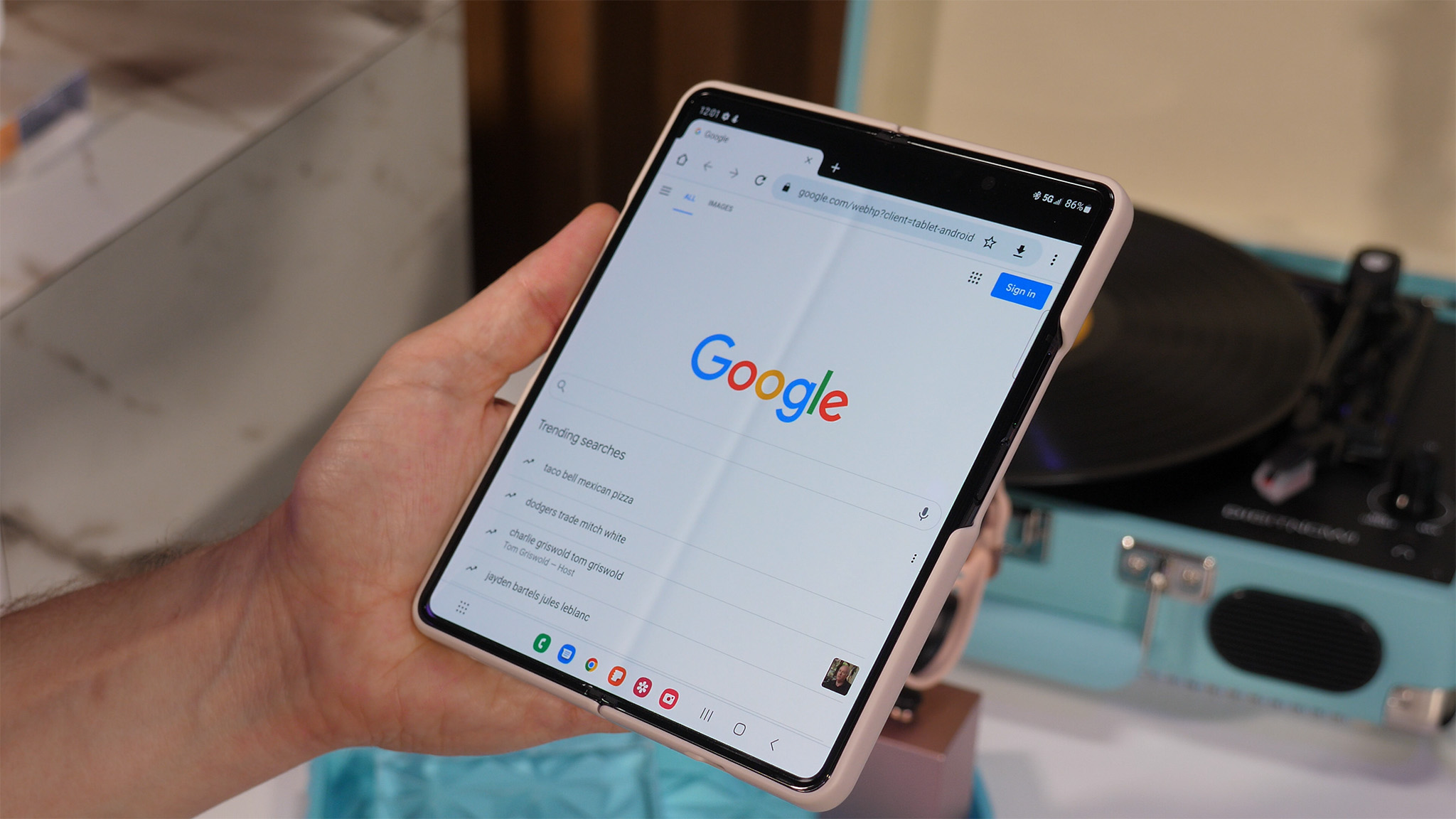
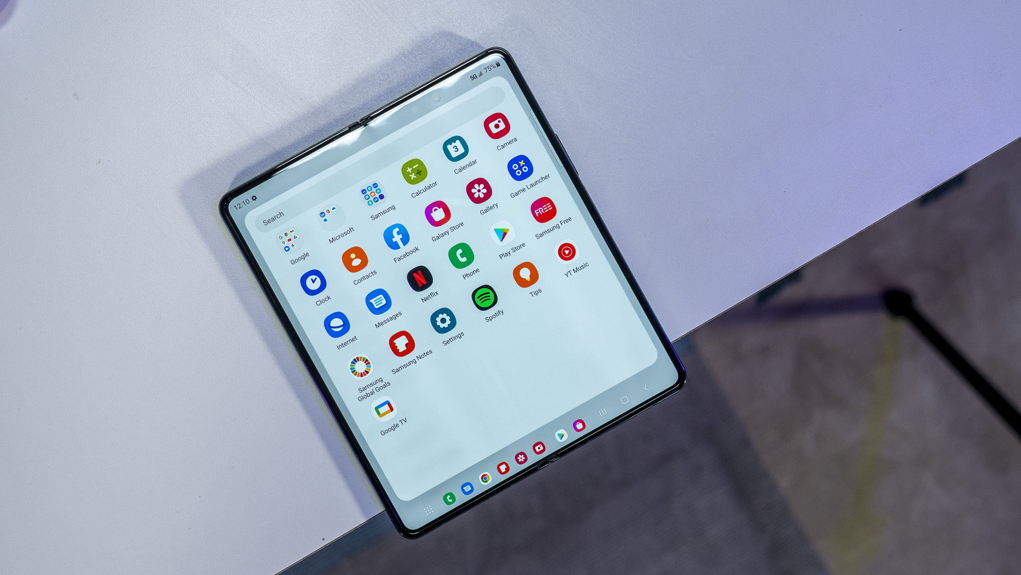
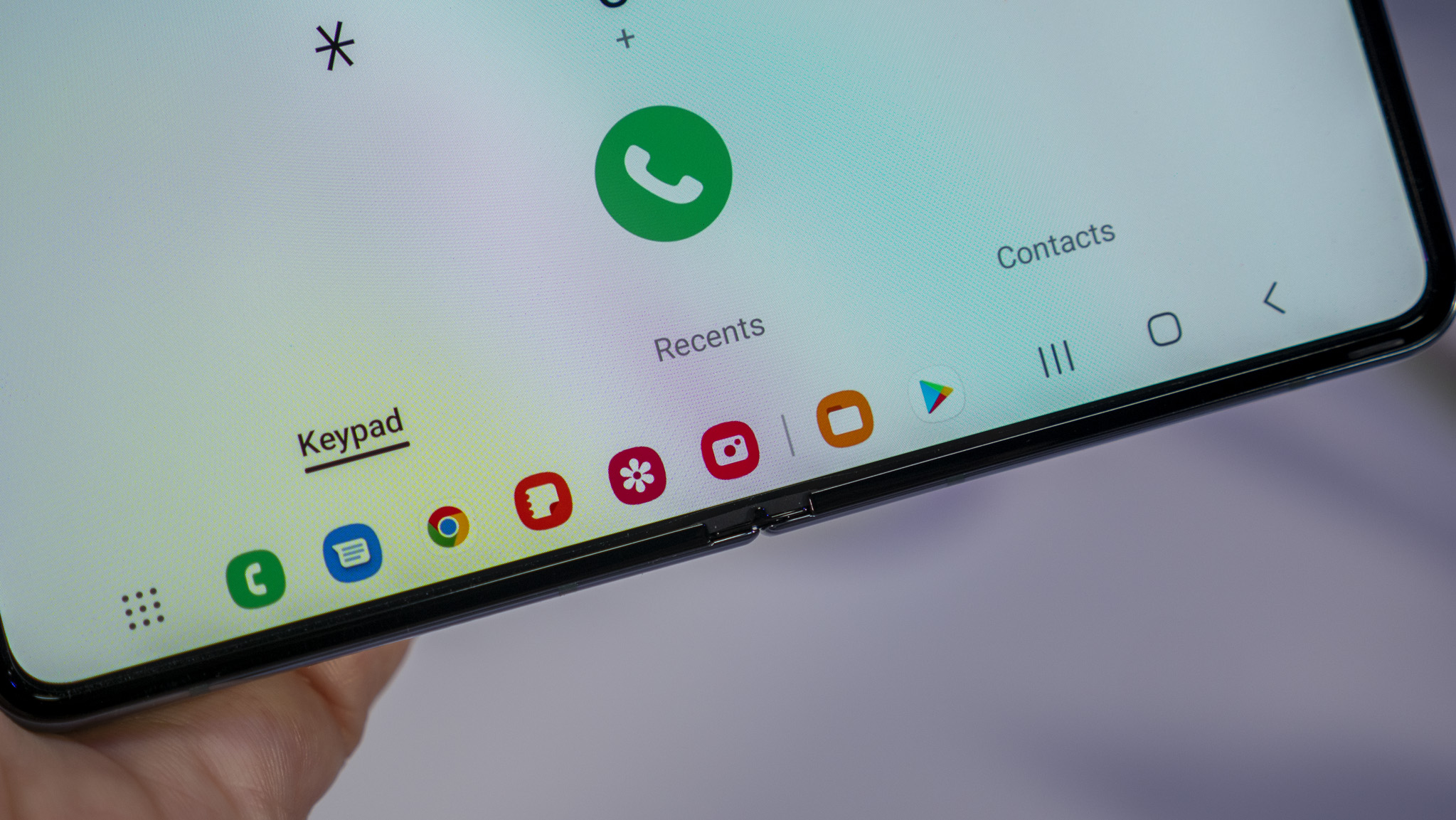
Since it shows recent apps by default, the taskbar makes it simple to quickly flip back and forth between and even split apps on the big screen.
Samsung has also further enhanced multi-window support this time around, making the multi-window functionality quicker and easier to use, thanks to the addition of that taskbar.
Since it shows recent apps by default, the taskbar makes it simple to quickly flip back and forth between, and even split, apps on the big screen. Tap and drag an icon to any side or corner of the display, and you can split up to three apps on the display at a time.
That taskbar also helps to push the screen closer to a wider aspect ratio, instead of the more square-like ratio of the Z Fold 2 and 3. Since the phone is 3mm shorter and 3mm wider, the display more comfortably fits full-screen videos with a smaller letterbox. Plus, that makes it even less necessary to rotate the phone to watch videos since the portrait aspect ratio is wider.
Galaxy Z Fold 4: The case for a Note
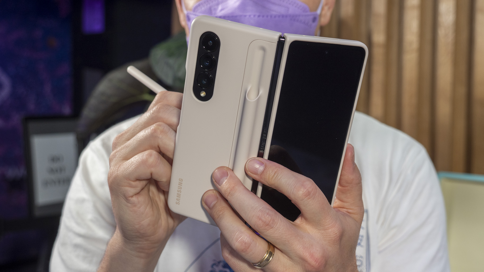
On the Z Fold 4 front, Samsung is debuting a new Note package, which includes a completely redesigned S Pen case and the S Pen Fold Edition. While it's still a two-piece shell design, it's not the flimsy S Pen case that Samsung delivered last year.
This time around, the S Pen is housed tightly in a holster around the back. It's still not quite as effortless to use as a "proper" Galaxy Note device, but I prefer the larger S Pen anyway, and am fine with the trade-off.
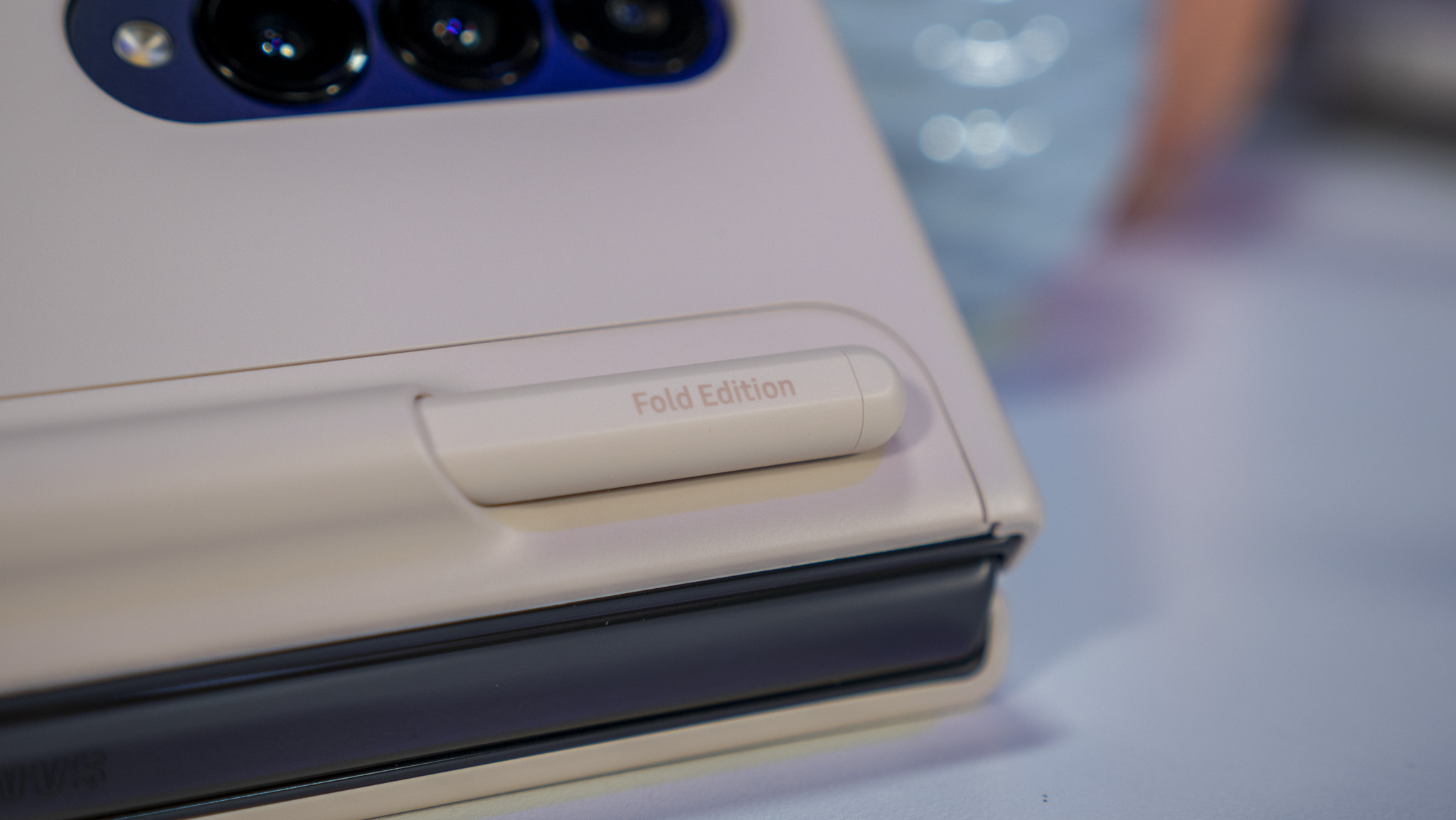
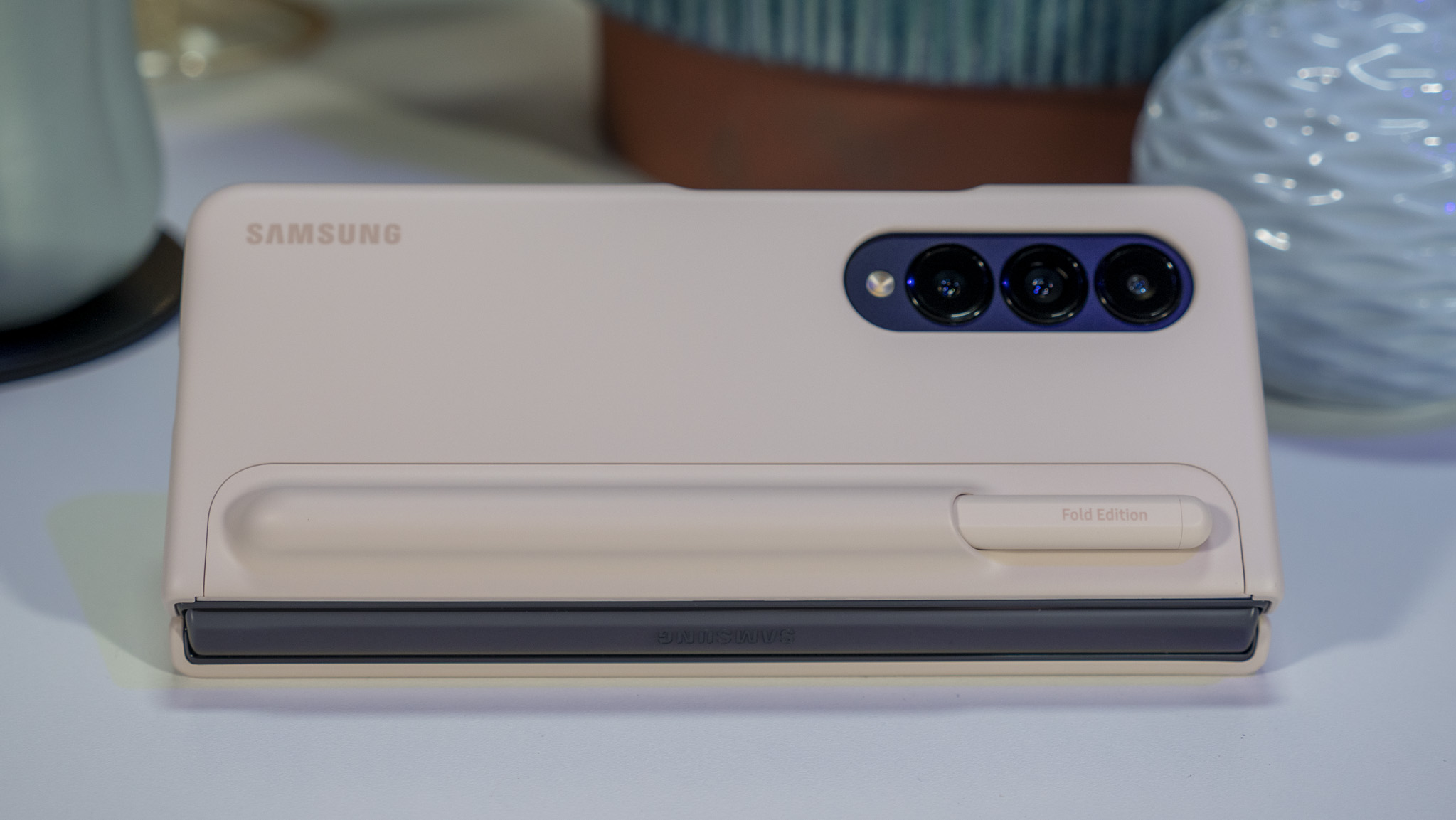
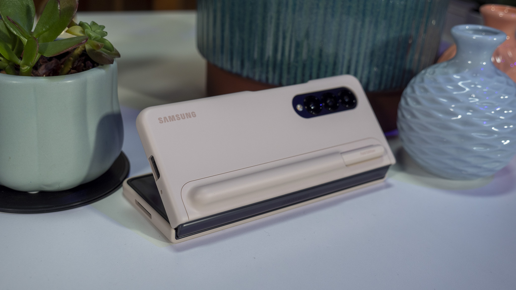
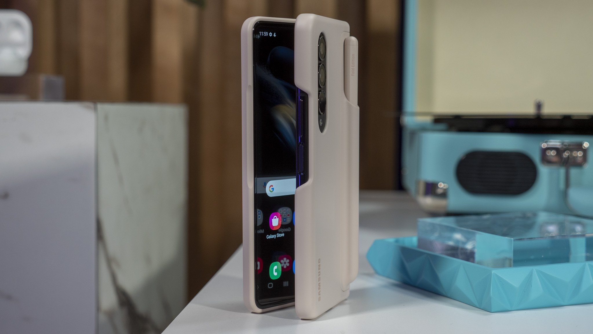
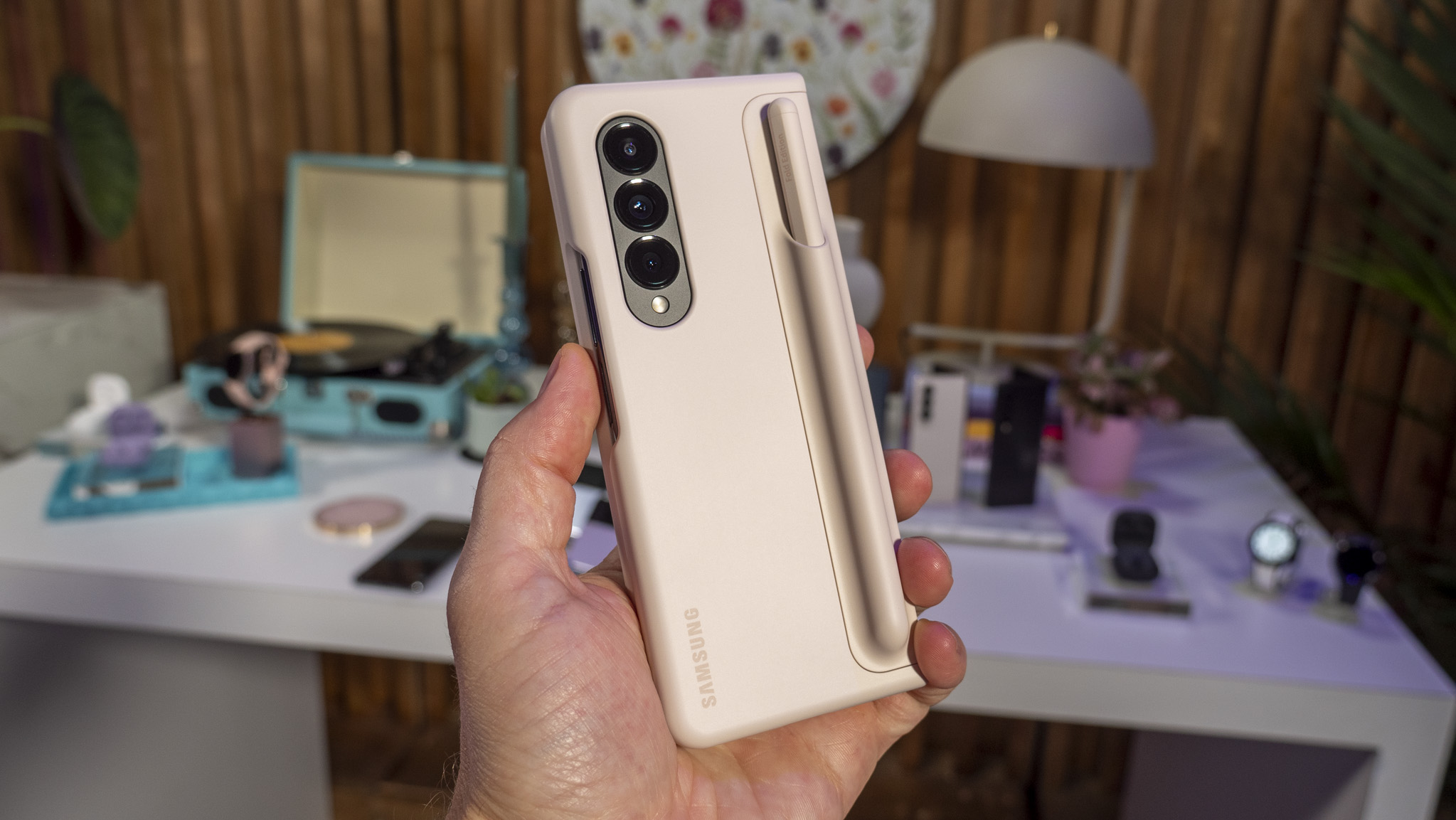
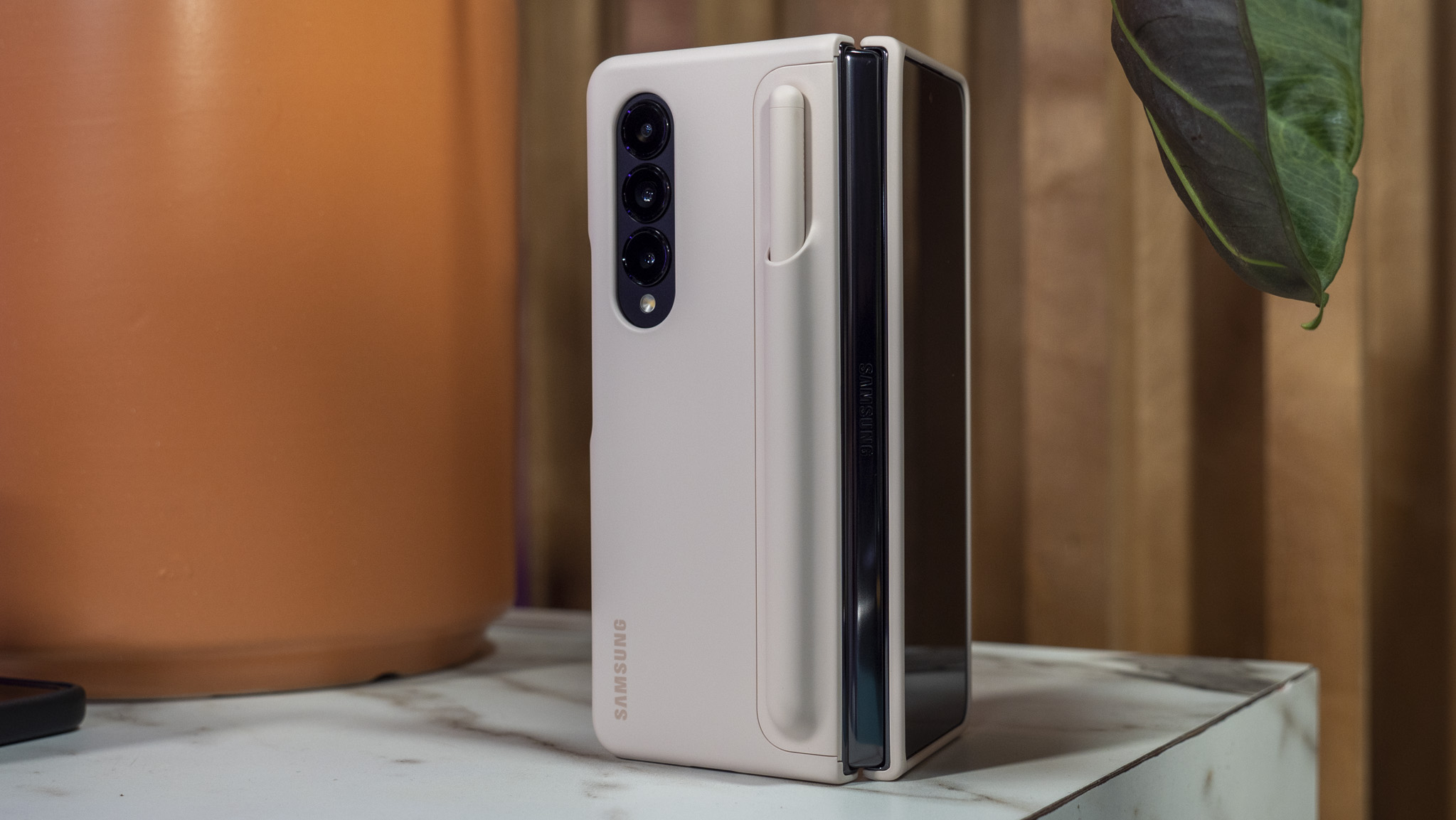
You can get the S Pen and the Note case in several different colors to match the new Grayreen and Beige colors of the Fold 4, which is in addition to the black case and S Pen. If you have a Z Fold 3 and previously picked up an S Pen Fold Edition, it'll also work on the Z Fold 4. Samsung isn't debuting a new design or new S Pen features with the Z Fold 4.
Galaxy Z Fold 4: Coming in August
Samsung is bringing the Z Fold 4 to market starting on August 26, 2022. There's no big price reduction or increase this year — it's the same $1,799 unlocked price as last year — but the hardware improvements should be a welcome change to anyone upgrading from an older Galaxy Z model. If you were waiting to upgrade from a first or second-generation Galaxy Z foldable, this certainly seems to be a fantastic year to do it.
As always, Samsung runs a great trade-in program that's sure to give you quite a bit for your old phone. It's also worth checking out your local carrier to see what deals they might be running as well.
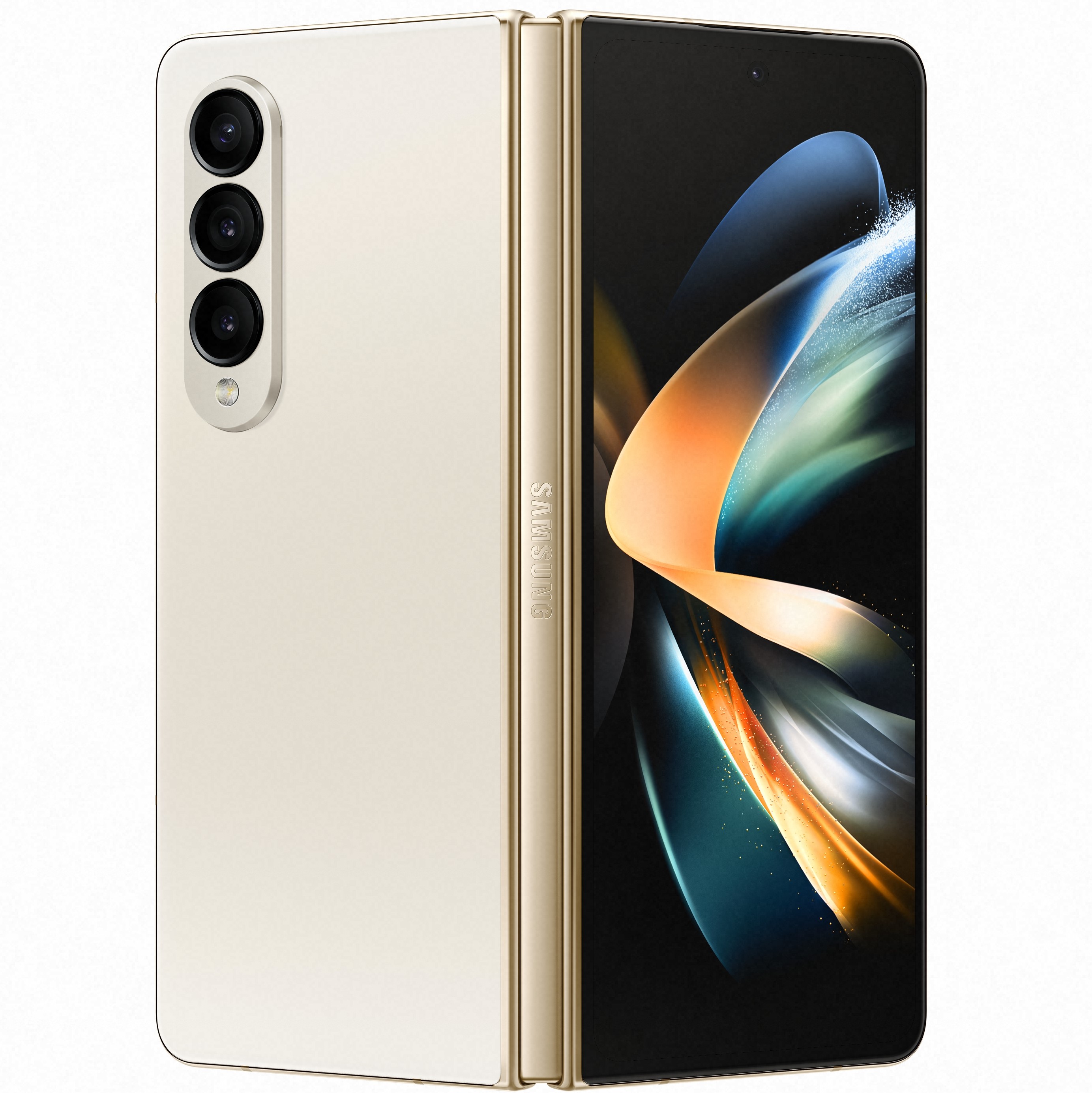
Samsung's Galaxy Z Fold 4 is more powerful than ever, bringing productivity and fun to the next level. It also comes in a sleeker, lighter, and size-optimized design to better fit with everything you can do with it.
48 hours later
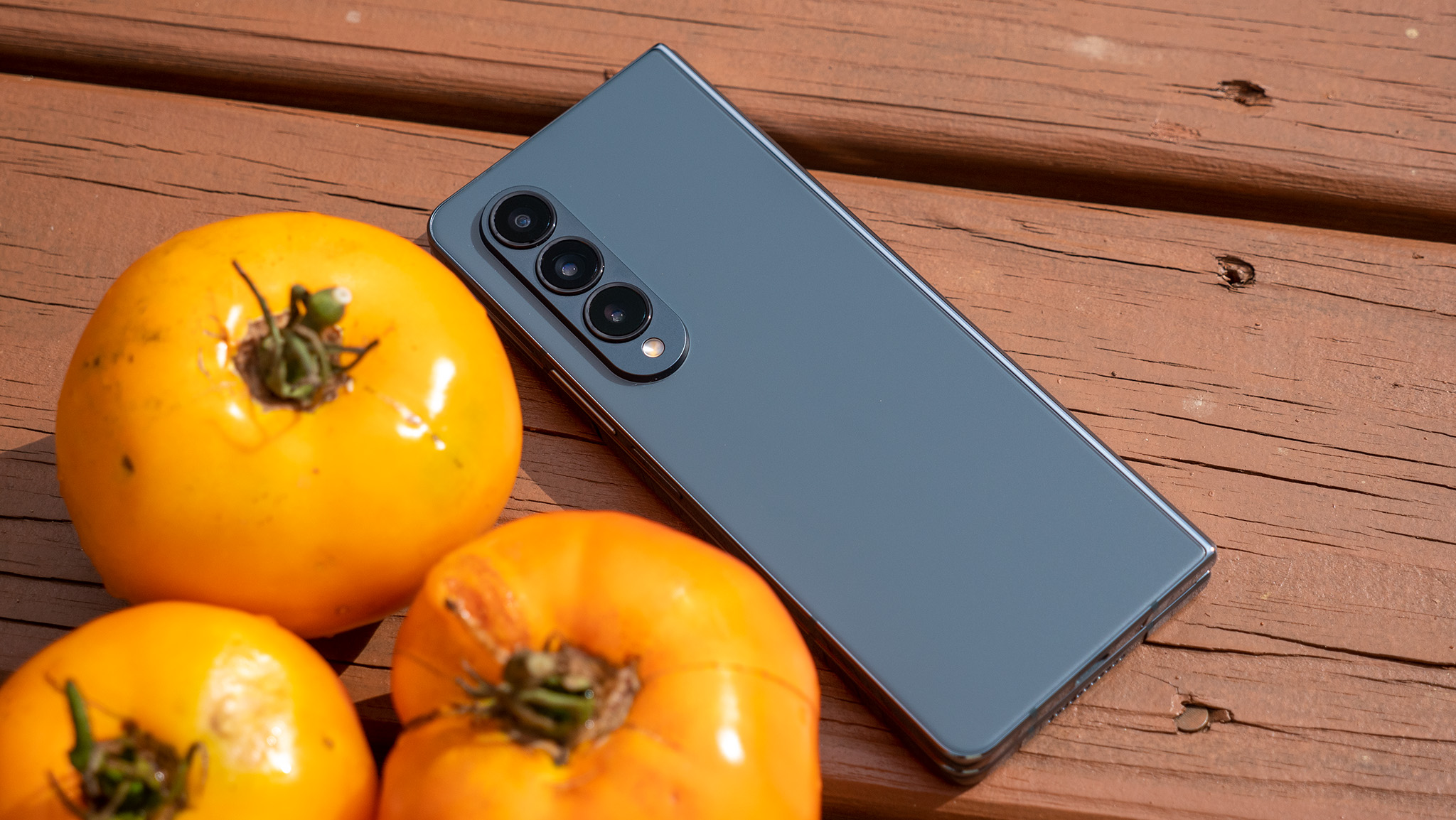
I've now had the Samsung Galaxy Z Fold 4 for roughly 48 hours and, I have to say, I'm quite pleased with the changes Samsung made with its latest large foldable. The hardware changes are a bit subtle at first glance, but regular use has proven to me that they are far more than small changes.
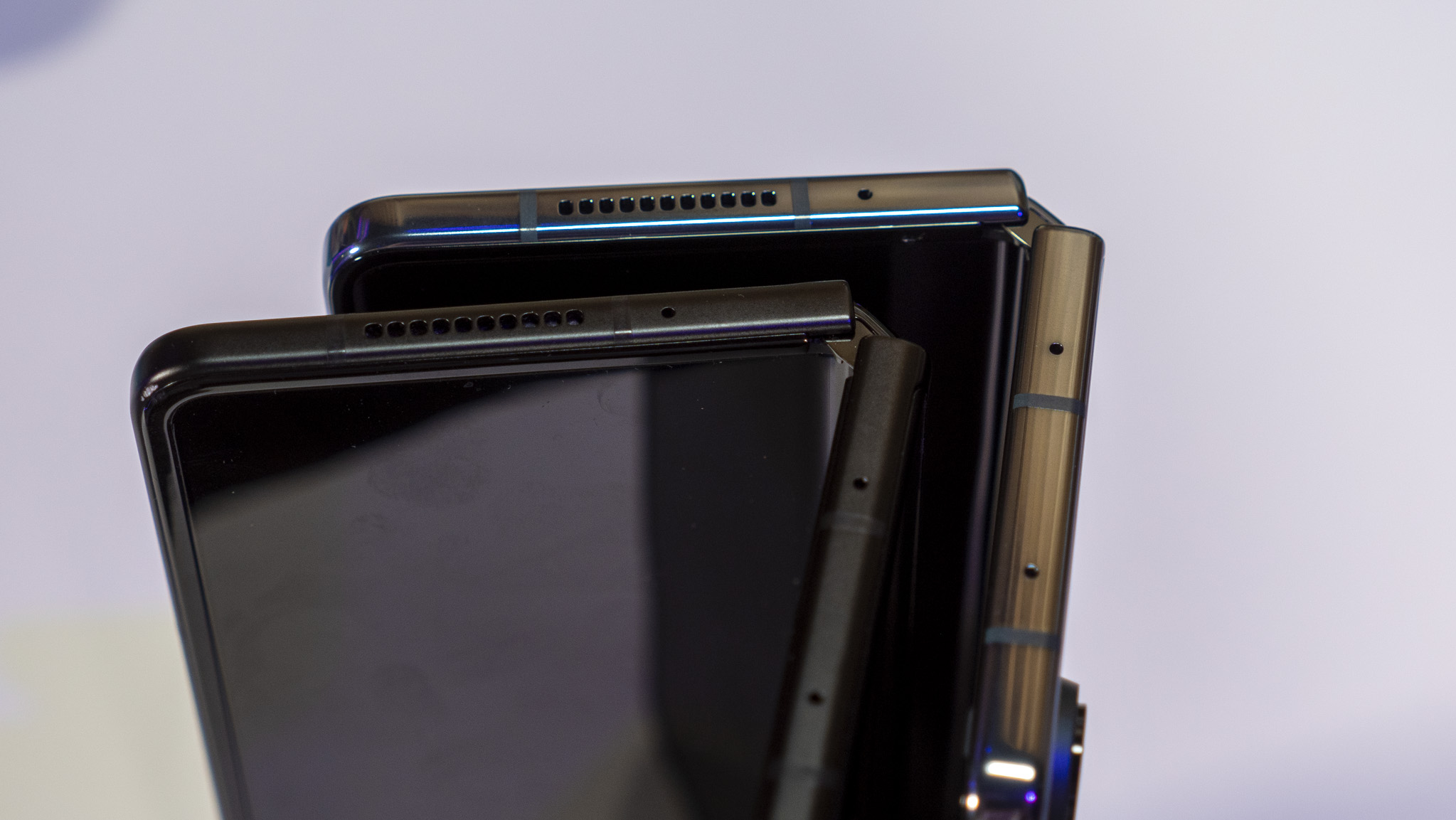
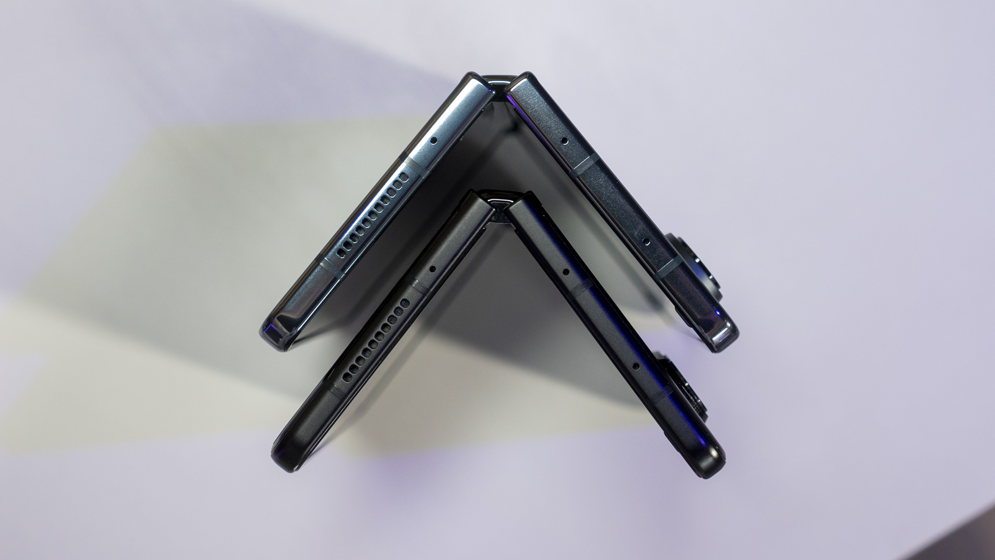
The Z Fold 4 is quite a bit nicer to use every day and, for me, that starts with the hinge itself. What I hadn't realized at the hands-on event was just how much more the Fold 4 opens than the Fold 3. That may sound strange, but it's something subtle I've always thought about with the Fold 3 but never actually inspected. Here's a visual:
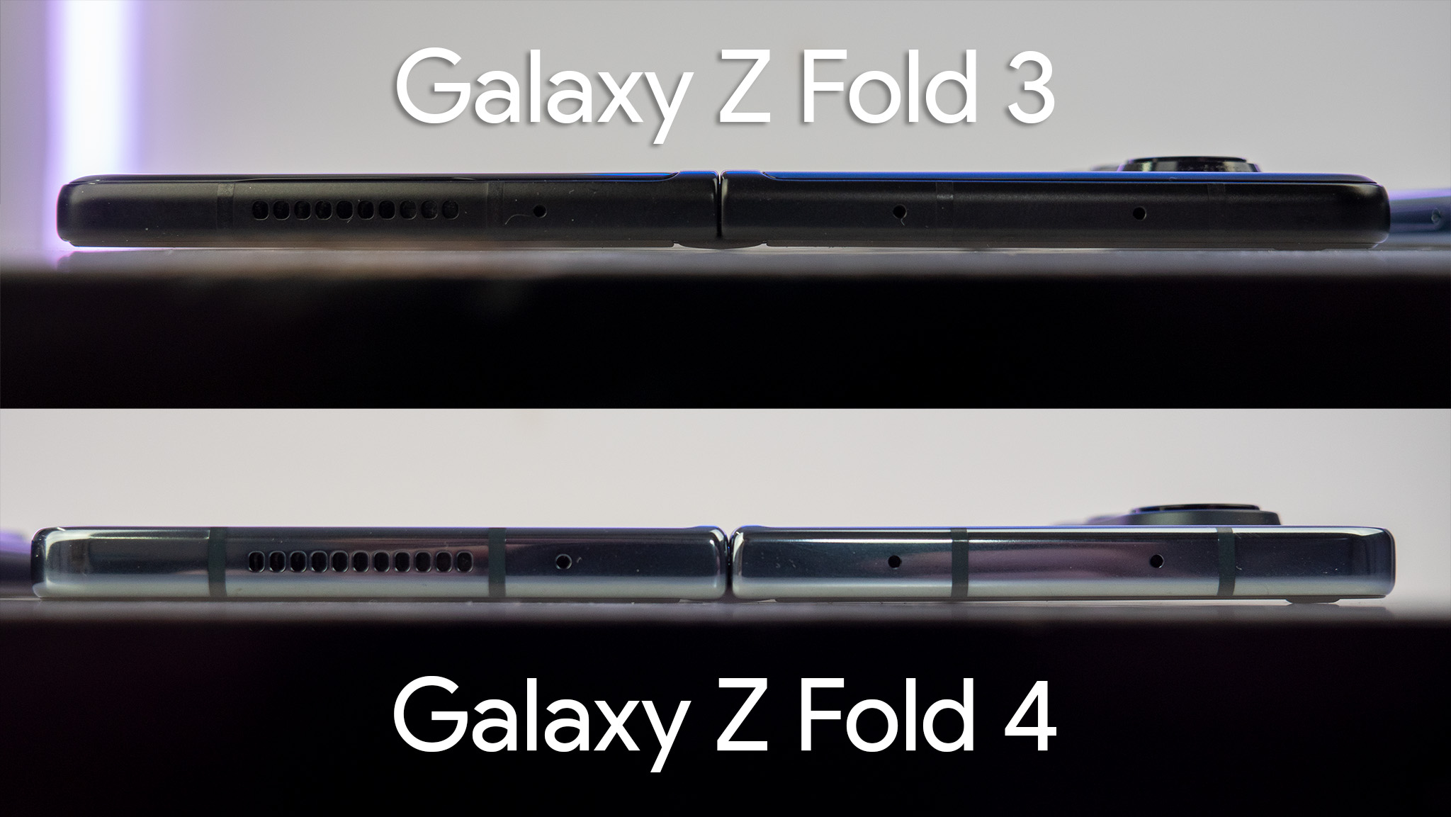
Both phones were opened fully and placed display-down on the table. If you look closely, you can see the gap between the table and the Fold 3 in the middle. The slight angle of the right side of the screen, in particular, shows that it's not actually fully unfolded flat (and it doesn't open more).
The Fold 4, however, opens fully and you can really feel the difference when using the phone. Samsung also increased the height of the edge lip on the Fold 4 to keep the display from clapping against the edge of the phone, which can be seen in the raised hump on the right side.
The new camera sensors do, indeed, produce much better results than the Fold 3's cameras.
The hinge itself also just feels much better to regularly open and close. It's much easier to grab and open than the Flip 3 — which, as I noted in the review last year, was a little scary to open sometimes as the hinge requires a bit of force to open — and closing the Fold 4 is also much softer. Samsung packed some new padding into the hinge mechanism and it's immediately evident going from one phone to the other.
You'll also notice from this picture how much larger the camera hump on the Fold 4 is. The lenses are bigger and the hump itself protrudes from the body just a tad bit more. That, of course, is to fit in all the new sensors.
Turns out, those new sensors make a pretty big deal and produce much better results than the Fold 3. I put both phones head to head and you can see how much better the Galaxy Z Fold 4's cameras are.
I've also noticed that, at least so far, the slight growth in width of the front screen is making all the difference in the world. It feels a lot more normal to use the smaller front screen than it ever did on the Fold 3, and it's a lot easier to type, as well. So far, I haven't experienced any ghost swipes or other oddities that I would occasionally come across on the Fold 3's narrower display.
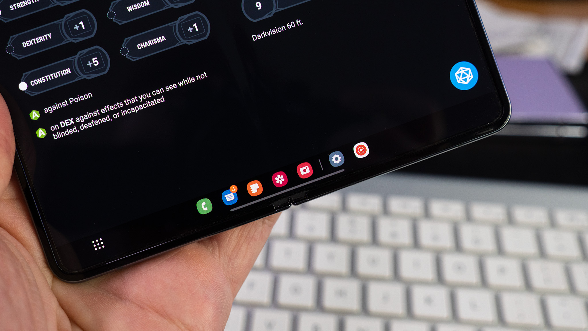
This phone feels like a complete powerhouse because of the taskbar and I absolutely love it.
But, so far, no other change or addition has enamored me like the taskbar. Yes, you can get a similar type of thing on the Fold 3 but it doesn't work (or look) quite the same way. The taskbar is enabled by default and is split into two sections. The left side is a mirror of the apps you have pinned on the Samsung One UI home screen, while the right side shows the last two apps used.
If that's not enough, the little button on the bottom-left is a full app launcher and gives you immediate access to all apps installed on your phone. It's amazing and makes the phone feel more like a desktop or laptop.
The downside to the taskbar design is that it only properly works if you are using Samsung's One UI home screen. I tried using Nova Launcher for a while — which has been a favorite of mine for years and works fine — but the taskbar doesn't pull these shortcuts from third party launchers. Only the official, default Samsung one.
I also had the taskbar bug out several times while using third party launchers but haven't seen any issues since moving back to the One UI launcher.
On the bright side, even folders will make their way here, so folks who are organized will be two taps away from literally any app they use on a daily basis.
The taskbar also finally makes it super simple to split apps onscreen by just tapping and dragging the icon anywhere you want, including to float windows. This thing feels like a complete powerhouse because of it and I absolutely love it. Stay tuned for our full review over the next week or so!

