The Galaxy S23 stands out because it doesn't
New year, new S23.
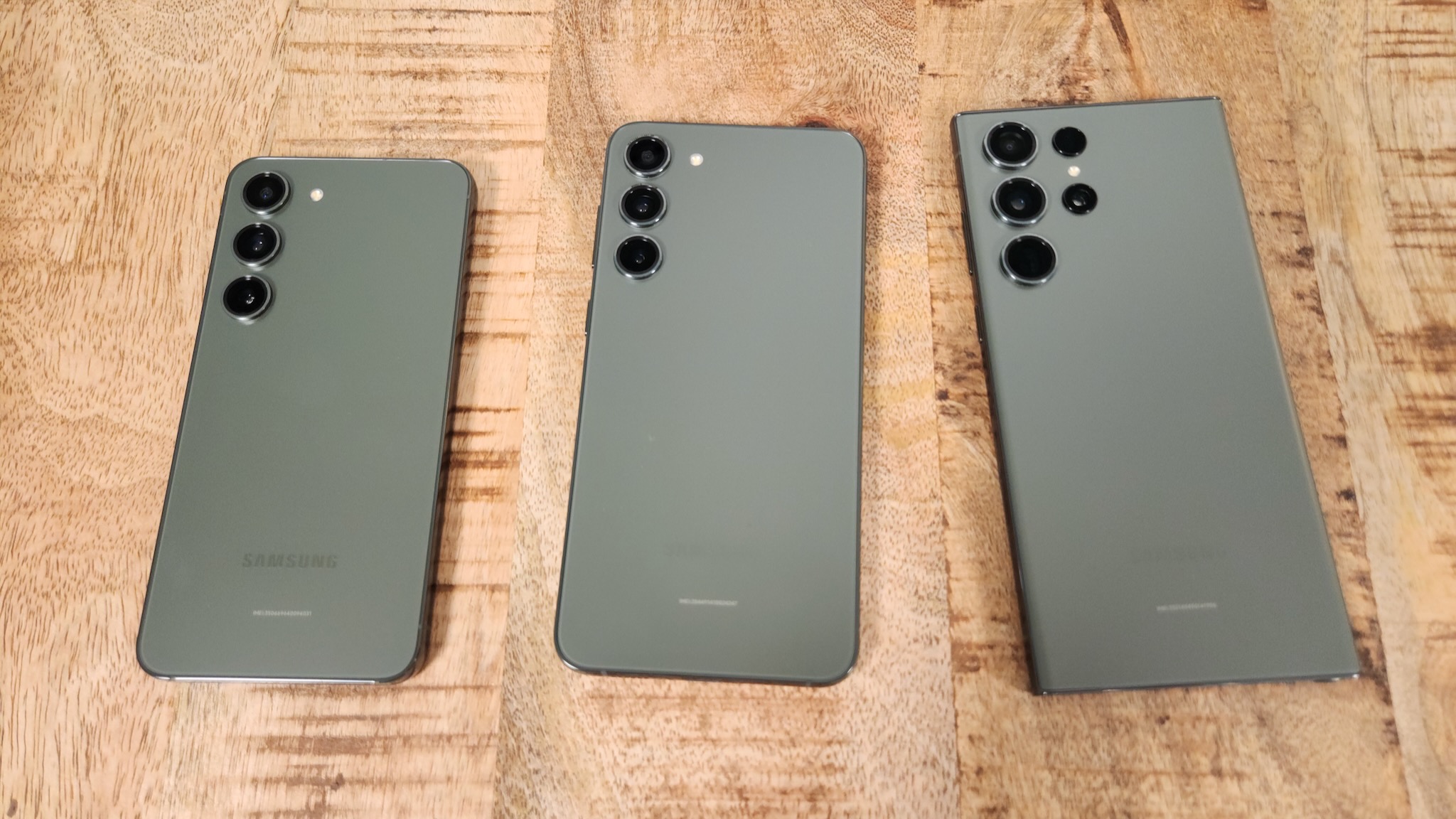
Samsung latest and greatest got some notable changes on the inside thanks to the beefier chipset and larger batteries on two of the three models, but the Galaxy S23 and S23+ also got a bit of a low-key glow-up. The new design gives the phones a simplified look with a flat rear panel and no separate camera island. The only interruption is the three individual camera modules protruding from the top left corner. It's giving LG Velvet.
My colleague Nick Sutrich and I have opposing views on the design — he hates it, and I think it's pretty good. But what we both seem to agree on about the Galaxy S23 design is that it is outright boring.
And to me, that's as much of a good thing as it is a bad thing.
Consistency is key
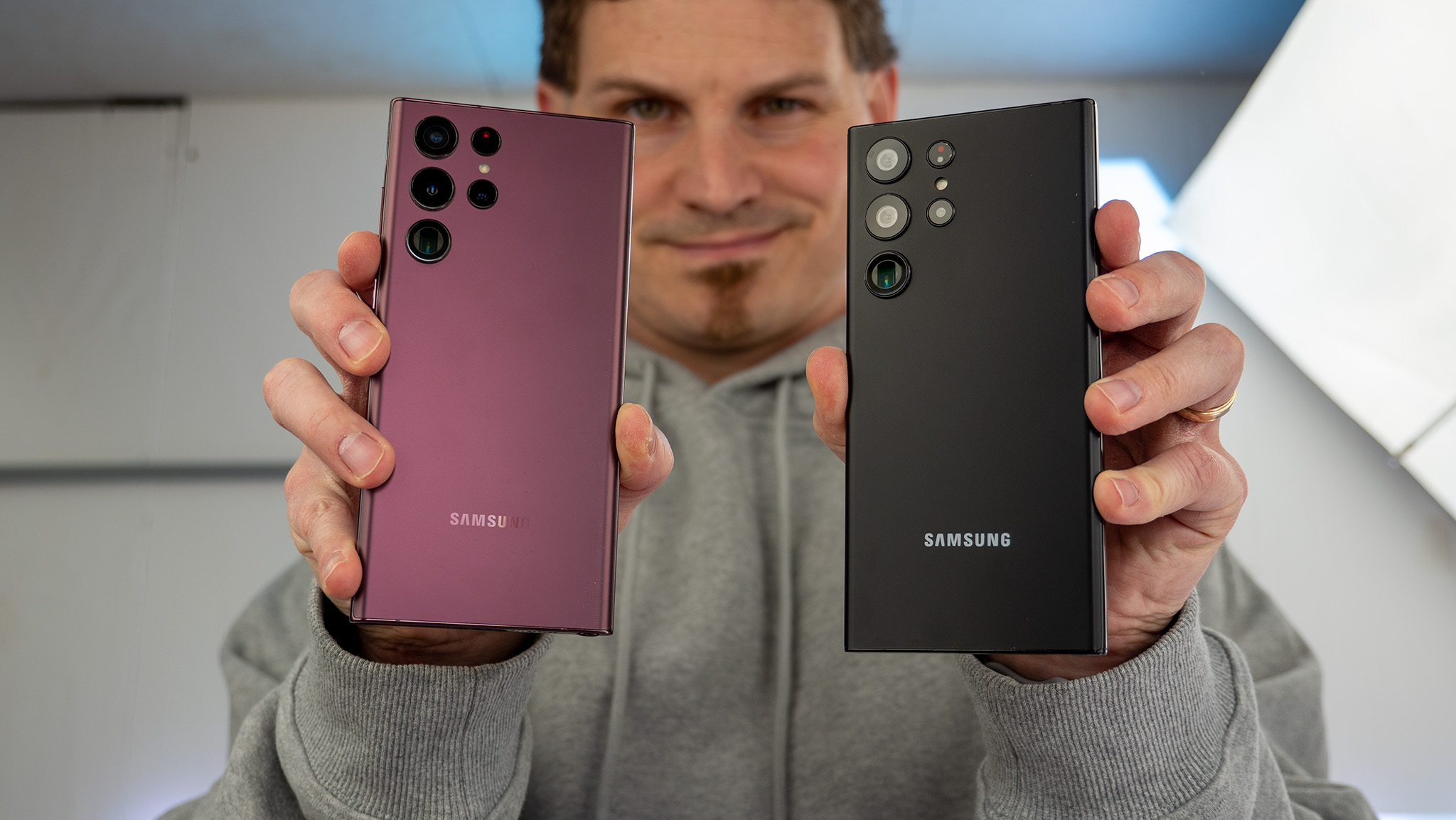
It makes sense that Samsung would go this route for the S23 series. Last year's Galaxy S22 and S22+ retained the same design from their predecessors while Samsung put all its focus and effort into giving the S22 Ultra a new design, removing the camera island and giving us protruding camera lenses. This time, the Galaxy S23 and S23+ have caught up to the new design language, giving the new flagships a more consistent look. They even have matching colors now (no Ultra exclusive colorways this time unless you look at the Samsung-exclusive ones).
It looks like Samsung is going for a singular design language across its lineup.
But this isn't exclusive to the S23 series. Samsung launched the Galaxy A14 5G in January, which gave us our first official look at the company's new design language. Despite being a budget phone, the new design makes it look more premium than it actually is, at least from the back. It also looks better than most cheap Android phones in its price range, which could be a deciding factor for someone looking for an inexpensive smartphone.
The fact that a budget smartphone has a similar design to a flagship screams not only consistency, but to the average consumer, it could suggest quality. And based on leaks of upcoming A-series phones like the Galaxy A54, A34, and A24, it looks like Samsung may be banking on this idea by copying/pasting this design across its entire lineup for 2023. Not to mention how this may simplify Samsung's manufacturing if just about all its phones look the same.
Boring is boring
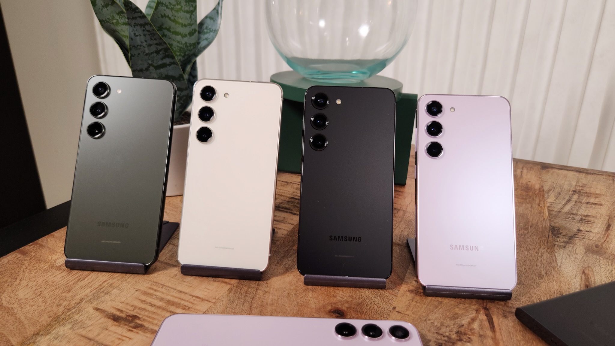
Then again, this could also backfire. Giving its flagship S-series phones the same exact design as its mid-range and budget A-series phones also screams "cheap." Samsung didn't exactly pick the best colors for the Galaxy S23 and S23+ (the new green is a real downgrade), and given its tendency to give the A-series phones more fun colorways, I would probably be more visually enticed to pick one of those up.
Be an expert in 5 minutes
Get the latest news from Android Central, your trusted companion in the world of Android
Additionally, there are some downsides to this camera design. As Nick pointed out in his Galaxy S22 Ultra review, the individual camera modules tend to collect a heap of dust and lint around them, which can be difficult to clean. Another problem is that the protruding lenses are more exposed to the elements than if they were housed on a camera island, so if you like to live on the edge without a case, you’re putting your cameras at risk.
Look outside of Samsung's lineup, and you really see how its new design pales in comparison to other recently launched phones. The Xiaomi 13, IQOO 11 Pro, OnePlus 11, and Motorola X40 Pro all have camera islands that give their phones a distinct look. Given there are few ways to differentiate a phone from the front, the back is where OEMs can really make their phones stand out. The Galaxy S23 series is just... there.
Despite a similar camera layout, the LG Velvet was a much nicer-looking phone.
Even the LG Velvet seemed more distinct, with a nearly identical camera setup made to form a water droplet shape. Perhaps because it was compared to previous LG phones, but the Velvet was often hailed as LG's best-looking smartphone. I don't expect the S23 series to win any design contests, and I’m not sure if adding a camera island wouldn’t have made it look any better. But going from the fairly unique island on the S22 series to no island at all just leaves the cameras floating in a sea of utter boringness.
Does Samsung really need a flashy design?
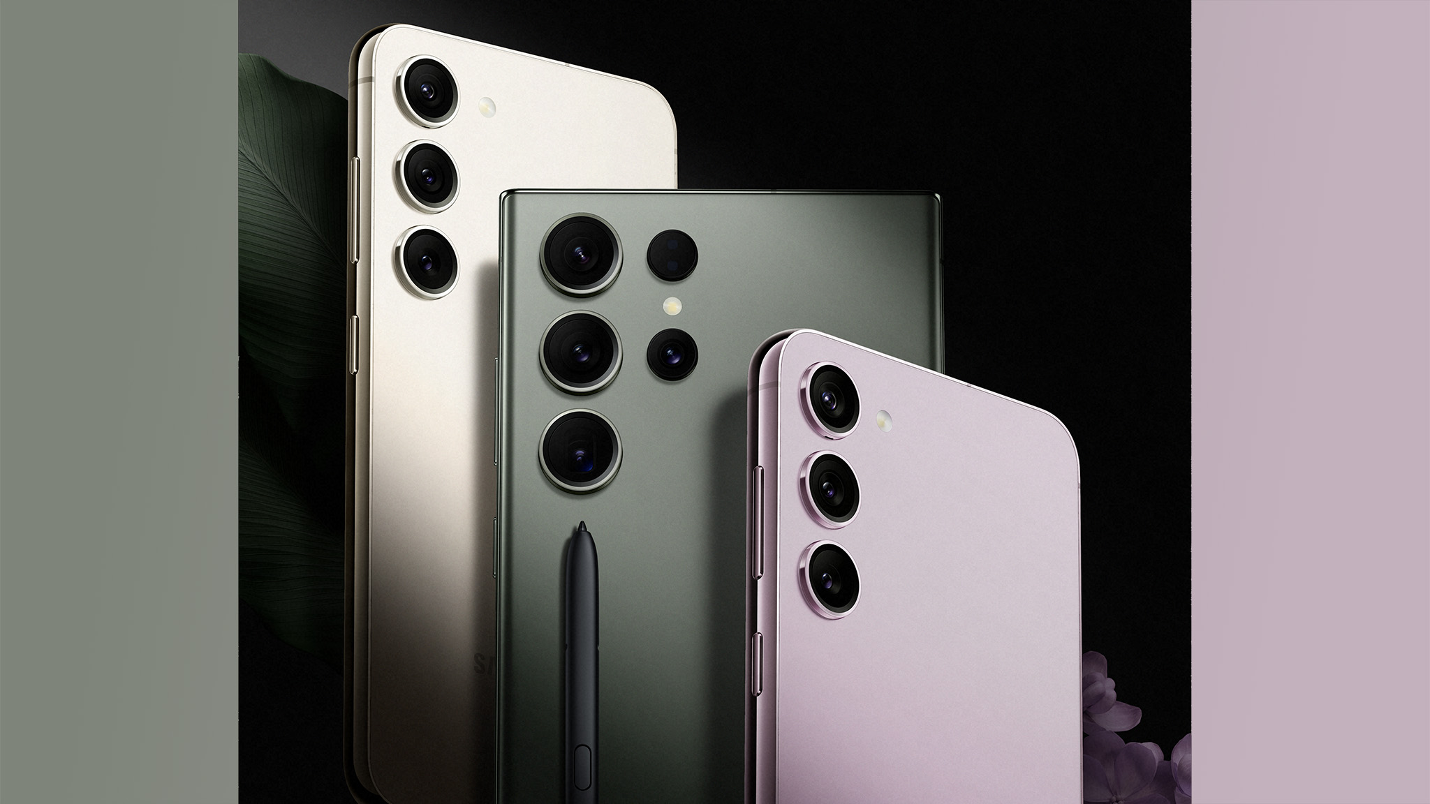
As the largest Android OEM in the world, one might argue that Samsung doesn’t have to try too hard to sell a phone. The company could launch the most boring-looking phone, and people would still buy it if the company marketed it enough. And as the saying goes, it’s the inside that counts, and Samsung and Qualcomm pulled out all the stops with the new Snapdragon 8 Gen 2 for Galaxy.
Design is only one aspect of buying a phone, and honestly, it’s probably the least important part. Of course, we recommend slapping on a Galaxy S23 case, which can give your phone a drastically new look. So whether or not the Galaxy S23 design is boring, it may not matter all that much if you plan on protecting it either way. Plus, you may want a case to avoid dust building up between the camera modules.
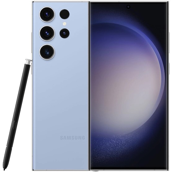
The Galaxy S23 Ultra is the ultimate smartphone of 2023. It has a simple yet effective design, a large 120Hz display, built-in S Pen, and it's powered by the latest Snapdragon chipset. And if you like taking photos, the 200MP camera will give you all the detail you need and then some.

Derrek is the managing editor of Android Central, helping to guide the site's editorial content and direction to reach and resonate with readers, old and new, who are just as passionate about tech as we are. He's been obsessed with mobile technology since he was 12, when he discovered the Nokia N90, and his love of flip phones and new form factors continues to this day. As a fitness enthusiast, he has always been curious about the intersection of tech and fitness. When he's not working, he's probably working out.
