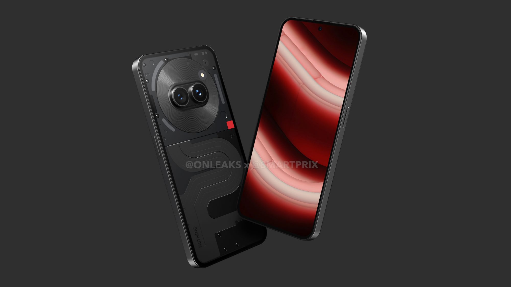
Fresh Nothing Phone 2a renders reveal the budget phone in full
The new renders claim to be accurate, unlike the previous ones that were misleading.

What you need to know
- Nothing's new Phone 2a renders reveal the device's design and glyph interface.
- They indicate a premium design for the budget segment the device aims at.
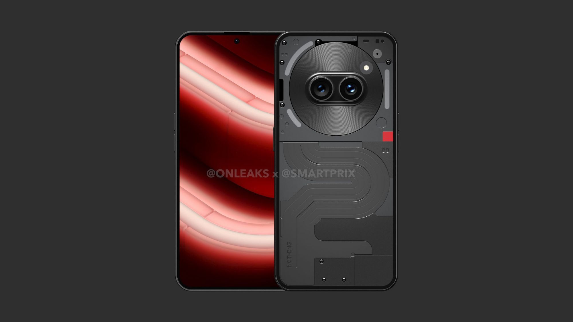
- Phone 2a has a translucent design and a limited set of glyph interfaces, unlike the flagship models.
Prolific Leaker is back again with a new set of renders of Nothing Phone 2a, which is all set to launch next month. While it's a new product catered to a different segment, Steve Hemmerstoffer, aka OnLeaks, has shared fresh renders showing the device in all its glory.
Earlier shared renders of the Phone 2a turned out to be misleading, which were also shared by OnLeaks, wherein he acknowledged the mistake and apologized for sharing the wrong renders. However, he's back with new official-looking renders that appear more authentic and reveal the design of the upcoming budget phone from Nothing.
Sooo #FutureSquad... Once and for all and for the very last time...😏THIS is the #NothingPhone2a (most detailed and accurate look at its "Fresh Eyes" yet through stunning 5K renders) and its full specs sheet! 👀 On behalf of @Smartprix 👉🏻 https://t.co/tSA5Gr332C pic.twitter.com/c1YRSxqAyPFebruary 20, 2024
OnLeaks has partnered with Smartprix to reveal the new Phone 2a renders. Per the renders, the signature translucent design is here to stay on the Phone 2a, similar to the previous Nothing phones, Phone (2) and Phone (1). Unlike the latter phones with a vertical camera array, the Phone 2a could have a horizontal dual camera setup enclosed in a circular visor.
The visor is accompanied by Nothing's signature glyph interface featuring two large LED strips coupled with a shorter one. While the flagship Nothing phones came with a glyph interface covering the whole rear panel, the Phone 2a appears to be settling with only the top half of the panel.
The graphic design placed in the other half of the rear panel of the Phone 2a is inspired by the New York Subway map made by Massimo Vignelli, confirmed earlier by Chris Weightman, the Industrial Designer at Nothing, during last week's launch date announcement video.


The high-quality renders reveal a punch-hole display on the front and a flat edge design paired with slightly rounded corners. Overall, these Phone 2a renders imply a prominent use of high-quality materials despite the device aiming for a cost-effective segment.
Suppose these official-looking renders are believed to be accurate. In that case, Nothing should definitely have an advantage over its counterparts when it comes to design, as it will undoubtedly stand out.
Be an expert in 5 minutes
Get the latest news from Android Central, your trusted companion in the world of Android
As for specs, Nothing recently announced that it is opting for a MediaTek chip on the Phone 2a, unlike its other phones that relied on Qualcomm. We will be seeing the Dimensity 7200 Pro powering the Phone 2a, which will have an octa-core design with 2.8GHz clock speeds.
The company had also considered utilizing Snapdragon 7s Gen and 782G of Qualcomm but ultimately had settled on the Dimensity 7200 Pro, which is said to be Nothing's co-engineered chipset with MediaTek.
As we near the launch — slated for March 5, 2024, we are seeing interesting details about the device officially and unofficially through these renders. We expect more to be unveiled in the next few weeks before the Phone 2a's release.

Vishnu is a freelance news writer for Android Central. Since 2018, he has written about consumer technology, especially smartphones, computers, and every other gizmo connected to the internet. When he is not at the keyboard, you can find him on a long drive or lounging on the couch binge-watching a crime series.
