Android Central Verdict
Nothing has delivered a stellar second-generation phone and a first-generation launch in North America. It successfully challenges the Galaxies and Pixels of the region with a competitive price, unique features, and a solid overall experience. Nothing is an extremely compelling option if you're looking for something a little different this year.
Pros
- +
Gorgeous design
- +
Great price
- +
Good performance and battery life
- +
Unique features and UI
- +
High PWM rate (1,920Hz or higher)
- +
Very capable camera
Cons
- -
Low-light shots are lacking
- -
Image stabilization could be better
- -
No telephoto lens
Why you can trust Android Central
Last year's Nothing Phone (1) was a spectacle of a device. Nothing CEO and founder Carl Pei is a hype man if nothing else, and his new company's first device was certainly unique, but it had its flaws. Chief among them were some issues with the hardware and software that just weren't as full-featured as phones from companies like Google, Samsung, and Apple.
This year, Nothing is leaning into the fun factor with the Nothing Phone (2), a phone that certainly looks like a "Nothing Phone," complete with the lighted glyph interface on the back. The hardware has been refined, with a slightly taller build, a curved glass back, and a faster processor. But the real improvement is in the software.
From the moment you turn it on, you can tell this thing was designed to provide a certain look and experience from the get-go. The monochrome dot matrix look is everywhere, from the initial setup to each and every widget and app Nothing makes. It's incredibly stylish, and Nothing even launched several new unique features that are just plain fun, and it's an easy recommendation as an alternative to the best Android phones made by Samsung and Google.
Nothing Phone (2): Price and availability
The Nothing Phone (2)'s release marks the first time Nothing is officially offering a phone in North America. That means you'll get full 5G speeds with full network support on AT&T and T-Mobile. It's not officially compatible with Verizon.
The Nothing Phone (2) is available in both white and dark gray colorways starting at $599 USD / $929 CAD for a model with 8GB RAM and 128GB storage. Upgrades are available with 12GB of RAM, starting at $699 USD / $999 CAD for 256GB of storage and $799 USD / $1,099 CAD for 512GB of storage.
The Nothing Phone (2) is sold directly through Nothing's website and has been available since July 17, 2023.
| Category | Nothing Phone (2) |
|---|---|
| Display | 6.7-inch 120Hz OLED (LTPO), 2142 x 1080 (394 PPI), 1,600 nits peak brightness, Gorilla Glass |
| Display qualities | 1,920Hz PWM dimming, SGS Low Blue Light certified |
| Chipset | Qualcomm Snapdragon 8+ Gen 1 |
| Memory | 8GB or 12GB |
| Storage | 128GB, 256GB, 512GB |
| Rear Camera 1 (main) | 50MP, Sony IMX890, ƒ/1.88, 1.0μm, 1/1.56-inch sensor size, OIS and EIS |
| Rear Camera 2 (ultrawide and macro) | 50MP, Samsung JN1 sensor, ƒ/2.2, 0.64μm, 1/2.76-inch sensor size, 114-degree FoV, EIS |
| Front Camera | 32MP, ƒ/2.45, 1/2.7-inch sensor size |
| Video resolution | Max 4k/60FPS on rear cameras, 1080p/60FPS on front camera |
| Battery | 4,700mAh |
| Charging | 45W wired fast charging, 15W wireless charging, 5W reverse wireless charging |
| Ports and SIM | USB Type-C, Dual SIM |
| Audio | Stereo speakers, 3 microphones with noise suppression |
| Wireless | Bluetooth 5.3, NFC, Wi-Fi 6, 5G Sub-6 |
| Security | In-display fingerprint sensor |
| Weight | 201.2 grams |
| Dimensions | 76.4mm wide x 162.1mm tall x 8.6mm thin |
| Water and dust resistance | IP54 |
| Colors | White, Dark Gray |
| Software update promise | 3 years of Android updates, 4 years of security updates every 2 months |
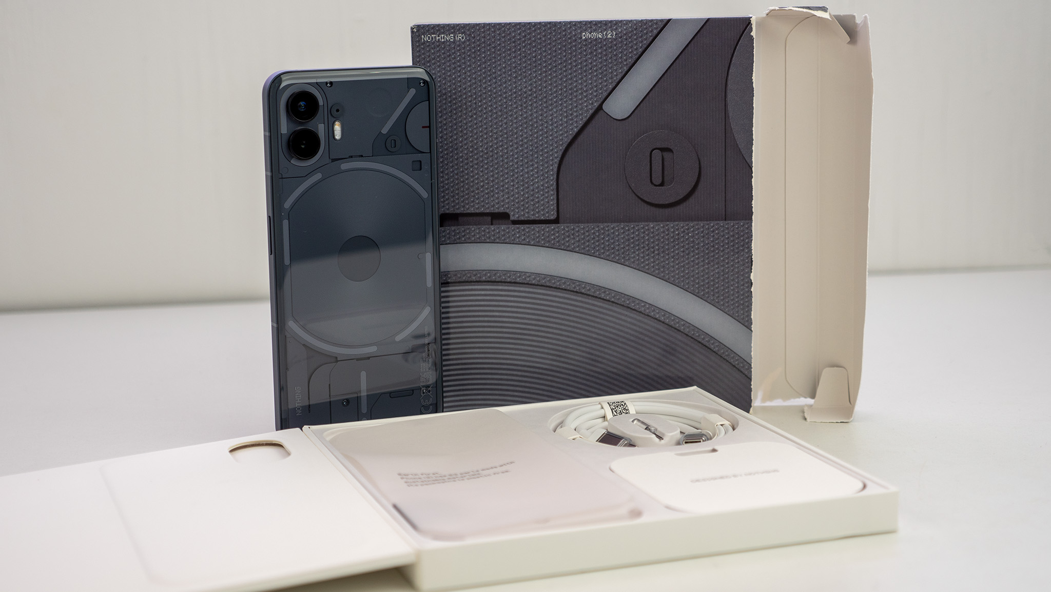
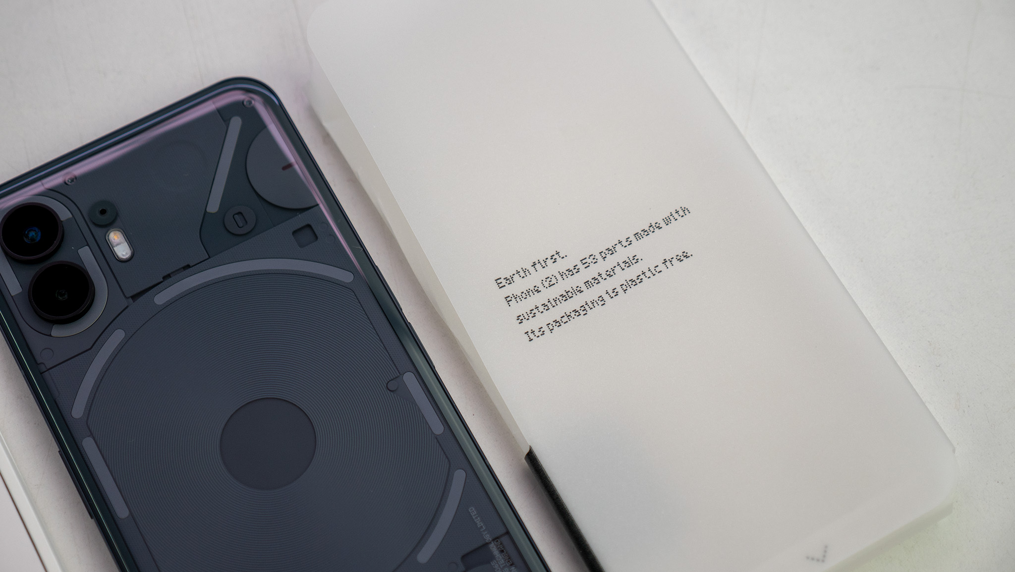
In the box, you'll find the phone, a new USB-C cable with transparent connectors, the same snazzy transparent SIM ejector tool from the first phone, and a handful of small pamphlets. The packaging is entirely plastic-free, and Nothing even prints the phone's carbon footprint on the box.
Nothing was able to reduce the carbon footprint of the phone by using less plastic and more recycled materials. The Nothing Phone (2)'s carbon footprint is 53.45 KG CO2E, a full 5.05 KG CO2E lower than Nothing Phone (1). SGS certifies this rating, so you know it's legitimate and not something only Nothing's marketing team came up with.
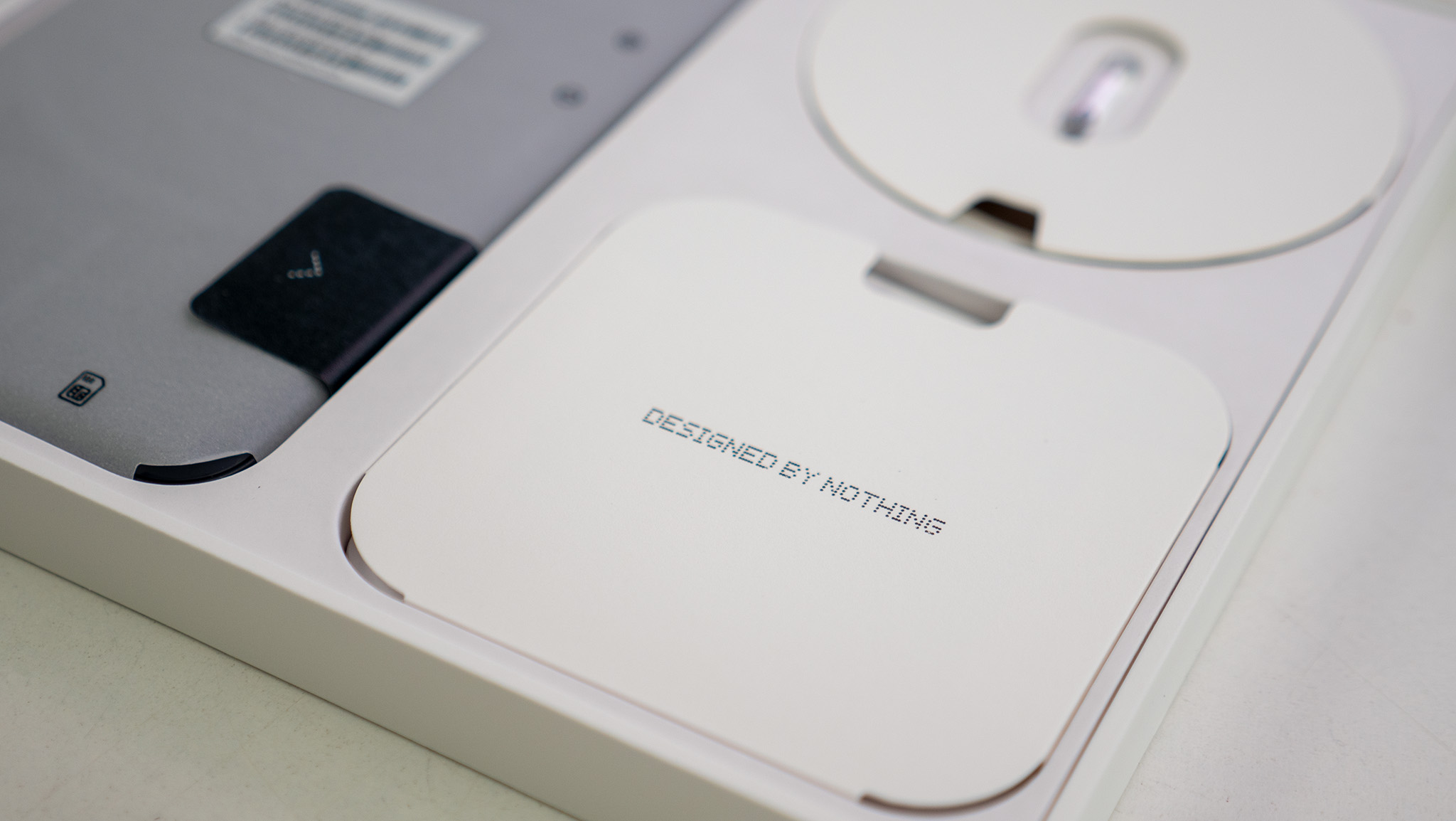
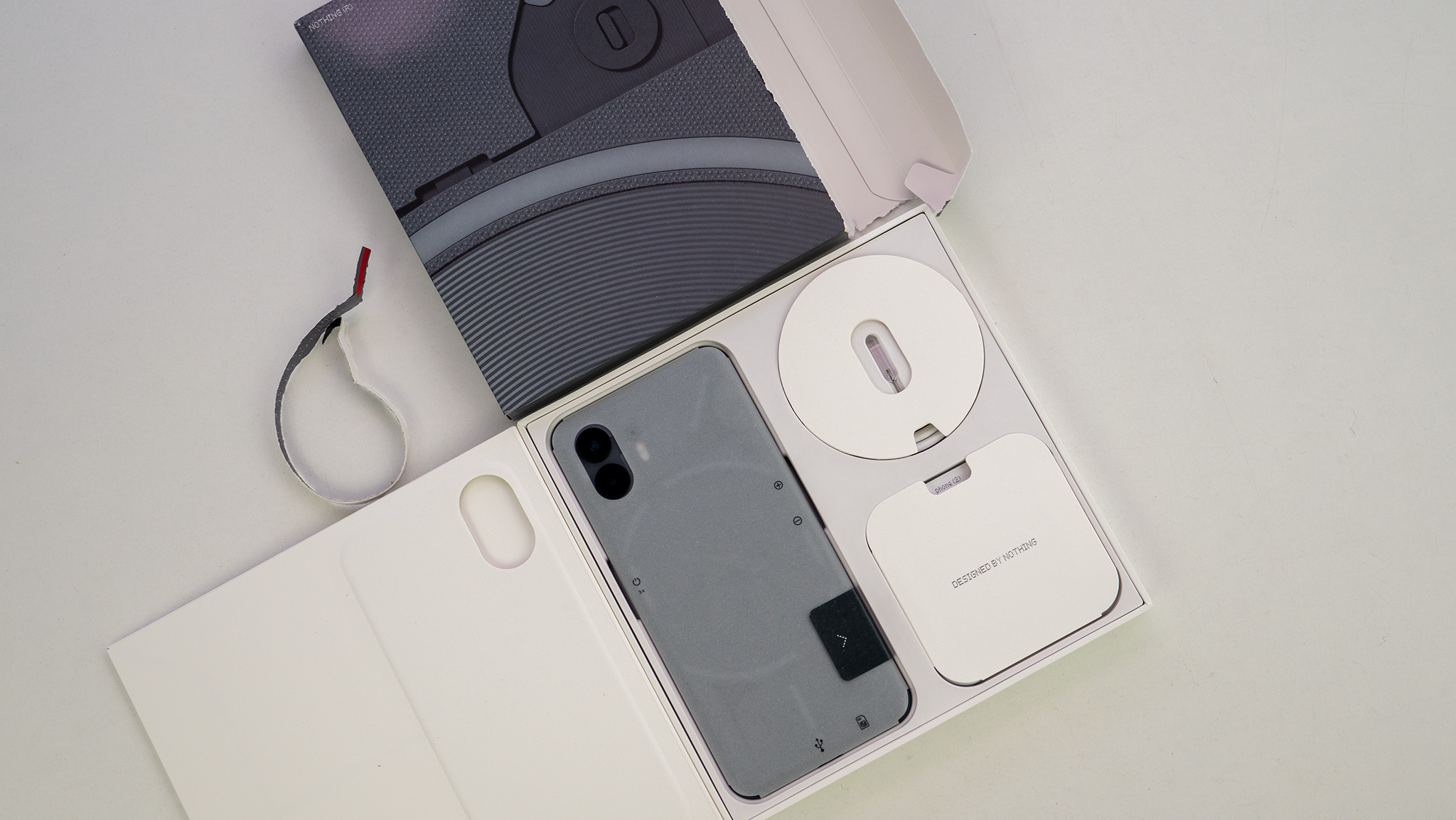
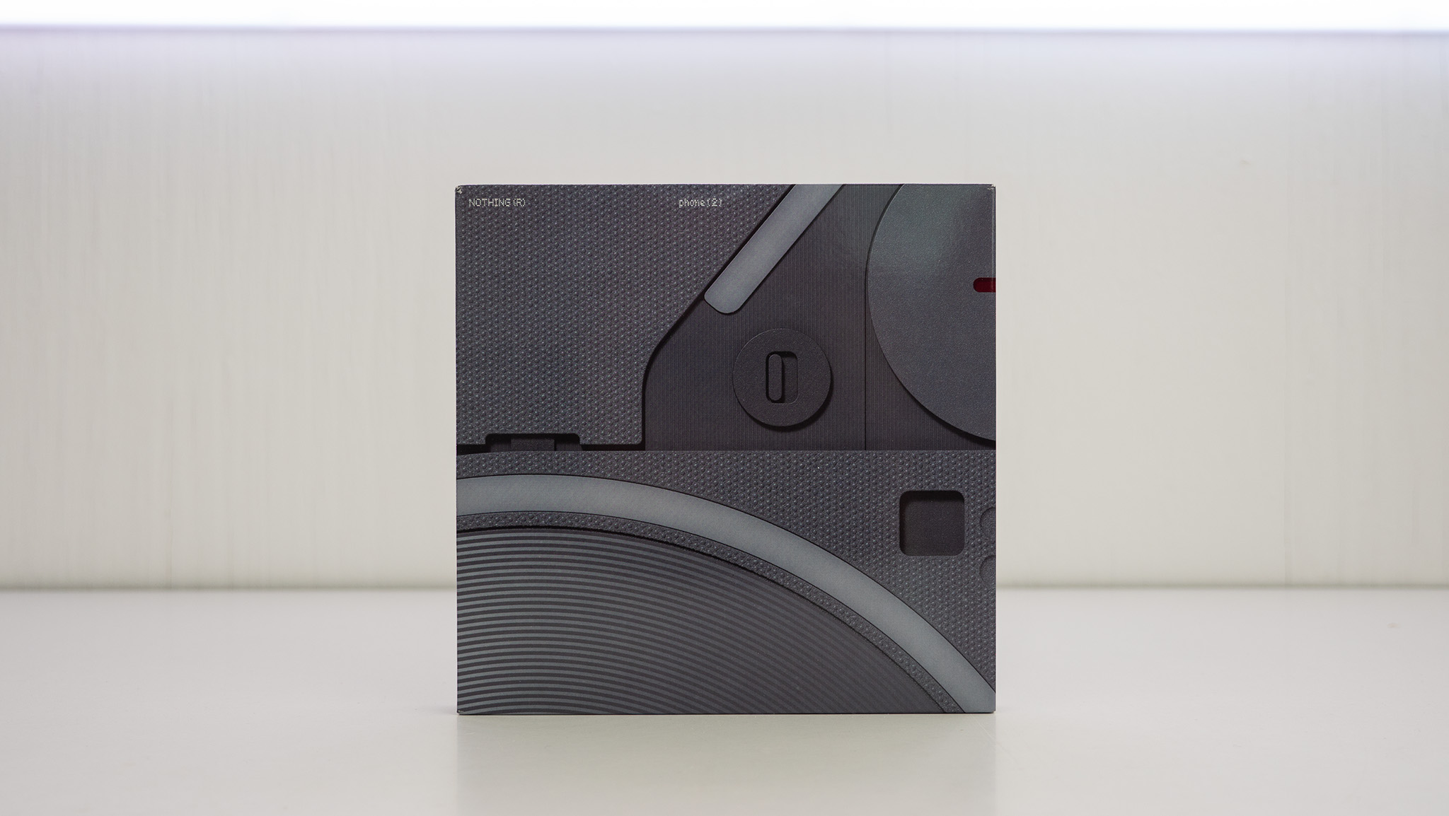
Everything about the unboxing process for this phone is beautiful. As with last year's Phone (1), the Nothing Phone (2) comes packaged in a box that has no openings except for a small pull tab at the top. Like a gum package, you'll use this tab to tear the box open and slide the phone packaging out.
The company is headed by huge names in the design industry, and you can tell Nothing takes design seriously just from the box alone. A new USB-C cable with transparent connectors is included and continues to flow along with Nothing's transparent design mantra, found in products like the Nothing Ear (2).
Nothing Phone (2): Design and display

There's no denying that Nothing is still styling its phone similarly to an iPhone in every way, complete with the faux "deconstructed" Apple logo on the back in lighted glyphs. But that doesn't mean it's just a copycat.
The curved glass back makes the phone feel so much nicer to hold. As my colleague Andrew Myrick put it, "This is how I want the iPhone to feel like when I pick it up."
The frame is made of 100% recycled aluminum and, combined with the curved back, feels elegant and premium. Not everyone will enjoy the flat sides, but the argument between flat and curved sides is more of a preference, anyway.
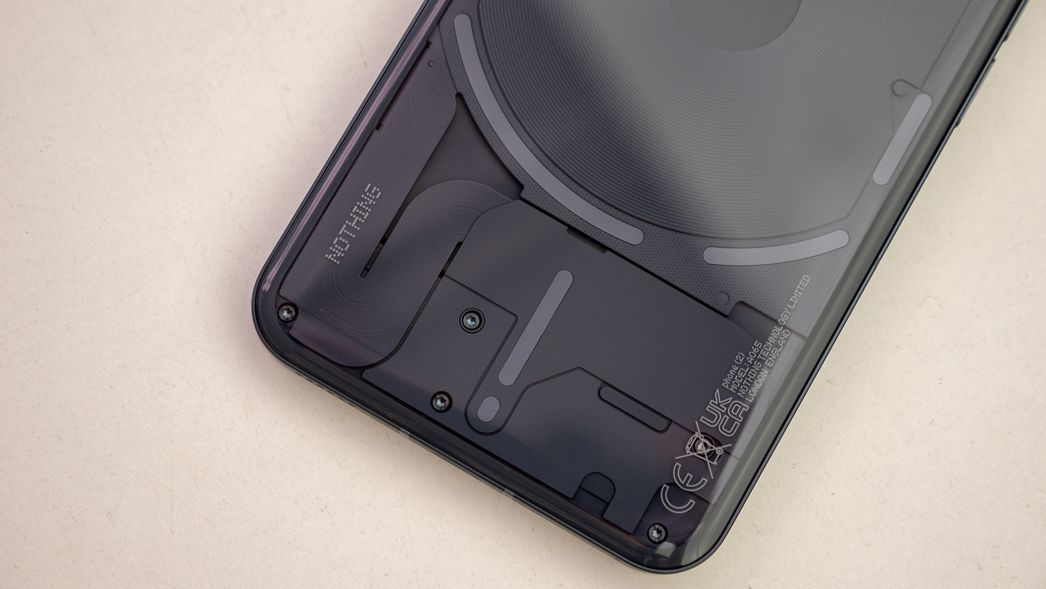
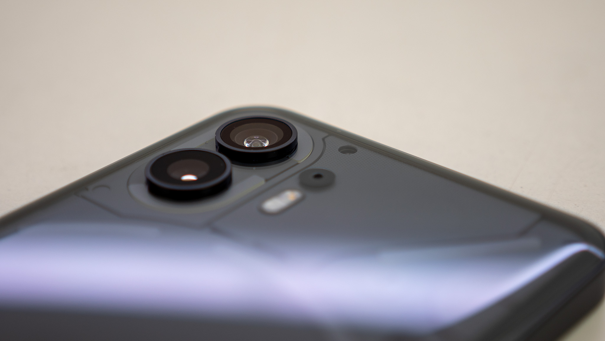
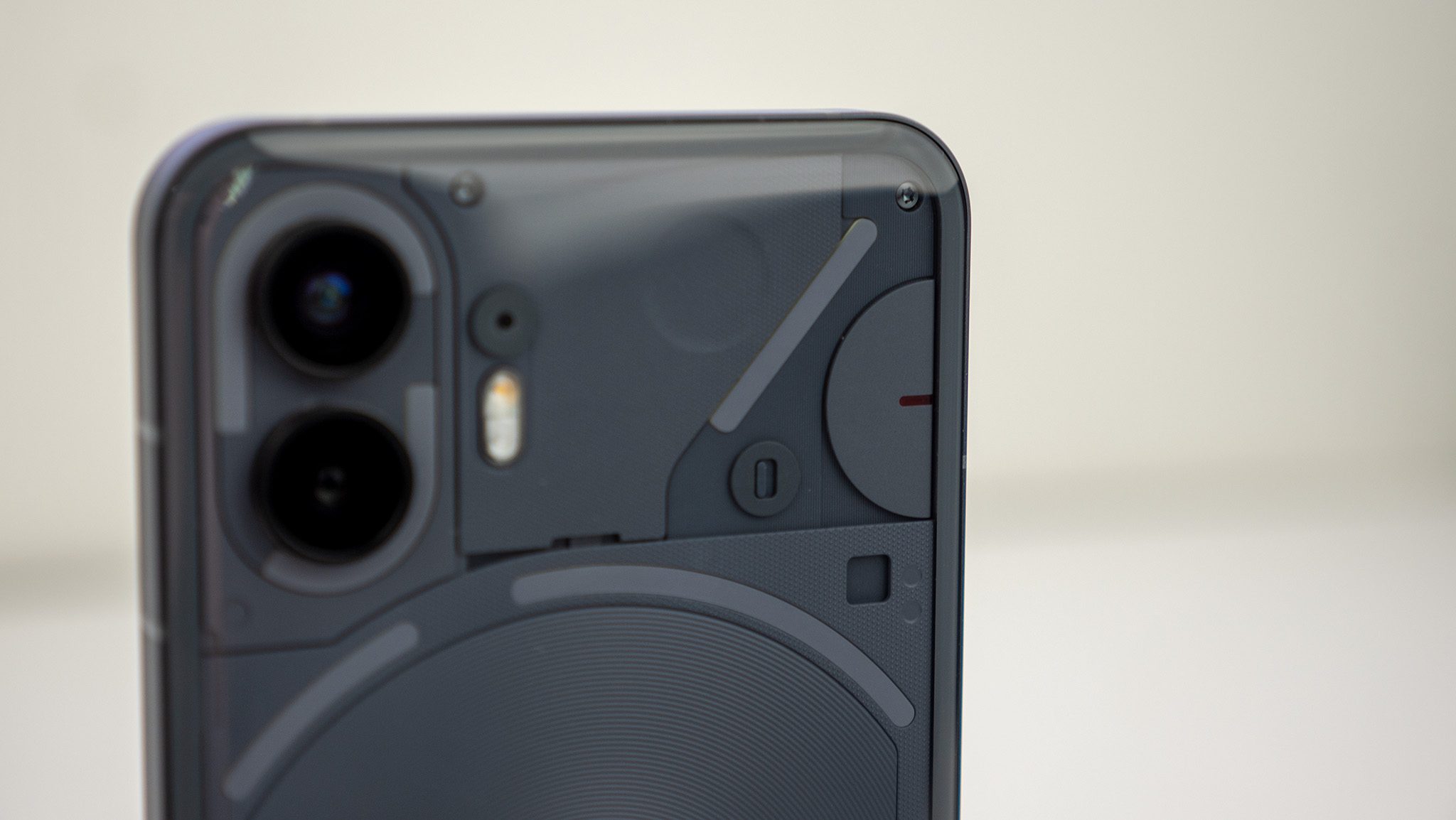
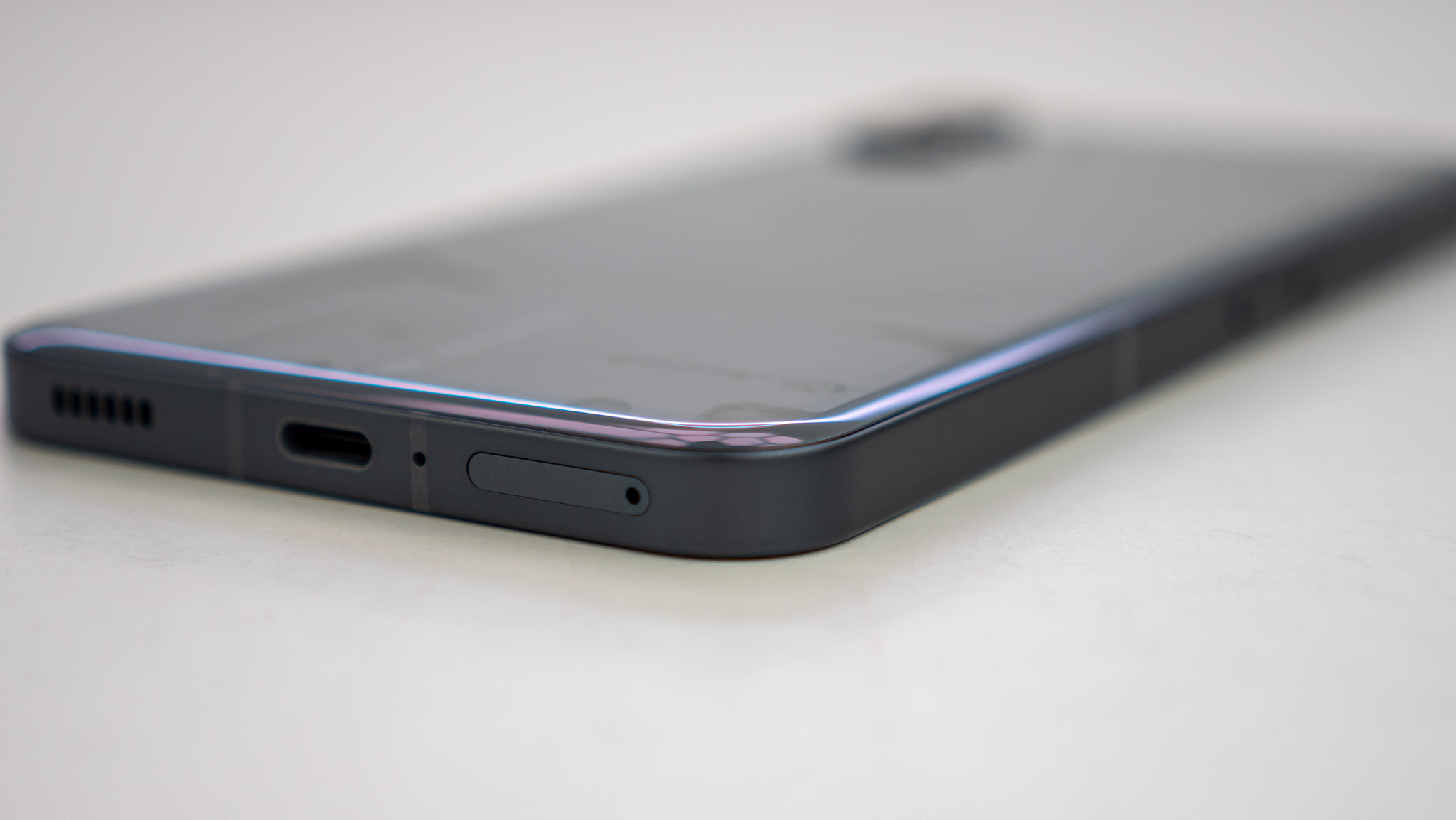
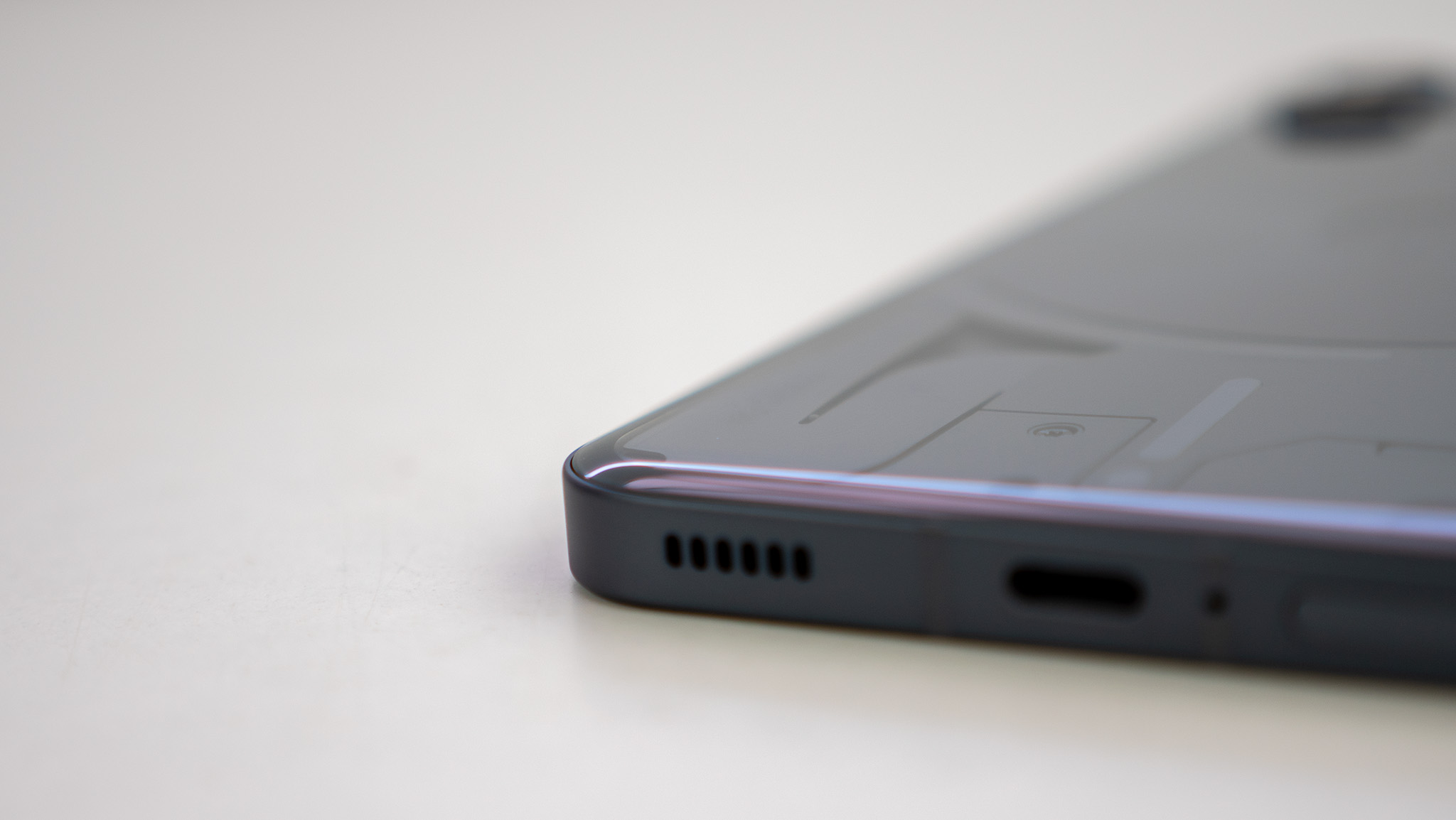
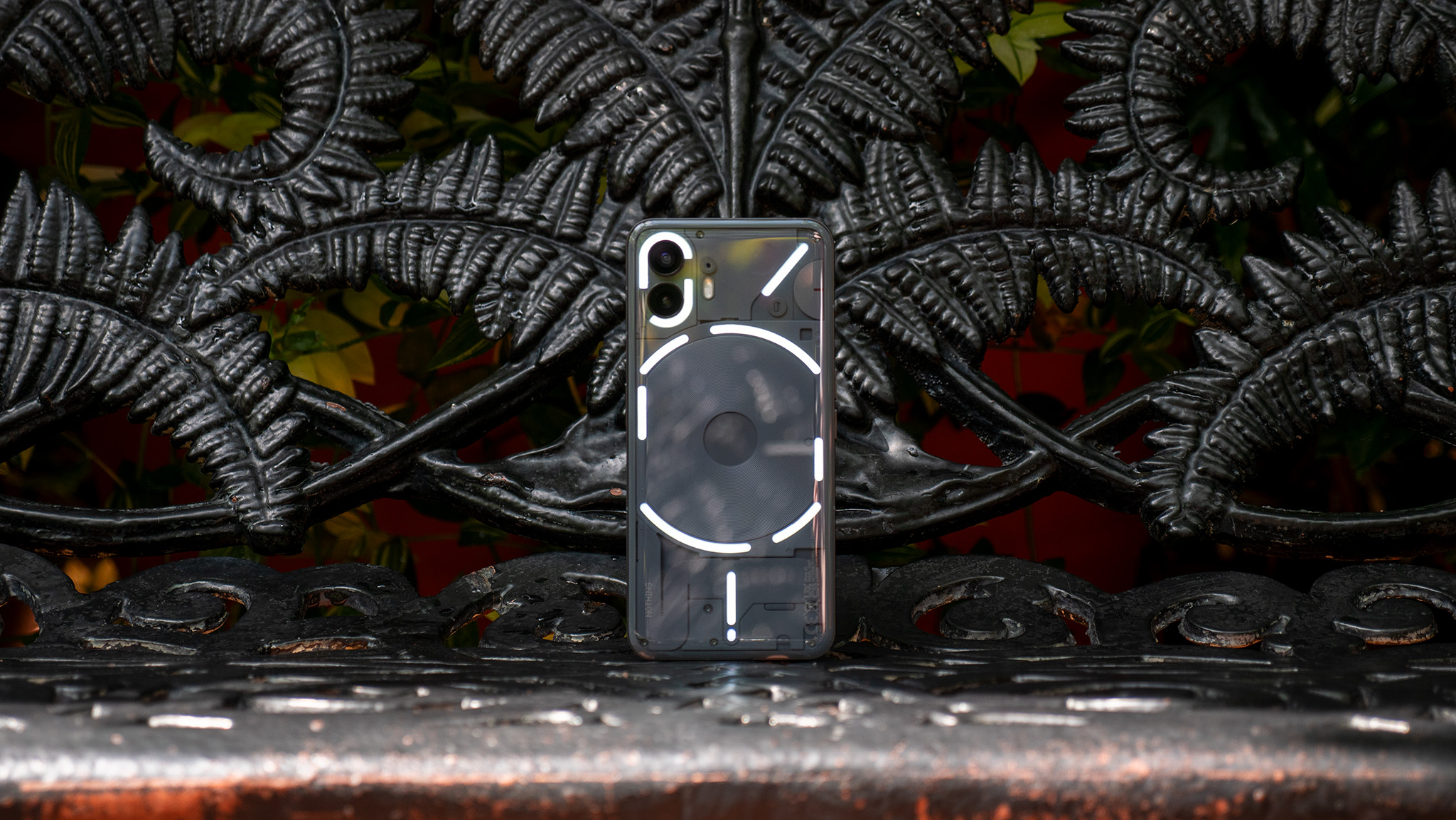
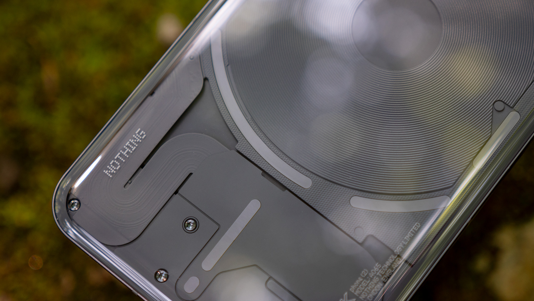
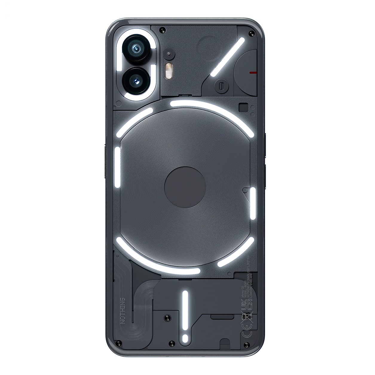
The back of the Nothing Phone (2) is absolutely striking and immediately recognizable. While there's little functional purpose behind the semi-transparent design, the company's lighted Glyph Interface has proven to be a boon for setting the phone apart in more ways than just looks.
Those LED lights on the back of the phone have been upgraded and now have more functionality. Phone (2) has 11 LED strips on the back, and each strip is made up of 33 individual zones — up from 12 on Phone (1). Nothing says it designed the Glyphs so users can be "more present in their everyday lives."
There's even a new sensor that tunes the brightness of the Glyphs automatically, ensuring that you don't get blinded in the dark by a notification.
The Glyphs have been improved with 33 individual zones and the ability to create more custom ringtones and notifications.
The idea is that you'd put your phone face-down on a table, and instead of reading individual notifications as they come in, the Glyph interface can be used to filter out the noise so only important notifications come through.
Now, while I love this idea, I never found myself using it naturally as a replacement for my smartwatch or a way to actually filter notifications. With that being said, I regularly see people in public who use the LED flash on the back of their phones as a way to get their attention when a notification comes through.
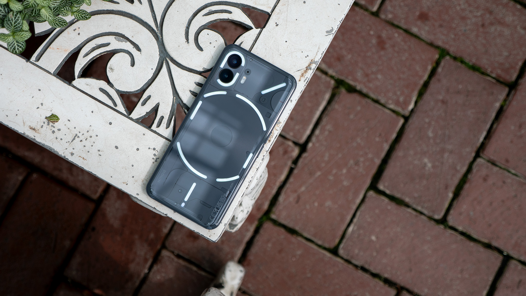
I think these are the people that will enjoy these glyphs the most, as they can be fully customized and act a bit like a Do Not Disturb mode, as you can select which apps display Glyph lights and customize the pattern for each app.
Furthermore, some apps let you even dial down into individual notification types or conversations. So if your significant other messages you, the lighting pattern can be different than if someone else is trying to get your attention.
There's even a cool new Glyph Composer that lets you make your own ringtones, complete with lighted Glyphs and custom sounds by EDM group Swedish House Mafia.
The design is gorgeous and elegant feeling, but it's also incredibly slippery.
As it's all glass and aluminum, this phone is heckin' slippery. I don't have one, but the official Nothing Phone (2) case is a must-buy for anyone worried about dropping the phone.
I can't tell you the number of times over the past few weeks that the phone has dropped itself on the floor when I just placed it on a table or a couch. This is both when the phone is face down or back down, and it made me nervous to put it on any smooth surface.
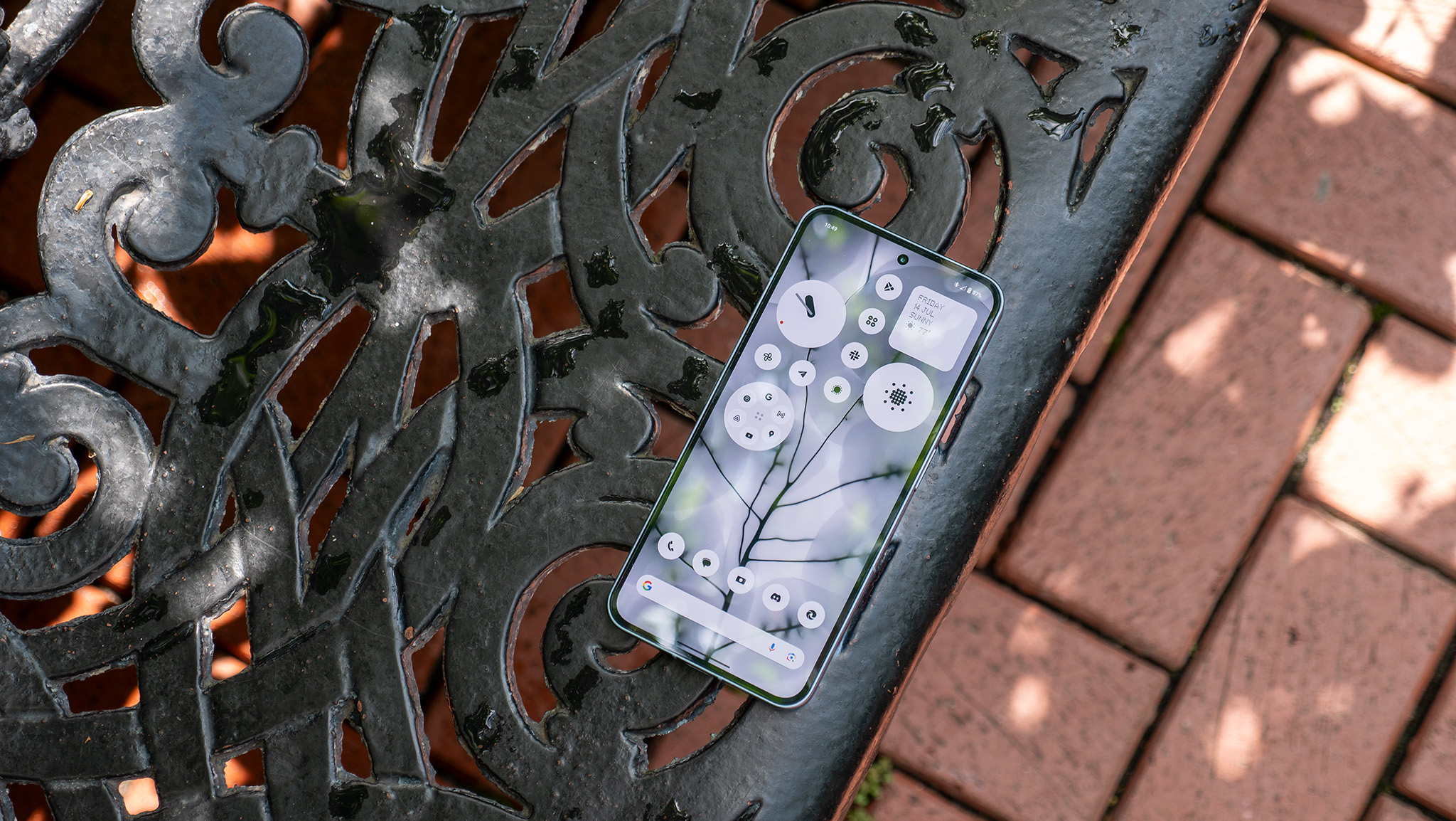
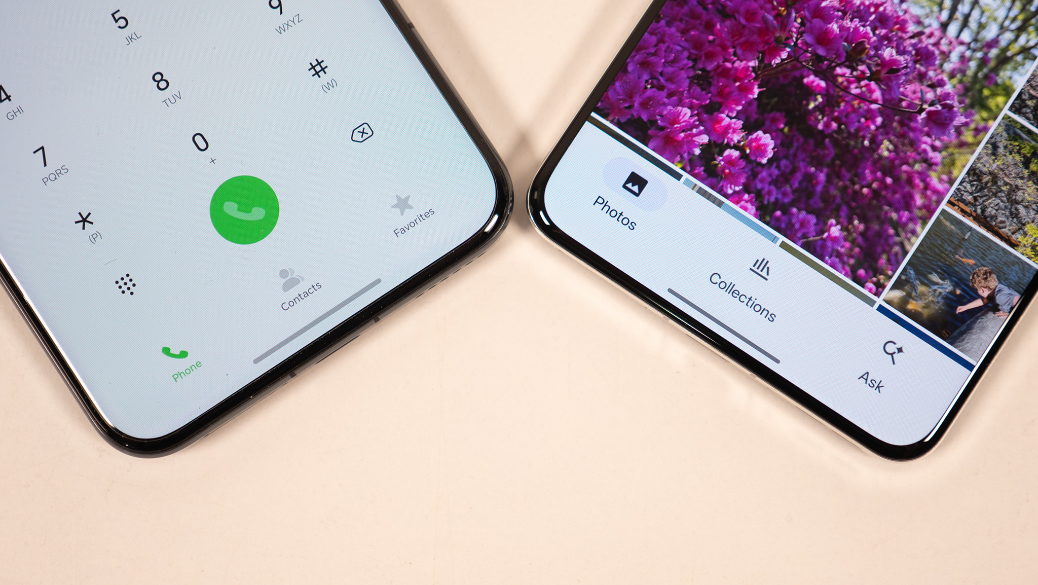
The Nothing Phone (2)'s display is an interesting beast. Instead of being made by LG or Samsung — the companies that make the vast, vast majority of OLED displays on the market — this one is made by a little-known Chinese company called Visionox.
But throw away any preconceived notions about what a smaller company might be able to do because Visionox makes displays that are far more eye-friendly than Samsung's awful AMOLED panels and even better than LG's OLED panels. In some ways, at least.
The OLED on the Nothing Phone (2) uses a PWM rate of 1,920Hz at the default dynamic refresh rate (1-120Hz). That makes it far more eye-friendly than any phone Samsung or Apple has made in years. Not only that, but it actually uses DC dimming at above 47% brightness, meaning it's not rapidly flashing all the time like a phone from Samsung, Apple, or Google.
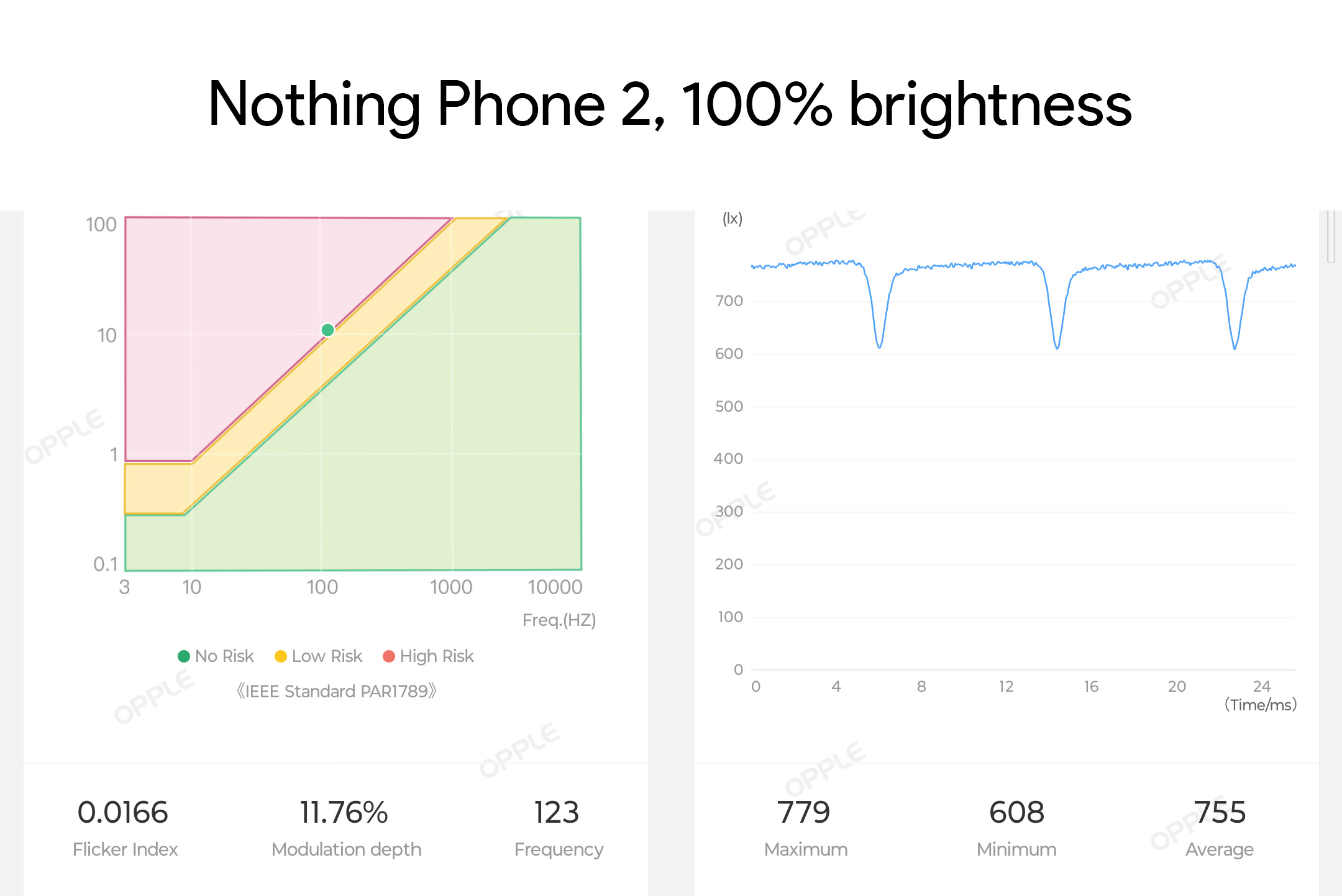
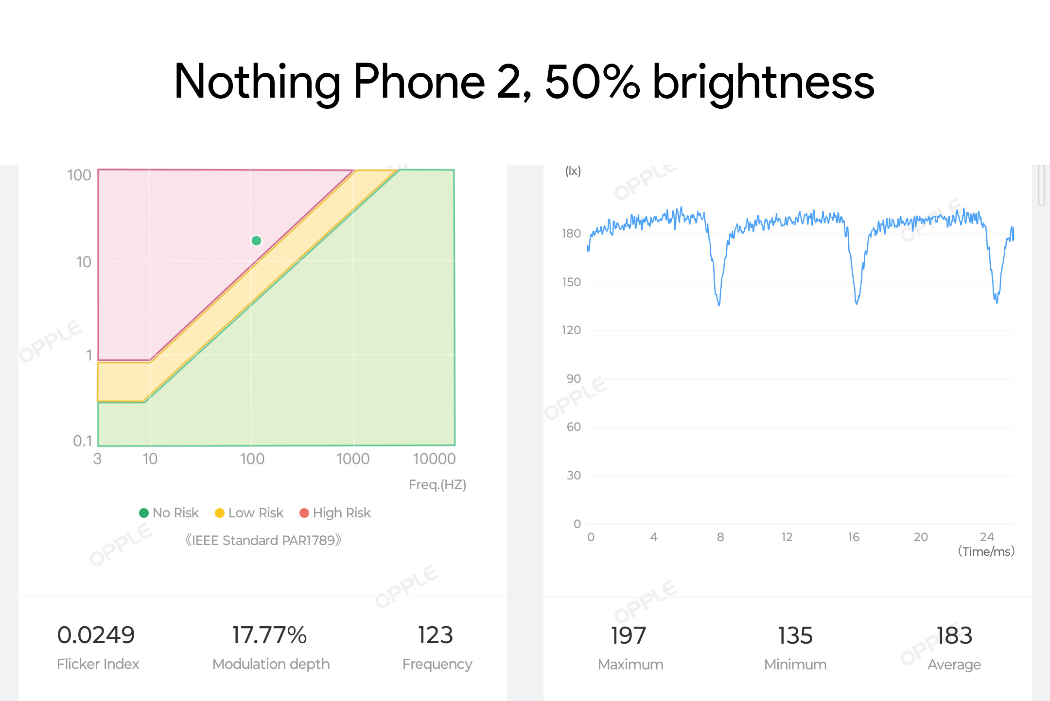
With that being said, I was only able to use it for a day or two before I started to feel dizzy. While it does use DC dimming, OLEDs inherently drop a bit in brightness every refresh cycle — in this case, 120Hz. That means the display is still dipping in brightness 120 times per second, on average.
According to my readings above, this is an 11% dip in brightness. From what I've learned over the past few months, any change higher than 8% seems to negatively affect me. The issue of display flicker sickness is a complicated one, and, unfortunately for those of us affected by it, no single feature improvement will work as a solution for everyone.
Using a high-speed shutter and high ISO rate to analyze the PWM dimming method, it seems that anything above 47% brightness should be relatively OK for most people, including PWM-sensitive folks since it doesn't flicker much. Go below 47%, however, and PWM kicks in heavily. If you own the phone, I wouldn't recommend going below this brightness level if you have sensitive eyes.
Nothing Phone (2): Performance and battery life
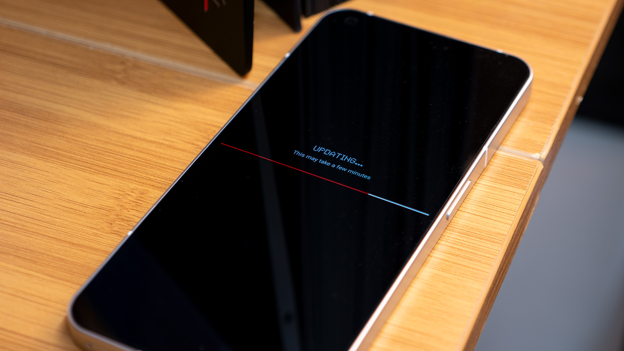
While the Phone (2) sports last year's Qualcomm Snapdragon 8+ Gen 1 processor, there's never a time when I feel like performance is lacking. As Nothing says, the 8+ Gen 1 is a "proven processor" that's both efficient and fast, ensuring that gaming on the phone is smooth and daily tasks happen without lagging, all while the phone sips from the 4,700mAh battery.
I played quite a few games on the Nothing Phone (2) over my first two weeks of testing and let my son's friends play Roblox and other titles on it, too. True to my expectations, the phone never lagged or slowed down, even in graphics-heavy titles. This is the great Snapdragon 8+ Gen 1, after all.
Performance and battery life are both as ideal as it gets on a flagship phone.
I never had a day where I even considered what the battery life might be or had to rush to a wall charger. Most days ended with over 50% battery left, which is always a good sign.
The Nothing Phone (2) supports 45W PPS wired charging, so a full charge takes less than an hour, and topping up 50% happens in 25 minutes. Plus, it's got 15W Qi wireless charging and 5W reverse wireless charging for added convenience.
Nothing Phone (2): Software
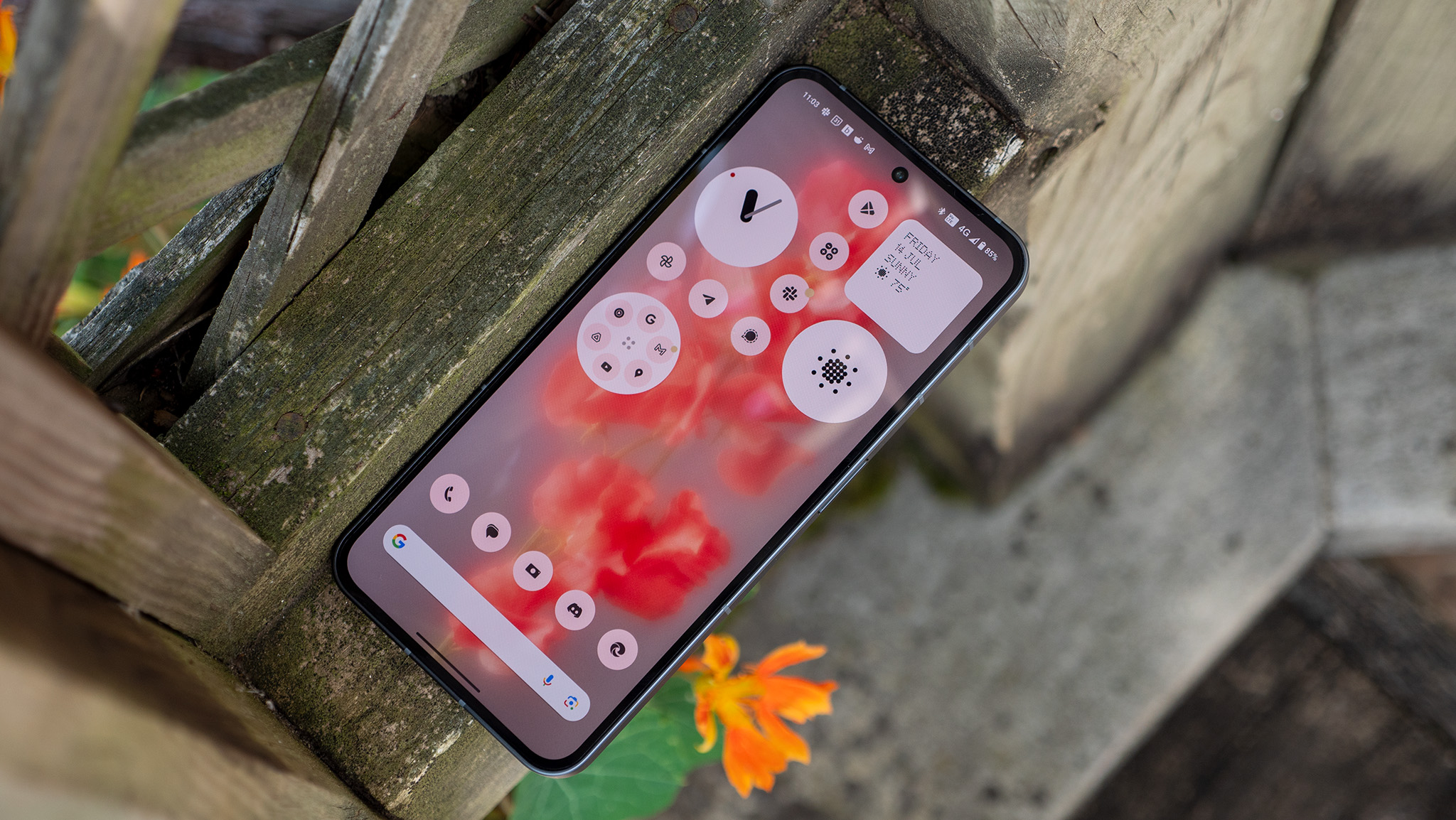
As a child of the 80s and 90s, I have a fondness for retro-chic design. Clearly, so do the designers at Nothing. Every app and widget Nothing designed for this phone fits perfectly into this design, and it's so refreshing to see something so well-honed and executed make its way into a consumer product, especially one that's only a second-generation product.
There's something calming about the Nothing Phone (2)'s home screen that I just can't quite put my finger on. Maybe it's the entirely grayscale color palette or the bevy of beautiful, circular widgets and folders? Either way, I love the way this home screen looks, and that feeling channels itself into other apps and settings menus throughout the experience.
Nothing has added a handful of new widgets, including the ability to add any quick toggle as a home screen widget. Additionally, you can customize icons to make them all grayscale or all one color. Nothing says the idea here is to make using your phone more thoughtful instead of being swayed to use one app more than another due to "color marketing science."
In short, this is what the experience on Phone (1) should have felt like, and Nothing OS 2.0 is proving to be a substantial upgrade in every way possible. Nothing is also offering three major OS upgrades and four years of bi-monthly security updates, matching what many other Android manufacturers have begun to offer, even if it comes just short of Samsung and Google's update promises.
The phone is filled with little ways to use it more thoughtfully, including simple tools like additional widgets and grayscale icons.
Little things like the quick toggles menu — which retains the oversized Wi-Fi and Bluetooth buttons of the original release — aren't just cool looking. They're also incredibly functional.
Those Wi-Fi and Bluetooth toggles dynamically change and can be swiped on, and Nothing even added a quick Bluetooth connection pop-up that's similar to Android's Internet Panel. Why this isn't available in stock Android is beyond my understanding — it's just so darn useful!
And included apps like the aforementioned Glyph Composer made it fun to create my own ringtones complete with customized patterns on the back Glyph lights.
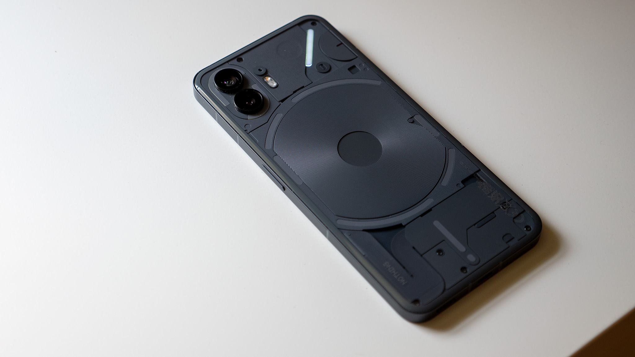
Nothing has worked to incorporate the Glyph lights into more things, including deeper support for customized notification light patterns. Apps will all deliver the same notification light pattern, but you can choose special apps that keep the top-right line illuminated until you check the notification.
The Glyphs might be gimmicky for some folks, but they can genuinely play into a life of using your phone less.
Nothing targets this customization feature for apps that deliver "essential notifications." The idea is that all apps will make a default pattern unless they are essential to your life when the phone is flipped.
There's even a new API that app developers can use to take advantage of the lights. Uber is the only app that supports it right now, and it uses it in an ingenious way. One of the curved lights illuminates fully when you make your Uber request. As your ride gets closer, the bar shrinks to represent how far away your ride is.
Obviously, this is a little gimmicky, but it plays into the company's mantra of not looking at your phone's screen all day long when a small light can be used to give you just enough information to get the job done.
Nothing Phone (2): Camera
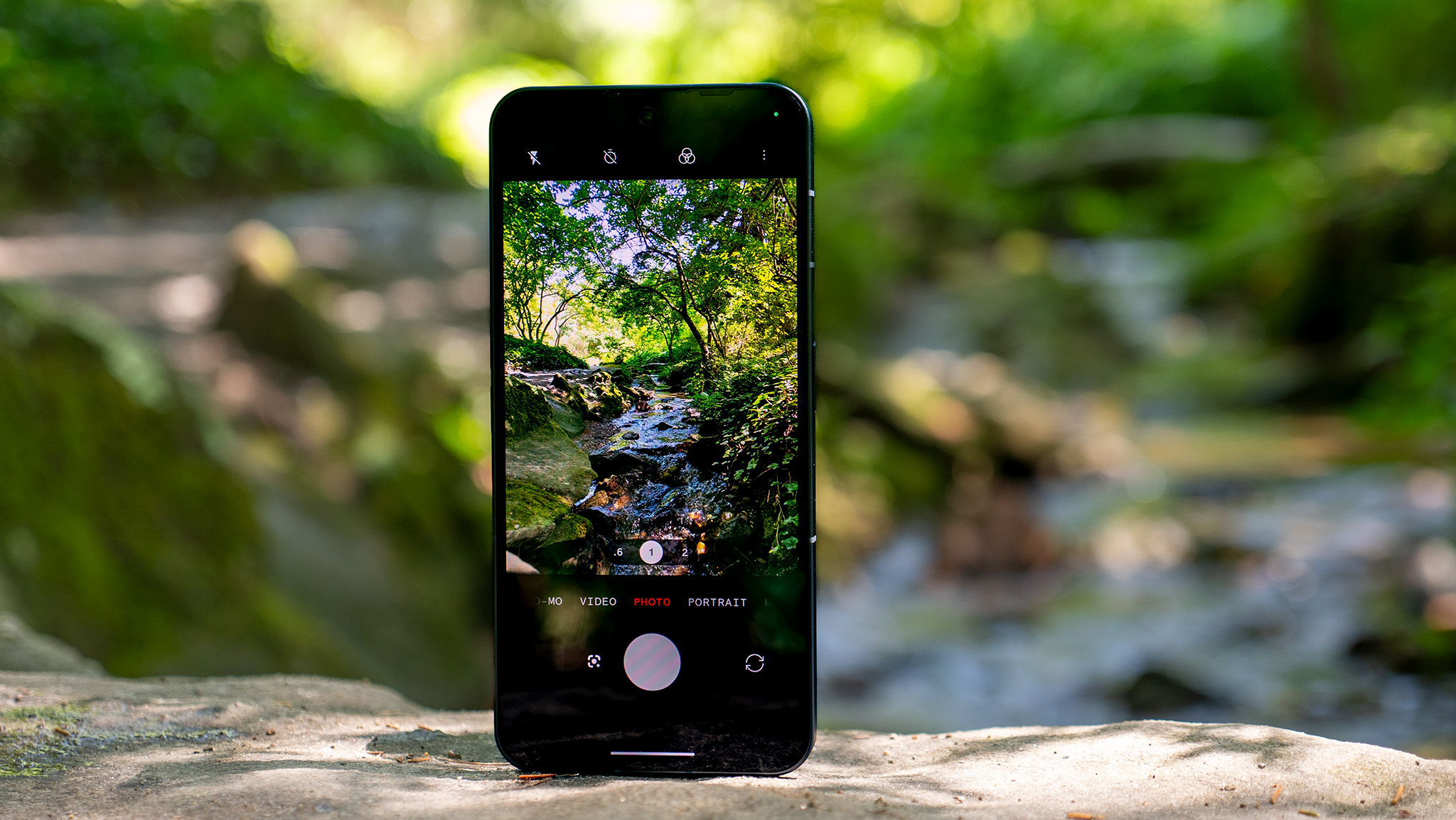
The cameras have been substantially improved over the original Nothing Phone (1). This isn't just a "better" camera, though. It's a genuinely excellent one that surprises me every single time I use it. Shots are crisp and clean, dynamic range is generally good (although it could be better at times), colors are natural, and portrait mode cutouts and bokeh are out-of-this-world good.
Some of this has to do with software tuning improvements Nothing made over the past year. Other improvements are down to hardware. The Snapdragon 8+ Gen 1 inside has a substantially more capable ISP (image signal processor), and the main camera has been swapped out for a newer, better sensor.
This camera is a huge improvement over Phone (1) in basically every way.
To showcase the difference SoC and software tuning changes can make, I wanted to compare the ultrawide angle camera first. The ultrawide sensor is identical to what Nothing used in its first phone — the Samsung JN1 — yet, performance and image quality are substantially improved.
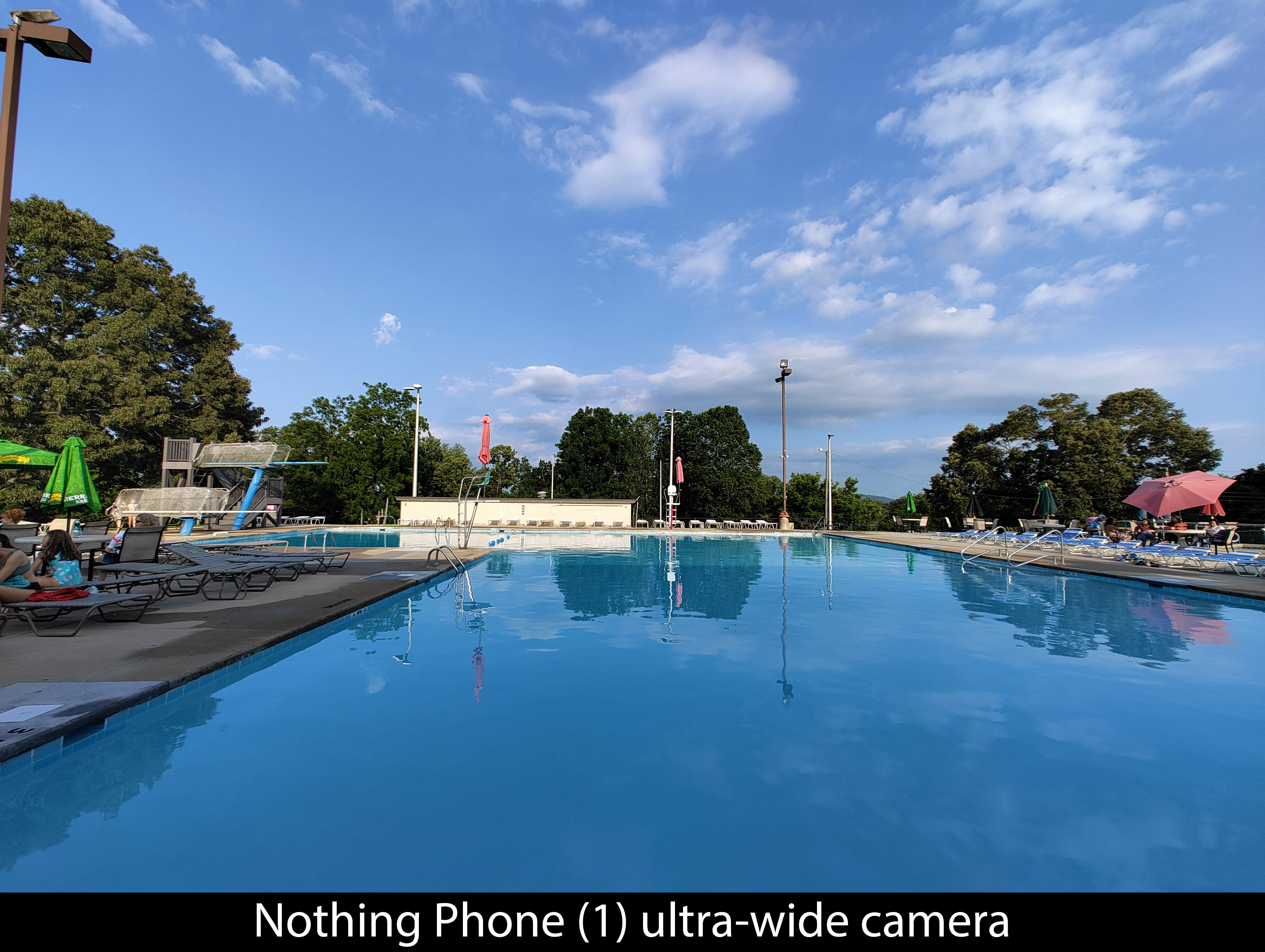
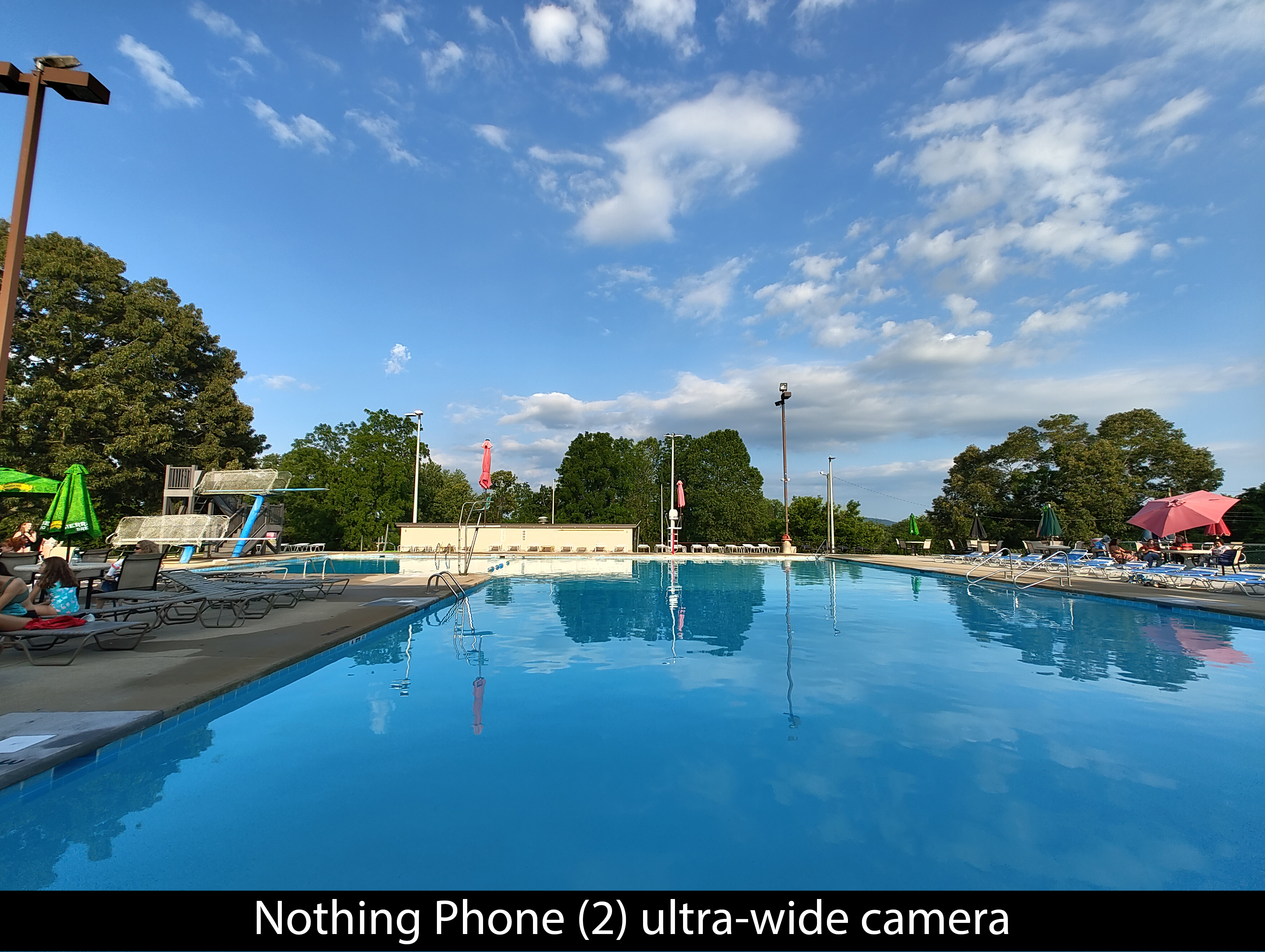
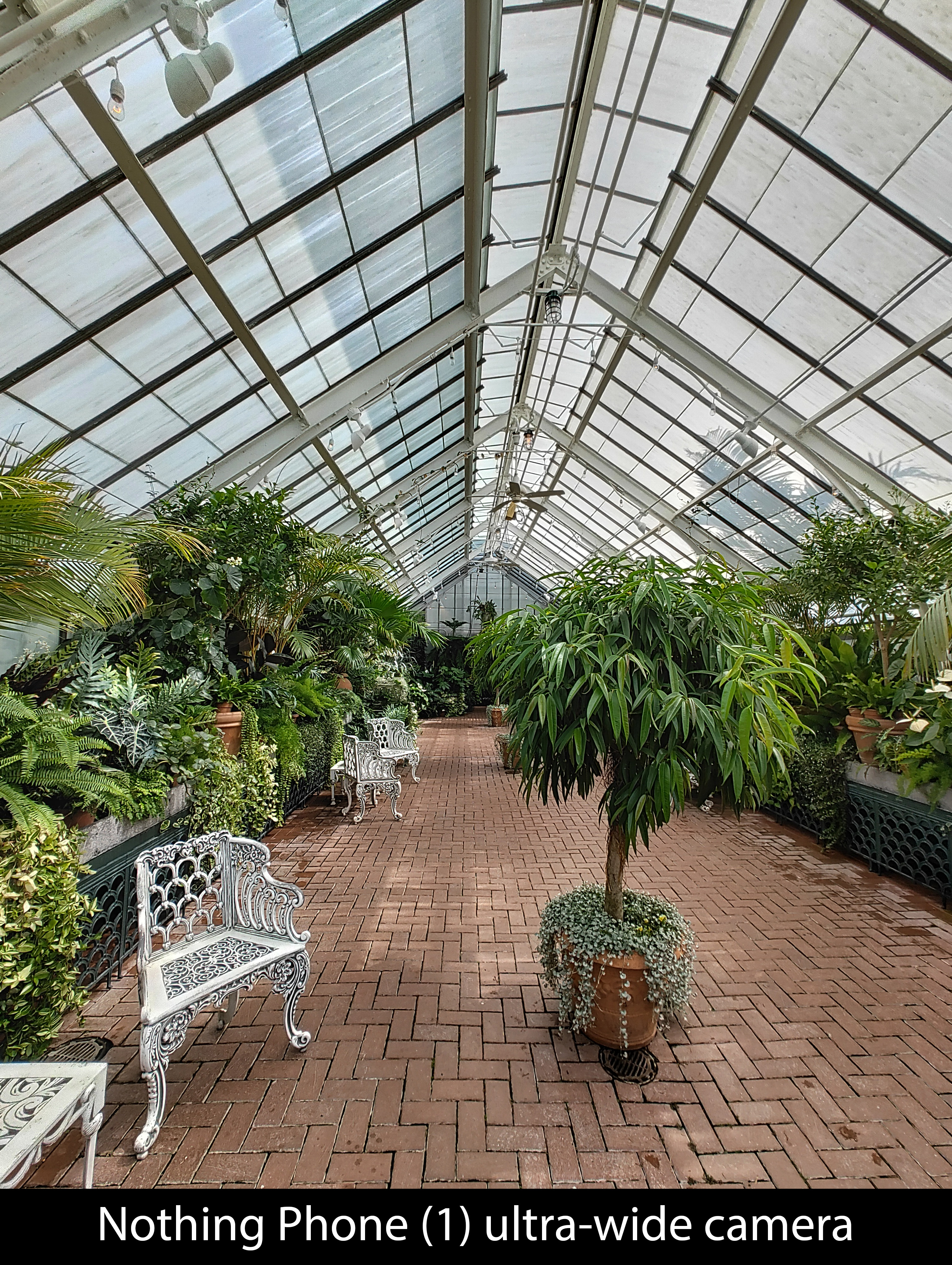
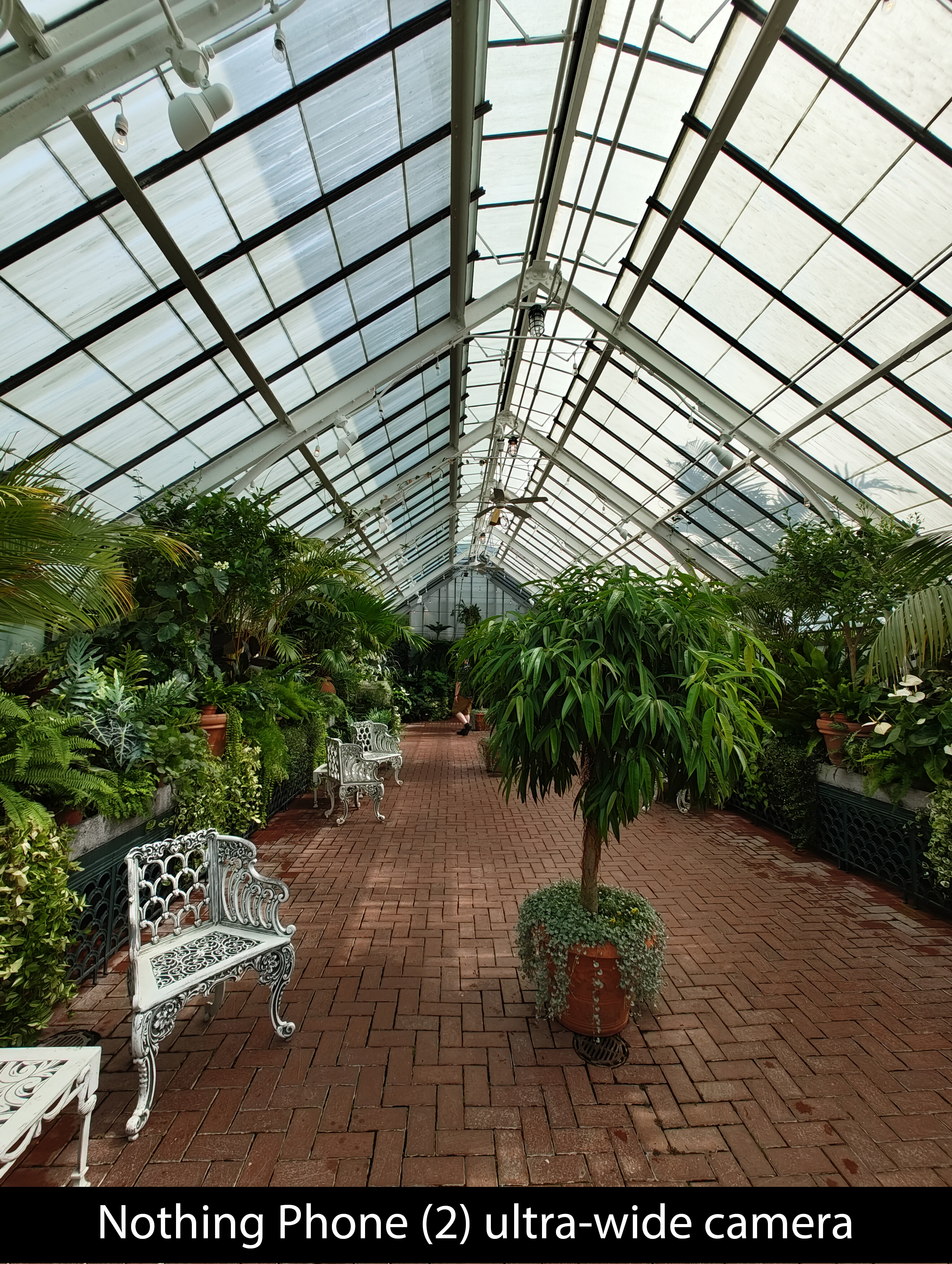
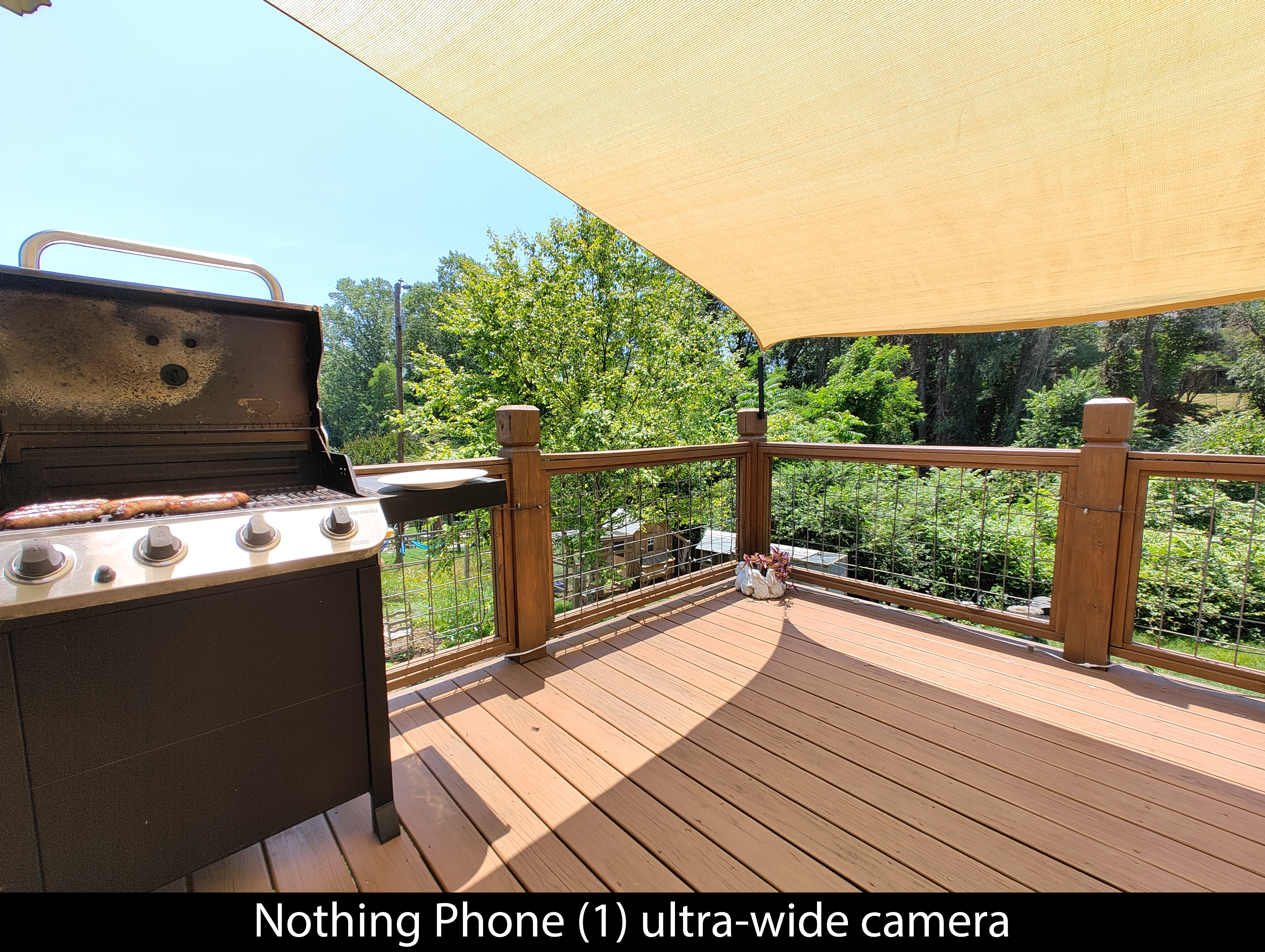
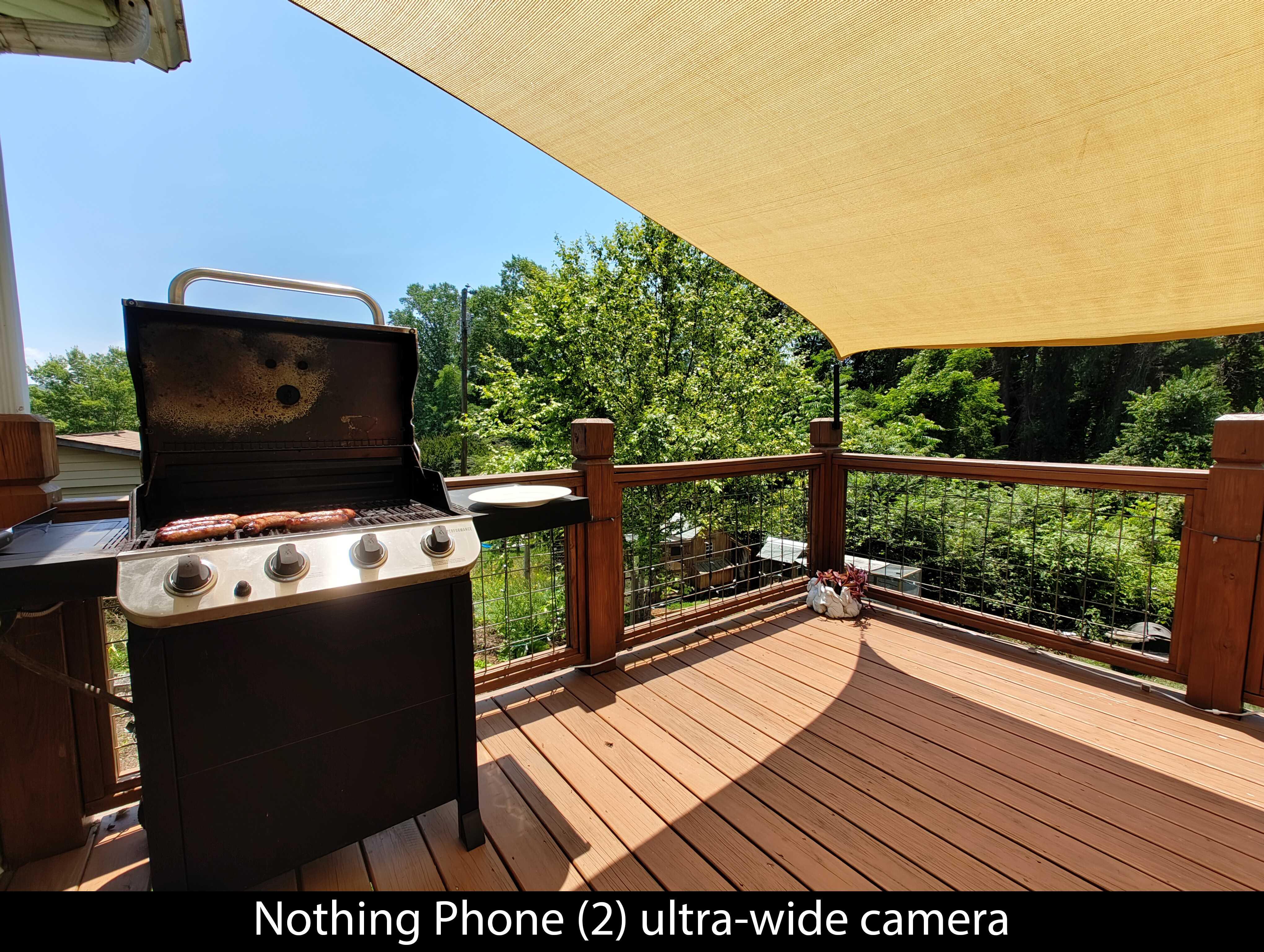

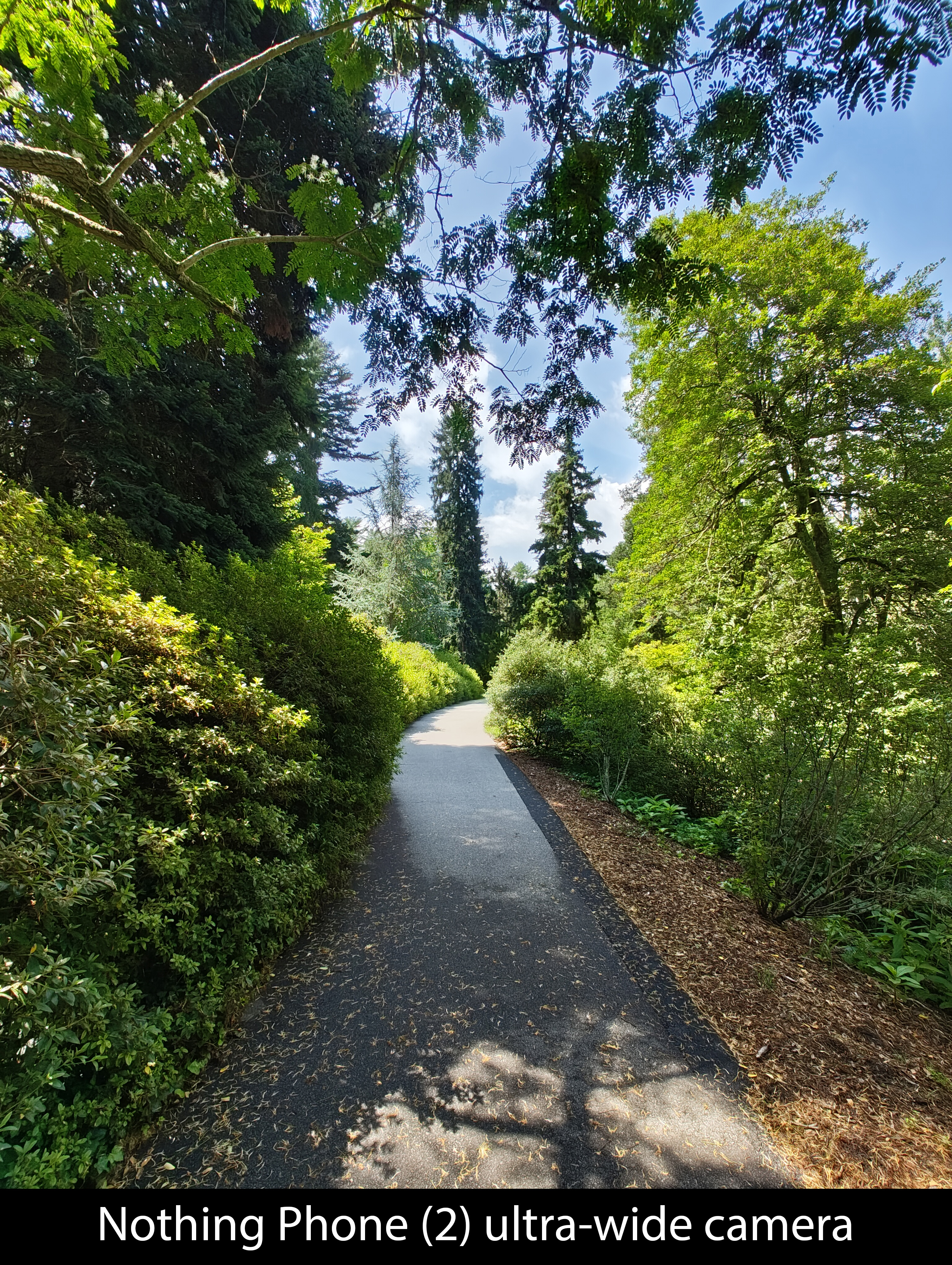
Image quality on the Phone (2) is better than Phone (1) in basically every way, but there's something that's consistent across all sensors — both for good and bad. Nothing Phone (2) photos tend to be darker and have higher contrast than competing phones I compared it with, including the Phone (1).
In some cases, as you can see above, this is a positive trait. In other cases — low-light scenes, for instance — it's both a blessing and a curse. Here are two great examples, one versus the Phone (1) and one versus the Pixel 7a.
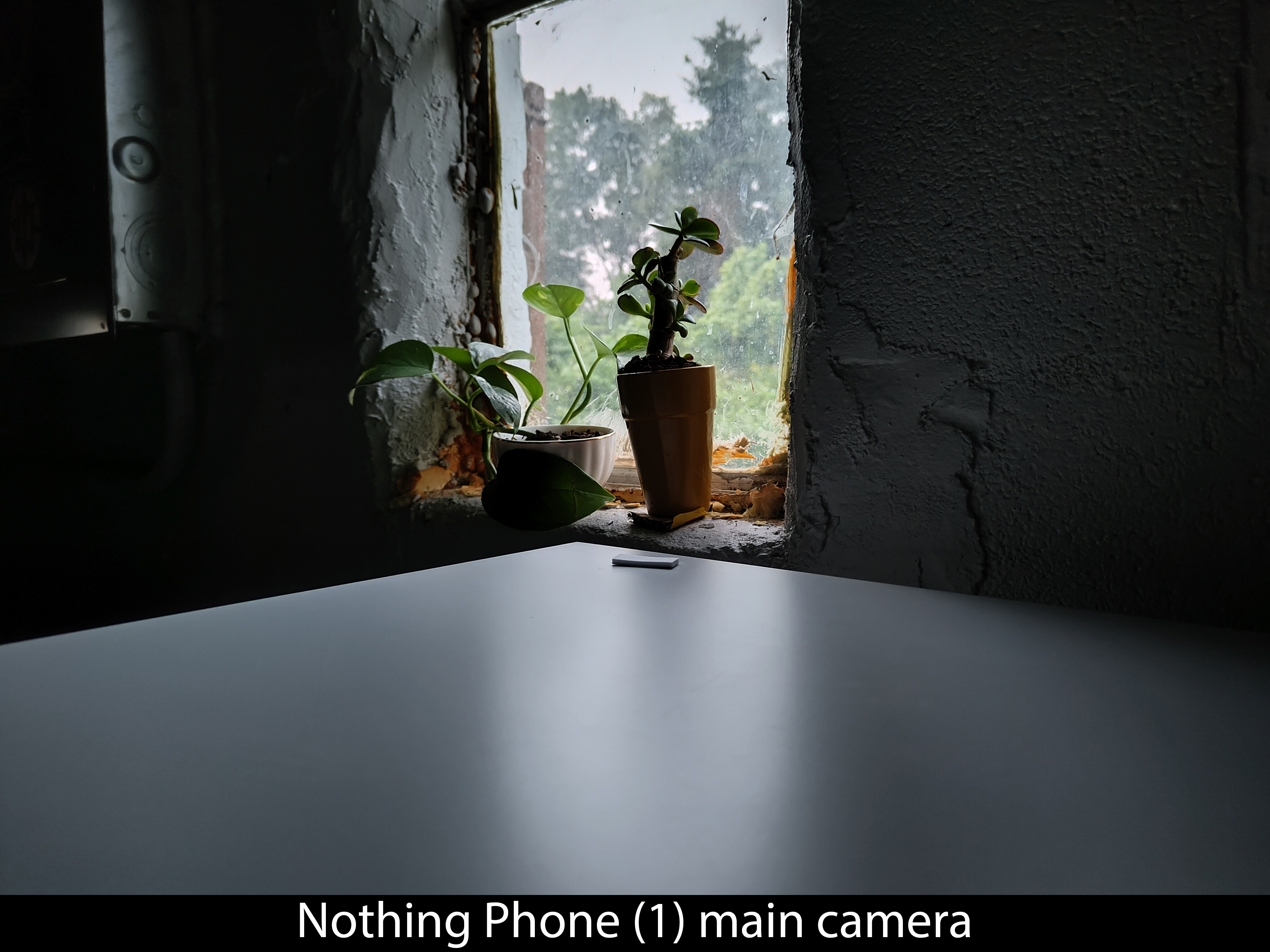
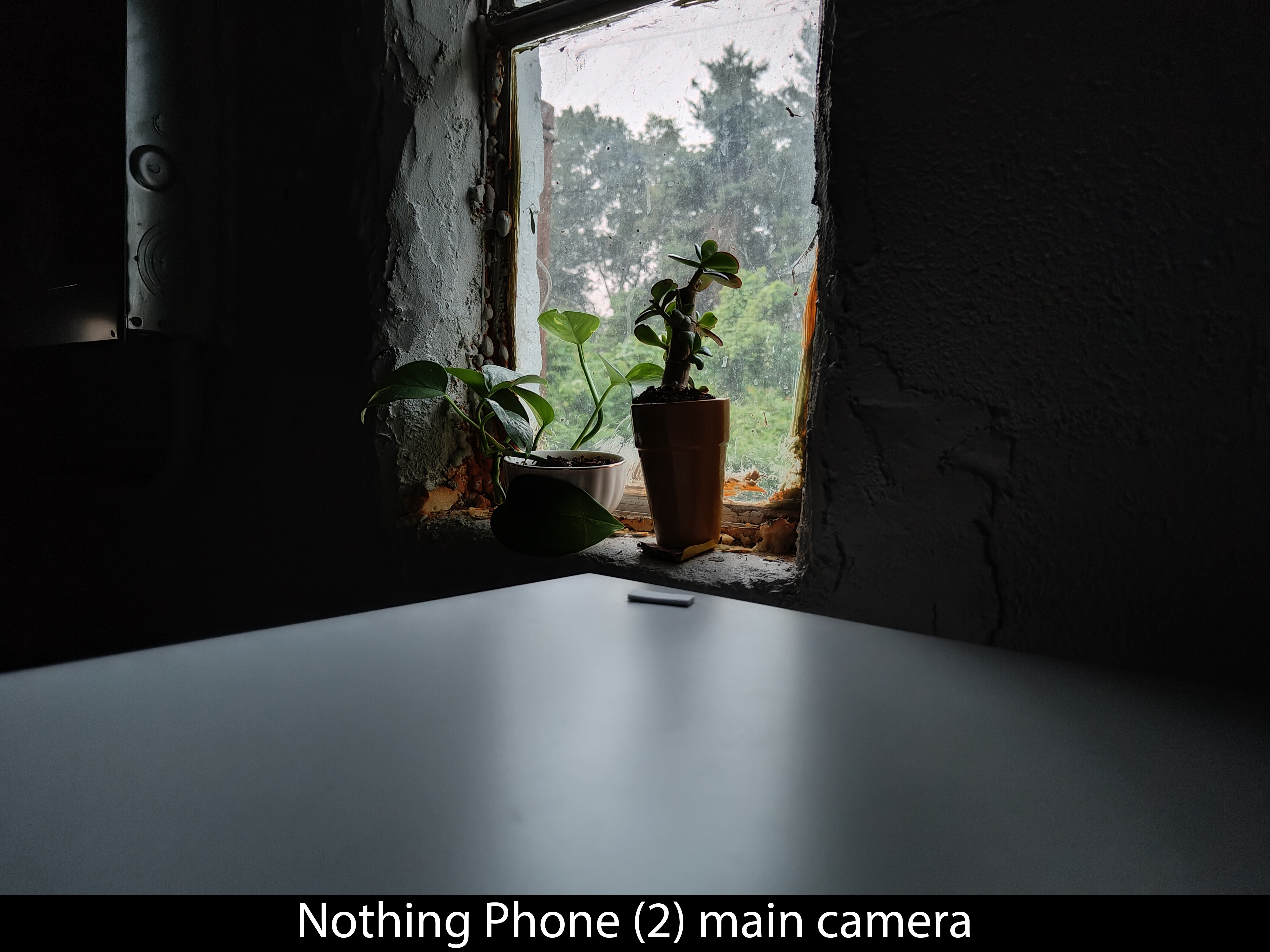
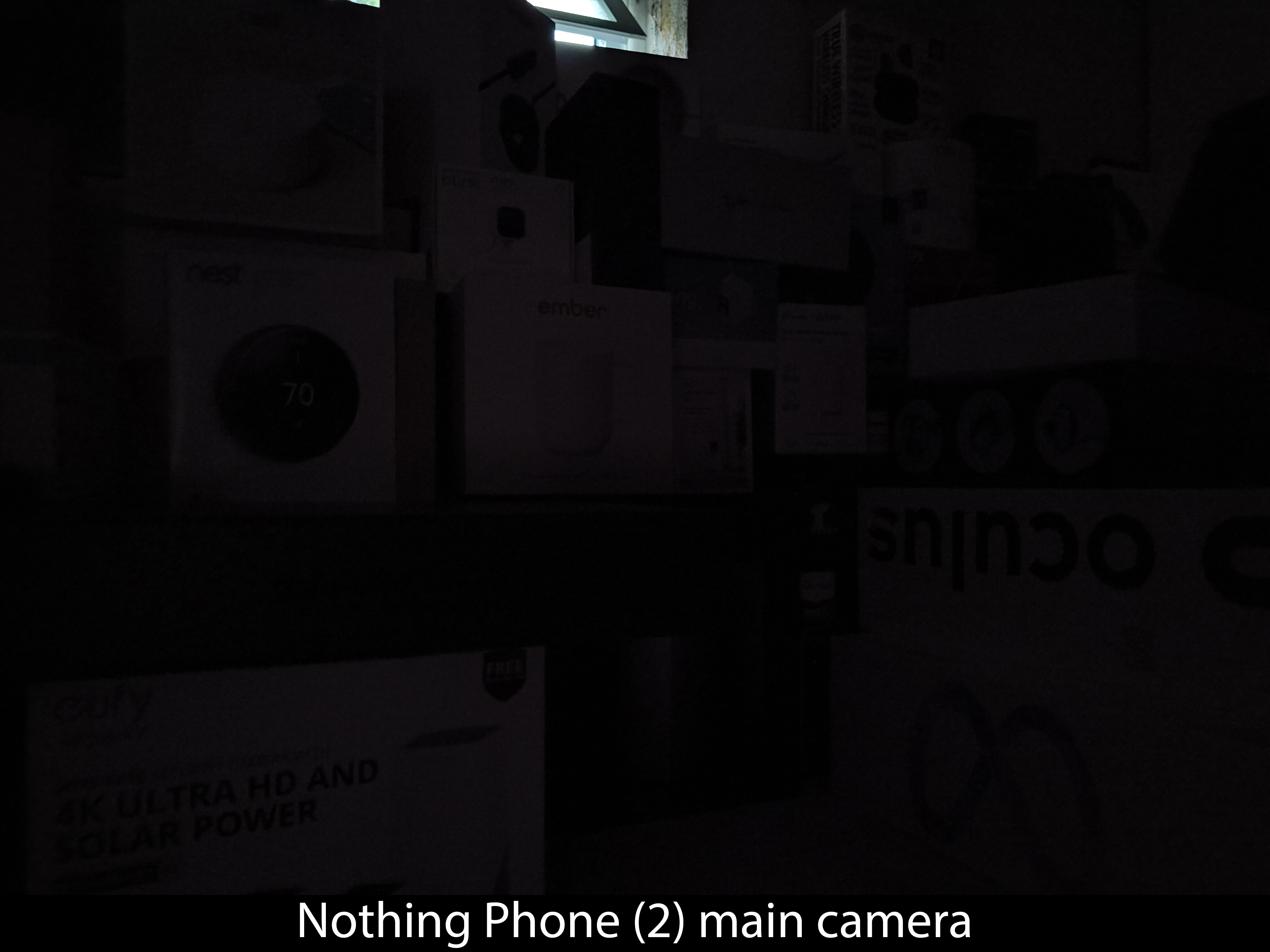
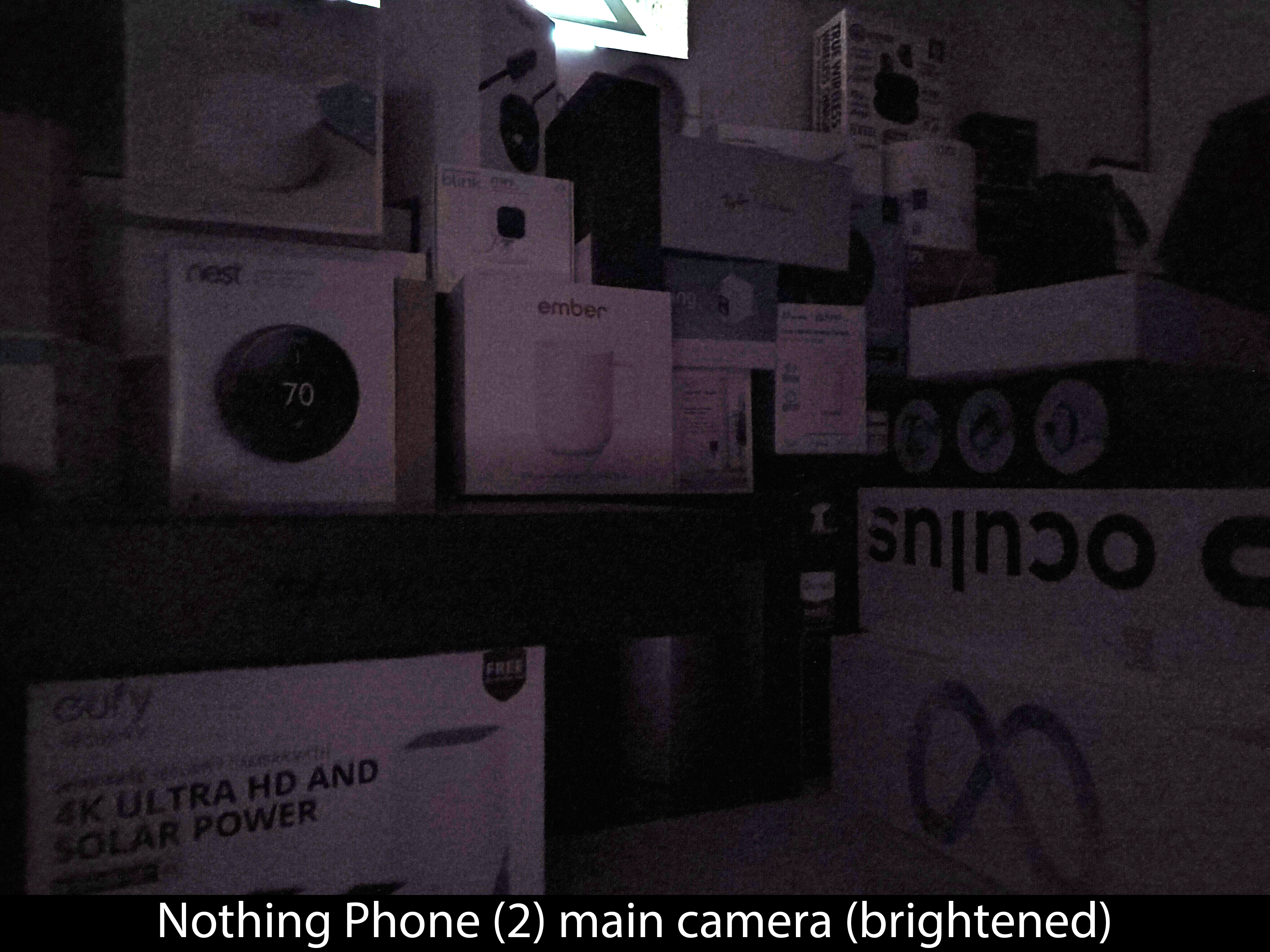
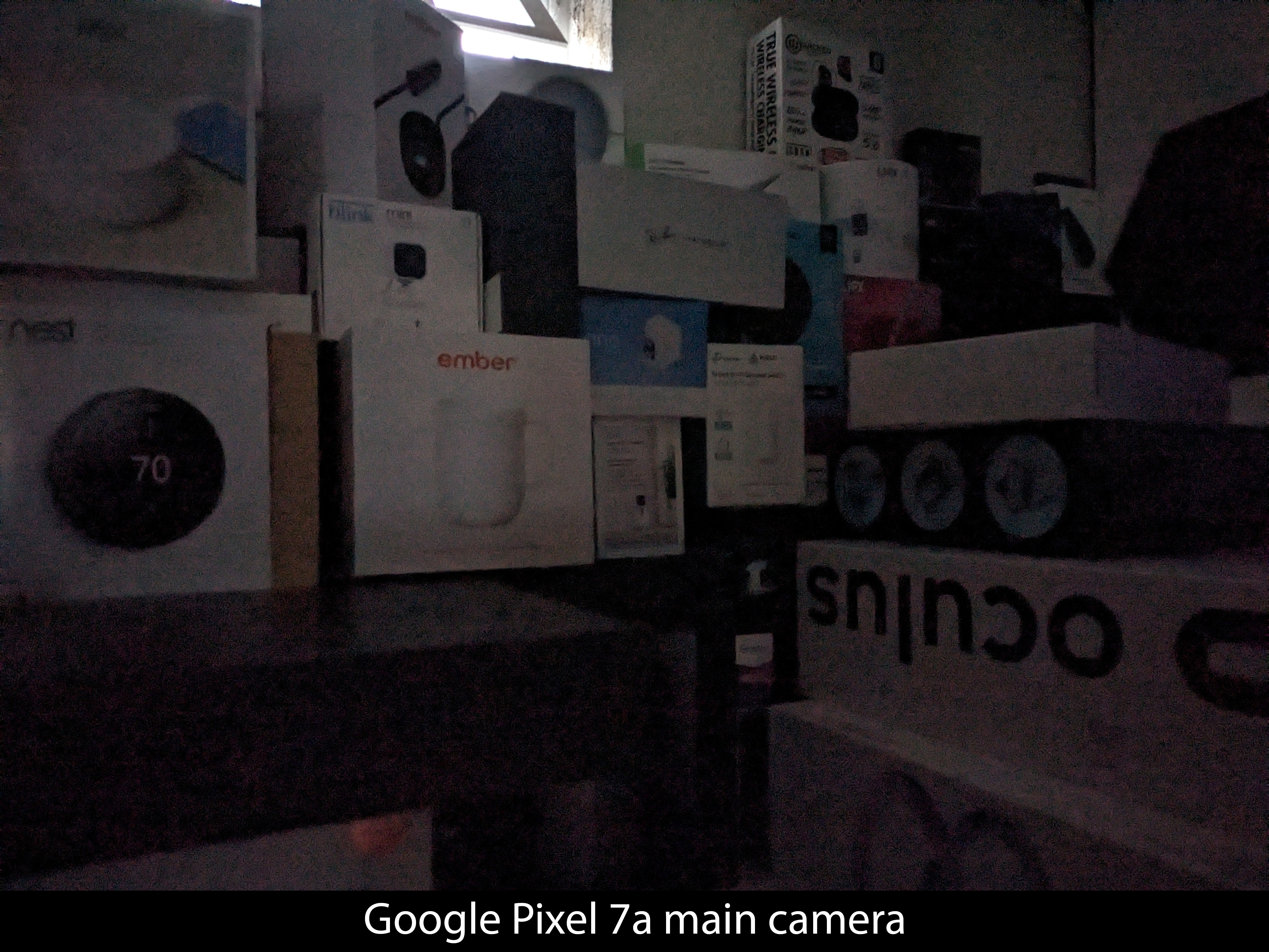
In both cases, the Nothing Phone (2)'s shot is darker than its competitor. But the Phone (2)'s photo is also more detailed and less noisy overall than that same competitor. Brightening up the image in post reveals a lot of hidden detail, which is annoying, but at least the image can be successfully edited to improve it.
However, it's worth noting that both of these examples are from phones that are at least $100 less expensive than the Phone (2). The low-light gap gets wider with more expensive phones. Here's one comparing the Galaxy S23 with the Nothing Phone (2).
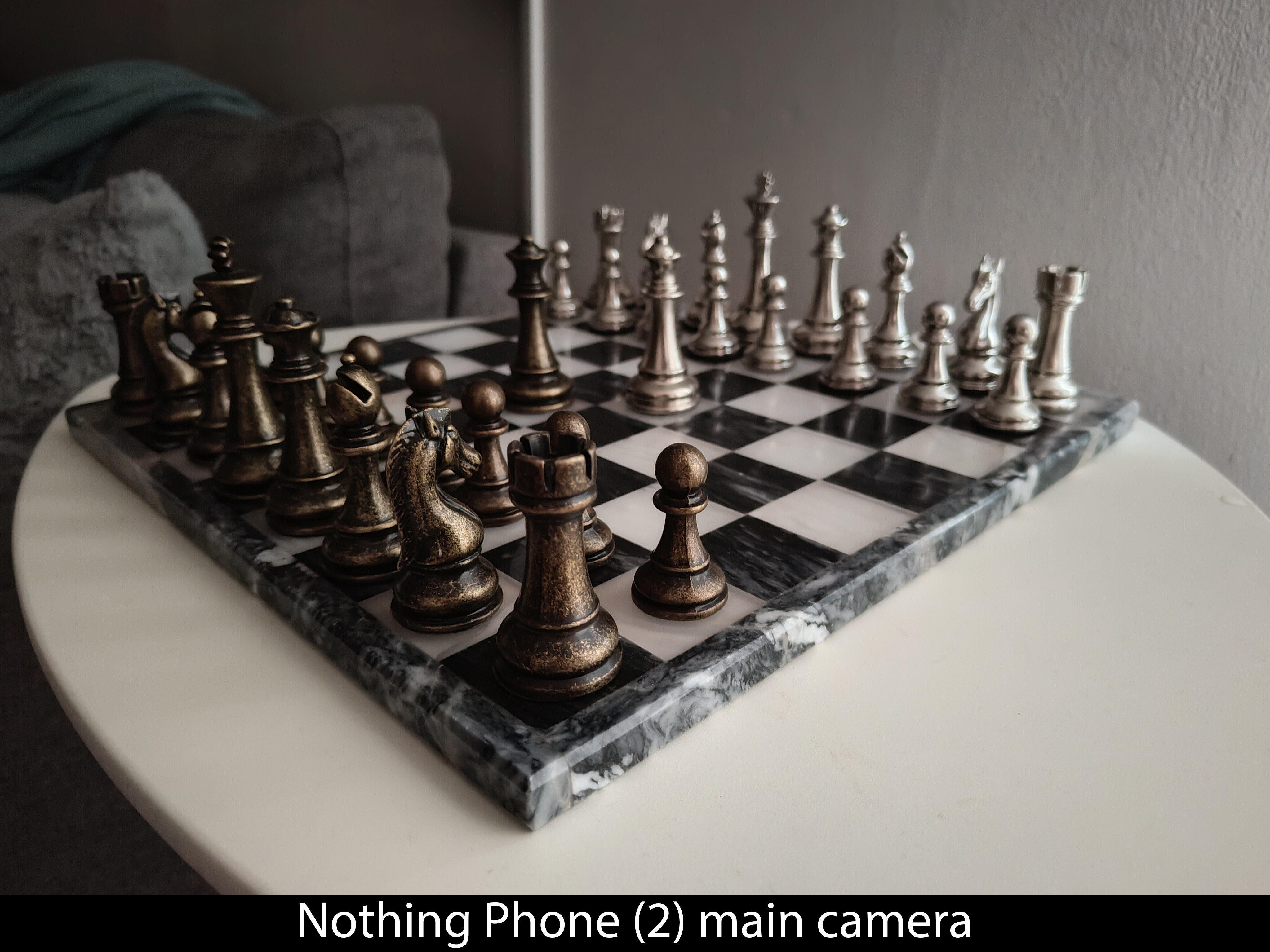
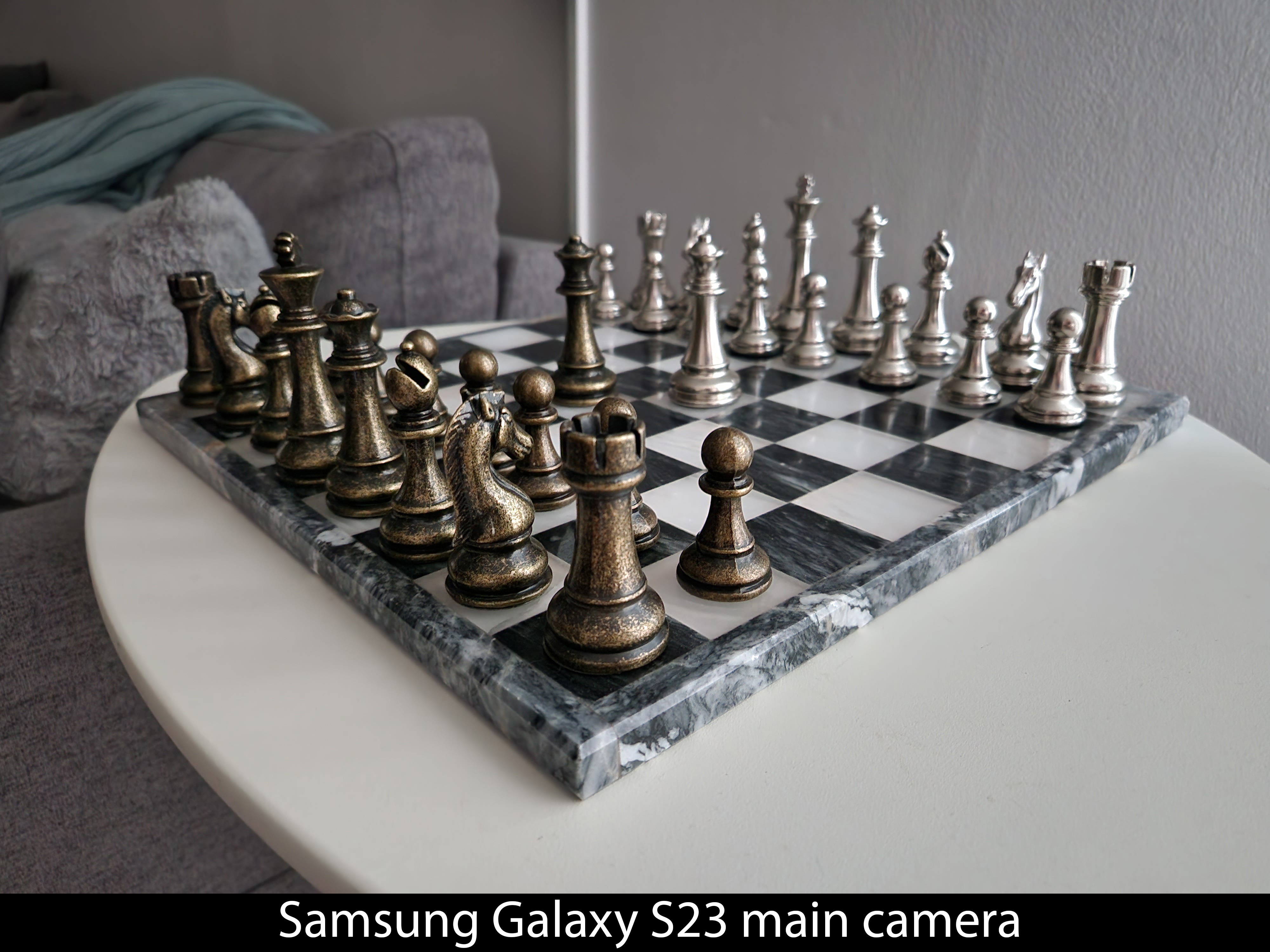
Moving on, video is both better and worse than the Nothing Phone (1). Most aspects are better — dynamic range, white balance, overall detail — but exposure is a bit of a crapshoot. During the day, I found Phone (2) to be incredibly bright even when compared to Phone (1). However, it did a better job of keeping the sky blue even when some other parts of the scene bordered on overexposure.
In low light, the phone struggles a little bit to keep the image properly stabilized and also has a darker, more noisy image than when compared to the Pixel 7 or Galaxy S23. My initial thoughts on the video quality were extremely positive, and I still think this phone captures great video. However, when diving in further and directly comparing it to the S23 and Pixel 7, I found it was less competitive than I initially thought.
Video recording and low-light could use improvement, but Nothing is king at portrait shots and photos from the front-facing camera.
With that said, Nothing does two things extremely well: portrait mode shots and anything from the front-facing camera. To say the front-facing camera is an upgrade over the one on Phone (1) is a major understatement. Pictures from this camera look better in any light, especially in low light.
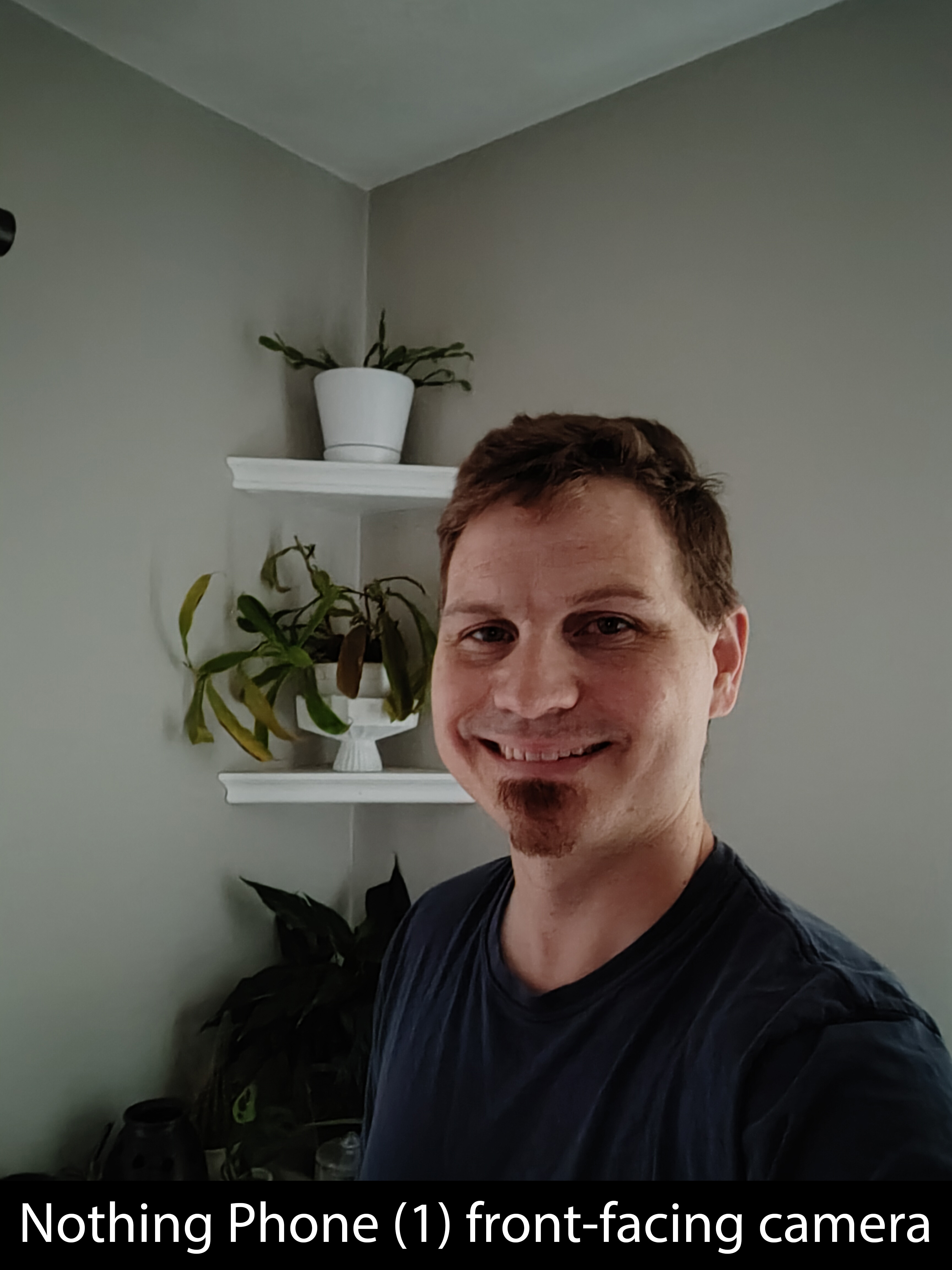

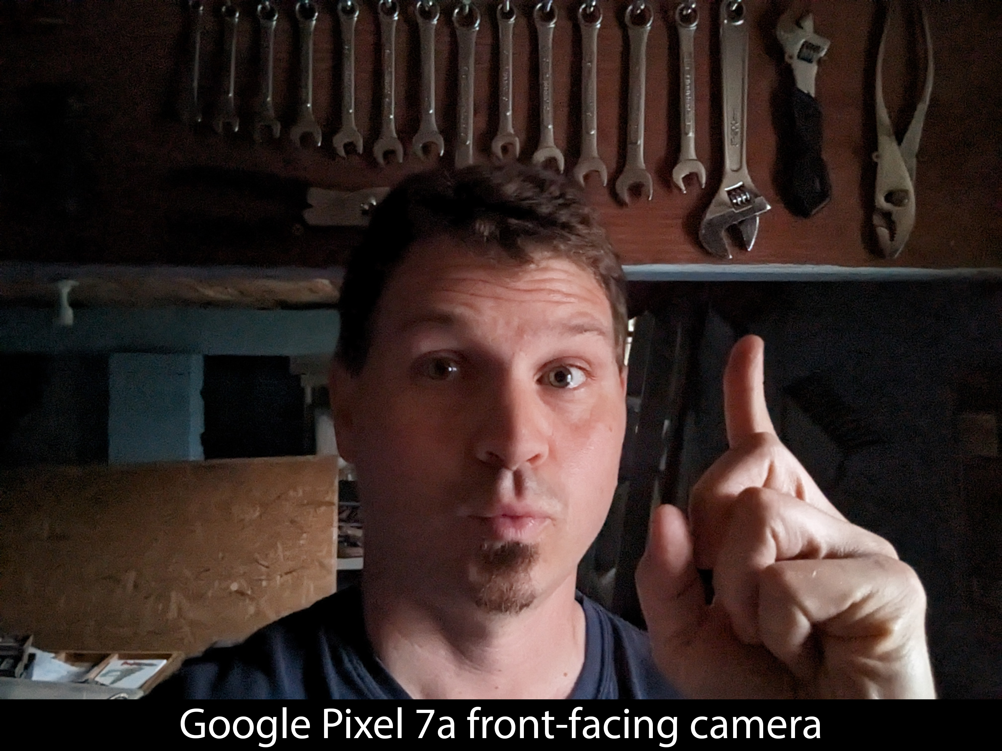
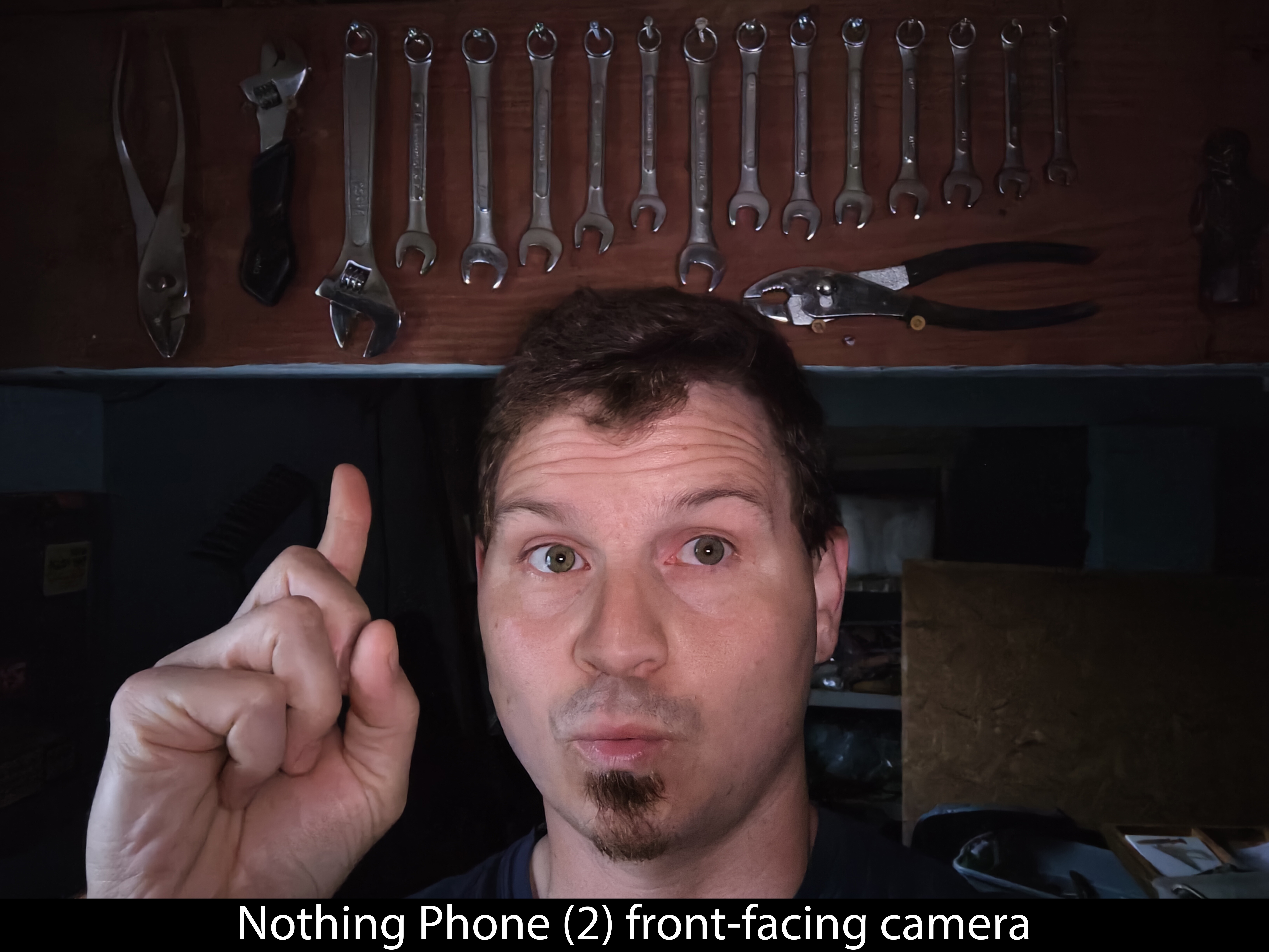
This is a truly excellent front-facing camera and easily one of the best on the market. Everything about it is good, even low-light performance. It's absolutely the best quality camera on the entire phone.
Portrait mode is similarly excellent on both front and rear cameras. My favorite part isn't the quality — even though that is excellent. Instead, it's the little f-stop button that can adjust portrait depth on the fly before taking a photo.
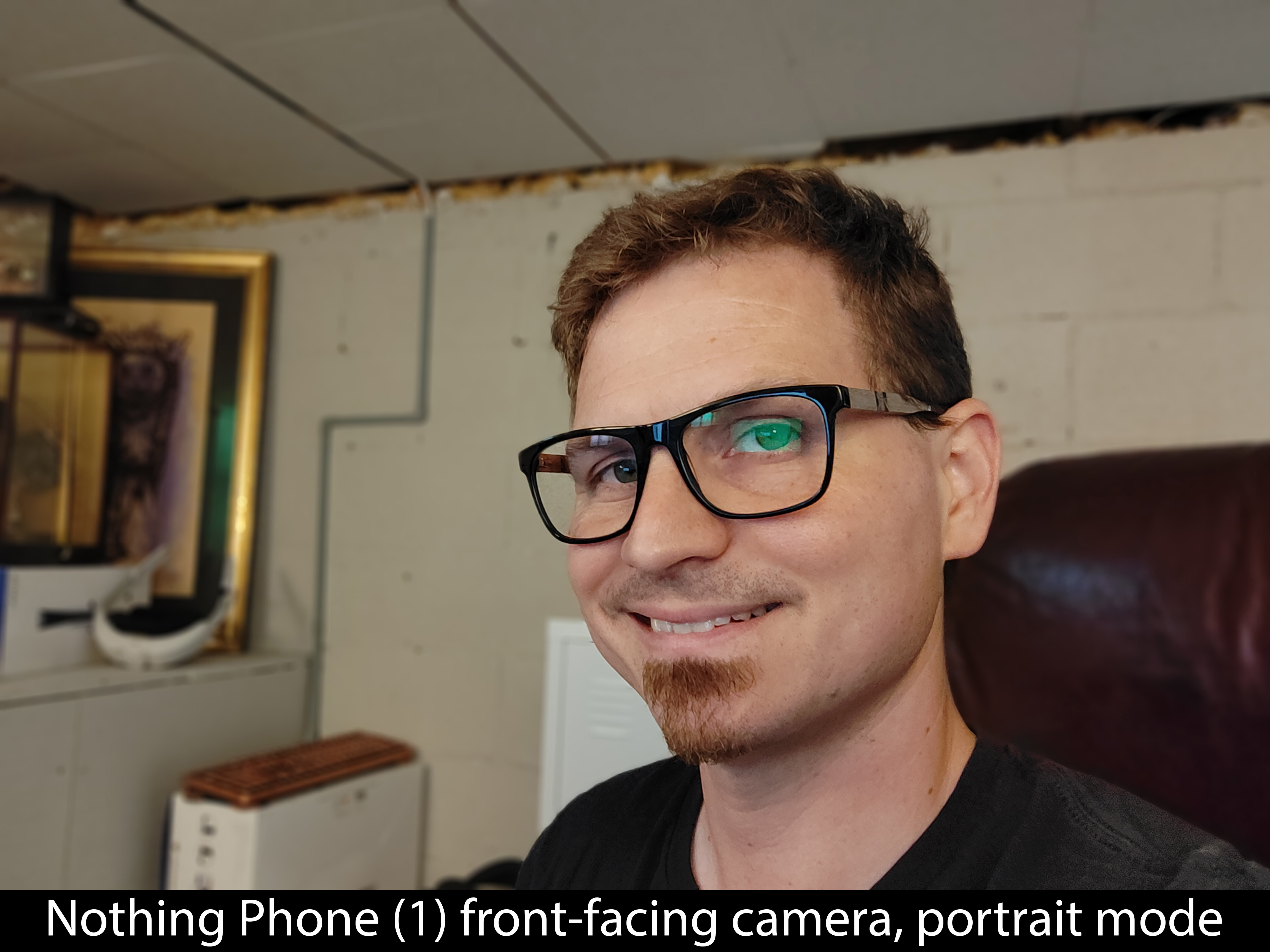
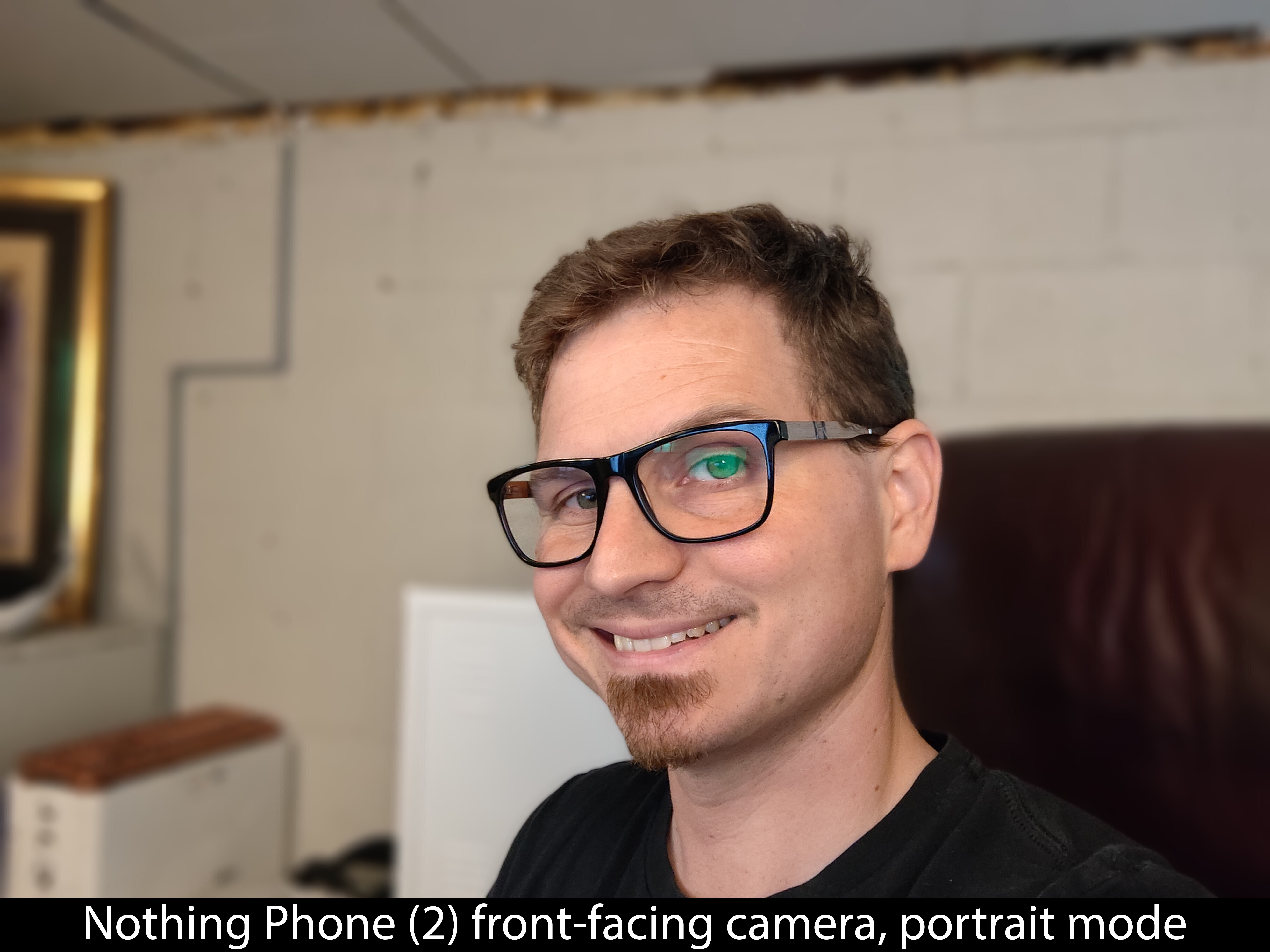
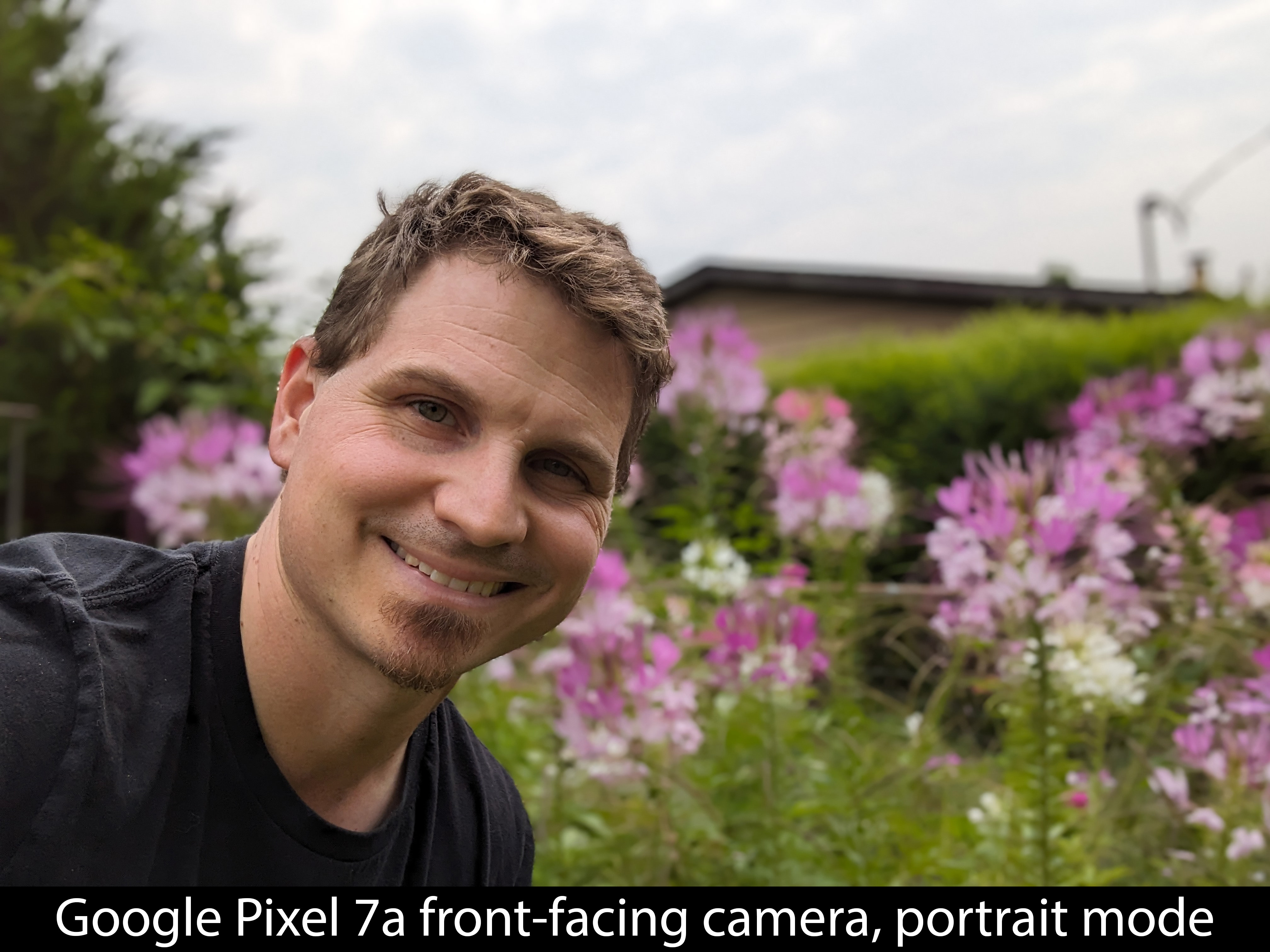
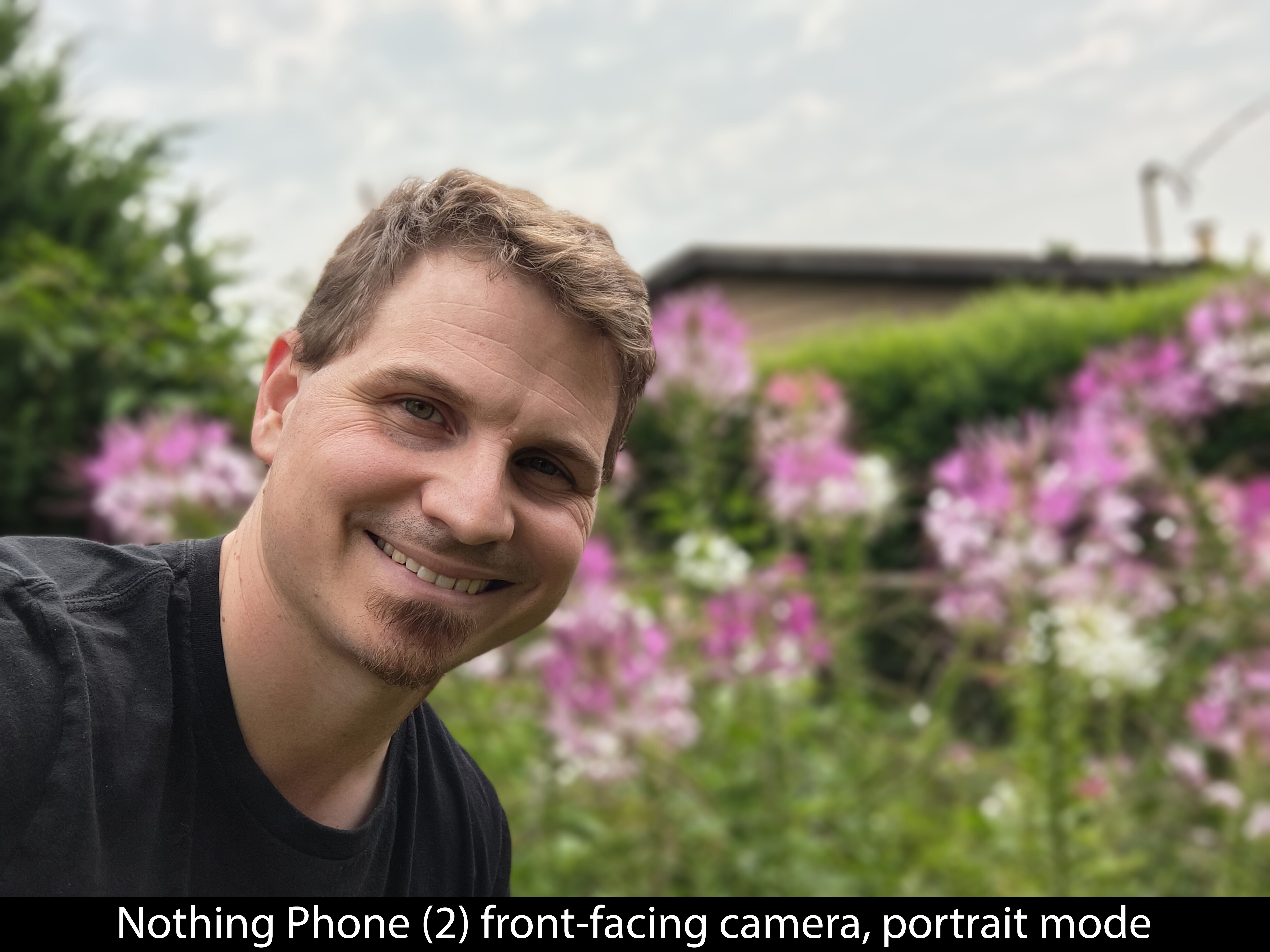
Better yet, you can still adjust several properties after taking the photo through the Google Photos app. That means if you don't like where it focused or how deep the blur is, you can fine-tune it after taking the photo.
You can't completely change the photo after taking it — there's no way to remove the blur after taking a portrait photo — but you can substantially edit it.
Nothing Phone (2): The competition
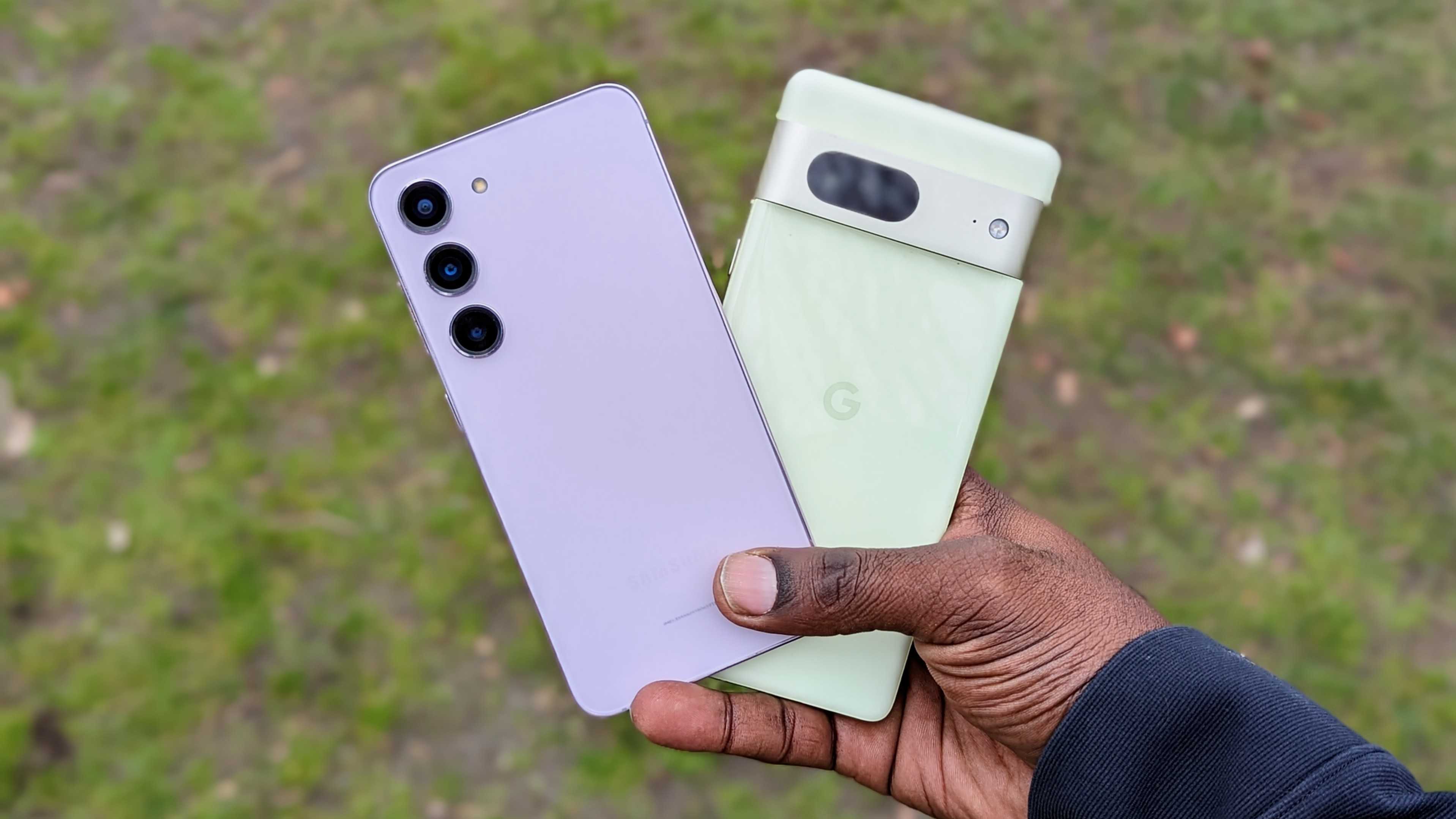
The hardest part about recommending a new phone isn't usually based on the phone itself; it's based on the phone's competition. But, at $599, this phone doesn't have too much actual competition. The Google Pixel 7 retails for the same price and includes a better IP rating for water and dust resistance, plus an additional year of software and security updates.
But, beyond that, I think you can pick and choose which features are more important to you. The Nothing Phone (2) seems to capture better quality video, while the Pixel 7 captures better photos. Google has plenty of great Pixel-exclusive features, but Nothing has the style factor going for it, including that nifty Glyph interface on the back.
Plus, the Nothing Phone (2)'s performance and battery life are substantially better than what's offered on the Pixel 7.
If you're willing to go with a carrier-locked variant, you can get a great Galaxy S23 deal for less than an unlocked Nothing Phone (2). The S23 eclipses the Nothing Phone (2) in basically every way if you can find it at the same price, although the design is substantially more boring than what Nothing pulled off with the Phone (2).
Nothing Phone (2): Should you buy it?
You should buy this if...
- You want an affordable phone with flagship performance
- You want a phone that can help you be more intentional with your screen time
- You're looking for something different than what Samsung or Google offers
You shouldn't buy this if...
- You need the best camera
- You want this year's processor and performance
- You intend to keep using the phone for longer than 4 years
Nothing has proven it can be a compelling alternative to a Pixel or a Galaxy phone. $599 is a great price for what you get here, including updates and support for years to come. Everything about this phone feels like a win, and while it's not necessarily the best at a bunch of things, it excels in some key areas.
PWM-sensitive folk may just find a haven with this high-frequency display. Folks who love taking selfies or portrait mode photos will love what they get. And anyone who enjoys fancy gadgets with some particularly unique, obvious aspect will thoroughly enjoy the Glyph lights on the back.
It also performs admirably across all tasks, has excellent battery life, and sports a build that rivals even the best manufacturers in the industry. All in all, this phone is a winner, and I think anyone who chooses to pick one up will find they won't regret it.
Nothing is back with its first North America-ready phone offering flagship performance, a more eye-friendly OLED display than Samsung or Google, unique features deeply tied into the Glyph lights on the back, and a solid overall experience that'll make you love your new phone.

