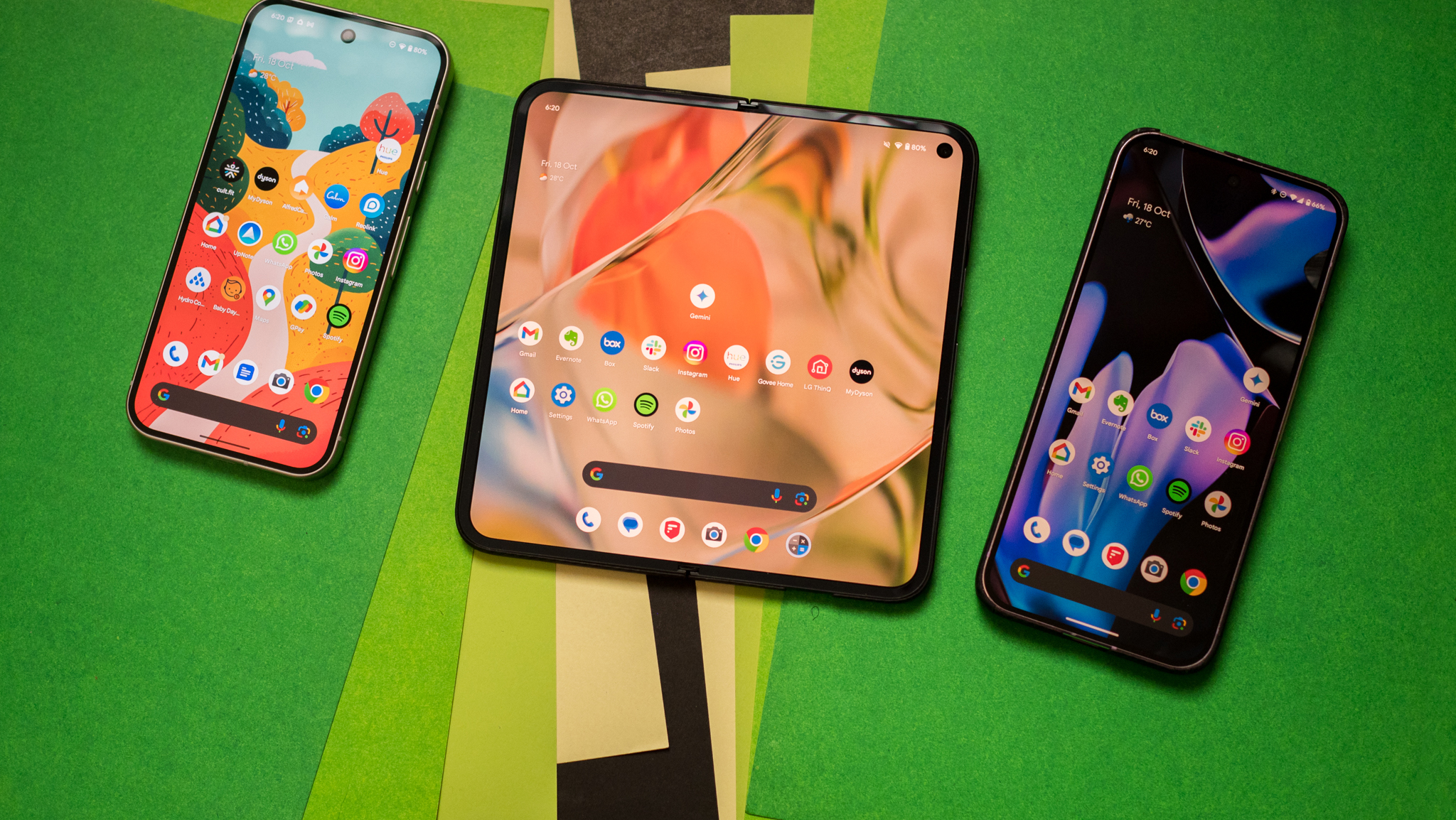
Exclusive — Nothing co-founder Akis Evangelidis on building the Phone 2a: 'We wanted to create a product that we would use ourselves'
Here's why Nothing decided to make a budget phone.
It is difficult to stand out in the smartphone segment — particularly for a new brand — but Nothing makes it look easy. Thanks to a combination of clever marketing, a design-focused approach to products, and a lofty motto that aims to "make tech fun again," the brand was able to attract a sizeable share of attention that often exceeds more entrenched rivals.
Nothing's products have generally been well-received, with the Ear 1 standing out for its see-through design aesthetic, the Phone 1 featuring a unique design at the back, and the Phone 2 building on that foundation and offering high-end hardware along with a more polished design that's among the best of any phone today.
Nothing has been around for over three years now, and for 2024, it is taking on its most ambitious challenge yet: making a budget phone that's actually fun to use. That's the premise behind the Phone 2a, which is now on sale in select global markets. It's relatively easy to build a high-end phone like the Phone 2, but much more challenging to launch a budget phone that shares a similar ethos — that's what Nothing set out to do, and after using the device, I think the brand managed to pull it off.
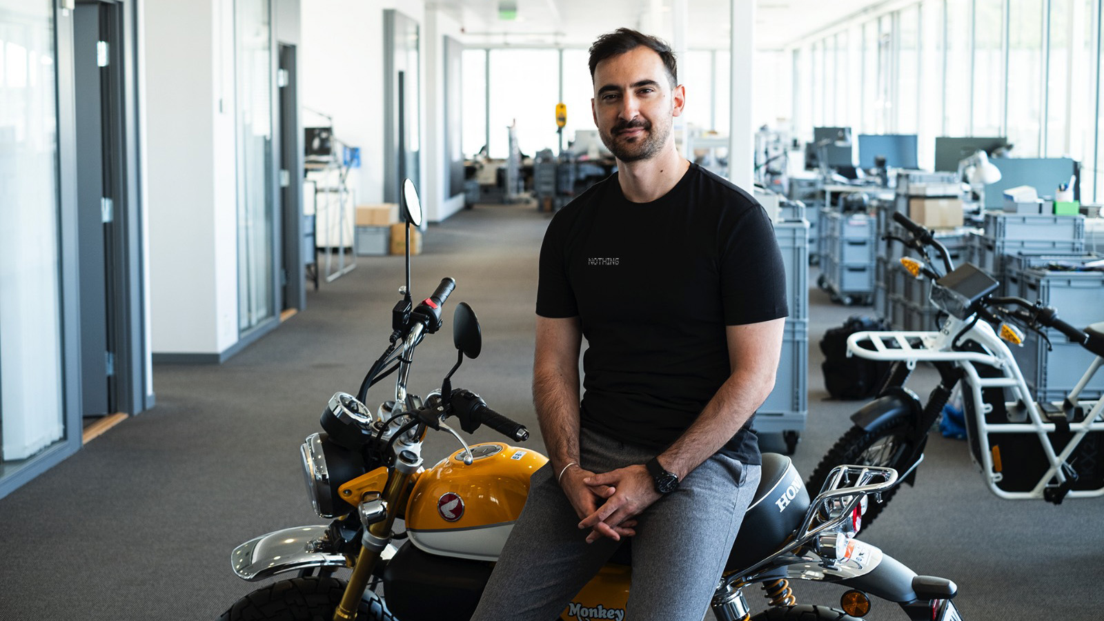
Shortly after the launch of the Phone 2a, I sat down with Nothing co-founder Akis Evangelidis to talk about the conception of the device and why the brand is now turning its attention to the budget segment. Evangelidis will be a familiar figure if you've followed OnePlus's journey; he was with the Chinese manufacturer for half a decade, overseeing its marketing efforts in the EU.
Evangelidis started by talking about the guiding principles at Nothing and how design differentiation was a "low-hanging fruit" that allowed the brand to stand out from the very beginning. That's clearly the case with the Phone 2a as well, with the phone featuring a similar see-through aesthetic at the back that shows off the innards.
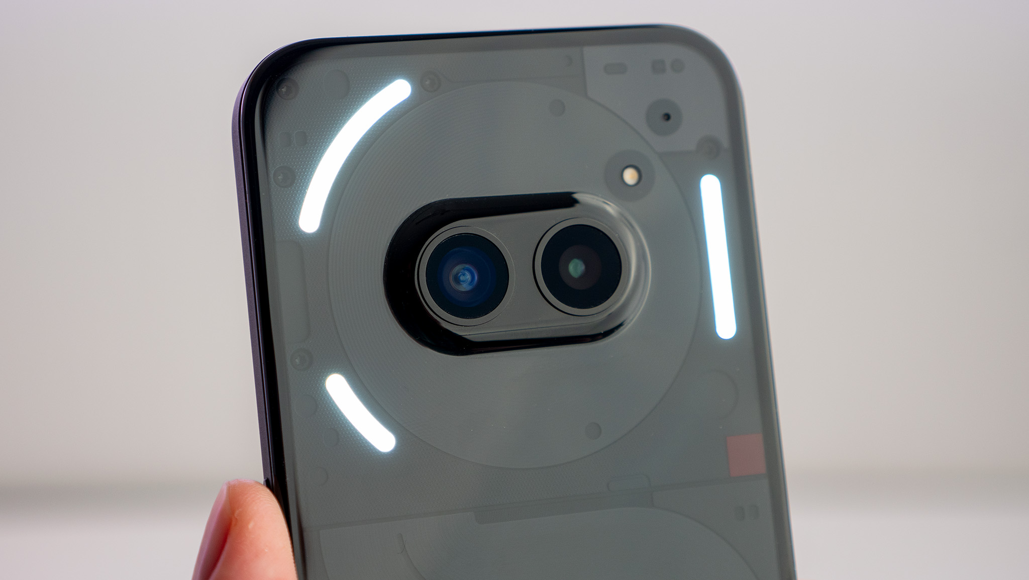
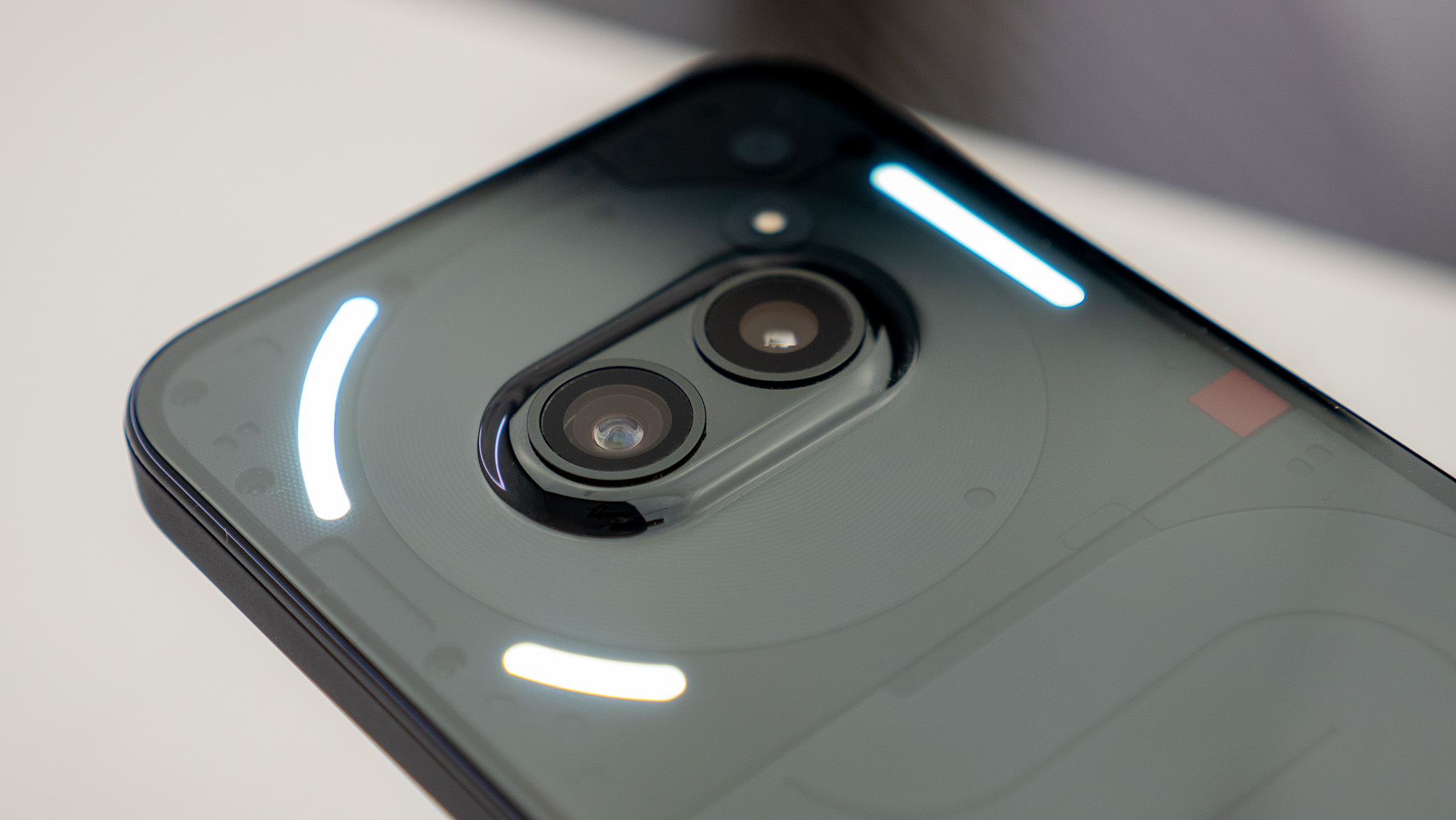
What's different this time is that the Phone 2a has centered cameras, and the housing is encircled by the NFC coil. The design looks rather evocative — particularly on the white version — and Evangelidis said that a lot of thought goes into just what is highlighted at the back. "When we first design a product, we look at what components we want to bring to the surface. Everything starts from the engineering side — even our designers consider themselves to be engineers — and on the Phone 2, we chose the wireless charging coil."
As the Phone 2a doesn't have wireless charging, Nothing made a few tweaks to the design to allow the NFC coil to be prominently showcased. It is a functional design choice, and being able to see the coil makes it a lot easier when making payments, as you don't have to guess where to tap the phone against a reader.
Be an expert in 5 minutes
Get the latest news from Android Central, your trusted companion in the world of Android
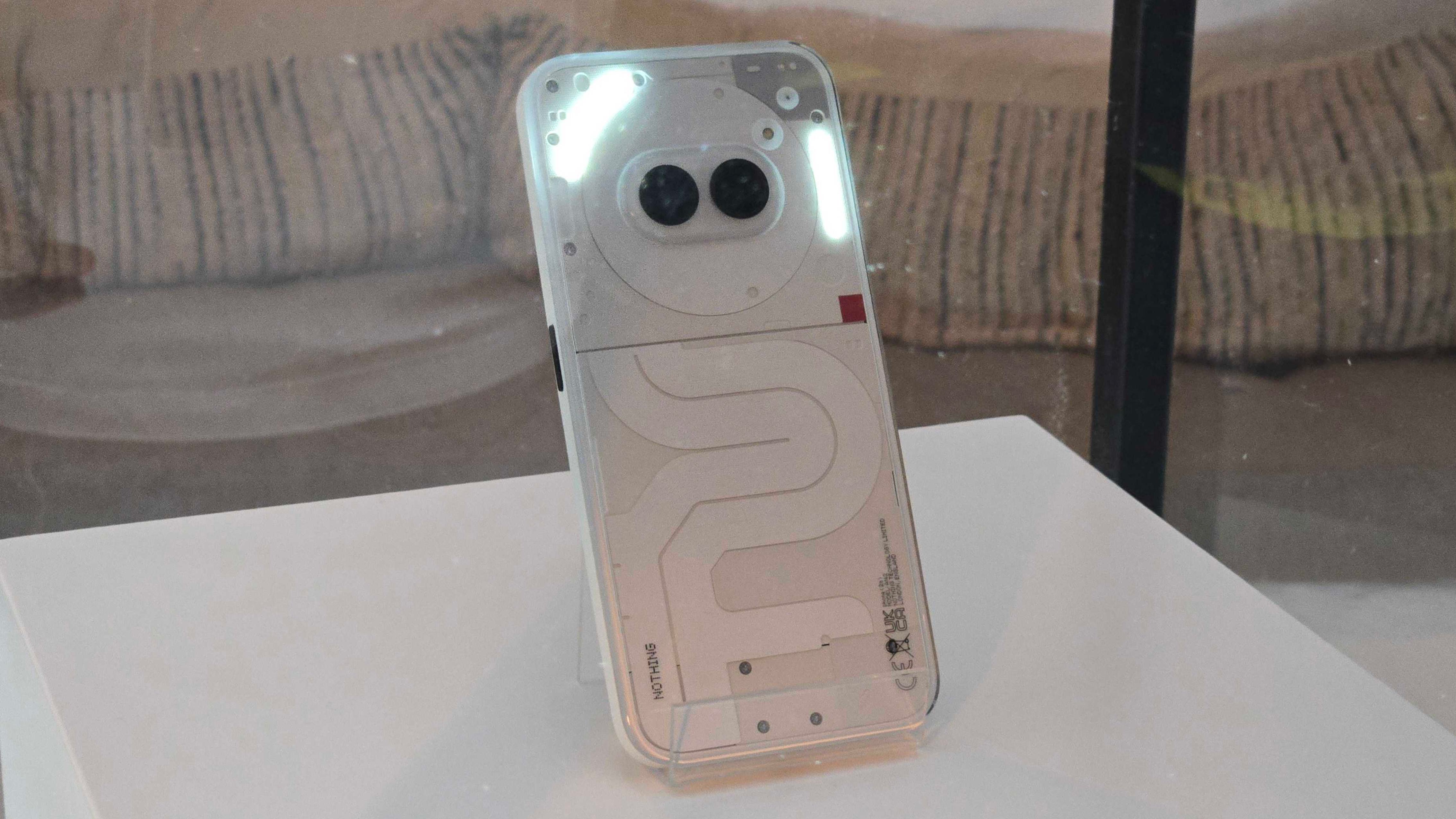
Then there's the positioning of the rear cameras. Evangelidis said that Nothing tried a lot of different configurations, but went with a centered design as it looks "striking." Another side effect of using a centered camera system is that the phone doesn't wobble when it's on a table. "A lot of work went into integrating the camera module, and we built a circular system with all the components — the Glyph interface, LED flash, positioning of the various screws — within a specific radius to create symmetry."
Nothing used a polycarbonate back to save weight (and manufacturing costs), and Evangelidis noted that it allowed the brand to come up with a unibody design that flows around the camera module and extends to the sides, with subtle curves where the back meets the mid-frame. The phone still uses an aluminum mid-frame — giving it structural rigidity — and Nothing's decision to use recycled materials is also an outlier in this segment.
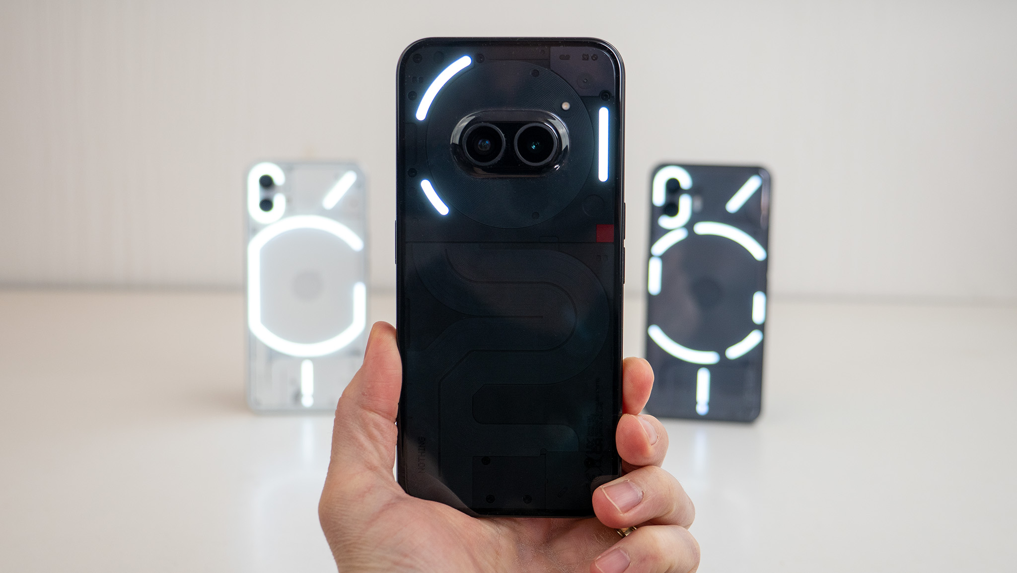
The other differentiating design feature at the back is the battery cable. "The team took inspiration from Massimo Vignelli's NYC subway maps, and the idea was to turn something complex into a design that was visually simple and aesthetically elegant. We've had a similar curve on all our products, but the Phone 2a is the first product that really showcases it fully."
Evangelidis said that the final design of the 2a is close to the very first concept the brand envisaged back in 2020, but they couldn't execute the design at that point. That's a good segue into Nothing's capabilities; the brand now has dedicated hardware and software teams, but that wasn't the case back when the Phone 1 launched. As such, that device had a vanilla interface that wasn't cohesive with the bold design, but Nothing remedied that in 2021 with the launch of its own interface.
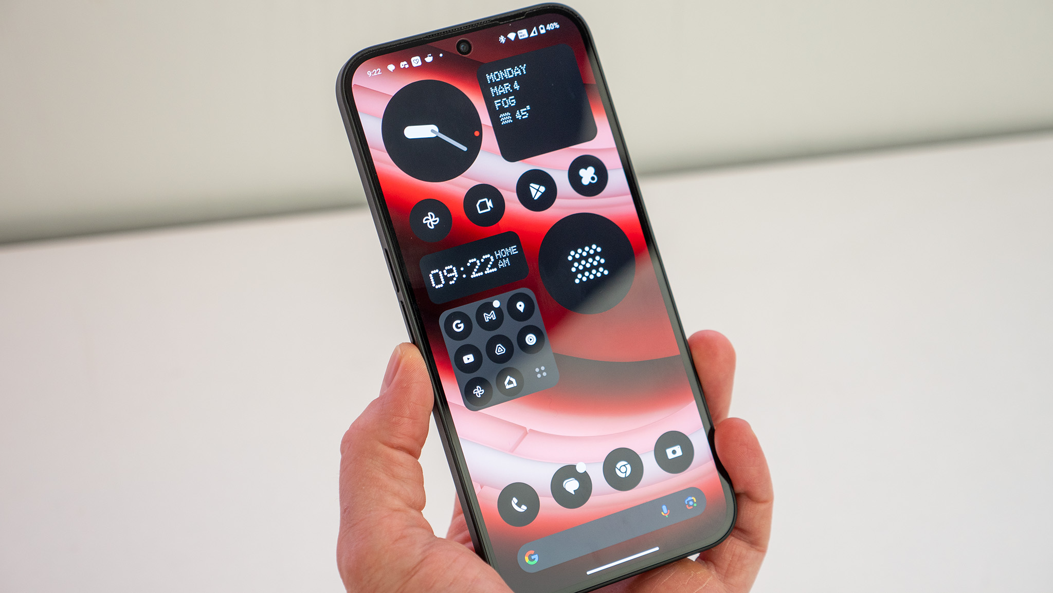
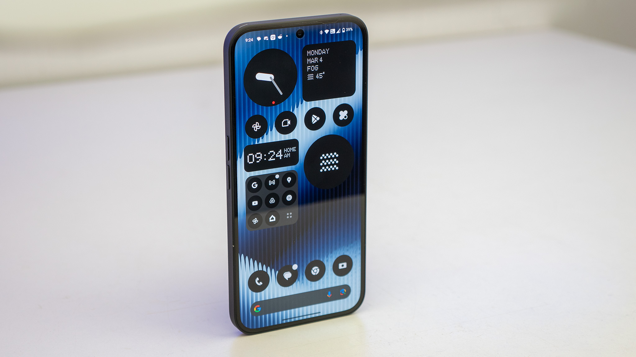
The Nothing OS team includes a lot of staffers who previously worked on OxygenOS, and like legacy versions of that interface, the goal here is to deliver a "fast and smooth" experience that's intuitive at the same time. Nothing OS 2.5 is visually striking thanks to the liberal use of bold colors, and there's a clever widget system, a monochrome mode that's just plain cool, and meaningful customizability.
One area where the Phone 2a stands out from other Nothing phones is the use of MediaTek hardware instead of Qualcomm. Evangelidis noted it was an "obvious decision" to use the Dimensity 7200 Pro, even though it required more work to integrate the hardware and optimize the platform.
As to why Nothing is focusing on the budget segment, Evangelidis said it all came down to timing. "We started Nothing to do something different in the industry; the Ear 1 was purely about hardware design differentiation, and it sold half a million units. That allowed us to raise money to get into the phone segment, and for the first two years, we built products while simultaneously setting up our teams, and it was hectic."
"Phone 2 was a turning point as we had the hardware and software teams in place, along with the hundreds of vendors that handle manufacturing of all the various parts. We wanted to enter the premium segment to prove that we could deliver at that level, and we managed to do that."
While the Phone 2 certainly delivered in a lot of areas, the phone was significantly costlier than its predecessor, and that made it less accessible to a swathe of Nothing's user base. "The price gap (between Phone 1 and 2) was a bit too much for some of our users, and we've seen with the Phone 2 that there is a sizeable fanbase that is engaged with the brand and wants to use our products, so we wanted to create a product that lives up to the Nothing expectations while being much more accessible. We wanted to create a phone we would use ourselves."
Evangelidis touched upon the state of budget phones, noting how a few brands were chasing meaningless hardware goals without thinking of the end user. So with the Phone 2a, the brand went with two 50MP cameras at the back instead of adding a lot of auxiliary sensors, a flexible AMOLED screen with thin bezels on all sides, and a 5000mAh battery — its largest yet — with 45W charging.
But it's the software where things are noticeably different. "We offer three years of platform updates on our flagship, so it was obvious for us to roll out the same guarantee with the Phone 2a. We didn't want to compromise on our core values, and aimed to deliver the same great user experience in this segment."
Nothing is all about scaling its efforts in 2024. It has the requisite teams in place, and Evangelidis said the brand is "kicking into high gear" with its product portfolio. The Phone 2a is off to a strong start as one of the best budget phones, netting 60,000 sales on launch day in India, well ahead of what the Phone 1 and 2 managed cumulatively. It will be interesting to see how Nothing builds on the early momentum, but it's clear that the brand absolutely nailed the timing.
On the subject of timing, Evangelidis said the brand isn't quite ready to make a full-fledged debut in the U.S., so it isn't making the Phone 2a available in general sale at this moment. But in the markets where the phone is officially launching, it has the potential to shake things up — and that's no small feat for a brand that's just three years old.

Harish Jonnalagadda is Android Central's Senior Editor overseeing mobile coverage. In his current role, he leads the site's coverage of Chinese phone brands, networking products, and AV gear. He has been testing phones for over a decade, and has extensive experience in mobile hardware and the global semiconductor industry. Contact him on Twitter at @chunkynerd.
You must confirm your public display name before commenting
Please logout and then login again, you will then be prompted to enter your display name.
