Android Central Verdict
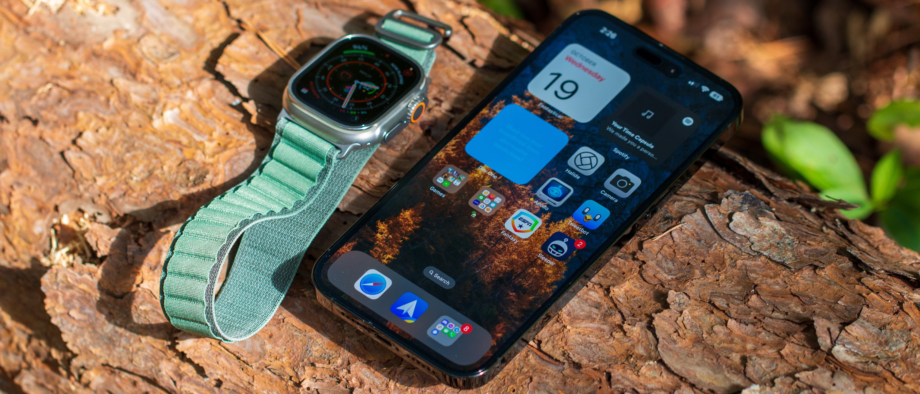
Apple tried to get everyone excited about the iPhone 14 Pro Max, and in a lot of ways, it's the best smartphone on the market. But there is still room for improvement, as the Dynamic Island could be used to handle more UI elements. Regardless, the 14 Pro Max is big, heavy, beautiful, and a joy to use if you're okay dealing with iOS and being locked to an eSIM.
Pros
- +
The best battery life
- +
Excellent camera quality
- +
Always-on display is finally here
- +
Dynamic Island is different and nifty
- +
Incredible performance
Cons
- -
Much of the software "magic" isn't limited to this model
- -
Still using Lightning not USB-C
- -
eSIM-only is annoying and unnecessary
Why you can trust Android Central
What should a company do as an encore when it releases a phone that feels as complete and well-rounded as the iPhone 13 Pro Max? It offered incredible battery life — better than any flagship smartphone we've ever seen. It was still among the best regarding picture quality while leading the pack in video, and its overall performance was at the top of its class.
The answer with the iPhone 14 Pro Max is that, apparently, you start making drastic changes across the board. While Apple's latest iPhone retains the same design that was introduced back with the iPhone 12 lineup, a call-back to the iPhone 4 era, one tap of the screen shows that this isn't part of your run-of-the-mill release cycle. At least in most regards.
iPhone 14 Pro Max: Price and Availability
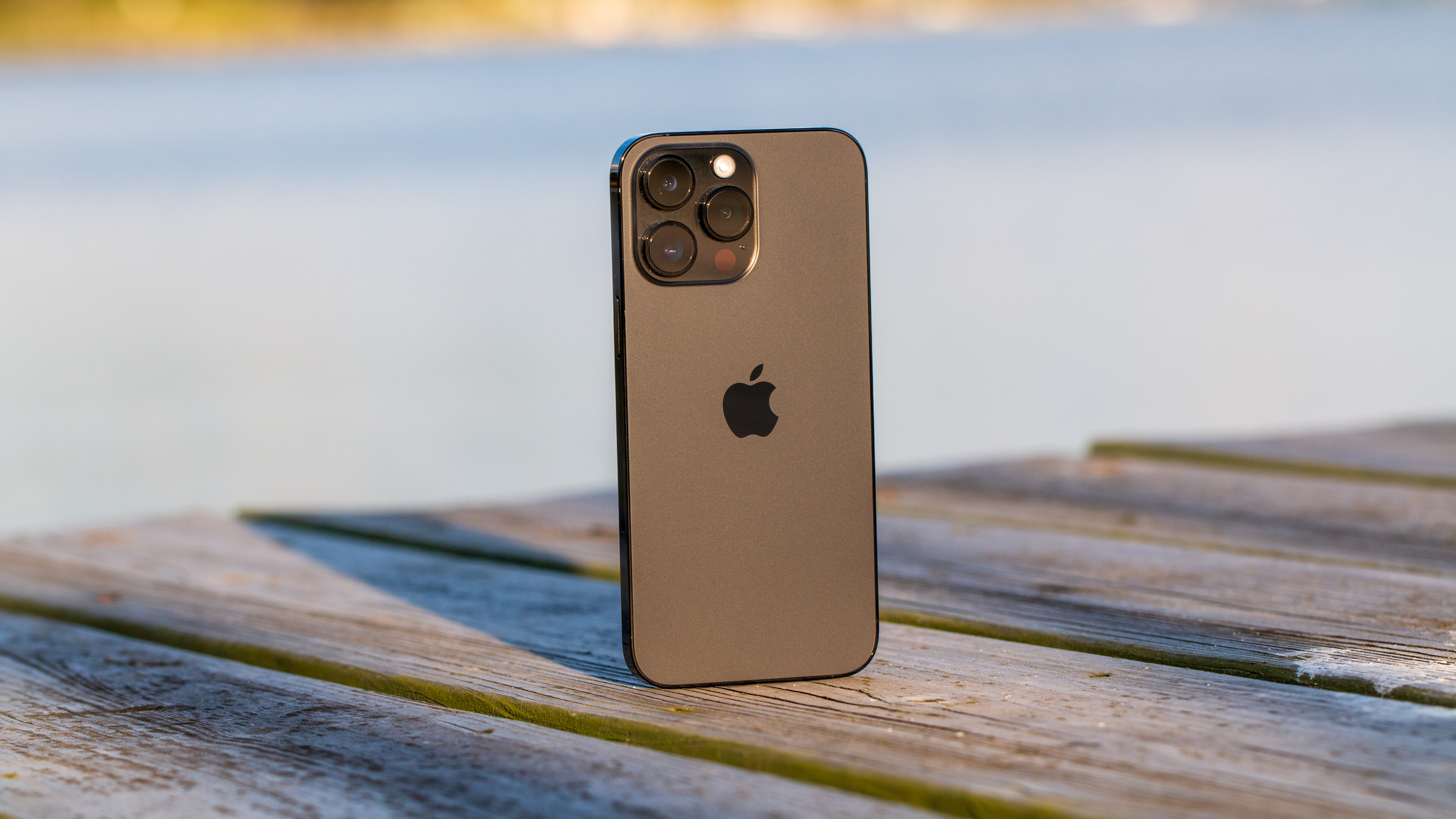
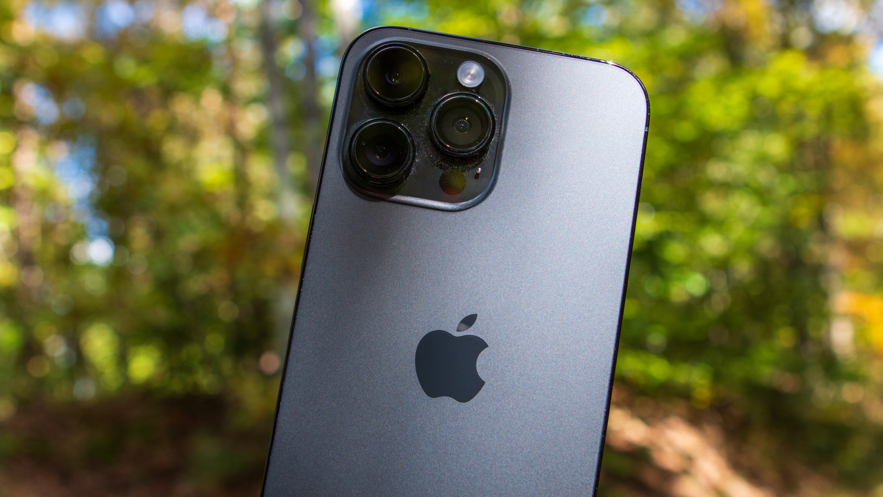
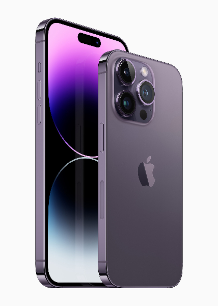
The iPhone 14 Pro Max was announced on September 7 alongside the rest of the iPhone 14 lineup of devices. Pre-orders began on September 9, and it became available on September 16. There are four different storage configurations, starting with the 128GB model priced at $1,099, maxing out with a 1TB model for $1,599. Apple is also offering the iPhone 14 Pro and Pro Max in four different colors, including Deep Purple, Gold, Silver, and Space Black.
iPhone 14 Pro Max: It might be time for a design change
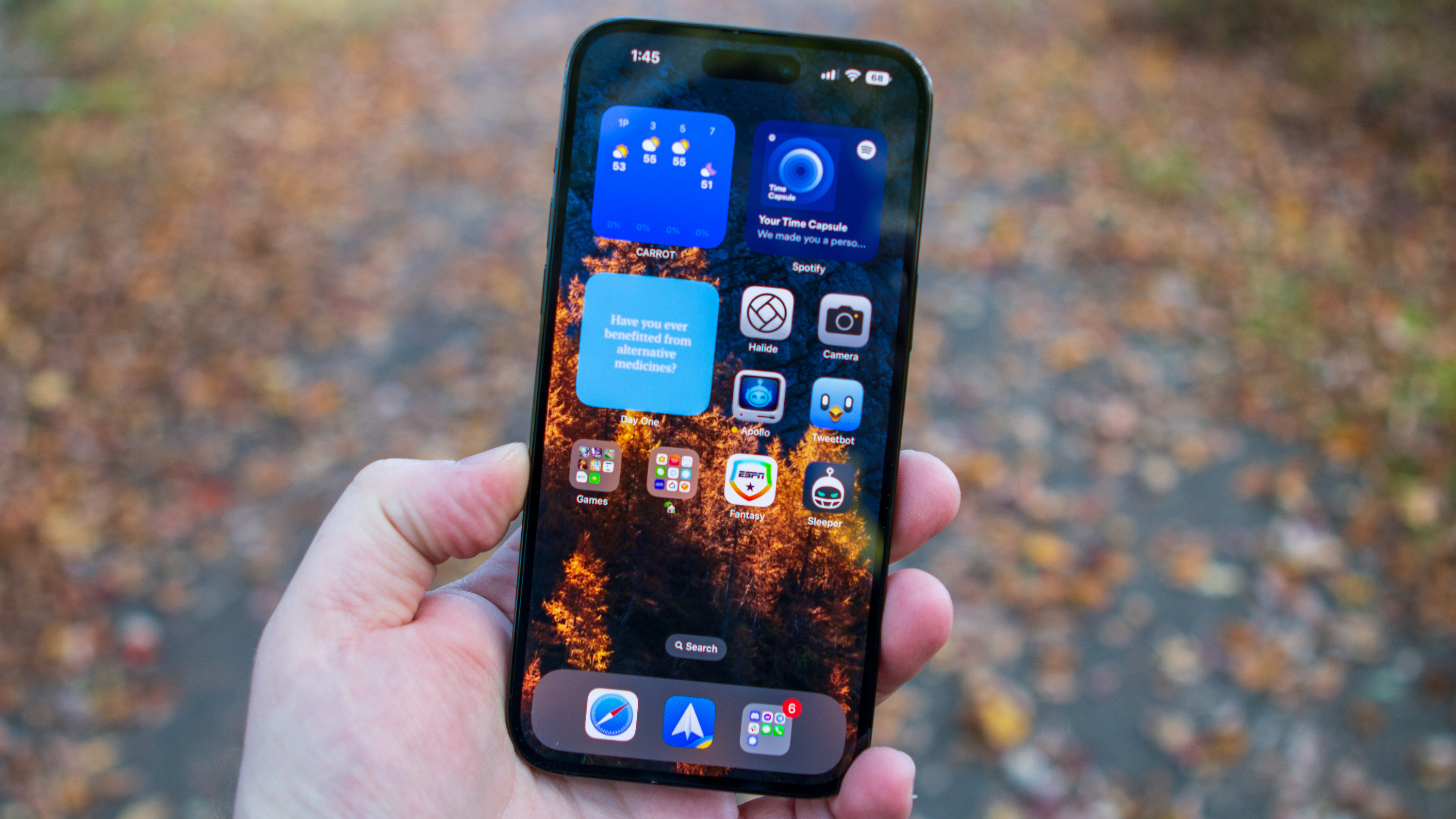
As I alluded to in the intro, you really won't notice too much of a difference in design between the iPhone 14 Pro Max and its predecessor. The 14 Pro Max is still big, heavy, and slightly uncomfortable to hold with its sharp-ish edges that can dig into the palm of your hand. And you'll definitely want to improve the strength of your pinky, or just grab something like a MagSafe PopSocket to improve one-handed usability.
Over the past two years, I didn't actually start out with the Pro Max models, instead opting for the 13 Pro and 14 Pro with my pre-orders. The only reason for this was due to the aforementioned one-handed usability, as the sharp edges just make my hands feel uncomfortable after a little while.
| Category | iPhone 14 Pro Max |
|---|---|
| OS | iOS 16 |
| Display | 6.7-inch XDR OLED (2796x1290), 1 - 120Hz, 2000 nits max brightness, HDR10, Dolby Vision, Ceramic Shield |
| Chipset | Apple A16 Bionic, 2 x 3.46GHz Everest + 4 x 2.0GHz Sawtooth cores, 5-core GPU, 4nm |
| RAM | 6GB |
| Storage | 128GB/256GB/512GB/1TB |
| Rear camera 1 | 48MP f/1.8, 1.22um pixels, sensor-shift OIS |
| Rear camera 2 | 12MP f/2.2 wide-angle, 1.4um pixels, 120-degree FoV |
| Rear camera 3 | 12MP f/2.8 telephoto, OIS, 3x optical zoom |
| Front camera | 12 MP f/1.9 autofocus, 4K at 60fps video |
| Connectivity | Global 5G bands, Wi-Fi 6, Bluetooth 5.3, NFC, UWB, Emergency SOS (NA) |
| Ingress Protection | IP68 dust and water resistance, 6 meters for 30 minutes |
| Security | Face ID |
| Audio | Stereo sound, Lightning jack |
| Battery | 4323mAh battery, 20W wired charging, 15W MagSafe |
| Dimensions | 160.7 x 77.6 x 7.9mm, 240g |
The 6.7-inch display on the Pro Max is massive for a slab phone, but it just feels completely different compared to using something like the Pixel 7 Pro. Both phones use the same screen size, but they feel so much different in the hand. While I've largely been a fan of the design changes introduced with the iPhone 12 series, I've also found myself missing the iPhone 11 design with its rounded edges.
Because the iPhone 14 Pro feels much lighter in the hand, this was the main reason why I tried going with the smaller Pro this time around. However, there are two reasons why I ended up sticking with the iPhone 14 Pro Max and getting rid of my 14 Pro. The first reason is because of the larger screen, something I've become accustomed to, and as I get older, my eyes really don't like using smaller screens. It's something that I've even noticed when using the Cover Screen on my Galaxy Z Fold 4.
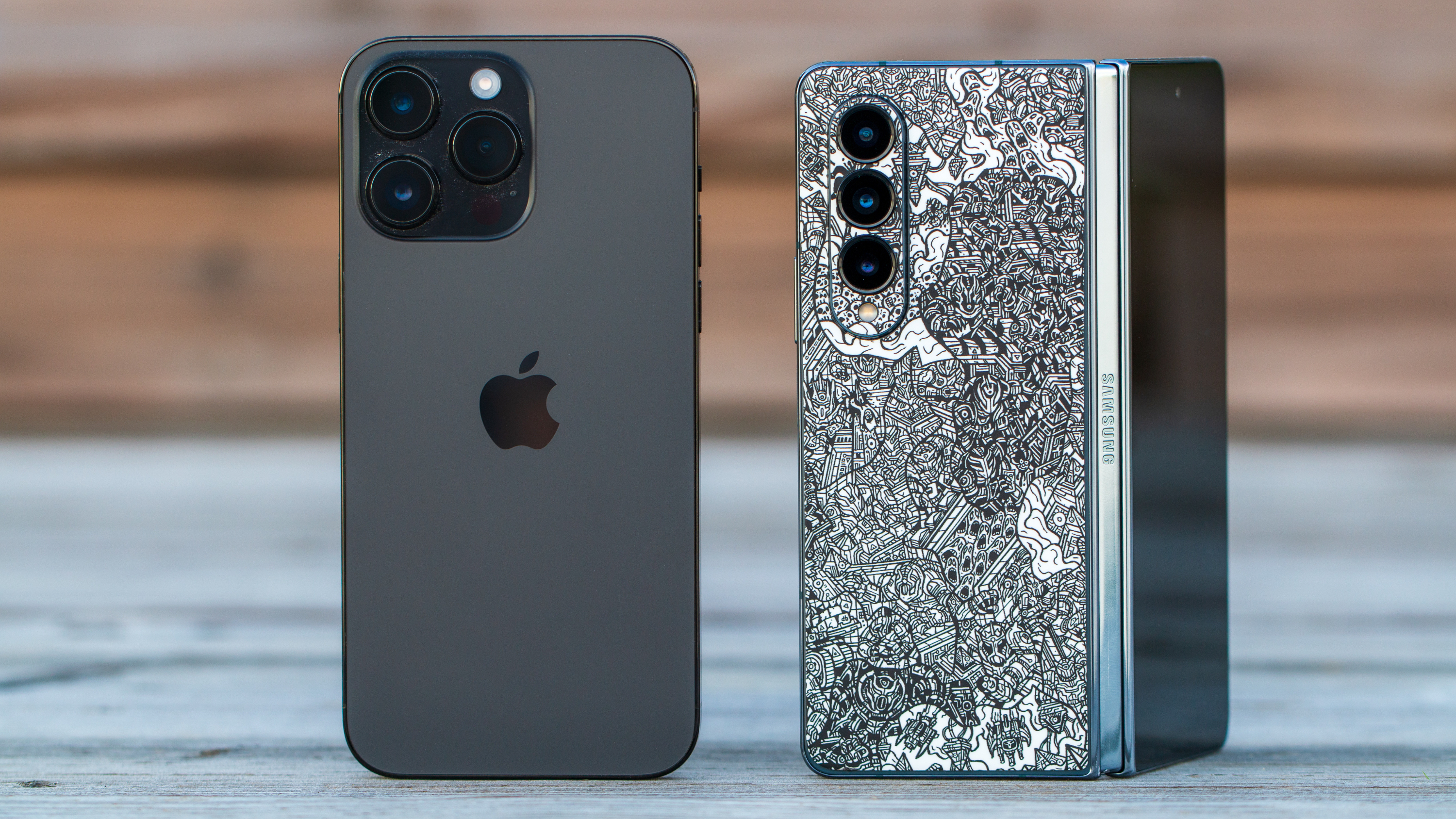
However, the more important reason that I continue to go with Apple's most expensive iPhone is because of its battery life. The iPhone 13 Pro Max was largely touted as the "battery king" of the smartphone world. And after spending just a few days with the iPhone 14 Pro, even with the new always-on display turned off, I just knew it wouldn't be enough.
There's a reason why optimization is so important, and Apple continues to lead the charge in that regard. Since Apple controls practically the entire "stack," it's able to optimize its software to take full advantage of the power offered by the hardware when it needs to while pulling back and sipping on battery when it doesn't.
MagSafe continues to be incredibly convenient, and I'm still hoping to see something similar brought to Android phones.
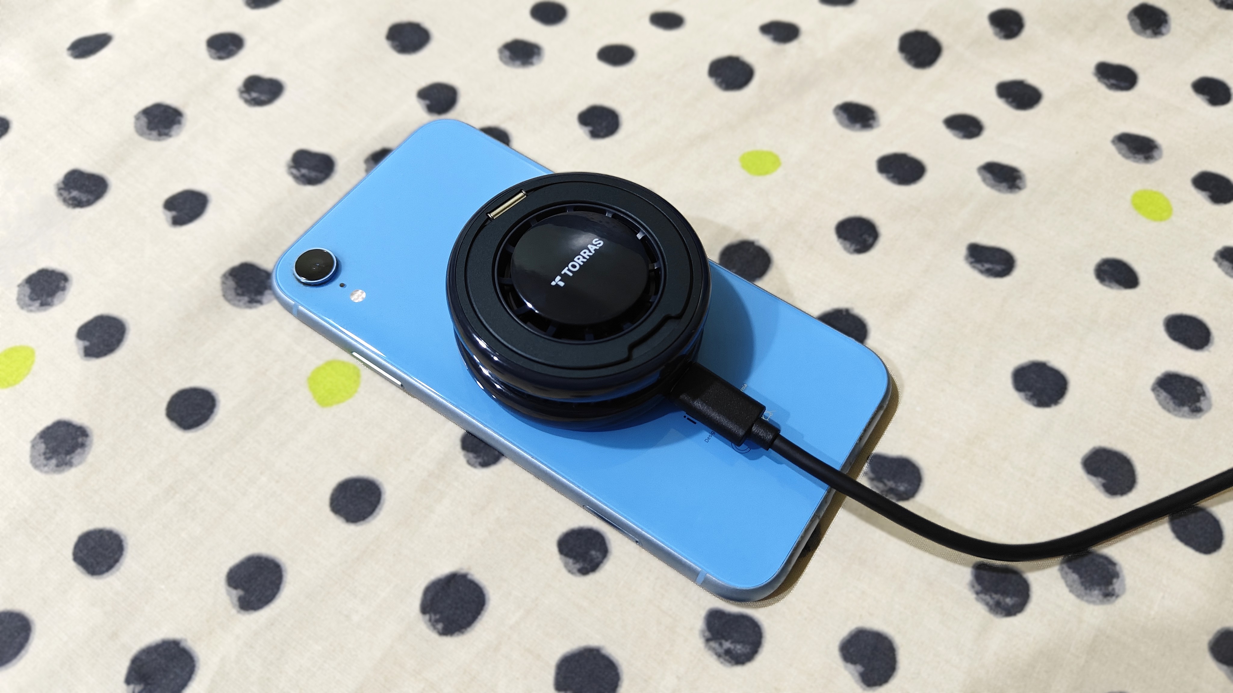
Pivoting over to another one of my favorite features, Apple's continued inclusion of MagSafe makes using other phones without almost impossible. As I wrote in January 2021, I have been hoping for Samsung to "borrow" MagSafe and integrate it into its phones in the same way that Apple has. With MagSafe, I can just slap my iPhone on a charger without having to worry about the charging coils being misaligned. MagSafe also opens the door to a slew of accessory opportunities, from things like wallets to car mounts and everything in between.
I'll save my updated diatribe on this for another time, but I just wanted to point out how MagSafe has "broken" me when using phones that don't have it. It's resulted in me picking up a bunch of Spigen and Mophie adapters so I can continue using MagSafe when I switch over to another phone.
iPhone 14 Pro Max: Going to the Dynamic Island
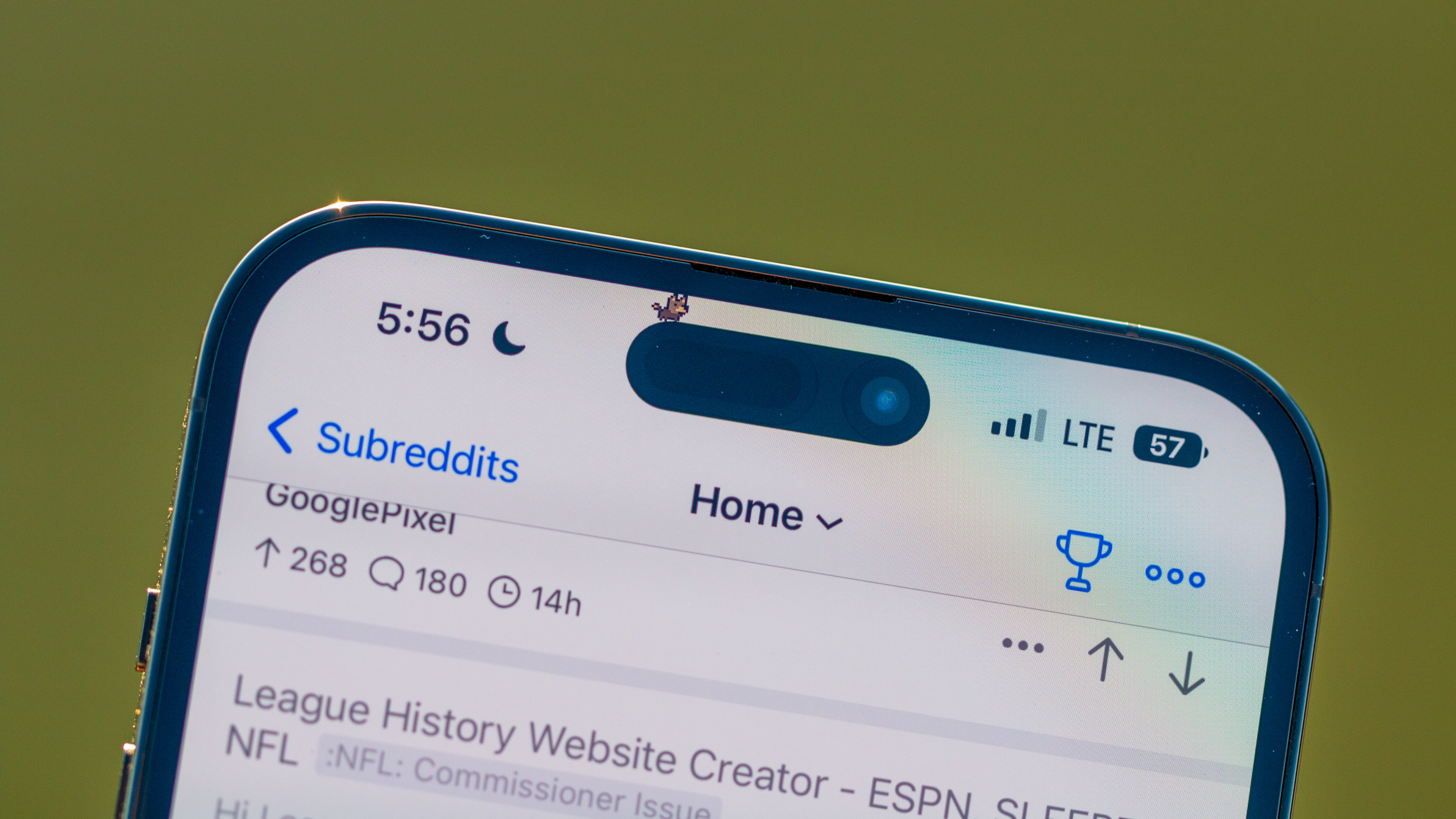
Even though I've had the iPhone 14 Pro Max since the week that it launched, I keep going back and forth about the Dynamic Island. On the one hand, there are things about it that I'm absolutely enamored with, largely when it comes to how UI elements and dialog boxes are handled.
Instead of a dialog box appearing in the middle of the screen, making it impossible to interact with anything, many of this has been relegated to the Island. The UI animations are divine, with the Island being expanded when I need do any type of authentication.
And we're also seeing more and more apps updated with "support" for the Dynamic Island. And this is where I still feel a bit waffle-y about the change, as I'm not one that really sets timers, let alone just to see the Island expand when I close the Clock app.
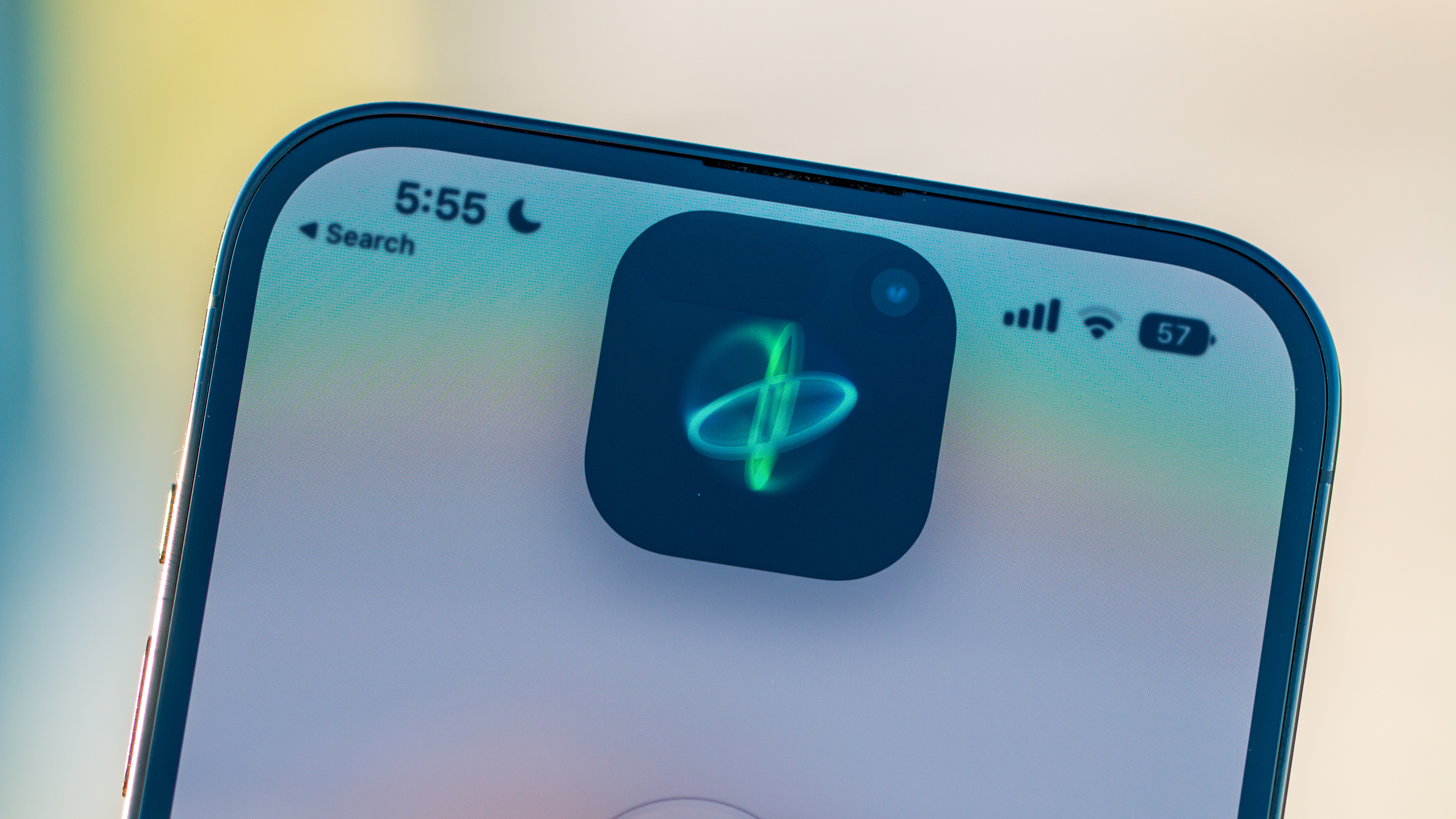
With iOS 16 being available for around a month and iOS 16.1 landing any day now, more third-party app developers are including support for this feature that blends hardware and software. While I admit that it's been nice having Overcast (for podcasts) or having a little "Pixel Pal" scroll through Reddit with me (courtesy of Apollo, the best Reddit client ever), I'm still hoping for Apple to continue iterating on the overall functionality.
There are some UI elements that could take advantage of the Island, as noted in a Twitter thread from Parker Ortolani. Instead of the boring notification box that appears, the Island could expand to show an incoming message or even a way to use Apple Pay without taking up the entire screen. The current implementation is pretty solid as it is, but there's definitely room to grow, so here's to keeping my fingers crossed for iOS 17.
iPhone 14 Pro Max: Software
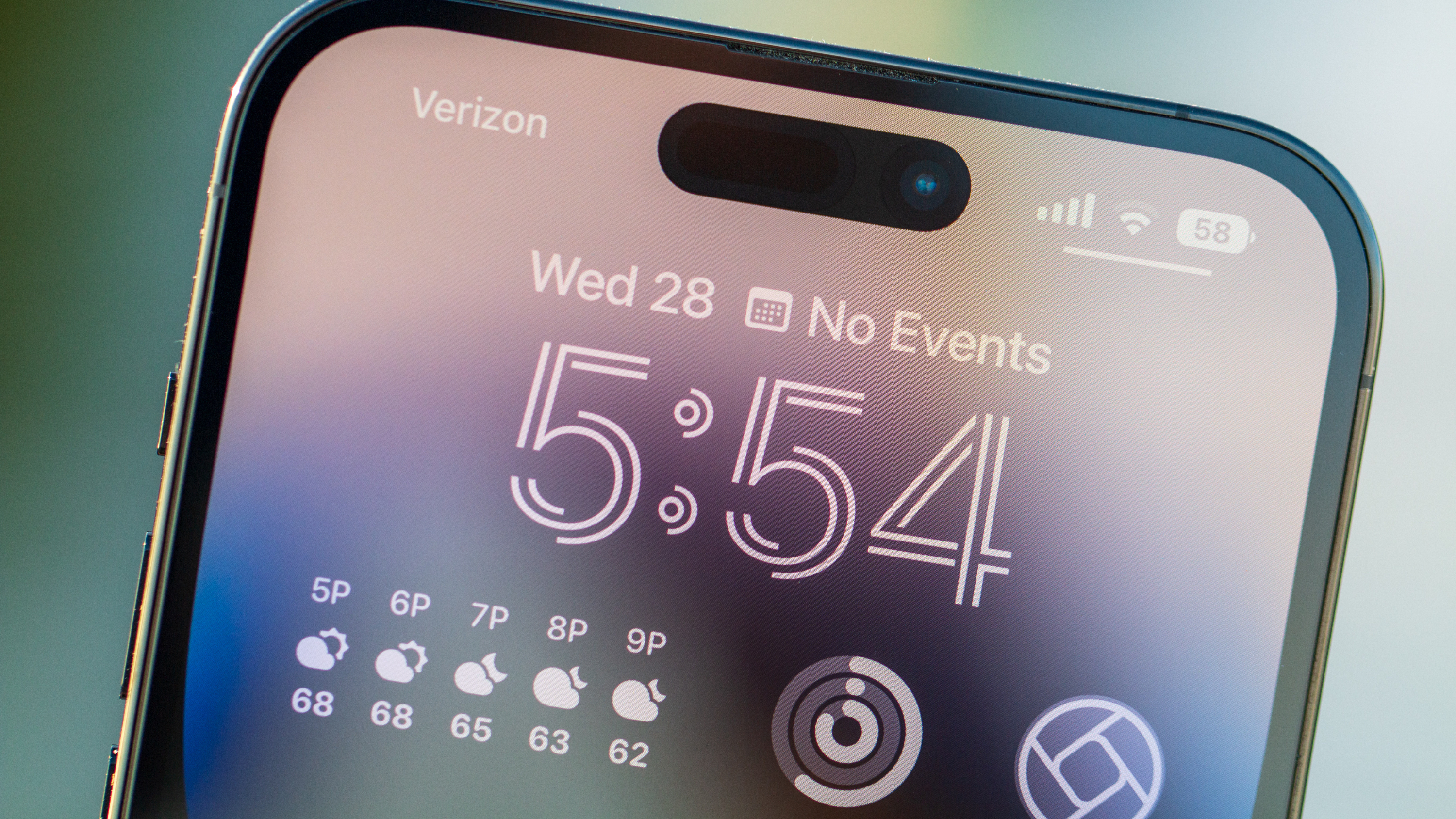
Sometimes its fun to join in on the fun and point out when Apple "stole" or "borrowed" something from the Android scene. Hell, I wrote two of those posts covering iOS 16 and the iPhone 14 announcement, as Apple does an excellent job at implementing new features or changes and then acting like it was the first company to do such a thing. This includes things such as Lock Screen widgets, the Always-on Display, a standalone Fitness app that works without a smartwatch, and more.
I'm definitely going to get a bit of kickback here, but despite some of the bugs we've seen since the iPhone 14 Pro Max was released, I would go so far as to say that iOS 16 just isn't as boring anymore. I'm still keeping my fingers crossed for the day when I can place a damn icon anywhere I please on my Home Screen. Seriously, how are we in 2022, and this still isn't a thing?
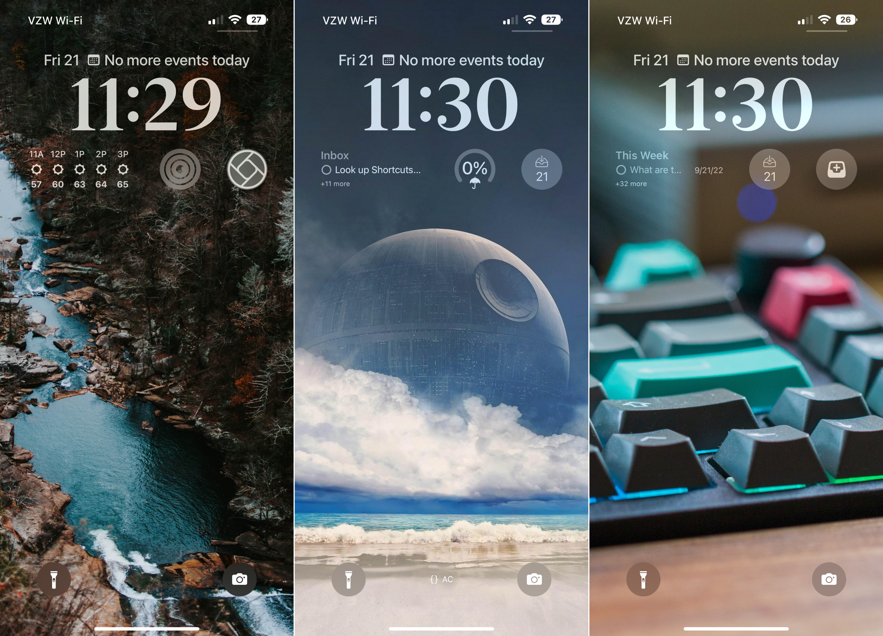
But it feels as though Apple might be planning another major UI overhaul in the near future, and it's all starting with the Lock Screen. This is the screen that you look at the most throughout the day, and for the first time ever, you can actually customize the way it looks in more ways than just changing the wallpaper. iOS 16 brings the ability to add up to four widgets on your Lock Screen at any given time, along with a few different options for the clock.
The real fun begins if you want to start messing around with automation through Focus Modes and Shortcuts. As noted in Harish's iPhone 14 Pro review, "you can also set several lock screens and cycle between them throughout the day, and the best part is that they work in conjunction with the new Focus mode." Plus, Focus Filters have been added to iOS 16, offering you the ability to hide content within certain apps, and it's really just been a complete game changer.
Apple's A16 Bionic may be faster on paper, but you likely won't notice any difference if you're coming from a recently-released iPhone.
As for overall performance, it's still the same iOS that drives some people crazy, with others pledging their devout allegiance to the platform. Apple's A16 Bionic is more than powerful enough, as it feels as though we're barreling towards the "end game" of mobile processors in smartphones. For the purpose of this review, I held back from installing the iOS 16.1 Developer Beta, and I've actually been happier about it. There were a few annoying bugs at launch, but overall, I haven't run into any issues with the iPhone 14 Pro Max from a software perspective.
iPhone 14 Pro Max: Cameras
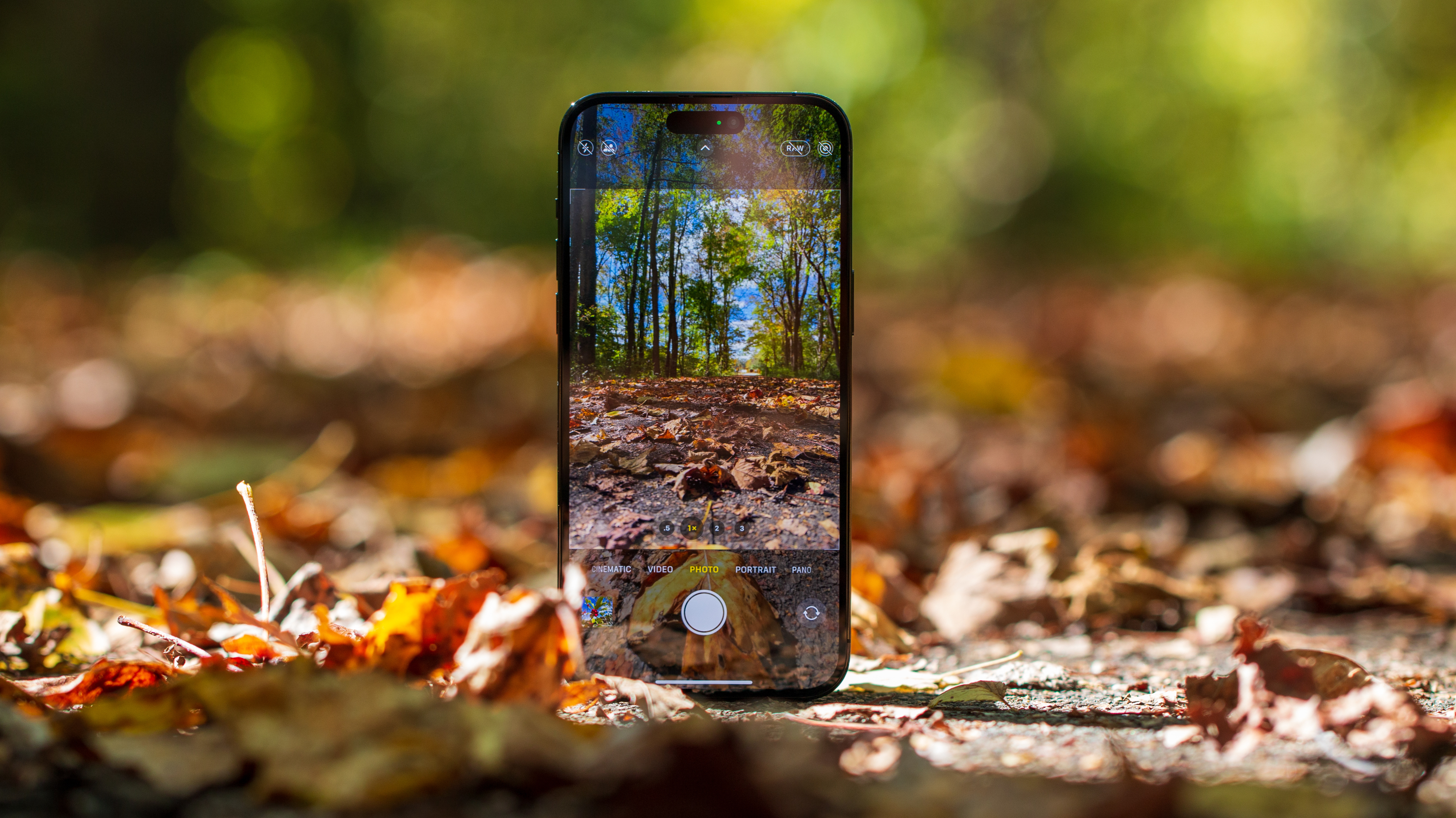
For what could be the last time in an iPhone, both the iPhone 14 Pro and iPhone 14 Pro Max share the same camera hardware and software features. This means you'll find an all-new 48MP primary wide-angle sensor paired with a 12MP ultra-wide lens that doubles as a macro mode for extremely close-up shots, and a 12MP 3x telephoto camera rounds out the pack. Previous iPhone models were limited to using 0.5x, 1x, or 3x zoom ranges, but the new 48MP sensor pulls double-duty, as the Pro Max also now offers a 2x zoom.
Out of the box, Apple's software does some pixel-binning, turning a potential 48MP picture into a 12MP one. But you also have the ability to enable Apple's ProRAW format, taking full advantage of the 48MP sensor. You'll just need to jump into the Settings app in order to turn on this functionality.
As for actually snapping photos, the only noticeable difference comes in the form of the new 2x zoom button. Otherwise, it's the same Camera app that Apple has been using for a little while. And if you are taking non-ProRAW photos, the interface is just as snappy as ever, allowing you to quickly swipe between the different camera modes. However, I actually have two complaints about the overall camera experience.


For one, I'm a big advocate for snapping pictures in some scenarios, at least in the RAW format. More data being captured means that I can fine-tune the picture to my liking, compared to just taking a picture in the traditional JPEG. But when you switch over to ProRAW, you can't just tap the shutter button and keep moving. That's because the iPhone needs a bit more time to finish taking and processing the image.
So you tap the shutter button and then see a rotating animation appear as the image is processed. There have been a few times when I tried to take different ProRAW pictures in quick succession, just to realize that I had to wait before being able to try again, and as a result, I've missed out on a few different photo opportunities.
My other complaint shouldn't come as much of a surprise, but I want Apple to make it possible to actually capture 48MP native RAW files. This isn't possible even when using Apple's built-in Camera app, let alone the best third-party camera app for iPhone, Halide. Sure, the image files would be massive, but that's already the case anyways, with some image sizes nearing the 100MB mark.
iPhone 14 Pro Max: I'm growing tired of the "lock-in"
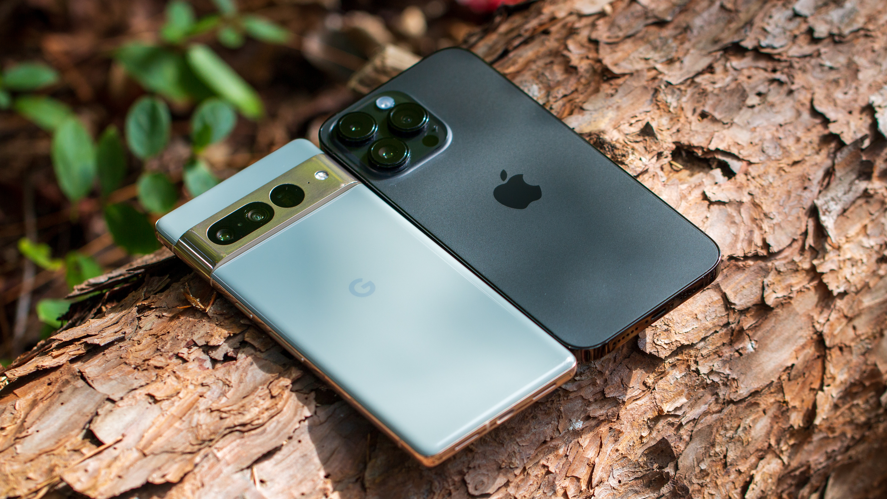
When I started writing this review, I went back and forth about mentioning the Apple ecosystem and what it means for the smartphone market. The iPhone is the natural choice if you already own things like a Mac or an iPad and for those who want to enjoy what the Apple Watch offers compared to Android smartwatches.
Apple took things a step further this year, at least in the States, by removing the physical SIM card tray altogether. Instead, you'll need to use an eSIM, which is potentially frustrating for those who frequently travel abroad and rely on swapping out SIM cards. And while I don't handle many smartphone reviews anymore (say hi to Nick and Harish), I've been hesitant to even switch over to my Galaxy Z Fold 4 or Pixel 7 Pro.
Apple is intentionally making it difficult to switch away from an iPhone 14 with the removal of the physical SIM card.
Transferring your SIM card to an eSIM is an easy enough process, as I didn't run into any issues going from my iPhone 13 Pro Max to the 14 Pro and then the 14 Pro Max. But I've seen far too many nightmare stories about going between an iPhone and an Android phone. When it comes to my smartphones, I want to switch back and forth without needing to call my carrier to make sure my account is provisioned properly.
While I agree with Jerry about the future of eSIM and its benefits, I can't help but feel that Apple decided to go eSIM-only here in the States to further "lock in" its customers. Maybe I'll be able to just transfer my eSIM with ease and find that there's nothing to really worry about. But I really hate the fact that this change has made me think twice about it, and there's nothing I can do but "suck it up and deal with it." It sucks, and it's stupid.
iPhone 14 Pro Max: The competition
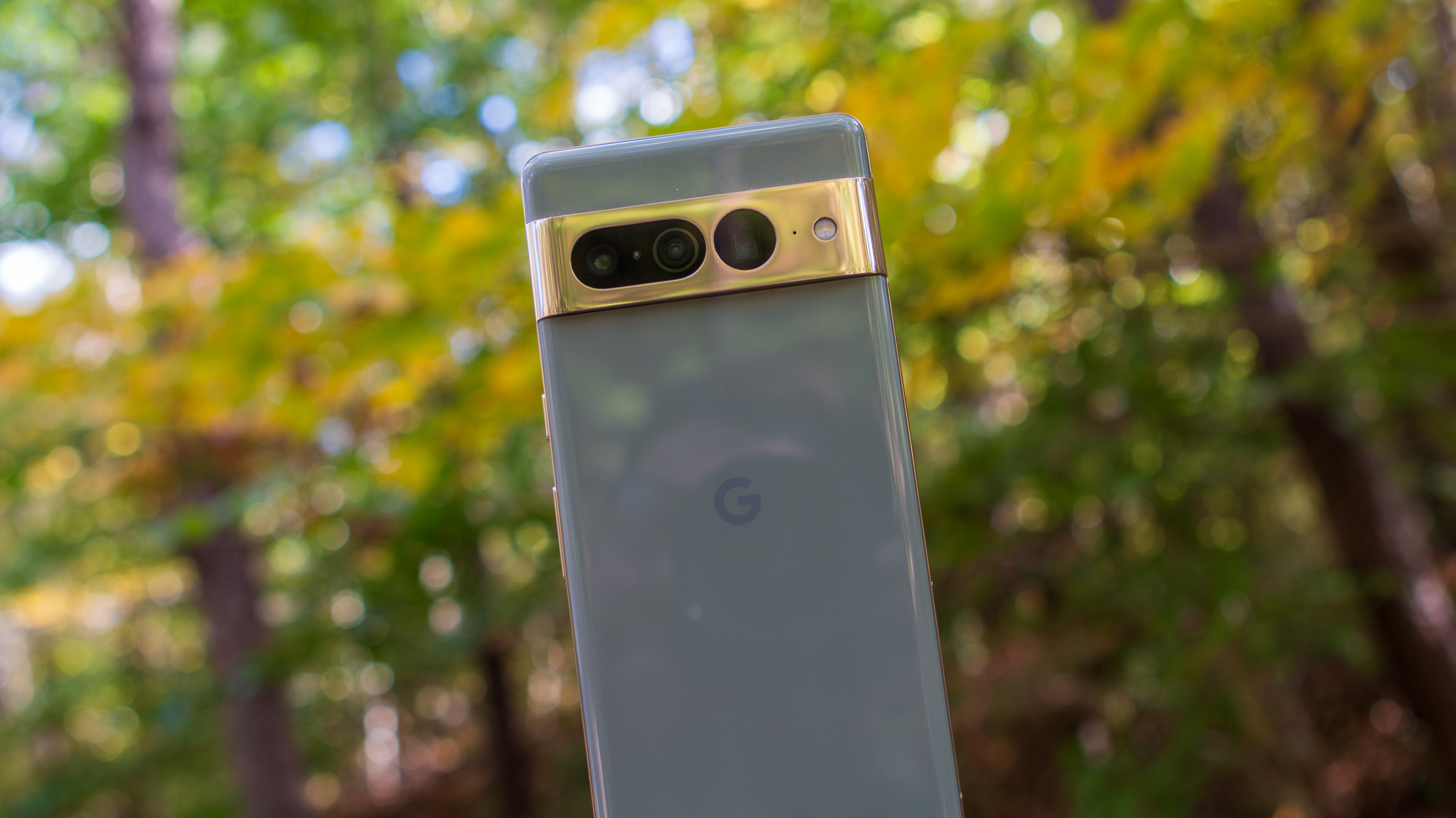
So I'm kind of tipping my hand for the next section a bit, but if you're looking to upgrade and are considering an iPhone, go with the iPhone 13 pro max. There aren't enough differences between that iPhone and the 14 Pro Max to warrant the price tag, let alone if you're looking to upgrade. You'll "miss out" on the Dynamic Island and 48MP primary lens, but all of the other major changes are available with iOS 16 anyways.
Moving to the Android side of things, we have a couple of obvious recommendations. The Galaxy S22 Ultra remains one of the best Android phones and stacks up quite nicely against the 14 Pro Max. It also has the added benefit of being a reincarnation of the Galaxy Note with its included S Pen, along with some extras like DeX mode, Space Zoom, and others you won't find elsewhere.
A phone that I would probably recommend over the S22 Ultra, personally, would be the Pixel 7 Pro. No, the improvements to the Tensor G2 chip still don't match up with what Apple has done with the A16 Bionic. But it doesn't need to. Much like my infatuation with optimization on the iPhone, Google has achieved exactly this with the 7 Pro. It also comes with the same screen size but is so much more comfortable to use, one-handed or not. Plus, the 7 Pro is (arguably) the most affordable flagship out there, not counting trade-in deals or any potential savings for Black Friday.
iPhone 14 Pro Max: Should you buy it?
You should buy this if:
- You want the biggest and best iPhone out there.
- You need one of the best smartphone cameras on a smartphone.
- You need multi-day battery life.
- You already are part of Apple's ecosystem with other devices.
You shouldn't buy this if:
- You are on a budget.
- You don't care for the Dynamic Island.
- You want to easily swap SIM cards when traveling abroad.
It's no secret that I'm one of the Apple fanboys who doubles as someone who just enjoys all the different flavors of technology. It's why I own three different smartphones and use a combination of Chromebooks, macOS, and a custom-built Windows PC, in addition to an iPad Pro and Tab S8 Ultra. But I also know and recognize that outside of this industry of bloggers and editorial staff, I'm in the minority. A blip on the radar, if you will.
If you're trying to decide whether you should spring for the iPhone 14 Pro Max, the simple answer is yes if you want the best that Apple has to offer. The 14 Pro Max is an incredible piece of hardware that disappoints in a few minor areas but is an extremely reliable and performant device. My only caveat to this would be if you are upgrading from the 13 Pro Max, which offers slightly-better battery life, practically the same level of performance, and still offers an excellent camera experience.
But the truth is, slab phones are generally boring, and after the Dynamic Island's honeymoon period ends, it's just another big iPhone. There's not much excitement, and that could change with the help of third-party developers, but again, it's just another iPhone. The iPhone 14 Pro Max is the best overall smartphone and is also the most boring one out of the bunch.
If you're thinking of getting one of Apple's flagship phones, then be sure to check out all the best prices and plans via our friends over at iMore as they've put together a roundup of the best iPhone 14 Pro Max deals.

Andrew Myrick is a Senior Editor at Android Central. He enjoys everything to do with technology, including tablets, smartphones, and everything in between. Perhaps his favorite past-time is collecting different headphones, even if they all end up in the same drawer.
