I spent a week with the Z Fold 5: Coming home
There's something comforting about using a device that you're already used to.
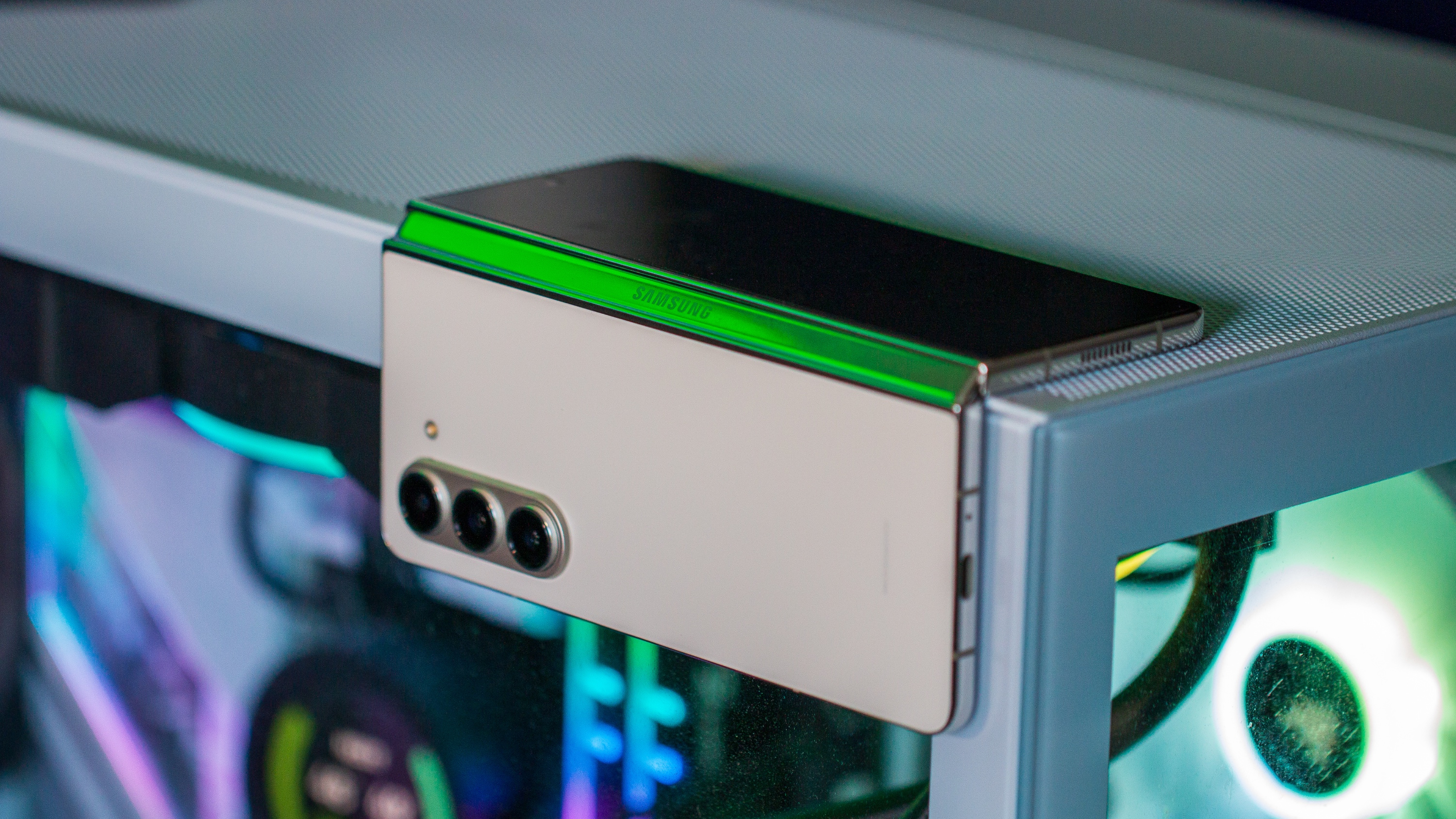
It's no secret that I'm a big believer in foldable phones, and have been since I first received the Galaxy Z Fold 2 a few years ago. Since then, I've pretty much only stayed with Samsung's offerings, as there really hasn't been much competition here in the States.
That obviously changed following the launch of the Pixel Fold, and doing so made me (surprisingly) more excited to try out the Galaxy Z Fold 5. Even with all of the troubles I've dealt with when it comes to trying to get my Fold 4 repaired, I still wanted to see if I would want to rush back to the Pixel or stick with the Galaxy.
Familiarity reigns supreme
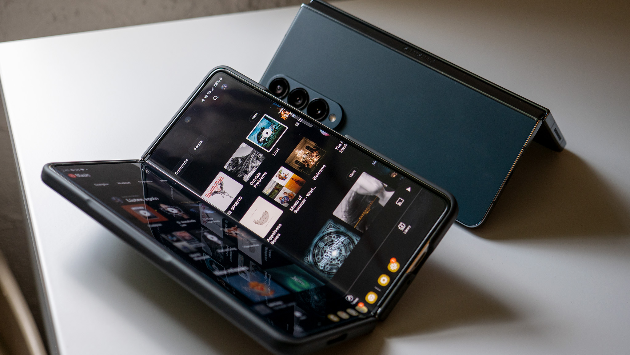
As soon as I took the Galaxy Z Fold 5 out of the box, it gave me a sense of familiarity that I really wasn't expecting. I mean, it's not like I went from a slab phone to the Fold 5 as I literally swapped my SIM from the Pixel Fold. But everything from the Cover Screen to the big and bright inner display just felt comfortable.
A lot, if not all, of this, can be attributed to the fact that Samsung really hasn't changed the overall design for the past three years. The biggest change this time around is that the phone can pretty much close completely shut, removing some of the concerns about debris making its way in between the screens. Other than that, it really just felt like I was using my Z Fold 4 again, with a different color and the need for new accessories.
The software is a gift, and a curse
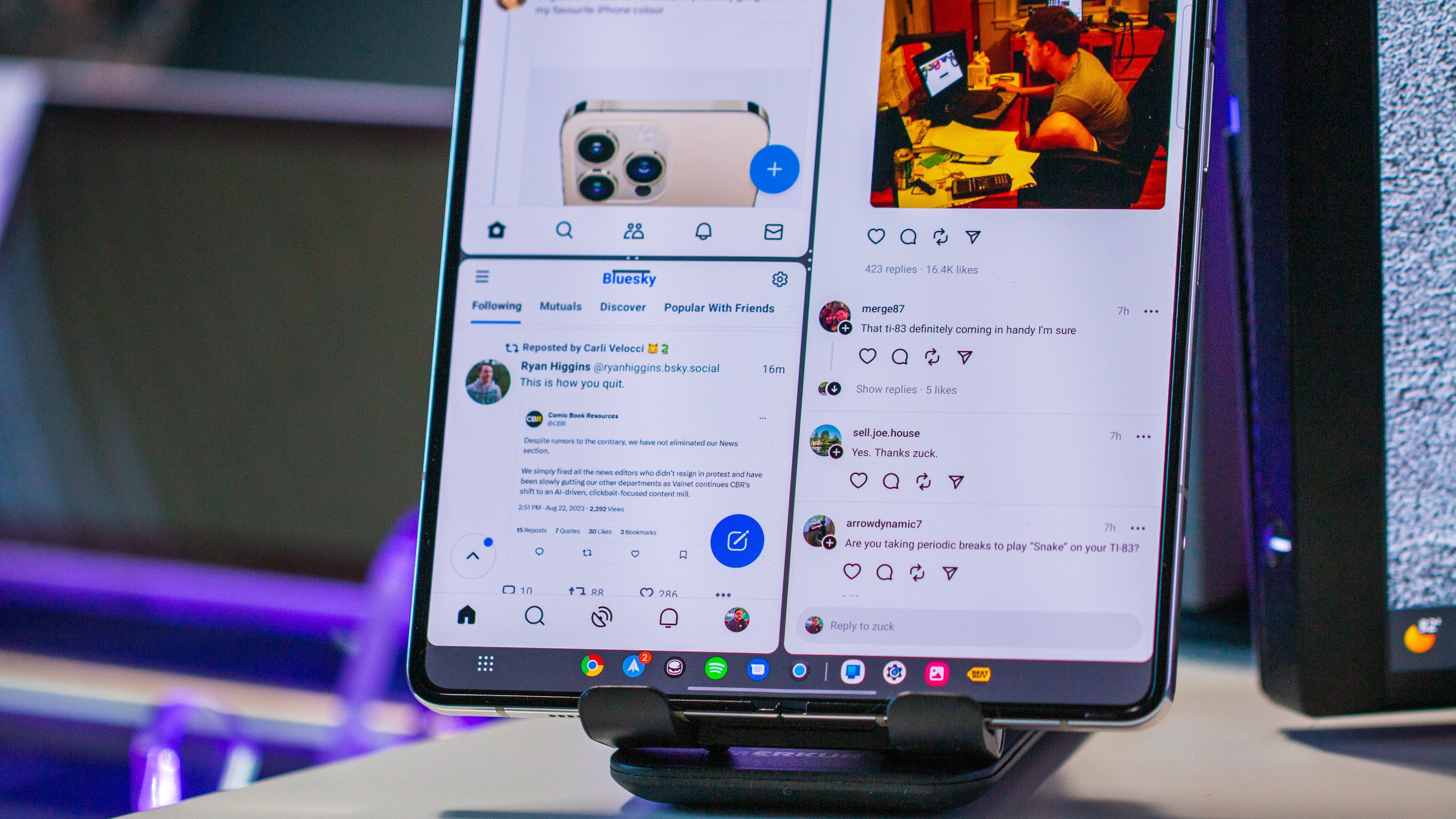
In my time with the Pixel Fold, I came to appreciate some of the little things that Google tweaked with the software. The biggest thing that I miss is the floating taskbar that lets me swipe up from the bottom to access my apps. Obviously, Samsung offers an arguably better solution as you can just have the taskbar pinned at the bottom of the screen all of the time. But there's just something to be said about the animation that Google implemented when you're using an app and want to switch.
That being said, it's pretty apparent and obvious to see the experience that Samsung has with the software. You don't have to worry about things like black bars on either side of apps. And you can have more than just two apps showing on the inner screen at the same time. This isn't something that everyone will take advantage of, but being able to have three apps showing or having a floating window appear can be really convenient.
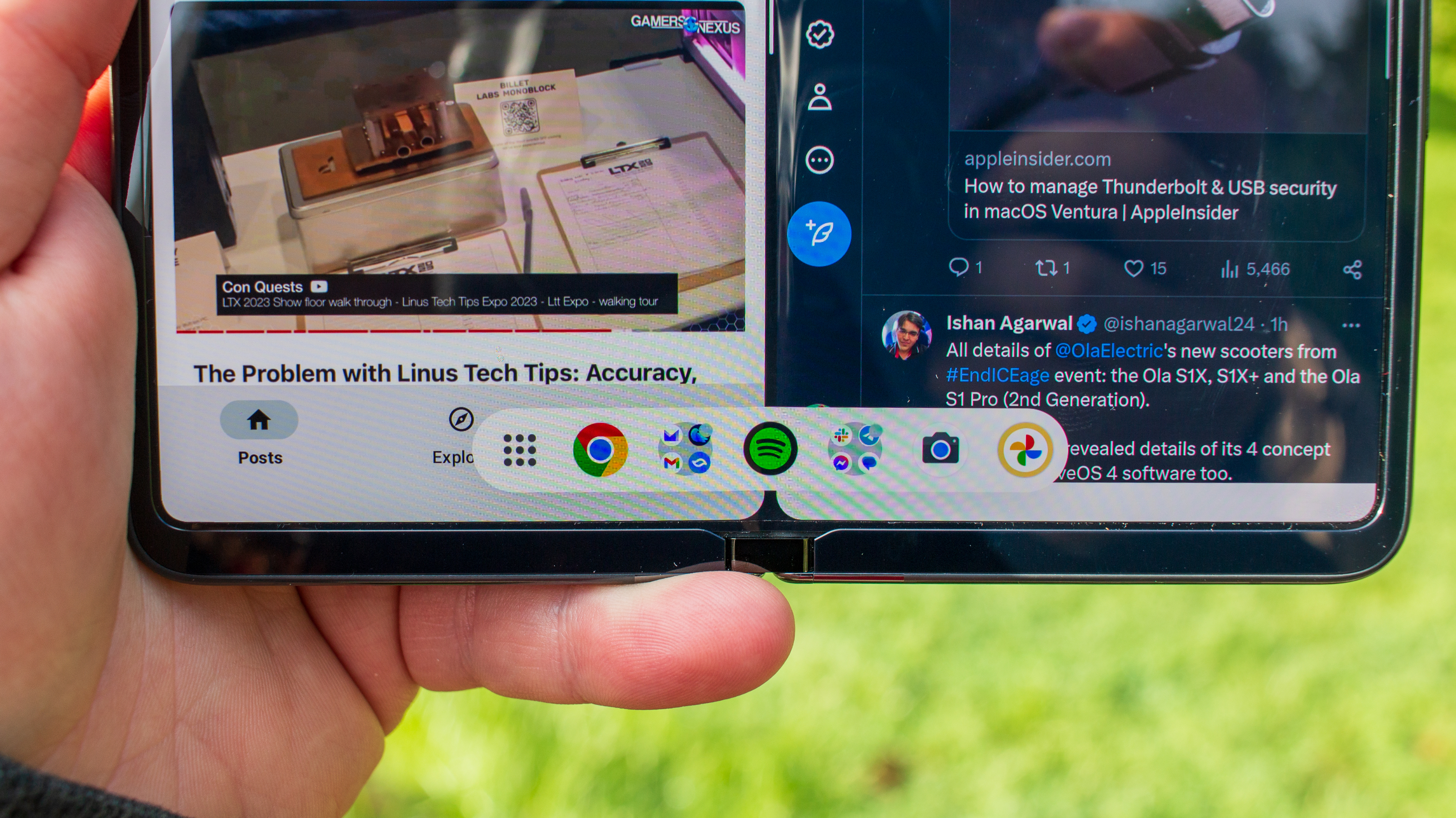
But as much as I love having the flexibility that Samsung's software offers, it really can be a bit daunting. Sometimes it can be really frustrating when you know that the phone should be doing something, but you have to jump through endless settings menus and panels to find the right toggle. None of that is a problem with the Pixel Fold, and it really just reinforces Samsung's "kitchen sink" approach to software.
Be an expert in 5 minutes
Get the latest news from Android Central, your trusted companion in the world of Android
Sometimes, I just want to use my phone and not have to worry about anything, and that's where the Pixel Fold wins for me.
The Cover Screen is fine
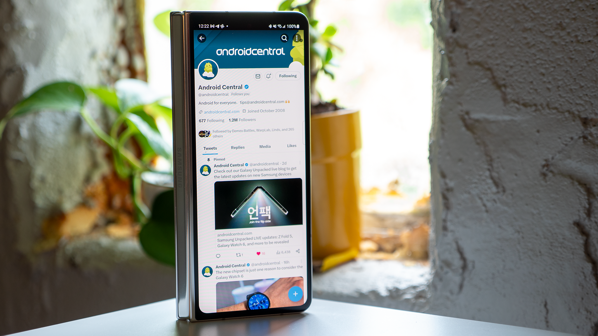
There's been a lot of debate over whether Samsung should finally make a wider Cover Screen. I'm still firmly in the camp that it should, with the Pixel Fold only reinforcing those feelings. But the truth is that the Cover Screen works in the way that Samsung wants it to work.
If you want to quickly reply to a message, doom-scroll social media, or just look something up, the Cover Screen is pretty much perfect. And as soon as you want to do anything more, just unfold the phone and take advantage of the bigger screen real estate.
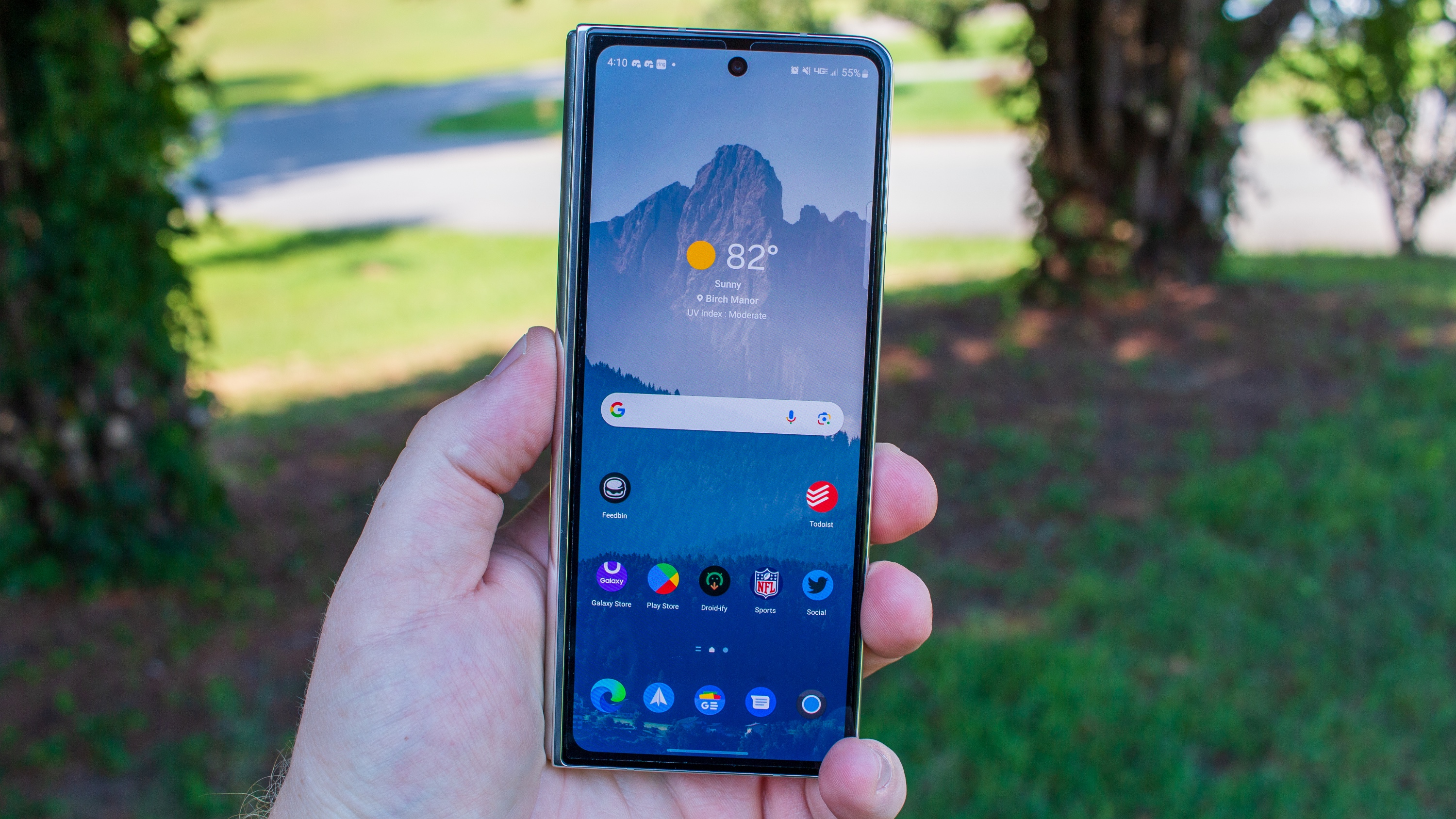
Unlike the Pixel Fold, I'm using the internal screen A LOT more than the Cover Screen, most of the time. And I really think this is by design, as Samsung wants you to use the bigger screen. The unfortunate side-effect is that instead of getting a Galaxy S23 Plus and an iPad Mini, you're getting something more akin to the Xperia 1 V and an iPad Mini.
I'll admit that there have been times when I wish I was using the Pixel Fold, simply because I wanted a screen wider than the Fold 5 without actually opening the phone. Whether it's because I didn't want to or because I couldn't, it's made me realize that Google probably made the right move with its design choice.
Bigger, brighter, and more useful
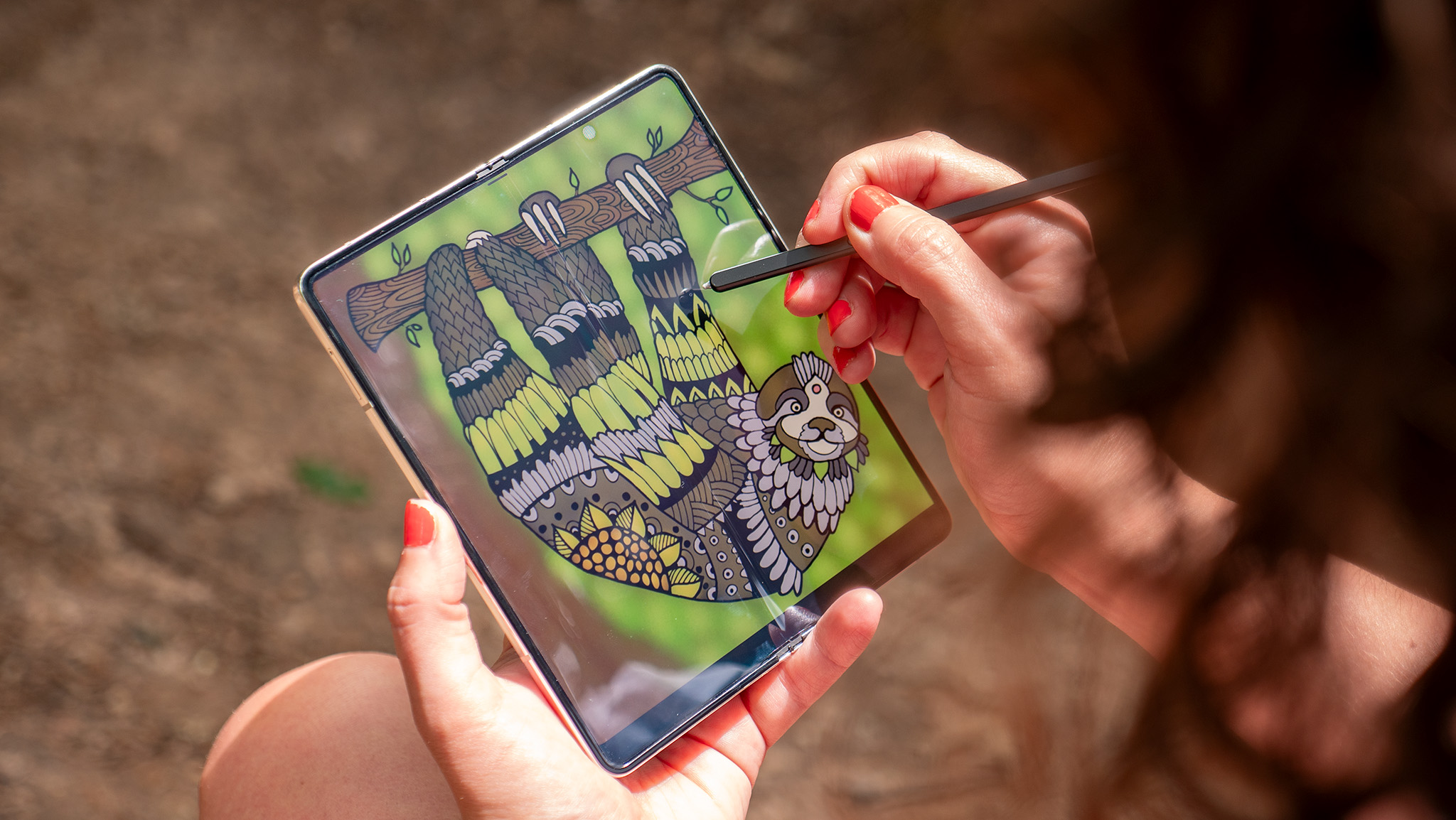
One of my biggest complaints about the Pixel Fold is that the inner screen just doesn't get bright enough to use outdoors. There were too many times when I'd unfold the phone just to fold it back up and use the outer screen. As I expected, this hasn't been a problem at all with the Galaxy Z Fold 5. It gets as bright as I want to, even if I need to manually adjust the brightness myself.
The real dagger, for me at least, is the ability to use a stylus with the inner screen. I was really hoping to see this functionality come to the Cover Screen, but it's just something else I'll put on my wish list for the Galaxy Z Fold 6.
And it's not just being able to handwrite notes with the S Pen on the Fold 5. Sometimes I just like to use the phone with a stylus, as it has a finer point than my sausage fingers, and is more enjoyable. This is especially true when trying to play around with KWGT or trying to tinker with my app layout.
Cameras are cameras
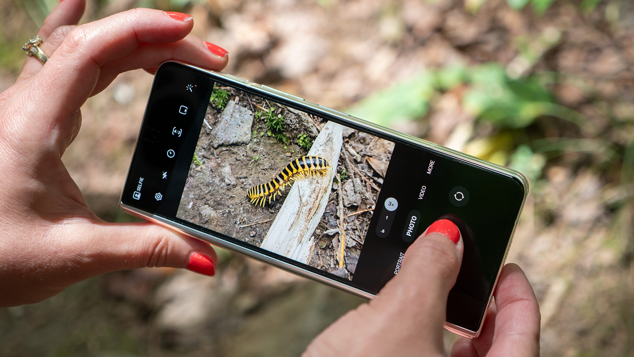
On paper, I was pretty disappointed with Samsung's decision to stick with literally the same camera array from the Fold 4. The phone costs $1,800 and Samsung couldn't even bother upgrading any of the sensors. It just feels like the company "phoned it in" and focused on the hinge instead.
But as my colleague Nick Sutrich covered in his Fold 5 camera review, there are some differences. For one, I don't have to wait an eternity for a picture to be taken, as you can just tap the shutter and it'll capture the picture. That's something I've hated about Samsung phones for years, and I couldn't be more excited that it's finally been changed.
There are still some areas for improvement, but by in large, I've been pretty satisfied with what the Fold 5's cameras can produce. I'm still waiting for a compatible GCam mod to be released because I think that could dramatically change things, so keep an eye out for that comparison.
One's for work, the other's for everything else
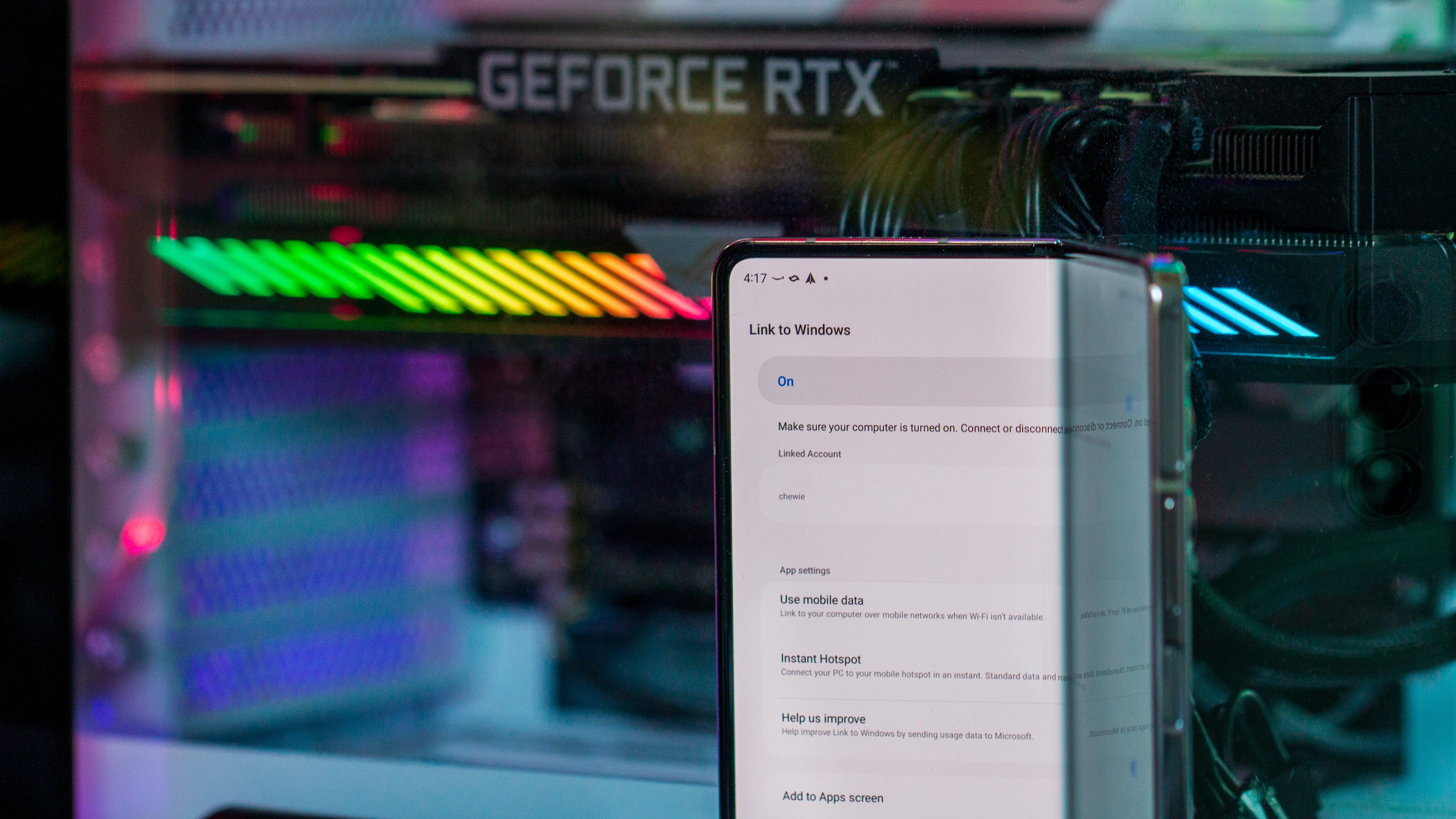
Shortly after I received the Fold 5, it became pretty obvious that Samsung and Google were targeting two different segments of an already niche market. I've been trying to figure out the best way to put my thoughts into words, and this is what I've come up with.
If you want a phone that can do anything and everything under the sun, the Galaxy Z Fold 5 is the one for you. It handles multi-tasking and gaming like a champ and even has all-day battery life, which came as a surprise.
But if you want the "dad" phone that you're just going to use to read content, answer calls, and maybe watch a video, then the Pixel Fold is the way to go. Both of these phones offer a similar yet very different experience. And as long as you have the funds, you'll really be happy either way.

Andrew Myrick is a Senior Editor at Android Central. He enjoys everything to do with technology, including tablets, smartphones, and everything in between. Perhaps his favorite past-time is collecting different headphones, even if they all end up in the same drawer.
-
northlanarkshire @AndrewReply
SGCAM mod has been working fine since the fold4 was released a year ago and still works ok on the fold5
