Dynamic Island is what Android should have done with hole-punch cameras years ago
And LG almost did it a decade ago, too.
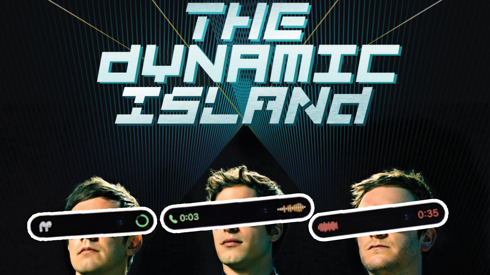
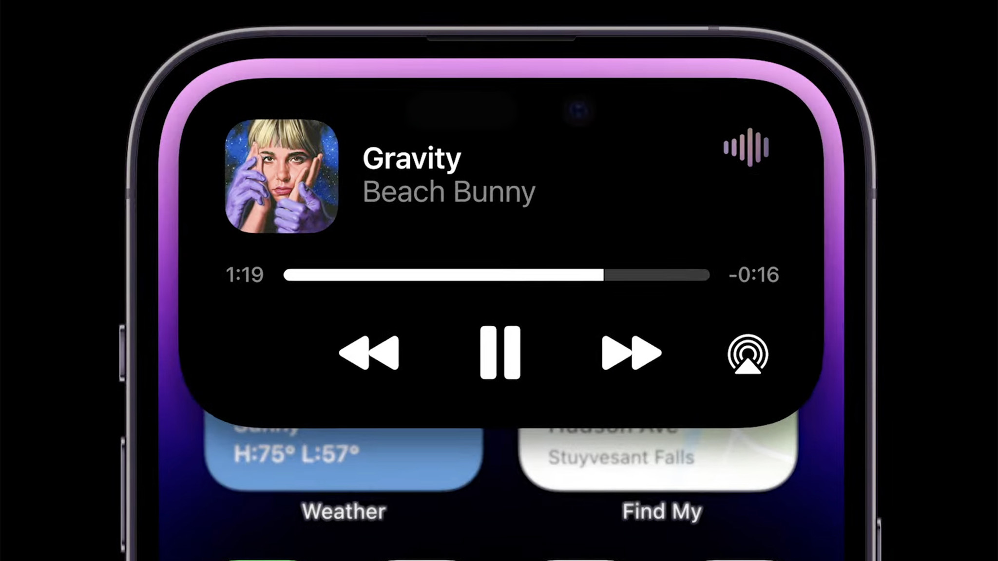
Apple's iPhone 14 Pro finally ditches the ugly notch for something that doesn't look too different on the surface, but the second a notification or call comes in, transforms into something incredible. Apple calls it the Dynamic Island.
The genius of this clever software trick is in its ability to take a technical deficiency — that's the inability to put the front-facing camera and FaceID tech under the display without affecting quality or facial recognition accuracy — and turn it into something both beautiful and useful.
In many ways, LG did something like this nearly a decade ago with its V-series, and called it the Second Screen. It was literally a secondary ticker display placed above the main display that could display anything from the usual plethora of status icons and the time, to a handful of quick toggles, music player controls, quick actions for the camera, and even custom widgets.
It was glorious, but why didn't it catch on with the best Android phones? Now that Apple has done it, I'm willing to bet it will, and that's beyond frustrating from an Android enthusiast's perspective.
When life gives you lemons...
Anyone who was a fan of LG phones knows the company was the king of innovation in the Android space for as long as it made phones. From weird dual-screen devices like the LG Wing to phones like the LG G Flex — which started the bendable OLED trend before anyone else — it felt like LG was willing to try just about anything to differentiate itself from the pack.
In many ways, it worked. While their flagship phones didn't sell all that well, the company made enough of a name for itself to hold the #3 spot in the U.S. for mobile devices (and better in some other countries) until it finally pulled the plug on a division that just couldn't get things right, according to the top brass at the company.
Fast forward to Fall 2022 when Apple announced the iPhone 14 Pro, the first all-screen iPhone without a notch.
Be an expert in 5 minutes
Get the latest news from Android Central, your trusted companion in the world of Android
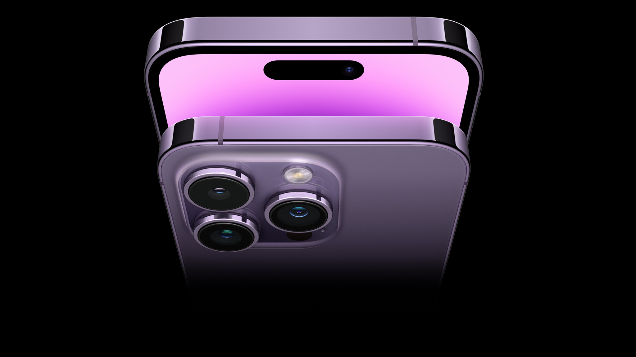
Yep, there it is. It's not a notch, but it's certainly bigger than most hole-punch cameras we're used to on the Android side. If anything, it's closest to the dual-camera setup we saw on the Samsung Galaxy S10 Plus. When Samsung finally got over its stigma of making fun of Apple's terrible notch design on the iPhone X and beyond, it went with hole-punch cameras that took up a lot less space than a notch.
But it wasn't Samsung that really did anything with these cameras. It was Samsung's loyal fanbase, who quickly turned the literal hole in the screen into something entirely fun, albeit a bit useless. The trend of putting great hole-punch wallpapers on your Galaxy S10 became a Reddit phenomenon, and it showed that users don't care as much about technical limitations, as they care about what can be done to make them fun.
If Apple's presentation of the Dynamic Island in its September 7 debut was anything, it was lots of fun. Typical over-produced Apple product announcement segments might have flanked each side of the Dynamic Island's announcement, but the fact that Apple took yet another huge cut out in its display and turned it into a fun, useful feature is sheer brilliance that I would have expected from Google. Or, as I said before, LG in its heyday.
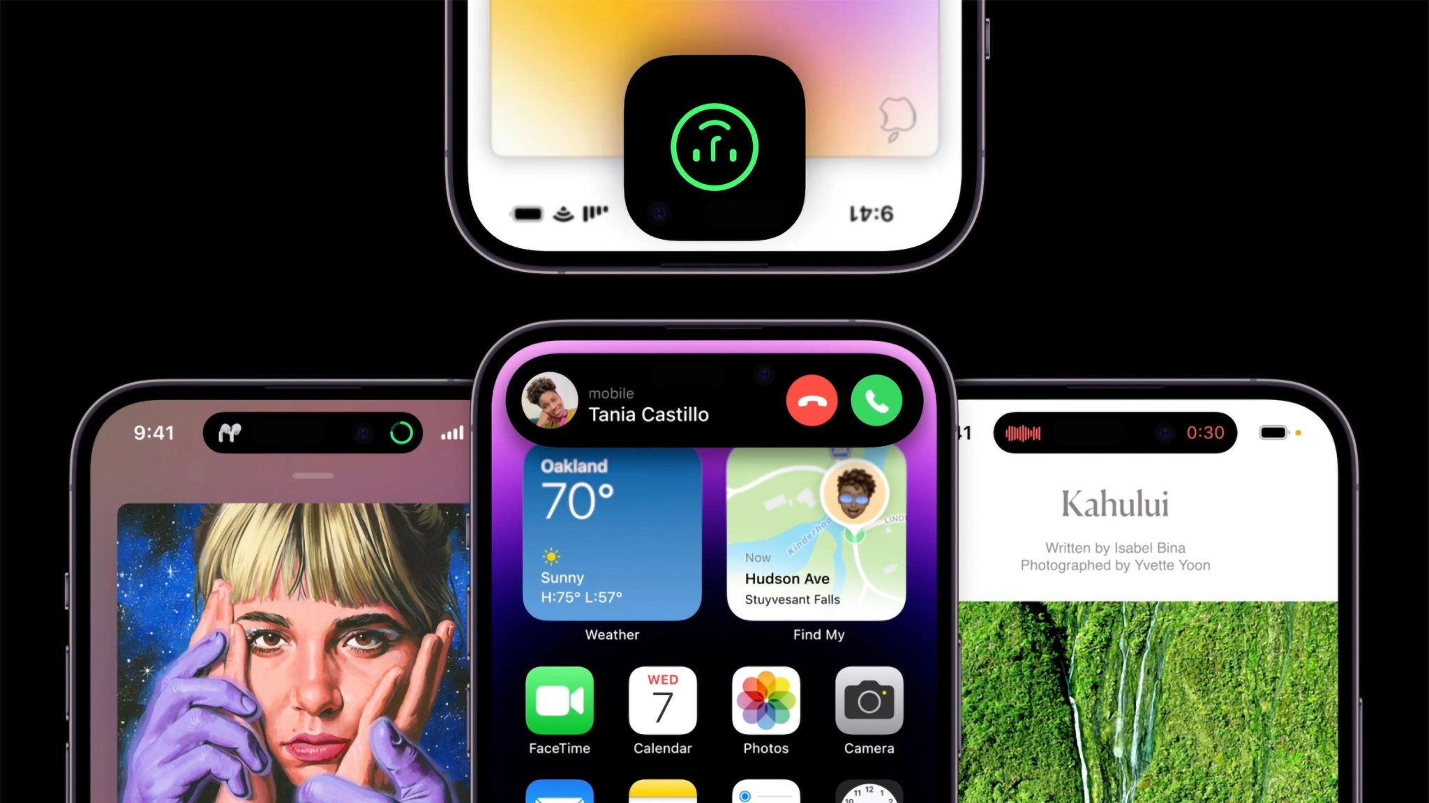

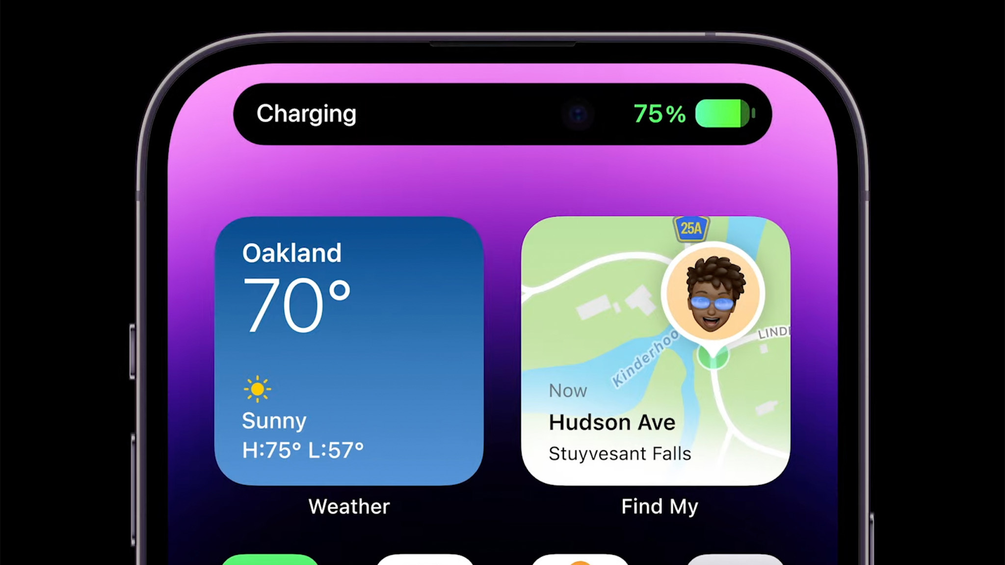
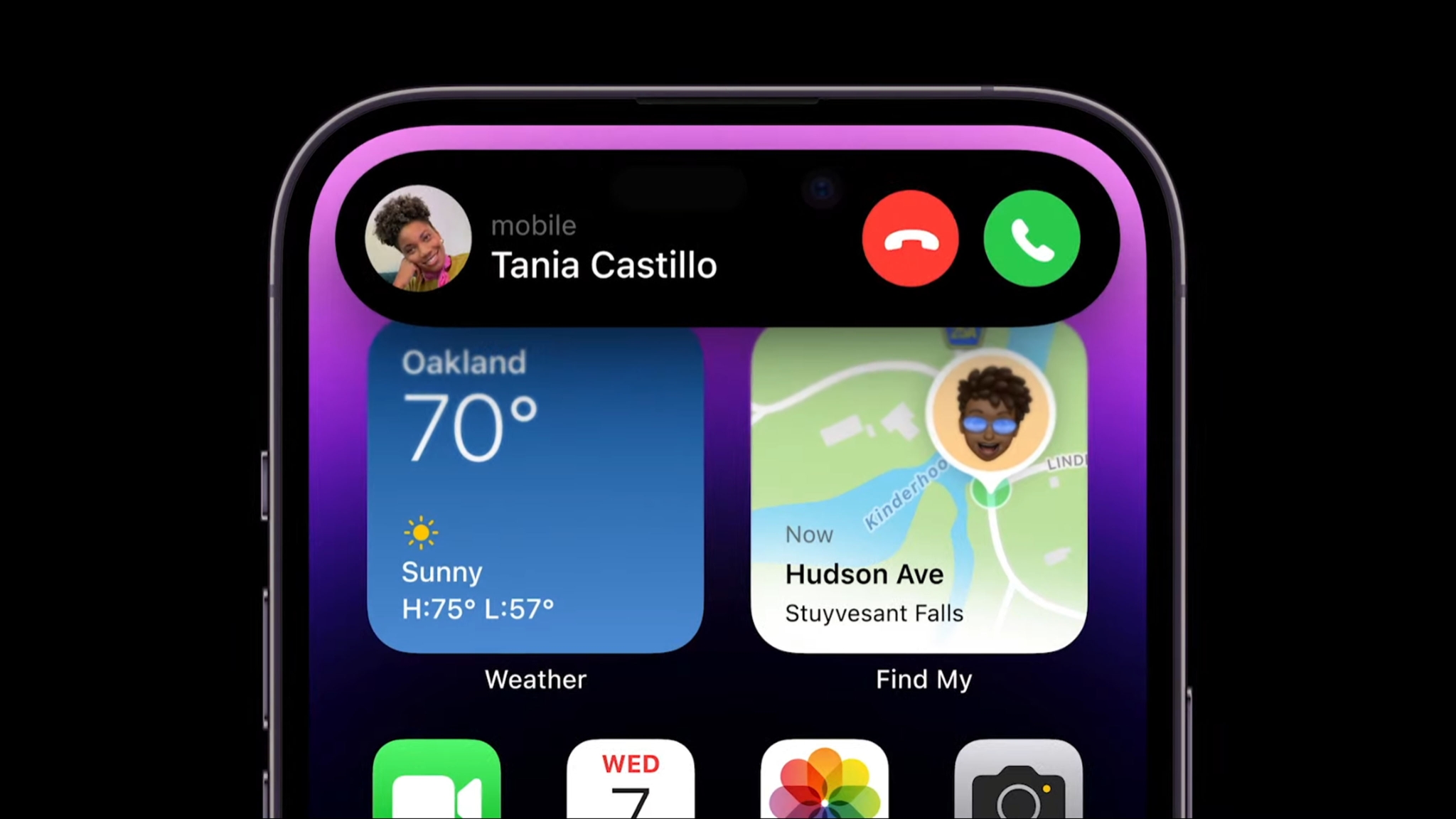
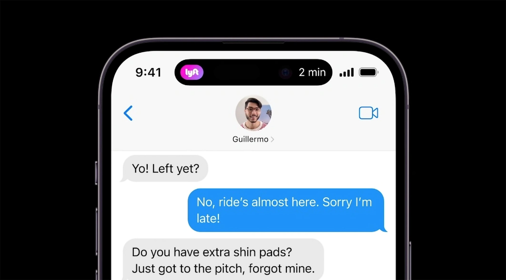
The collage of options above shows the plethora of features that Apple has built into the Dynamic Island, which is cleverly hidden by being integrated into the software experience.
When your phone needs biometric authentication, a playful face appears to pop out of the Island and wink at you when it recognizes you. Incoming phone calls display dedicated answer and hang up buttons. Media playback can be instantly accessed with a tap. Even your next Lyft ride will notify you of its estimated incoming trajectory with a quick pop-out from the Island.
Essentially, it works toward fixing the absolute mess that iPhone notifications have been since the dawn of the product line, and it does so in a way that seems entirely superior to anything we have on the Android side. On the surface, at least.
Dynamic Island won't fix the issues with Apple's messy notification shade design at all, but it certainly will help with active background apps and secondary tasks like music listening, or the timer running in the background. And to this, I ask Google and other Android OEMs: Why the heck didn't you do this first?
Time to copy the copy
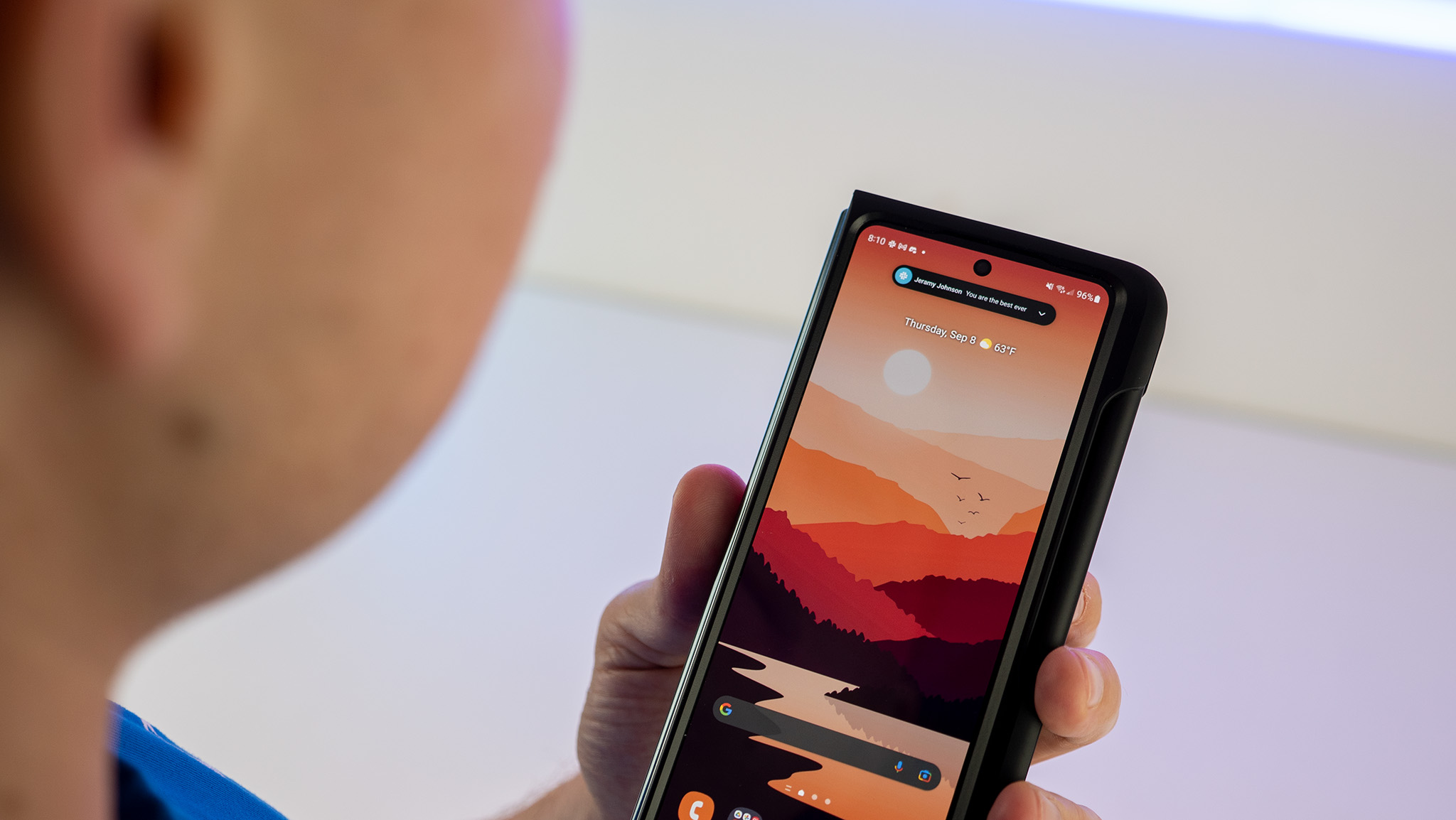
To be fair to Apple, Dynamic Island isn't a direct copy of something Android did — there's always plenty of that with every Apple release — but it is a brilliant concept that clearly stemmed from several different ideas Android vendors have come up with along the way. It's also a substantially better way to handle notifications than the current slide-down nonsense that Google adopted several years back.
Samsung has gotten the closest to what Apple provides with its smaller notifications (seen in the image above), which deliver the same message as those giant get-in-the-way types without actually getting in the way. Seeing this appear on the status bar — not unlike the ticker notification style Android used to have — would be a major improvement if you ask me.
But Dynamic Island represents a new level of interactivity and multitasking that we haven't really seen outside of floating windows (like when you start a timer and go do something else on your phone). It's a brilliant way to turn "wasted" space on the screen into something that's not just useful, but fun at the same time.
I want to see Android OEMs adopt this, and I want to see this in Android 14 next year. It's time Android's terrible slide-down notification system gets an overhaul, and I think something similar to Dynamic Island is the way to do it. It'll take a bit of work from Google to figure it out — most Android phones have a different camera setup or a different location for the punch-hole camera, after all — but I think the work will be totally worth the effort.

