Android 13 is Google's low-key but important follow-up to 12L
Three weeks with the latest developer preview 2
With the arrival of the second Android 13 developer preview, we're getting a better idea of what's to come in the next major version for Google's mobile OS. This is the software that'll ship on the coming year's best Android phones.
Following Android 12, which was a huge deal for the entire platform visually, and Android 12L, which overhauled Android for bigger screens, Android 13 might seem like a relatively low-key update. After all, Google has spent much of the past year ironing out bugs in Android 12 and putting the finishing touches to 12L.
There's more to Google's vision for Android in 2023 than a handful of minor changes, however, as I've discovered using the latest Android 13 build on my Google Pixel 6 over the past few weeks.
Less notification spam
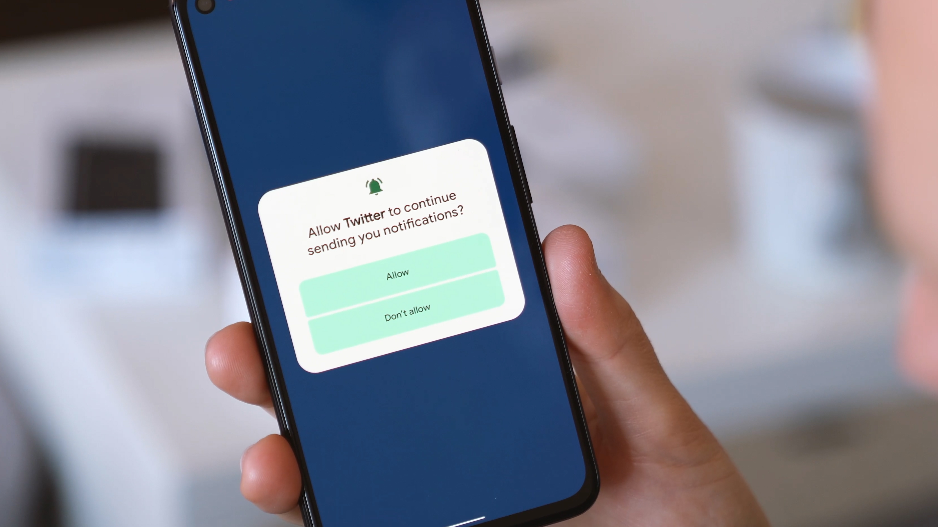
The biggest feature addition in the current Android 13 developer preview is the new permission around notifications. Currently in Android, apps don't need explicit permission to send you notifications. Any app can fire off notifications as much as it wants — although Android also makes it easier to silence alerts from noisy apps. After updating to Android 13, existing apps will trigger a prompt to ask you if you want to receive notifications, and new apps will do the same when you use them for the first time.
There are plenty of apps — even relatively reputable ones — that play it fast and loose with notifications. And while Android's notification channels feature has long allowed users to filter out the alerts that they don't want to see, an explicit permission to send notifications is a welcome improvement — a great way to avoid increasingly noisy apps delivering notification nags for non-essential things. Now Notifications require the user to explicitly opt in, just like any other potentially bothersome feature.
Using Android 13 with the new notification permission has also let me go through a sort of mini-audit of apps that are allowed to send notifications. While I'm fine with notifications from most social apps — at least I can have them arrive quietly if I don't want to be bothered — other apps like games and streaming services are only ever going to clutter up my notification shade with stuff I don't want.
There's also a digital wellbeing angle here, of course, with the new permission pretty much guaranteed to reduce the number of distractions coming from your phone throughout the day.
Be an expert in 5 minutes
Get the latest news from Android Central, your trusted companion in the world of Android
Better multilingual support
There's also improved rendering for many languages using character sets besides the Latin alphabet. In Japanese, for instance, text will wrap between lines more naturally instead of by character. (There isn't really any English equivalent here, but the way things currently work is somewhat similar to having words split between lines.)
In other languages, such as Tamil and Burmese, where line height sometimes results in parts of characters being chopped off, Android 13 introduces improved line spacing so characters can appear correctly.
And in languages like Japanese and Chinese, where you type phonetically as opposed to inputting characters directly, Android 13 improves auto-completion while searching so you don't have to wait to commit characters. This new API doesn't appear to be used anywhere in any of the preloaded apps, but should be a big time-saver once it's rolled out.
If you only ever type in a language that uses a character set like the Latin alphabet, you'll have taken for granted the ability for apps to type as you enter characters in a search field. With this latest change, Android brings searching in these languages up to speed with the implementation for English and other European languages. (For an English analogy here, imagine if your in-app search only offered suggestions once you completed a word or sentence.)
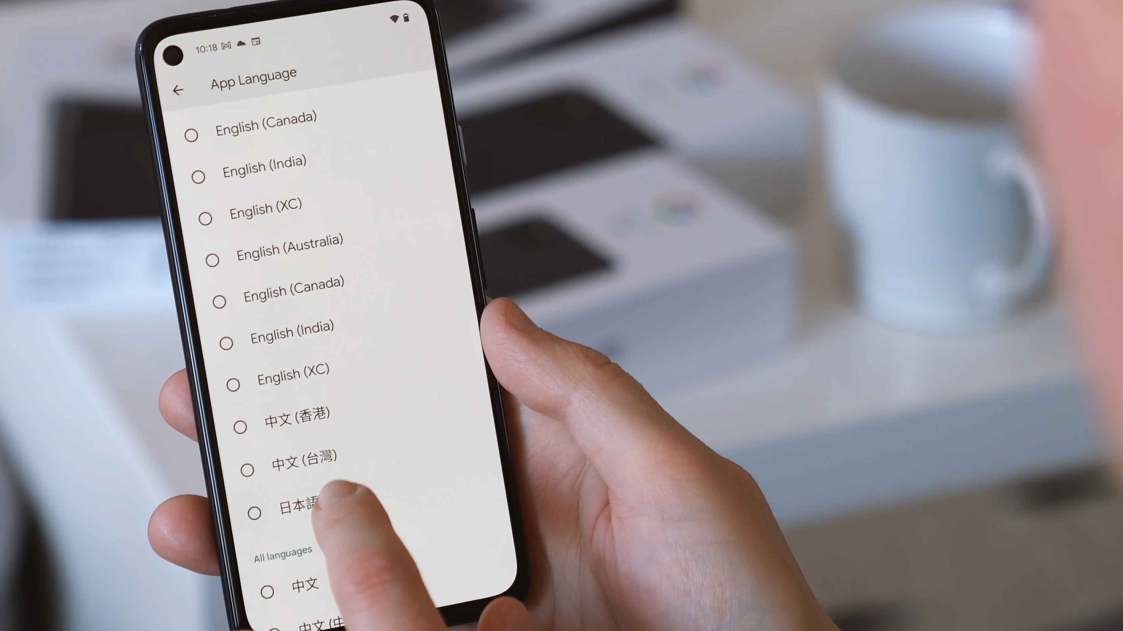
In a related change, the per-app language setting that was announced back with the first developer preview is now actually live, with apps letting you choose either one of your system languages or any from a very long list of supported languages. Not every app supports this feature — Twitter, notably, is locked to your system language — but a surprising number of popular apps will let you apply a specific language choice.
If you're bilingual and routinely juggle two or more languages, this could potentially be a major quality-of-life improvement. Even if you're a learner, switching one or more apps to your second language could help you improve your fluency.
Clearer audio, sharper emojis
Bluetooth LE Audio is also new in the latest Android 13 Preview. This is the latest wireless audio standard that, combined with the right headphones, can save power when you're listening to music, videos, podcasts or whatever else. Much in the same way that Bluetooth LE made wearable gadgets more battery-efficient, ushering in the era of smartwatches, LE Audio should do the same for audio playback.
Android Central senior editor Jerry Hildenbrand explains more in his write-up of Bluetooth LE.
"Bluetooth operates on two different radios. The Classic Bluetooth radio uses more power to do things like push higher bitrate streams and extend the range of connected devices while the Low-Energy radio has traditionally been used for slower connections in things like IoT devices. LE Audio aims to change some of that. Improvements have been made that will allow the Low-Energy radio to transmit better sounding audio at longer distances so the battery in your headphones and the battery in your phone will last longer.
The Bluetooth SIG claims that this will allow manufacturers to use Low-Energy for the same use cases that the current Bluetooth spec needs the Classic radio for and consumers will notice the benefit. It also says that this means brand new use cases for Bluetooth equipment can be created, so look out for some cool new ideas from companies that make speakers and headphones."
You'll probably need new headphones (and possibly a new phone) as well as the Android 13 update to take advantage of Bluetooth LE Audio. Regardless, support built into Android 13 is the beginning of better mobile audio for the entire ecosystem.
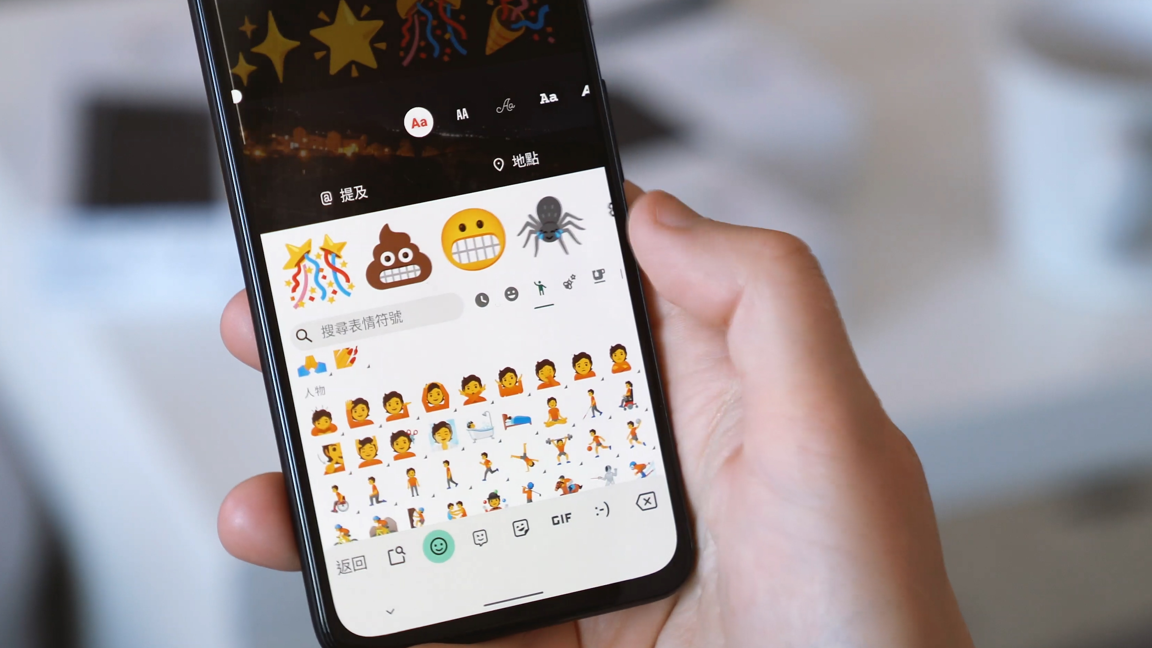
Another standard adopted by Android 13 is COLRv1, a standard for color vector fonts. What this means is that emoji should scale up to larger sizes more cleanly, without the blurring you get from taking a raster image and upsizing it. If you've ever created an Instagram story or TikTok video you'll know that most emoji right now exist as images with a fixed resolution — that's why they go blurry or pixelated once you scale them up to a larger size.
Emoji are a huge part of how we communicate and express ourselves on our phones, so better-looking emojis are definitely something we can get behind.
A plethora of smaller UI changes
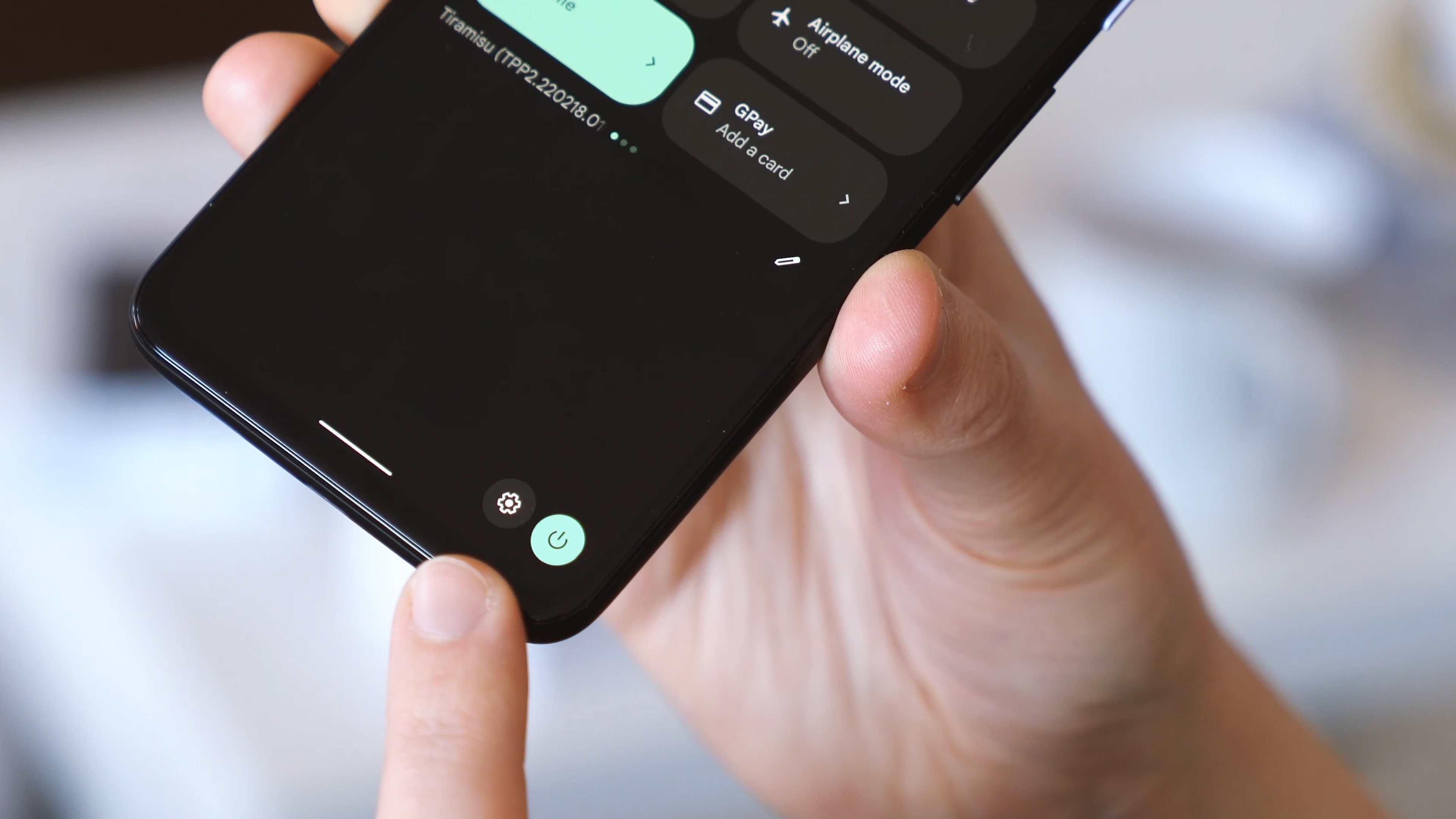
There are a bunch of smaller changes to the Pixel UI in this build. The most obvious is the new media card design, which is larger and uses album art as a backdrop. Google has messed with the way this particular slice of UI works quite a lot over the past few Android versions, and Android manufacturers have had their own take on media cards as well. But in vanilla Android 13 Google has landed on something that looks pretty good, combining the Material You aesthetic with a decent level of functionality, while giving prominence to the visual representation of whatever you're listening to.
There's also a new way to jump into messaging apps from a notification in Android 13 — simply long-press on an alert and drag it onto the top or bottom section of the screen. This feature isn't fully fleshed out just yet, and in my experience would just load the messaging app full-screen, even after selecting a split-screen view. But this could be another convenient way to respond to messages without interrupting what you're doing in the background.
And there's another minor change that's sure to mess with years of muscle memory for longtime Android users — the Settings and power buttons have moved to the lower portion of the notification shade, perhaps to distinguish them more from the rest of the quick settings area.
And interestingly, Android 13 on big screens has grown an app drawer button — which resurrects a bit of vintage Android iconography we haven't seen for quite some time, while also being a natural addition to the new tablet UI from Android 12L.
As with anything in developer preview, all this stuff could change between now and the eventual stable version of Android 13. The final release is still likely around five months out, and that's a long time in software development.
The current build will be the final Android 13 developer preview — the next build in April should kick off the Android 13 Beta Program ahead of the Google I/O conference in May. As Google approaches the home stretch of development, I/O is where we'd expect to hear more about any remaining major features that have yet to be revealed.

Alex was with Android Central for over a decade, producing written and video content for the site, and served as global Executive Editor from 2016 to 2022.
