Pebble Steel first look: Our favorite smartwatch, sophisticated

Metal, leather and tweaked hardware add a bit of class (and $100) to the Pebble smartwatch
Put the Pebble smartwatch next to any of its major competitors from the past year, and this much is clear: Metal trumps plastic when it comes to sophistication. We've known it. Pebble's known it.

And now it's doing something about it.
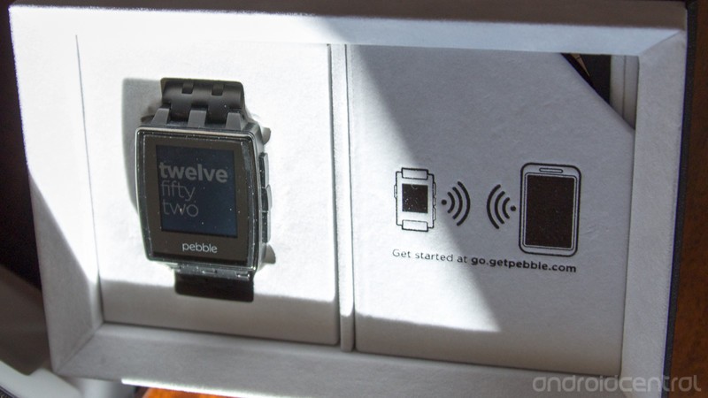
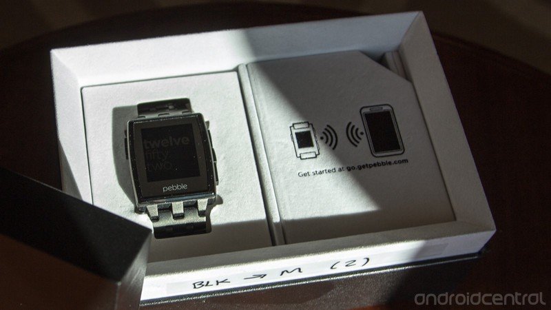
Pebble today is unveiling Pebble Steel — a classed-up metal version of its previously plastic and rubber watch. It's available today for preorder from getpebble.com, ships starting Jan. 28 in mid February, and costs $249 — a $100 premium over the (now) basic Pebble.
Last month, we spent a day at the Pebble offices in California, getting to know the smartwatch, as well as the folks who make it. Today, we bring you our first look at Pebble Steel.
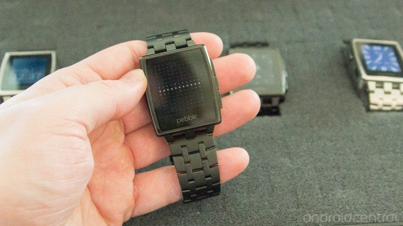
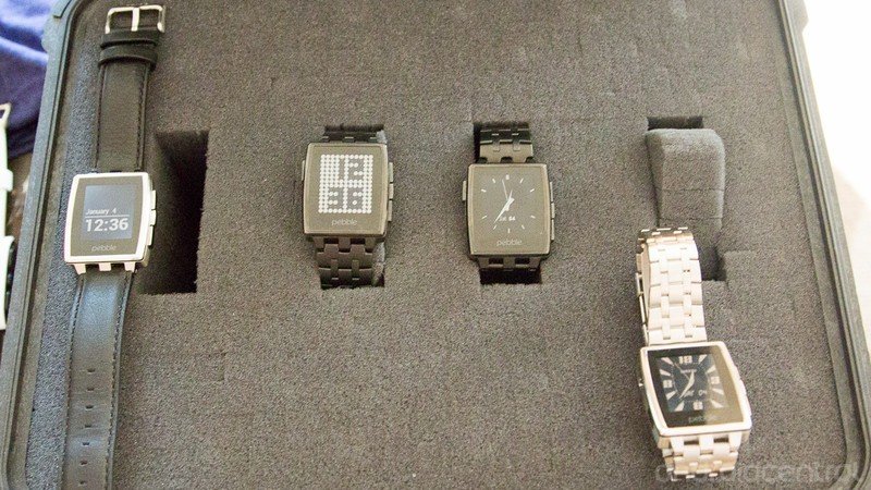
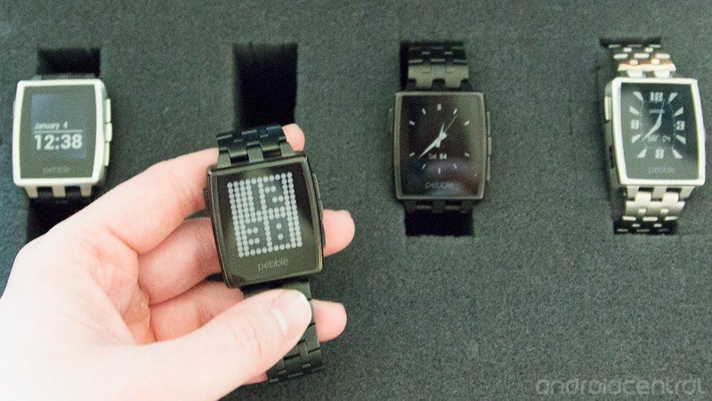
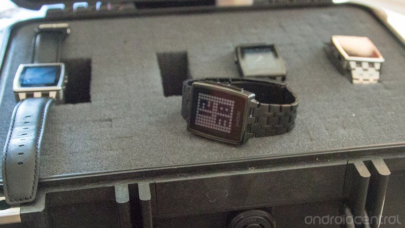
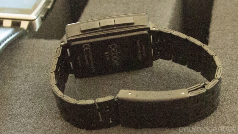
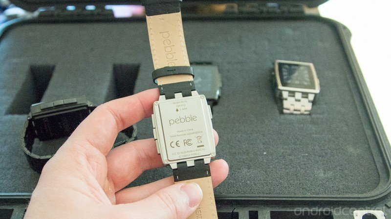
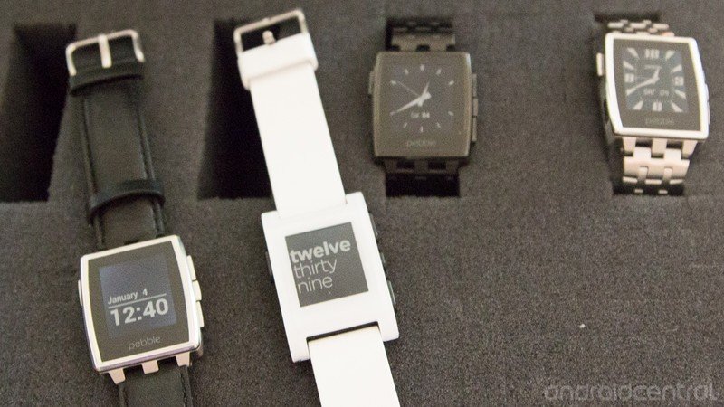
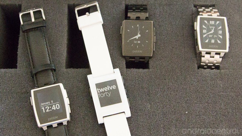
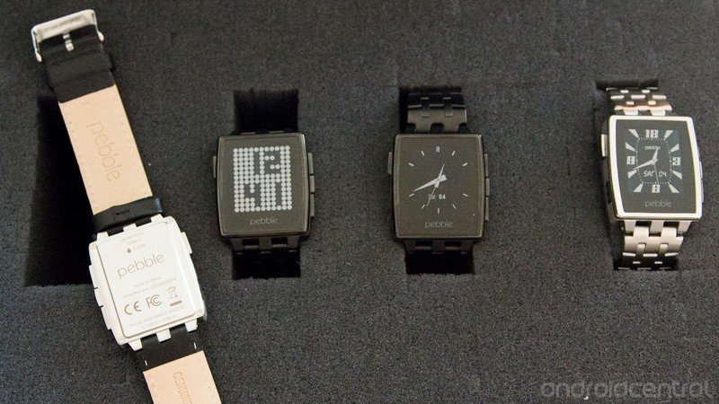
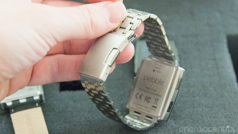
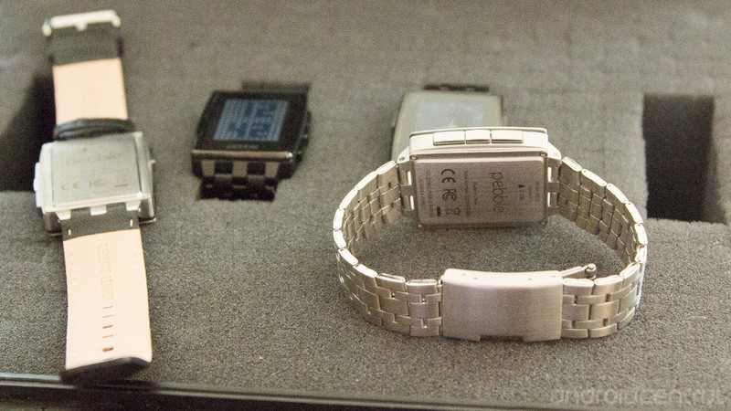
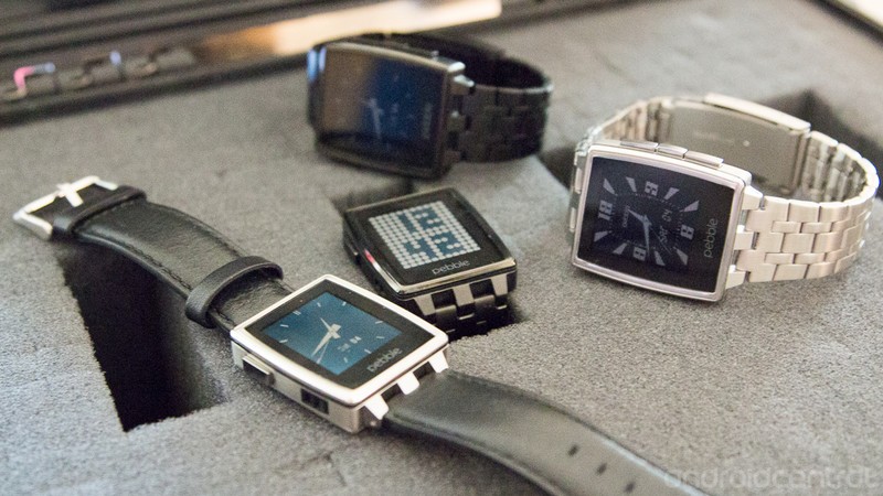
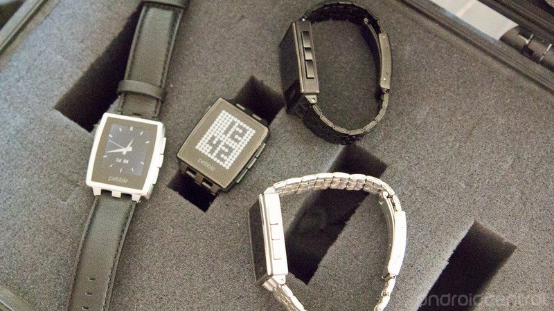
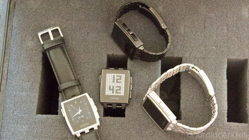
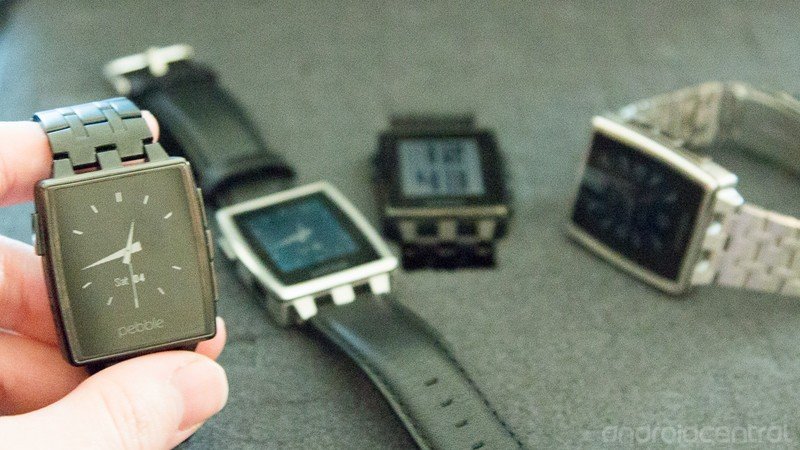
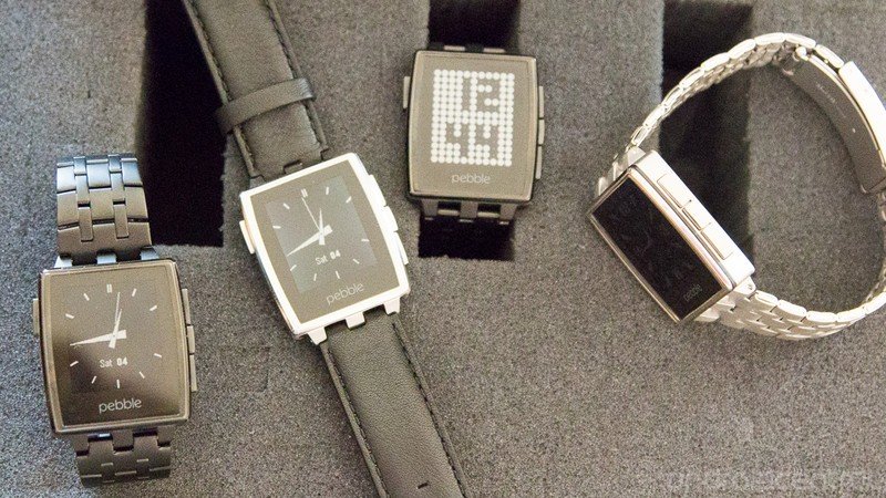
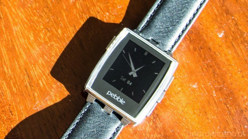
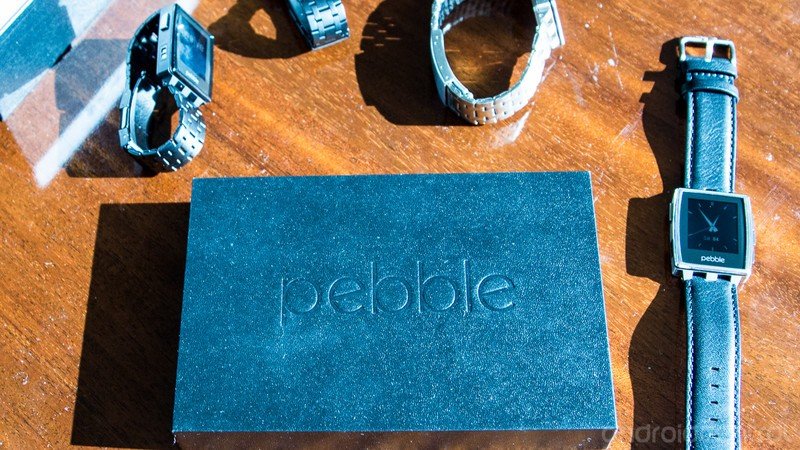
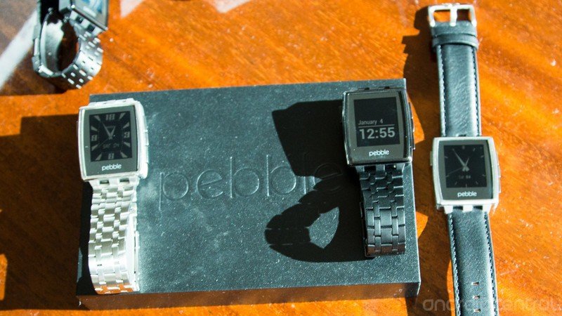
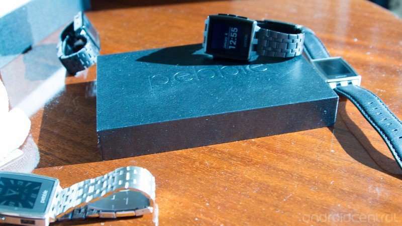
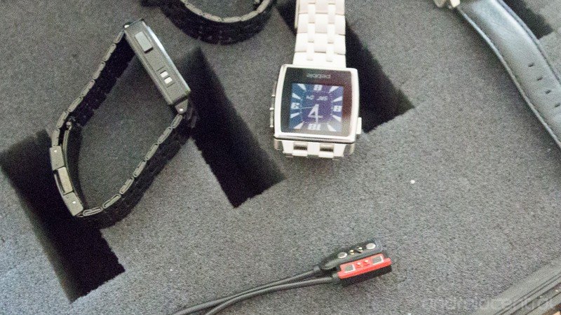
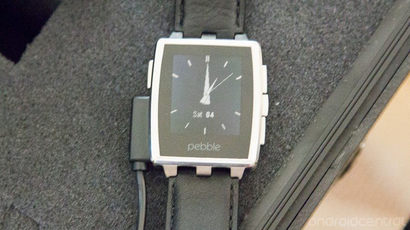
As the name implies, Pebble Steel is made of, well, steel. Gone is the plastic of the earlier iteration. And, in fact, we've got two designs to choose from — traditional stainless, or a matte black, the latter with a PVD semi-gloss finish. Both colors come with matching metal bands as well as a leather strap. (We recently showed you how easy it is to change a Pebble strap; here's your chance to put that to use.)

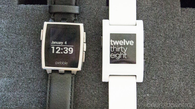
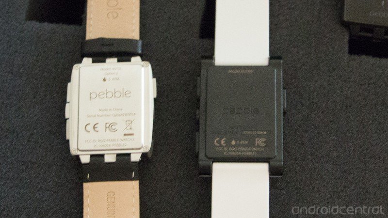
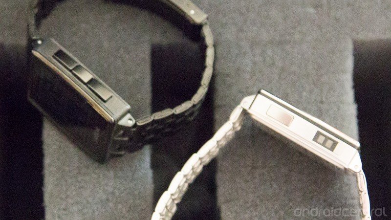
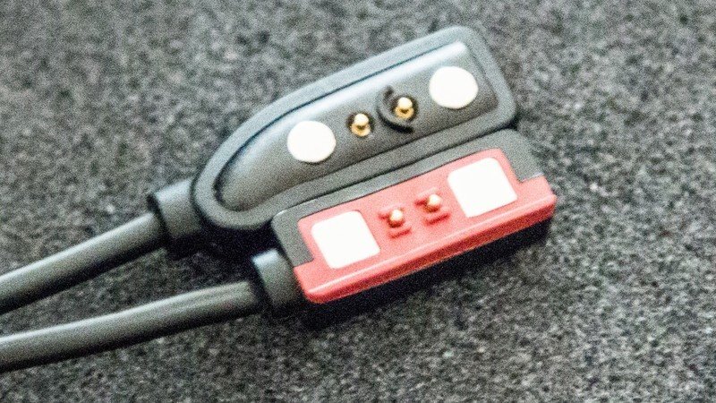
You'll note that the watch itself has gotten a bit of a redesign, too. While many of the past months have been dedicated to getting the existing Pebble into customers' hands, the industrial design team went back to work on Pebble Steel. The face has become a little more angular (still covered in Gorilla Glass, though), and the bezel made smaller. The three side buttons have found a tighter design and are now spaced more closely together. The charging connector has been redesigned. (The new one is color coded, so you can keep them straight if you have both versions.) And, yes, Pebble's eponymous logo is now front and center.


All in all, it's safe to say we're now looking at a more mature, sophisticated Pebble. And that was the point, Pebble execs told us here in Los Vegas. Some customers had said there were times they weren't wearing their Pebble because it was just too casual — especially if in brighter colors. So the idea wasn't so much to redesign Pebble, but to class it up a bit. And, more important, they still wanted it to be a Pebble. Maintaining consistency in the experience was paramount. Developers have taken to the SDK, so fragmentation could not happen.
Be an expert in 5 minutes
Get the latest news from Android Central, your trusted companion in the world of Android
This is still a Pebble. Same monochrome, e-paper display. But it's more grown-up Pebble. Newer apps. A classier look. And a more grown-up price to go with it, for sure, but still below that of the more major manufacturers. We'll have more on this new guy later in the month.
For more, swing by our pals at Smartwatch Fans.
