Pantech Discover review
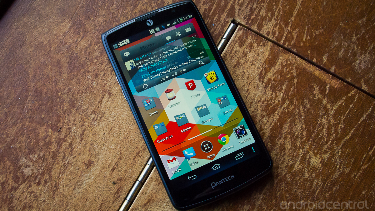
Pantech, much like other smartphone manufacturers, is trying to make the tricky transition from carrier-branded spec devices to its own flagships. But making a name for yourself when few know your brand -- or worse, know it only alongside low-end phones -- is a tough proposition. Pantech is hoping to step up its game for the start of 2013 with this device, the mid-range Discover on AT&T, currently available for $50 on contract.
Cheap on-contract phones in the U.S. have always been in an awkward position. Their only chance at being purchased is one of confusion, to be honest. When comparing to higher end devices that are also on contract, the difference in up-front pricing is miniscule compared to the cost of service for the 2-year contract period. Saving $50 or $100 over the life of a $2,500 contract is nothing, yet eager-to-buy and less-informed consumers make the choice every day. This being said, does the Pantech Discover have what it takes to make you choose it when there are formidable competitors at about the same price? Read on and find out.
Pros
- The Discover has better build quality and performance than you'd expect from this manufacturer and price point. On-screen buttons, large battery and solid feel in the hand all help the experience with the device.
Cons
- While the screen is high resolution, color reproduction is subpar at best, which is sad for an LCD display. The viewing angles are absolutely atrocious, which seriously hurts daily usability. The software targets a certain user in this price-point, but will feel old and wastefully tacked-on to any Android pros.
The Bottom Line
It's hard to recommend the Pantech Discover to any particular user given the tiny cost difference in having a vastly superior device. There are a few users that the design and niche features will appeal to, but for the wide masses (and readers of this site) I just can't recommend it. The HTC One X, One VX and LG Optimus G can all be had for about the same price and offer better screens, software and overall value.
| HardwareSoftwareCamerasBottom line | Pantech Discover ForumsPantech Discover unveiled at CES 2013 |
Pantech Discover hardware
The Pantech Discover actually offers much higher specs than you may have expected based on its pricing and manufacturer. Out front you're looking at a 4.8-inch TFT LCD display at 720x1280 resolution, with on-screen buttons taking up just a small portion of that. There's a 12.6MP camera around back, 2MP in the front, with the former supporting 1080P video recording.
Get the top Black Friday deals right in your inbox: Sign up now!
Receive the hottest deals and product recommendations alongside the biggest tech news from the Android Central team straight to your inbox!
Under the hood we're looking at a 1.5GHz dual-core Snapdragon S4 processor -- the MSM 8960 model -- which is the same found in U.S. variants of the Galaxy SIII (S3,) Motorola RAZR HD and HTC Evo 4G LTE. It has 1GB of RAM and 16GB of internal storage, which is expandable by Micro SDcard. That SDcard is found next to the Micro SIM slot underneath the removable battery cover, which houses the also-removable 2100mAh battery.
Build Quality
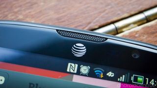
The overall build quality of the Discover will also catch you off guard, with a nicer finish and feel than you'd expect. The 4.8-inch display is set in a black border, with small bezels. They seem particularly small on the device, especially on the top and bottom, which makes it much easier to hold than other devices of the same screen size. There's a black speaker grille set into the glass at the top of the device, with an AT&T silkscreen logo under it. The bottom bezel holds just a Pantech logo, as the navigation buttons are of the on-screen variety, and the pinhole microphone that rests just under the edge of the screen glass.
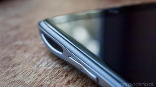
Speaking of the glass, Pantech certainly has learned a thing or two about industrial design here. Reminiscent of the way HTC molded the screen glass on the One X and One S, the Discover has extremely smooth and pleasantly rounded glass on the perimeter of the screen. The glass doesn't extend all the way to the very edges of the device, but rather rounds off so smoothly onto the adjacent plastic that you can't notice a gap without pressing your fingernail down onto it. It makes the abrupt hard plastic edges on some other devices (cough Galaxy Nexus cough) seem primitive by comparison. As I noted, Pantech certainly isn't the first to make use of this design but still deserves commendation for implementing it here so perfectly.
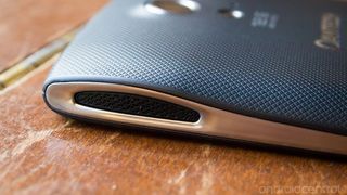
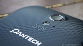
On the back, the phone is primarily wrapped in a textured plastic with an interesting color -- I wouldn't call it black, but more like graphite or gray, with possibly a slight blue tint to it. The back is curved at the top -- housing the 12.6MP camera -- and bottom, as well as rounded on the sides. This leaves a nice concave portion of the back perfectly fitting your hand. There's a continuous smooth silver piece of plastic that runs the length of both sides and the bottom of the device, which reminds me of stainless steel more than plastic and isn't cheap feeling at all. If you look at the side profile of the Discover, you'll see wide openings at the top corresponding with the camera hump, each holding a black speaker grille. Those grilles house dual stereo speakers, which are quite amazingly loud for a phone.
The top of the phone houses a 3.5mm headphone jack and the power button, both made of the same type and color plastic on the sides. I'm not usually a fan of top-mounted power buttons, but this one's quite large and the aforementioned small top and bottom bezels actually make the power button reachable without much hand contortion. The right side of the device is bare, and the left holds a volume rocker near the speaker that's easy to find and press without looking.
Under the back cover of the device, you'll find a removable 2100mAh battery -- which many people like -- and slots for the Micro SDcard and Micro SIM card. There are slots at both the top and bottom to pry the cover off, but the top one doesn't seem to be as easy as the bottom to use. The way the door latches makes it seem like the top one shouldn't be used at all, so I'm not sure why it's there. The back cover is pretty thin and flexible, but it's not noticeable when it's snapped onto the phone. There's still noticeable gaps around the edges where it attaches, which is the downside of a removable cover.
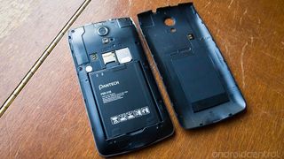
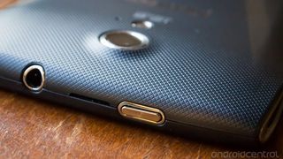
Click on images to view larger versions
The hardware is certainly nice, but that's not to say that the design is particularly appealing. I realize design aesthetics are subjective, but this just isn't a very good looking phone... and there's no nice way to put this -- the Discover still looks like a Pantech phone. That's sad because people choose from the start to pick up a phone based on it's looks, and may never even give this a glance to find out how nice it feels in the hand. I understand that there's often a tradeoff between striking design and ergonomics, but this is more than just a compromised design.
That being said, if you're not put off by the design, you're definitely in for a treat as far as hardware and build quality goes here. The raw hardware quality beats your average mid-range phone, and even blows the Galaxy S3 out of the water -- something Pantech should be proud of. You're getting a good bang for your buck with the Discover, and even if it won't be a big seller it gives me a good feeling about what we may see from Pantech in the future.
Display
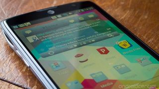
No, that's not bad white balance or focus in the picture above (as you can see by the edges of the device,) the viewing angles are just that bad on the Discover's display. I'm usually quick to qualify any talk about viewing angles with something about how "you'll never use a phone at that angle," but the Discover's display distorts so quickly it's almost unusable.
When viewing the display straight-on, it's actually quite decent, and at 306 PPI (pixels per inch) it's high enough resolution that you can't pick out individual pixels. Being a TFT LCD, the display has generally good color reproduction, but still feels a bit washed out when sitting next to other LCD-toting devices, and miles away from the likes of the SLCD2 and 3 displays offered by HTC. There's no real noticeable gap between the display and glass, although I wouldn't go so far as to say it's "gapless."
This just isn't what you'd expect from a modern 720P LCD display, especially in January 2013, and is the first indication on the Discover's hardware that you're dealing with a mid-range device.
Radios
Everything in the radio department of the Discover works as expected. You've got both HSPA+ (AT&T "4G") and LTE on board, as you would expect from any smartphone in the U.S. today. You've also got Wifi, GPS, Bluetooth, NFC and the usual set of sensors on-board. Radio performance is right on par with other AT&T devices, and everything worked just fine. Phone calls were clear as well, if you even care to make those still.
NFC works, but was a little spotty. Pantech (and/or AT&T) has surely messed with something on the software side, which means it doesn't always work as it should when interfacing with another NFC-enabled device running stock Android. The device wants to use proprietary "Smart Beam" software rather than regular protocols, which gives issues. The device won't interface for photo transfers with a Nexus 4, as the Nexus thinks the Discover is an NFC tag, and the Discover tries to set up a link that the Nexus can't handle. This is far from the ideal NFC experience. What good is it if you can't interface with any devices other than Pantech's own?
Battery life
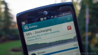
With its 2100mAh battery, the Discover performed what I would describe as "above average" as far as battery drain was concerned. We're always a little hesistant to go too in-depth with battery life comparisons here because everyone's setups and usage vary wildly, but my regular use left me pleasantly surprised with battery life.
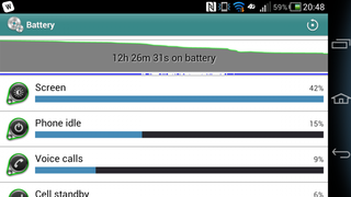
My regular usage, which is primarily on Wifi, consists of multiple email accounts and social network apps fully syncing with push notifications, a little casual gaming and somewhere between 1.5 and 3 hours of "screen on" time depending on the day. With heavy Wifi use the Discover's battery held up well. When stepping out of the house and onto mobile data, battery life notably -- although not drastically -- decreased, as is expected. The 2100mAh cell definitely held up to a full day of my use with power to spare, and I would guess the same will be true for most users.
Pantech Discover software
I noted earlier that the Discover's screen would be the first indication of the phone's mid-range status. If you (somehow) didn't happen to notice the display, the software would firmly plant the target audience of this device into your mind. Pantech started with a solid base -- Android 4.0.4 -- and just ran with it from there, changing basically everything about the software experience. You've got a custom lockscreen, launcher, settings menu, status bar, icons -- pretty much everything.
I struggled with how I would characterize the software on this device, as I can tell that I'm far from the target audience that this was made for. That being said, I really can't see the software being a preferable experience for many demographics -- and I can see it being vastly detrimental to the user experience for every demographic -- when compared to the stock offerings of Android (even Ice Cream Sandwich.)
Launcher and interface
There are few parts of this system that Pantech haven't changed notably. The launcher and overall interface of the Discover have a vast set of changes that are for the most part usable, but dramatically uglier than their stock Android counterparts. From icons and coloring down to the on-screen buttons, everything has been changed to follow more of a "cartoonish" style, which to an advanced user will seem patronizing and to a novice user will seem cheap. Luckily you can get rid of some stock "flare" by switching to a new launcher, but you'll still be stuck with Pantech's styling in buttons, settings and status bar. You can also turn off its custom lockscreen -- and go back to stock Android 4.0's -- in the settings.
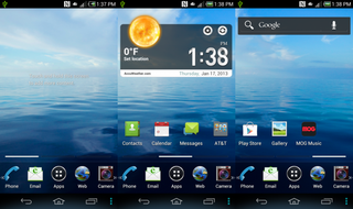
I honestly wouldn't mind many of the additions that Pantech has made from a functionality standpoint if they were implemented in a better design. Most of the additions, like notification toggles and settings tweaks, are very useful but they still don't outweigh the bad design of the software.
A main selling point of the Discover is the choice of putting the phone into an "Easy Experience" that locks it down tight to the phone's core functions for a novice user. When you're in Easy Experience mode, you're basically locked into a new launcher and settings menu that has minimal options and features. The single homescreen and limited settings keep users from getting themselves into trouble, while still allowing access to normal phone features. This may be appealing to the first-time smartphone buyer or someone handing their device to a family member, but other than that I don't see it being super useful. One head-scratcher that I ran into when browsing the Easy Experience is the inclusion of an "Advanced Settings" item in the Settings that takes you directly into the Developer Options menu. I don't see why this would ever need to be accessed by a novice user, and it shouldn't be this easy to stumble upon.
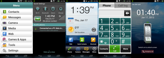
The Pantech Easy Experience launcher, settings and lockscreen
Bundled apps
AT&T and Pantech have gone to town on the Discover, loading it up with dozens of pre-loaded (and generally useless) apps that can neither be uninstalled nor disabled. I went through attempting to disable and uninstall apps that I didn't want, and found only 4 that could be disabled. By my rough count there are 28 Pantech or AT&T apps pre-installed on the device.
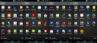
That third party launcher you installed to hide the stock offering will come in handy here to hide all of these apps from view in the app drawer.
Performance and usability
Even with the heavy changes to the firmware, the Discover still runs as smoothly as you'd hope with the level of processing power inside it. In my time with the device, there were no noticeable hiccups inside of or transitioning between apps, even intensive ones like 3D games. Navigating through the homescreens and settings is smooth, which is good to see. Design aside, Pantech has done a good job with keeping the software smooth here.
Pantech Discover cameras
Pictures
The Discover has a 12.6 megapixel camera with LED flash on the back, which sounds impressive on paper but doesn't end up offering pictures that are any better than your usual mid-range 8MP shooter. In good light the camera performs quite well, with clear shots and accurate colors, but doesn't always impress -- some photos still come out a touch grainy or overexposed if you're not aware of your settings. It does just moderately well in low-light, but most phones do poorly in dark situations so I can give it a pass there. The HDR mode just seems to blow out colors rather than enhance them, and most shots come out better in "normal" mode.




Click on images to view larger versions
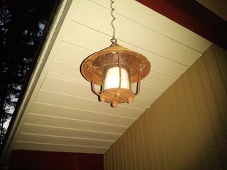

Two low-light pictures, the first with the flash turned on
The camera UI is actually really nice, with a lot of settings to choose from. There's a quick toggle to choose between "normal" and "HDR" modes, and all of the other settings hide behind a slide-out panel. Inside that panel, you get a whole host of settings from exposure and flash to different pictures modes and effects. You can take any setting in the menu and drag it out to the main screen and it'll turn into a quick toggle on the left side of the UI. You can have up to five, and it's very useful because there are certain settings you'll always keep coming back to.
Video
The Discover records 1080p video at 30 frames per second, although like most devices the default setting is 720p, likely for file size concerns. The video seems to look good, and suffers during quick motion the same as every other phone. When standing still, video improves dramatically. The microphone picks up pretty high quality audio when recording, which is a plus.
Front camera
The front-facing camera is a 2MP sensor and works just fine. Use it for a mirror, use it for video calls, don't use it for stills.
The bottom line
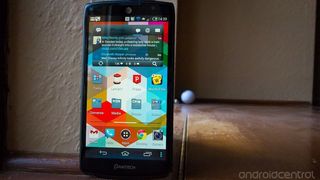
I got all the way through this review and I'm still a bit confused as to whom the Pantech Discover is actually the best choice for. While the hardware, build quality and specs are all notably nicer than the price point, there are glaring issues with the screen and software that make it hard to recommend. Even if the Discover toned back the software bloat and improved the display viewing angles, it would be hard to recommend it over other devices that are either the same price or $50 more (on-contract) that offer a substantially better experience. There are just unarguably better deals to be hand when walking into an AT&T store today.
Pantech has seriously improved many aspects of this device compared to previous models, and made many good choices, but it just falls short in enough areas that the complete package is less than compelling. The one thing Pantech has accomplished with the Discover, if it's any consolation, is making me hopeful for the quality of its future devices.


Andrew was an Executive Editor, U.S. at Android Central between 2012 and 2020.