Pantech Crossover review
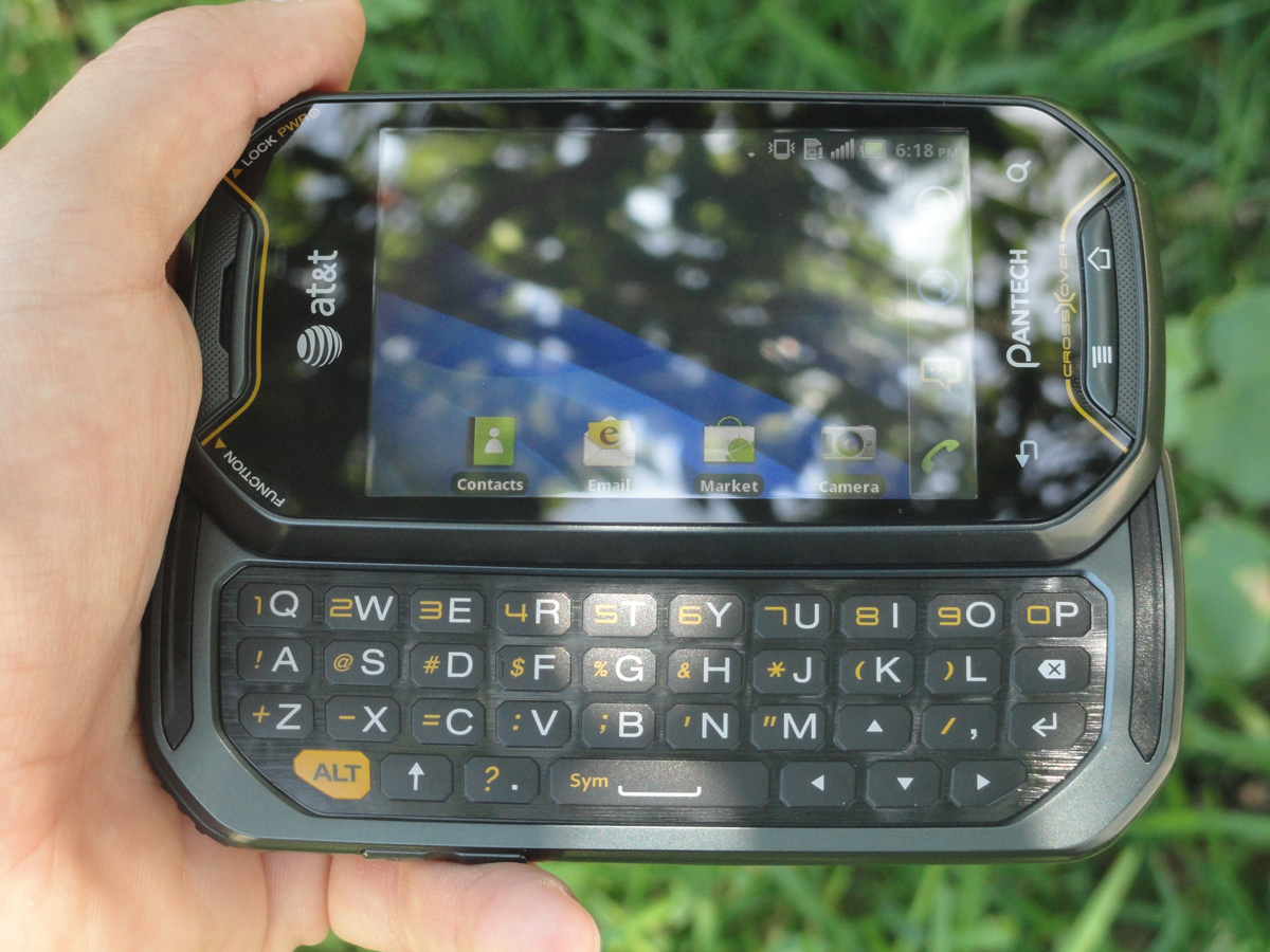
The Pantech Crossover is one of those phones that's hard to place. It's a bit smaller than most of it's smartphone brethren, isn't packing the latest components, plus it's got a retro-funky design. It's a bit of an anomaly in the sea of high-end phones surrounding it, but at the very least, it's a breath of fresh air.
But what does that mean for those on AT&T? Is this keyboard-packing slider worth investing in? For those with furious fingers, is this seemingly rugged, message-focused phone the one for you?
Those are all questions I aim to tackle, so take a deep breath, join me after the break, and let's find out.
Initial hands-on
The hardware
The Pantech Crossover is, in a word, unique. Angled corners, a textured battery cover, and capacitive and physical buttons for navigation. Pantech took a chance with their design, and while it's not bad, you definitely won't be getting it confused with anything else out there.
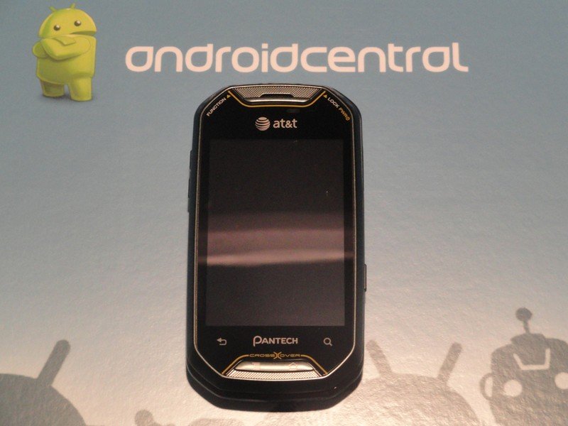
The Pantech Crossover comes equipped with a 3.1-inch display, more reminiscent of the G1 or the HTC Hero than the bigger, badder phones (like the Motorola Atrix) it's being released alongside. The resolution isn't anything to phone home about, either, as you're getting a usable (but not giant) 320 x 480 to work with.
The display, despite being small, is still fairly good. It's not up in the echelon of Super AMOLED or anything like that, but if you're not actively comparing it to the higher quality displays, you'll be just fine. The blacks aren't very deep, looking more like a dark grey, but again, there's enough contrast to get the job done. Viewing angles are a bit more limited than they are on some higher end handsets, but unless you feel the need to text, Tweet, send emails, and surf the web with your phone at an unnatural and awkward angle from you body, you'll be able to see everything just fine.
Screen brightness is a bit of an issue. I'm not sure whose idea it was to leave the maximum screen brightness so dim, but that's the way it goes. For my personal use, I kept automatic brightness turned off and had the brightness slider at maximum, but even then, it left something to be desired. The screen is also highly reflective, so don't expect lots of usability in the sunlight. If the sun is bright and high in the sky your two options are either to seek shade or just leave your phone in your pocket. On the plus side, the screen is small enough to easily and effectively shade it with one of your hands, leaving the other one free to type on the virtual keyboard, but that's an acrobatic act the user shouldn't really have to employ just to use their phone.
Be an expert in 5 minutes
Get the latest news from Android Central, your trusted companion in the world of Android
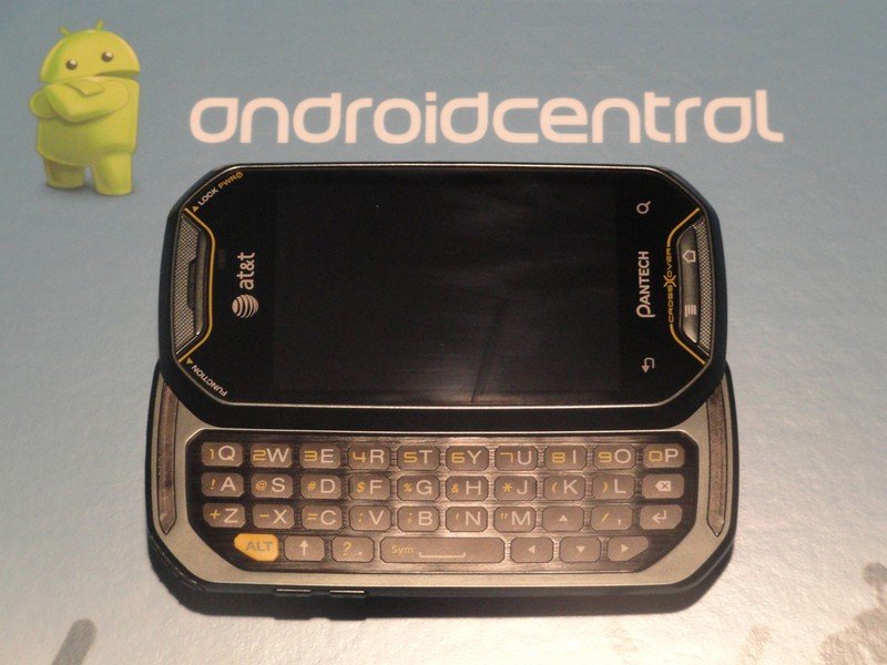
Unlike many other Androids out there today, the Pantech Crossover comes with a slide-out keyboard. While this is usually a much sought-after feature, the keyboard on the Pantech Crossover doesn't really hit the sweet spot for me. The buttons are really flat, almost too much so. The lack of a dedicate number row also kind of sours the experience, as typing even "1" feels unnatural and awkward. I understand the phone isn't very large and a fifth row isn't easily added, but it would have definitely improved the experience. The button response is good, and if this is your only phone, I'm sure you'll get used to it, but otherwise, I'd stick with a virtual keyboard.
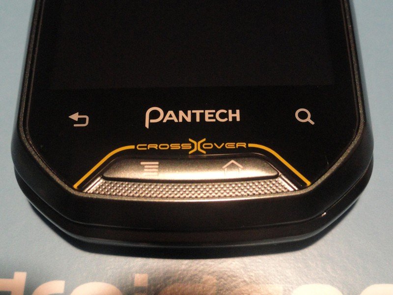
Pantech really went out on a limb to be memorable, and it shows not only in the overall design, but also in the two hardware buttons mixed with two capacitive buttons. The capacitive buttons work really well. They're just as responsive as those on my EVO, and you've got a decently sized radius to press and still get a response. The physical buttons have a good clicking feel to them and feel rather sturdy. I would have appreciated a slightly lower action, but you don't have to press obscenely hard to have them work. It just seems if they'd had a lower action, the overall response and feel of the buttons would be more similar across the board, instead of effortless on the capacitive to less effortless on the physical buttons.
The earpiece is small but still of pretty high quality when taking voice calls. Located just due southeast of the earpiece is a light sensor, but unfortunately, a front-facing camera wasn't invited to the party. If you're not going to be video chatting on Google Talk , it's no loss (oh wait, this thing's on Android 2.2), but for those who love to take self-portraits and put them up on MySpace Facebook, this isn't going to be the phone for you.
Dimension-wise, the Crossover isn't too thick, but it's not the thinnest phone with a slide-out keyboard, either. It weighs in at a moderate 5.15 ounces and measures 4.45 x 2.28 x 0.56 inches. She isn't no fat bottom girl, but she's not the skinniest girl at the club, either. In hand, the phone feels like a solid little brick. It's not necessarily dense, but you can tell this phone was designed with sturdiness in mind. Not being as big as the other phones on the market, it sits well in a hand, pocket, or purse (I assume), but being so accustomed to the average of a 4" screen dictating the rest of the phone's size, the Crossover can come off as a bit small. If you're looking for easy portability, I guess this is the way to go.
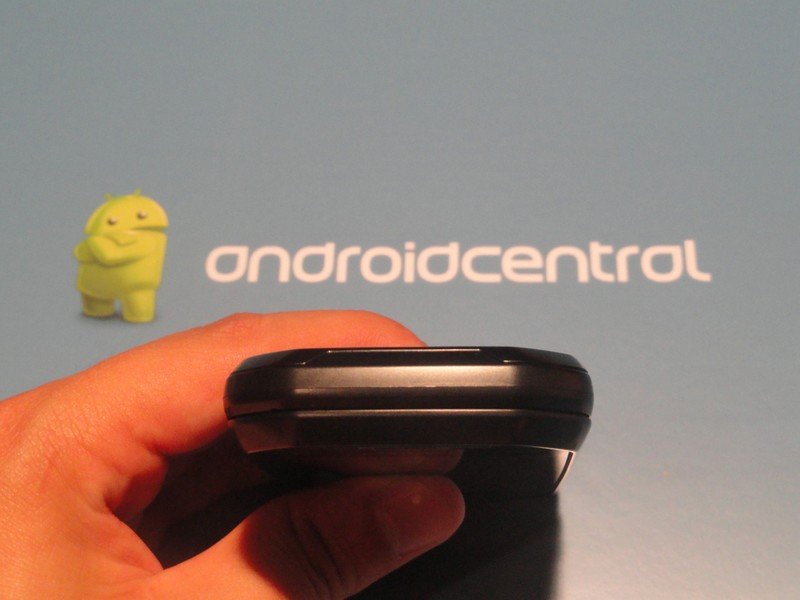
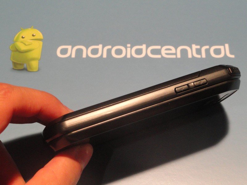
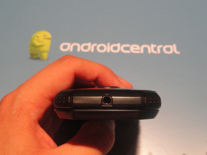
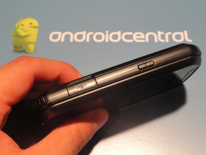
The bottom bezel is mysteriously clean, while the left bezel holds the volume rocker exclusively. The top bezel has the 3.5mm headphone jack, and on it's rounded/angled corners are the Function button and Power button, respectively. The right bezel has the microUSB port and a dedicated camera button, which is always welcome on any device.

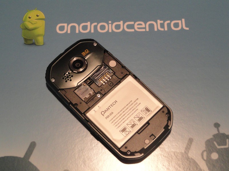
Pull a 180 on the Crossover and you're greeted with a lonely 3MP shooter, sans flash. His only buddy on the backside is the speaker, and it is easily the softest speaker on a smartphone I've ever heard. Audio is definitely more treble-heavy, but that's if you can even hear what's being played. You're definitely going to want to park this close by if your phone doubles as an alarm, but for an occasional impromptu jam session while you're without headphones, that speaker is going to have to be next to your ear.
The battery cover is pretty cool, actually. It's got a nice cross-pattern going on, which gives it a strong grippiness in your hands as well as no issues popping the cover off. Since it's not reflective plastic, there's no fingerprints to worry about. Simple, yet effective.
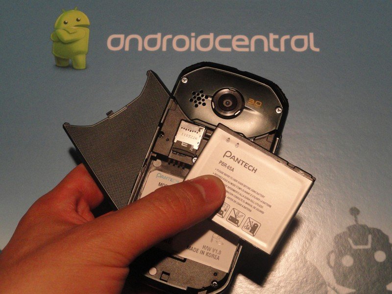
Slide off the easily removable battery cover and you've got a whopping 1500mAh Li-on battery, microSD slot (supports up to 32GB), and SIM card slot. The Crossover only has 512MB internal storage, but comes with a 2GB microSD, so if you plan on storing any amount of music, you'll want to invest in a larger card.
What's under the hood
The Pantech Crossover is powered by a 600MHz processor and runs Android 2.2.1. I know, it's Froyo, but with that processor, Froyo might have been the right choice. On this phone, I care about performance, and if Froyo was the right choice for them, good call.
The rest of the rundown is as follows:
- 600MHz processor
- Android 2.2.1
- 512mb onboard memory
- 3.1" display at 320 x 480
- 3MP camera
- 1500 mAh battery
- 802.11 b/g/n, Bluetooth, GPS
- Accelerometer, light sensor, proximity sensor
- Tri-band UMTS 850/1900/2100 MHz
- Quad-Band GSM 850/900/1800/1900 MHz
The software

The Crossover comes with a skinned version of Froyo, which I'll now call Pantech UI. Pantech UI is actually one of the better things about the system, offering a little bit of visual flourish on an otherwise underspec'd, stock Froyo phone.
The Pantech UI permeates the experience of the phone, changing how menus look, removing checkboxes for green-filled circles, and otherwise creating this grey-orange-green color palette that fits in nicely with the identity the Crossover is carving out for itself.
The dock doesn't let you change the icons Pantech has forced in, which is annoying. Plus, you only get three shortcuts because the last icon is actually the app drawer. I'm not sure the reasoning behind this, but it's the way Pantech skinned their phone, so that's what you get.
Performance-wise, the skinning doesn't slow the phone down at all, and honestly, if you didn't know you were running a 600MHz processor, you probably wouldn't be able to pick a number close enough to the actual speed. It clips along nicely, maybe not as quickly as it's Snapdragon comrades, but as long as you've got a static background image, you won't really notice any lag. If you use a live wallpaper, your phone will be near unusable.
The camera
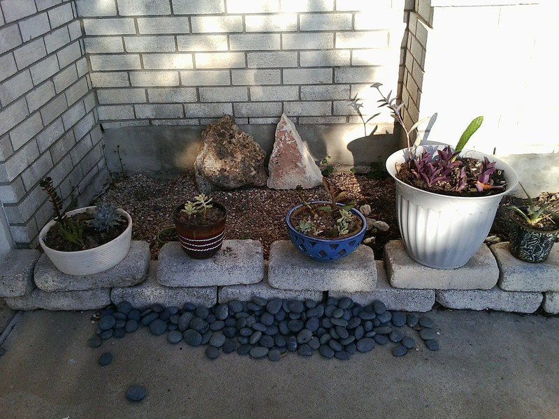
I'm not terribly big on describing the intricacies of the camera with words. I like to let the pictures speak for themselves, so I'll do that. I will say the camera doesn't do well in low light situations because it's missing an oh-so-necessary flash, but in the daytime, with full on sunlight, the pictures look pretty good.




The camcorder on the phone isn't nearly as strong as the pictures, and the quality difference is evident in this short video. The picture is grainy the whole time, the microphone is picking up all sorts of ambient sound and white noise, and the overall picture looks jittery and unsettled.
Battery life
As I predicted in my initial hands-on, a phone chirping along at 600MHz with a small display and a 1500 mAh battery was going to last a while, and my prediction was pretty true. I could easily go through a day without having to worry about finding a charger to plug the phone in (something I still do with my EVO), and this was under me trying to simulate normal use conditions as best I could.
Battery life on this phone is definitely one of the most solid aspects of the phone, so if that's enough to win you over, I'd get it.
The wrap-up
The Pantech Crossover is, without a doubt, one of the more unique Android phones on the market right now. That being said, unless you're absolutely dying for one of it's features (like the slide-out keyboard), I'd move along.
It's not that the Crossover is a bad phone, per se. It performs well and would probably be sufficient for a non-power user. It's just the idea that I feel like the Crossover is at it's end of life before it's ever really started.
Launching with the specs of not only yesteryear, but the inception of Android phones seems like a questionable decision. While I'm sure it helps keeps costs down, for just a small increase, you can net yourself a phone with less dated specs and not guarantee obsolescence within the first few months of owning your new device.
Overall, I think the Pantech Crossover is a nice device for the low-end market. However, I would not recommend it for anyone looking to lock themselves into a two-year contract. If, through some twist of fate, this phone ever becomes prepaid, that might be it's time to shine.

