Oppo R9s review: An important step forward

Without making much of a splash in the west, Oppo has found itself towards the top of the list of smartphone manufacturers. While the top two, Samsung and Apple, are still a ways out, Oppo is now a constant presence around the number four spot, and that's no small achievement.
Like many other phone makers from China, we've seen significant improvements from Oppo in several key areas with recent devices. The latest, the Oppo R9s, is now launching outside China for the first time and represents another step forward, albeit a subtle one.
| Category | spec |
|---|---|
| Operating System | Android 6.0 Marshmallow |
| Display | 5.5-inch AMOLED1920x1080 |
| Processor | Qualcomm Snapdragon 625 |
| RAM | 4GB |
| Storage | 64GB |
| Expandable | Yes |
| Rear Camera | 16MPf/1.7 |
| Front Camera | 16MPf/2.0 |
| Connectivity | 802.11ac Wi-Fi, Bluetooth 4.1, GPSMicro-USB |
| Audio | 3.5 mm headphone |
| Battery | 3010 mAhNon-removable |
| Charging | microUSBVOOC Flash Charge |
| Water resistance | No |
| Security | One-touch fingerprint sensor |


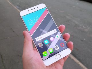
To look at from the front, the R9s looks just like the F1s and F1 Plus we've encountered most recently from Oppo. There is a design language and it has been stuck with throughout 2016. Be that a good thing or a bad thing depends on your outlook. It's not as if its an ugly phone though, that's for sure.
We've got the same metal back and sides we've seen before with the almost same home button on the front flanked by a pair of capacitive ones. I say almost because for the R9s, the home button isn't actually a button. It'll still take you to the home screen and it still houses the fingerprint scanner, but it's just a touch now rather than a press.

In fact, it's probably the best fingerprint scanner I've ever used on any phone on any platform.
Oppo has been putting excellent fingerprint scanners into its phones of late and the R9s is no exception. In fact, it's probably the best fingerprint scanner I've ever used on any phone on any platform. It is lightning fast and so far, extremely accurate. If it fails or you scan a wrong finger, you'll get a vibrate, but given there's no longer a button the R9s is a single-touch operation. And that means you've unlocked your phone before you can blink.
One other notable and pleasing feature on the outside is the antenna lines. Oppo has gone for an arrangement of three extremely thin lines over one much thicker one top and bottom and it makes a difference. The Rose Gold back of our unit isn't being interrupted by a nasty white line, instead gently touched by a series of fine ones that don't stand out nearly as much. I like it.
Otherwise it's business as usual. It's slim, it's light, it has a very nice looking 1080p 5.5-inch AMOLED display and it has a Micro-USB port on the bottom. Oppo hasn't yet gone to USB-C with its VOOC flash charging, and at the back end of 2016 it is mildly disappointing. There's also a headphone jack, because you have to remind people that these still exist, apparently.
Be an expert in 5 minutes
Get the latest news from Android Central, your trusted companion in the world of Android

The hardware isn't at all surprising, really. I've used most of Oppo's main phones for 2016 and every time the hardware has been on point. Sleek form, great build quality, attractive design. Job done.
Where Oppo generally disappoints is in the same place other Chinese companies do, and that's when you turn it on.
Oppo finally moves to Marshmallow as 2016 is about to leave us.
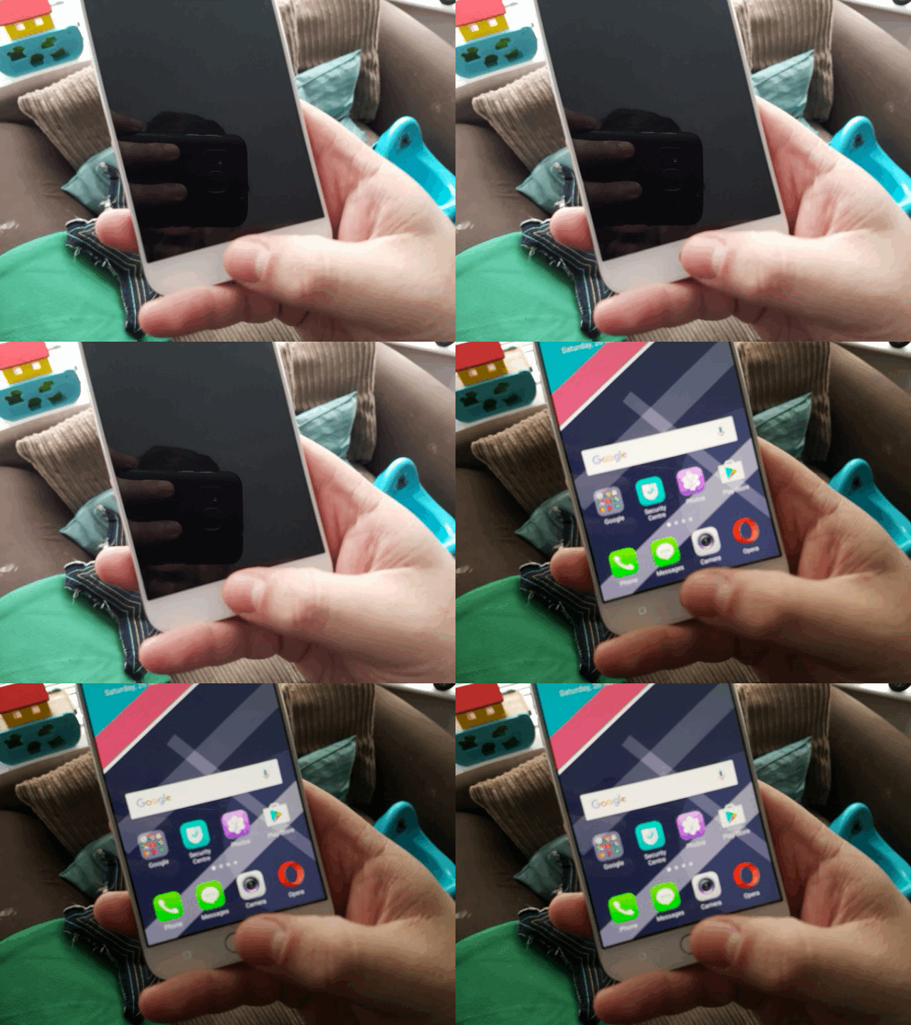
What you're greeted with is something that still looks more like iOS or Xiaomi's MIUI than regular Android. Color OS is Oppo's own custom build and it's still on version 3.0 for the R9s. While the appearance will split opinions, it does at least perform well and nothing appears broken. There is a comprehensive theme store to change up how it all looks if you don't like what you find, but there's going to be a lot of white and a lot of pastel colors wherever you go.
The biggest change here is that finally Oppo has moved on to Android 6.0 Marshmallow. This is going to be an area of concern probably more outside China than within, but it just can't keep taking a year to get on in this case even the previous version of Android. Expecting Nougat would have been a stretch, but at least Lollipop has finally been left in the dumpster.


The arrival of Marshmallow doesn't mean you can use Android Pay with it, though, in supported markets. Because there's no NFC. But at least you get all the other benefits associated with Marshmallow, so there's that.
Camera wise, Oppo continues to pursue the perfect selfie. On the back is a 16MP camera, the same resolution as the one on the front. The camera app associated with both is fairly simple and speedy to use. Both cameras focus and snap in a flash, and produce very nice pictures. The front camera isn't any better or worse than the F1 Plus or the F1s, but that's fine. It takes great selfies, if that's important to you.


I've only been using this phone for a few days now but I've been able to get a decent feel for battery life and so far it's pretty good. The Snapdragon 625 and 1080p display combination seems to assist fairly frugal drain in regular situations, but at least with the VOOC flash charging you know you'll be able to top up in a hurry.
What the R9s marks is another step towards Oppo making a truly great phone. It looks nice, it performs well, doesn't cost a heap and isn't as far behind on software as some of its predecessors. There are some mild annoyances, like no USB-C when the world is moving that way and no NFC for people in places that can use tap-to-pay, but on the whole it's a job well done.

Oppo gets it right where it'll matter for more of the average consumers. By stuffing in a pair of good cameras, 64GB of storage with a microSD slot as well and providing software that at least works smoothly and without too much in the way of hair-pulling moments.
As we reach the end of 2016, Oppo has delivered a phone that can compete with those around it. What we want to see in 2017 is another push forward without waiting until November to get there.