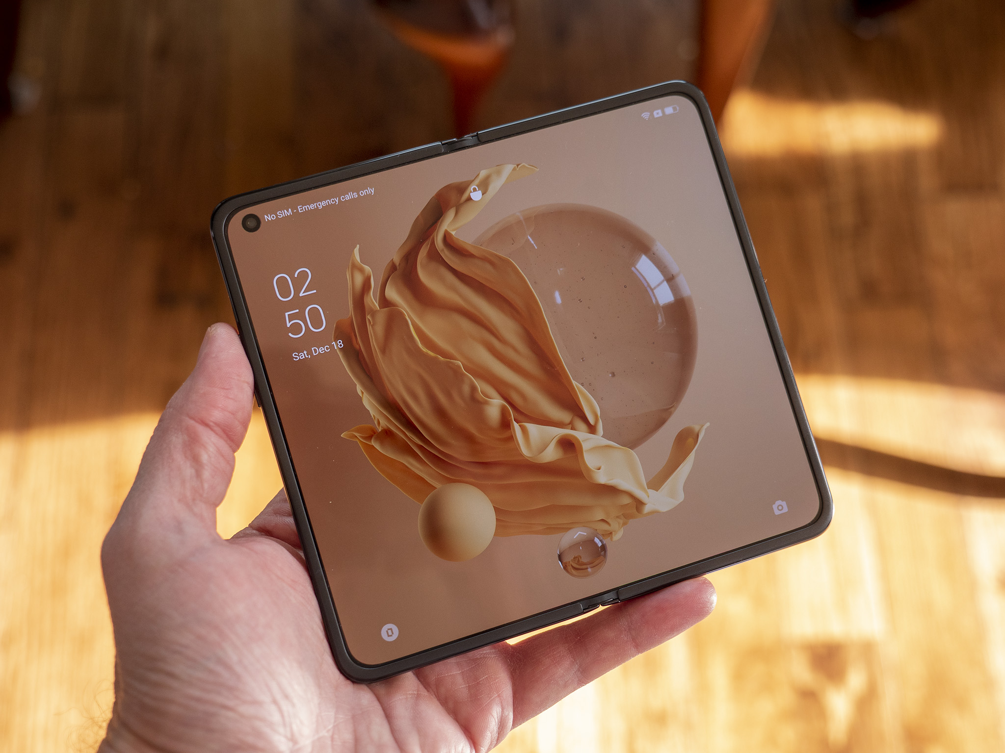
OPPO Find N hands on: The creaseless foldable phone
Updated on December 20 to include comments from OPPO about water and dust resistance.
It's only been a few days since OPPO announced the OPPO Find N, and I still can't believe it's already in my hands. As a Samsung Galaxy Z Fold 3 user, I was incredibly excited to see if OPPO's claims of a creaseless display were really true. After all, we're on the third generation of Samsung foldables now — all of which have creases on the inner display when unfolded — and many other foldable phones also suffer from this same cosmetic issue.
But, it turns out, OPPO figured out how to create a hinge that folds the display inward in a different way — that's in the shape of a waterdrop — and while the OPPO Find N does not carry an official water or dust resistance rating, OPPO tells us it has been tested to withstand sweat, moisture, and light drizzles without issue. It's a similar design to Motorola's hinge on the Moto RAZR 5G, including the general lack of a crease.
That certainly gives OPPO a weird mix of advantages and disadvantages when compared with Samsung's Galaxy Z Fold 3 but, at launch, the OPPO Find N is priced much more closely to the less expensive Galaxy Z Flip 3 than the Fold 3. It's just a shame it's not leaving China's shores, otherwise, this could be a contender for best foldable phone.
The myths of foldable glass
So far in the relatively short journey of foldable phones, we've come to expect that foldable glass means dealing with a crease. Without being a material scientist, this made sense to me. If the glass has to fold into a clamshell design the same way every time, building a crease into the hinge mechanism ensures that the glass would, indeed, fold the same way every time.
| Category | OPPO Find N |
|---|---|
| Operating System | Android 11, ColorOS 12 |
| Outer Display | 5.49 inches, 18:9 aspect ratio, 1972 x 988 (402 ppi) resolution, 60Hz OLED |
| Inner Display | 7.1 inches, 15:14 aspect ratio, 1792 x 1920 (370 ppi) resolution, 120Hz LTPO OLED |
| Processor | Qualcomm Snapdragon 888 |
| Memory | 8GB or 12GB LPDDR5 RAM |
| Storage | 256GB or 512GB UFS 3.1 |
| Rear Camera | 50MP, ƒ/1.8 aperture, Sony IMX76616MP Ultra-wide, ƒ/2.2 aperture, Sony IMX48113MP Telephoto, ƒ/2.2 aperture, Samsung S5K3M5 |
| Front Camera (inner and outer display) | 32MP, ƒ/2.4 aperture, Sony IMX615 |
| Security | Side-mounted fingerprint scanner |
| Battery | 4,500mAh, 33W wired charging, 15W wireless charging |
| Water Resistance | Light amounts (no rating) |
| Dimensions (folded) | Height 132.6 x Width 73 x Thickness 15.9 mm |
| Dimensions (unfolded) | Height 132.6 x Width 140.2 x Thickness 8.0 mm |
| Weight | 275g |
As we had hoped, this was a problem that could be overcome with the right engineering team. Truth be told, I didn't expect it to happen this soon.
After very little fanfare — especially compared to the marketing blitz Samsung has done with the Z Fold 3 and Z Flip 3 phones — OPPO has delivered on a promise that it quietly made early this week when it first showed off its first foldable phone.
Be an expert in 5 minutes
Get the latest news from Android Central, your trusted companion in the world of Android
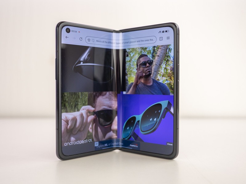
When using the OPPO Find N in its larger, unfolded state, you simply will not notice a crease. I'm not saying you have to hold it at a certain angle or have the screen on maximum brightness to negate the physics of light reflecting off of the curved glass. There is no crease on the OPPO Find N's inner display.
Mind-blowing doesn't quite cover it.
This is because OPPO engineers have been prototyping the Find N for several years now, eventually discovering the ingenious waterdrop shape hinge that's inside the Find N's spine. Judging by what we know, it's similar in design to what Motorola uses on the RAZR 5G, albeit on a larger foldable device.
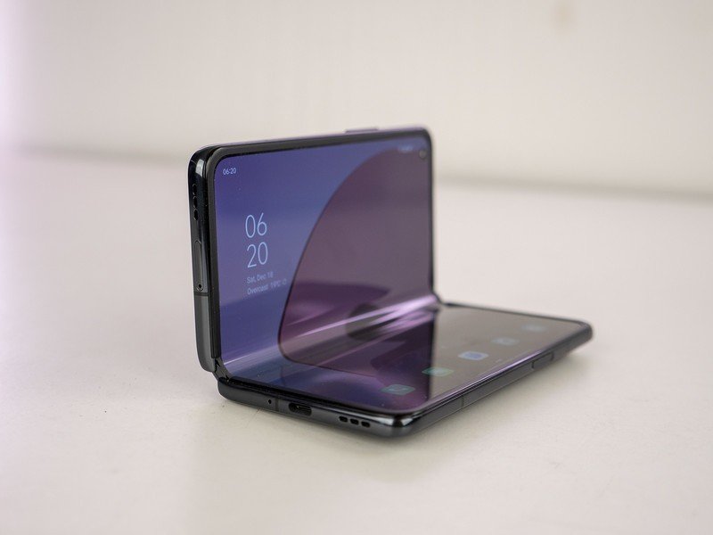
As you fold and unfold the display, you'll notice that the middle part of the large display does, in fact, fold into a waterdrop shape. You can see that in the images below, and the difference this makes in day-to-day use is nothing short of monumental.
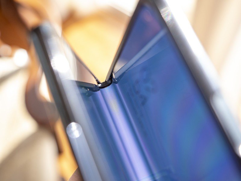
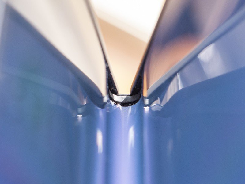
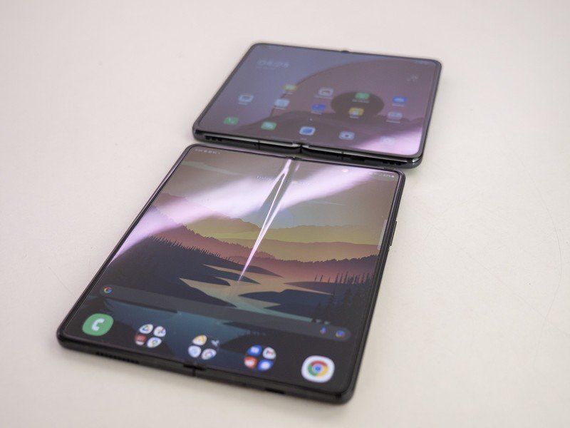
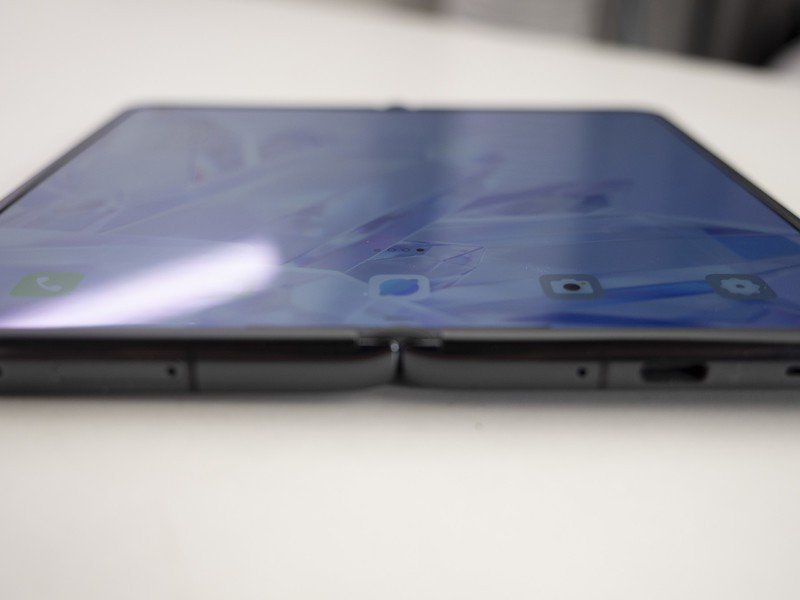
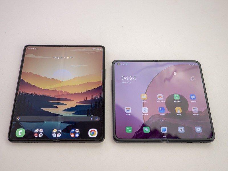
OPPO has created the ideal foldable phone display.
Sure, having a crease is about as big a deal as having a notch carved into a display. It's annoying and is something that never truly goes away, even if your brain works to normalize these types of abnormal designs. Ideally, of course, you don't want a crease on a foldable phone.
And that's just it. OPPO has created the ideal foldable phone display, and it did it right out of the gate without having to iterate over several generations of consumer-ready foldable phones.
OPPO assured us that, despite having no official water or dust resistance rating, "water resistance and durability testing were applied to the OPPO Find N to ensure it can easily cope with sweat, moisture and light drizzles that are encountered in our daily lives."
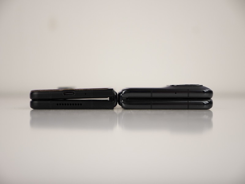
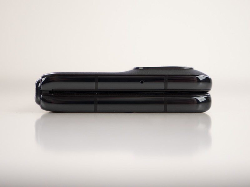
On top of having no crease, the waterdrop hinge solves another odd design issue with the Galaxy Z Fold series: the OPPO Find N folds flat.
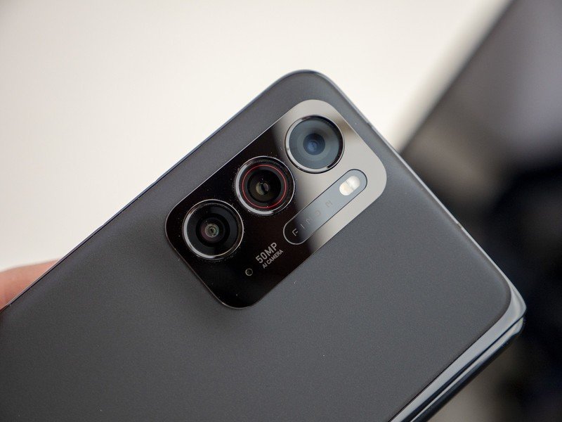
That means there's no tiny little gap for something to slide itself into when placed in your pocket, and it also means that the Find N sits flat on a table when placed on its face. Like the Z Fold 3 — and all other flagship phones, for that matter — a sizable camera hump on the back keeps it from lying flat, otherwise.
In addition to this, OPPO chose a rather unique aspect ratio for its displays. The outer display sports an 18:9 aspect ratio, which is similar to most normal slab phones. That's a big contrast from Samsung's oddly tall and narrow design on the Z Fold 3.
The outer display's wider, squat aspect ratio is more ideal than the Z Fold 3's tall, narrow outer display.
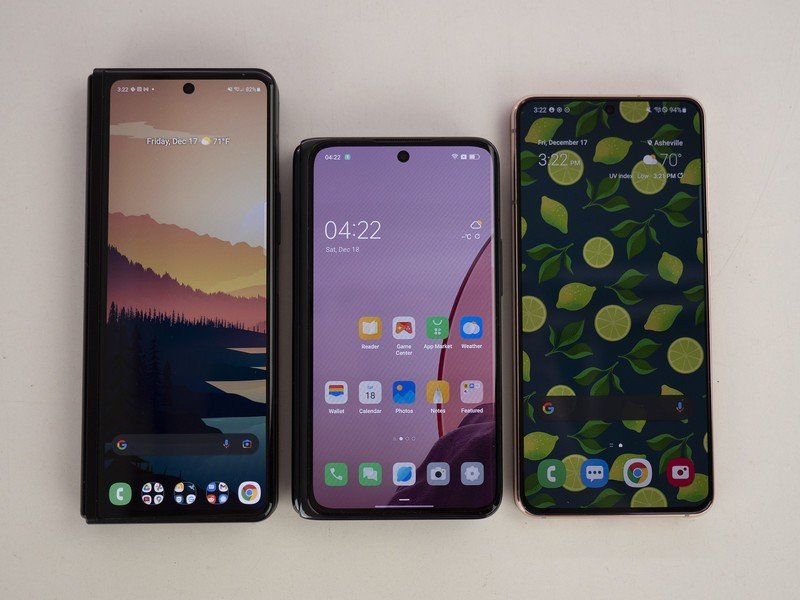
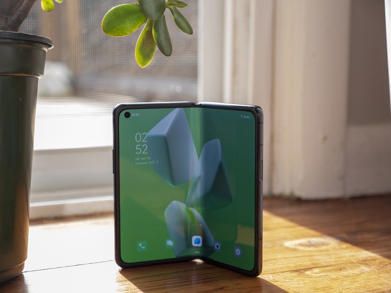
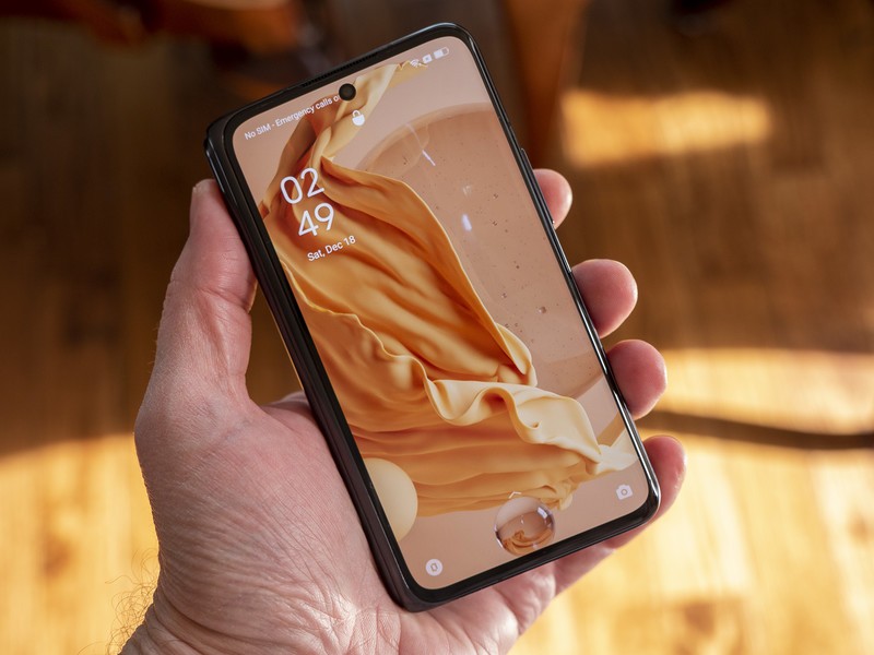
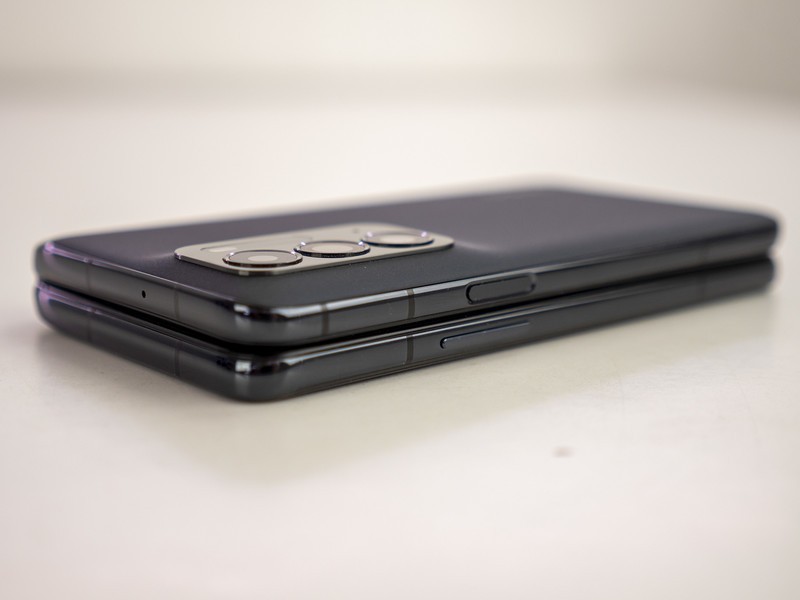
The squared-off inner display means you don't have to rotate the phone to get the best aspect ratio for videos.
This display means the Find N doesn't feel any different from using a normal slab phone — except for the thickness, of course — whereas the Z Fold 3 definitely takes some getting used to and is never very easy to type on. This display's biggest weakness is that it's only a 60Hz panel, which can feel a bit jarring when moving between it and the larger 120Hz panel inside.
The inner display uses a much more squared-off 15:14 aspect ratio, which means you won't need to rotate the phone while watching videos to get the best aspect ratio. That's a nice change from the Z Fold 3, which needs a rotation in order to get the largest display for videos.
Couple that with the fact that there's no crease — yes, I know that's probably getting old — and you have a superior display for content consumption. You can even half-fold the display so that it makes basically any angle and it won't close on on itself, making video calls, group photos, and a number of other scenarios much easier than on a traditional flat slab phone.
Around the back, you'll find an anti-fingerprint fogged finish that contrasts nicely with its shiny camera hump and side rails. The phone feels incredibly solidly built, to say the least.
I also love that the volume rocker and power button are on opposite sides when the phone is unfolded, as it makes finding the excellent side-mounted power button easier to find, and even makes taking screenshots simpler since you don't have to hold it awkwardly.
The software experience
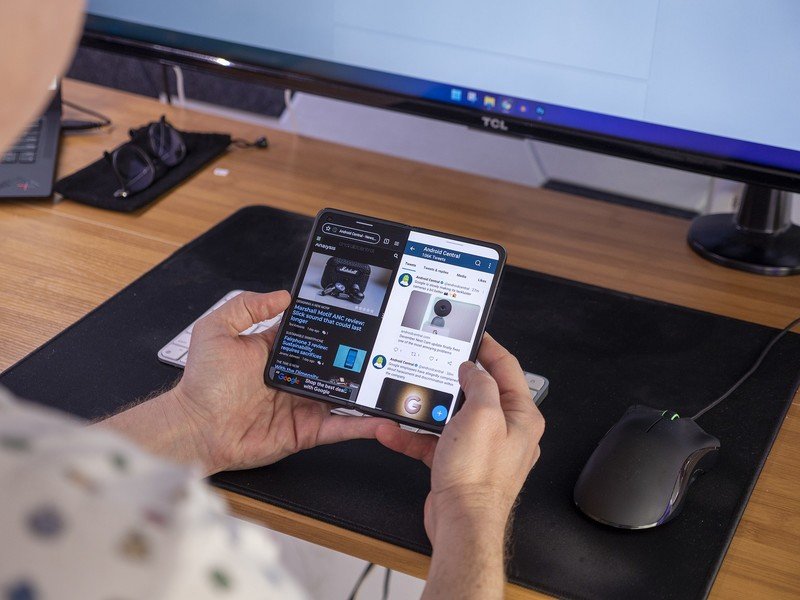
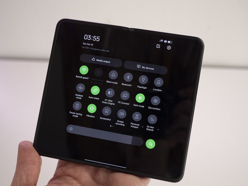
OPPO spent a good deal of time working on the software experience for the Find N, ensuring that it isn't just a normal phone that just so happens to unfold. The OPPO Find N comes with Color OS 12, but with one big, strange caveat: it's Color OS 12 based on Android 11.
The Find N ships with Color OS 12, but it's based on Android 11.
Given how new Android 12 is, it's not terribly surprising to see its absence from the Find N. After all, OPPO needed to engineer all of its own foldable software tricks since Google only just recently launched the development tools for the foldable-specific version of Android, Android 12L.
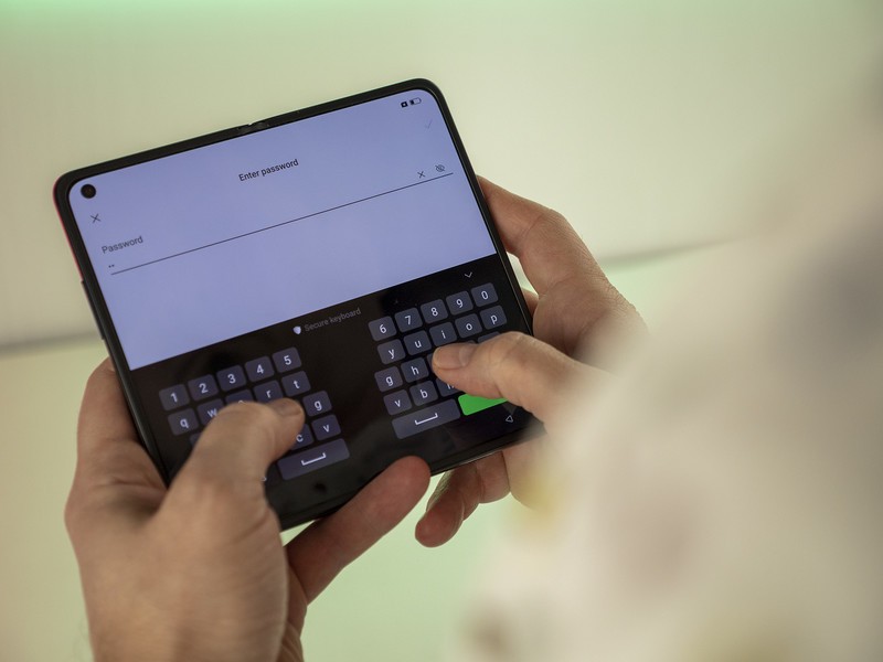
Despite being based on Android 11, though, you won't feel like this phone is old in any way. Everything feels bespoke from the moment you pull up the keyboard, which runs in split mode by default on the large screen. That's super handy since it's a wide display.
The Snapdragon 888 inside keeps things running smoothly, and transitions when migrating from the small screen to the large screen are undeniably smooth.
OPPO pointed out that its transitions are seamless and, in my time so far with the phone, this holds true. It's a considerably smoother experience than Samsung's One UI on the Z Fold 3, and almost instantly transitions from screen to screen no matter if you're opening or closing the phone.
Initially, I noticed that the phone doesn't go to sleep when I close it. At first, I didn't like that at all. After all, one of the joys of owning a foldable phone is being able to slap it closed to hang up on someone or put the phone to sleep.
But Oppo requires you to perform a quick swipe up on the screen when moving from large to small screens, adding in a very small gesture that allows you to quickly continue on with what you're doing without having to unlock the phone again. Moving from the small to the large screen — that means simply opening it — requires no additional action and is an incredibly smooth experience.
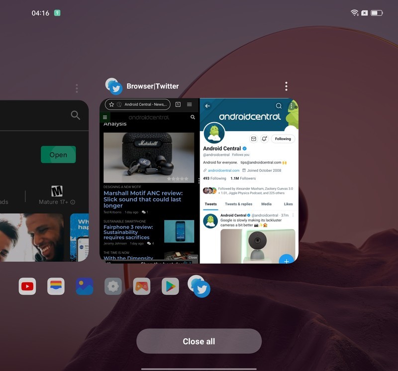
I was also pleasantly surprised with the out-of-the-box multitasking experience, too. While using gesture navigation — which is the default selection in the initial phone setup — it's much, much easier to migrate apps to floating windows, split the screen so you can use two apps at once, and navigate through the multitasking Overview screen.
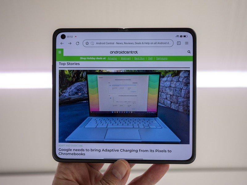
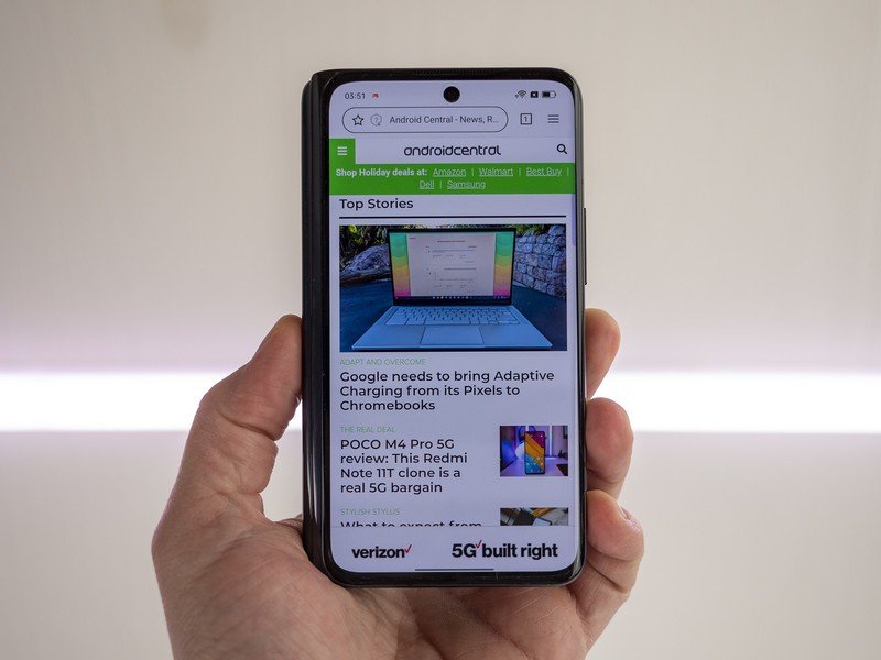
Multitasking requires much less effort on the OPPO Find N than compared to the Galaxy Z Fold 3.
Swiping up and dragging to the top of the screen — a feat that's actually easy on the Find N thanks to its shorter display — floats a window instantly. Dragging that floating window to the side will hide it, while swiping out from the tab that's created will float it right back onto the display. You can also four-finger pinch inward to turn any supported app into a floating window.
Similarly, swiping down on the middle of the screen with two fingers will instantly split the screen in two, sliding the active app to one side so you can quickly multitask.
Unlike Samsung, however, OPPO doesn't have a way to force all apps to work with split-screen or floating windows. A toast notification on the screen will tell you when an app isn't supported. Thus far, however, all the apps I would actually split or float worked just fine.
Looking forward to the future
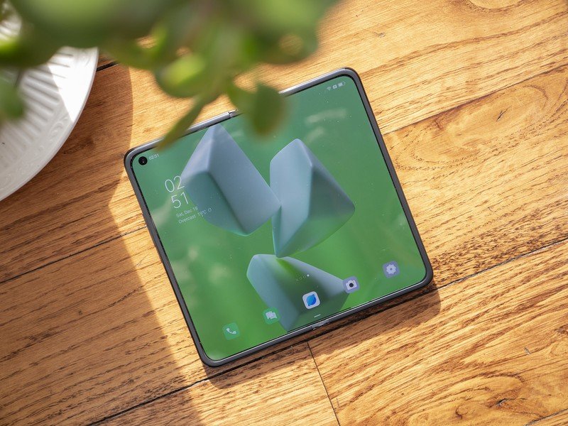
I'm certainly impressed with OPPO's first foldable phone. The hardware is easily the most impressive part of the experience, as it eschews several of the biggest assumptive negatives of foldables. OPPO made some huge strides with this phone's hardware that I absolutely hope continues to be used in the foldables space.
OPPO says it has no current plans to sell the phone anywhere other than China.
But the phone faces two uphill battles as it comes out of the gate, the first of which is the extremely limited distribution. OPPO says it has no current plans to sell the phone anywhere other than China. That's a shame for a number of reasons, the least of which certainly isn't the fact that this is technically $600 less expensive than a Galaxy Z Fold 3.
Our phone shipped with Google Play Services installed, which would be a huge deterrent for overseas buyers, but having the option means that someone could at least import a Find N if they were curious enough about the device.
But the current state of Color OS 12 running on Android 12 is pretty messy on other OPPO and OnePlus phones.
OPPO's software has improved massively over the years, and its dedication to building foldable-specific features into its popular Color OS platform hasn't gone overlooked. This is a superb experience that truly feels more useful than a regular slab phone and it's not just because of the superior aspect ratio of the displays.
But the current state of Color OS 12 running on Android 12 is pretty messy. Recently, OPPO decided to bring together its two brands' operating systems, unifying Color OS from OPPO phones and Oxygen OS from OnePlus phones. So far, we haven't been impressed with the results.
Let's hope OPPO gets that under wraps, especially given that this phone is already technically running on an outdated OS. Until then, though, this is an impressively solid experience that I'm looking forward to digging my heels into as I head to CES in just a few weeks.


