OPPO Find 5 review
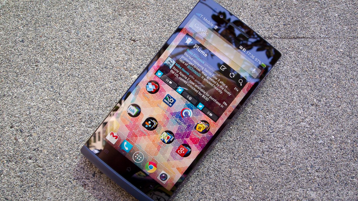
The name "OPPO" probably doesn't come to mind when thinking of which phone to buy next, but the Chinese manufacturer is working hard to try and change that. Best known for making high quality Blu-Ray players and various other consumer electronics, the company has only dabbled in phones previously. But with an aggressive strategy of building high-end devices and selling direct to customers with some impressive prices, the components are all there to make at least a little splash in the market. The Find 5 is OPPO's latest attempt at a device that on paper has all of the line items to make a great phone.
But making smart phones is a difficult business to get into, and selling high-end unlocked handsets is the toughest area to aim for. Does OPPO have what it takes to branch out from making other consumer electronics and take a meaningful foothold with consumers? It certainly has some things going for it. Read on past the break for our full OPPO Find 5 review.
Pros
- Extremely well-built case with quality materials. Great, high-resolution display with good viewing angles. Unlocked and pentaband HSPA+ 42 radio. The promise of frequent software updates and a generally passionate hacking community give you many software options if you're motivated.
Cons
- Large, heavy and often uncomfortable to hold while using one-handed. Capacitive keys, including a menu key, hinder usability both physically and in the software. Camera sensor is better than average, but the software backing it up lacks all common camera features. Software and interface are quirky and in many ways poorly designed.
The Bottom Line
The OPPO Find 5 probably wont appeal to as wide of an audience as its manufacturer had hoped. There are some usability issues in both hardware size and software features that make it hard to recommend to just anyone, even with its great build quality. Those who are interested in getting a nice hardware platform to play around with the software on won't be disappointed, but it's still a tough sell at $499/$549 considering the Nexus 4 offers much the same (and even better hacking support) for $200 less.
| HardwareSoftwareCamerasBottom line | OPPO Announces the Find 5A quick look at the OPPO Find 5 |
OPPO Find 5 hardware
The Find 5 ticks all of the boxes when it comes to high-end hardware specs for early 2013. Powering the device is your standard combination of a Snapdragon S4 Pro quad-core processor at 1.5GHz, 2GB of RAM and 16 or 32GB of internal storage. We also have a seemingly industry-standard 5-inch 1080x1920 display, this one being of the IPS LCD variety. Around the back of the device you'll see a 13MP camera along with a dual LED flash, and under the back cover sits a 2500mAh non-removable battery.
Be an expert in 5 minutes
Get the latest news from Android Central, your trusted companion in the world of Android
Build Quality

Just because you may not have held -- or heard of -- an OPPO device doesn't mean you should have any worries about the build quality of the Find 5. And while it's basically just a giant grey slab of glass, plastic and metal it does have some design flair that is striking when you first see and hold it. The build quality and materials are top notch, all the way down to the box it ships in, which is probably built better than some phones from other manufacturers. You won't find a single gap, creak or bend out of place on the Find 5.
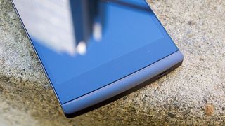
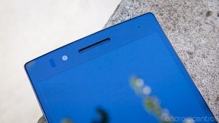
The front of the Find 5 is dominated by a solid slab of glass, which reaches from the very top edge of the phone down to a small, curved chin at the bottom. The chin doesn't seem to serve any purpose other than to be aesthetically pleasing, and it does tie together the look of the device. The glass is surrounded by what is either a metal or extremely dense plastic edge, which wraps around three sides of the device and gives the illusion when looking at it from the side as though you're looking at the side of the glass from the screen. The bulk of the edges though are surrounded in a hard plastic of a different texture and color that has a matte finish. It seems to be one solid piece of the phone that wraps all four sides (including the chin), which would account for much of the phones rigidity.


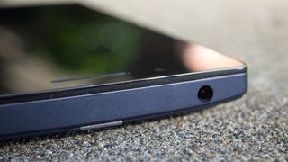
The Find 5 has a pretty standard button placement, although the power and volume keys are switched from what you see on many phones today. You have a side-mounted power button on the left, and volume keys on the right. A microSIM card slot sits right above the power key, and you'll find a solitary micro USB port on the bottom, as well as a 3.5mm headphone port on the top. The volume and power keys are a very interesting semi-clear acrylic type of material that gives them a very similar look to the material wrapped around the edges of the screen, which gives the phone a nicely designed look. The mixes of matte and shiny materials give a little depth to what is otherwise a generally bland slab device.

The back plate of the Find 5 is made of the same material as the sides, but is actually a separate piece from it. This leaves a noticeable jump between the sides and the back, one that OPPO clearly isn't trying to hide as it adds to the overall design of the device. The back plate is non-removable, and is a pretty simple affair -- camera and LED flash pod up at the top in the center, OPPO branding in the middle and a drilled speaker grille at the bottom.
As we said before, you really can't fault any piece of the build or materials on this device. It's pretty much built like a tank, but almost to a fault as the phone is likely too tall, heavy and angular to use comfortably by most. Because we're looking at a 5-inch display along with capacitive navigation keys, the Find 5 is a very tall device (142mm). It also has some sharp corners and edges, which aren't the most ergonomic things for your hand to hold onto when you're trying to reposition the phone often. And at 165 grams -- 35 grams more than the Galaxy S4 -- it's no lightweight either. You get the satisfaction of holding an extremely well-made device, but usability takes a hit.
Display

A 5-inch 1080p display, as crazy as it sounds, is pretty normal nowadays for Android smartphones. What isn't quite so predictable, however, is the quality of these panels. Luckily OPPO has picked one of the good ones for the Find 5, and it's hard to find a flaw here. As we mentioned above it is a IPS LCD, and at 441 ppi it's plenty pixel dense for even the most eagle-eyed among us. The display is capable of very high brightness levels, and color reproduction seems pretty spot-on to our eyes. The viewing angles are also very good, thanks in part to what seems to be a gapless display technology at work. This is a high quality display that's worth some praise.
Radios
The Find 5 supports your standard set of radio bands, covering the five common ones needed for HSPA+ 42 in the U.S. -- 850, 1700/2100 (AWS), 1900 and 2100MHz -- for T-Mobile and AT&T. Unfortunately LTE support is nowhere to be found here. Aside from mobile data, you'll find Wifi a/b/g/n, Bluetooth 4.0, GPS, NFC and every other modern sensor inside. OPPO even ships a couple of stickable NFC tags in the box for you to program, which is fun.
Battery life
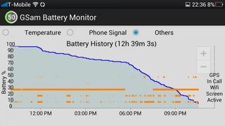
Battery life on the Find 5 seemed to be pretty hit or miss depending on usage. As we've come to see with recent phones that are packing 1080P displays, the amount of "screen on" time still dramatically changes what you can expect in terms of battery life. With our casual usage of mostly Wifi and at least 2 hours of "screen on" time, checking email, playing a short amount of casual games and keeping up with social media accounts the Find 5 would hit a "full" 12 hour day of use.
In more intense situations when out of the house on mobile data and using the camera, Google Maps and pinging GPS more often, the battery dropped like a rock. There were a few days where the Find 5 barely made it to the 8 hour mark before we were searching for a plug, and that's a little worrying. Usage varies dramatically between different people of course, but you may want to keep this in mind when considering this device. On paper the 2500mAh battery should provide plenty of juice, but there's a lot going on under the hood that can drain that battery.
OPPO Find 5 software
When you power on the Find 5, you'll be greeted by a heavily customized version of Android 4.1.1 Jelly Bean. Other than the basic layout of things, not much will be familiar unless you've seen an OPPO phone in action before.
Launcher and interface
The launcher on the Find 5 may be familiar to you if you've dabbled with MIUI custom ROMs in the past, and borrows many design elements from that system. The launcher focuses on large icons with lots of extra pops of color and fake light reflections across icons. The folders have been changed up as well, as have the individual app icons -- most icons for third party apps are given clear square backgrounds to keep each the icons very similarly sized. The app drawer is the most frustrating of the bunch, as it can't be organized alphabetically or sorted automatically in any way. The apps simply fall in the order that you installed them unless you manually move each app to where you want it.
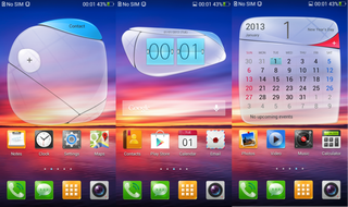
Adding widgets gives a similarly frustrating experience as the app drawer. Widgets are added from the home screen -- rather than app drawer -- with either a long-press on a home screen or using the menu button, and again aren't listed in alphabetical order. The ordering of widgets seems to be in whatever order you installed the apps, which isn't intuitive and gets even more frustrating because you can only scroll through three widgets at a time. Frustrations aside, the launcher actually performs extremely well, and we understand why its designed the way it is. The styling fits well with the rest of the menus, settings and notification shade to make a complete product.
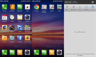
That's not to say that those other areas of the phone haven't also been completely customized. They absolutely have, starting with the notification shade, which has been heavily redesigned. Notifications are separated into "Ongoing" and "Notifications" areas to distinguish between those that can be swiped away and those that cannot, and the "clear all" button has been moved down to the bottom center of the shade. Curiously OPPO seem to have somehow disabled the stock Jelly Bean ability to have expandable notifications as well, which hurts usability. The settings button stays in the top right, as do customizable notification power toggles across the top. The Find 5 also includes a handy data counter at the bottom of the shade showing today's and this month's usage.
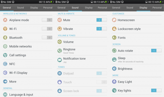
The consistent styling continues into the settings menu, which is split into four tabs -- General, Sound, Display and Personal -- across the top. It helps cut down on the number of nested settings and extremely long lists, but can be hard to navigate and remember where everything is. The menus themselves are clean and useful, and its hard to fault OPPO for following a consistent design language throughout them. You'll have to re-learn where things are in these menus coming from other devices, but that can be the case more often than not when switching devices nowadays. Every manufacturer has their own way of laying things out.
Performance and usability
General performance on the Find 5 is actually quite speedy, and we never experienced hiccups when moving through the launcher or menus. We did find some occasional app instability, although it's hard to pinpoint the reasoning. We had some games freeze and need a force close or a reboot to clear the issue, but they played properly a good 95-percent of the time otherwise. Regular productivity apps -- Google Talk, Skype, Chrome, Google+ -- all performed just fine with no crashes whatsoever.
The one other big bug we found, which we think is software related, has to do with the Wifi. No matter what way we configured the settings, we couldn't get the Find 5 to stay connected to an 802.11n router for more than a few hours consistently. Although the Wifi would indicate that it is still connected, no data would be transferred (up or down) over Wifi until it was toggled off and back on. It took a few nights before we realized that the phone was losing its ability to transfer data over Wifi in the middle of the night. A half dozen other devices have no problem with the router.
OPPO has committed to making new software releases quickly available to users both OTA and on a fast track to side-load from the official user forums, which we would expect to iron out some of these small issues. But promises only get you so far, and at some point you just want your phone to work. The Find 5 is extremely far from a buggy mess, but there are still some issues that need addressing. Of course if you're interested in going the custom ROM route, you could attempt to fix some of the issues on your own. The Find 5 seems to have a small but dedicated hacking community around it to help you out.
OPPO Find 5 cameras
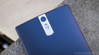
The Find 5 comes equipped with a 13MP auto focus f/2.2 camera, backed up by a dual LED flash. Those are all the numbers you're likely looking for in a smart phone camera nowadays (unless its Ultrapixels you're after), and OPPO seems to have picked some pretty good components. Where it falls on its face is in the camera software department, which is downright anemic.
The camera UI itself is simple and nicely designed, with a shutter key, still/video toggle key and gallery button on the right, and a set of four camera options on the left. The problem being those settings aren't exactly useful. You get an extremely basic set of camera functions, which are limited to toggling the flash, HDR, panorama, resolution, turning on a 5 second timer, and turning on a grid overlay for the viewfinder. Completely absent are exposure, ISO, white balance, metering, scene modes, image stabilization or any other advanced features.
This really isn't much of an issue when taking quick snapshots in good lighting and normal conditions, but as soon as you step out of those confines you'll likely be frustrated by the lack of options. It also wouldn't be as big of a deal if the camera offered some intelligent automatic settings, but sadly this isn't the case either. The camera doesn't seem to do any work to help properly expose or white balance photos in less than ideal conditions. The combination of these two shortcomings leads us to say that the stock software on the Find 5 is about one notch above useless. You'll want to explore some third party camera app options if you intend to make the best of your photos.
Pictures
When you are in those ideal lighting conditions, the Find 5 takes quite acceptable pictures. They aren't the sharpest you'll ever see from a 13MP smart phone (the post-processing isn't top-notch), but they are far better than average. Again, the big thing holding you back here is the software. Knowing that you won't be able to adjust anything, you end up just looking for pictures that you know it can take, and going from there. Stick to great lighting conditions and you'll get good results.


Click images to open full-sized in new window


Video
1080P is the standard video resolution here, and OPPO does you one better by also offering an HDR video option, which hasn't quite caught on with every other manufacturer. Below is an HDR video sample, which turned out pretty well.
Front camera
You also get a 1.9MP front-facing camera, which is situated to the left of the speaker grille. The pictures are fine, nothing to see here.
The bottom line

After spending a considerable amount of time with the Find 5 as a daily device, it's clear that OPPO has put a lot of time into it. Coming out of (relatively) nowhere to produce a phone with a top-notch build quality, high-end internals and a great display is an abnormality nowadays. These high points are unfortunately brought down to earth with the realities of what first-generation software development looks like -- questionable design choices and some glaring gaps in usability when compared to other phones in the price range. OPPO does hit a certain target market that wants high-end specs and a digestible -- $499/$549 unlocked -- price-point, but only for those who are willing to hack with the software a little. Unfortunately, for those sort of people there may be a better "bang for your buck" elsewhere. At a minimum, OPPO has proven with the Find 5 that it is more than capable of making high quality devices that could one day join the conversation with the other headline Android manufacturers.


Andrew was an Executive Editor, U.S. at Android Central between 2012 and 2020.


