Oppo F1 Plus unboxing and first impressions: Promise it's not an iPhone
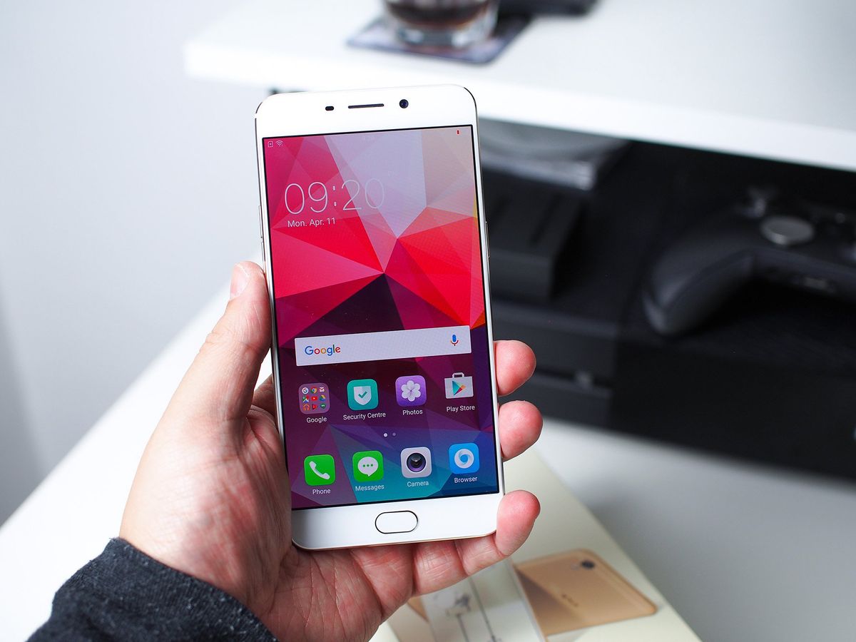
This is the Oppo F1 Plus, a beefed up version of its recent, camera focused F1. And if you read the slogan on the box, this phone is a "selfie expert."
That would be because the signature feature of this phone is its whopping 16MP front facing camera.
Sixteen. Megapixels. Those are going to be some high-resolution selfies.
We've had one shipped over from China to take a look at, and while it's only been here for little over 24 hours, it's at least long enough to crack it out of the box and get an early feel for it.
The retail packaging for the F1 Plus is on par with recent Oppo phones, to say, very good. Everything you might need is inside, including a clear TPU case to keep your shiny new metal phone shiny and new.
The included charging brick is of particular importance since it enables Oppo's VOOC rapid charging. When used with a compatible phone it runs at 4A and will charge the phone quickly, while it tones down to 2A should you plug into anything else.
And you're hooking up via micro-USB still. The lack of USB-C may be down to the first-party quick charging, but it's here regardless.
Be an expert in 5 minutes
Get the latest news from Android Central, your trusted companion in the world of Android
Once you're out of the box here's the main specs to look at:
| Category | Features |
|---|---|
| Operating System | Color OS 3.0 based on Android 5.1 |
| CPU | MediaTek MT6755 Octa-core |
| RAM | 4GB |
| Display | 5.5-inch 1920 x 1080 AMOLED |
| Rear Camera | 13MP f/2.2 |
| Front Camera | 16MP f/2.0 |
| Storage | 64GB + microSD |
| QuickCharge | YesVOOC Flash Charge at 4A |
| Battery | 2,850mAh |
| SIM | Dual nano-SIM |
| Connectivity | MicroUSB |
| NFC | No |
| Fingerprint scanner | Yes |
| Dimensions | 151.8 x 74.3 x 6.6 mm |
| Weight | 145g |
| Price | €389 or £299 |
There are some things which stand out immediately. For me, the 64GB storage, 4GB of RAM and £299 price point are all extremely pleasing to see. For a couple of hundred pounds less than the likes of a Galaxy S7 and an LG G5 you're getting twice the internal storage while still retaining a microSD card slot.
They're not necessarily competing, but it'd be nice to see more of the big players offer more than 32GB of internal storage.
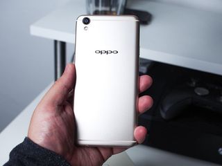
Then we'll get to the obvious: Yes, the F1 Plus looks a lot like an iPhone 6s. That's either a good thing or a bad thing depending on your outlook. But treating it on its own, it's well designed and it certainly feels well built. It's very slim and fairly light for a phone with a 5.5-inch display, and of course, it comes in gold.
Yes, the Oppo F1 Plus does look a lot like an iPhone
Gold shouldn't be a surprise to anyone in 2016, not least a phone coming from a Chinese brand. Customers in China like gold phones, so there's going to be plenty more to come.
On the front of the phone you find a couple of noticeable things. The first is the physical home button which is also a fingerprint scanner. I'm not sure if it's just me doing something wrong, but the fingerprint scanner seems pretty bad. It doesn't seem to work with your finger on it in just any orientation and it's barely worked to unlock the phone in the time I've had it so far.


We'll have to see what it's like after some more prolonged use, but initially at least, it's been turned off.
The second thing you notice on the front are the really slim side bezels. This helps keep the F1 Plus' size manageable since it's not as wide as some other phones, making it nicer to hold.
Touching quickly on the software and the first thing that's apparent to anyone who's ever seen Color OS before is that this is different. We're up to version 3.0 now and there are both good and bad things to say about it.
Starting with the bad: It's still based on Android 5.1 Lollipop. For an April 2016 phone, that's not good. Not at all. It's practically unacceptable.
As is always the case with Color OS the entire Android operating system has been reworked. This latest iteration looks a lot like Xiaomi's MIUI which in turn takes cues from iOS. There's a lot of white and pale colors, though you can also download any one of a huge number of themes from Oppo's store.


Bloatware is fairly minimal, with the only thing pre-loaded on this unit a copy of WPS Office and Oppo's own, stock apps. The Oppo browser is based on Opera, so you get chance to use the data saving features you'd find in the standalone app, but aside from that it's pretty standard fare.
One thing that's a little confusing is that the settings for the stock apps have all been migrated to the main Settings app on the phone. Just like on iOS. If you're not going to use them, it won't bother you, but it's still strange to see on an Android phone.
Color OS has finally said goodbye to Mr Lag
What is however immediately noticeable and positive about Color OS 3.0 on the F1 Plus is performance. The last couple of Oppo phone's that have come our way have suffered from some pretty horrible lag in even simple tasks. That seems to have gone away and the F1 Plus is smooth and snappy throughout.
Whether it's software optimization or the extra hardware that's been thrown in to it, it doesn't matter. What matters is that using it doesn't suck anymore.
The "selfie expert" claim will be put to the test in the course of our full review, mainly because I haven't been outside since it arrived. And we'll give a good look at the rear camera as well, for those who like to take pictures of other things. The camera app is still basically the same as previous Oppo phones, very simple, easy to use and with a few manual controls for the more adventurous.
So, to wrap up. First impressions are pretty good. Personally I don't care whether it looks a lot too much like an iPhone in hardware or software, but I know others will. The F1 Plus is a good looking, well made phone with a great display and software that now feels actually pleasant to use.
24 hours isn't enough time to begin to touch on how good this phone is or isn't, but we'll be back with a full review in the days ahead.

