The budget space is one of the most competitive and exciting areas of the smartphone marketplace right now. In early 2016, $200-400 — or the local equivalent — can now get you a shockingly good handset without any of the usual contract-related strings attached. Many of the most competitive brands in this space are new upstarts and Chinese phone makers who've yet to make it big in the West.
Among them is Oppo — a huge phone brand in China, but not a name recognized by those outside the technology bubble in Western markets. The company has always produced head-turning designs, including the ridiculously thin R5 and the camera-rotating N1. But like local rival Huawei, its highly-customized software has been a point of contention.
The latest affordable phone from Oppo is the F1, priced at just £169 on Amazon in the UK. At that price, it goes up against the likes of the 2015 Moto G and the Huawei-made Honor 5X. So how does it shape up? Read on to find out!
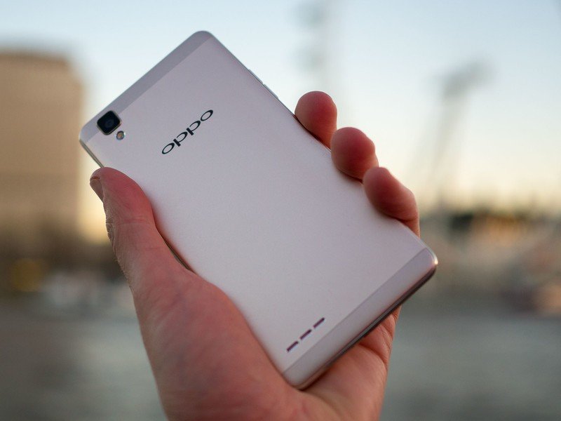
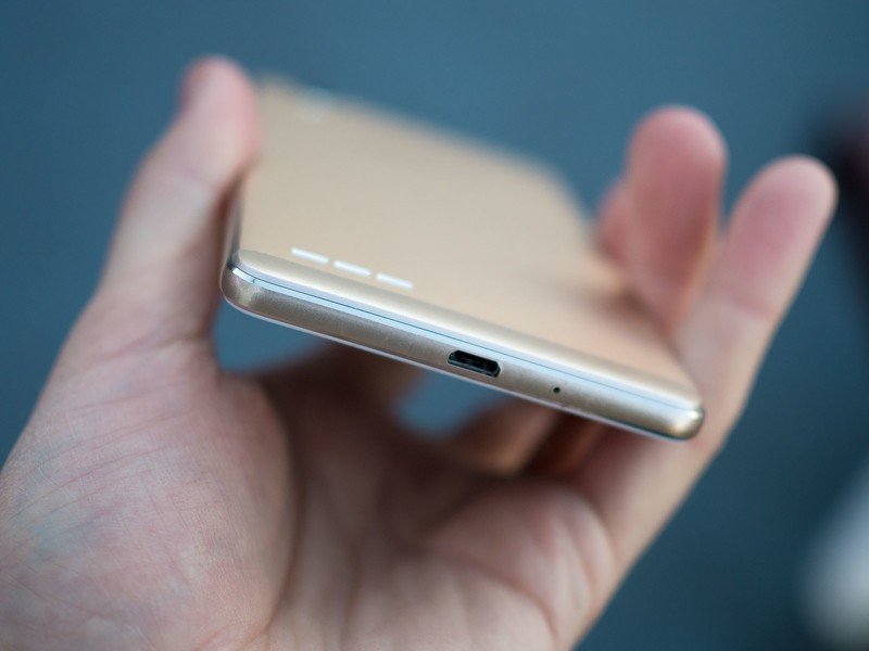
An entry-level phone with premium aspirations.
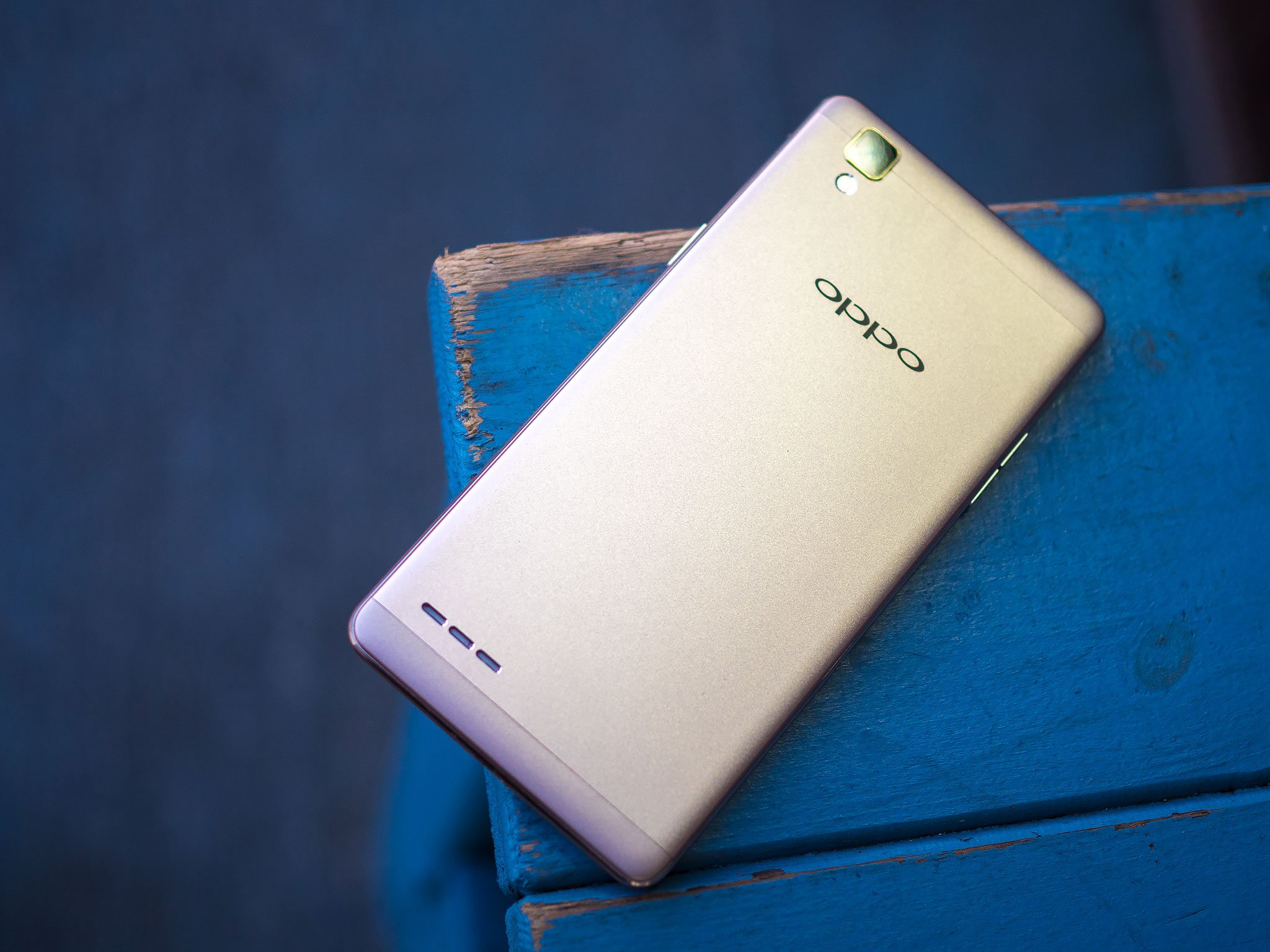
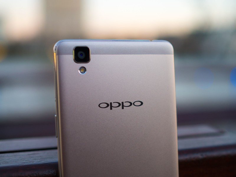
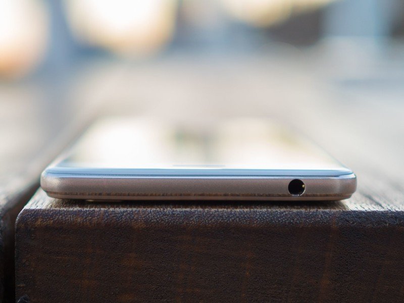
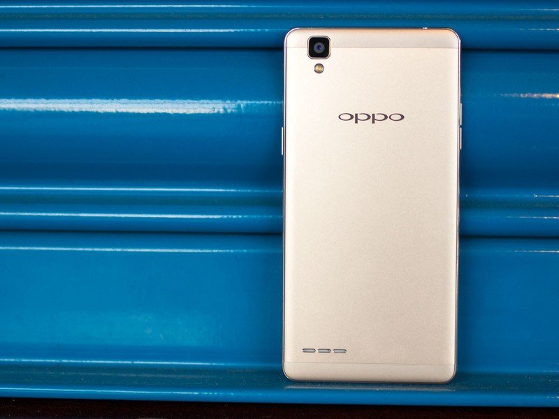
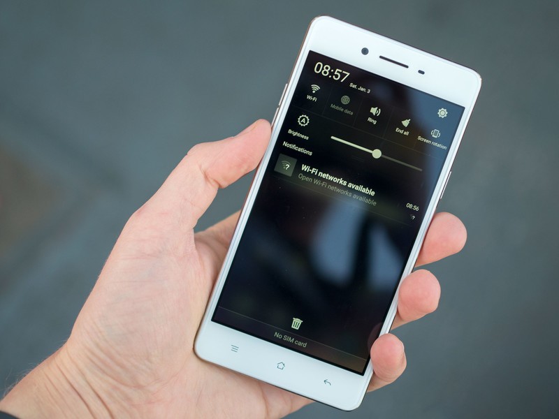
On the outside, the Oppo F1 looks every bit the premium smartphone. There's a 5-inch display with gently tapered edges on the front, and attractive metal back and grippy, polished trim. Like the Honor 5X, it looks much classier than its price tag would suggest. Unlike that phone, though, the metal has a matte texture to it, so the in-hand feel mostly matches its high-end looks.
It's a comfortable fit in hand, with gentle curves that improve the ergonomics without making the phone feel slippery.
But look closely and the high-end illusion begins to fade. Though it looks metal, the outer trim of the F1 is in fact plastic. And the screen also has an odd plasticky texture, and lacks any kind of oleophobic coating — as does the factory-fitted screen protector. The F1's plastic parts aren't a huge deal — after all, most phones under the £200 mark are all-plastic affairs anyway. But the smudgy, fingerprinty screen is an unfortunate compromise, and sadly one that's shared by the Honor 5X as well.
Being the main input and output device, the display is important, and its tendency to attract fingerprints isn't its only weakness. It sports an ample 720p resolution (giving a density of 294 pixels per inch) and looks pretty decent indoors. Take it outdoors though, and there are some visibility issues, even at the highest brightness level.
Fortunately the phone performs a little better when it comes to audio, with the rear-facing speaker producing sound that's loud, if a little tinny, at high volume levels.
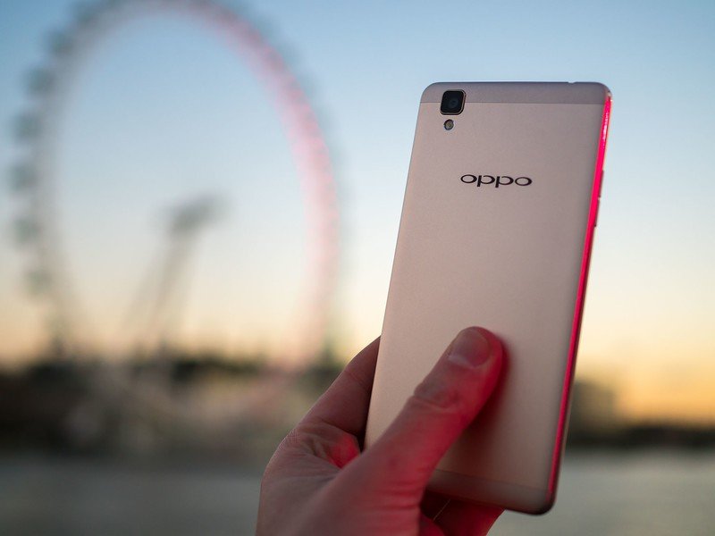
Between a lack of oleophobic coating and outdoor visibility issues, the F1's screen is pretty weak.
On the inside there's a Qualcomm Snapdragon 616 processor powering the Oppo F1 — a slightly updated version of the more common Snapdragon 615. Qualcomm's current mid-range SoC is more than capable of handling Android on a 720p display, and as such performance is quick smooth throughout the UI. Oppo's ColorOS — which sits atop Android 5.1 Lollipop — features plenty of swooping, iOS-style animations, and there's no lag to be found anywhere at all. (That's in stark contrast to other devices using this chip with a 1080p display.)
ColorOS also brings back the legacy menu key — something we haven't seen in a high-profile Android phone in the West for literally years at this point. Oppo's software still relies on this menu toggle in places, and that's at odds with the way Google's been doing things for, well, the past five years at this point. The result of this odd button choice is that you'll need to long-press the menu key to switch apps on the fly, which is kinda tedious in comparison to basically every other Android phone.
It's just one of a few weird design decisions in ColorOS which, we'll explore a little later.
As for memory, you're looking at an ample 3GB of RAM — which is a lot for an entry-level phone like this — and 16GB of storage, expandable via microSD. And that SD slot is contained in the same tray as the second SIM slot, meaning you can use either one SIM and one SD card at a time, or two SIMs, but not all three concurrently. We found that the F1's SIM-switching capabilities worked as expected — both SIMs can be active at once, but only one can be used for 4G data at any one time. (That's all pretty standard for a dual-SIM smartphone.)


The F1 boasts one of the best cameras in its price range.
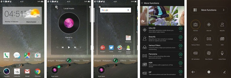
If the Oppo F1 is a mixed bag in some other areas, imaging is a big part of what sets it apart from the budget-priced competition. The phone benefits from Oppo's full-featured camera app, also found on more expensive phones like the R7 and R7s, bringing a wealth of shooting modes. There are smartphone staples like HDR, filters, panorama and beautification modes, as well as more unique options like a built-in GIF recorder and "Ultra HD," which takes a series of exposures over several seconds. This is then number-crunched into an image measuring in at some 53 megapixels which sometimes (but not always) captures more fine detail than a regular 13-megapixel shot.
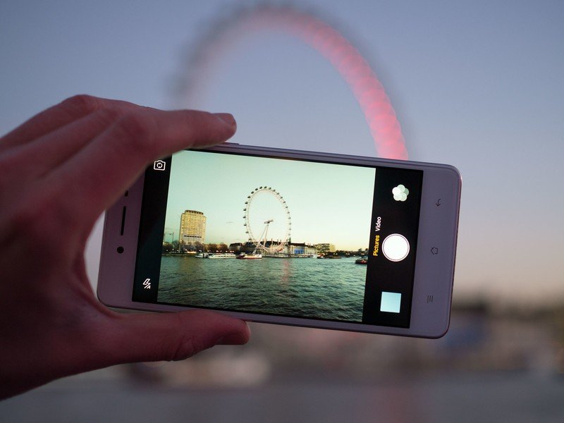
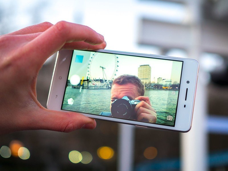
But you don't really need to rely on these fancy shooting modes to get good photos out of either the 13-megapixel rear shooter or the 8-megapixel front-facer. Both are surprisingly competent for a budget phone, with a little grain up-close, but otherwise adequate fine detail and no weird color anomalies. Blacks tend to be a little crushed, but we've also noticed that dynamic range on the whole is better than both the Honor 5X and Moto G 2015.
Pictures soon become noisy and mushy in low light, though the front camera does a decent job of keeping things relatively crisp in challenging indoor situations.
Overall, the F1 delivers more camera than you'd expect for your money at this price point, and a challenge to others selling entry-level Android phones: If you're selling any smartphone — even a cheap one — the camera can't afford to be an afterthought.
We've touched briefly on Oppo's ColorOS software, which runs alongside Android 5.1 Lollipop on the F1, and bringing with it some odd design regressions like the return of a physical menu key. And from a Western perspective, much of Oppo's UI seems unfamiliar and contrary, in design terms, to the way Google does Android. It's a point we've raised many times before in relation to Huawei's EMUI — it looks and feels like it was designed for the Chinese market.
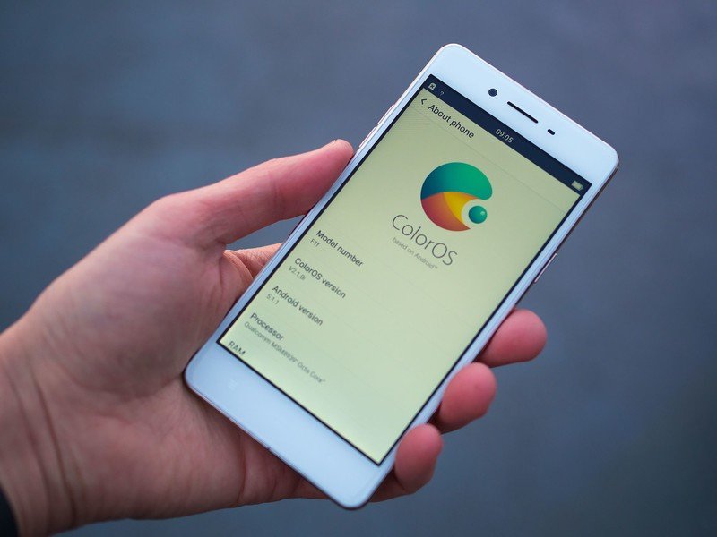
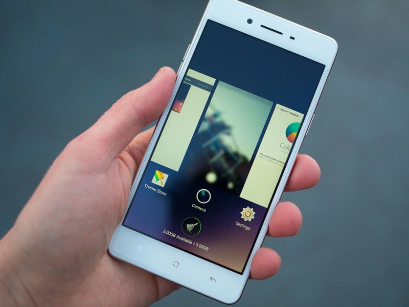
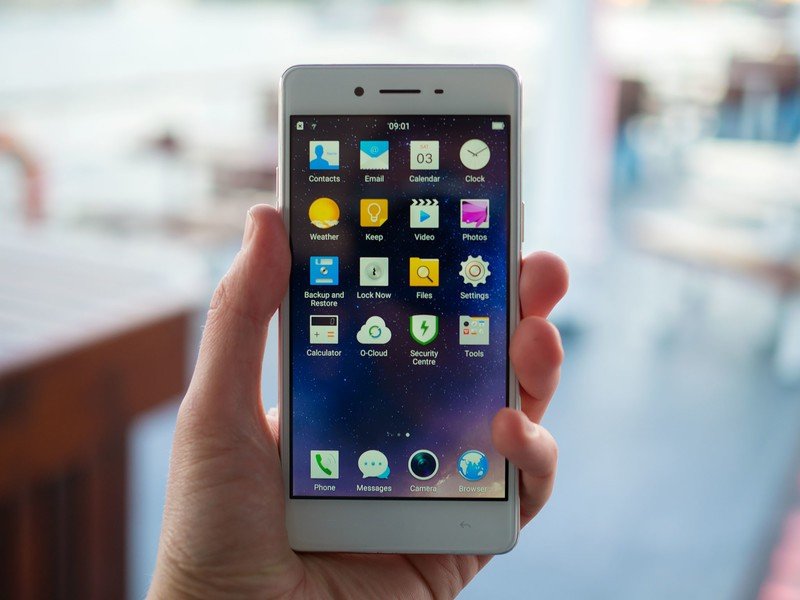
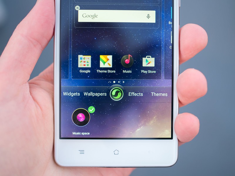
And like Huawei's software, there's a lot of iOS influence to be found in ColorOS, from the Springboard-style launcher to the swooping animation style and folder layout and the basic structure of the camera app. But this isn't a straight iOS clone — Oppo has its own visual style mixed in, which comes off as a little regressive. It looks and feels more like the HTC Sense UI of years past, with bezeled buttons, big, detailed icons, overflow animations and gradients aplenty.
Of course you can change the way much of ColorOS looks though the built-in themes system, but most of the themes to be found online are just as overbearing as the default skin.
On a functional level, ColorOS works pretty well. As mentioned, performance is consistently quick, and none of the bundled apps look terrible. Nor is it loaded with bloatware — the most offensive piece of software we found was the "Security center" app, which frequently throws up notification nags about speeding up and cleaning out your phone.
So if you're used to the way Android looks and works on a Nexus, Samsung, HTC or LG phone, ColorOS is going to take some adjustment, and might even be a reason to pass on the Oppo F1 altogether. But if you can learn to live with its quirks — or even use its many customization options to tweak it to your liking, there's not much else to complain about.
The same is true of battery life from the fixed 2,500mAh cell. The F1 manages full, solid day of use, including moderate web browsing on LTE with two SIMs inserted (we used EE and Three UK SIMs in our review unit.) Screen-on time clocked in at around 3.5 to 4 hours over a full working day on Wi-Fi and LTE, which is a respectable number for a phone in this category.
Overall, the Oppo F1 is a solid mid-range phone, and great value for £169 unlocked in the UK. But as much as it illustrates how far budget smartphones have come, it also demonstrates the compromises that remain — a rather disappointing screen, software that's not in tune with what you'd expect from an Android phone, and a metal body that's still got quite a bit of plastic going on.
But should you take the plunge, you'll find a phone with speedy performance, useful dual-SIM features and one of the best camera experiences in a cheap handset.

Alex was with Android Central for over a decade, producing written and video content for the site, and served as global Executive Editor from 2016 to 2022.
