Opera browser beta: Starting the move to WebKit

Opera has announced that it is making the switch to WebKit, and they're giving everyone a look at their first effort with a beta version of the browser packing the new engine. Building on top of that new engine, the Opera browser beta brings along new features that are meant to help speed up browsing, as well as a new interface design.
Hang around after the break and see how the first WebKit-based Opera browser beta performs.
The Opera beta is a sign of more than just the move to WebKit, it's a move towards a new interface that fits into the latest Android design language. Gone are the awkward rounded corners and black interface elements, replaced by a much cleaner grayscale interface with little pops of color. You surely aren't alone if you find Opera beta to resemble the interface of Chrome for Android -- several UI elements are nearly identical -- but that's not necessarily a bad thing.
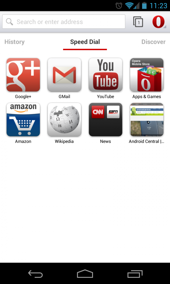
Opera now has a new launch screen that's separated into three tabs. The main page is called "Speed Dial", which is a launcher of sorts for a set of convenient shortcuts and web apps, although most will likely just use it as a bookmarks list. Speed Dial items can be left as individual shortcuts, or grouped into folders. To the right of Speed Dial is Discover, which is a complete news reader integrated into the browser. You can specify specific countries and categories to receive news from, or just view "Top stories". Your web history is found to the left of Speed Dial, listed in reverse chronological order. Pages are grouped by their domain, and tapping it shows the specific pages on that domain you visited in the session.
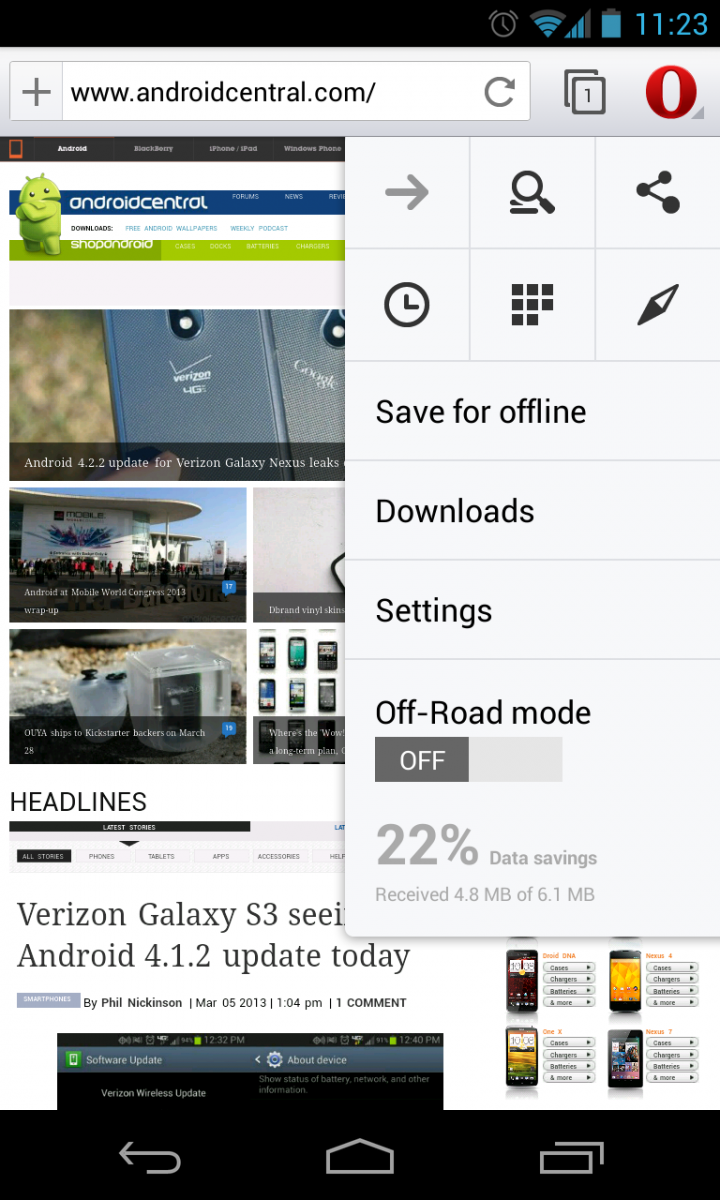
Also similarly to Chrome, the settings for Opera can be found by tapping the "O" (instead of a menu key) in the top right of the tab. One tap brings you quick settings, where you can go forward, search and share, as well as go directly to your History, Speed Dial and Discover tabs. You can also directly access your Downloads, full Settings and toggle "Off-Road" mode from this quick settings window.
Off-Road mode is a setting item in Opera beta that is meant to help speed up browsing and reduce data usage when you're on a slow connection. It's not completely clear what's being done to improve page load times, but it's likely that they're leveraging some of the technology used for years in Opera Mini to compress and serve data more efficiently. Turning on Off-Road mode puts a thin red bar at the top of the browser to indicate it is on, and the page load times are certainly more consistent. We didn't actually see any downside to not using Off-Road mode, as pages loaded more consistently no matter the connection we were on, but the improvements were most notable when browsing on mobile data.
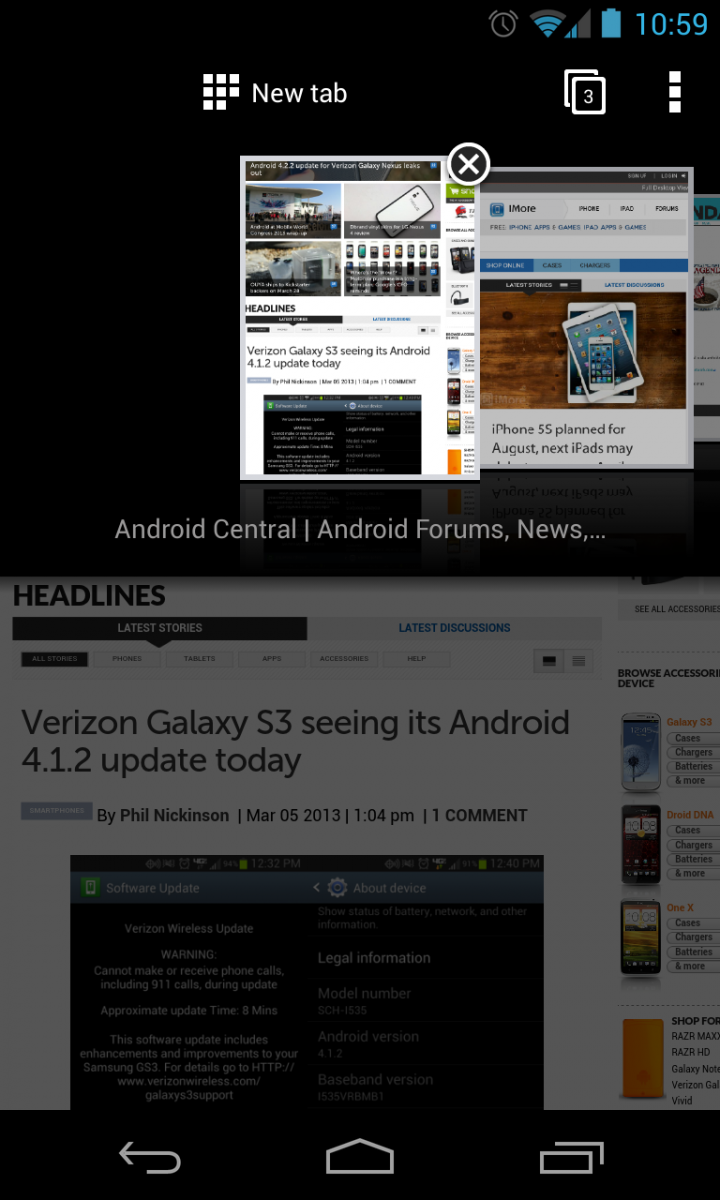
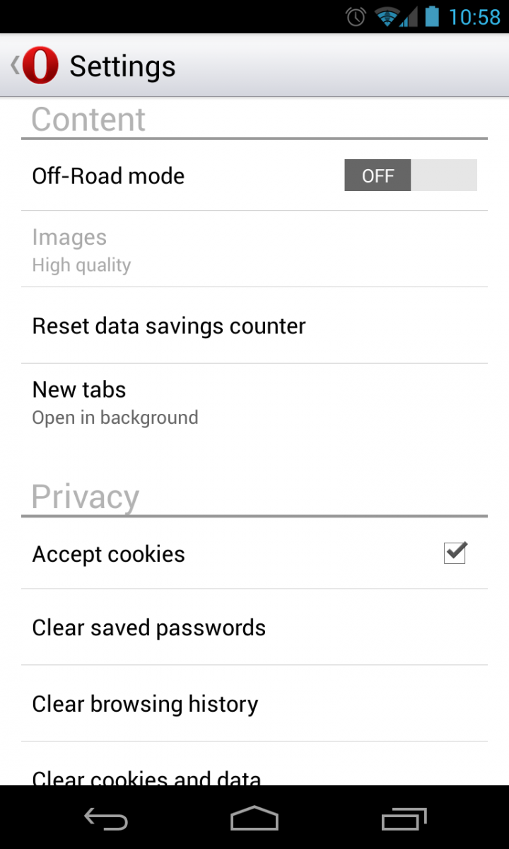
Opera beta is also incorporating Opera Link, which lets you sync your Speed Dial, History and browsing data between your phone, tablet and desktop Opera clients. This is really nice if you are an Opera user on your other desktop machines, but we know most people aren't. The fact that Chrome for Android offers (generally) seamless syncing with Chrome on the desktop means Opera just won't be an option for many people. But for those who are using Firefox, Safari or Internet Explorer on the desktop or are indifferent on syncing to your phone, this won't be an issue for you.
Be an expert in 5 minutes
Get the latest news from Android Central, your trusted companion in the world of Android
As far as first beta releases go, Opera beta is surprisingly stable and usable. Building on a WebKit engine means pages are far more likely to render properly and fit for the device you're viewing on, and also provides snappy performance. In our time using the browser on a Nexus 4, it performed just as well as Chrome Beta and even performed slightly faster in web benchmarks. Pages loaded quickly, scrolled smoothly and navigated with few hiccups. We did experience a few oddities with pages not loading or displaying a couple of graphical glitches, as well as the default page zoom and text fitting to be a touch off. But this is the initial beta release of the browser, after all, and these issues will likely be fixed soon.
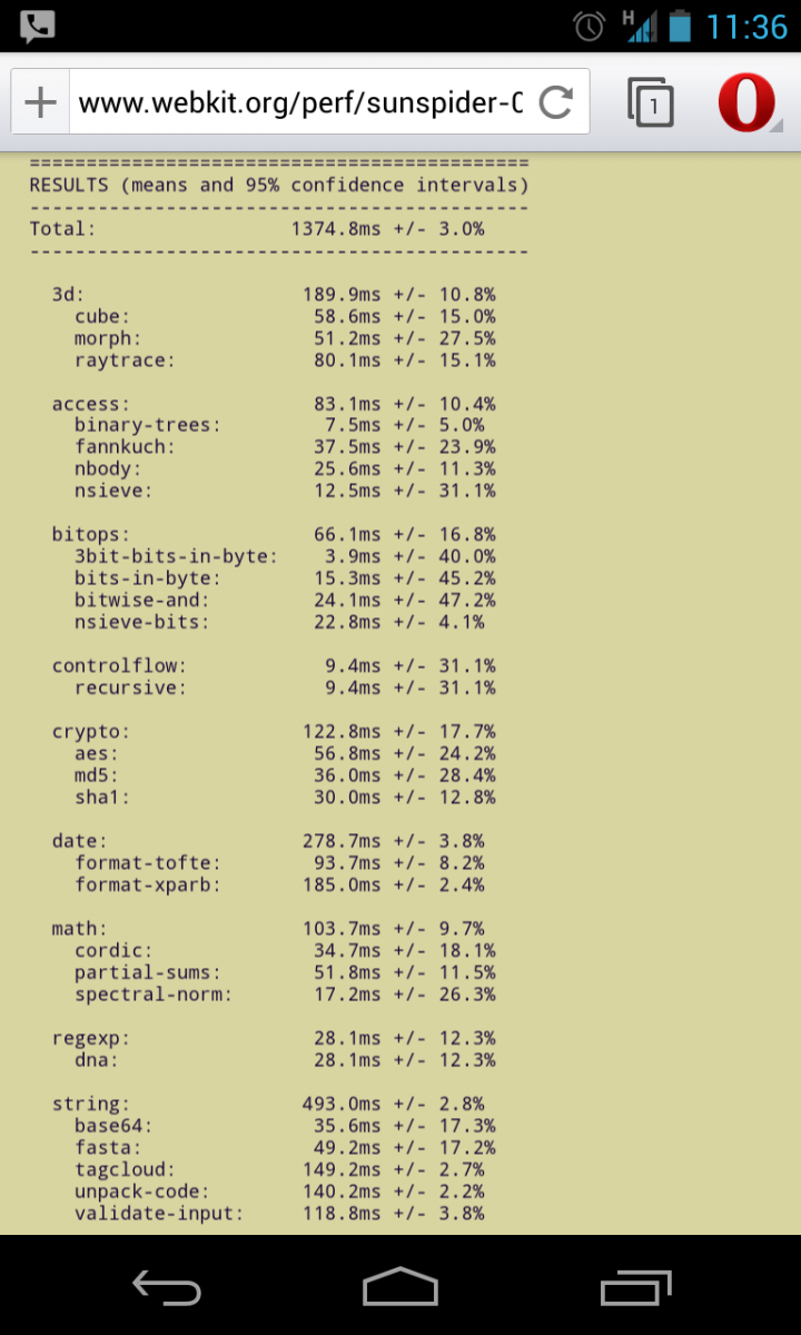
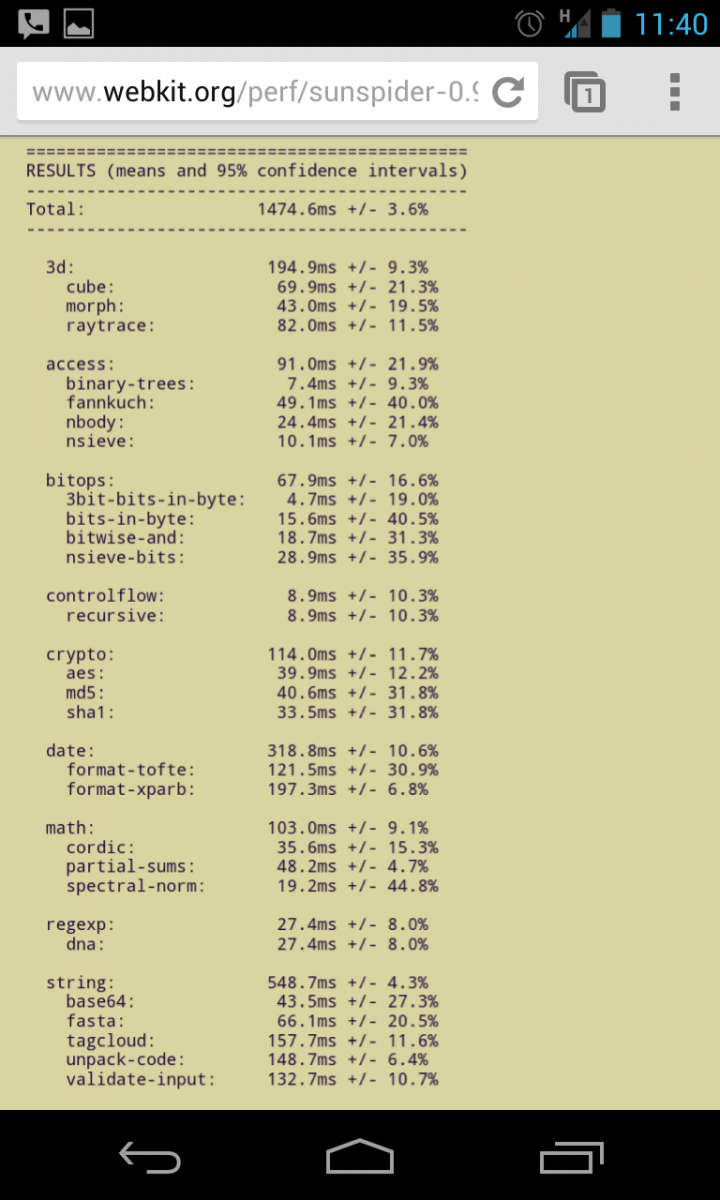
Opera has certainly made a huge stride in performance and most interestingly interface in the first release of its WebKit browser, and we've come away impressed with its offerings. If you don't live and die by Chrome sync on your mobile device, Opera is certainly worth a look. The features and design are great, and will only get better as the beta updates come along.
Andrew was an Executive Editor, U.S. at Android Central between 2012 and 2020.

