OnePlus has absolutely spoiled me: Every Android should have an 'Alert Slider'

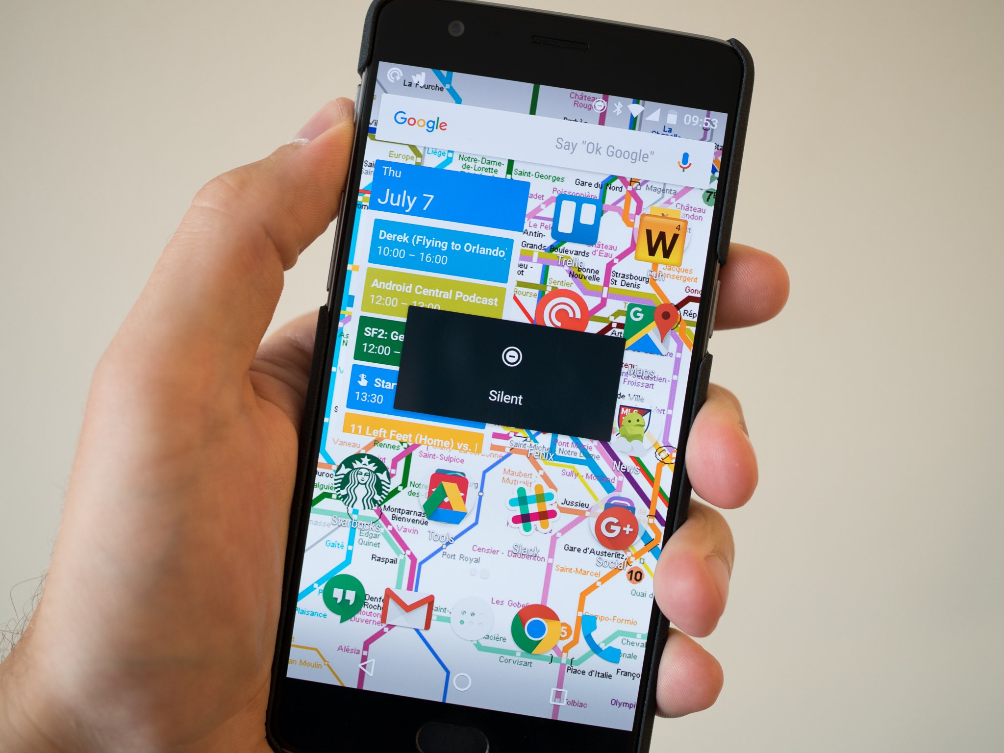
There's clearly a lot about the OnePlus 3 that impresses me. It's fantastically built, offers great performance, has a solid camera and perhaps best of all undercuts flagship competition by hundreds of dollars. And though the OnePlus 3 doesn't offer as many whiz-bang features as the competition, it does have one that no other phone has: its Alert Slider.
Yes, that little three-stage switch on the left edge of the phone that lets you quickly toggle between notification priorities. Such a simple thing, and yet no other company is doing it. As soon as I opened the box on the OnePlus 3 I was brought back to my days of joy using the Alert Slider on the OnePlus 2 — and I think that every phone should have some sort of switch like this. It should be no different than having a power or volume buttons on the side of your phone, if you ask me.

From the first moment I used Android 5.0 Lollipop's calamitous notification priority system, I wanted to have a hardware switch that coordinated with the all/priority/none paradigm of notifications. When OnePlus introduced the Alert Slider in mid-2015 with the OnePlus 2, it just felt natural. Later in the year the OnePlus X had a handful of issues, but the Alert Slider wasn't one of them.
An Alert Slider should come standard on every Android.
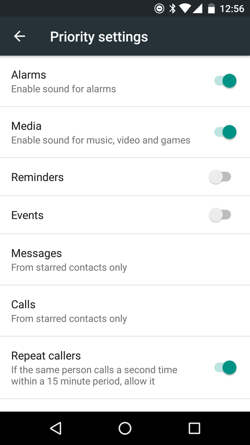
And now with Marshmallow — which has admittedly improved on the priority notification system — and a few extra software tweaks, the OnePlus 3's Alert Slider is still one of its magnificent unsung features. The simple slider lets you choose whether your phone rings for all notifications, just high-priority notifications or none at all, and a pivotal part of this is the ability to granularly control just what alerts you in each position — for example, muting the media volume when the Alert Slider is set to "none," or enabling alarms but not reminders when in "priority."


Sure you have the option of all-software features from numerous manufacturers — and Marshmallow's built-in settings work alright as well — but the ability to reach down and toggle a switch on the phone without ever turning on the screen or even looking at it is extremely reassuring. It's something that iPhone users know about and love, and OnePlus does it a step better with its three-stage key versus a simple on/off switch.
Will other Android makers turn up and launch new phones with their own take on the Alert Slider? I sure hope so, but I'm not all that confident it'll take any sort of priority. But perhaps the next time they consider doing something weird like put the volume keys on the back of the phone, or include a mostly useless physical camera shutter key ... they'll consider putting in an Alert Slider instead.
Be an expert in 5 minutes
Get the latest news from Android Central, your trusted companion in the world of Android
Andrew was an Executive Editor, U.S. at Android Central between 2012 and 2020.

