One UI 4: Top 5 things we want to see from Samsung's Android 12 update
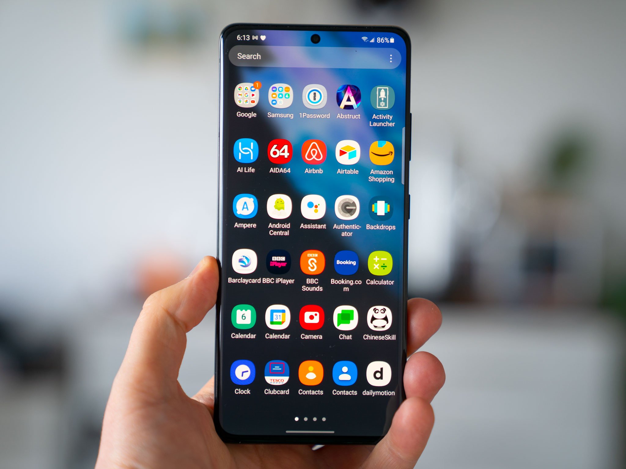
Samsung's One UI software is at the heart of many of the best Android phones out there, like the Galaxy S21 series. The company's smartphone UI has come a long way since the days of TouchWiz (a.k.a. the old, bad Samsung UI), and the current One UI version 3.1 boasts fast performance slick animations and a rich feature set.
Nevertheless, there's always room for improvement, and Samsung's position as the leading Android manufacturer in the West means that expectations are high for the upcoming One UI 4.0 update. After three years of One UI, we've rounded the top five things we want to see in the next version.
1. No more ads
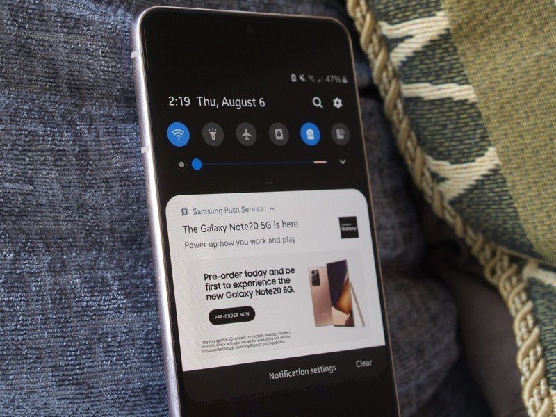
There's no excuse for unblockable push ads on a $1000+ phone.
In the U.S. in particular, Samsung phones have become notorious for aggressively pushing ads, often in the form of notifications, to its users' devices. While it is possible to turn off ads on a Samsung phone, this involves digging into the settings in multiple places, and even then some promotional messages will pop up from time to time. Even in core apps like Weather, you'll see videos surfaced from Samsung's partner, Weather.com, with no way to disable this part of the app.
Samsung's best phones sell for between $1000 and $2000 unlocked, and so it's understandable that owners feel irked by such an aggressive level of advertising on even the most expensive Galaxy phones.
With the upcoming launch of One UI 4, Samsung has the opportunity to eliminate, or at least severely cut back on this growing annoyance.
2. More helpful notifications
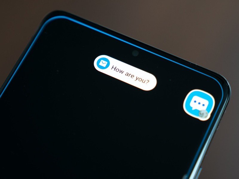
Notifications are a core part of the smartphone experience. Our phones, ultimately, are communication devices, and notifications are a big part of how we communicate. Which is why it's weird that the current version of One UI bungles notification popups pretty badly compared to other Android phones. The out-of-box configuration for pop-up alerts on a Samsung phone is "brief," meaning you'll only see the first few words of a message, without the additional buttons to mark as read or reply inline. (To do that, you'll need to find the notification in the notification shade.)
Want easy glanceable notifications? On One UI 3, you're largely out of luck.
This is easily remedied by changing the setting to "detailed," which gives you the standard-sized Android alert, buttons and all. The only problem there is you can't use the "Edge lighting" feature with detailed notifications, so it's not possible to have the full message text pop up when the screen is off. Compare that to the stock behavior on OnePlus, Pixels and most other Android phones, Samsung's approach makes it less easy to quickly glance at alerts as they come in.
Be an expert in 5 minutes
Get the latest news from Android Central, your trusted companion in the world of Android
The broader Android ecosystem is full of examples of easy glanceable notifications, whether it's via an Always-on Display feature or Pixel-style popups — and pretty much all for these work better than what's currently in One UI 3.
3. A more functional power menu
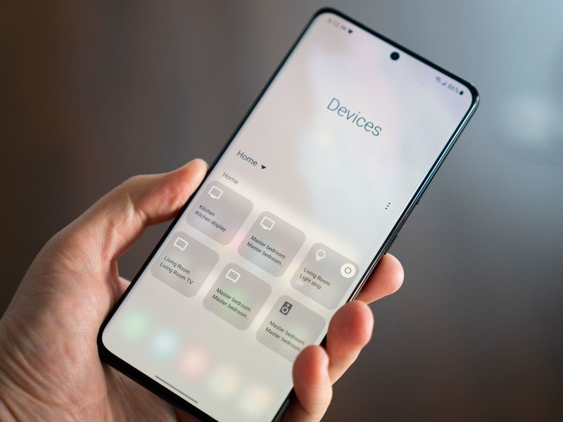
The power button (or side key, as Samsung calls it) pulls double duty on Galaxy phones, sharing functionality between the power menu and Bixby. However, Samsung is missing a trick in not including smart home controls in its power menu, as most rival manufacturers do. Instead, this stuff lives behind the "Devices" shortcut key in the notification shade, where it's harder to reach.
If you regularly use your phone to control smart bulbs, speakers or Chromecast targets, you'll probably agree that the barebones power menu offered by Samsung at the moment is a waste of prime UI real estate. Whether you're using Google Home or Samsung's own SmartThings ecosystem, there's definitely more that can be done with the One UI power menu, and we'd hope to see it expanded in the next version of the software.
4. Vertical scrolling app drawer
One UI was originally built to split the screen into a display area and an interaction area. Samsung recognized that phones were getting bigger, and most people could only comfortably reach the bottom half of the screen. As such, apps and menus were redesigned with new scrolling behavior to make it easier to reach the top of lists, and relocate important controls closer to the bottom of the screen.
But one notable area where One UI is stuck in the past is its app drawer. On the current version, it scrolls horizontally, meaning some apps are perpetually stuck at the top of the screen. Most other Android phones avoid this issue by scrolling vertically, so most apps are easily reachable. The same goes for the app search bar at the top of the app drawer — reaching these with one hand on a larger phone like the Galaxy S21 Ultra is almost impossible.
Not everyone uses the app drawer. But for those that do, and for the sake of usability, Samsung should consider redesigning this part of its launcher in One UI 4.
5. A more useful Recents menu
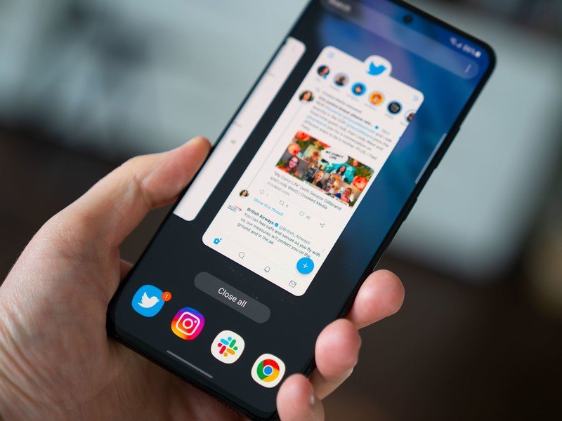
As of Android 12, Google includes plenty of extra features in the recent apps menu, including screenshots, direct text selection translate and Google Lens. By comparison, Samsung's is relatively barebones, offering only a selection of four predictive app shortcuts at the bottom of the screen. With more manufacturers like Oppo building direct translation and Lens into their versions of Android, it's time for Samsung to follow suit.
A redesigned Recents menu could also let Samsung highlight its pretty great windowed and split-screen modes, most of which are hidden behind yet another layer of menus on the Recent apps page.
Samsung One UI 4.0, coming soon
Samsung's One UI 4.0 is likely to break cover this fall, bringing with it the Android 12 platform update. If previous years are any indication, we could see beta versions of the new software available as early as September or October. We'll be crossing our fingers for these new features in the next version of One UI. In the meantime, be sure to share your own hopes for the next-gen Galaxy UI down in the comments.
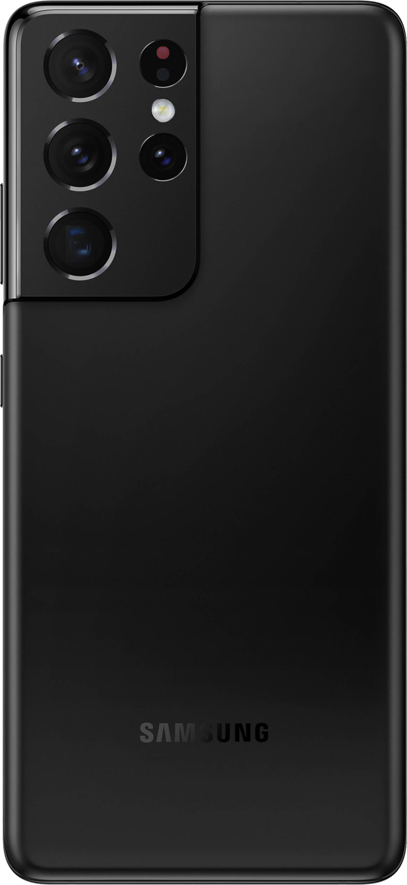
Samsung Galaxy S21 Ultra
The Samsung Galaxy S21 Ultra is the best phone you can buy right now, and will be one of the first devices to get Android 12 / One UI 4.0 when it launches.

Alex was with Android Central for over a decade, producing written and video content for the site, and served as global Executive Editor from 2016 to 2022.
