Nova Launcher 7 has been completely rewritten — here's what's new
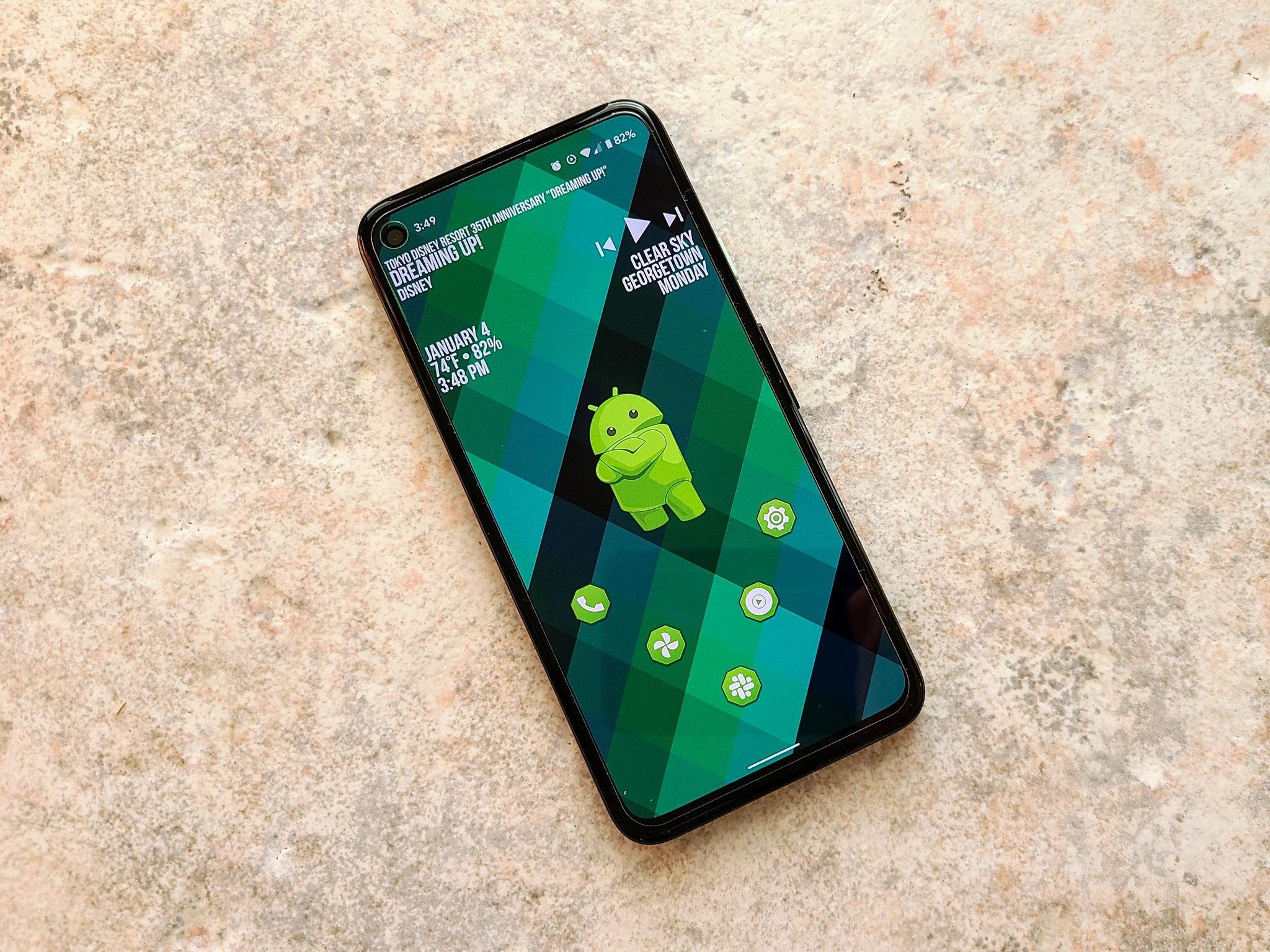
Nova Launcher remains one of the most popular and prevalent Android Launchers around, and while it's certainly feature-packed, that also means the launcher was getting kinda big and bloated, which is when its time to make a drastic change and trim things up. What's driving that change this time is Nova rewriting itself around Launcher3 rather than the deprecated Launcher2, a change that has been needed for a couple of years now.
This is a big update and it's not quite ready for the whole world yet — that's why it's starting with a beta test through the Nova Launcher Discord channel — but it's in pretty good shape so far from my experience with the beta. Most Nova features are staying the same or improving with the switchover from the Launcher2 base to Launcher3, but there are a few features that are going away when this update pushes out to the stable channel. There's no ETA on when that might be, but I'd wager it's at least a month away.
If you prefer your changes shorthand, here's the changelog so far for the Nova 7 beta:
- Radial folder icon layouts
- Vertical paginated folder scrolling
- Swipe Down action on icons (requires Prime)
- Search bar and Tab Bar in drawer can be placed at the bottom
- More Nova search window and bar options
- Save APK popup menu action
- Improved handling of reshaping icons in themes
- Option to disable haptic feedback on expand notifications swipe
- So, so, so, so, so, so, so, so many bug fixes
A new feature that seems small but could make a big impact is the ability to set different apps/shortcuts for when you swipe down from a home screen app instead of just when you swipe up. For instance, you could set the swipe up from your Phone app to bring up Google Meet for your morning video call instead and a swipe down to direct-dial your mom.
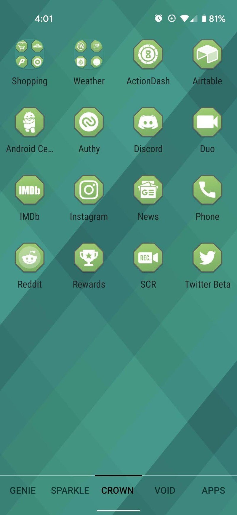
One area where we're seeing a lot of changes is the app drawer, and it starts with the elimination of horizontally-paged app drawers, at least in part. You can still use app drawer tabs and swipe through them horizontally, but each tab is now a vertically-scrolling list or grid rather than static pages you could flip through. For most, this isn't a big deal, but if you have your app drawer tab-sorted by category, rest assured you can still use your tabs, and now you can even set the tab carousel at the bottom rather than the top, making it easier to use on taller phones.

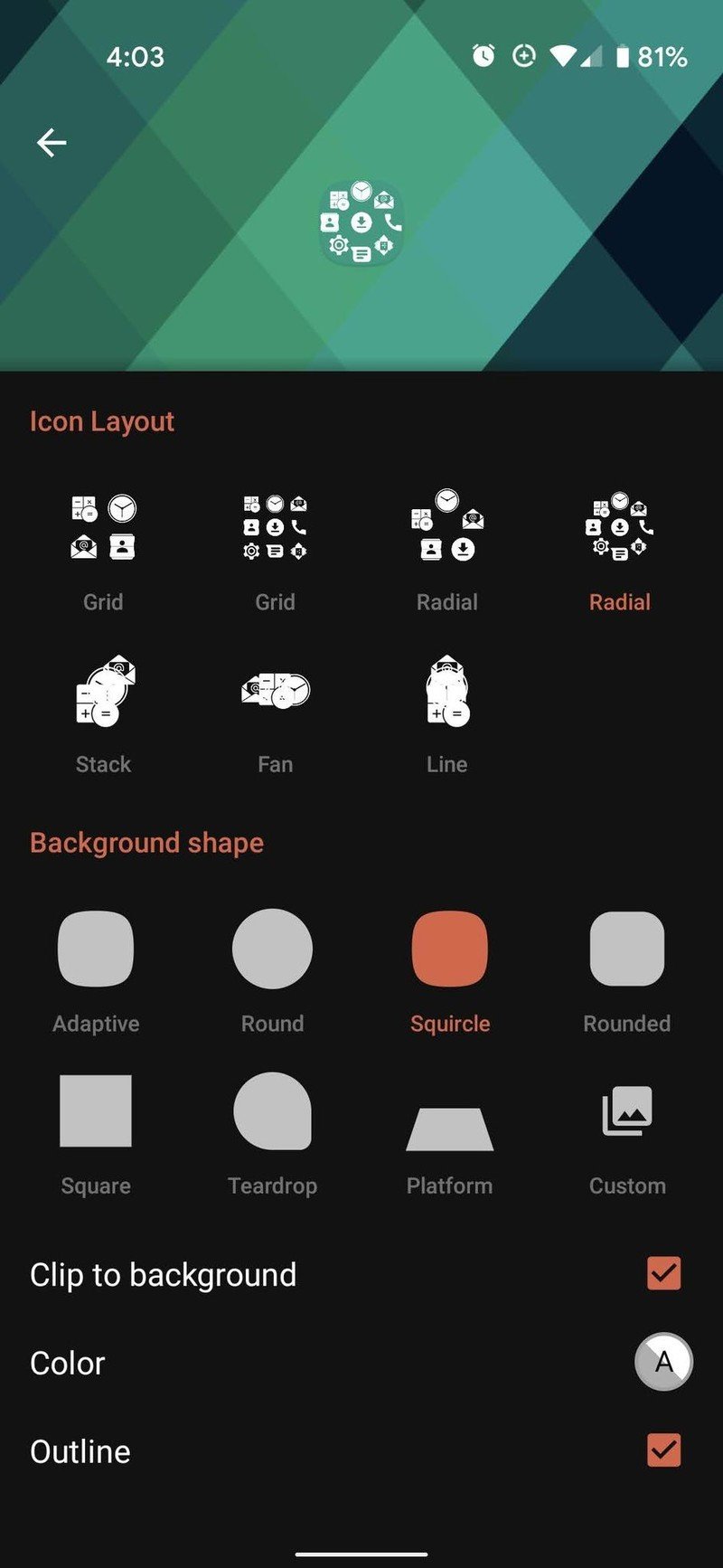
Source: Android Central
There are similar options for the search bar in the app drawer as well, and folders are getting new tweaks as well in both look and feel. I'm hopeful that more changes will come as Nova 7 makes its way towards a stable release — please, we need a central theming menu so I don't have to change colors in ten different places when I swap themes — but the changes we're seeing so far are very encouraging.
Be an expert in 5 minutes
Get the latest news from Android Central, your trusted companion in the world of Android
The new year is a great time to mix things up and try your hand at some theming and customization, and if you want to start that journey with a new launcher it's hard to beat Nova Launcher. After all, there's nothing that makes an old phone feel like a shiny new phone quite like a new launcher and home screen theme.
Ara Wagoner was a staff writer at Android Central. She themes phones and pokes YouTube Music with a stick. When she's not writing about cases, Chromebooks, or customization, she's wandering around Walt Disney World. If you see her without headphones, RUN. You can follow her on Twitter at @arawagco.
