Notification Weather: an elegant way to check the forecast
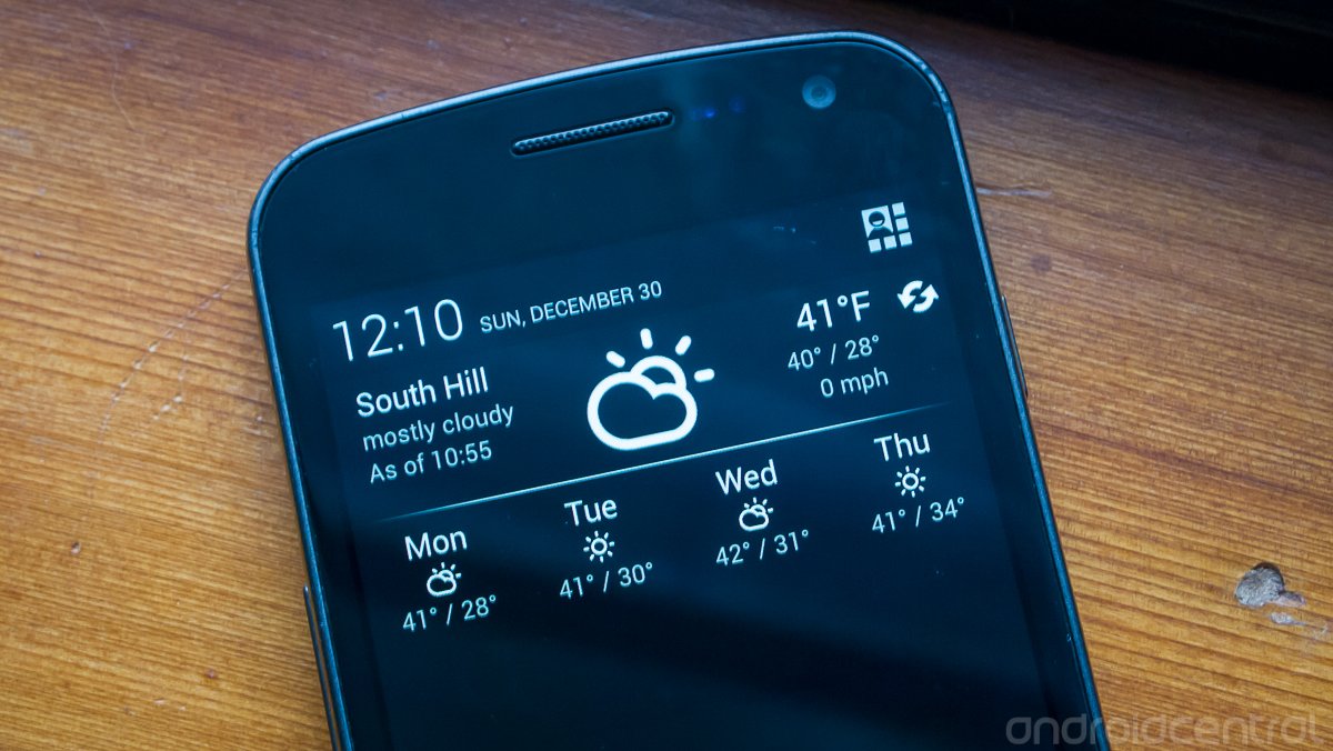
The release of Android 4.1 and 4.2 Jelly Bean brought several improvements to the handling and functionality of notifications. With expandable, actionable and prioritized notifications, developers can manage their apps and take control of what goes on when a notification is presented to the user. Notification Weather, as the name implies, takes advantage of the new notification options in Jelly Bean to elegantly present the weather to you when you drop down the pane.
It seems like everyone's got a favorite weather app loaded on their device already, so does Notification Weather have what it takes to become your new favorite? Read on past the break and see what this one has to offer.
Let's get this out of the way from the start: Notification Weather is only available to users with devices running Android 4.1 and above. At first glance that's a bit of a let down considering the vast majority of users are still on 4.0 and below (mostly 2.3 still,) which means the potential audience for this app is severely diminished.
This isn't just an arbitrary restriction though -- this app really gains its appeal by working with the latest in Jelly Bean features and just wouldn't give the same impression to a user on Gingerbread.
Look and feel
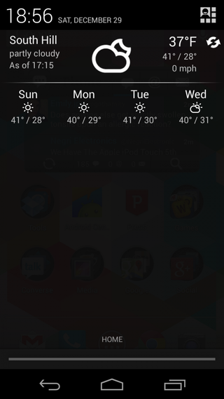
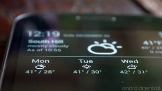
The design of Notification Weather is most certainly focused to fit in with the Jelly Bean aesthetic. The stark, white on black and minimalist layout fits perfectly in the notification bar of a stock Android 4.2 device -- in this case my Galaxy Nexus -- as if it was part of the stock software. The weather display is simple but barely configurable, split into two rows. The top shows your current location, the last data sync time, a nice weather icon and the current temperature, high/low forecast and wind speed. The refresh button on the right... refreshes. The bottom is a 4-day forecast with the same icon and high/low temperature layout.
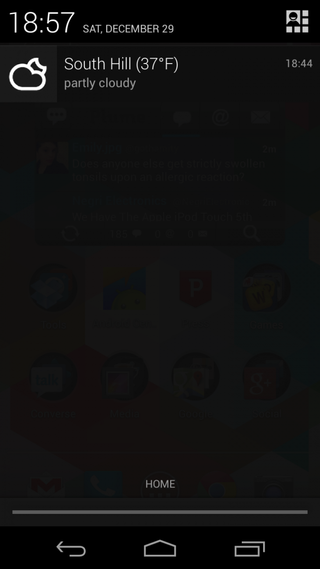
The app has a fully expanded notification (left screenshot above) by default, a new feature as part of Jelly Bean, but can also be collapsed to show just a small version of the same information. The smaller notification (right screenshot above) shows just the icon on the left side with your location, temperature and description of the weather next to it. It's good to see both types of notifications offer you a good set of information. This is basically everything you'd be getting out of any regular weather app or widget, but now it's pinned in your notification bar.
The fact that the notification fits so nicely in with every other system app and notification on a stock Jelly Bean device is what makes this app usable for me. If it stood out more, was overly flashy or busy I wouldn't find it useful enough to have it take up the room of 1 or 2 notifications at all time. Because it's so simple, you can easily ignore it and get to your other notifications if you want to.
Be an expert in 5 minutes
Get the latest news from Android Central, your trusted companion in the world of Android
Settings and features
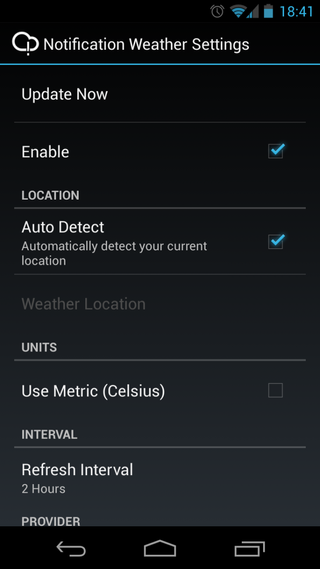
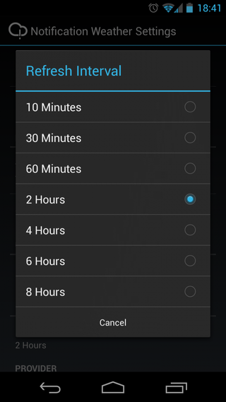
When opening the app from its icon in the app drawer, you're taken directly into the settings menu. There's no way to access the weather the app provides other than from the notification pane -- settings is all you get. The settings are simple, again following holo design perfectly, with everything you'd want or expect in a basic weather app. You can simply enable or disable the notification's display, have your location auto-detected or set one manually and choose either Celsius or Fahrenheit for the temperature. For a data refresh interval you get a wide range -- from 10 minutes to 8 hours -- to choose from, although a conservative 2 hours is set as default.
There are three different weather data providers to choose from -- Yahoo! Weather, Open Weather Map and World Weather Online are your only choices at the moment. Open Weather Map is a good one to see represented, as it often has data available for some of the smaller towns and cities that many of the big providers skip over. It would be nice to see more options available, but there are likely licensing and API call limit problems to deal with that keep the list limited.
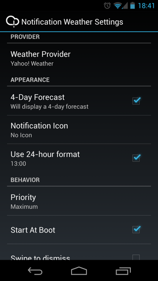
You can choose whether or not to display the full 4-day forecast under the current weather (which would turn it into a single-high notification,) although I'd be surprised if you didn't keep it displayed. The app respects the system setting for 12- or 24-hour clock display by default, but you can toggle it to change if you prefer. By default the app will start on device boot, but you can turn this setting off as well -- a little nod to the power users that like to manage their auto-starting processes.
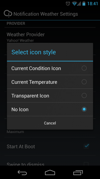
The most interesting -- and mildly confusing -- settings of the whole lot have to do with the notification icon and the notification priority. In the former, you can set it to display an icon of the current weather condition, the current temperature, a transparent icon or no icon whatsoever. For the latter, you can select from a range -- maximum, high, normal, low, minimum -- of priorities that control how high up the notification pane the weather should appear. For example, "Maximum" will keep the weather pegged at the top, and "Minimum" will let it be pushed down by a newer notification. It reminds me of the settings in Google Now, which let you choose whether to make certain cards display notifications and at what priority level. When setting the app to display no icon it overrides the priority setting you chose, which leads me to believe there's no simple way in Android to turn off a notification icon without changing the priority it reports to the system. Similar apps that need to remove the icon often require root in my experience.
That being said, there seems to be some discrepancy between the way the Galaxy Nexus and Nexus 4 -- both running Android 4.2 -- handle the priorities. Between our resident neckbeard Jerry Hildenbrand and I, our devices are acting differently. When using the "No Icon" setting, my weather is being pushed down as a low priority notification. Jerry and the Nexus 4 are seeing the weather stay up top. We're not sure what the differences are, but it's definitely something to note. If you plan on keeping the notification and "Maximum" priority, it should act the same regardless of device.
The verdict
If you've got a device running Android 4.1 or higher -- especially a Nexus with the stock variety -- and you're already using a notification weather app, there's no reason not to spend the $1.02 and take this one for a test drive. For anyone who's not been interested in other weather apps because of their off-putting design that clashes with the stock Android look-and-feel, Notification Weather may be worth a look to see if you can live with it.
There are some issues, such as limited settings and questionable weirdness with notification priorities, but there's nothing here that is big enough of an issue as to detract from the overall great design of this app. If you're still on the fence, at least give the free version (with fewer settings) a try and if you like it, toss the developer a dollar for their great work. Notification Weather is a great example of how developers should be keeping up with the latest in Android design.
Andrew was an Executive Editor, U.S. at Android Central between 2012 and 2020.
