Nokia Review -- Smartphone Round Robin
Nokia. The invisible giant. The king of kings. It's the elephant, if you will. And yes, it's the world's most popular smartphone platform. It's true, even with little to no footprint in the US, Nokia has managed to become wildly successful, landing atop the world smartphone marketshare with a ton of room to spare. Any way you spin it, the world we live in is simply dominated by Nokia smartphones.
How? Well, making awesome phones for one. But they've also been invested in the smartphone market for quite some time and have done an incredible job around the world. Here in the US? We hardly think of smartphone when we hear Nokia--in fact, I think of my first cell phone. I think of playing snake with those gelly buttons. I don't think Linux. I don't think open source. I don't think of awesome phones. Nokia is all about that. And that's what we're taking a look at.
It's going to be an interesting ride because this is our very first time using a Nokia smartphone, in fact, it's the first time we ever included Nokia in the Smartphone Round Robin.
Read on for the full review of Nokia from an Android perspective!
Nokia?
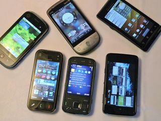
First things first, the common smartphone user here in the United States of America will have a hard time finding an 'affordable' Nokia smartphone. There's a few you can get subsidized from a carrier (E71, which I hear is awesome) but for the most part, the 'flagship' type devices from Nokia are only available unlocked, meaning it costs nearly $500 a pop. So yeah, unless you're a die hard Nokia user, you're probably not going to get a Nokia device anytime soon. For some odd reason, Nokia hasn't built the relationships with US carriers to get subsidized. So if you want to buy a Nokia device in the US, you're going to plop down A LOT of money. It's just the way America spins for Nokia for now.
And off the bat, you get a foreign feel from Nokia. Not only because it's foreign (it is) but because you don't run into Nokia devices enough on a daily basis to get to know it, it's completely unfamiliar. Let's face it, if you're reading this site, you're probably comfortable enough with most of the smartphone platforms enough to identify something with it: iPhone has apps. Blackberry has email. webOS has multitasking. Android has Google. Windows Mobile has, what does Windows Mobile have? (we kid). Even with our knowledge of smartphones, we can't think of an 'identifying' feature for Nokia.
And it gets a wee bit more complicated because Nokia now has two smartphone platforms. One is Symbian S60, which powers the N97 Mini, it's their traditional smartphone platform and the other is the Maemo platform, which powers the N900, and is their 'newer' platform. From the looks of it, they're both going to be around, and from our time with it, they're both ridiculously powerful in their own ways. We like Maemo a lot more than we do S60, but there are definitely features we enjoy on both.
Get the top Black Friday deals right in your inbox: Sign up now!
Receive the hottest deals and product recommendations alongside the biggest tech news from the Android Central team straight to your inbox!
So yes, in this Round Robin we're going to focus on two Nokia smartphones. The N97 Mini (which is the smaller device) and the N900 (which is the huge one). Up to speed? Good.
Hardware
The overall hardware of the two Nokia devices, the N97 mini and N900, are familiar yet uniquely distinct from your typical US-bound smartphone. There's no doubt that it's Nokia, meaning there's no doubt that these devices aren't made by HTC, Motorola, etc, it's unmistakably different.
There's an odd button arrangement (what's up with that diagonal button), the keyboard is strikingly different from most smartphones (there's a ctrl key, space is shifted to the right side, etc), and even though the form factors are in line with what we're used to, the overall shape veers from the normal course of smartphones. That's not to say it's bad, it's just different. The hardware is still stellar and Nokia absolutely knows how to build phones. We personally prefer HTC & Motorola designs but the build quality of Nokia devices are so rock solid it helps their case.
Let's take a closer look.
N97 Mini
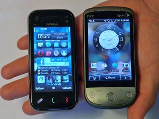
It's a slider device that's skinny, not in thinness but in width. Okay, skinny isn't the right word. The N97 Mini is a narrow device (that's better). In fact, we think you'd be hard pressed to find a 'narrower' horizontal slider device. The narrowness of it is a big plus when using the phone in portrait mode because it's just so easy to hold--even though it's a 'big touchscreen', it still manages to give off a phone-esque shape. With Android you have to grow use to the added width but with these Nokia devices, the size is much more natural and basically feels 'just right'.
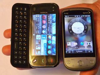
But then again, the narrowness of the device only leaves room for a slide out 3-row keyboard that's not bad, but not great either. With only 3-rows to work with, the space bar is shifted over to the right and the button layout seems closer to the top edge of the keyboard (bottom edge of the screen). It's a nuisance to say the least, but we're sure you could learn to live with it in time.
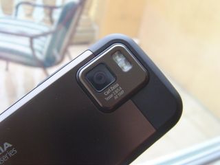
The N97 Mini packs a resistive screen but it's actually an okay enough resistive screen. No stylus comes with the N97 Mini and surprisingly, it's not really necessary. The camera is ah-mazing, typical of Nokia it comes with Carl Zeiss lens. If we can take one thing and one thing only from Nokia, it'd definitely be the awesome camera. It takes pictures in the sun, in the dark, at night, in a room, as good as your typical point & shoot.
N900
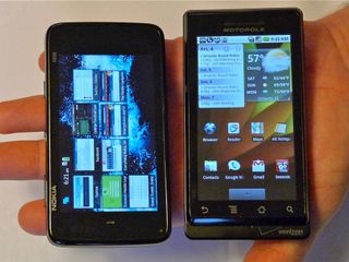
In short, it's a monster. Beastly. Behemoth. Big. Bold. Ballsy. Anyway you spin it, the N900 is large and undoubtedly, in charge. It's thick, has heft, and an extremely large footprint for a phone, if you can even call it that. Trust me, that picture above doesn't give it any justice. You can liken the N900 more to a netbook or MID than a smartphone. Specs are also awesome, it has a 800x480 resistive touchscreen, ARM Cortex A8 processor, 32GB of storage, Wi-Fi, Bluetooth, 5 megapixel camera, pretty much the works.
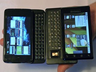
Unfortunately, even with a device with that footprint, the N900 packs the same 3-row keyboard as the N97 Mini (ctrl key, right side space bar, etc). We assumed that with such a large device, that we'd see something more similar to the Touch Pro 2 keyboard than the N97 Mini. Even more surprising, the keyboard on the N900 is actually not as good as the N97 Mini. The buttons line up right next to each other with no space between them. For comparisons sake, think of the N900 keyboard like the Droid's and the N97 Mini keyboard like the G1's.
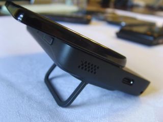
There's a cute little kickstand for the N900 and we're sure we'd use it plenty if the N900 was our daily driver. The N900 has so much heft, it's sometimes better to use on a desk. We're only half kidding. It too has a resistive touchscreen, but the N900 actually comes with a stylus. We still didn't bother using the stylus because the touchscreen was decent enough. Matt Miller of NokiaExperts tells me that Nokia will start bringing in capacitive screens in 2010.
If you want to learn more about the N900, head over to NokiaExperts where our good friend Matt Miller wrote an excellent guide.
Software
S60 (N97 Mini)
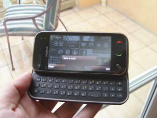
We're not sure if we love it, but that might be because it's just so foreign to us, but it takes a lot more time to learn to like S60 than any other platform in the Smartphone Round Robin. Which is surprising because S60 does manage to hit some of our 'required' smartphone features: there's a homescreen experience, there's widgets, and there's some sick customization. But for some odd reason, S60 just seems so dated (especially in comparison to Maemo).
The homescreen only consists of one page, and that's the only page where you can place widgets. It uses the page intelligently, doubling as both a place for a 'Today' screen and for widgets but we'd sure love to have the 5 pages of Android. The customization is really awesome though, you can easily create folders for what you want, arrange icons however you want, and basically make the phone uniquely yours.
The N97 Mini also multitasks (what self respecting smartphone doesn't these days =P) but because it comes with so little RAM, it doesn't multitask extremely well. If you have too many things open, the experience becomes sluggish and nearly unusable. Also, there's definitely weird quirks here and there, some of it is because I'm not schooled in Nokia's philosophies but mostly because it just isn't as streamline as more 'modern' OS's. To be brutally honest, S60 seems dated and even though we know it's fully capable of mostly anything you throw at it, it has a 'featurephone' feel to it. Maybe it's just because we're faulting it for the lack of one killer feature, but on the surface, S60 just doesn't blow you away enough.
Maemo (N900)
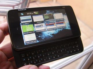
This is undoubtedly Nokia's future. S60 might be responsible for all of Nokia's success in the world but Maemo is what will carry Nokia into the new decade. Maemo is much 'prettier' than S60 and definitely more modern. The UI is almost beautiful, not quite webOS or iPhone elegant but certainly comparable to our very own Android (pre 2.1). Maemo isn't quite ready for the prime time (it doesn't have the customization capabilities like S60), to be truthful, using Maemo kind of feels undercooked. We're absolutely certain that in the future, Maemo will be a force to be reckoned with but as it stands now, it's just not ready for common consumer usage.
And like S60, Maemo has its own quirky nature. It might be by choice, but the N900 is intended strictly for landscape use. In fact, the only way to use the N900 in portrait mode is to make calls, everything else is designed for two-handed, horizontal mode use. The browser has this cute 'swirl-to-zoom' which allows you to basically swirl your finger on the screen and it'll zoom in, it's crazy crazy but also kind of crazy cool.
But the browser, oh the browser, is wonderful. Instead of using a typical WebKit based browser like Android, the iPhone, and webOS, it's based off Mozilla (like Firefox) and it can pretty much handle any site you throw at it. Flash works wonderfully and it's really magic. It's easily, easily the most powerful browser on a mobile platform.
In the end though, Maemo almost, sort of seems like a proof-of-concept. Okay it's a little better than that but it's Nokia re-affirming their users that they too can potentially build a powerful OS that is both modern and usable. It's not something I would want to use daily right now but it's something I definitely want to keep my eye on for the future.
Thoughts on Nokia in the US
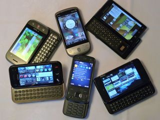
Nokia is different, but we didn't even have to tell you that, right? They use words like Symbian, Ovi (their store), Maemo, have weird naming patterns for their phones and even have the gall to offer two smartphone platforms, one that seems to be reaching it's end and another that's not exactly ready. But there's some differences that are actually worthwhile, their keyboard is most like a desktop keyboard with directional arrows and a control key so it's rather natural to use, their phones can basically do whatever you want however you want, and the build quality is as good as it gets. But I guess it doesn't matter if Nokia is different, one smartphone platform is different from another, you can eventually learn the ins and outs of Nokia as you can any other.
But I guess the bigger issue is, does Nokia care about the American market? Because Nokia is firmly entrenched at the top of the world smartphone market, it doesn't necessarily need to make a lionhearted effort in the US. Nokia's competitors? Android, Apple and probably most of all, Palm absolutely need the US market to survive. They can't deliver undercooked or half-baked platforms and ideas to the market because they'll immediately lose marketshare. Being in front, Nokia has the benefit of time on their side. But the competitors are catching up, offering platforms that give the pure excellence of experience. If Nokia doesn't react quick enough, the ol' elephant might just get passed up by hungrier companies.
And aside from Windows Mobile, Nokia is in the weirdest spot for a smartphone platform. Because if Nokia is serious about making a dent in the US market, the dated S60 won't do and the undercooked Maemo needs some more time in the oven. We're not sure how well this one foot in the past, one step into the future will work out.
Final Thoughts
I said this about Windows Mobile last year, but it applies even more so to Nokia now. I apologize for being crude but I sucked as a Nokia user the first time I used it, I sucked less as I used it more, and given a little more time with it, I might not even suck at all. Both Nokia platforms are intimidating, unfamiliar, complex, and any other synonym for difficult. In fact, I still feel like there's still much to learn. But both Nokia platforms are so feature rich, powerful, and unique that it can be fun to use. It's almost a shame that it's not readily available to the US.
But finally, the difference between the two plaftorms is that I don't want to learn S60, but I wouldn't mind spending more time with a Maemo device, it can be that good. The browser is just so full featured, the device is so powerful that it's just so easy to forget it's a phone. I'm definitely excited to see if Nokia will allow Maemo to grow.
