Nobex Radio review - a BlackBerry port with its work cut out

Earlier this summer Nobex Radio made its way onto Android after establishing itself as pretty much the only radio streaming application for BlackBerry. For the low, low price of free, users had access to thousands of traditional radio stations through a categorized, searchable database. No matter what the station, Nobex provided a listing of the songs that have been played recently, allowing you to look back and share particularly good tunes that come up. For $3.99/month, users can get in on the premium service, which provides access to stations outside your country, skips pre-roll audio ads, and a handful of other features.
Style

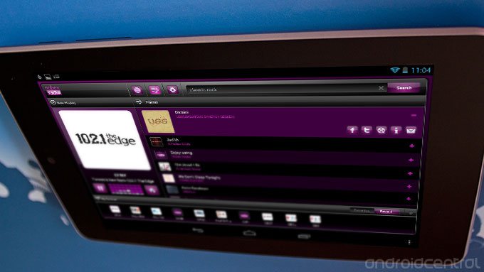
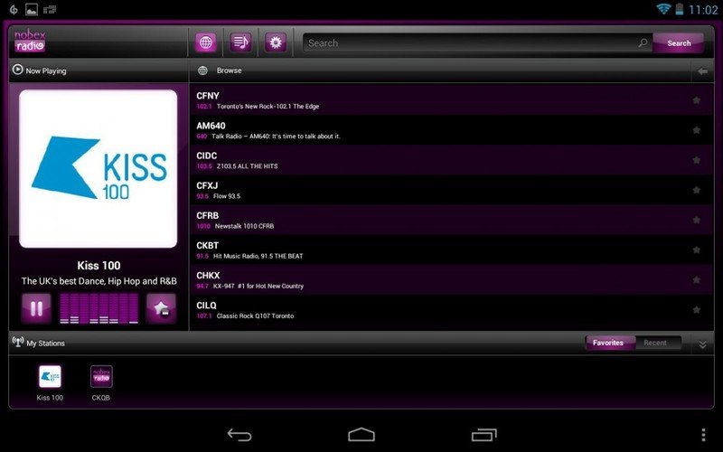
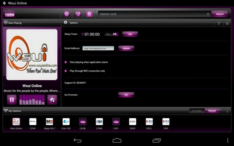
Nobex’s user interface is still suffering some growing pains in its move from the PlayBook. Both the tablet and smartphone versions of the app have a significant lags in responsiveness and a general lack of Android-friendly design. The layout is still sensible enough, and the purple color scheme sets a very groovy mood, though the bouncing audio bars that are little more than a looped animation don’t feel particularly necessary.
Function

The quality of the audio playback is really good and easily on par with anything I would be enjoying with another service. Of course, after living with digital streaming services for awhile, it’s a little weird going back to radio, complete with segments interspersed with chatty DJs, obnoxious ads, and call sign sound bytes with goofy sound effects.
You can share songs out to Facebook or Twitter, though the app boots you out to the browser. There’s no tie-in with the system-wide share menu, and the only e-mail link sends details of a track to the address you registered with. Other links kick you out to YouTube for a search for the track, and another goes to last.fm for artist biographical information.
One of the things that really bugs me about the whole track identification system is that for some stations it only kicks in once the song’s over. This means that any album art showing on the main screen is for the last song, which is confusing and not particularly helpful. The spot Nobex takes in the notifications area only shows the current station, but it would be great to see that what’s playing from there and maybe some playback controls. Speaking of which...
Nobex Radio is significantly hurting for playback control options. In-line headphone controls don’t work, there’s no home screen widget, and no lock screen controls. The notification area only shows For any music app, these are essential. Even for a free app, missing a lack of convenient controls can be a dealbreaker.
Pros
- Lots of selection
- Free
Cons
- Interface lags
- Clunky usability
Bottom line
Free, streaming music is hard to complain about, but after getting acclimatized to standard digital music streaming services like Rdio, Slacker, and Songza, an app that showcases traditional radio feels just a little anachronistic. Besides, there are plenty of interface and usability issues that need to be worked on before Nobex is any kind of ideal music experience on Android. At the very least the audio quality is solid and there’s a good selection available.
Be an expert in 5 minutes
Get the latest news from Android Central, your trusted companion in the world of Android

