Nexus 6 ROM port gives a closer look at Lollipop features and apps
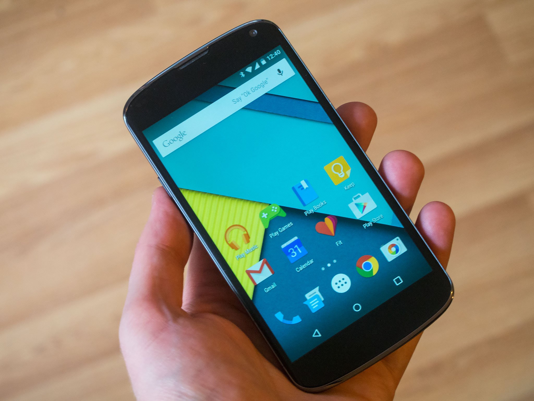
Leaked firmware reveals new Gmail, Calendar and Messenger apps, along with a few surprises ...
The most recent Android 5.0 developer preview gave is a pretty good idea of what to expect from Lollipop when it officially launches. But not every feature from the Nexus 6 and Nexus 9 can be found in the current developer build, and what's more the updated Material Design Google apps are also MIA.
In recent days, however, a new custom ROM ported from the Nexus 6 has shed some light on Lollipop in a more final form, complete with new Google apps, an updated Messenger app, the long-awaited Google Fit app and a handful of other surprises.
Read on for a closer look.
First up, a pretty big caveat: What we're seeing here comes from a custom ROM created by sykopompos over on xda-developers. It incorporates pre-release versions of several Google apps because parts of it are taken from a Nexus 6 build leaked to the ROM-maker by an anonymous source. So with that said, bear in mind that what you see here may well change in the weeks before we see Lollipop on shipping devices. We're running the ROM on the Nexus 4.
Home screens and launcher
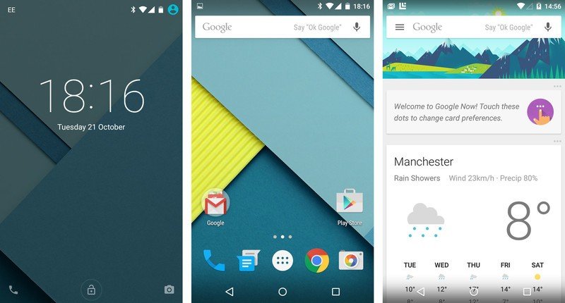
This build runs the Google Now Launcher, just like the current Lollipop preview for the Nexus 5 — Google apps front and center, a somewhat tweaked Google Now over on the left. The only major difference here is the new icon designs for some of the applications.
Ambient Display
Be an expert in 5 minutes
Get the latest news from Android Central, your trusted companion in the world of Android
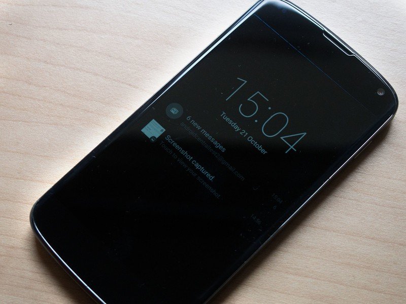
The Nexus 6's Ambient Display feature, mentioned in passing in the Play Store listing for the device, can be found under Settings > Display. When enabled, it wakes the display briefly when a notification arrives, or when the phone is picked up. From there, you can tap the display to go to the regular lock screen. Since the Nexus 4 lacks the required motion coprocessors though, Ambient Display only works when notifications first arrive. The obvious comparison here is Motorola's Moto Display — formerly Active Display — which serves a similar function on the Moto X.
Gmail
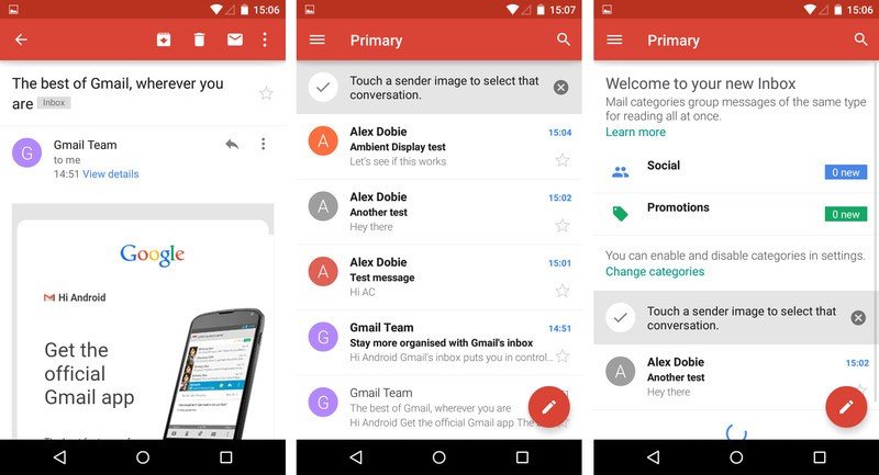
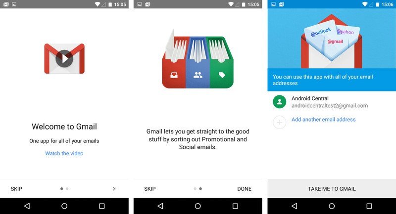
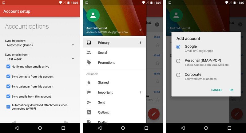
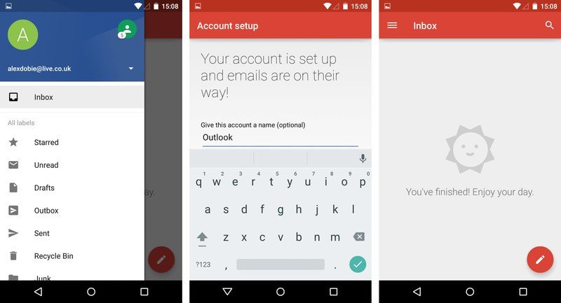
The long-awaited (and perhaps long-overdue) redesign of Gmail brings a new icon and a Material redesign — the app's looking a lot more red these days — along with IMAP support. (Starting the app up for the first time will walk you through Gmail's new IMAP tricks.) The Compose button has been moved to a floating red icon, but beyond that the app functions much as before. Swipe in from the left to view the navigation pane, from which you can switch accounts or hop between folders.
Google Calendar
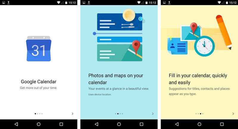
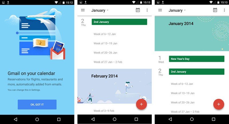
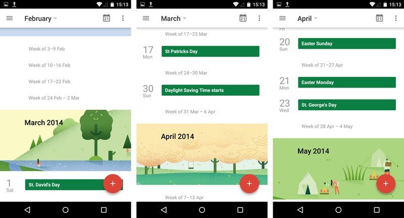
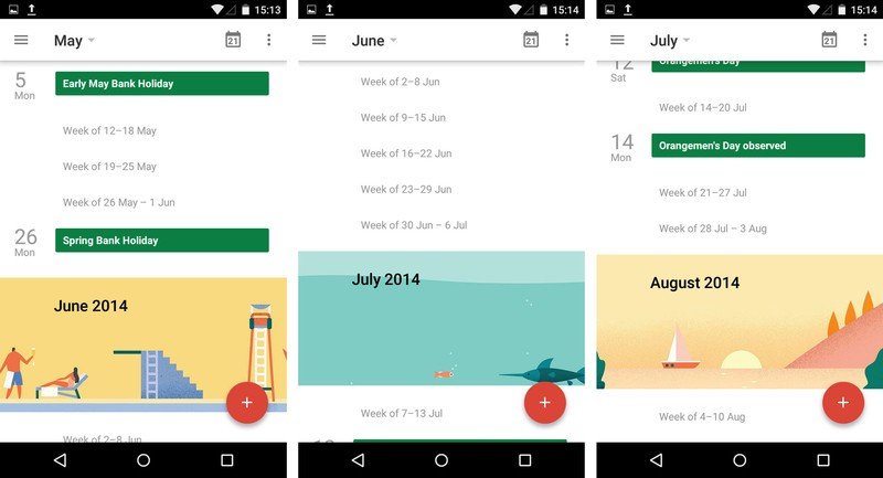
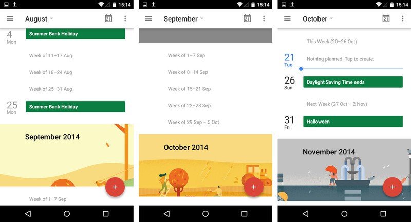
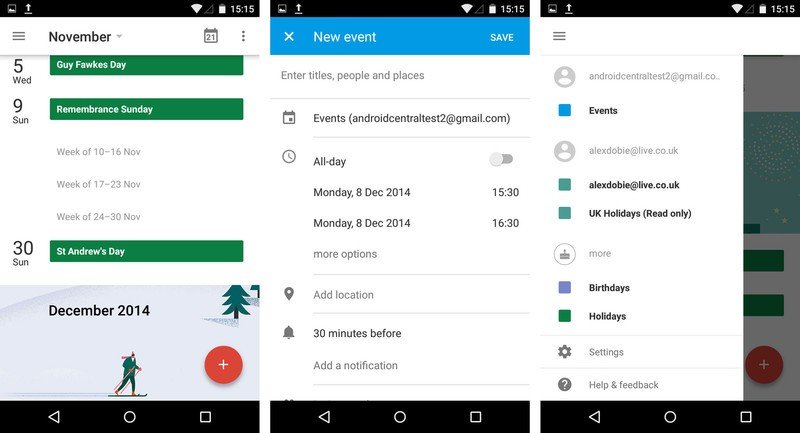
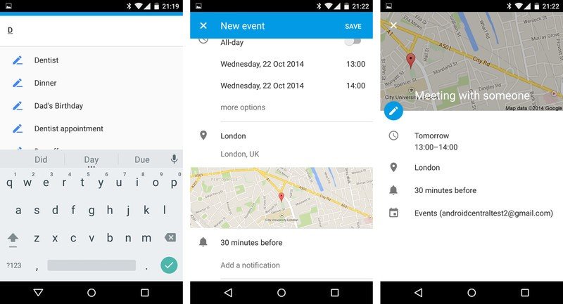
Calendar also gets a major overhaul, with several new features detailed in the app's splash sequence alongside visual changes and new Material Design-style transitions. Events now incorporate inline Google Maps images and photos, though we weren't able to get the latter to work. The app also predicts titles, contacts and places when you're filling out an event. And there's also a redesigned "schedule" view incorporating not only your events, but also Google Now-style art for each month.
Google Drive, Docs, Sheets and Slides
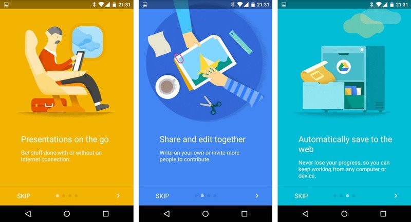
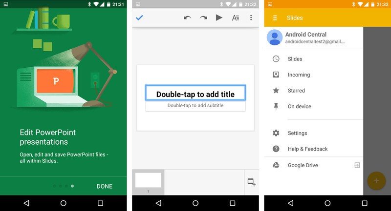
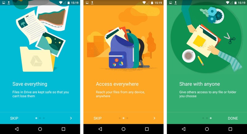
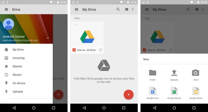
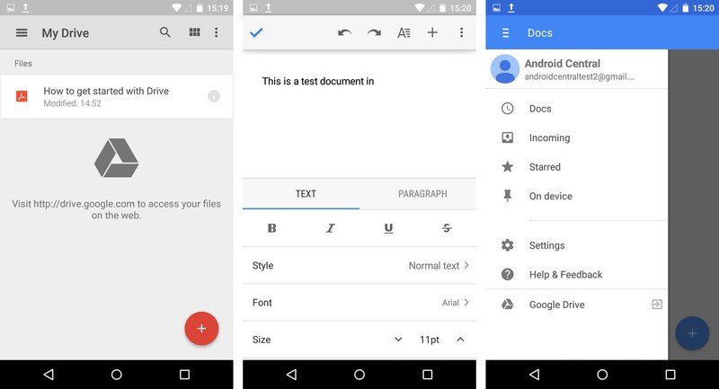
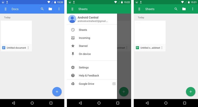
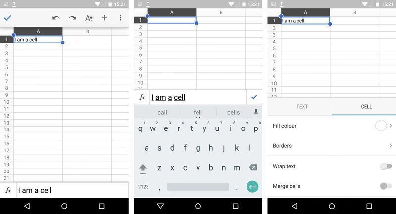
We weren't able to track down any major functional changes in Google's suite of productivity apps, but all four have received a visual overhaul to bring things in line with Material Design.
Google Fit
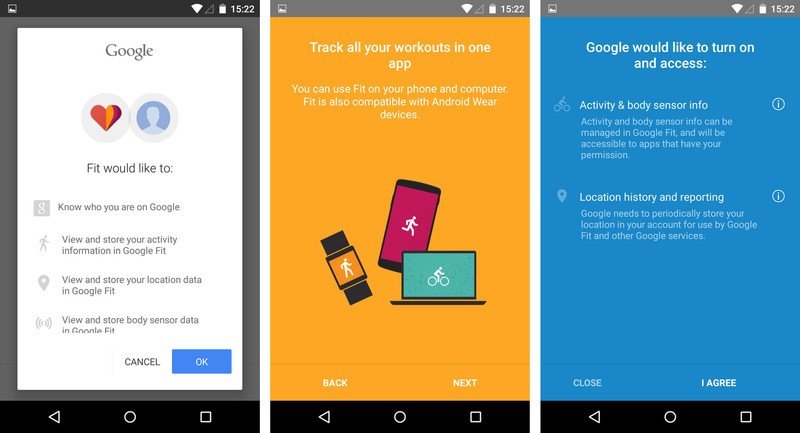
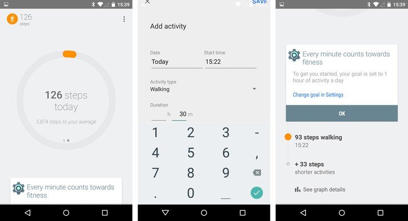
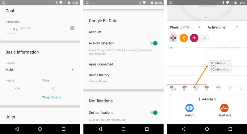
Announced back at I/O Google's long-awaited fitness app can be see in this ROM, along with many of the features promised earlier in the year. You can set daily goals for different activity types, and track this over time using built-in charts. Activity data can be tracked using the phone's built-in sensors, or through an Android Wear device — though the latter didn't appear to be working in this build. As the "connected apps" section reminds us, though, the real power of Google Fit lies not in its ecosystem potential, and the ability to share this data with other applications and devices.
Messenger
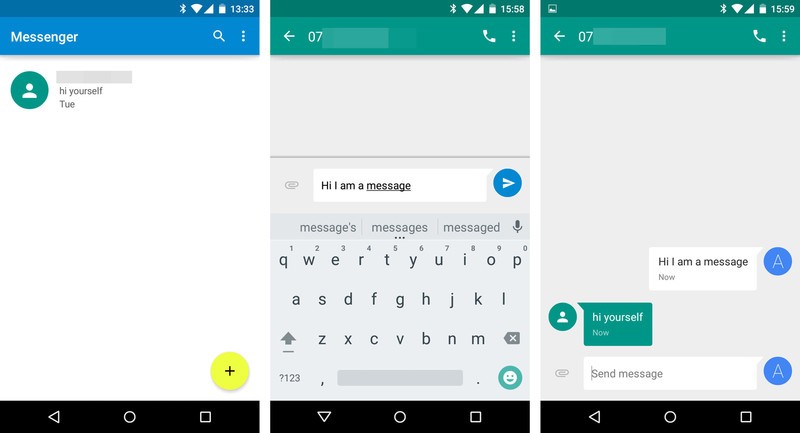
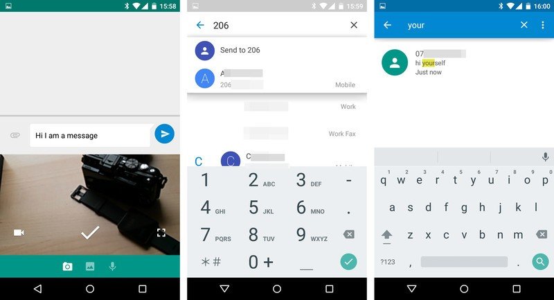
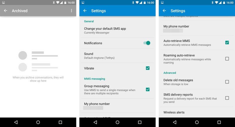
We've seen a few Google messaging apps over the years; this one is built from the ground up with Material Design, and intended to serve as a replacement for the old Android SMS app, which was itself replaced by Hangouts on the Nexus 5. Confused? Basically, this is just a new, more modern text messaging app from Google. Messages are shown in a threaded layout, with pleasing Material transitions throughout. New features include the ability to search and archive messages, and a new "attach" icon letting you take a photo directly in the app, choose one from your gallery, or attach a voice clip.
Google Play Music and Play Books
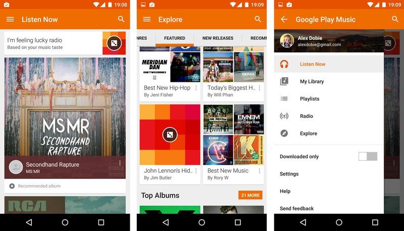
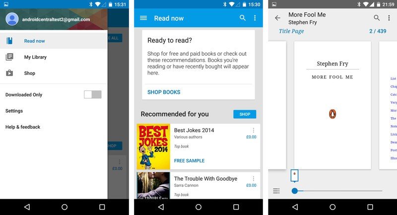
The build of Play Music we see in this ROM is a close match to the version now rolling out to all Android devices through the Play Store. Material Design brings smooth transitions between into album and playlists views, as well as a flatter UI that makes use of Google's color guidelines. Over in Play Books it's a similar story — the app functions much the same as before, only with a slight Material facelift. The only functional change we spotted was a new zoomed-out interface for quickly browsing through pages.
Other bits
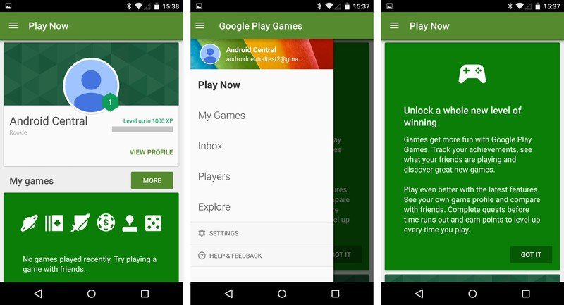
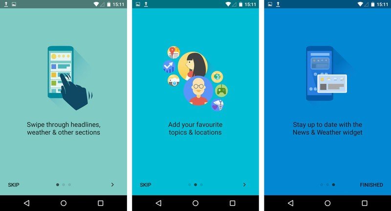
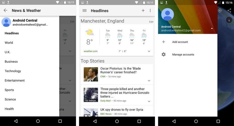
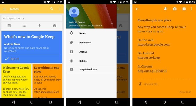
Google News and Weather, Google Earth and Google Keep get a light redesign to bring them in line with Google's new design guidelines. Main changes include new transition animations, and the ever-present "three lines spinning into an arrow" that we've seen in other apps, in place of the old "hamburger" menu icon.
More to come ...
Consider this an early look at what's coming in the full Android 5.0 Lollipop release when it lands on Nexus devices. Many of these apps are work-in-progress builds which were never intended to see the light of day, so
Which apps are you looking forward to using on Lollipop? Shout out in the comments!

Alex was with Android Central for over a decade, producing written and video content for the site, and served as global Executive Editor from 2016 to 2022.
