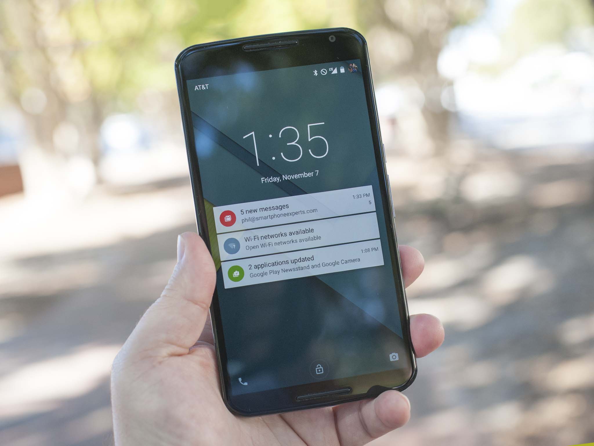
How much does Google's new Nexus 6 — manufactured by Motorola and a spitting image of the 2014 Moto X — have in common with its more diminutive cousin? I found that out the hard way, trying to pull the SIM card out of my Moto X and swapping it into what for us phone nerds (to say nothing of editors of Android websites) is one of the biggest releases of the year. And this was happening at 75 mph, somewhere on the New Jersey turnpike, in the back of an Uber, headed to Newark Liberty International Airport, with the clock ticking not just on my flight, but for my initial hands-on with the Nexus 6.
Not the first time I've done that, by the way.
And of course one of the SIM trays falls out of my lap and onto the floor of the car. I wasn't sure which tray I picked up. Turns out it didn't matter. You can put a Moto X SIM tray inside the Nexus 6. (And more important is that you can get it back out again.)
Was that a sign of things to come? Or just dumb coincidence? A little both, really.
But mostly it was an amusing start to a new era with a new Nexus, Android 5.0 Lollipop and Material Design. And here, now, is the Android Central review of the Nexus 6, Google's baby, birthed by Motorola.
About this review
We've been using the Nexus 6, as supplied by Google, exclusively for just shy of two weeks now. It's running Android 5.0 Lollipop, of course, Build LRX21I. We've used it mostly in Pensacola, Fla., on T-Mobile as well as AT&T, with a noticeable difference between the two. And we've used it connected to a couple of different Android Wear smartwatches — the Moto 360 and the Sony Smartwatch 3. That affects the amount of time the display is on, which in turn affects battery life. But it's also how I use all my smartphones, and in any case it didn't appear to improve battery life. More on that below.
We're also aware that there has been a new software build seen just before this review went live, but we've yet to receive it. We'll update this review if and when that happens, and if anything noticeable changes. But we do need to note that we've seen a few bugs, most notably in the lock screen when using a PIN code, and with the multi-user profile option. We've also seen the camera app crash a bit when processing HDR+ shots, as well as other random crashes of apps. Some of that may be system-related, or it maybe could be fixed on the app side.
Nexus 6 hardware
It's a big Moto X
At risk of repeating ourselves — something we'd never do, of course — you just can't talk about the Nexus 6 without talking about the Moto X. They're damned near identical. And that's not a bad thing. We were fans of the original Moto X, as well as this year's update. The Moto X is a very good Android smartphone.
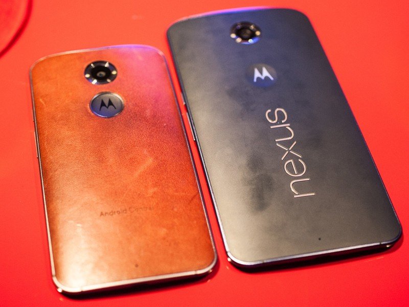
So it's easy to say that the Nexus 6 is a bigger Moto X and mostly be done with it. And there's an argument to be made there. Both run unskinned "stock" versions of Android. That is, things mostly look how Google intended. They both have AMOLED displays. They both have the same look. And if you happen to have one hand that's much bigger than the other, they both pretty much feel the same.
These definitely are not the same phones, though.
The Nexus 6 is big. Really big. It's tempting to say it's too big, but the simple fact is for many folks, it won't be. And in fact it's really not all that much bigger than, say, the Samsung Galaxy Note 4. Or even the (less available) OnePlus One. Phones have been getting increasingly bigger year by year. The HTC EVO 4G was too big, remember? Then the original Galaxy Note. Or the HTC One M7. Or the M8. And every Galaxy Note since then.
Big is in the hand of the beholder.
For me, the difference really is in the shape. Like the Moto X, the Nexus 6 is thicker in the middle and thinner on the edges, and that actually makes it tougher to hold, at least in the traditional one-handed sense. The thicker edges of the Note 4 make it easier for me to hold. Same for the iPhone 6+ (which I've held plenty but don't actually use.) The OnePlus One is more narrow, and that makes a big difference, as does the textured back.
Being the biggest "phone" that I've used, the Nexus 6 also has become the most conspicuous phone in my pocket. Sophomoric jokes aside, people are going to notice when you're packing this thing. And it's often been uncomfortable to leave in my jeans pocket when driving. But then it doesn't fit in my cup holder, which is another growing issue with these larger phones.
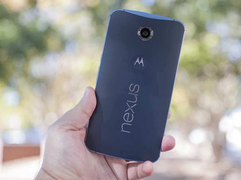

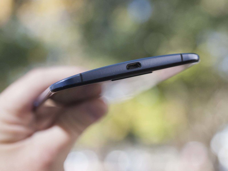
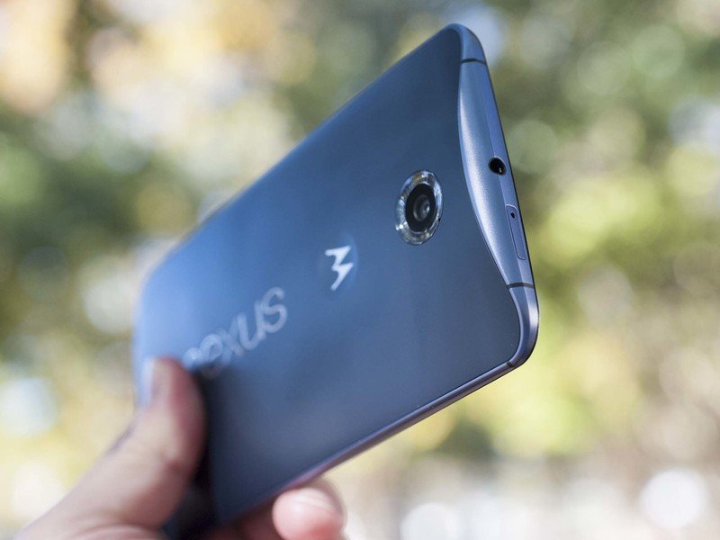
Unlike the Sony Xperia Z Ultra, which really is a tablet with a phone inside, the Nexus 6 is still a phone. Just a really big one. But put simply, a phone this large is not enjoyable for me to use as a phone. It's not impossible, though. (And, again, I've been using it exclusively for two weeks now, without cheating.) Holding it up to your ear for phone calls isn't uncomfortable — it just feels like you're holding a big phone. And if you don't need to ever do one-handed work, it'll probably serve you well.
Put simply, a phone this large is not enjoyable for me to use as a phone.
As we've come to expect from Motorola, the Nexus 6's 5.9-inch QHD AMOLED (with a 2560x1440 resolution and 493 pixels per inch) is OK. It's not nearly as good as the Note 4's QHD AMOLED panel, and it's not all that great in direct sunlight, but it'll do. And it's definitely not as useful as the "Moto Display" feature you'll find in the Moto X. Oh, the Nexus 6 will occasionally flash up the time and date and notifications when you pick up the phone — this is called "Ambient Display" — but not with the same consistency as the Moto X. That is, there are times I pick the phone up or take it out of my pocket and I don't see a damned thing. And if you press and hold on a notification, you're taken to the usual lock screen. So it's really not so much a peek as just a shortcut. And you can forget about waving your hand over the display to sneak that peek — the Nexus 6 lacks the infrared sensors on the front that the Moto X and Verizon Droid Turbo have. It's really just a display.
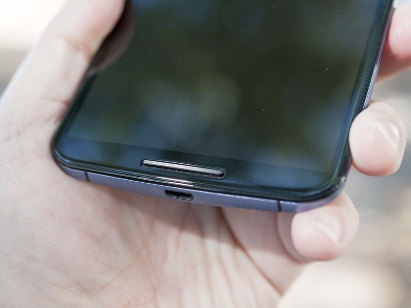
The Nexus 6 does, however, have front-facing stereo speakers, a feature Motorola added earlier this year in its mid-range Moto G. And they're actually quite good. Not quite as deep or responsive as the HTC One M8, but they're darn close. And if you've never experienced proper front-facing speakers on a smartphone before, they'll drastically change the way you use your device.
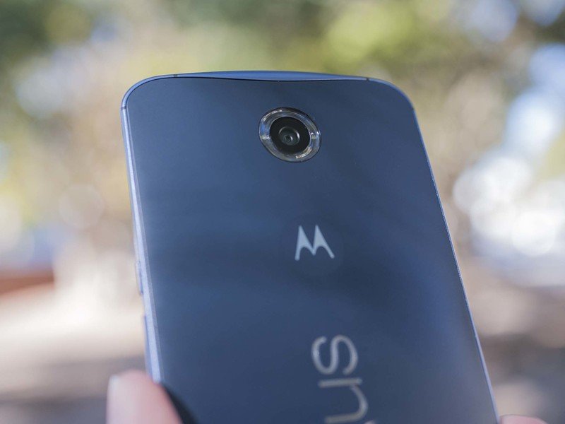
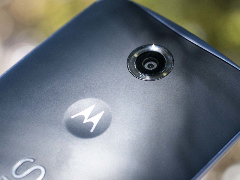
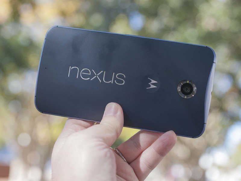
The back of the Nexus 6 — wait for it — mostly looks like the Moto X. Same sort of camera housing and dual LED flashes. Cool Nexus logo embedded in the plastic. (It's possible to get pocket lint trapped in there, though.) And here's a surprise — the old-style Motorola dimple, not the new-style pockmark that's on the 2014 Moto X.
As far as the internals go, the Nexus 6 has a Qualcomm Snapdragon 805 processor at 2.7 GHz, and an Adreno 420 GPU, with 3GB of RAM. That's standard high-end fare at this point, and the Nexus 6 appears to use it well, as we've not seen anything that we'd attribute to stress on the hardware. And by the same token we've not really experienced any thermal concerns. Yeah, things warm up a bit if you're in a state of poor connectivity or are doing something that really pushes the processor, but even then the phone was quite comfortable to use. (You gotta figure that the sheer size of the thing helps with thermal dissipation, too.) We're still in a 32-bit world here, though. If you want to move to 64-bit — which at this point is more about future-proofing that it is any noticeable real-world difference — you'll need to check out the Nexus 9 tablet.
The Nexus 6 comes in two flavors. The low end has 32 gigabytes of on-board storage, which is what should be the minimum these days. So kudos to Google for that. We get about 25GBs of that space available for apps music and pictures and stuff. If you need even more space, there's a 64-gigabyte option.
Nexus phones have never really been known for their great battery life. That's been due in part to the cutting-edge nature of the software. Google just never did the same optimization that other manufacturers have done. But the Nexus 6 has two things going for it. First is battery capacity. This big phone has a fairly big battery at 3,200 mAh. That's not as large a capacity as, say, the new Motorola Droid Turbo, which packs a 3,900 mAh battery into a smaller device, but it's still pretty good, about the same as the Samsung Galaxy Note 4.
The other thing the Nexus 6 has is Google's software optimizations, dubbed Project Volta. The short version of this is that it helps developers schedule things behind the scenes so that power isn't wasted, and it gives users a better way to see what's using battery when. And core apps use those same, APIs so they should do better on the battery.
I've used the Nexus 6 for a couple weeks now. In my day-to-day life, where I'm on Wifi for a good part of the day and usually just have a couple hours of screen on time, I'd get between 12 and 15 hours of use and still have about 30 percent to 40 percent (give or take) of the battery left over. That's pretty good, but I wouldn't consider it hard-core use. Not a whole lot of video, and no gaming. Start taking a lot of pictures and you'll see battery life drop significantly. On the road, where I'm much harder on my devices, I've found myself needing to charge up in the afternoon.
The larger 3,200 mAh battery should help, even if battery life itself isn't spectacular.
Also, I've used both T-Mobile and AT&T with the Nexus 6, and the latter seemed to do better for me on battery life. That's anecdotal, but it's what I've seen.
It's also entirely possible that battery life may change with software updates. With Nexus devices, it's often hard to know if what you've got is final and how radios might change. So I'm taking my own results with a slight grain of salt. But the higher 3,200 mAh capacity should help, even if battery life itself — as in usage — isn't spectacular at all. We'll have to wait and see a little on that.
But on the plus side is that Motorola's Turbo Charger comes standard in the Nexus 6 box. So you're able to charge up faster than before. And that's definitely come in handy with the Nexus 6.
Nexus 6 software
It's stock Android 5.0 Lollipop, for better or worse
It used to be one of the main selling points of the Nexus line was that it was "stock Android," which really just means "Pure Google," which really just means "basic launcher and UX with out a lot of really bad manufacturer customizations."
But the thing is, the manufacturers finally started to get better at user experience. HTC refined and scaled back Sense a bit. Even LG is more respectable these days. (Samsung's Touchwiz is ... well, we'll leave that for another time.) Really, though, it's Motorola itself that has caused us to question what having a Nexus phones means anymore. Starting with the Moto X in late 2013, Motorola chose to pretty much leave stock alone. No skins, no flounce, and just a few key customizations that truly do make the Android experience better for us as users. They did it with Android 4.3, again with Android 4.4, and they'll do it again in Android 5.0 Lollipop.
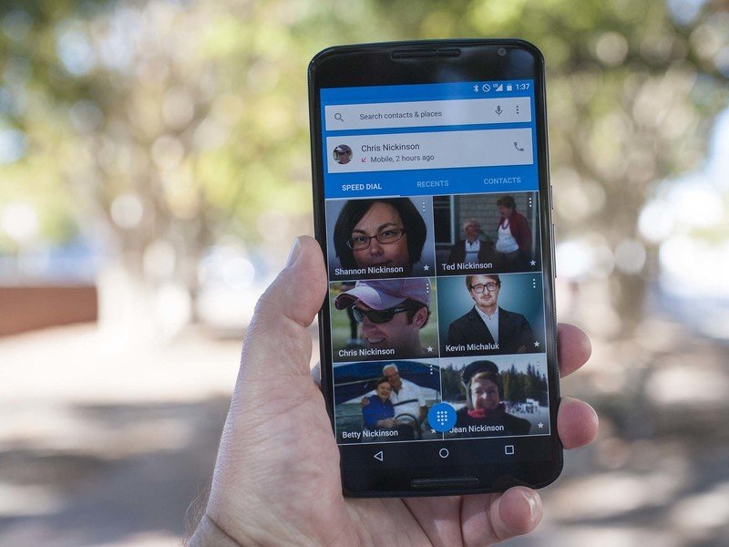
That "stock Android" experience in the past is what made a Nexus a Nexus. And it's what we have on this new Nexus.
A good many of us have been using the Android L release since the summer in either of the two Developer Previews. So we knew what to expect in this full release of Android 5.0 Lollipop. We're taking a more in-depth look at Lollipop in a separate piece, so I'll relate my thoughts as to how it relates to the Nexus 6 here. And it also comes with a caveat: There have been a few bugs, most notably when it comes to the lock screen and notifications.
And a good bit of the Lollipop experience involves "Material Design," Google's new design language not just for Android the operating system, but for everything it touches. Its apps. Its own web design. And to that end, Google still has some work to do. It's been updating its own apps such as Gmail and Google Maps and the like, but there still are a number of inconsistencies in their design. We expect that to shake out as time goes on. And while it might be tempting to lump that into a review of the Nexus 6 itself, the phone and the operating system are separate matters.
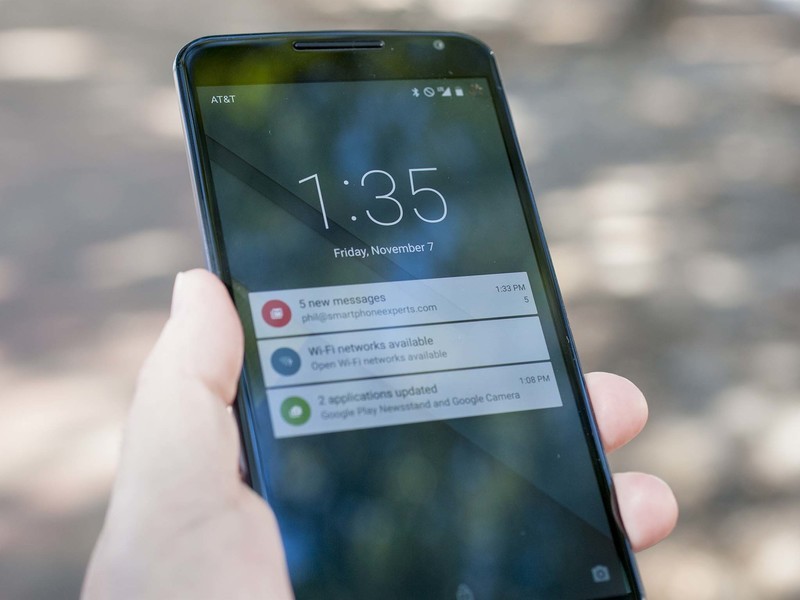
So, yeah. We're using Android 5.0 Lollipop here on the Nexus 6. And one of the standout features has to be the new notifications on the lock screen. As anyone who's used the Moto X the past year or so knows, once you're able to go straight from a lock screen notification to the app in question, there's no going back. It's a great, intuitive leap. (Is it even more important on the Nexus 6 because of the size of the display? Possibly.) We can't help but think there's just a bit too much latency between the time we tap the notification and the time we finally get to the app in question.
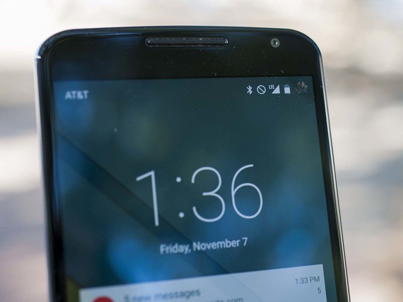
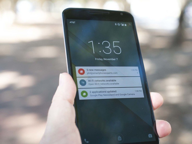
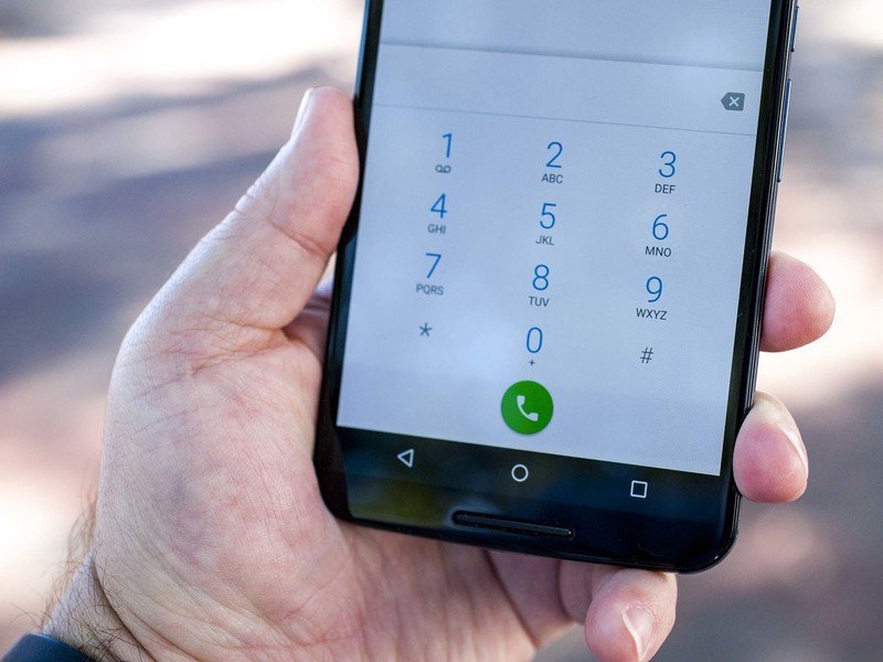
You also can go straight to the phone dialer or the camera app from the lock screen, but those shortcuts take a little getting used to. If you don't drag the camera app just perfectly — and to be fair there's a visual indicator for when you've got it just right — you merely unlock the phone. And we're still not getting it right 100 percent of the time.
The inclusion of Trusted Bluetooth devices — a feature we first got in the 2013 Moto X and is now called "Smart Lock" — is another game-changer. In 2013 we wrote that it was "a must-have for every smartphone going forward." Today it's baked into Android. (And every manufacturer needs to make sure it stays there.) The idea is that you have lock screen security turned on — a PIN code or pattern or even your face — but then you're able to designate a connected Bluetooth device to keep the phone unlocked. Break that connection, and the phone locks itself back up. You also can use an NFC tag to unlock the phone, but it's been wonky for us.

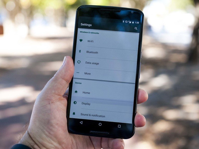
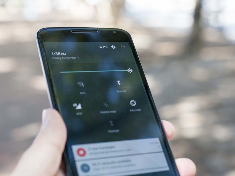
Android's new quick settings are a nice touch, too. Pull down from the top of the phone with two fingers — or pull down twice with a single digit — and you get shortcuts to the brightness slider, Wifi, Bluetooth, and cellular connections, airplane mode, auto-rotate (does anyone actually ever turn that off?) and — finally! — a proper torch shortcut. Nice. (That's a flashlight for the less civilized among us.)
Google's new Lollipop keyboard is a looker, and it continues to improve with every iteration. You can still swipe to type, and the keyboard continues to improve with its predictions. It's a little tough to say if it's as good as, say, SwiftKey (my usual keyboard), because there's a learning curve if you're switching from one learning keyboard to another. Google's missed out on an opportunity to exploit the larger screen of the Nexus 6; we'd love to see a dedicated number row. (Which, in fairness, took years for the likes of SwiftKey to add, too.)
We can't really say that Android 5.0 Lollipop looks and feels like it was meant for the Nexus 6 — it really looks and feels like it does on the Nexus 5 or the Moto X. Once you get settled in to the new designs, the next question will be how to applications take advantage of the features and APIs.
Nexus 6 cameras
They're not bad, but also not the best
Nexus phones have never been known for having spectacular cameras. But starting with the Nexus 5 they definitely began to get better. The Nexus 6 has a 13-megapixel shooter out back with an f/2.0 aperture, and a 2-megapixel camera in the front. You've got your choice of the full 13 megapixels at 4:3 aspect ratio, or 9.7MP at 16:9.
I've mostly been pleased by the pictures I've gotten from the Nexus 6. Unsurprisingly, shots aren't unlike what we've seen from the 2014 Moto X. The Nexus 6 is just OK in low light, above average in good light, and it handles backlighting about how you'd expect. Again, I've gotten some really good low-light shots. And I've gotten some really bad ones.
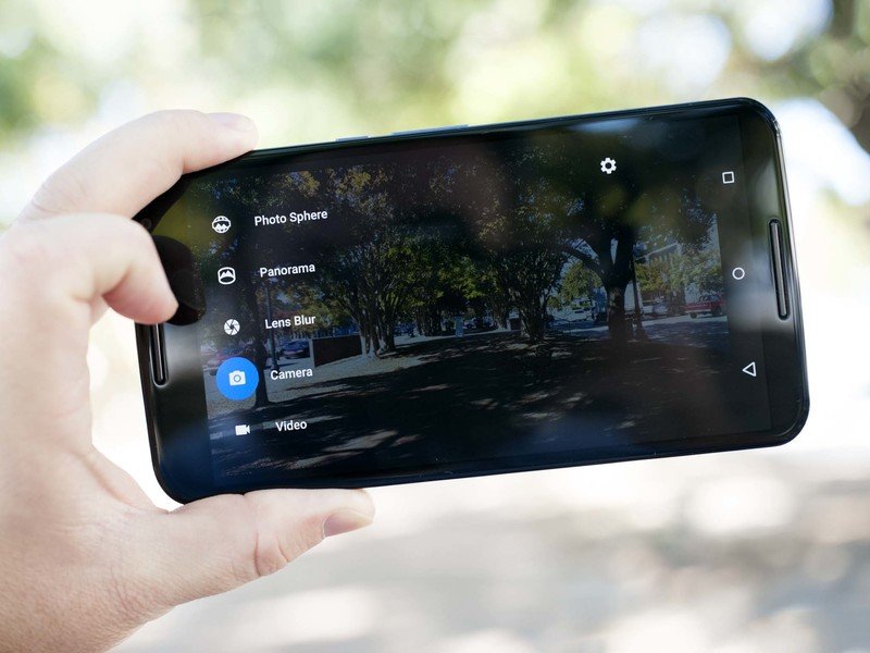
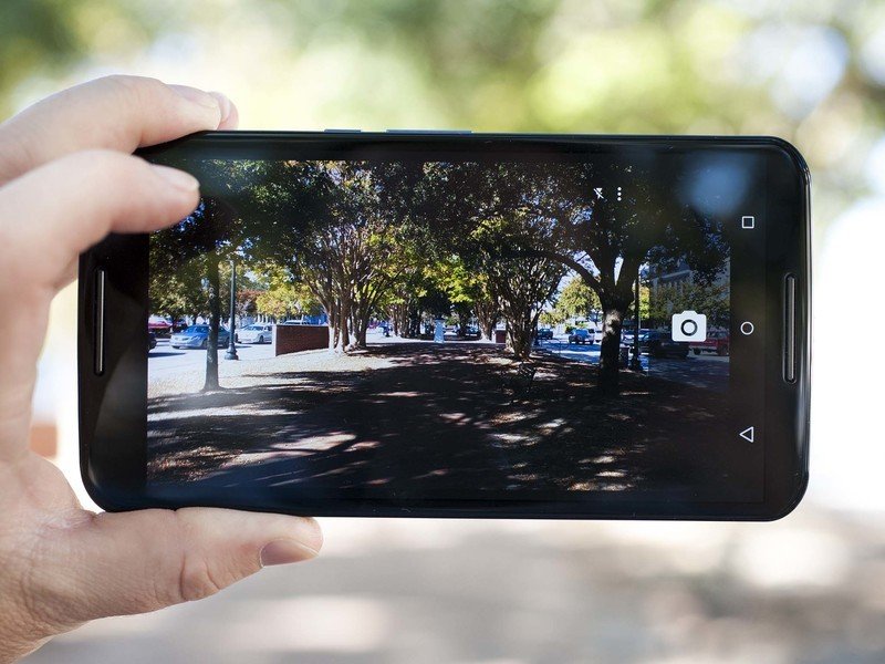
Google's HDR+ mode helps with that some, bringing a little better balance. But it also exposes our chief gripe with the camera app. It's just slow. It takes more than a few beats to launch from a cold start, and even worse if you don't manage to actually launch it on the first try from the lock screen shortcut. (We're very much missing the wrist-flick of the Moto X here.) And you can take an HDR+ shot then have to wait a good 5 or 10 seconds for it to finish processing before you can tell if you need to take another one.
Video can shoot up to 4K resolution from the rear camera, and 1080p from the front. Audio quality was pretty good as well.
The proof, of course, is in the pudding.


Other odds and ends
- Call quality on AT&T and T-Mobile was fine. No issues there.
- Calls over speakerphone were fine — once the speakers kick in. They fade in when you first hit the button, which is a bit annoying even after you get used to it. (On the other hand, no more blasting your face unexpectedly.)
- No issues with GPS.
- With a phone this big, I'd like to see a lanyard option, perhaps.
- Fingerprints are an issue with this phone. Not so much on the display as on the rear of the phone. Oil stands out horribly on this dark blue plastic.
- And now that I think about it, I've not really considered the phone to be blue. It looks nearly black in most light.
Nexus 6: The bottom line
A really good, really big phone, if that's what you're into
In a vacuum, the Nexus 6 is a pretty compelling device, particularly if you want something big. But the Nexus 6 doesn't live in a vacuum, particularly if you consider that what's supposed to make it special — the Nexus brand and what comes along with it — isn't quite as exclusive as it used to be.
Maybe being a Nexus is still enough.
The comparisons to the Moto X are natural, of course. Same manufacturer. Nearly identical design, just scaled up both visibly as well as with improved internals. And when the Moto X is upgraded to Android 5.0 Lollipop — which should be very close to the launch of the Nexus 6 — they should be just about on level terms as far as the base operating system goes. We'll have to see how Motorola's tweaks stand up, and what might have been reabsorbed back into the OS.
But the standout feature of the Nexus 6, for better or worse, is its size. The question is whether the added size is worth giving up the better camera (or ridiculous number of software features) in, say, the Samsung Galaxy Note 4. Or the PlayStation integration of the Sony Xperia Z3. Or the simplicity of the Moto X. Or the total package of the HTC One M8.
Or maybe you just don't need a reason. Maybe being a Nexus is still enough.
