Nexus 5 review
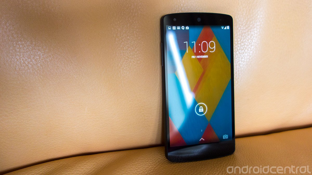
LG’s second Nexus is the best phone you can buy for $350, and an excellent platform on which to experience the new Android 4.4 KitKat — but that experience isn’t entirely free from compromises
Just what is a Nexus? The definition of Google’s homegrown gadget lineup has evolved — if not changed beyond all recognition — in the almost four years since the arrival of the Nexus One. Originally expensive, exclusive and developer-centric, Nexus is now solidly a consumer-focused brand. With wallet-friendly price tags, a Nestle-promoted launch, numerous carrier and retailer partners and new, prettier software, the LG-built Nexus 5 is more a phone for normal people than any previous Google-branded handset.
But despite the face of “vanilla” Android becoming more friendly and the Nexus line growing more accessible, these products have always garnered attention from tech-savvy enthusiasts more than average smartphone buyers. Nerds, if you will. People who value the specs, performance and the latest version of Android over shiny features and space-age build quality.
That was clearly the case with last year’s Nexus 4, which demanded users sacrifice LTE connectivity to be part of the elite Nexus club. Similarly, Nexus 4 buyers got only an average camera and unspectacular battery life for their $299. Though it was a fantastic phone for the time — and for the money, particularly in countries where LTE had yet to take off — Nexus 4 ownership was also a lesson in compromises. And so for $50 more, this year’s Nexus promises high-end internals, 4G LTE support wherever you live, and an improved camera experience with “HDR+” mode — in essence, more of what made the Nexus 4 great, with fewer bugbears.
However, hardware is only part of the equation — arguably more important is the new Android 4.4 KitKat software, the biggest step forward for the OS since 2011’s Ice Cream Sandwich release. Aside from the clear visual refresh, KitKat aims to revamp Android’s basic phone and SMS experiences, while making it easier to get to use Google Now, one of the platform’s greatest assets.
All of this for $349 (£299) sounds like impossibly good value. So can the Nexus 5 really be a slam-dunk of high-end hardware, slick, beautiful software and an unbeatable price point? And for those willing to spend more, is a Nexus still the best way to experience “vanilla” Android in a world of Moto Xs and Google Play editions? Let’s find out in the full Android Central review of the Nexus 5.
Pros
Be an expert in 5 minutes
Get the latest news from Android Central, your trusted companion in the world of Android
- Solid build quality. Bright, good-looking screen. Top-notch performance. KitKat delivers a welcome visual refresh to Android while adding useful and important new features. Built-in wireless charging. HDR+ mode is capable of taking awesome photos. By far the best phone you can get for the money.
Cons
- Average battery life. Camera is slow to focus, and requires too much time and effort to get great shots. Video camera drops frames in low light.
The Bottom Line
As a high-end Android phone, the Nexus 5 doesn’t exactly nail it in every category. However the price point, speed and quality of user experience makes the Nexus 5 a great device for regular people as well as nerds. Nexus doesn’t necessarily mean you’re getting the best phone. But for enthusiasts, early adopters, performance freaks or anyone looking for a great device at the $350 price point, Google and LG have crafted a phone that's more than worthy of your attention.
| Video walkthroughHardware reviewSoftware reviewCamera reviewBattery lifeWrap-up | Initial camera impressionsInitial battery impressionsNexus 5 forumsNexus 5 FAQEven more coverage |
Nexus 5 video walkthrough
Nexus 5 hardware and build quality
Its design might not be particularly striking, but the Nexus 5 excels ergonomically.
In a world of black slabs, the Nexus 5 is — well, yet another black slab. Or, perhaps, a white slab, if you go for that color. In stark contrast to the Nexus 4’s reflective trim and sparkly glass derriere, this latest Nexus cuts a relatively muted figure. The front is completely flat, black and featureless, save for a tiny circular earpiece up top. The back and sides differ slightly depending on which color option you choose — the black model is furnished in soft-touch plastic all over, the white version has glossy black sides and a white back with a slightly slicker finish. While last year’s Nexus was clearly based on the LG Optimus G, there seems to be a little less LG DNA present this time around. The Nexus 5 more closely resembles a miniature Nexus 7, and this family resemblance shows how serious Google is about establishing a clear visual identity for the Nexus line.
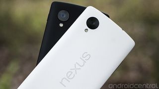
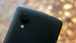
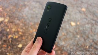
Its design might not be particularly striking, but the Nexus 5 excels ergonomically. The very soft, soft-touch coating of the black version we’re using feels great — we definitely like it more than the slicker white model — and is markedly different to the rougher matte finish of the 2013 Nexus 7. Like the 7-inch tablet, Google’s new smartphone is decorated with a large, vertical Nexus logo which is big, but not obnoxiously so. The other main feature of the back panel is the 8-megapixel rear camera, which protrudes slightly through the back of the device. It’s unclear why the face of the camera needs to be this big, as only a small part of it covers the lens. Nevertheless it’s there, and it doesn’t detract too much from the overall look and feel.


The hardware is meant to just get out of the way and allow you to focus on the display
The curved back and slightly angled sides make the Nexus 5 extremely hand-friendly — there’s a visible join between the sides and the back, but this isn’t something you’ll feel in regular use. Instead, the device’s weight — or lack thereof — is what’s most noticeable when you pick it up for the first time. It’s seven grams lighter than the Nexus 4, which combined with its larger surface area makes for a remarkably airy feel. Clearly, the hardware is meant to just get out of the way and allow you to focus on the display. In keeping of one of the main goals of the Nexus program, the purpose of the N5’s design seems to be to showcase what’s on the screen — the latest version of Android — not necessarily what’s around or behind it.
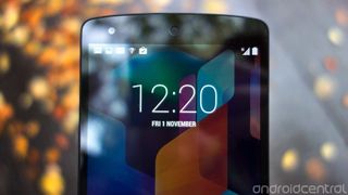
That makes display quality an area of paramount importance, and thankfully the Nexus 5’s screen doesn’t disappoint. While the Nexus 4 struggled with laissez-faire auto-brightness and poor color tuning, neither of these problems affects its successor. The Nexus 5’s 4.95-inch, 1080p IPS LCD is big, bright and beautiful, and while it might not be able to unseat the HTC One’s SuperLCD3 or the Galaxy Note 3’s SuperAMOLED in terms of contrast and vibrancy, it’s a great-looking display regardless. The bright whites of Android 4.4’s new color scheme leap off the screen, and text is beautifully sharp, as you’d expect from a panel with 445 pixels per inch. Unlike earlier Nexuses, the N5’s auto-brightness setting easily keeps up with the transition from bright to dark areas and was always bright enough to use regardless of lighting conditions. (In fact, if we’re honest, it almost seems a little trigger-happy in this department.)
It’s also impressive that LG has managed to cram a 5-inch display into a device barely any wider than a lot of 4.7-inch handsets — including the HTC One and Nexus 4 — which makes it just as hand and pocket-friendly than those devices. Contrariwise, the N5 does sport a pretty hefty bottom bezel which seems to serve no purpose besides housing the tiny notification LED. Unfortunately that pushes the display a bit further up, moving the top of it out of easy thumb reach.
Unlike the LG G2, upon which its hardware is said to be based, the Nexus 5 keeps its buttons and ports in the usual, sensible places. Power lives on the right, a little higher up that before; volume is on the left, microUSB down below and headphone jack up top. The N5 also boasts ceramic power and volume buttons — a small detail, but one which gives the keys a more premium finish than the plastic buttons of most Android devices. The microSIM tray, again accessible with a SIM removal tool, now lives on the right edge, under the power button.
Playback on the Nexus 5 a decidedly monaural experience
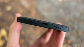
On the bottom of the phone, flanking the USB connector, are two sets of speaker holes. Unfortunately, as is the case with the G2, one of these is a facade. Only the left one actually houses a speaker, meaning playback on the Nexus 5 a decidedly monaural experience. We’ve recently investigated the software bugs affecting playback through the built-in speaker in some apps, which Google says it’ll fix in a future update. But even in apps that aren’t affected by the glitch, audio playback isn’t exactly outstanding, excelling in neither loudness nor bass. It’s good enough for notifications, ringtones and other bleeps and bloops — as many smartphone speakers are — but it leaves much to be desired for music and movie playback.
The earpiece, for what we've experienced, is acceptable in calls.
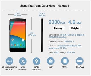
The phone’s internals are just as trailblazing as we’ve come to expect from the Nexus line. It’s powered by a 2.3GHz quad-core Snapdragon 800 CPU and an Adreno 330 GPU, which is just about the fastest chipset you’ll find in any Android phone right now. That’s paired with an ample 2GB of RAM and 16 or 32GB of internal storage. The former gets you 12.55GB for your own stuff, the latter provides a more roomy 26.76GB. And unsurprisingly for a device based around Google’s own guidelines for Android, there’s no microSD expandability.


A high-end CPU and GPU combined with the latest “stock” Android results in a phone that absolutely flies, whether you’re using regular Android apps like, Gmail, YouTube and Chrome, or using the Nexus 5 with high-end games like Asphalt 8. Touch response, scrolling performance and general butteriness is as good as we’ve seen on any Android handset. We’ll dive deeper into performance in our software section, which focuses on the new Android 4.4 KitKat OS, but suffice it to say it’s fast — really fast.
Also lurking inside the N5’s chassis is a 2,300mAh battery and Qi wireless charging receiver, both fixed and non-removable, we’ll examine later in the review. While Google’s latest phone won’t be setting any records for longevity, we’re more convinced than ever of the value of wireless charging on high-end smartphones.
Depending on where you buy the Nexus 5, you’ll get one of two models — the LG-D820, which features U.S. LTE support, or the LG-D821, which supports LTE bands used in Europe and elsewhere. So we’ve not quite reached the point of having global LTE coverage in a single handset, but you do at least get official LTE support for carriers in your own country, which is more than the Nexus 4 could offer a year ago. Nexus 5 does include pentaband HSPA+ (42Mbps) support, though, which is a consolation for jet-setters.
Cellular radios aside, the N5 offers a standard array of connection options — Wifi a/b/g/n/ac on 2.4 GHz and 5 GHz frequencies, Bluetooth 4.0 support and Miracast for wireless display mirroring. Some posters on the Android Central forums have reported Wifi compatibility problems with some routers, but we didn’t run into any problems when testing the N5 with our own networks.
There’s a world of difference between the feel of the N5’s soft-touch plastic back and other, glossier plastic offerings
As we’ll discover later in the review as we take a closer look at Android 4.4 KitKat, the Nexus 5’s hardware is probably the least interesting thing about it. But it’s important that Google’s checking most of the right boxes here, particularly when you consider the device’s low price point. The Nexus 5 is one of the best examples in the Android space of how to make a plastic phone — there’s a world of difference between the feel of the N5’s soft-touch plastic back and other, glossier plastic offerings like the Samsung Galaxy S4 and LG G2. It isn’t drop-dead gorgeous, but it always feels solid, lightweight and classy. At the same time, we shouldn’t underestimate the importance of shipping a Snapdragon 800 handset at such a competitive price point, in terms of both the performance delivered out of the gate and potential longevity with future software updates.
Nexus 5 specs
The software: Android 4.4 KitKat on the Nexus 5

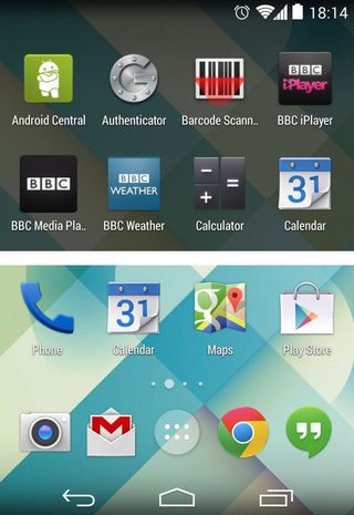
Here’s where the rubber really meets the road: The Nexus 5 is the first handset to run the new Android 4.4 KitKat OS. (And, in fact, its version of KitKat is slightly different than what's been updated on other Nexus phones and tablets.)
The most obvious refinements in KitKat are visual — it’s lighter, flatter and more colorful, in contrast to the dimmer sci-fi stylings of Honeycomb through Jelly Bean. Sure, remnants of the old, darker Holo design language remain in certain areas — in the alarm clock app, for instance, where it makes sense to use darker tones. However the prevailing “Holo blue” text, icons and accents that dominated Android 4.0-4.3 have been all but eliminated. The result is not just an Android that’s brighter, friendlier and more accessible, but also an OS that looks a lot sharper.
KitKat makes better use of the large, high-resolution screens of modern smartphones like the Nexus 5, with less dead space than earlier iterations of Android. Icons in the new home screen launcher are larger and more closely-spaced, though there’s still some incongruity among the graphics used for Google’s built-in apps. Obsessive-compulsives may notice the “G” icons for Google, Google Settings and Google+ are different sizes, while the embossed logos for the various Google Play properties — Music, Books, Magazines, etc. — look out of place in the new, flatter Android.
Fonts are another area of refinement — KitKat replaces some of the heavier typefaces in Jelly Bean and ICS with lighter equivalents, which is most noticeable in the clock app and certain home screen widgets. Like HTC, Google has switched to the Roboto Condensed font in its updated launcher, which fits in well with the visual style of KitKat. And it’s bundled some beautiful abstract wallpapers too, which complements this new design language.
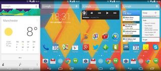
Elsewhere, Google’s “cards” metaphor, present now throughout many of its properties on the web and beyond, is slowly taking over. It’s most noticeable in the updated dialer app, which uses it to display top contacts, but it’s been creeping into other areas, including the stock Email and Gmail apps, as well as Google Drive and the new file opener dialog. It’s a nice bit of visual consistency that benefits Android as a platform and the wider Google ecosystem.
Google's ecosystem is at the heart of Android in KitKat, more than ever before.
And Google's ecosystem is at the heart of Android in KitKat, more than ever before. Consider the three biggest app changes in the new OS version — the launcher, the dialer and Hangouts, the default SMS app — in Android 4.4, all three have been augmented with more Googley features.
The phone dialer app has been redesigned to focus on people, not numbers — as evidenced by the first screen you see in the phone, which is filled with recent and starred callers, not a traditional number pad. And up top is the famous Google search bar, which allows you to search local businesses from directly within the app. Similarly, if you get a call from an unknown number, Google will try to match it against businesses on Google Maps and show you a name and photo as well as a number. From 2014 it’ll start doing the same for personal phone numbers, for better or worse.
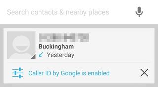


The updated dialer is a great example of Google using its vast data reserves to enhance one of the most basic smartphone apps — one which had barely been given any attention at all since Android 4.0.
A somewhat less perfect marriage of Google services and a staple smartphone function is the new Hangouts app with SMS support. Available as an update on older phones, Hangouts 2.0 is the only way to send and receive text messages on the Nexus 5. Seemingly part of a push to get more users onto Google’s instant messaging platform, a message pops up after initial setup to tell you that Hangouts is the place for all your messaging needs.
SMS feels oddly shoehorned into Hangouts.
For the most part everything works well enough. If you’ve got multiple Google accounts you can choose which one you want your texts to show up in; it’s also possible to select different notification settings for SMS versus Hangouts messages, which is useful. But SMS feels oddly shoehorned into Hangouts, like a second-class citizen in Google’s world of instant online messages. Then there’s the confusion likely to be caused by the Hangouts naming convention — most users would be looking for an app called “Messages” or something similar, and even those familiar with Google’s ecosystem aren’t likely to associate Hangouts with text messaging. Google Voice support, too, remains problematic at present.
It’s easy to see why Hangouts doing SMS messages makes sense for Google, but it’s less clear how the current implementation is of any real benefit to users. Fortunately you can still choose a third-party app for SMS if you want, and this process is relatively straightforward in Android 4.4.
One argument in favor of consolidating similar apps is that it avoids duplicated functionality. Yet there’s one big, glaring example of this in KitKat that’s been created by the arrival of the new “Photos” app, formerly known as G+ Photos. As we’ve discussed elsewhere there’s a lot of crossover between this and the regular “Gallery” app, which remains in Android 4.4. It’s likely Google will roll these two apps together — along with the stock camera app, which as of Android 4.1 is part of the “Gallery” app anyway. For the moment, though, you’ll need to hop between Gallery and Photos, and the new name for the latter muddies an already confusing situation for users.

Gallery + Photos: Why does Nexus 5 have two ways to handle images?
Despite this, the new Photos app does introduce some great sharing features, which we’ll get to later in this review, such as HTC-style video highlights.
The stock Android home screen launcher has been completely redesigned in KitKat.
After being left largely unchanged since Android 4.1, the stock Android home screen launcher has been completely redesigned in KitKat. We’ve already mentioned the larger, flatter icons and font changes, which look great on the Nexus 5’s vast, high-res screen. But the underpinnings of the launcher are just as important. As foretold by our own Phil Nickinson over a year ago, Google Now — Google’s predictive search app — is now part of your home screen, accessible by swiping to the right on the leftmost home screen page. This works just as it did from the old swipe-up shortcut, displaying cards showing the weather, nearby attractions, sports scores, public transit times and a bunch of other timely info. Google Now is one of Android’s great assets, and for the most part we welcome the move to make it easier to find and use. It’s easy to turn it off through the launcher settings menu if you don’t want it, though it’s not possible to disable Google Now in the launcher and keep it around through the old swipe-up shortcut.
And the Nexus 5 currently is the only device to officially have Google Now on the home screen. You can hack it onto the updated Nexus 4 or either of the Nexus 7 tablets running KitKat, but it's not there by default.

Voice search has further augmented in the KitKat home screen app. If you’re using U.S. English you can say “OK Google” anywhere on the home screen to activate this feature. Being able to get to it from outside the Google Search app is a significant step forward, even if it doesn’t match the Moto X’s voice control capabilities. In addition, given how well voice recognition works for both U.S. and UK English, the fact that voice activation isn’t available in regions outside the U.S. is a little baffling. (A new Google Search update rolling out now adds even more voice search and Google Now capabilities for all Android 4.1+ devices, including the Nexus 5.)
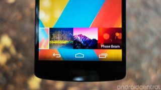
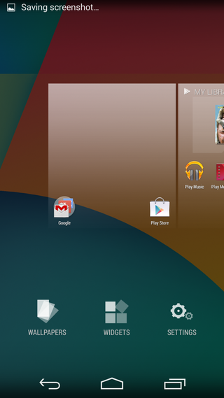
Elsewhere in the launcher, there’s a new customization view accessible by long-pressing on an empty area of a home screen. From here you can change your wallpaper, rearrange home screens and modify other settings. This is also the new way to add widgets to your home screen, since they no longer live in the app drawer — a design decision which, if we’re honest, never really made much sense.
Speaking of widgets, lock screen widgets are disabled by default in KitKat, and users are required to navigate into the “Security” settings page, of all places, to switch them on. We’ve never been big fans of this feature, a last-minute addition to Android 4.2. Perhaps this is a tacit admission that Google, in hindsight, feels the same?
Lock screen widgets on Android 4.4

"Lock screen widgets are still present in Kit Kat, but you'll need to enable them in your settings should you wish to use them. Nestled appropriately under the "Security" section of the device settings, you'll see a line item for Enable widgets. While you're not really told as much — Google often has "issues" communicating well — the group of settings there for Owner information, Enable widgets, and Screen lock all have to do with the lock screen."
Read full article: Inside KitKat: Changes to the lock screen widgets
Another important visual changes in KitKat allow apps to make better use of on-screen real estate, particularly on devices (like Google’s Nexus line) with software buttons. Apps such as the Google Now-enabled launcher can now implement a transparent notification bar and software controls, meaning these areas of the screen are no longer hidden behind black borders.
The launcher is currently the only regular app that currently takes advantage of this feature, meaning you’ll still be dealing with opaque borders most of the time. However the redesigned lock screen controls for music can now expand album art to cover the full screen, including the areas usually reserved for software controls and the black notification bar. In addition to looking great, the new lock screen controls also allow you to seek through tracks by long-pressing on any of the buttons.

Also new is the fullscreen immersive mode, which is only utilized in one of the bundled apps — Google Play Books. Entering immersive mode removes the notification bar and software buttons, allowing the app to take control of the full screen area. A swipe up or down gesture onto the screen brings back the top and bottom chrome, similar to the way Samsung devices handle fullscreen apps.
Between these handful of new features, KitKat should allow developers to make greater use of the full screen area of Android phones, particularly on Nexus, Sony and Motorola devices with on-screen buttons.
But not all of the important new features in Android 4.4 are flashy or immediately user-facing. KitKat gains printing support through Google and HP’s cloud printing service, accessible in certain apps like Google Chrome and QuickOffice; this also serves as an easy way to save many types of documents as PDFs. In addition, the “open” dialog for files gives you an easy way to load documents, images and other stuff from local or cloud storage into various apps.
New printing capabilities in Android 4.4 KitKat

"Google says that "most devices" with KitKat will have Google Cloud Print pre-installed, and Chrome, Drive, Gallery and QuickOffice all support it as well. Other applications might need updating by the developers. As an added bonus, you can save printable items as PDFs. (That's an offshoot of the way this all works in the first place, and it's handy as hell.)
This isn't the new framework in and of itself. Obviously, HP's played a hand here. But it's also just about as simple as it can get."
Read full article: Printing in Android 4.4 KitKat (with help from HP)
Not all of the important new features in Android 4.4 are flashy or immediately user-facing
In the latest release, Google’s efforts to improve Android’s performance have focused on the way the OS uses memory, so much so that the company now claims it can run acceptably on devices with just 512MB of RAM. Though it packs four times as much memory as this low-end requirement, the Nexus 5 has nonetheless reaped the benefits of Google’s ongoing work to improve responsiveness. Whatever you’re doing on an Android phone, chances are there’s nothing out there that’ll do it as fast as the Nexus 5. From app load times to heavy gaming to quickly multitasking between running apps, the new Nexus is flawlessly smooth. That’s likely down to hardware and software in equal measure — let’s not forget that the N5 is powered by one of the fastest mobile chipsets around. Sure, performance in third-party apps can never be completely guaranteed, though Google certainly has plenty of tools to allow devs to test their apps’ smoothness and memory efficiency. Nevertheless, we can confidently say that the bad old days of scrolling lag micro-stuttering are all but gone, and that in version 4.4 Android is more buttery than it’s ever been before. It’s not necessarily a great deal smoother than Snapdragon 800 phones running Jelly Bean, but it does feel more consistent in its performance.
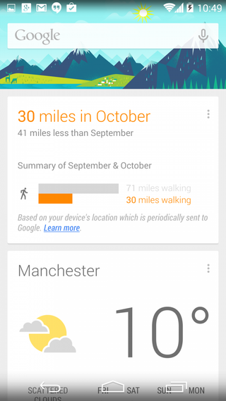
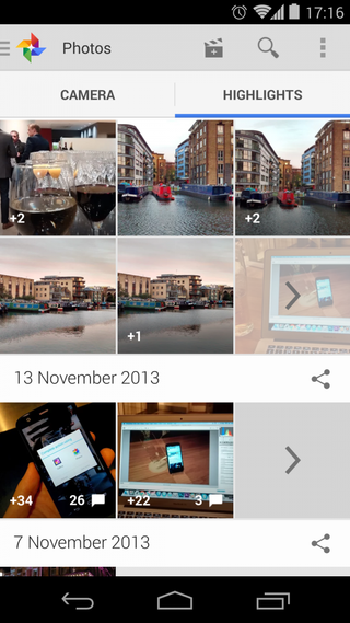
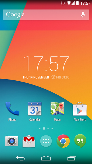
Ultimately, Android 4.4 KitKat is the sum of many, many small changes and a few big ones, almost all of them positive steps for Android. It’s easy to point out the visual enhancements and the new launcher as the major milestones for Android 4.4. But it’s just as important to remember the behind-the-scenes changes, and the work that’s been done on less sexy parts of the OS like the dialer, the printing service and the universal “open file” dialog. There have been some missteps along the way — we’re still baffled by the presence of separate “Photos” and “Gallery” apps, and Hangouts’ SMS integration seems clumsy in its initial release.
Android 4.4 is more closely aligned with Google’s ecosystem and design language
In any case, the result of all this is an OS that’s more closely aligned with Google’s ecosystem and design language — and if you’re looking to buy a Nexus, that’s probably a plus for you. The software looks more Googley and uses more Google services in a way that adds value to the end user, whether it’s through quicker access to Google Now, putting Google’s business directory at your disposal in the dialer or making it easier to use voice search. It’s a solid foundation upon which to build in 2014, and we can’t wait to see it on more devices.
Other software bits:
- Wireless payments should be made easier through KitKat’s HCE (Host Card Emulation) feature, which lets it emulate NFC-based smart cards, thus allowing NFC payments without the need for a secure element. We weren’t able to test this out on our device, as Google Wallet is still unavailable in the UK. But if it works as advertised, then it opens many interesting new possibilities for NFC transactions on Android phones.
- Android 4.4 and the Nexus 5’s pedometer support works as advertised with the Runtastic Pedometer app. This seemed about as accurate as S Health on the Samsung Galaxy S4, which is to say it’s pretty accurate.
- The Google-owned QuickOffice is bundled on a Nexus for the first time, allowing you to manage Microsoft Word, Powerpoint and Excel documents out of the box. You could argue that this duplicates some of the functionality offered by Google Drive, but the distinction between the two seems clear enough to us — QuickOffice is for old stuff (and email attachments) on local storage, Drive is for your current stuff in the cloud.
Battery life and wireless charging
Battery life is unspectacular, but by no means terrible.
The Nexus 5 sports a 2300mAh built-in, non-removable battery, which is towards the lower end of the capacities we’ve seen paired with Snapdragon 800 handsets. As such, there was some concern when the device’s specs first became known that it would suffer from mediocre battery life — and we found after a few days with the device that those fears weren’t entirely unfounded.
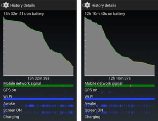
The Nexus 5’s battery life is unspectacular, but by no means terrible. After almost two weeks with the device, our impressions are that its longevity is about average for an Android smartphone, but little more than that. A few of our editors have transitioned from the HTC One to the Nexus 5 and we’ve found that the two compare very closely in terms of longevity. That means you’ll get a full working day, but usually no more than that. And if you try, you can absolutely kill it in 8 to 9 hours of heavy use.
Our first full day of testing the Nexus 5 got us down to the warning level of 19 percent in just over 12 hours. During that time we were browsing and using social apps over Wifi and HSPA+ connections, taking around 100 photos with the rear camera, streaming just under an hour of music over Google Play Music and making a couple of brief phone calls. We had Google+ Photo Backup and Dropbox auto-upload enabled during our testing, but only set to kick in when connected to Wifi. By early evening — around 9 hours in — we were approaching 35 percent charge remaining.

The days that followed have proved a little more fruitful, to the point where we’re now getting a healthy 15 to 16 hours with mixed use split between Wifi, HSPA+ and LTE. In terms of screen-on time, we were able to squeeze 4 to 5 hours with the display on across those 15 or so hours away from the charger. Again, decent, but nothing to write home about.
As we noted in our first impressions of the Nexus 5’s battery life, certain tasks seem to strain the battery considerably, more so than on other devices. The Nexus 5’s screen is the big, bright screen is the most significant battery-guzzler, perhaps due to its aggressive auto-brightness mode. The camera app, too, took its toll on our available charge — an hour of shooting photos on and off was enough to deplete a quarter of the phone’s battery.
Battery life is probably the closest thing the Nexus 5 has to an Achilles’ heel.
So battery life is probably the closest thing the Nexus 5 has to an Achilles’ heel. And if you really need it to get you through the full day, every day, that might be a reason to consider purchasing another phone instead. (If it’s "stock Android" you’re after, the Galaxy S4 Google Play edition should last a little longer between charges than the Nexus.)

The Nexus 5 has one important trick up its sleeve however, and that’s wireless charging support. Like the Nexus 4 and Nexus 7, the 5 is compatible with the Qi charging standard, and should work with any Qi-compliant charger. (We’ve been using the Samsung and Zens chargers, and they work great with the device.) Wireless charging is no substitute for a larger battery, but it is a hugely convenient way to keep the phone topped up if you’re working at a desk, without having to fiddle around with cables. We should also mention that the Nexus 5 seemed to charge considerably faster using Qi chargers than the Nexus 4, while at the same time generating less heat.
Photography, video and camera apps

Is the camera any good? The answer isn’t “yes” so much as “yes, but ...”
It’s fair to say the Nexus line has a pretty dismal record when it comes to camera quality. The Galaxy Nexus brought a disappointing 5-megapixel shooter to the table; a year later the Nexus 4 upped the megapixel count but still struggled in all but ideal lighting conditions. So with Google’s marketing materials for the Nexus 5 focusing on “capturing the everyday and the epic,” there’s hope that its latest handset can buck the trend and deliver a solid camera experience. So is the Nexus 5’s camera any good? Well, the answer isn’t “yes” so much as “yes, but.” It’s good, but not great; hampered by slow focusing, slow captures and some general software weirdness.
The Nexus 5 brings to the table an 8-megapixel rear camera with LED flash. It’s got a 1/3.2-inch BSI sensor (up from 1/4-inch on the Nexus 4) and f/2.4 aperture lens with OIS (optical image stabilization). Google’s also making a lot of noise about its new HDR+ shooting mode, which combines multiple exposures with new, smarter sharpening techniques. For the most part, the Nexus 4 produces good-looking images in most lighting conditions. Colors are generally accurate, if a little muted in non-HDR shooting modes; there’s also a slight tendency to grey-out darker areas of photos in normal mode.

In well-lit conditions there’s not a great deal to separate the Nexus 5 from the current crop of high-end Android phone cameras. Samsung’s Galaxy Note 3 captures more pixels, and seems to produce more vibrant (though not necessarily more realistic) images. Meanwhile, the N5 comfortably outperforms the HTC One in daylight photos, capturing more detail and offering wider dynamic range. However the comparison with the One leads us to one of the Nexus 5’s greatest weaknesses — capture speed. While the HTC One snaps photos with next to no shutter lag, the Nexus is often slow to focus and slower to capture. And manually focusing can be problematic too, with the N5 struggling to lock onto objects right in front of it in darker scenes.
The Nexus 5’s camera woes seem to be footed in software rather than hardware. The stock Android camera app isn’t particularly quick to navigate — settings are buried behind layers of arc menus that users must swipe through, and it’s easy to accidentally change settings by brushing the screen with your finger. What’s more, there’s a delay of a second or so when switching in or out of HDR+ mode. All of these minor annoyances lead to vital seconds being lost, increasing the likelihood that you’ll miss that time-sensitive shot.


On the flip side, if you’ve got time to switch into properly use HDR+ mode and frame your shot properly, the Nexus 5 can produce some fantastic images. In these kinds of shots the N5 comes close to rivaling the HTC One’s superlative low-light capabilities, and daylight photos come out looking crisp and noise-free with vivid colors. In fact, if image quality is a priority, then HDR+ mode is where you should spend most of your time. The regular shooting mode isn’t fast enough to justify the reduction in image quality — which isn’t to say it’s bad when set to auto, just that HDR+ a lot better at producing high-quality photos. Like all good HDR modes, it successfully picks out detail in bright and dark areas, but the selective sharpening that's applied to photos is what makes it truly impressive. Edges in HDR+ shots are extremely sharp, almost unnaturally so. And this is all done (for the vast majority of cases) without adding any appreciable visual noise. There’s a short delay while the phone processes HDR+ images, but most of this is done in the background after capture.
The Nexus 5’s camera isn’t bad, it’s just weird.
The Nexus 5’s slow capture speeds mean it isn’t ideal for moving subjects, but the built-in OIS does a great job of eliminating blurring caused by hand motion, especially in HDR+ shots. The effect of OIS is also noticeable in video footage recorded on the N5, which is extremely smooth and stable even with lots of handheld motion. And with sufficient lighting the Nexus 5 does a good job of capturing 1080p video at up to 30 frames per second — our daytime footage was generally clear and free from noise and artefacts, same as the current crop of high-end smartphones. Video quality deteriorates rapidly in low light, however, as the N5 chops down its frame rate in order to maintain image quality. And the device also struggled to evenly expose bright areas in nighttime scenes.
Overall, the Nexus 5’s camera isn’t bad, it’s just weird. It seems like there’s a higher ceiling for image quality than many competing Android phones — mainly thanks to the excellent HDR+ mode — but it’s all the more difficult to take those great images because of the wonky camera app and slow capture speeds. Hopefully the issues we ran into during our first couple of weeks with the phone can be fixed in a future over-the-air update. Until then you’re dealing with capable camera hardware, hamstrung by software gremlins.
Once you’ve taken your photos, the Nexus 5 offers a wealth of image editing and sharing capabilities. The stock “Gallery” app has been upgraded with an extremely full-featured photo editing suite, letting you add filters, crop photos and even add localized effects, tweak brightness, contrast, vividness and curves. These are some really powerful options to help you get the most out of your photos.
A few simple changes to make your pictures look a better
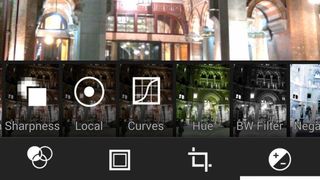
"Tapping the edit button while viewing a photo in the Android 4.4 Gallery isn't going to bring a brand new experience by any means, but that doesn't mean improvements haven't been made. In fact, Google has made several enhancements to the experience of editing photos on your phone."
Read full article: Photo editing improvements in the Android 4.4 KitKat Gallery
And although it’s not exclusive to the Nexus 5, the new Google+ “Photos” app (again, not to be confused with the Gallery app) lets you create HTC One-style video highlight reels from your photos and videos. The Photos app gives you a lot more filtering and music options than HTC’s implementation of this feature, though the videos themselves are less instantaneous — you need to go to the Photos app to create these Auto Awesome videos.
After you’re done, you can share your highlight reels to Google+ or save to local storage at up to 1080p resolution.
Auto-awesome all the things with the new Google+ application

"The built-in photo editor has changed, with a new UI that allows you to choose a filter-set then apply one of four different variants. There's a button for a quick look at the original for comparison purposes as well. Finally, there are a slew of frames to add to your picture if you want that extra touch. The edited images are saved separately, so you won't overwrite your original."
Read full article: First look at Google+ update with all new photos app
The bottom line
Fast, beautiful, full-featured and more affordable than its competition, the Nexus 5 is a great device in its own right. It’s also an excellent showcase for the new Android 4.4 KitKat, which is an important step forward for Google’s mobile OS in terms of design, functionality and integration with Google services.
As a high-end Android phone, the Nexus 5 doesn’t exactly nail it in every category. The camera packs a ton of potential, but right now the slow, janky camera software will be a source of frustration for many. Equally, if you absolutely need all-day battery life every single day, then this is probably not the phone for you. But these two major pain points have to be considered alongside the price of the device — $350 for a blazingly-fast 1080p Snapdragon 800 phone is a deal you won’t find anywhere else right now. And as a Nexus handset the N5 has a unique appeal to Android fans who need the latest updates right away, along with an unlockable bootloader.


The price point, speed and quality of user experience makes the Nexus 5 a great device for regular people as well as nerds
The price point, speed and quality of user experience makes the Nexus 5 a great device for regular people, too. The inclusion of LTE connectivity, a big, high-quality screen and genuinely useful software additions such as Google Caller ID make the Nexus 5 a great purchase for anyone looking for a high-end Android phone without breaking the bank.
If you’re willing to pay more, it’s certainly possible to do so and get a device that excels across the board — LG’s G2 and Samsung’s Galaxy Note 3 come to mind, though you’ll have to make do with Jelly Bean for the time being on those phones. Other “stock” Android options include the Google Play edition Galaxy S4 and HTC One, which should be receiving updates to KitKat imminently. Though more expensive, those devices provide superior build quality and better audio (in the case of the One) or longer battery life and a more capable camera (in the case of the S4). You’ll pay more for all of these options, however.
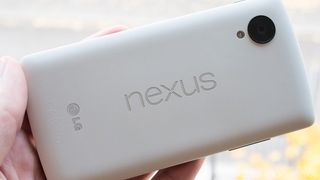

Google and LG have crafted a phone that's more than worthy of your attention
While KitKat is an important milestone for Android, Google is making it less crucial to have the latest version of the OS, by rolling certain built-in apps out onto the Google Play Store and pushing out new features through Google Play Services. So the question of whether you need the latest updates is more a matter of personal preference than it was in the past. Which brings us to the root of what a Nexus really is. It remains a great device for nerds, with the side-effect of being a great value handset for normal people. Nexus is still about the latest specs at a low-ish price point, combined with the latest stock Android and unlockable, hackable hardware. It’s more mainstream than ever before, but still a niche product. And there are still compromises to be made, most notably in terms of battery life and certain areas of camera performance.
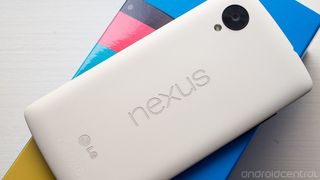
Nexus doesn’t necessarily mean you’re getting the best phone, period. But for enthusiasts, early adopters, performance freaks or anyone looking for a great device at the $350 price point, Google and LG have crafted a phone that's more than worthy of your attention.

Alex was with Android Central for over a decade, producing written and video content for the site, and served as global Executive Editor from 2016 to 2022.
