The new Google Play: We've come a long way, baby
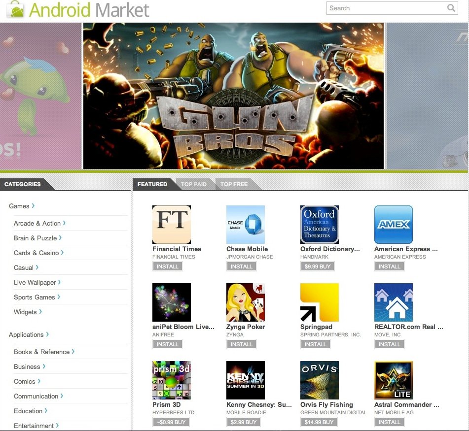
The Android Market website, circa Feb. 2011
For better or for worse, Google does what Google does — we're going to have to adapt
I'm seeing a lot of hate about the new Google Play web redesign. It seems like no matter what Google does with it, haters gonna hate, and Google can't please everyone. We get it — change is not always a good thing, and it makes people uncomfortable. But love it or hate it, it's here and you're stuck with it.
The biggest complaints I'm hearing are about permissions, the "My apps" list, and filtering reviews by device. Now I don't claim to know why Google does the things it does, but to me there's an easy explanation about each of these changes. I like the easy explanation, because usually, it's also the right explanation. Occam's Razor and all that.
Hit the break, let's talk.
App permissions
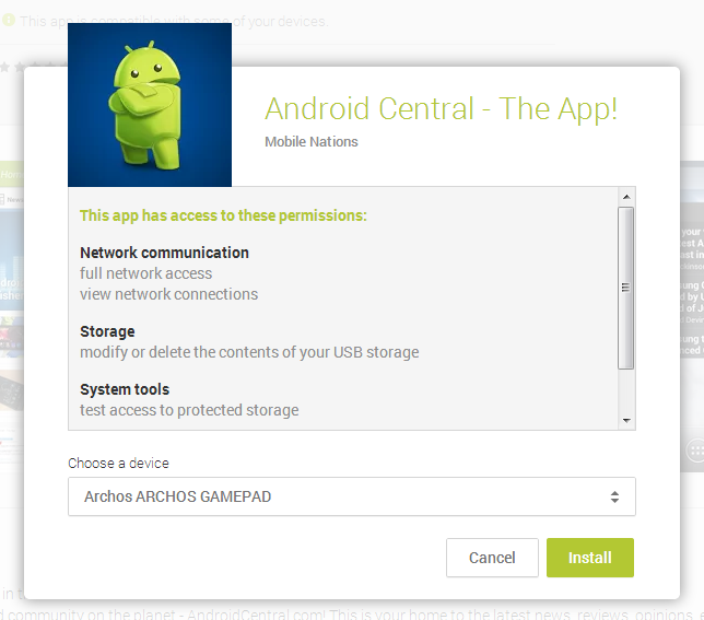
They're still there, big as life. In fact, I think they are done better. (And I'm not alone.) When you install an app from your phone, you have to look at them and acknowledge them before you can install. The web store should be no different. Want to see them? Click the install button and read. The only thing that's changed here is the placement, and that they look about a million times better with the new UI. And now you're forced to see them.
My apps
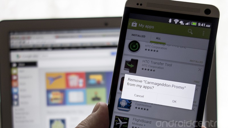
Think of the Google Play website as an aggregation of all your Google Play content in one big, messy place. It's not the place to see what's installed on each device, because you have a device with its own Play store app and library to tell you what's on it. The Library of Congress catalogs every book, but it doesn't tell you what's on the shelf at your local public library.
Be an expert in 5 minutes
Get the latest news from Android Central, your trusted companion in the world of Android
Need to know what's installed on your phone, or you want to remove an app from your local library? Pick up your phone, tap the Google Play icon and do it. You don't like it, or think it's a step backwards -- I hear you, but there isn't anything we can do about it. It's Google's baby, and this is what we have to do. Feel free to complain to Google about it, and maybe it'll do something to change it. Or not. Things work well in this new form.
Filtering reviews by device
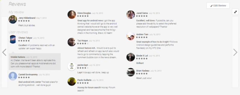
I don't think you're ever going to get this one back. No matter how helpful you think it was to have (and often it was very helpful), it's ultimately up to the developers to make sure their app runs well on particular devices. There's a function in the Play store developer dashboard to exclude certain devices from seeing your app in Google Play. If your app doesn't work well with a specific device, use that option and block it. Developers also have the ability to filter reviews by device in the dashboard, so they can see what's what.
Since Android 4.0 the APIs are pretty unified, and an app written correctly should work across all devices. If it doesn't, the developer needs to sort it out. A bad review shouldn't be device specific.
Of course, a lot of times they are pretty bad on one particular device. Google has now put that ball squarely in the app developers' court.
The bottom line
But you just might find, you get what you need.

Jerry is an amateur woodworker and struggling shade tree mechanic. There's nothing he can't take apart, but many things he can't reassemble. You'll find him writing and speaking his loud opinion on Android Central and occasionally on Threads.
