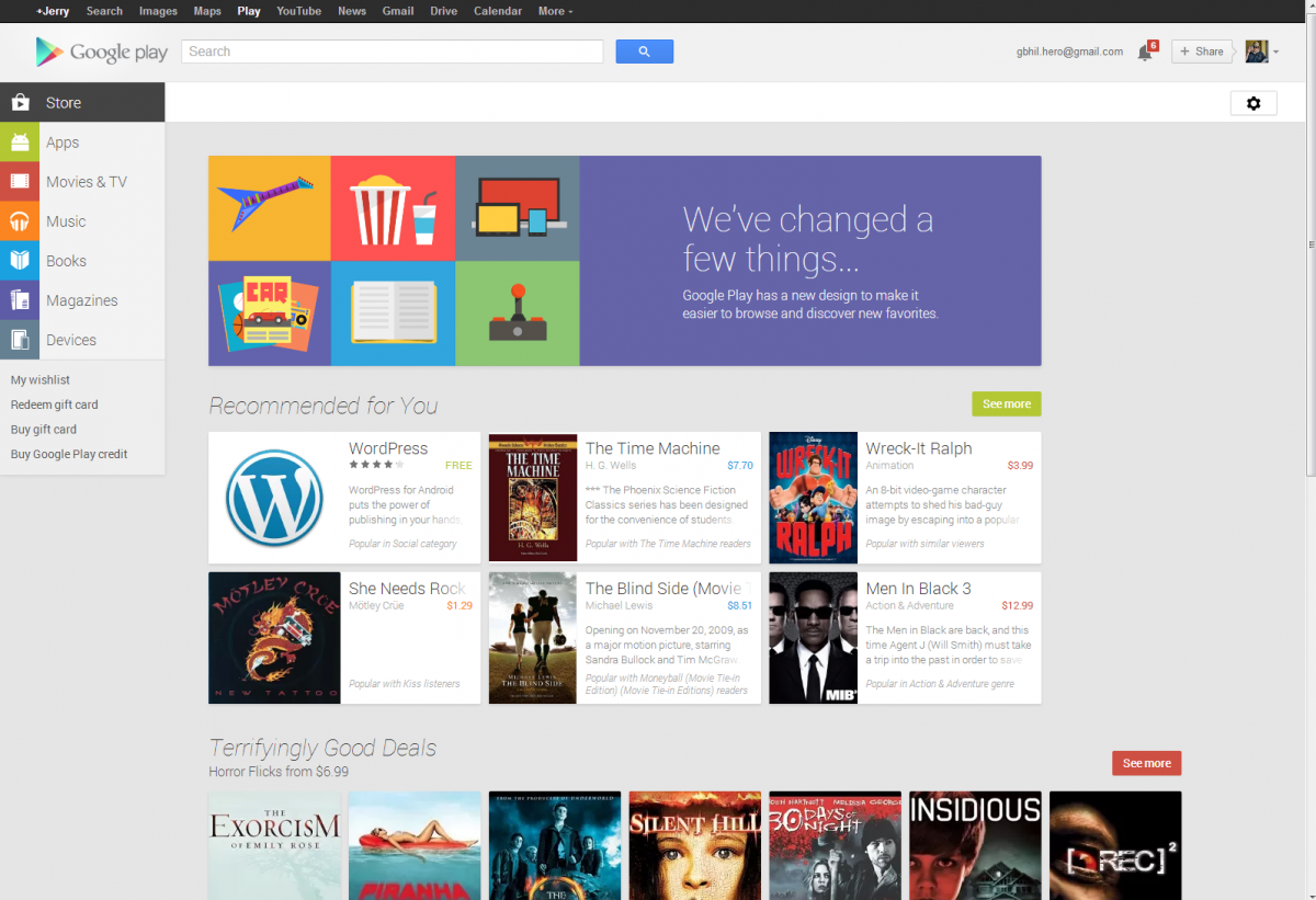
The new Google Play store design is now on the web, too

That fresh, new card interface design that we've grown to love in the Google Play app has now made its way to the website. All the content is still there, they've just made it a bit easier to navigate and made it look a lot more modern and in-step with Android's new design language.
You can still rent and purchase videos, buy books and devices, subscribe to magazines, and even install Android apps right to your phone or tablet from the site. Now it's easier to discover content and navigate with big blocks that hold all the information you need. Differences include much bigger screenshots for Android apps and other content, and it's all done up in Google's webP format for speedy loading. There's even a menu sidebar on the left like we've seen in the new style of Google apps. It's a big change, but we're liking what we see. Check it out and see if you feel the same.
Source: Google Play; via +Google Play
Be an expert in 5 minutes
Get the latest news from Android Central, your trusted companion in the world of Android

Jerry is an amateur woodworker and struggling shade tree mechanic. There's nothing he can't take apart, but many things he can't reassemble. You'll find him writing and speaking his loud opinion on Android Central and occasionally on Threads.
