New Google Assistant design rolling out to limited users

What you need to know
- Google is doing a limited A/B test of a new design for Google Assistant on phones.
- It's been seen on Pixel and OnePlus phones with version 9.84.10.21 of the Google app.
- We don't know if this will become the default in the future or not.
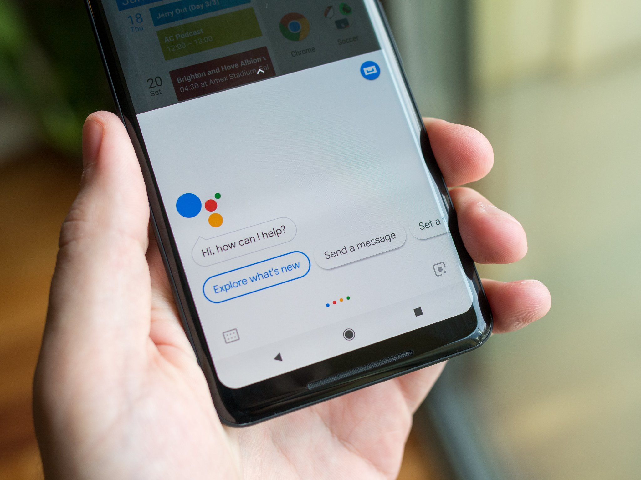
Google appears to be testing a new design for Google Assistant with users reporting the change in a thread on Reddit.
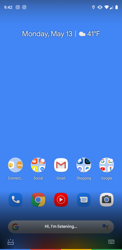
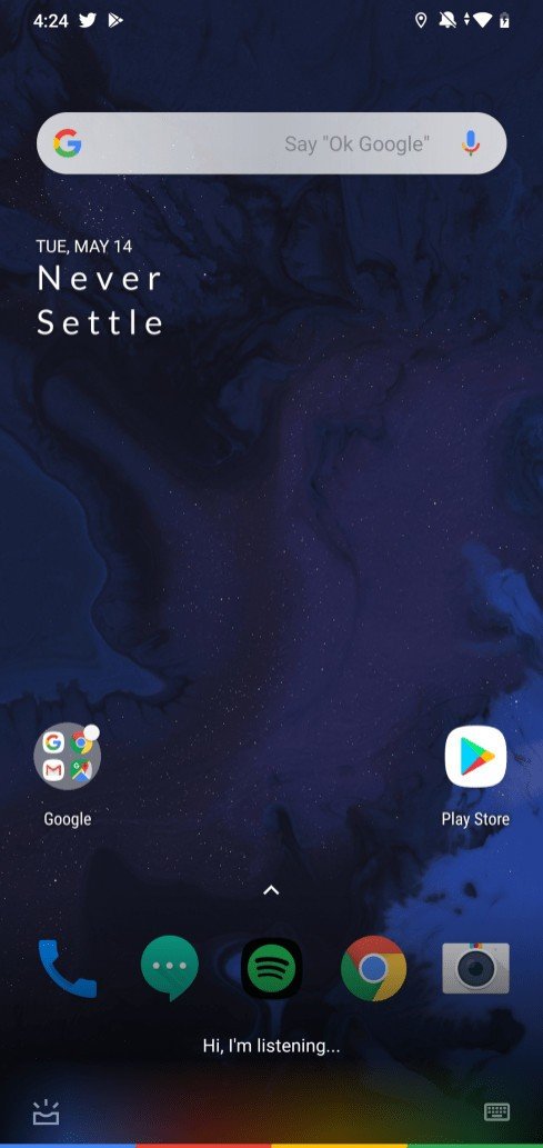
The new design drops the white overlay we've come to know when summoning Google Assistant on our phones. Instead, the new overlay shows up as semi-transparent black outline at the bottom with the words "Hi, I'm listening."


Once you swipe up, however, the design goes back to the tried and true white background that we've come to know over the years. It's a striking change from the solid white background that used to be displayed. Not only has Google switched the color to black, but it's now transparent with a see-through glass effect.
As with many Google tests, this is open to a very limited A/B test that is enabled on the server side. It is appearing for users with the 9.84.10.21 version of the Google app and has shown up on a Pixel phone and a OnePlus device.
At this time, we are uncertain if this is going to roll out to everyone or if Google is simply testing the waters with a new design. Kyle Bradshaw over at 9to5Google was able to confirm the "Hi, I'm listening..." string of text is present in the Google app, however.
It's interesting that Google didn't bring up changing the design of the app with all of the other announcements made last week at Google I/O 2019. It teased us with many new features, including how it will make Google Assistant up to 10 times faster on phones in the future, but made no mention of changing how Google Assistant looks when it is triggered on your phone.
How to change the Google Assistant voice on your phone and Google Home
Be an expert in 5 minutes
Get the latest news from Android Central, your trusted companion in the world of Android

