Neatly for Twitter beta: A smooth and functional new client
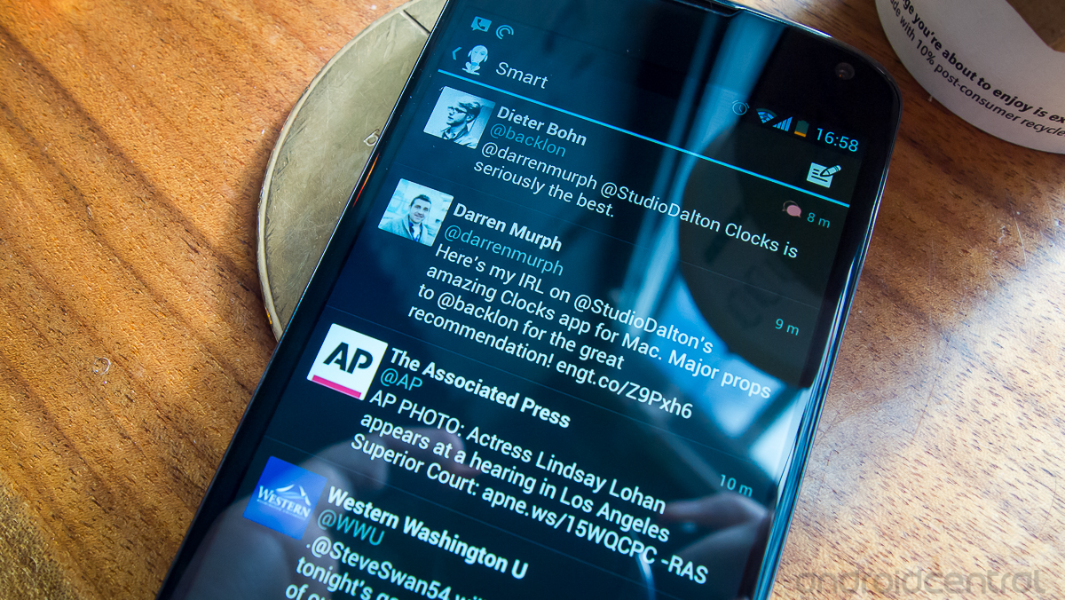
Twitter's recent API limit enforcement has put a bind on many developers that are making clients, but that doesn't seem to have deterred Neatly from releasing its own. Currently in a "final beta" release, Neatly is a simple and clean (hence the name) client that performs well and gives simple settings for managing timelines and muting users.
Hang with us after the break and see how Neatly for Twitter hangs with other clients in its current beta state.

Like so many popular apps nowadays, Neatly is only available for devices running Android 4.0 and above. One major benefit of this is being able to target a more consistent set of users and design to the holo user interface. Neatly follows the guidelines and keeps things extremely smooth and simple as it goes. The main interface works just like every other Twitter client, with a main timeline view to show all of your tweets. There are no crazy tabs or anything across the top however, just a simple compose button on the right. The latest beta also added pull-to-refresh, which is nice.
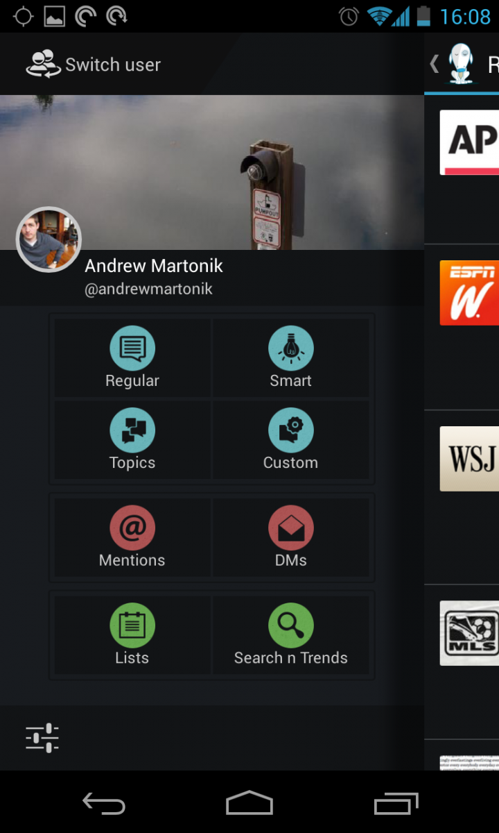
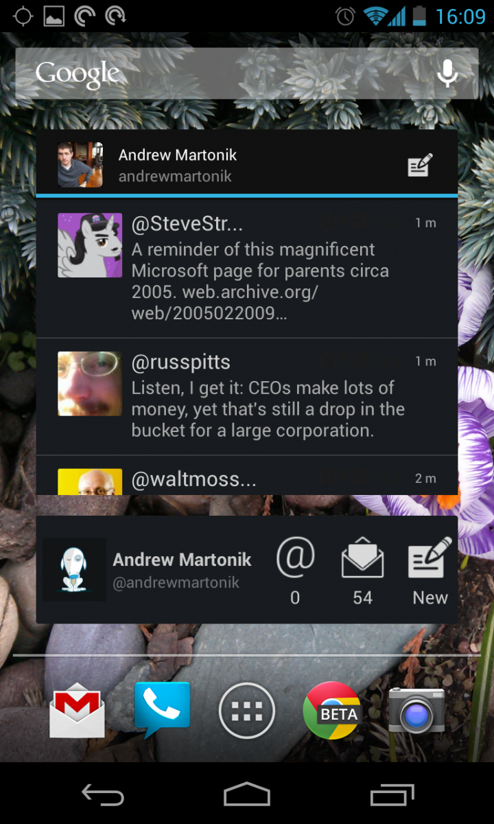
Things get a little busier when you reveal the options with a slide in from the left, but not by much. The panel gives a nice view of your profile and timeline pictures, along with your name and an option to switch between accounts. Underneath are 8 different options. You can choose which timeline you'd like to view -- regular, smart, topics or custom -- which can give many options as to which users or topics you'd like to see. You can of course view your DMs and Mentions, as well as your lists and make searches for users and hashtags. As for widgets, Neatly includes both a 4x2 (and resiziable) and 4x1 widget, which are in the black holo theme.
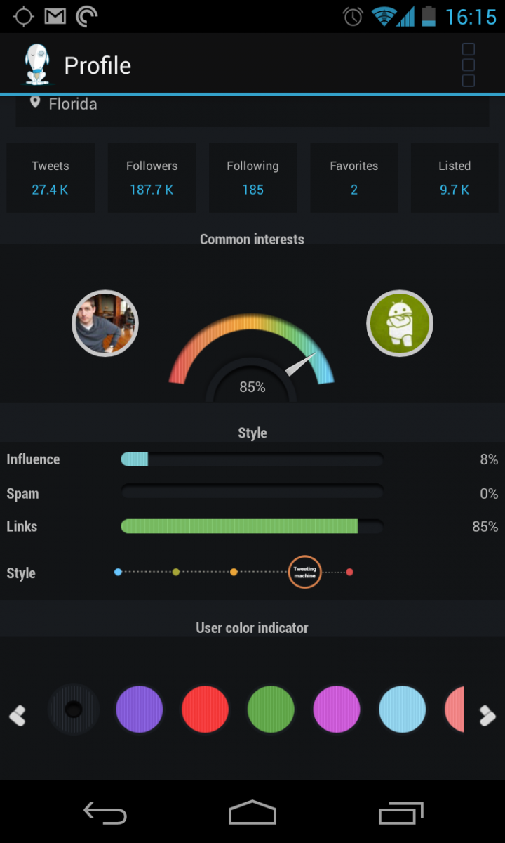
Tapping on a user's (or your own) profile picture gives a nice view of their profile information, including some analysis that Neatly does on what they tweet. You are provided with a scale of "common interests" between you and the other account, as well as a scale of how much they tweet, how many links they tweet and the ability to tag them with a specific color so you can pick them out in the timeline. The profile page is the only deviation from the clean interface of the rest of the client -- but there's really no way to make this amount of information any leaner.
The most notable part of Neatly is that it is extremely smooth and responsive. As the beta builds have progressed, the developers have certainly been working some magic on the back end to make things work right. But let's remember that this is still a beta, and there are certainly little hiccups that are lingering. We've had an issue with the app keeping GPS awake, and there are a few others, but we'd assume those will be worked out when it hits an "official" release.
With the amount of turnover we're likely to start seeing in the world of mobile Twitter clients, it's good to have another great option out there for us. Neatly has a couple interesting features and most importantly is wrapped in an extremely smooth and responsive interface, and for that reason we think it's worth a look. You can grab a download of the final beta from the Play Store link at the top of this post.
Be an expert in 5 minutes
Get the latest news from Android Central, your trusted companion in the world of Android
Andrew was an Executive Editor, U.S. at Android Central between 2012 and 2020.

